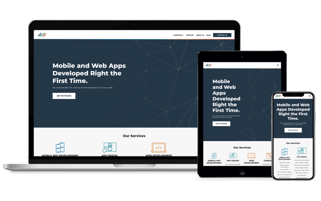
Responsive Mobile Web Design: Crafting User-Friendly Experiences
Did you ever wonder what a menu looks like through a keyhole? Well, that’s what browsing non-responsive websites on a phone feels like.
You squint your eyes, zoom in, and pinch out – all this digital obstacle course gets us is frustration and the click of the ‘back’ button.
Here’s the catch: It’s not 2010 anymore. The world has gone mobile. And so should our websites.
Responsive mobile web design isn’t just another cool-sounding term to throw around when talking to IT guys – it either helps you reach your audience or lets them slip away to competitors who understand this.
Take a moment to think about this. How recent was that time when you had to deal with an unfriendly site that was meant for desktops only while using your phone? Yeah, I thought so.
Our attention spans are now shorter than TikTok videos, and expectations are higher than ever.
However, responsive design does not make things appear prettier (although it does). It shows respect for people’s time spent online via their gadgets and their need for seamlessness across various platforms.
It creates virtual environments that seem explicitly tailored for each user regardless of whether they are surfing from their smartphone, tablet, or PC.
So, are you tired of shouting at people through keyholes yet? Would you like to start communicating with them face-to-face instead?
Then let us plunge into the realm of a user-friendly but buzzword-heavy responsive mobile web design environment together!
- Responsive web design ensures user-friendly experiences across devices, improving accessibility and retention.
- Over 60% of global web traffic now comes from mobile devices, emphasising the necessity for mobile compatibility.
- Google favours responsive designs in search rankings, enhancing overall site visibility.
- Key components include fluid grids, flexible images, and media queries for adaptable layouts.
- Responsive design streamlines development by requiring only one site for all devices, reducing maintenance costs.
- The Mobile Revolution: Why Responsive Design Matters
- What Is Responsive Mobile Web Design, Anyway?
- The Benefits of Responsive Design: More Than Meets the Eye
- The Nuts and Bolts: How Responsive Design Works
- Mobile-First Design: Starting Small for Big Results
- Responsive Typography: Words That Work Anywhere
- Navigation in Responsive Design: Guiding the Way
- Performance Optimisation: Speed Matters
- Common Responsive Design Patterns: Tried and True Solutions
- Responsive Images: A Picture's Worth a Thousand Words
- Conclusion: Embracing the Responsive Future
- FAQs
The Mobile Revolution: Why Responsive Design Matters

Do you remember when we used to squint at tiny text on our phone screens, desperate pinching and zooming just to get around desktop websites? Thankfully, those days are long gone.
With the mobile revolution, everything has changed, and responsive design is leading the way.
The Figures That Shock
Let’s start by looking at some numbers:
- 60% of the total global web traffic comes from mobile devices.
- 90% of internet users own a smartphone in the US.
- On average, people spend 5 hours a day on their phones.
These statistics show that failing to consider mobile users sets you up for disaster. However, responsive design isn’t only about serving mobiles – it’s about giving a consistent experience to all users, whatever device they’re using.
Google: The Unlikely Advocate
Did you know that Google loves responsive design? Yes, they do – it’s one of the things they consider when ranking sites in their search results pages.
But why would Google care about this?
The answer is simple: if people have good experiences online, then more people will like Google, which is much better than any other search engine!
What Is Responsive Mobile Web Design, Anyway?
All right, let's get to the point. What does it mean when we say responsive mobile web design?
The Adaptable Foundation
At its centre, responsive design is about changing the appearance of websites based on different screen sizes and devices.
It's like having a website that acts as a chameleon that changes colours according to its placement.
The Three Mainstays of Responsive Design
- Fluid grids
- Flexible pictures
- Media queries
These three things collaborate to give uniformity across multiple gadgets, but we will cover each later.
The Mobile-First Approach
Here’s a new way of thinking: Instead of designing for desktop and shrinking for mobile, designers are starting with mobile and working up.
It’s called the mobile-first approach, changing everything about web design as we know it.
The Benefits of Responsive Design: More Than Meets the Eye
You might think: “All right, I hear what you say about responsive design. But what’s in it for me?” Well, get ready because the advantages are enormous.
Enhanced User Experience
People like to stay where they’re happy. When your website flows seamlessly from one device to another, you remove barriers preventing users from interacting with content. That’s a win-win.
Improved SEO Performance
I told you earlier how much Google loves responsive design, but it’s not just about making the search engine gods happy. A site with responsiveness is more manageable for Google to crawl and index, which can result in higher search rankings.
Affordable Development
Instead of having separate mobile and desktop device sites, now just one site covers everything. This could save time, money and lots of headaches later down the road.
Quicker Load Times
Responsive design should have been built well enough so that no matter what kind of device it is loaded onto, it does so quickly every time, which we all know is essential in today's digital age. Users need to be engaged within seconds, or they will leave.
The Nuts and Bolts: How Responsive Design Works

Now that we have discussed why, let us move on to how. How does responsive design work?
Fluid Grids: The Foundation of Flexibility
Think about your website as a grid. The grid is fluid in responsive design, meaning it can expand or contract depending on the screen size.
Ratios instead of fixed pixel widths are employed here; it’s like having a rubber band for your layout.
Flexible Images: Looking Good on Any Device
Nobody wants to look at a blurry photo. That’s why, with responsive design, pictures will adjust to fit their containers.
So whether someone views your site from an enormous 4K monitor or just their little phone screen, everything will still be clear and sharp!
Media Queries: Shape Shifting Stylesheets
Media queries act as “secret agents” for responsive web pages; they figure out what kind of device (or more specifically, browser) is requesting content so different CSS rules can be applied accordingly based on those variables alone — such things might include screen size/resolution orientation, etc.… This way, we should switch to a column layout for smaller screens – and vice versa.
Mobile-First Design: Starting Small for Big Results
Remember when the mobile-first approach was brought up earlier? Let’s talk more about it because this idea is revolutionary.
Why Mobile First?
It’s all about limitations. When you design for mobile, you must concentrate on what matters the most.
What is the main content? Which features are key? By starting little and expanding later, you can build a strong base for your design.
Progressive Enhancement Method
The mobile-first design naturally goes with progressive enhancement. You begin with an essential experience that will be functional on any device and then add more intricate functions as needed by higher-end gadgets.
It’s like making a cake – first comes plain sponge, then fancy icing.
Problems With Mobile First
I will be honest: mobile first isn’t always straightforward. It requires new ways of thinking and can feel confining for designers used to working on large desktop screens.
But trust me, it pays off in the end!
Responsive Typography: Words That Work Anywhere
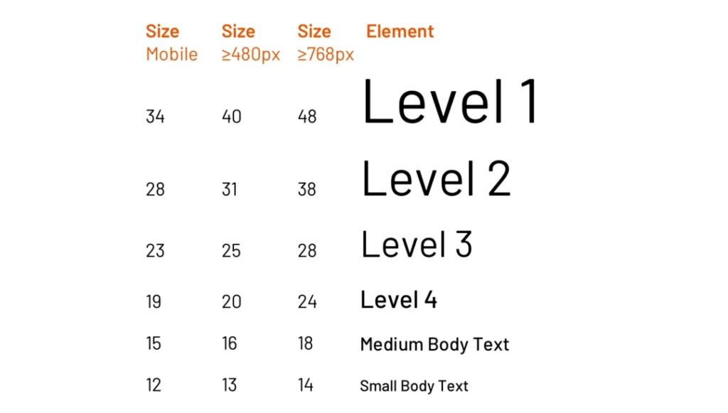
Typography is crucial in web design. This role becomes more significant in responsive design. Let’s check out how to make your text look amazing on any device.
The Art of Scaling
Responsive typography is not only about making text bigger or smaller, but it involves determining the correct font size, line height, and line length that ensures readability across different displays.
Using REMs and EMs
In responsive design, you can take advantage of these relative units of measurement, which allow your text to scale according to the user’s default font size.
The Importance of Hierarchy
On smaller screens, clear typographic hierarchy becomes even more essential. Therefore, use headings, subheadings, and body text to establish a clear visual structure that guides users through your content.
Navigation in Responsive Design: Guiding the Way
Excellent or lousy navigation can make or break a mobile experience. How do you change a complex desktop menu into something that will function on a small screen?
The Hamburger Menu: Is it good or bad?
It’s everywhere – those three little lines hiding the menu on mobile. But is it always the right choice? We’ll go over the pros and cons.
Different Navigation Patterns
Off-canvas menus and bottom navigation bars…there are many ways to handle navigation in responsive design.
Touch Targets Matter
Have you ever tried to tap a tiny link on your phone and accidentally tapped the wrong thing? So annoying. We’ll talk about how to create touch-friendly navigation elements.
Performance Optimisation: Speed Matters
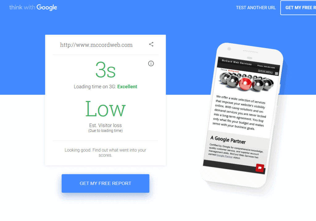
A responsive site is not very useful if it loads too slowly. So, let’s talk about how to ensure your responsive site is fast and responsive.
Dealing with Mobile Devices
Mobile devices often have slower connections and less processing power than desktop computers. With this in mind, how can we design websites?
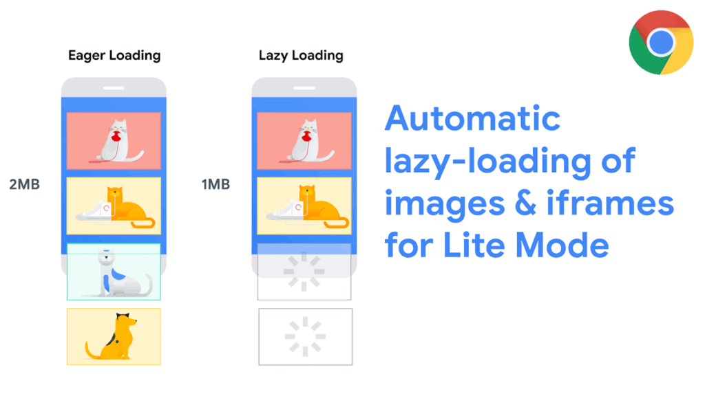
Methods for Optimising Images
This section will cover techniques from lazy loading to responsive images – all used for serving the image that fits best at any given time.
Cutting Back on HTTP Requests
Each file loaded by your website causes another HTTP request, so how can we minimise these requests to speed things up?
Common Responsive Design Patterns: Tried and True Solutions
Why reinvent the wheel?
It’s a valid question, particularly when we’re neck-deep in responsive design.
Here’s the deal: Patterns are there for a reason. They’re the shortcuts that intelligent people have figured out, tested and refined before us. They’re the cheat codes of the design world.
But let me be clear: using a pattern is not cheating.
It’s learning from our industry’s collective wisdom. And it’s how we stay sane and productive in the fast-paced world of web design.
So, let’s talk about patterns. Not like those plaid things you’d find on a hipster's shirt – I’m talking about the ones that make our websites sing across devices.
First up, we’ve got the Mostly Fluid Pattern.
Think of it as responsive design's Swiss Army knife – versatile, reliable, and gets the job done.
Imagine your content is water, and your layout is a series of containers. As screen sizes change, these containers resize and reflow to keep your content… well, mostly fluid.
When do you use it? Whenever you want your site to look good without overthinking it or if you have different types of content that all need to play nice together.
Then there's the Column Drop Pattern – think digital Tetris.
As screens get narrower, columns stack like falling blocks on top of each other vertically.
This one's best for sites with lots of content – why? Because it prioritises your content so nothing gets lost in translation (or on smaller screens).
Its strength? Simplicity. Its weakness? You can end up with too much same-y-ness if you're not careful, but this is a beast in skilled hands.
And, oh yeah – Off-Canvas Navigation!
This one is like magic for responsive design: complex menus appear and disappear with a finger flick (and some slick JS).
Picture this: your desktop site has a massive menu that would make a sitemap blush. How do you squeeze that into a mobile screen? You don’t. You tuck it away, off-canvas, ready to slide in when summoned.
It’s smooth, it’s efficient, and when done right – it’s delightful.
But here’s the thing: These are not straight jackets. They’re starting points, frameworks for your creativity. Real magic happens when you take these proven solutions and make them your own.
See, in responsive design-land, it's not about having the fanciest solution – it's about having the right one. The one that serves your users, tells your story, and, yes – maybe even delights along the way.
Responsive Images: A Picture's Worth a Thousand Words
Responsive design images are like teenagers at a family reunion; they’re essential and demanding, and if you don’t manage them correctly, they can cause many problems.
So here’s the thing: We live in an image-based culture.
Our brains process visuals 60,000 times faster than text, so Instagram isn’t just another photo app; it’s a cultural force. But images are the problem children of responsive design: they’re big, heavy and inflexible across devices.
So what’s the solution?
We get clever. We get flexible. We use what we’ve got to make images work with us rather than against us.
Meet the element: Having a shape-shifter in your HTML toolbox is like having a shape-shifter. With, you’re not just serving up an image — you’re serving up the right image.
Think about it: Why would you send a massive 4K image to a tiny smartphone screen? That’s like using a fire hose to water a potted plant. The element lets you serve different image versions for various scenarios, not just responsive—responsible.
But here’s where things get interesting: sometimes it’s not about scaling — sometimes it’s about telling a whole other story.
Enter art direction.
Imagine you’ve got this fantastic landscape shot on a desktop. Maybe you can show the whole panorama but on mobile? Perhaps it’s just that one incredible mountain peak.
Same story, different perspective — that's art direction in responsive design. It's not just about making things fit — it's about making things resonate.
And then there's SVG – the unsung hero of responsive design… think of SVG as yoga for your images – bendy, stretchy and adaptable to any size screen from smartwatch to smart TV while keeping its form intact throughout.
When considering vectorised air in a pixel-obsessed world, SVGs are lightweight and great for logos icons, illustrations, etc..
But here’s the kicker: knowing these tools isn’t enough. It’s about knowing when and how to use them. It’s about seeing every image on your site as an opportunity to engage, surprise, and delight.
Because responsive design is not about making “things” look good on different screens.
It’s about creating experiences that transcend devices… it's about respecting your users' time, data and attention… it's about telling your story most effectively, whether through a carefully art-directed photograph, flexible SVG icon, or smartly implemented element – whatever works.
Conclusion: Embracing the Responsive Future
Responsive mobile web design is more than just a fad. It is a permanent change.
As we have epitomised, it is not only about creating adaptable and flexible websites across all devices.
There are many things to consider, from liquid grids to responsive typography, performance optimisation, testing strategies and many others.
However, the benefits outweigh the costs of having delighted users who will always be coming back for more visits, thus increasing the ranking on search engine result pages (SERPs), which eventually leads to having an internet site ready for anything that comes its way.
The principles of responsive design will grow further as time progresses.
Different gadgets, new technologies, and user expectations should give us a clue as to what direction to take when dealing with web design. But still, at its most basic level, this means making sites respond according to the context of use.
Are you prepared for the age of responsiveness?
Whether you’ve been around for some time now or are just getting started as a developer, there has never been a more perfect moment than this one in history where everything revolves around responsive mobile website designing because they will appreciate it.
As we can see from this article, mobile web design is no longer an option – it’s a necessity!
FAQs
What sets responsive design apart from adaptive design?
Both try to give the best experience on any device. Still, while responsive design employs flexible images and fluid grids that can fit into any screen size, adaptive design has different layouts for different screens.
Is coding a requirement when implementing responsive design?
No. Many website builders and content management systems today offer responsive templates and tools that do not require extensive coding knowledge, although it can be helpful.
How does SEO respond to responsive designs?
It ensures a uniform user experience across all devices, thus reducing bounce rates and doing away with separate mobile URLs.
Does creating separate mobile sites cost more than using a responsive design?
Yes. Initially, you might need to invest more in making your site responsive, but eventually, this becomes cheaper since only one version has to be maintained.
What can I do to know whether my site is responsive or not?
You can use browser developer tools and online responsive design checkers or test it on physical devices with different screen sizes.
In your opinion, what’s the best way one should handle images in responsive designs?
To serve appropriately sized images for different devices, you should use techniques such as element, srcset attribute and CSS media queries, among others.
How does a responsive design care for input methods like mouse vs touch?
Touch-friendly elements are often considered when creating a responsive design where buttons may become more prominent and tap targets placed appropriately on mobile devices.
Can I make my non-responsive site responsive?
Yes. One can apply responsive design principles to an existing website, although this may prove difficult compared to starting afresh with a responsive approach.
What effect does responsive design have on site performance?
When done right, it can lead to better performance by sending properly sized resources for each device, but if implemented well, load times may be positively affected.
Do you always have to use the mobile-first approach in responsive design?
No. Although it is common and usually effective, you may not need to use it depending on your project requirements or target audience.
How do you handle complex data tables in responsive design?
You can choose between collapsing columns, horizontal scrolling and transforming tables into cards or lists when dealing with responsive tables with large amounts of information.
What part does typography play in responsive designs?
Typography is essential to create a good, responsive layout since units like ems or rems are used alongside fluid typography, ensuring readability across different devices.

