
How to Create a Brand Identity System for Visual Consistency
A brand identity system is the complete set of visual components and the strategic rules governing their use, designed to ensure visual consistency across all customer touchpoints.
This system is formalised in a brand guidelines document, which specifies the official logo, colour palette (with HEX/Pantone codes), typography hierarchy, and imagery style.
Like Apple's iconic and cohesive design language, a strong system builds powerful brand recognition and ensures every marketing asset, from the website to packaging, is instantly identifiable.
- A brand identity system centralises visual components and rules to ensure consistent recognition across all customer touchpoints.
- Core elements include logos, colour palette, typography, imagery, motion, and collateral documented in clear guidelines.
- Design systems extend guidelines with reusable, pre-coded components for consistent, efficient digital product development.
- Consistency builds trust and recognition, improving efficiency, collaboration, and the overall customer brand experience.
Brand Identity System Components
Logos
The logo is often the cornerstone of a brand identity system. It is usually the most recognisable element, providing instant recognition for the brand. A brand identity system typically has three types of logos: the primary brand mark, the secondary brand mark, and lockup variations.
The primary brand mark is the main logo representing the brand's identity. It is the most commonly used logo that consumers associate strongly with the brand.
The secondary brand mark is an alternate version of the emblem utilised in specific contexts or applications where the primary brand mark may not be suitable. Lockup variations are different logo arrangements, allowing for flexibility in their placement on various platforms and materials.
Let's take Coca-Cola as an example. The primary brand mark is the classic Coca-Cola script logo, instantly recognisable and strongly associated with the brand. The secondary brand mark might be a simplified version, such as the “Coca-Cola” script without additional elements.
Lockup variations could include arrangements where the logo is positioned alongside other components, such as taglines or images, to maintain the brand's visual coherence.
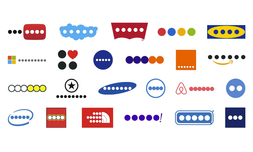
Besides serving as a brand's identifier, the logo can communicate essential aspects of the brand's identity and values. For instance, the Amazon logo features an arrow that points from the letter ‘a to ‘z', indicating that the company offers everything from “a” to “z” while also representing a smile, reflecting the company's focus on customer satisfaction.
Colours
The colour palette is another crucial component of a brand identity system. It is a collection of colours representing the brand consistently across all materials and platforms.
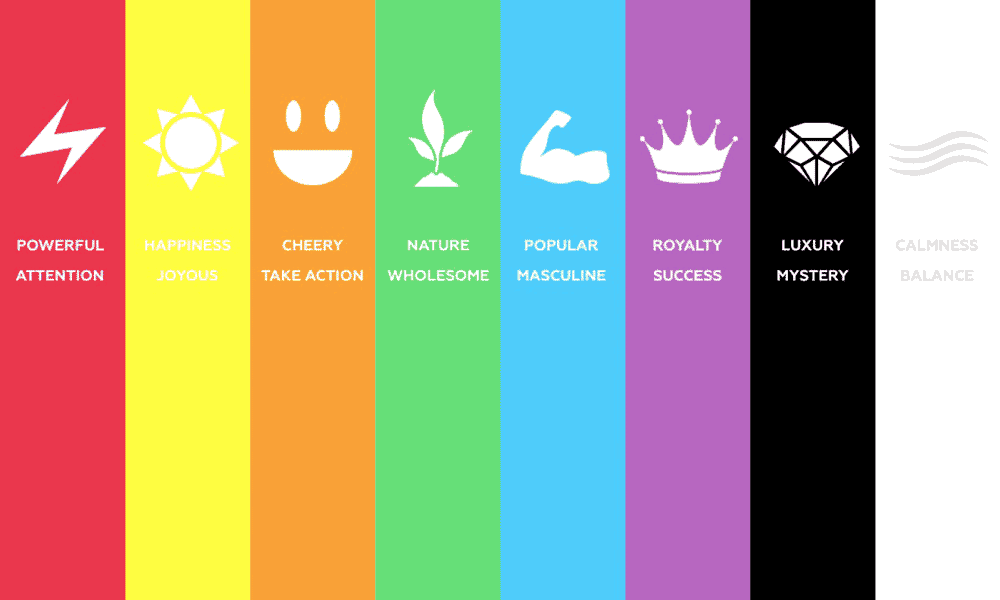
The colours chosen for a brand's palette should reflect its personality and evoke the desired emotional response from its target audience. For instance, bold, vibrant colours reflect a youthful, energetic brand. At the same time, muted, earthy tones are used for a brand that wants to convey a sense of sustainability and connection to nature.
In addition to reflecting the brand's personality, colours also have a profound psychological impact. Different colours can evoke specific emotions and associations, which can be leveraged to reinforce the brand's message and values. For example, blue is often associated with trust and reliability, making it a popular choice for financial institutions and tech companies.
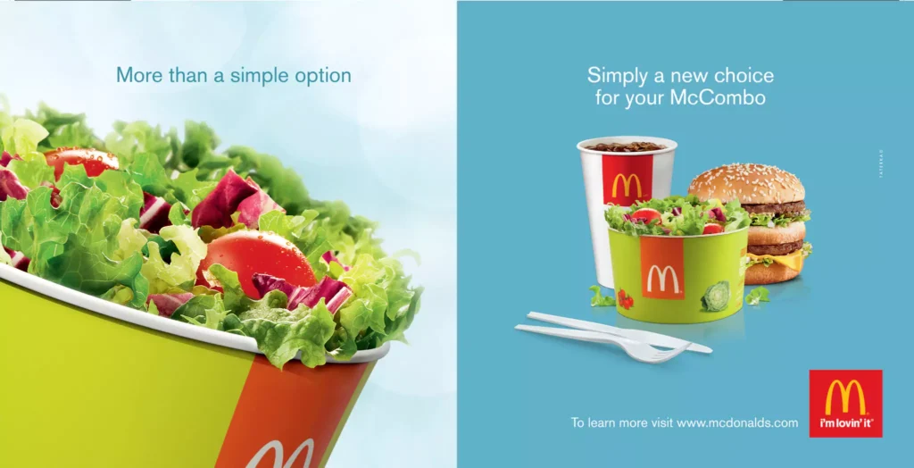
A prime example of the effective use of colour in a brand identity system is the fast-food chain McDonald's. The brand's distinctive red and yellow colour scheme is instantly recognisable and evokes feelings of warmth, happiness, and excitement, aligning perfectly with the brand's image of providing quick, enjoyable meals.
Typography

Typography is another crucial component of a brand identity system, providing a visual voice for the brand's written content. Carefully chosen fonts can communicate more than words—they can express the brand's personality, tone, and values.
Whether a brand opts for a modern, minimalist sans-serif font or a traditional, elegant serif font, the typography should align with its identity and enhance its overall aesthetic.
Typography can significantly impact the brand's visuals and enhance its overall identity. Different font styles, weights, and arrangements can dramatically alter how a brand is perceived. For instance, a tech startup might opt for a sleek, minimalist font to convey a sense of innovation and forward-thinking. At the same time, a luxury brand might use an elegant, stylised font to signal sophistication and exclusivity.
A notable example of typography in a brand identity system is The New York Times. The newspaper uses a distinctive, custom serif font for its logo and headlines, projecting an image of authority, tradition, and credibility. This consistent use of typography across all platforms enhances the brand's identity and helps establish a robust and recognisable brand image.
Imagery and Graphics
Imagery and graphics form a brand's visual language, which is pivotal in telling its story and enhancing its identity. This includes photographs, illustrations, icons, patterns, and other visual elements consistently used across all brand materials. The style and characteristics of these visuals should align with the brand's identity and resonate with its target audience.
For instance, a brand that targets a youthful, creative audience might use bold, colourful illustrations and quirky graphics. In contrast, a brand catering to a professional, corporate audience might opt for more subdued, high-quality photographs. These visual elements can add depth and context to the brand's narrative, making it more engaging and memorable for the audience.
Consider the brand identity system of Airbnb. The company uses a consistent style of photography across its platform, featuring warm, inviting images of homes and experiences. These images enhance the platform's aesthetic and effectively convey Airbnb's brand message of belonging and community.
Tone of Voice
Right, so you've got your visuals looking sharp. But what about how the brand sounds? That's your tone of voice, and frankly, it's just as important. It's the personality that comes through in your writing, you know?
The words you use on your website, your emails, your social media posts, the lot. The thing is, your tone has to match your visuals. If your design is all clean and minimalist, but your writing is full of complicated jargon, it just feels… off.
The mismatch creates friction and confusion for the customer. The tone should back up the visual story, making the whole brand personality feel genuine and complete. Look at Mailchimp, their visual brand is simple, friendly, and a bit playful with its monkey mascot.
And their tone of voice? It's exactly that. They use simple language, offer encouragement (‘You got this!'), and have a sense of humour. It feels like a helpful mate guiding you through, which is precisely the brand image they want to project to small businesses that might feel intimidated by marketing.
Animation and Motion Graphics
In a digital world, stuff doesn't just sit there anymore. It moves. That's why animation and motion graphics are a massive part of a modern brand identity system. We're talking about how your logo loads on screen, how menus slide into view, or even the tiny ‘like' button animations.
These are called micro-interactions, and they all add up. This isn't just about making things look fancy for the sake of it. Consistent motion reinforces your brand's personality and improves the user experience.
Is your brand energetic and quick? Your animations should be fast and bouncy. Is it more refined and serious? Then your movements should be smooth and deliberate. You need rules for this, things like timing and style, to keep it consistent.
Google's Material Design is a perfect example of this done at scale. They have a whole rulebook for how digital elements should move across their apps. It's not random; every transition and button tap feels intentional and familiar. That consistent motion is a quiet but powerful way they make their entire product family feel connected and intuitive to use.
Brand Collateral

Brand collateral is where the brand identity is visually expressed and experienced by consumers. This can include various materials, such as websites, advertisements, packaging, business cards, social media posts, etc.
Each piece of collateral should consistently use the brand's logo, colour palette, typography, and imagery, reinforcing the brand identity and creating a cohesive brand experience.
Elements like store layout, uniforms, and tableware for physical brands can also contribute to the visual identity. These physical assets provide an opportunity to extend the brand's visual identity into the physical world, creating a more immersive brand experience.
Starbucks provides an excellent example of brand collateral in action. From the green apron that baristas wear to the design of their stores and product packaging, every piece of collateral is consistently branded.
The Starbucks logo and colour palette are prominently featured, while the typography and imagery align with the brand's identity. This cohesive brand collateral helps reinforce Starbucks' brand identity and creates a distinctive, memorable brand experience for customers.
Brand Identity Guidelines

Brand identity guidelines are a crucial part of a brand identity system. These guidelines provide a comprehensive reference for how the brand's visual elements should be used to maintain consistency and protect the brand's identity over time. They typically include specifications for logo usage, colour codes, typography rules, imagery style, and more.
Having clear and detailed brand identity guidelines ensures that the brand's identity is consistently and correctly represented, regardless of who is creating the brand collateral or where it is being displayed. This is particularly important for larger organisations, where multiple teams or external partners may be involved in creating brand materials.
But let's be honest, having a set of guidelines is one thing. Getting a big team or outside agencies to actually follow them is another challenge altogether. That's where a Digital Asset Management system, or a DAM, comes in.
Think of it as a single, organised online library for all your approved brand materials. It's the one place everyone goes to get the latest logo, the correct colour codes, the approved photos, everything.
No more a marketing person using a squashed, pixelated logo they found in an old email for a massive new ad campaign. A DAM is the single source of truth that helps enforce your guidelines, saving a load of time and preventing expensive, embarrassing mistakes.
For example, the tech company Atlassian has comprehensive brand identity guidelines covering everything from logo usage and colour palette to typography and iconography. These guidelines ensure that every brand collateral, whether a webpage, marketing material, or product interface, consistently reflects Atlassian's brand identity.
However, brand identity guidelines are not just about maintaining visual consistency—they also play a significant role in preserving the brand's integrity. By ensuring that the brand's identity is represented correctly and consistently, brand identity guidelines help build and sustain consumer trust.
Consumers can confidently interact with genuine brand materials, and the consistent brand experience reinforces their connection with the brand.
The Evolution from Brand Guidelines to a Design System
Brand identity guidelines are the foundation, no doubt about it. But for any company with a serious digital footprint, the game has moved on. The next level is a full-blown design system.
Look at it this way: if guidelines are the recipe book, a design system is a kitchen full of pre-measured ingredients ready to go, complete with the instructions printed on the packet. A design system goes way beyond just looks. It includes a library of reusable, pre-coded components.
We're talking about buttons, forms, navigation bars, and all the other bits that make up your website or app. It ensures your identity is applied perfectly, not just visually, but functionally too. This saves an insane amount of time and money because you're not redesigning the same things from scratch over and over again.
Shopify's ‘Polaris' design system is a brilliant example. A developer building a new feature for a Shopify store doesn't have to guess how a drop-down menu should look or behave. They just grab the official ‘Polaris' component. It already has the brand's colours, fonts, spacing, and even accessibility features built in, making it incredibly efficient to build new things that are instantly, perfectly on-brand.
Benefits of a Visual Identity System
A well-defined visual identity system offers numerous benefits for businesses. It improves content creation by providing a consistent and recognisable brand image across all platforms and materials. This consistency enhances the brand's professional image and makes it easier for consumers to identify and remember the brand.
This consistency does something more important than just looking professional, though. It builds trust. When a customer sees the same logo, colours, and style across your website, your packaging, and your ads, it creates a feeling of reliability.
The brain likes predictability; it sees it as safe and dependable. Think of your favourite coffee shop. You go there because you know you'll get a good coffee, the place will look the same, and the staff will be friendly.
That consistency makes you trust them with your money every morning. A brand that looks different every time you see it is like a coffee shop that's a different colour every week. You'd feel wary and probably wouldn't go in. Consistency shows you've got your act together and are a reliable choice.
A visual identity system also helps to avoid misunderstandings or misinterpretations about the brand by providing clear guidelines for graphic representation. This ensures that the brand's identity, values, and message are accurately and consistently communicated to the target audience.
Spotify is an example of a brand that has reaped the benefits of a solid visual identity system. The music streaming service is known for its distinctive green and black colour scheme, quirky graphics, and bold typography. This consistent visual identity has helped Spotify stand out in a competitive market and created a distinct brand experience that resonates with its target audience.
A visual identity system can facilitate collaboration between different organisational teams or departments. By providing a shared set of guidelines and resources, an optical identity system makes it easier for teams to create consistent, on-brand materials, even when working independently. This can significantly improve efficiency and cohesion within the organisation.
Moreover, a visual identity system provides a strong foundation for implementing marketing and branding strategies. By defining the brand's visual language, a visual identity system helps to align all marketing efforts with the brand's identity and goals. This alignment can enhance marketing campaigns' effectiveness and help create a stronger, more consistent brand image.
Steps to Create a Visual Identity System
Creating a visual identity system is a comprehensive process that involves several key steps. The first step is to define the brand's identity, values, and target audience. This involves understanding the brand's personality, what it stands for, and who it aims to attract. This foundational understanding informs the brand's visual direction and ensures that the optical identity system effectively communicates the desired brand message.
The second step is to create a mood board for inspiration and feedback. A mood board is a collection of images, colours, typography, and other visual elements that reflect the desired aesthetic for the brand. This can serve as a visual guide and provide a tangible reference for developing the brand's visual identity.
Next, it's essential to gather feedback from stakeholders. This can include team members, leadership, and even target audience members. Their input can help refine the visual identity system and ensure it aligns with the brand's goals and resonates with its target audience.
Finally, guidelines for each element of the brand identity system need to be established. This includes rules for logo usage, colour codes, typography rules, and procedures for imagery and graphics. These guidelines ensure that the brand's visual elements are used consistently and correctly, protecting its identity and enhancing its professional image.
For instance, when Google developed its visual identity system, it started by defining its brand identity as simple, trustworthy, and user-friendly. This informed the development of its minimalist logo, bright colour palette, and straightforward, clean typography. Google also established comprehensive guidelines for each element of its visual identity, ensuring its brand identity is consistently represented across all platforms and materials.

- Hardcover Book
- Wheeler, Alina (Author)
- English (Publication Language)
Building a Visual Identity System
Building a visual identity system involves several key components. The first step is to design and create visible features, such as logos, colour palettes, typography styles, and graphics. These elements should be prepared to align with the brand's identity, message, and purpose.
Next, design principles that align with the brand's identity, message, and purpose must be established. These principles guide the design process and ensure the visual identity system effectively communicates the brand's identity.
Another component of building a visual identity system is implementing an icon library. Icons are versatile visual tools representing various aspects of the brand, from products or services to brand values or features. An icon library ensures consistent and scalable use of these visual elements.
Style properties also need to be defined and standardised. This includes specific colour codes, font sizes and styles, and other stylistic guidelines. Standardising these properties ensures the brand's visual elements are consistent across all platforms and materials.
Design patterns should also be created. These reusable design solutions can be applied consistently across different media and platforms. Design patterns improve the efficiency of the design process and enhance the consistency of the brand's visual identity.
Finally, the effectiveness of the visual identity system should be continuously analysed and reviewed. This involves tracking its performance, gathering feedback, and making necessary adjustments or improvements.
A prime example of a well-executed visual identity system is Atlassian's. The tech company's visual identity system includes components, patterns, brand foundations, and content guidelines, covering aspects like accessibility, colour, typography, iconography, and more. This comprehensive and well-organised visual identity system has helped Atlassian project a distinct and unified brand identity, enhancing its recognition and reputation in the market.
Examples of Successful Brand Identity Systems
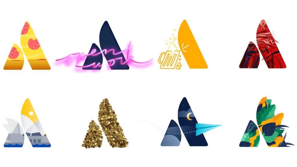
One of the best examples of a successful brand identity system is Atlassian. The tech company's visual identity system includes components, patterns, brand foundations, and content guidelines, covering aspects like accessibility, colour, typography, iconography, and more. This comprehensive system ensures that Atlassian's brand identity is consistently and accurately represented across all platforms and materials.
Atlassian's visual identity system has been instrumental in establishing its brand identity in the highly competitive tech industry. The consistent use of its distinctive logo, colour palette, typography, and graphic elements across all brand materials has made Atlassian's brand image instantly recognisable. Moreover, the detailed guidelines provided in its visual identity system ensure that all stakeholders, from internal teams to external partners, accurately represent the brand's identity.
Another exemplary brand identity system is that of FedEx. The delivery services company's identity system includes a distinctive logo—famous for its hidden arrow symbolising speed and precision—and a bold, vibrant colour scheme that varies depending on the specific service (e.g., FedEx Express, FedEx Ground). This consistent and cohesive visual identity has helped FedEx establish a strong brand image, making it one of the most recognised brands in the world.
Tips for Creating and Implementing a Brand Identity System

Creating and implementing a brand identity system requires careful planning and strategic thinking. The first step is clearly defining the brand's identity, values, and personality. This foundational understanding informs every aspect of the visual identity system, from the logo and colour palette to typography and imagery.
Storytelling is also a crucial part of creating a compelling brand identity system. A compelling narrative that aligns with the brand's identity and resonates with the target audience can enhance its appeal and make its identity more memorable. This involves crafting a narrative that embodies the brand's values and goals and then expressing that narrative through the visual identity system.
Designing a visual identity system must be adaptable and practical across various mediums, including digital and print. This means considering how the brand's visual elements will look on different platforms and formats, from a small smartphone screen to a giant billboard.
Simplicity and clarity should also be a goal in design. A simple, straightforward design is often more memorable and impactful, making it easier for consumers to recognise and remember the brand. This doesn't mean that the design has to be plain or minimalist—rather, it should be free of unnecessary elements that could distract from the core brand identity.
Lastly, a well-designed visual identity system should help the brand stand out. This involves creating a unique and distinctive visual identity that distinguishes the brand from others in the market. A standout visual identity can give a brand a competitive edge through a unique logo, a distinct colour palette, or innovative graphics.
For an example of a brand that has successfully implemented these tips, consider Airbnb. The company has a clearly defined brand identity centred around belonging and community. This identity is effectively communicated through its visual identity system, from its distinctive logo and warm colour palette to its consistent style of photography.
Airbnb's visual identity system is also adaptable across various media, from its website and mobile app to print advertisements and billboards. The simplicity and distinctiveness of Airbnb's visual identity have helped it stand out in the competitive travel industry.

- David Airey (Author)
- English (Publication Language)
- 242 Pages – 08/20/2014 (Publication Date) – Peachpit Press (Publisher)
Conclusion
In conclusion, a brand identity system is a comprehensive collection of visual elements that create a consistent and cohesive brand image. This system includes various components, such as logos, colours, typography, imagery, and graphics, uniquely communicating the brand's identity and values.
A well-designed and implemented brand identity system is instrumental in establishing recognition, building customer loyalty, and distinguishing a brand from its competitors. It provides a consistent visual narrative that enhances the brand's appeal and makes its identity more memorable for consumers.
Creating a brand identity system involves defining the brand's identity and values, designing the visual elements, establishing guidelines for their use, and continuously reviewing and refining the strategy. This process requires strategic thinking, creativity, and a deep understanding of the brand and its target audience.
Investing time and resources in creating a comprehensive and compelling brand identity system is essential for any brand striving to establish a strong presence in the market. Whether a startup is looking to make its mark or an established brand is aiming to maintain its position, a powerful brand identity system is a foundational tool for achieving branding success.
Last update on 2025-10-18 / Affiliate links / Images from Amazon Product Advertising API

