
User Experience Design: How to Think Like a Customer
Your website might be stunning. A visual masterpiece that your graphic designer is immensely proud of. It might even win an award for its aesthetic.
But it could also be utterly useless. A beautiful, expensive, digital paperweight that confuses customers and actively drives business away.
Too many entrepreneurs get sold that a “great website” looks good. They burn through cash on fancy graphics and slick animations, then wonder why nobody buys anything.
Here’s the rub: they’ve focused on the paint job, not the engine. They’ve built a show car that can’t be driven.
This is the expensive confusion at the heart of user experience (UX) design. And untangling it is the first step to building a website that doesn’t just sit there looking pretty, but works.
- User Experience (UX) focuses on functionality; User Interface (UI) is about aesthetics.
- Good UX is seamless and often unnoticed; poor UX is frustrating and memorable.
- Prioritise clarity, simplicity, empathy, and feedback in UX design.
- Conduct user testing to identify flaws in website navigation and structure.
- Your website should generate leads and sales, not just look pretty.
First, Let’s Settle This: UX Is Not UI
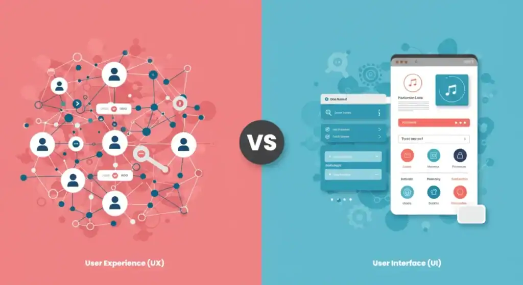
If you take nothing else from this article, burn this into your brain: User Experience (UX) is not User Interface (UI).
My pet peeve is saying “UI/UX” like they’re the same. It’s the foundational mistake that leads to almost every other problem.
The Architect and The Interior Decorator
Think of it this way.
The UX designer is the architect. They map out the entire structure. They decide where the rooms go, how you move between them, where the plumbing needs to run, and whether the flow of the house makes sense for the people living in it. Does the kitchen flow into the dining area? Can you get from the bedroom to the bathroom easily in the dark? Their job is about function, structure, and the overall experience of living in the house.
The UI designer is the interior decorator. They come in after the architect has finished. They choose the paint colours, the furniture, the light fixtures, and the textures. They make the house look and feel a certain way. Their job is about aesthetics and the visual and tactile elements within the structure that the architect built.
You need both. A house with a brilliant layout but awful decor is unpleasant. A home with beautiful decor but a nonsensical layout is unusable.
Why This Simple Mistake Is Costing You a Fortune
When you chase UI before you’ve sorted UX, you hire an interior decorator to build your house. You get a beautiful mess. A website with gorgeous buttons that lead nowhere. A stunning menu that’s impossible to navigate. A visually arresting layout that hides the one thing your customer came for: the “Buy Now” button.
You end up paying twice, once for the pretty mess and again for someone to come in and fix the underlying structure. Good UX puts the user’s goals first. Good UI makes that functional journey aesthetically pleasing.
Function first. Always.
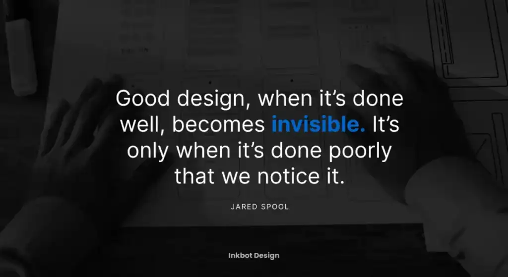
The Uncomfortable Truth: Good UX Is Invisible
Here’s a paradox for you. When UX is done well, you don’t even notice it. It’s completely invisible. The experience is so smooth and intuitive that you achieve your goal without a single moment of friction or thought.
When It Works, You Don’t Notice It
Think about the last time you used a truly great app or website. You probably don’t remember the specifics of the design. You just remember that it worked.
Amazon’s one-click ordering is a classic example. You find a thing, click a button, and it’s coming. The UX is so refined that the interface all but disappears. You’re not thinking about the checkout process; you’re thinking about the book that will arrive tomorrow. That invisibility is the hallmark of mastery.
When It Fails, It’s All You See
Conversely, you remember every single detail about a bad user experience.
You remember the government form that timed out and deleted all your information. You remember the online banking portal that made you click seven times to find a simple statement. You remember the e-commerce site with the tiny, un-clickable “x” on the pop-up that covers the entire screen.
Bad UX is a blaring, infuriating alarm. It screams, “We don’t respect your time!” And in a world with infinite choice, disrespect is a death sentence for a business.
Four UX Principles That Actually Matter
You can read endless textbooks filled with academic theories. Or you can focus on the four things that genuinely make a difference to the person on the other side of the screen.
1. Clarity: Can a visitor understand it in three seconds?
When someone lands on your site, they have one question: “Am I in the right place?” You have about three seconds to answer it. Your headline, sub-headline, and hero image must immediately communicate who you are, what you do, and for whom. You’ve already lost if a visitor has to squint, scroll, and puzzle it out.
2. Simplicity: Are you making them think? Stop it.
Steve Krug wrote a book on this: Don’t Make Me Think. Every extra thought you force on a user—”Is this button clickable?”, “Where is the search bar?”, “What does this jargon mean?”—is a drop of friction. Enough drops, and they’ll leave. Your job is to remove thought from the process. Make the next step the most obvious step.
3. Empathy: Have you watched a real person use your site?
This is the one that most entrepreneurs skip, and it’s the most critical. You are not your user. You know your business inside and out. You know what every clever icon means and where every link goes.
Your customer knows none of this.
You cannot design with empathy from a spreadsheet. You need to sit someone down—a friend, a family member, a customer—and watch them try to perform a basic task on your site without your help. It will be a painful, humbling, and incredibly illuminating experience.
4. Feedback: Does your website talk back (in a good way)?
Good UX is a conversation. When a user does something, the site should acknowledge it. Click a button? It should change colour or show a loading spinner. Fill out a form correctly? A green checkmark appears. An error? A clear, helpful message tells them exactly what went wrong and how to fix it. This feedback provides constant reassurance that the system is working and they’re on the right track.
A Dirt-Simple UX ‘Process’ for People Who Hate Processes

The agency world loves to mystify the UX process with fancy diagrams and expensive software. It doesn’t have to be that complicated. For a small business owner, it boils down to four common-sense steps.
Step 1: Stop Guessing. Start Watching. (Research)
Before you design a single pixel, figure out what your users want. Not what you think they want. Talk to them. Read customer emails. Look at your competitors. What problems are people trying to solve when they come to you? What are their biggest frustrations? Write it down. This is your foundation.
Step 2: Sketch It on a Napkin. Seriously. (Wireframing)
Forget Figma or Sketch for a moment. Grab a pen and paper. Draw the most basic boxes and lines to represent the pages of your site. Where does the logo go? The main menu? The call to action? This isn’t about design; it’s about layout and hierarchy. A simple wireframe forces you to think about structure without being distracted by colours and fonts: it costs nothing and saves you a fortune in rework later.
Step 3: Build the Cardboard Version. (Prototyping)
Once the napkin sketch makes sense, you can create a simple, clickable prototype. You can build this low-fidelity version of your site in tools like Figma. It doesn’t need to be pretty. It just needs to link your wireframes together so a user can click from the “homepage” to a “product page” to the “checkout.” This is your testable blueprint.
Step 4: Ask Someone to Break It. (Testing)
Find a real human. Give them your prototype and a simple task, like “Try to buy a blue widget.” Then, shut up. Don’t help them. Don’t guide them. Just watch where they click, where they hesitate, and where they get frustrated. Their confusion is pure gold. It shows you exactly where your architectural plans are flawed, before you’ve laid a single expensive brick.
This simple loop—observe, sketch, build, test—is the engine of all good user experience design.
Three UX Sins That Bleed Small Businesses Dry
I see the same mistakes over and over. They’re born from ego, impatience, and a fundamental misunderstanding of the user.
Sin #1: Designing for Your Ego, Not Your Customer
The most dangerous person in a design meeting is the business owner who says, “I don’t like that button.” Your personal preference is irrelevant. The only opinion that matters is that of the person trying to give you money.
I once worked with a client who insisted on a dark grey font on a light grey background because it looked “sophisticated.” His conversion rate was abysmal. We changed it to high-contrast black on white. Sales doubled. He still thinks it looks “less elegant.” Who cares?
Sin #2: Chasing Every Shiny, Animated Trend
Your website is not an art project. It’s a tool for business. That fancy “parallax scrolling” effect might look cool for five seconds, but it often slows down your site and can be disorienting on mobile. That video background hogs bandwidth and distracts from your core message.
Don’t let a web designer’s desire to build their portfolio piece hinder your need to make a sale. Focus on speed, clarity, and ease of use. A boring-looking site that converts at 10% is infinitely better than a beautiful one that converts at 1%.
Sin #3: The Aggressive Pop-Up and Other Desperate Tactics
Nothing says “we don’t respect you” quite like a full-screen pop-up demanding an email address two seconds after you arrive on a site. It’s the digital equivalent of a salesperson grabbing you by the collar when you walk into a shop.
Yes, email lists are essential. But you must earn the right to ask for that information by providing value first. Aggressive tactics might get you a few more short-term sign-ups, but they erode trust and damage your brand in the long run.
How to Know If It’s Working: Metrics That Don’t Lie
You can’t improve what you don’t measure. But most people measure the wrong things.

Forget ‘Bounce Rate’. Ask These Questions Instead.
Everyone obsesses over Google Analytics’ “bounce rate.” It’s an essentially meaningless metric in isolation. A high bounce rate could mean your site is confusing, or the user found exactly what they wanted (like your phone number) and left. It lacks context.
Instead, measure success based on tasks.
- Task Success Rate: What percentage of the people who tried to buy a product succeeded?
- Time on Task: How long did the average user take to complete the checkout?
- User Error Rate: How many people clicked the wrong link or had to go back a page?
These metrics tell a much clearer story about the health of your site’s UX.
Your New Best Friend: The Heatmap
If you do one thing after reading this, go sign up for a service like Hotjar. It provides heatmaps that visually showing where people click, tap, and scroll on your site.
It’s a game-changer. You’ll see people trying to click on things that aren’t links. You’ll see them completely ignoring the button you thought was obvious. You’ll see them stop scrolling before your most important call to action. It’s like looking over your user’s shoulder, and it’s the fastest way to diagnose your site’s most significant problems.
When to Bring in the Professionals
You can and should do a lot of this basic diagnosis yourself. But there comes a point where fixing fundamental architectural problems requires an architect. If you’ve identified that your checkout process is broken, your navigation is a maze, or your entire site structure is illogical, it’s time to call for help. A proper web design service isn’t just about making things pretty; it’s about rebuilding your site’s engine to be efficient and powerful.
Your Website Is a Workhorse, Not a Show Pony
It’s time to stop considering your website a digital brochure and treat it as your hardest-working employee. It should generate leads, make sales, and answer customer questions 24/7. If it isn’t, its looks are irrelevant.
The Quick and Dirty UX Audit You Can Do Today
- The 3-Second Test: Ask a friend who has never seen your site to look at your homepage for three seconds. Close the laptop. Ask them what your business does. If they can’t tell you, your clarity is broken.
- Find the Contact Info: How long does it take that friend to find your phone number or contact form? If it’s more than 5-10 seconds, it’s too hidden.
- Mobile Test: Don’t just use your browser’s “mobile view.” Pull up your site on your phone. Try to navigate the menu with your thumb. Is it clumsy? Are the buttons too small? Be honest.
Final thought: Is Your Site Helping or Hurting?
This isn’t just an academic exercise. A confusing, frustrating website is actively harming your business. It creates negative brand experiences and sends potential customers straight to your competitors.
Fixing your user experience is one of the highest-leverage investments you can make. If your site’s engine is sputtering and you’re ready to rebuild it, it might be time to request a quote and see what a functional, user-focused design can do.
Stop admiring the paint job. It’s time to look at the engine.
Frequently Asked Questions (FAQs)
What is the main difference between UX and UI design?
UX (User Experience) is the overall feel and effectiveness of the experience, the architecture. UI (User Interface) is the look and feel of the individual visual elements like buttons and menus—the interior decor. You need both, but UX comes first.
Why is UX design so important for a small business?
Good UX directly impacts your bottom line. It increases conversions by making it easier for customers to buy, improves customer satisfaction and loyalty, and reduces wasted marketing spending by ensuring the traffic you drive to your site can accomplish their goals.
Can I do UX design myself?
You can and should apply basic UX principles yourself. Simple steps like talking to your customers, simplifying your content, and testing your site on friends can make a huge difference. However, for deep structural problems, a professional is often required.
What are some signs of bad UX on a website?
Common signs include confusing navigation, slow loading times, text that is hard to read, buttons that are difficult to click (especially on mobile), aggressive pop-ups, and a checkout process with too many steps.
How much does professional UX design cost?
The cost varies wildly depending on the scope. A simple UX audit might cost a few hundred pounds, while a complete website redesign is a much larger investment. The key is to see it as an investment with a clear return, not just a cost.
What is the single most important UX principle?
Clarity. Nothing else matters if a user doesn’t understand what your site is for and what they should do within seconds.
How do you measure the ROI of user experience design?
You measure it through key business metrics. Look for increases in conversion rates, a decrease in shopping cart abandonment, higher average order values, and improved customer satisfaction scores. For example, “After the redesign, our conversion rate went from 1% to 3%.”
What’s a user persona, and do I need one?
A user persona is a fictional character representing your ideal customer. It helps you focus your design decisions on a real person’s needs rather than your own. Even a simple, one-page description of your target customer is better than nothing.
What is information architecture?
It’s organising and structuring your website’s content logically and intuitively. Essentially, it’s the science of not confusing people. It’s a core component of UX.
Is “minimalist” design always good for UX?
Not necessarily. Minimalism is an aesthetic (a UI choice). While simple interfaces are often suitable for UX, a minimalist design can be bad if it hides important navigation or makes actions obscure to look clean. Clarity should always win over a particular aesthetic.
Your website is your hardest-working employee. If it’s not performing, it’s time for a tune-up.
If you’re tired of a website that looks good but does nothing, explore our other brutally honest articles on what it takes to succeed online.
If you know your site’s engine is broken and you’re ready for a professional rebuild, see what our web design services can do for your business.
