Timeless Branding: The Logo Design Framework That Lasts
Timeless branding isn’t about looking “old” or “classic.”
It’s about clarity. It’s about honesty. And it’s about having the guts to reduce, not just add. It’s an act of profound business confidence.
This article is the framework I use. It’s not magic. It’s just the hard work of thinking clearly and executing with intention.
- Timeless branding is strategic, not a style — it endures by grounding visual choices in a single, unarguable business truth.
- Simplicity and memorability: reduce to essential shapes and messaging so audiences recognise and recall instantly.
- Authenticity: visual identity must honestly express the brand truth across materials; inauthenticity destroys trust.
- Adaptability and consistency: evolve style for new contexts while enforcing disciplined repetition to build long-term equity.
- The "why" matters most: a clear story emotionally anchors the brand and permits confident, defensible design choices.
What is Timeless Branding (And What It Isn’t)?

First, let’s clear the decks. Timeless branding is not a “style.” It’s not a specific font (like Trajan) or a colour (like burgundy).
Timeless branding is a strategic asset that retains its relevance and power, even as superficial trends shift.
It’s an identity system so clear and true to the core business that it becomes a familiar, reliable shortcut for the customer. When you see the Coca-Cola script, you feel something. When you see the Nike swoosh, you don’t need the word “Nike.” That’s the goal.
The opposite is “trendy” branding. Trendy branding is built on sand. It’s a visual costume adapted to fit in with the current moment. The problem? The moment always passes.
Here’s a simple breakdown of the two mindsets.
The ‘Trendy’ vs. ‘Timeless’ Trap
| Attribute | Trendy Branding (The Trap) | Timeless Branding (The Asset) |
| Foundation | Built on current aesthetics (e.g., “that 80s gradient,” “the minimalist tech look”). | Built on core business truth, values, and strategy. |
| Goal | To look relevant, “cool,” and “current.” To fit in. | To be clear, recognisable, and memorable. To stand out. |
| Key Emotion | Hype. Novelty. Exclusivity (of the moment). | Trust. Reliability. Confidence. |
| Lifespan | 6-24 months, until the next visual fad arrives. | Decades. Evolves slowly and with great care. |
| Risk | High. Requires a costly, confusing rebrand every few years. | Low. Builds long-term equity and customer trust. |
| Example | A coffee shop using a “quirky” hand-drawn font and a pastel palette… just like the three other new coffee shops on the street. | A coffee shop that uses a bold, industrial typeface and a single, primary yellow—because its “truth” is “fast, strong, no-nonsense coffee.” |
Entrepreneurs fall for the trendy trap because it feels safe and familiar. It’s easier to copy what’s “working” than to do the hard work of unearthing your own truth.
But this isn’t just about theory. It’s about building a solid foundation. That foundation is the first and most critical part of all good logo design and branding. Without it, you’re just decorating.
The Bedrock: Your Brand Strategy Must Be a Simple, Unarguable Truth
You cannot design a timeless anything—logo, website, business card—if you don’t know what you stand for. And I don’t mean that in a fluffy, spiritual way.
I mean, what is the one simple, unarguable truth about your business?
- Volvo: Safety.
- Patagonia: Activism.
- Aldi: Value.
- Apple: Simplicity.
Notice these are single words. They are not “Our mission is to empower global communities through synergistic blah blah blah…” That’s fluff.
Your strategic truth is your anchor. When a new trend comes along (e.g., “Everyone’s using neon colours!”), You hold it up to your anchor. Does “neon” support “Safety”? No? Then ignore it. Does it support “Value”? No. Ignore it.
This is the hardest part for any founder. It requires brutal honesty.
I once had a client, a law firm, that insisted their brand truth was “modern and approachable.” But their entire business model was based on an intimidating, old-school reputation and winning complex cases. Their clients didn’t want “approachable.” They wanted a shark.
We threw out the “modern” concept. We built the entire identity around the concept of “Strategic Force.” We used a dark, authoritative colour palette and a sharp, elegant serif font. They tripled their average retainer within a year.
Why? They stopped lying. They embraced their actual truth. Confidence sells.
Your strategy is the “why.” The visual identity is the “what.” You must have the “why” before you can even think about a logo.
The 5 Pillars of Brand Endurance
Once you have established your unarguable truth (your strategy), you can begin building your identity. A timeless identity isn’t a single logo. It’s a system built on five pillars.

Pillar 1: Simplicity & Memorability
The human brain is lazy. It prefers to process things it has already seen. It craves simple, recognisable patterns.
A timeless brand never makes the customer work hard.
- Logos: The most timeless logos are, almost without exception, painfully simple. The Nike swoosh. The Apple (apple). The McDonald’s arches. The Target (target). A child can draw them from memory. They are simple, distinctive shapes.
- Messaging: The tagline is clear. “Just Do It.” “Think Different.”
- The Test: Can you describe your logo over the phone to someone in 10 seconds? If not, it’s too complicated.
This is why investing in a professional logo design is not a cost; it’s a fundamental investment in cognitive ease. It’s an investment in being remembered.
Logo generators and cheap designers don’t reduce; they decorate. They add swooshes, gradients, and complex icons. True design is the disciplined art of reduction—of taking away everything until only the essential idea remains.
Pillar 2: Authenticity (The Core Truth)
This pillar connects directly back to your strategy. Your visual identity must be an honest expression of your truth.
If your truth is “craftsmanship,” your brand can’t look like it was made from a cheap template. It needs to reflect that value in its typography, the paper stock of its business cards, and the materials used in its packaging. Hermès appears expensive because it is, and its entire identity—from the orange box to the elegant typeface—screams “quality.”
If your truth is “value,” like Aldi or Lidl, your branding should reflect that. Simple, bold, no-nonsense fonts. Bright, primary colours. The store experience is functional, not luxurious. It’s honest.
Inauthenticity is the fastest way to kill trust. Customers can smell it. Don’t be a budget airline trying to look like a luxury charter. Be the best, clearest budget airline on the market.
Pillar 3: Adaptability (The Flex)
This is the one that surprises people the most. Timeless does not mean static. A brand that never changes dies. It becomes a fossil.
A timeless brand is like a tree: the roots (your strategy, your “why”) are fixed and deep. The branches and leaves (your visual identity) can grow, shift, and adapt to the seasons.
- Google’s Logo: The core idea—”Google” in bright, primary colours—has remained for decades. But the style of the logo has evolved. It transitioned from a serif font (Garaje) with a drop shadow (a very 1990s effect) to its current clean, geometric sans-serif (Product Sans). It adapted to look clean on tiny mobile screens.
- Apple’s Logo: It started as a complex woodcut of Isaac Newton. It quickly (and wisely) changed to the simple, iconic “bitten apple.” That shape has remained, but it has evolved from a rainbow stripe (to showcase its new colour monitors) to aqua-blue, to chrome, and to its current flat, simple black or white.
The system adapts. The truth doesn’t. Your brand identity should be a toolkit, not a straitjacket. It needs to work as a tiny app icon and on a massive billboard. This “flex” is what allows it to survive for decades.
Pillar 4: Consistency (The Repetition)
This is where 90% of small businesses fail.
You’ve done the hard work. You have a great strategy. You have a simple, adaptable logo. You have your two brand fonts and your three brand colours.
…and then your marketing manager uses a “fun” script font in an email.
…and your sales team uses a different shade of blue in their PowerPoint.
…and the intern designs a social media graphic using a free template from Canva.
This is death by a thousand cuts.
Timelessness is built on relentless, boring consistency.
Coca-Cola owns the colour red. IBM owned blue. UPS owns brown. They achieved this not by magic, but by decades of disciplined repetition. Every truck, every box, every uniform, every ad—the same red, the same blue, the same brown.
It builds “brand recall.” It burns the identity into the public’s mind.
You must create a simple brand style guide. And you must enforce it with the same discipline as a drill sergeant. It’s not about stifling creativity; it’s about building an unshakeable, recognisable asset.
Pillar 5: The “Why” (The Story)
People don’t just buy what you do; they buy why you do it. They buy why you do it.
Your brand’s story—its “why”—is the emotional anchor.
- Patagonia’s “Why”: “We’re in business to save our home planet.” This story informs everything. It’s why they can run the “Don’t Buy This Jacket” ad. It’s why they donate 1% for the Planet. It’s why their brand feels authentic, even at a high price point. Their “why” gives them permission to act in ways other clothing brands can’t.
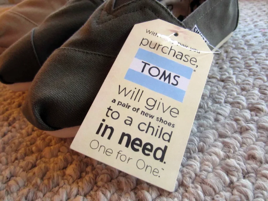
- Toms Shoes’ “Why”: “One for one.” A simple, powerful story. It turned a simple shoe into a global movement.
Your story doesn’t have to be a world-changing mission. It can be simple. “We started this brewery because we were sick of mass-produced lager.” “We started this accounting firm because we believe small business owners deserve to understand their numbers.”
That story, when told honestly and consistently, is what connects with people on a human level. And that human connection is the ultimate defence against trends.
The Visual Toolkit for Longevity (The “What”)
Okay, the strategic pillars are in place. Now, how does that translate into actual design assets? Here’s what matters.
1. Typography: The Voice of Your Brand
If your logo is the face, typography is the voice. It’s one of the most potent tools for building a timeless feel.
- Avoid “Trendy” Fonts: Steer clear of that “hot new font” on design blogs. It will be dated in 18 months. Brush scripts, ultra-thin geometric fonts, and 90s-revival “grunge” fonts are all trend traps.
- Build a Workhorse Family: Don’t just pick one font. Choose a font family—a “workhorse” with multiple weights (Light, Regular, Medium, Bold, Black). This provides the adaptability (Pillar 3) you need for every application, from delicate headlines to dense legal copy.
- Serif vs. Sans-Serif:
- Serifs (like Garamond, Caslon, Times): Have “feet” on the letters. They feel traditional, authoritative, reliable, and elegant. Think: law firms, universities, luxury goods, newspapers.
- Sans-Serifs (like Helvetica, Univers, Franklin Gothic): “Without serifs.” They feel modern, clean, direct, and functional. Think: tech companies, startups, healthcare.
You don’t have to choose just one. A classic, timeless pairing is a clean sans-serif for headlines (like Acumin Pro) and a readable serif for body text (like Merriweather). The key is to pick two, maybe three, and stick to them.
2. Colour Palette: Less is More

Colour triggers emotion faster than words or shapes. A timeless colour palette is not about what’s fashionable; it’s about what’s ownable.
- The 1-2 Punch: Most timeless brands are built on one or two primary, “core” colours. Coca-Cola Red. Tiffany Blue. UPS Brown. John Deere Green.
- The System: A proper palette has three parts:
- Primary Palette (1-2 colours): The “hero” colours. Used for the logo, main calls-to-action, and key brand moments. This should be 80% of what people see.
- Secondary Palette (2-3 colours): The “support” colours. These are complementary or analogous colours used for charts, subheadings, or secondary information.
- Neutrals (2-3 colours): Your shades of white, grey, and/or black. These are for body text and backgrounds.
That’s it. A total of 5-7 colours, maximum. This is about discipline. A limited palette forces creativity and, more importantly, builds that instant recognition (Pillar 4: Consistency).
3. The Logo: The Face of the Strategy
We’ve touched on this, but it’s critical. The logo is not the brand. The logo is the face of the brand. It’s the visual summation of the entire strategy.
A timeless logo must be:
- Simple: Can be drawn from memory.
- Appropriate: Feels right for the industry (e.g., a serious font for a bank, a playful one for a toy store).
- Scalable: Works as a tiny favicon on a browser tab and as a giant sign on a building. This is where complex, “generated” logos completely fail.
- Distinctive: It doesn’t resemble any of your competitors’ logos.
- Timeless: Not built on a visual trend (no drop shadows, no complex gradients, no “swoosh people”).
This is why “logo generators are a plague” is one of my core pet peeves. They are incapable of strategic thought. They offer a catalogue of generic options that, by definition, are not distinctive or authentic.
Real-World Brand Audits
Let’s apply this framework to a few real-world examples.
| Brand | The Timeless Elements (The “Good”) | The “Trendy” Trap (The Risk) |
| Ford | The Logo: The blue oval and the signature script are globally recognised. They’ve had it for over a century. It’s simple, consistent, and “owns” a shape/script. The “Why”: “Built Ford Tough.” A simple, authentic truth. | Identity Dilution: In recent years, Ford (like all carmakers) has been trying to be a “tech company” or an “EV mobility brand.” This can dilute the “Tough” anchor, making their identity confusing. |
| Le Creuset | The Form: The iconic shape of their Dutch oven is a piece of industrial design that is the brand. The Colour: The “Volcanic” orange is their “Coca-Cola Red.” Instantly ownable and consistent. The “Why”: “Ultimate craftsmanship and joy in cooking.” | Chasing Fads: Their biggest risk is diluting the brand with too many new “fashionable” colours and celebrity “collabs” (e.g., the Star Wars collection). It can make them feel less like a timeless heritage brand and more like a fast-fashion company. |
| Mailchimp | The Voice: The brand’s personality is its greatest asset. The friendly, quirky, and encouraging “voice” (and the “Freddie” mascot) is authentic and distinctive. The “Why”: “Empowering the little guy.” | The 2018 Rebrand: They flattened their logo and went with a “quirky” illustration style and bright yellow. This was a massive trend. It’s already starting to feel dated and less distinctive than their original, slightly retro look. They chased the “friendly startup” aesthetic. |
The Uncomfortable Truth: Timeless Branding Requires Guts
Here’s the real secret: building a timeless brand isn’t a design problem. It’s a leadership problem.
It takes guts to say “no.”
- It takes guts to say no to the new trend your competitor is using.
- It takes guts to say no to your marketing team when they want to “just try” a different colour.
- It takes guts to say no to a rebrand when sales are down, and “doing something” feels better than “staying the course.”
Timeless branding is an act of supreme confidence. It’s the quiet assurance that what you do is valuable, why you do it matters, and you don’t need to shout or change costumes to be heard.
It’s the difference between a brand that reacts and a brand that leads.
If your brand feels more like a 2024 fast-fashion trend than a 2050 legacy, it might be time to stop tinkering. It might be time to do the hard work, dig for your unarguable truth, and build something that lasts.
If you’re ready for that conversation, our team at Inkbot Design has built its reputation on exactly this.
Conclusion
Don’t confuse “timeless” with “boring” or “static.” A timeless brand is simple, but not simplistic. It’s consistent, but not rigid. It’s authentic, but not arrogant.
It is the deliberate, strategic result of knowing exactly who you are, what you stand for, and having the discipline to express that truth in everything you do.
It starts not with a font or a colour, but with an unarguable truth. Find that first. The rest is just execution.
Next Steps
It’s clear that a strong brand is built on a foundation of solid strategy and a simple, memorable logo design.
If you’ve been “chasing trends” and are tired of feeling invisible, take a look at our other posts on brand strategy. If you’re ready to have a serious, no-nonsense conversation about building a lasting brand, you can request a quote here.
Frequently Asked Questions (FAQs)
Is “timeless branding” just a boring, old-fashioned style?
No. It’s not a style at all. It’s a strategy. A timeless brand can be vibrant, modern, and playful (like Google). The “timeless” part means its core identity isn’t based on a passing visual fad, but on its core truth.
How often should I rebrand my business?
If your brand is built on a timeless foundation, you should almost never need a full, “rip-it-up-and-start-again” rebrand. You may evolve or refresh your identity (like Apple or Google) every 5-10 years to adapt to new technologies (such as mobile screens), but the core truth and visual DNA should remain constant.
What’s the difference between a brand, a brand identity, and a logo?
Brand: Your “unarguable truth.” It’s the public’s perception of you (e.g., “Volvo is safe”).
Brand Identity: The tangible system you create to express that truth (logo, colours, fonts, voice).
Logo: The single visual mark that acts as the face and primary shortcut for the entire identity.
Can a new business have a timeless brand?
Yes. Timelessness is about the foundation, not the age. A startup that does the hard strategic work from day one to define its “why” and builds a simple, authentic identity is already timeless.
My logo was made with a generator. Is it too late?
No. But you can’t fix a strategic problem with a new logo. First, go back and find your “unarguable truth.” Once you have that, you’ll see clearly why your generated logo doesn’t work, and you can engage a professional designer to create one that does.
What is the single most important part of a timeless brand?
Authenticity. Your identity must be an honest, clear expression of your core business strategy. Without that “truth,” all the clever design in the world is just a hollow costume.
How many colours should be in my brand palette?
Less is more. A timeless palette typically features 1-2 primary “hero” colours, 2-3 secondary “support” colours, and 2-3 neutrals (such as whites, greys, and blacks). Any more than that creates confusion.
What’s more important: logo or brand voice?
They are two sides of the same coin. Your logo is the face; your voice is the personality. A great logo with a generic voice is forgettable. A great voice with a terrible logo can make a company feel unprofessional. A timeless brand needs to be aligned.
Why is “simplicity” so important for logos?
Because the human brain is wired to do so. A simple, distinctive shape is easier to process, easier to recognise at a glance (e.g., on a busy street or in a social media feed), and, most importantly, easier to remember.
Can my brand be both “trendy” and “timeless”?
Not really. But a timeless brand can participate in a trend in a way that feels authentic to it (e.g., a social media post), while its core identity (logo, colours, fonts) remains stable. The application can be trendy; the foundation must be timeless.


