Colour Psychology in Graphic Design: How to Win Customers
Colour psychology in graphic design explains how colour influences human perception, emotional response, and purchasing decisions.
In branding, colour acts as a strategic communication tool that shapes recognition, trust, and differentiation.
Rather than relying on clichés like “red equals passion,” effective designers analyse audience demographics, cultural context, and brand positioning to select palettes that reinforce specific behaviours—such as engagement or conversion.
A colour’s impact emerges from its context within typography, imagery, and layout, not from universal meaning.
When applied intentionally, colour psychology helps brands guide attention, establish emotional tone, and ultimately win customers through visual coherence and psychological resonance.
- Use the 3‑C Model—Context, Competitors, Contrast—to choose colours that fit your industry, audience expectations, and strategic positioning.
- Prioritise contrast and the 60‑30‑10 rule so accents (CTAs) stand out; conversion depends on visibility, not a "magic" hue.
- Avoid clichés and trends: colour gains meaning through consistent brand use, differentiation, cultural research, and accessibility.
Problems I have with “Colour Psychology”
I’ve seen entrepreneurs waste thousands on rebrands because they got this wrong. Here’s what makes me tick:
- The “Red Means Passion” Lie: Stop. Red means “debt” on a bank statement, “sale” on an e-commerce site, “energy” for Coca-Cola, “stop” on a traffic light, and “heritage” for HSBC. It has no single meaning.
- The “Blue is Trustworthy” Cliché: Is blue trustworthy? Or did “Big Blue” (IBM) and the first big banks (like Barclays) use it to look stable and “corporate”… and everyone else just copied them for 50 years? It’s a self-fulfilling prophecy, not a psychological law.
- Ignoring the Competition: Choosing Your Colour Without Auditing Your Competitors Is Design Malpractice. If all your eco-friendly rivals use green, using more green just makes you invisible. You’re camouflaged.
- The “One Perfect CTA Colour”: There isn’t one. The “best” call-to-action (CTA) button colour is the one that contrasts most with the rest of your page. It’s about visual hierarchy, not a magic hue. We’ve A/B tested this to death. A high-contrast orange will beat a “passionate” red if the rest of the site is red.
The real “psychology” is about association and differentiation. Your job isn’t to pick a “passionate” colour. Your job is to choose a colour that positions you correctly against your competition and resonates with your specific audience.
What is Colour Psychology (And What Is It Not?)
In the world of graphic design, colour psychology is the study of how different hues, shades, and combinations influence human perception within the context of a brand or design.
It’s not a set of universal, hard-coded rules. It’s a set of cultural and industry-specific associations that can be used—or subverted—to send a message.
- It IS a tool for building brand recognition. (Think Cadbury purple or Tiffany blue.)
- It IS a way to position your brand in a crowded market. (Think Apple’s sterile white in a world of IBM blue.)
- It IS a system for guiding a user’s eye to what matters most. (Think a bright orange “Add to Cart” button on a monochrome page.)
It is NOT a magic spell. Using green won’t make your chemical company “eco-friendly.” Using purple won’t make your shoddy product “luxurious.” The product, service, and brand message must do the heavy lifting. The colour just sets the first impression.
A study from the University of Loyola, Maryland, found that colour can increase brand recognition by up to 80%. People remember colour. Your goal is to make them remember your colour in relation to your business.
Deconstructing the “Meaning” of Colours
This is where almost every other article gets it wrong. They give you a list of “meanings” without context.
Let’s fix that. Here is a real-world breakdown of what colours actually mean in the context of business and design.
The Colour Cliché vs. Real-World Context
| Colour | The Lazy Cliché | The Real-World Application (Context is King) |
| Red | Passion, Danger, Anger | Energy & Hunger: (McDonald’s, KFC, Coca-Cola). Used in fast food to stimulate appetite and create a sense of urgency. Boldness & Entertainment: (Netflix, YouTube). Used to grab attention and signal “look at me.” Heritage & Finance: (HSBC, Santander). Used to imply stability, history, and stand out in the blue “finance sea.” Warning & Urgency: (Error messages, Sale tags, Stop signs). |
| Blue | Trust, Calm, Security | Corporate & Tech Stability: (IBM, Dell, HP, Intel, Facebook, LinkedIn). The “default” serious business colour. Signals “we are established and safe.” Finance & Authority: (Barclays, Amex, PayPal, Chase). The overwhelming choice for banks is to signal security and conservatism. Calm & Health: (Oral-B, Headspace). Used in health/wellness to imply calm, cleanliness, and serenity. |
| Green | Nature, Growth, Eco | Obvious “Eco”: (Whole Foods, Greenpeace, The Body Shop). The literal translation for anything organic, sustainable, or “natural.” Finance & Wealth: (Standard Chartered, TD Bank). The colour of money (in the US), used to signal growth and prosperity. Tech & “Go”: (Spotify, Android, WhatsApp). Used to mean “go,” “on,” or simply to be a vibrant, human-friendly differentiator. |
| Yellow | Happiness, Optimism | Energy & Attention: (IKEA, Post-it, Hertz). High-visibility. Used to grab the eye from a distance. Excellent for retail and logistics. Playfulness & Affordability: (Best Buy, McDonald’s ‘M’). Often paired with red. Feels energetic, fast, and accessible. A “Challenger” Brand: (Snapchat). In a sea of blue apps, Snapchat’s yellow stands out as a rebellious, youthful statement. |
| Orange | Fun, Friendly, Cheap | Action & Enthusiasm: (Amazon, HubSpot, easyJet). A high-energy, confident colour. Amazon uses it for “Buy Now.” HubSpot uses it to be friendly. Affordability: (Home Depot, Fanta). Signals value and accessibility. Not “cheap” in a bad way, but “not expensive.” Creativity: (SoundCloud, Nickelodeon). A vibrant, youthful, and creative choice that stands apart from “serious” blue. |
| Purple | Royalty, Luxury, Wealth | Actual Luxury: (Hallmark, Asprey). Historically expensive to produce, it still carries connotations of premium, bespoke quality. Creativity & Whimsy: (Cadbury, Milka, Twitch). Cadbury owns this colour in confectionery. It’s unique, indulgent, and creative. A Modern Differentiator: (T-Mobile). In the US, T-Mobile (Telekom) used magenta/purple to shatter the “corporate” AT&T (blue) and Verizon (red) duopoly. |
| Black | Power, Elegance, Grief | Sophistication & Luxury: (Chanel, Gucci, Rolls-Royce). The ultimate in premium, high-fashion, and “timeless” branding. It’s confident and says, “We don’t need a loud colour.” Utility & “Default”: (The text you are reading). It’s the colour of information, simplicity, and function. Modern Tech: (Uber, Adidas). Used to feel sleek, modern, and high-performance. |
| White/Silver | Purity, Cleanliness | Minimalism & “Clean” Tech: (Apple). Apple defined this category. White/silver means clean, simple, and high-tech. It’s the absence of noise. Healthcare: Used to signal sterility and cleanliness. “Empty Space”: The most important part of any design. White space (negative space) is what allows your other colours to breathe and have an impact. |
See the pattern? The same colour has wildly different meanings depending on the industry, the competition, and the application.
Red is not “passion.” Red is what you make it.
The 3-C Model for Choosing Your Brand Colours
As an entrepreneur, you don’t need a textbook. You need a framework. When we take on a new brand identity project, this is the process we follow. I call it the 3-C Model.
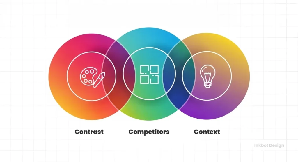
1. Context (Your Industry, Audience, and Message)
This is the most important step. Before you even think about a colour, you must answer these questions:
- What is my industry? There are strong colour conventions in most industries. Finance uses blue for trust. “Eco” uses green for nature. You must be aware of these conventions.
- What is my audience’s expectation? I once had a small wealth management firm insist on bright pink and orange. They wanted to “stand out.” They did. They looked like a sweet shop. Clients didn’t trust them, and the business failed. Their audience expected to see colours that signalled security and professionalism (blues, deep greens, greys). You can subvert expectations, but you must do it deliberately.
- What is my brand’s core message? Are you a high-value, premium, white-glove service? Black and white or a deep, rich purple might work. Are you a high-energy, low-cost provider for students? Bright orange or yellow might be better. Your colour must align with your price point and brand voice.
2. Competitors (The ‘Sea of Sameness’)

Once you know your context, you must analyse your competition. This is where most brands fail.
Get a blank spreadsheet. List your top 10 competitors. Go to their websites and take a screenshot of their logo and homepage.
Now, look at them all at once. What do you see?
- Is it a “Sea of Sameness?” In the tech space 15 years ago, it was a “Sea of Blue” (IBM, HP, Dell, Intel).
- Who is the market leader? What colour do they “own”?
- Are there any challenger brands? What do they do differently?
Your colour choice is your first, best chance to differentiate.
- When Apple launched, their clean white and silver was a direct rebellion against the “corporate blue” of IBM and Microsoft. It visually signalled “we are different, we are simpler, we are not them.”
- When Google launched, its multi-coloured primary logo was a rebellion against the “one colour” logos of other search engines (like Yahoo’s purple). It signalled that ‘we are playful, creative, and a ‘beta’ product.’
If all your competitors are green, your “eco” brand might be best suited to a bright, sunny yellow (energy) or a deep, earthy brown (authenticity). Don’t just be another green logo.
Industry & Colour: A Competitive Snapshot
| Industry | Dominant Colour(s) | Rationale | Challenger Colour | Rationale |
| Finance | Blue | Trust, Security, Conservatism (Chase, Amex, PayPal) | Green | Growth, Wealth, “New” Money (TD Bank, Chime) |
| Fast Food | Red & Yellow | Energy, Speed, Hunger, Attention (McDonald’s, KFC, Burger King) | Green | Health, Freshness, “Natural” (Subway, Sweetgreen) |
| Social Media | Blue | Connection, “Default” Tech (Facebook, Twitter, LinkedIn) | Yellow/Pink/Red | Youth, Energy, Speed, Entertainment (Snapchat, Instagram, YouTube) |
| Eco/Natural | Green & Brown | Nature, Earth, Organic (Whole Foods, Garnier Organics) | White / Brights | Cleanliness, Simplicity, Optimism (Native Deodorant, Who Gives A Crap) |
3. Contrast (Guiding the Eye and Forcing Action)
Your brand isn’t just a logo. It’s a website, a social media post, a business card. This is where your colour palette comes in, and the most important word is Contrast.
Myths abound here, especially about CTA buttons. “You must use a red button!” “Green buttons convert better!”
It’s all nonsense.
In A/B tests we’ve run, the highest-converting button is almost always the one with the strongest visual contrast to its surroundings.
Real-World Example: We were working with a SaaS company whose brand was heavily blue and grey. Their CTA was a different shade of blue. It blended in. Conversions were poor.
We tested a red button. It did slightly better.
We tested a green button. It did about the same.
We tested a bright, high-visibility orange button. Conversions shot up by over 30%.
Why? Not because orange “means” buy. It’s because on a blue-and-grey page, nothing else was orange. The user’s eye was pulled directly to it. It was unmissable.
Your brand palette should follow the 60-30-10 Rule:
- 60% (Primary Colour): Your dominant brand colour. This is your “Blue” or “Green.” It sets the overall tone.
- 30% (Secondary Colour): A complementary or analogous colour. This is used for subheadings, secondary info, and to create visual interest.
- 10% (Accent/CTA Colour): Your high-contrast “action” colour. This is your orange, your bright yellow, your electric pink. It’s used sparingly for buttons, links, and key highlights.
Your 3-C model (Context, Competitors, Contrast) provides a professional framework for building an entire brand identity, not just selecting a colour. This is the kind of strategic work we do every day. If you’re feeling overwhelmed, exploring professional graphic design services is often the most cost-effective next step.
Beyond the Logo: Colour in Your Full Marketing Ecosystem
A small business owner has to think beyond the logo. Colour psychology impacts every single touchpoint.

Website Design & CTAs
As discussed, this is about hierarchy and contrast. Your website’s background colour, text colour, and accent colour must work in harmony. Use your 60-30-10 rule. Your “10%” accent colour is reserved for clickable elements (buttons, links). This trains your users. They learn that “orange means action” on your site.
Social Media & Ad Creative
On a crowded Instagram or LinkedIn feed, your brand colour is your uniform. It’s how people recognise your post before they even read it or see your name. When you scroll past a post with a distinctive “Spotify green” or “Netflix red,” you instantly know who it’s from.
This brand consistency is non-negotiable. Using your colours consistently helps build the 80% brand recognition we discussed.
Packaging & Unboxing
For e-commerce or retail brands, colour is tangible. The “Tiffany Blue Box” is so iconic, the colour itself is trademarked. It evokes an immediate emotional response of luxury and excitement. When you’re designing packaging, ask:
- What will this look like on a shelf next to my competitors?
- What does the inside of the box look like? (An “unboxing” experience with a surprise pop of your 10% accent colour can be a powerful marketing tool).
The Nuances That Amateurs Forget
This is where true professional design separates itself.
Cultural Meanings: A Costly Mistake
Colour is not universal. What you think your colour means in London or New York can mean the complete opposite elsewhere.
- White: In most Western cultures, it’s purity, minimalism, and cleanliness (Apple). In many East Asian cultures (like Japan and China), it’s the traditional colour of death and mourning.
- Red: In the West, it’s often “stop,” “danger,” or financial “loss.” In China, it’s the colour of extreme luck, prosperity, and good fortune.
- Green: In the West, it’s “eco” and “go.” In some South American countries, it has associations with death.
If you are a global or multi-cultural brand, you must do this research. Don’t build your entire “clean, minimal” brand around the colour white if your primary expansion market is Tokyo.
Accessibility & Readability (The Non-Negotiable)
This is my biggest pet peeve. I don’t care how “psychologically perfect” your light-grey text is on a white background.
If people can’t read it, your design has failed.
You have a legal and ethical obligation to make your designs accessible, especially on the web. This is governed by the Web Content Accessibility Guidelines (WCAG).
The key is colour contrast. This is the difference in lightness between your text colour and your background colour.
- FAIL: Yellow text on a white background.
- FAIL: Light grey text on a white background.
- FAIL: Dark blue text on a black background.
Use a free online “colour contrast checker.” Your text and its background must “Pass” (with at least an AA rating) for readability. This is more important than any “psychological” meaning.
The Secret Lives of Colour
You think colour is just decoration. That’s why your understanding is superficial. This book reveals the hidden story. It’s the secret history of 75 colours and their role in war, art, and politics. Stop just looking at shades; learn the power they actually hold.
As an Amazon Partner, when you buy through our links, we may earn a commission.
What About Colour Trends? (A Trap for Small Businesses)
Every year, Pantone announces a “Colour of the Year.” Every year, design blogs fall over themselves to tell you to use it.
My advice? Ignore it.
Trends, by definition, are temporary. Your brand identity should not be. You are trying to build brand recognition for the next 5, 10, or 20 years.
If you redesign your site every year to match the new “Peach Fuzz” or “Very Peri,” you are not building a brand. You are just creating confusion. Your customers will never be able to build that instant recognition.
Be aware of trends, but do not be led by them. Stick to your 3-C framework.
Case Studies: When Colour Went Right (And Horribly Wrong)
Let’s look at some real-world examples.
The Right: Cadbury’s Purple (Ownership)
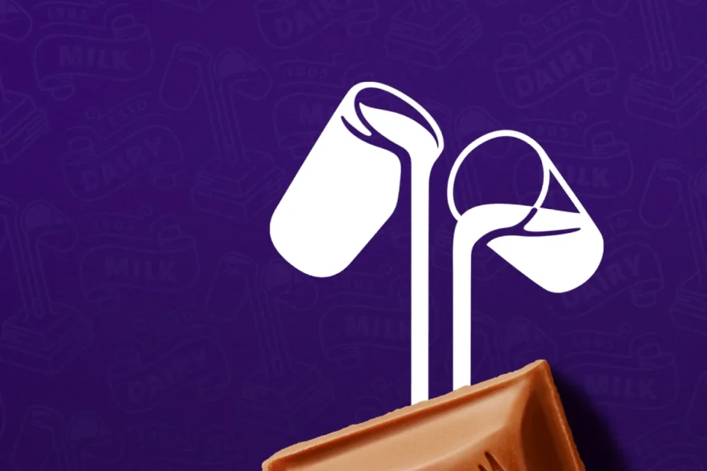
Cadbury (Dairy Milk) has been using purple (specifically, Pantone 2685C) for over 100 years. They have fought viciously in court (with mixed success) to trademark and “own” that colour for chocolate. Why? Because when you walk down a confectionery aisle, you don’t look for the word “Cadbury.” You look for the purple. They have achieved 100% brand recognition through colour consistency.
The Right: Facebook’s Blue (Pragmatism)

This is my favourite “myth-buster.” Why is Facebook blue? Is it because blue is “trustworthy” and “connecting”?
No. It’s because Mark Zuckerberg is red-green colour-blind.
Blue is the richest colour he can see. He told The New Yorker, “Blue is the richest colour for me; I can see all of blue.”
One of the world’s most valuable brands chose its colour based on pragmatism and accessibility for its founder—not on a marketer’s list of “meanings.” This is the ultimate proof that context, utility, and (in this case) personal limitation trump all the “psychology” fluff.
The Horrible: The Tropicana Rebrand Disaster
This is the cautionary tale I tell every entrepreneur.
In 2009, Tropicana (owned by PepsiCo) binned its iconic packaging—the one with the orange and a straw sticking out of it. They replaced it with a “clean,” “modern” design featuring a generic glass of juice.
The new design was sleek, minimal, and white. It looked like every other store-brand carton.
They lost their single biggest visual asset: the orange. Customers in the aisle couldn’t find their juice. They were confused. They thought it was a different, cheaper product.
Sales plummeted by 20% over the course of two months. This was a $30 million loss.
After 30 days, Tropicana scrapped the new design and went back to the old one.
The lesson: Tropicana didn’t just have a colour; they had an image (the orange) that was their brand. They replaced a powerful, differentiating identifier with a “modern” design that was generic and invisible.
Conclusion: Stop Looking for a Magic Colour
There is no “best” colour for your brand. There is no “most persuasive” colour for your button.
There is only one colour that is appropriate for your context, differentiates you from your competitors, and provides contrast to guide your users.
Your brand colour is an empty vessel. It’s your product, your customer service, and your marketing consistency that fills it with meaning. Coca-Cola’s red doesn’t mean “passion”; it means “Coca-Cola.” Cadbury’s purple doesn’t mean “royalty”; it means “Dairy Milk.”
At Inkbot Design, we build brands on this principle. We don’t start with a colour wheel. We start with a competitive audit and a business strategy.
If you’re looking at your current brand and realising your colour was chosen because it was “your favourite” or because a blog told you “blue means trust,” it might be time for a strategic conversation.
Your colour shouldn’t just be there. It should be working for you.
Colour Psychology FAQs
What is colour psychology in graphic design?
It’s not a set of magic rules. It’s the study of how colours and combinations influence perception in a specific context. For a business, it’s about using colour to position your brand, differentiate from competitors, and guide user attention (like on a website).
What is the most “trustworthy” colour for a brand?
This is a myth. “Blue” is the cliché answer, but it’s only “trustworthy” because the first big, stable banks and tech firms (like IBM) used it, and everyone else copied them. Trust comes from your actions, not your logo colour.
What is the best colour for a “Call to Action” (CTA) button?
There isn’t one. The “best” colour is the one with the highest contrast to the rest of the page. If your site is blue, a bright orange or yellow button will likely perform best, not because of its “meaning,” but because it’s impossible to miss.
How do I choose a colour for my small business?
Use the 3-C Model:
Context: What industry are you in? What do your customers expect?
Competitors: What colours do all your rivals use? (And how can you be different?)
Contrast: How will you use a main, secondary, and accent colour to guide your user’s eye?
What is the 60-30-10 rule in design?
It’s a classic palette-building rule.
60% is your Primary Colour (your main brand identity).
30% is your Secondary Colour (for visual interest, backgrounds, subheadings).
10% is your Accent Colour (a high-contrast colour for CTAs, links, and highlights).
Does the “meaning” of colours change in different countries?
Yes, dramatically. This is a critical, often-missed point. White is for mourning in many East Asian cultures, while it’s for purity/simplicity in the West. Red is associated with luck in China, but with financial debt in the West. Always research your key markets.
Should I rebrand my business to follow new colour trends?
No. This is a trap. Trends are temporary; your brand should be permanent. You build brand recognition (the “80% boost”) through consistency. Chasing the “Colour of the Year” just confuses your audience and makes you look fickle.
Why did the Tropicana rebrand fail so badly?
It failed because they replaced their most powerful brand identifier—the image of the orange with a straw—with a generic, “modern” design that looked like a cheap store brand. Customers couldn’t find it. It proves that differentiation and recognition are more important than “clean” design.
Why is Facebook blue?
Not because of a “psychological” reason. It’s blue because founder Mark Zuckerberg is red-green colour-blind, and blue is the colour he sees most vividly. It was a purely practical, accessibility-driven choice.
What is more important: colour psychology or accessibility?
Accessibility, 100% of the time. If your “psychologically perfect” colour choice means your text is unreadable (e.g., light grey on white), your design has failed. You must check your colour combinations for WCAG contrast compliance.
What’s Your Next Step?
I’ve laid out the entire framework we use to build real-world brands. The difference between a brand that has a colour and a brand that uses colour is strategy.
If you’re looking at this and realising your brand colour is blending in, causing readability issues, or was just picked on a whim, it might be time for a professional audit.
We build brands that are designed to stand out, not just fit in. If you’re ready to have that strategic conversation, you can request a free quote from us today. Or, you can see the full range of our graphic design services to learn more about how we turn strategy into design.
