Lights, Camera, Brand: The Art of Brand Photography
In today’s image-centred society, brand photography is not a luxury but a necessity. It can be the element that makes your brand hot or cold.
However, what exactly is this type of photography, and why should you care? Let us dive into this fascinating field that has reshaped how businesses connect with their clients.
Brand photography means telling your story through engaging visual content that speaks to your ideal buyers. It entails capturing your entity’s core values and persona so that it will communicate volumes without a word.
Consider it this way: when scrolling past different posts on social networks, which things make you stop scrolling? More likely than not, they are attractive images. That’s what good brand photography does.
But here comes the rub: excellent brand photography doesn’t just happen. It’s a mixture of creativity, strategy and technical expertise. You must thoroughly know what makes up your brand and represent those elements in impactful photographs.
Therefore, whether as an owner of a small business who wants better visuals or a marketing expert who needs polish on company branding, hold tight because we are going around the Brand Photography World, but after everything, we won’t see business the same way again.
- Brand photography is crucial for brand visibility and storytelling in an image-centred society.
- Effective brand photography requires planning, creativity, strategy, and technical expertise to communicate brand identity.
- High-quality visuals build trust, encourage engagement, and improve conversion rates, making brand photography a wise investment.
- Consistency in style, quality, and messaging across brand photographs enhances overall brand identity.
- Adaptability to different platforms and current trends is key for effective brand photography strategies.
The ABCs of Brand Photography

Let’s start with the basics. What is brand photography exactly? At its heart, brand photography is a visual representation of your brand’s identity.
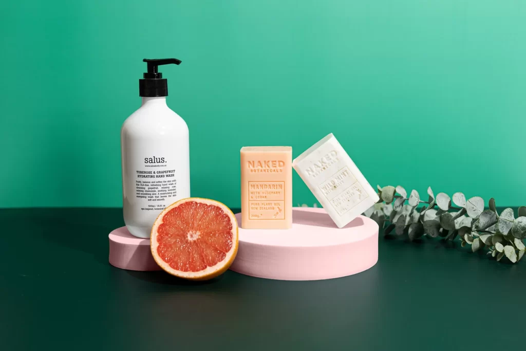
This means more than images of products or headshots of team members, though these can be included. Brand photography includes everything from lifestyle photos showing off your products being used to behind-the-scenes shots that let people see your company.
Consider this handshake between you and possible clients. It is usually their initial encounter with your business – and we all know how vital first impressions are! So make sure these photos represent what you do and who you are.
But there’s more: no two brands are alike; likewise, brand photography cannot fit every establishment under the sun! What may work wonders for one cool tech startup might fall flat for another luxury jewellery brand. The point is that these pictures should be unique – just like each business out there…
Why Brand Photography Matters
You may think, “Yes, beautiful images are good, but are they important?” The simple answer is yes.
We see graphic designs every day. The human brain processes pictures 60,000 times faster than words. This implies that your brand photographs can create an immediate impact in a way that texts cannot.
However, it is about more than attracting attention. High-quality branding photography can also:
- Establish trust: Professional and consistent visuals indicate that you take your company seriously.
- Encourage participation: People tend to engage more with or share visual content.
- Improve conversion rates: Compelling images may convert window shoppers into buyers.
- Differentiate brands: Unique pictures help businesses stand out in saturated markets.
Brand photography is an investment for tomorrow. They should make things look nice and build an aesthetic identity in people’s minds, which drives actual results in commerce.
The Elements of Effective Brand Photography

Well, what causes brand photography to become effective? This only partially depends on having a good camera (although it is undeniably helpful). Here are some essential factors:
- Uniformity: Brand photos should look like they belong together. It doesn’t mean that each picture must be the same; however, all visual representations must share something in common.
- Honesty: In an age of staged shots and airbrushing, authenticity always stands out. Your brand photos must be sincere and reflect your company’s personality accurately.
- Quality: It is obvious why this aspect is included. Even the most incredible brands may seem unprofessional if their images lack quality. Therefore, buy better equipment or employ a professional photographer.
- Relevant: Your photographs should talk straight into the hearts of your target viewers. What kind of pictures would touch them deeply? What can attract their attention?
- Adaptability: Use brand photos on different platforms, from your site to social media accounts and printing materials.
Remember that helpful brand photography involves more than just making beautiful pictures. It means creating hardworking visuals for your brand.
Planning Your Brand Photoshoot
Fine, so you understand the importance of brand photography. What’s next? It would help if you planned your photoshoot. However, don’t just grab a camera and start snapping away. A successful brand photoshoot takes careful planning and preparation.
The first thing is to set your goals. What should your brand photos do?
Do you want to display products or services? You can feature employees or share a behind-the-scenes look at how things are done within the company. Whatever it may be, let these objectives guide every choice made going forward.
Moving on, consider who you are as a brand; what’s your personality like?
Are you fun-loving and goofy, or more professional with an edge? Your pictures should represent this side of yourself, too!
That said, though… consider others too (i.e., target market). Who are they, and what types of images would resonate most with them? For example, if targeting younger tech-savvy individuals, then using trendy/edgy visuals might work best. However, if trying to reach out to older folks who prefer traditional values, stick with classic/timeless design elements instead.
Once these basics have been covered, though, now comes the time for detail:
- Location – Where will this shoot happen: studio vs outdoor, etcetera?
- Props/Apparel – What items can visually bring out our brands’ essence?
- People – Are models/staff/customers involved in shots (if any)?
- Wardrobe – Dress code representing us properly
- Shot list – Specific moments needed to be captured during the production process, etc…
Remember that sometimes plans change, but having one is better than none. So take some time beforehand because, like they say, “the devil’s in the details.”
Choosing the Right Photographer
Now comes the important part – who will take these fabulous brand photos? Even though you may be tempted to do it yourself, especially if money is tight, hiring a professional photographer can pay off.
Technical skill is needed to set a good brand photographer apart. The best ones know how to turn your brand identity into something visually appealing. They understand light, composition and subjects, so everything pops in their images.
But what should you look for when choosing the right person? Here are some things that might help:
- Style: Check out their portfolio – does their style match your brand’s?
- Experience: Have they worked with similar brands before?
- Communication: Can they see what you’re getting at? Do they know how to explain what they plan on doing?
- Professionalism: Are they dependable? Do they meet deadlines consistently?
- Budget: Is their rate within reach, financially speaking?
Don’t forget, this isn’t just like hiring any old service provider; this is someone who will help bring your vision for your company into view! Choose wisely.
The Art of Storytelling Through Brand Photography
We’re nearly at the most exciting part. The thing about brand photography is that it doesn’t simply involve creating beautiful pictures; it’s about telling the story of your brand. And trust me, when we talk about storytelling, a picture speaks louder than words.
Recall some of the best commercials you’ve watched. Most probably, they shared a narrative that connected with you in some way or another. Great brand photography does just that; it establishes an account that captivates individuals and makes them desire to be part of your brand’s story.
Now, how can you do this using photographs? Here are some hints:
- Build up a plot: like writing, start your photos off, take them through and give them an ending, too.
- Use emotions: capture moments which will stir feelings among those viewing them.
- Show instead of saying: don’t rely on text but let images speak for themselves.
- Be authentic: true happenings often form powerful stories
Every brand has its tale to tell while working on your visual as a storyteller.
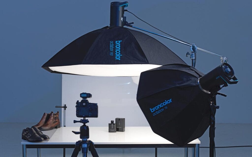
The Technical Side of Brand Photography
Ok, so let’s get a bit technical. Brand photography needs creativity, but it also requires some technical knowledge. Knowing these fundamentals will help you talk to your photographer better and ensure you get what you want.
- Lighting: Proper lighting can make or break a photo. It is often best to use natural light for brand photography to give the images a fresh and authentic feel. However, there are times when artificial lighting is necessary, such as for product shots or indoor scenes.
- Composition: How things are arranged within a photograph can significantly impact its message. While the rule of thirds is always a good starting point, don’t be afraid to break it for a more dramatic effect.
- Colour: Colour sets the tone for brand identity. Therefore, your brand photos should adopt a colour palette that matches your brand’s overall aesthetic.
- Focus: Selective focus directs attention towards specific parts of an image by blurring out everything around it – this is great for highlighting certain products or features.
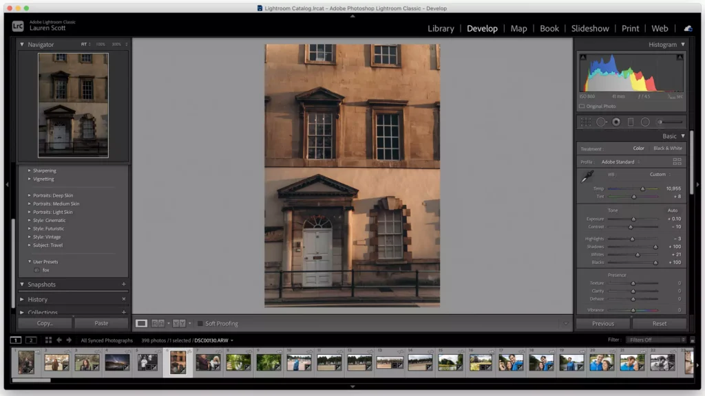
- Editing: You can always enhance your photos through post-processing, but be careful not to go overboard. Remember that post-processing should only serve as an effort meant to improve upon rather than radically change from what was captured originally via the camera lens.
Bear in mind that these technicalities should work hand in hand with your imagination rather than overpower it; thus, most captivating brand photographs strike the perfect balance between creative expression and technical brilliance.
Creating a Consistent Visual Brand
Brand photography requires consistency. This means your photos should be united to establish a solid visual identity representing your brand at first sight.
However, how can you achieve such uniformity? Below are some tips:
- Come up with a style guide: Here, you should indicate the visual aspects of your brand, such as colour scheme, preferred compositions, and general beauty.
- Ensure uniform editing: Apply the same filters or editing methods to all pictures.
- Stick to one theme: Whether minimalism, vibrancy or rusticity is your thing, let it link all the photographs.
- Repeat certain elements: Use similar props, locations or poses in different photo shoots.
Nevertheless, do not mistake consistency for monotony. You can still have various looks within an established brand appearance. The most important thing is to create a unique visual language of communication.
Brand Photography for Different Platforms
Take note – not all platforms are made alike for brand photography. What works on LinkedIn might work better on Instagram. Every platform has its own best practices and audience expectations.
For example:
- Instagram likes visually striking, lifestyle-focused pictures.
- LinkedIn prefers more professional, business-oriented visuals.
- Facebook can handle a mix of both professional and casual imagery.
- Pinterest is really into vertical images with rich, detailed visuals.
When planning your brand photoshoot, consider where these images will be used. You may need to shoot different versions of the same scene to fit various platforms.
Also, cropping! Most platforms have specific image dimensions. Ensure your photos can be cropped without losing their impact.
The ROI of Brand Photography
Let us discuss cash. Investing in brand photography may appear costly, particularly for small companies. However, good brand photography can bring a significant return on investment.
Consider it like this:
- High-quality visuals increase social media engagement, attracting more subscribers and potential buyers.
- Strong product photography can increase internet sales by giving consumers a transparent and appealing look at what they are purchasing.
- Consistent professional imagery throughout every touchpoint can boost brand recognition and recall.
- Authentic behind-the-scenes photos foster trust with your audience while also establishing a connection.
It is difficult to calculate the precise ROI of brand photography, but many businesses have discovered that its advantages far outweigh the expenses. It is an investment into the future of your brand.
DIY vs. Professional: Making the Right Choice
You may be asking right now – can’t I do this myself? We all have pretty good cameras in our pockets these days, don’t we?
Although DIY brand photography can be successful in some cases, particularly for small businesses that are just starting, there are several advantageous aspects to working with a professional:
- Knowledge: Professional photographers offer years of experience and technical expertise.
- Tools: They possess high-quality cameras, lighting equipment, and editing software.
- Efficiency: They can often achieve superior results faster than you could.
- Originality: An external perspective can introduce new concepts into your brand imaging.
That being said, if you opt for the DIY route, plenty of resources are available to help you improve your photography skills. Remember – your brand photos are often the first thing someone sees about your business. Make sure they’re representing it in the best light possible.
Measuring the Success of Your Brand Photography
You’ve spent hours and money on creating beautiful brand photos. But how can you tell if they’re working? Here are some ways to measure their effectiveness:
- Rates of engagement through social media platforms for posts with your brand’s images
- Click-through rates for emails or advertisements using your brand’s visuals
- The length of time that visitors spend on web pages containing your brand’s pictures
- Conversion rates regarding products which have received new professional photographs
Don’t forget that success doesn’t rely solely on popularity (although it would be great). The most important thing is whether or not pictures help achieve your company’s objectives.
Keeping Your Brand Photography Fresh

Brand photography is more than one-and-done. Your brand is constantly changing, so your photos should, too.
But how often should you refresh your brand photos? It depends on your field’s industry and trend turnover rate, but updating core brand images every 12-18 months is a good idea.
Between big shoots, try:
- Snapping behind-the-scenes moments
- Showing off new products or services
- Featuring customer stories or testimonials
- Highlighting seasonal changes or special events
Remember: Your brand’s photography should always feel current and resonate with your audience.
The Future of Brand Photography
Before we finish, I want to discuss where brand photography is going. Do you know how everything in the digital world is constantly changing? Well, so is this.
Here are a few trends to watch for:
- Authenticity — Consumers prefer real life over staged moments captured in the studio.
- Video content – Although images are still vital, videos will become even more significant soon.
- User-generated content – big brands will include customer’s pictures in their official imagery
- AI & AR — New advancements in tech mean interactive brand imagery has infinite possibilities.
The main thing here is that you must be adaptable and pay attention to what your industry and audience want.
Conclusion
Brand photography is not just a marketing ploy but an influential method of reaching out to your audience and telling them what your brand stands for. This can be done at any business level; whether you are operating on a small scale or have gone global, spending money on high-quality and consistent images will make all the difference in such a competitive world.
Good brand photography incorporates creativity and strategic thinking, i.e., art blended with science. This means that one has to plan meticulously and possess technical skills while at the same time having profound knowledge about one’s own brand and target group. However, it could change how people perceive or deal with your organisation forever if done correctly.
Therefore, do you want to improve on this visual aspect? Your company’s storyline waits for narration through pictures – trust me, they speak louder than words.
FAQs
What does brand photography mean as compared to product photography?
Brand photography includes images representing a brand’s identity, such as lifestyle shots, team photos, and behind-the-scenes glimpses. In contrast, product photography focuses on showing off products.
How much should I budget for brand photography?
The cost you should expect to pay varies greatly depending on what you need and how experienced the photographer is. Generally speaking, though, a pro-level brand photoshoot will set you back anywhere from £500 to £5000.
Can I use stock photos for my brand photography?
You can use stock photos for your branding efforts, but they tend to be more unique and authentic when compared with custom-made ones. Therefore, it’s best not to rely too heavily upon stock imagery if possible.
How many shots can I expect from a brand photoshoot?
This depends entirely upon the duration of your shoot and what you require. For example, an average half-day session might generate 20-50 final edited images.
Do I need a professional stylist for my brand photoshoot?
Although not always essential, hiring someone skilled in styling can make all the difference between having nice pictures taken & creating visually polished content that reflects well upon your organisational values.
What should I do to prepare myself before going into this process?
Make sure to create a shot list so nothing gets missed out on; gather props or products needed beforehand; choose good locations suitable for shooting in line with what message wants conveying through them, etc.; brief team members about dress code expectations (if any) as well as general things they should anticipate happening during photo taking sessions etcetera…and then finally just relax and enjoy!
Can I take brand photographs using my iPhone?
While smartphones have become increasingly capable over recent years, especially where camera quality is concerned – they still cannot beat out dedicated professional-level equipment when it comes down to producing high-res print-ready files, etcetera…that being said, though, it’s still worth having them around for BTS (behind the scenes) moments or social media posts but not as your primary method.
How do I decide what colours to use in my brand photography?
Consider your overall brand colour palette and the emotions/associations each evokes when selecting which ones work best for different parts of this visual strategy. Think about what personality traits should be conveyed through various shots, too!
Should there be people featured in my brand photos?
Try including individuals, as they can help add a sense of warmth or relatability to otherwise cold-looking visuals. However, Depending on the specific aims being pursued, these could equally well be team members, customers, influencers, etc.…


