Strategic Brand Identity Design
Where Creative Vision Meets Business Intelligence.
A logo won't grow your business, but a strategic identity will. We partner with forward-thinking companies to build visual systems that command attention and foster deep-rooted trust. Whether you’re scaling in the UK or dominating globally, we give your brand the clarity it needs to convert.

Strategic Branding Agency
Build an Identity That Commands Authority.
Your brand doesn't just live on a business card anymore—it lives in the minds of your customers and the data of AI search agents. A “pretty” logo isn't enough to survive.
You need a Strategic Identity System that acts as a competitive moat against the noise. We develop visual languages that build instant trust, ensuring your brand is recognised as a market leader across every digital and physical touchpoint.
Stop treating your brand as an expense. Start leveraging it as your engine for growth. We transform your vision into a high-performance identity—aligning your business goals with a scalable system built for global impact and lasting market authority.
Build Your Strategic Blueprint →The Inkbot Advantage
Where Business Logic Meets Visual Authority.
With all the AI-generated content we see, your identity must be more than a visual mark—it must be a Strategic Business Asset. We provide the high-level architecture required to transform a company into a category-defining brand.
Foundation
Data-Driven Brand Architecture
We don’t guess; we define. Through deep-market analysis and competitor mapping, we identify your brand’s “Onliness”—the one thing only you can claim. We build the structural foundation that ensures your identity isn’t just better-looking than the competition, but also strategically unassailable in both the UK and US markets.
Connection
Psychological Resonance & Storytelling
Using advanced Archetype Frameworks, we tap into universal human narratives to trigger immediate recognition. We don’t just “design logos”; we build tribes. By creating a deep emotional bond with your audience, we install an “anchor of loyalty” that protects your market share from lower-cost competitors.
Scale
Future-Proof Visual Engineering
A modern brand must perform everywhere—from 8K displays and social motion to the emerging world of AI search interfaces. We engineer Scalable Visual Identity Systems designed for the current landscape. We ensure your brand maintains total consistency and high-fidelity impact across every global touchpoint, today and tomorrow.

The Strategic Architecture
Where Your Brand Wins.
A brand is a living ecosystem. We provide the specialised architectural layers required to ensure your identity remains cohesive, scalable, and authoritative across every physical and digital frontier.
Brand Architecture & Hierarchy
Growth often leads to complexity. We define the logical relationship between your products, services, and sub-brands. By architecting a clear hierarchy, we ensure your market positioning is intuitive for customers and optimised for AI search categorisation—maximising the “trust equity” of your entire portfolio.
Dynamic Visual Identity Systems
We don’t just deliver a static logo; we build a Modular Design Language. This system—spanning typography, colour theory, and motion—is engineered to maintain high-fidelity impact across everything from 8K displays to immersive digital environments. It’s built to move as fast as your business does.
High-Stakes Brand Collateral
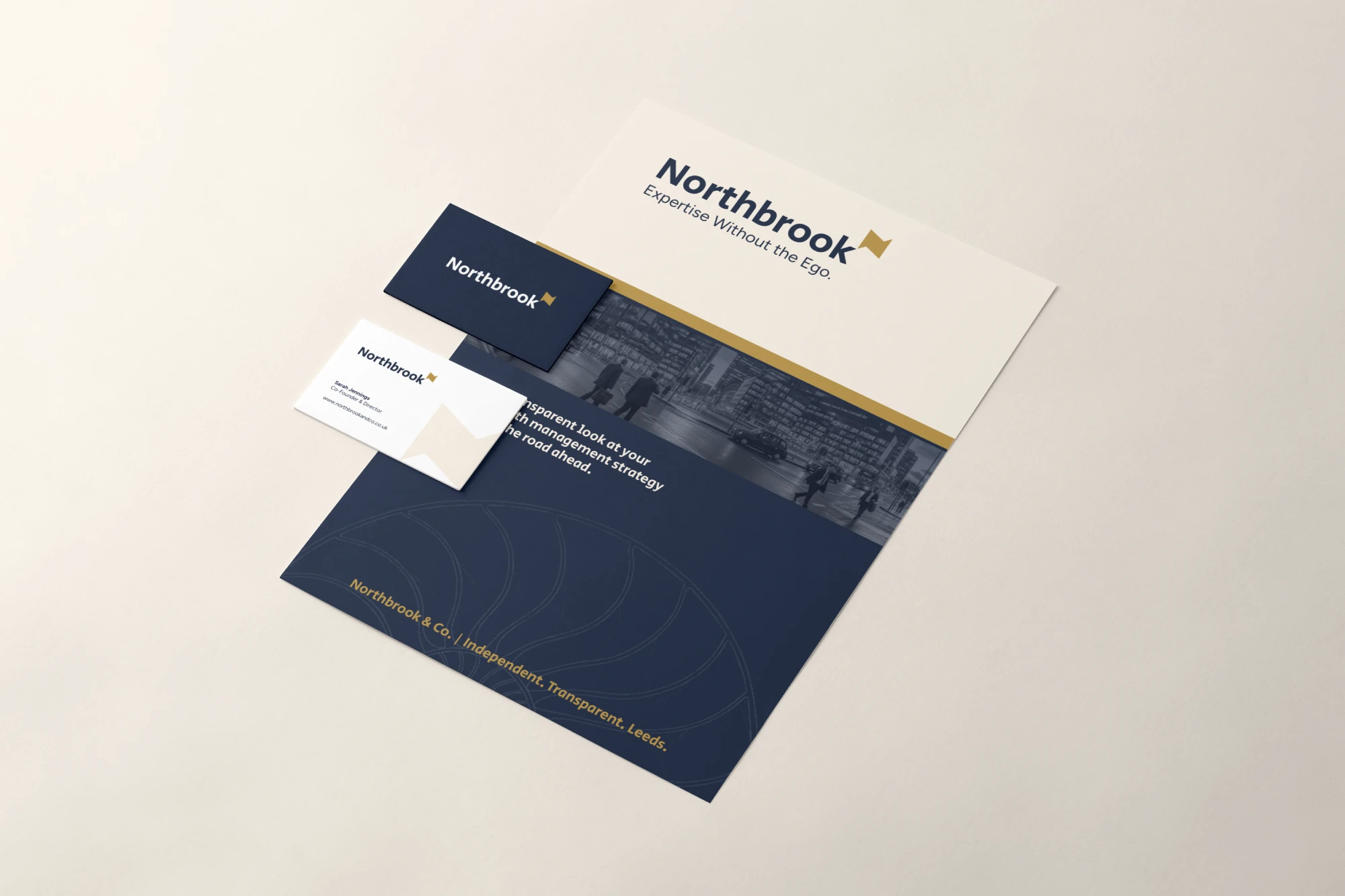
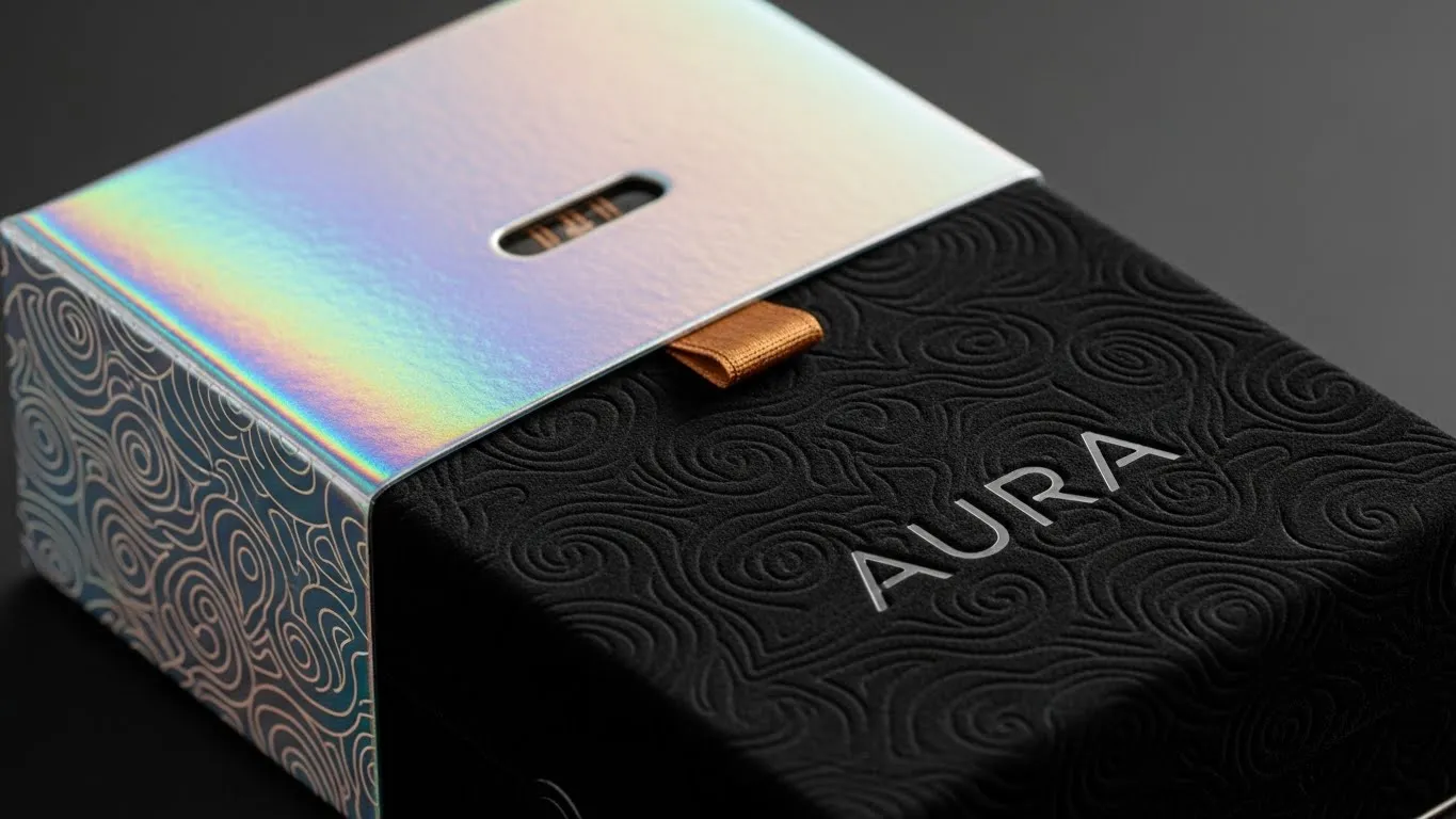
We translate your identity into a tangible market presence that drives revenue. Whether it’s a high-stakes pitch deck for investors, premium packaging, or a digital environment, we ensure every touchpoint reinforces your reputation and removes friction from the buyer’s journey.
Digital-First Brand Guidelines
Your brand’s “Source of Truth.” We provide cloud-based, living guidelines that dictate exactly how your identity lives in the wild. This protects your visual investment and empowers your team to scale globally without diluting your authority or confusing your audience.
Exit the Commodity Trap. Start Building Authority.
Stop competing on price and start winning on Strategic Identity. Whether you’re pivoting your market position or scaling for a global exit, our framework aligns your vision with high-performance design.
Reach out to schedule your Strategic Discovery Session—let’s turn your brand into your most powerful financial asset.
Inkbot Design architected a critical brand identity system for Eureka! with impressive precision. They excel at translating a complex brief into a cohesive visual strategy, genuinely listening to our needs while providing expert guidance throughout the process.
The results resonated across our entire organisation. They are more than a design partner; they are a pleasure to collaborate with and deliver a level of strategic impact rarely found. I would work with them again in a heartbeat.

Florence Symington
Marketing Director
Eureka! The National Children’s Museum
Blueprint for Authority
Our 6-Step Strategic Framework.
Strategic design is not an accidental creative spark—it is an engineered process. We follow a rigorous 6-step framework designed to align your visual presence with your business’s long-term fiscal objectives.
Strategic Discovery & Audit
The Deep Dive. Before we pick up a pencil, we pick apart the market. We perform a comprehensive audit of your current position, your competitors’ weaknesses, and your internal goals to identify the “Authority Gaps” your brand needs to fill.
The Result: You gain a data-backed foundation that ensures your new identity is an objective business tool rather than a subjective aesthetic choice.
Brand Architecture & Positioning
Defining Your “Onliness.” We establish the conceptual framework that makes you the only logical choice in your category. This step fixes your brand’s “Core Promise,” ensuring a scalable hierarchy that makes sense to both human customers and AI algorithms.
The Result: Your brand occupies a unique, unassailable territory in the customer’s mind that competitors simply cannot replicate.
High-Fidelity Design Engineering
Translating Strategy into Form. This is where strategy becomes visible. We develop the core visual elements—your logo, typography, and colour palette—using principles of Psychological Resonance to ensure your brand triggers instant trust and recognition.
The Result: A high-fidelity visual system that communicates market authority and professional “heavyweight” status in less than a second of exposure.
Scalable System Development
Building the Language. A logo is a word; a brand is a language. We expand the core identity into a modular, Scalable Visual System. This includes custom patterns, motion guidelines, and digital-first elements engineered for today.
The Result: Your identity becomes flexible and future-proof, maintaining total impact whether it’s on a smartphone screen, an 8K display, or a global billboard.
Ecosystem Activation
Deploying the Brand. We apply the new identity to your most critical, high-stakes touchpoints—from investor pitch decks to digital environments and physical packaging. We ensure every interaction reinforces your Verified Reputation.
The Result: Total consistency across the entire customer journey, significantly increasing brand recall and removing friction from the sales process.
Brand Governance & Legacy
The Source of Truth. We finalise your Digital-First Brand Guidelines. This cloud-based “Brand Bible” dictates how your identity lives in the wild, empowering your team to scale without “Brand Dilution” or inconsistent messaging.
The Result: You walk away with a permanent “Source of Truth” that protects your visual investment and ensures 100% integrity as your company grows.
Our Strategy
Your Brand is Either an Asset or a Liability. Choose Authority.
A fragmented identity isn't just a design flaw—it’s a leak in your balance sheet. Move beyond the noise of the “commodity trap” and embrace Strategic Visual Authority. We don’t just make brands look better; we make them worth more. Let’s build your moat and turn your brand into a high-leverage growth engine.

Where We Stand
By the Numbers
- 20+ Years of Industry Expertise
A quarter-century of navigating brand evolution, from traditional print to the age of Agentic AI.
- 4.9/5 Aggregated Sentiment Score
Based on 160+ verified reviews, our reputation is built on strategic depth and high-precision delivery.
- 2,500+ Strategic Resources
We don't just practice branding; we lead the conversation with one of the industry's largest libraries of strategic insights.
- Top-Ranked Strategic Partner
Vetted and ranked as a Top 30 Agency in the UK and the top branding firm in Belfast, Northern Ireland.

Built for Every Market, Tailored for Your Goals.
Good design isn't about following a niche; it’s about understanding human behaviour. From FinTech to Fashion, we’ve helped brands across the spectrum find their “Onliness.” Our process is adaptable by design, ensuring that no matter your industry, your brand remains authentic, authoritative, and impossible to ignore.
Insight
The Economics of Identity: Your Performance Multiplier.
Strategic branding is not a cost centre; it is the ultimate performance multiplier in a winner-takes-all economy. Here is why the world’s most resilient companies architect their identity with surgical precision:
01. The Valuation Lever
82% of Investors & Stakeholders cite Brand Equity as a primary factor in valuation and funding decisions. A strong, cohesive identity is your most effective hedge against market volatility and a direct driver of your Exit Multiple. If your brand looks like a commodity, it will be valued like one.
02. The Trust Signal
90% of Choice is Subconscious. Perception is the only reality that matters in the buyer's journey. If your brand doesn’t trigger an immediate “Trust Signal” through an Archetypal Narrative, you lose the sale before the customer even finishes your first paragraph. Today, trust is the rarest—and most expensive—currency.
03. The Premium Multiplier
Consistent, strategic branding is proven to increase revenue by up to 23%. By defining your “Onliness”, we move you from a “price taker” (competing on cost) to a “price maker” (commanding a premium). We ensure your visual authority justifies the fees your expertise deserves.
04. The AI Invisibility Threshold
In 2026, discovery is filtered by machines. If your brand isn't structured as a Verified Entity, you are invisible to the generative engines that now drive 70% of consumer intent. We build “machine-readable authority,” ensuring humans don't just see you, but are recommended by algorithms.
Your brand is your promise, your reputation, and your most resilient asset in a borderless, intelligence-driven marketplace. Don't leave its performance to chance.
Frequently Asked Questions (FAQ)
Frequently Asked Strategic Questions
Great partnerships start with great questions. Whether you’re curious about the technicalities of “Neural Trust” or just want to know when we can start, we’ve laid it all out for you here. If your question isn't on the list, consider it an invitation to jump on a discovery call with us.
Why shouldn’t I just use an AI generator or a cheap design platform for my logo?
Anyone can generate a “pretty” image in seconds. But a logo isn't a strategy. AI lacks the business intelligence to understand your competitor’s weaknesses, your “Onliness,” or your long-term exit goals. We don't just “make icons”; we engineer Competitive Moats. If you use what everyone else uses, you’ll look like everyone else—which is the definition of the “Commodity Trap.”
How long does the Strategic Identity process take?
Quality architecture can't be rushed, but we value momentum. Typically, a complete Strategic Brand Identity takes 6 to 12 weeks, depending on the complexity of your portfolio. This isn't just “design time”—it’s the time required for deep-market audits, psychological archetyping, and building a scalable visual language that will last you for the next decade.
We already have a logo. Can you just “clean it up”?
We certainly can, but we’ll start by asking why. If your current identity isn't driving “Trust Signals” or helping you command a premium price, a “clean up” is just a fresh coat of paint on a shaky foundation. We specialise in The Authority Pivot—taking existing brands and re-engineering them to reflect their accurate market weight.
What exactly is “Brand Architecture” and why do I need it?
Think of it as the organisational map of your business. If you have multiple products or sub-brands, Brand Architecture ensures they all pull in the same direction. It prevents “Brand Dilution” and ensures that the equity you build in one area of your business automatically strengthens the others.
You mention “AI Search Visibility”—how does design affect that?
It’s the technical side of modern branding. Search engines and AI discovery tools now look for Semantic Consistency and “Verified Entities.” By structuring your visual and verbal identity to be “machine-readable,” we ensure your brand is prioritised by the algorithms that now drive the majority of consumer intent.
Does Inkbot Design work with international clients?
Absolutely. While we are UK-based, our framework is designed for global impact. We’ve architected identities for firms from London to New York and beyond. In a borderless, digital-first economy, your brand needs to resonate across cultures while maintaining a singular, authoritative voice.
How much involvement is required from my team?
We view this as a partnership. We need your “Business Intelligence” in Step 1 (Discovery) to understand your goals. After that, we take the heavy lifting off your plate. We provide the “Source of Truth” guidelines, so your team can execute with total confidence, without you micromanaging every social post or pitch deck.
What is the “ROI” of a Strategic Identity?
It shows up in three places: Pricing Power (you can charge more), Sales Velocity (trust is built faster, so deals close quicker), and Asset Valuation (your business is worth more to investors). As we noted in the Economics of Identity, consistent branding can increase revenue by up to 23%.
Will I own all the rights to the final designs?
100%. Once the final investment is settled, the intellectual property is yours. We provide you with a full suite of high-fidelity assets and the “Brand Bible” (Guidelines), so you have total control over your most valuable business asset.
Do you handle the implementation (Web, Social, Print) as well?
Yes. Through our Ecosystem Activation phase, we ensure your identity is flawlessly applied to your most critical touchpoints. We don’t just give you a “logo file” and wish you luck; we make sure your brand is ready to perform in the real world.
My business is preparing for an “Exit”—is this for us?
Actually, this is our speciality. If you’re looking to be acquired or go public, your Brand Equity is a significant factor in your valuation. We help you present a “Verified Reputation” that signals stability, authority, and scale to potential buyers.
How do I get a quote for my project?
The first step is a Strategic Discovery Session. Simply fill out the form below. We don’t do generic “rate cards” because we don't do generic work. We’ll have a brief conversation to understand your goals and then provide a tailored proposal that aligns with the “Market Authority” you're looking to build.


