The Power of Colour: A Guide to Branding Colours
Dive into a vibrant universe of hues as we're surrounded by a mesmerising array of colours every day – from the brilliant blue sky to the lush green landscapes at our feet.
Colour plays an undeniable role in shaping our perceptions, emotions, and actions in our day-to-day lives. In marketing, colour is crucial in crafting brand recognition, as it wields power to sway consumer decisions in remarkable and lasting ways.
In this post, we'll explore the captivating realm of colour psychology and branding, investigating how businesses can leverage the evocative symbolism of colours to create stunning brand identities that strike a chord with their target audience.
To truly grasp the influence of colour on branding, consider this: research from the University of Loyola reveals that a whopping 90% of initial judgments about a product stem from colour alone.
This staggering statistic highlights the importance of colour as a persuasive instrument in branding. Colours can shape our moods, emotions, and even physiological reactions.
For instance, red is often synonymous with passion, enthusiasm, and immediacy, making it a prime pick for brands wishing to exude energy and dynamism. Conversely, blue typically signifies trust, stability, and serenity, making it a favoured option for brands aiming to project dependability and security.
Yet the power of colour extends beyond individual shades. Strategic combinations of colours can also be employed to communicate varying brand messages. For example, blue and green are frequently paired in eco-conscious brands to elicit a sense of unity with nature. Utilising black and white can evoke an aura of elegance and timelessness.
Furthermore, cultural nuances can shape the way colours are perceived. In certain cultures, red is considered auspicious, symbolising danger and caution in others. Consequently, businesses must thoroughly understand their target demographic and customise their colour choices accordingly.
- Colour Psychology and Brand Storytelling
- The Science Behind Colour Perception
- Colour Theory in Different Cultures
- The Psychology of Colour in Branding
- The Psychological Impact of Neutral Colours
- Choosing the Right Branding Colours for Your Business
- Colour Trends in Branding
- The Economic Impact of Colour Choices
- The Dos and Don'ts of Using Branding Colours
- In Conclusion
Colour Psychology and Brand Storytelling
Colour is not just aesthetic but also tightly interwoven with storytelling. Every hue becomes a narrative tool, enhancing brand stories by connecting emotionally with audiences.
For instance, Nike’s use of black and white in their advertising isn't just about contrast but communicates a narrative of simplicity, strength, and timelessness, resonating with athletic achievement narratives. Brands can evoke nostalgia, aspiration, or excitement simply through carefully chosen colour combinations.
Successful brands weave colours into their storylines, ensuring every visual element reinforces their core message and attracts the intended audience emotionally.
The Science Behind Colour Perception
Before diving into branding colours, it's essential to understand how we perceive colours. Our brains process colours based on a combination of light wavelengths and how our eyes interpret them.
Different colours can evoke other emotions and reactions in individuals. For example, red is often associated with passion, love, and excitement, while blue is associated with trust, calmness, and reliability.
Digital branding demands attention to how colours render on screens, which can vary vastly from print. Screen settings and ambient lighting can alter colour perception, making consistency vital.
High contrast and accessible colour palettes ensure clarity and appeal to users, especially those with visual impairments. Brands like Google have focused on colour accessibility, using bright, contrasting colours that maintain visual appeal on different devices.
Balancing aesthetic choice with functionality, digital branding succeeds when it includes a wide audience. This approach enhances navigation and user experience noticeably.
Digital platforms introduce unique challenges, such as differing resolutions and colour profiles, affecting how tones are perceived. Software like Adobe’s colour tools allows designers to test how colours appear on various devices, ensuring consistency. Moreover, digital branding must consider accessibility features, such as screen readers and high-contrast options, which improve user experience for individuals with vision impairments.
Brands like Microsoft have adapted their colour usage to support dark mode interfaces, maintaining their visual identity across user preferences. Such considerations ensure inclusivity, broadening reach while preserving design intent.
Primary Colours
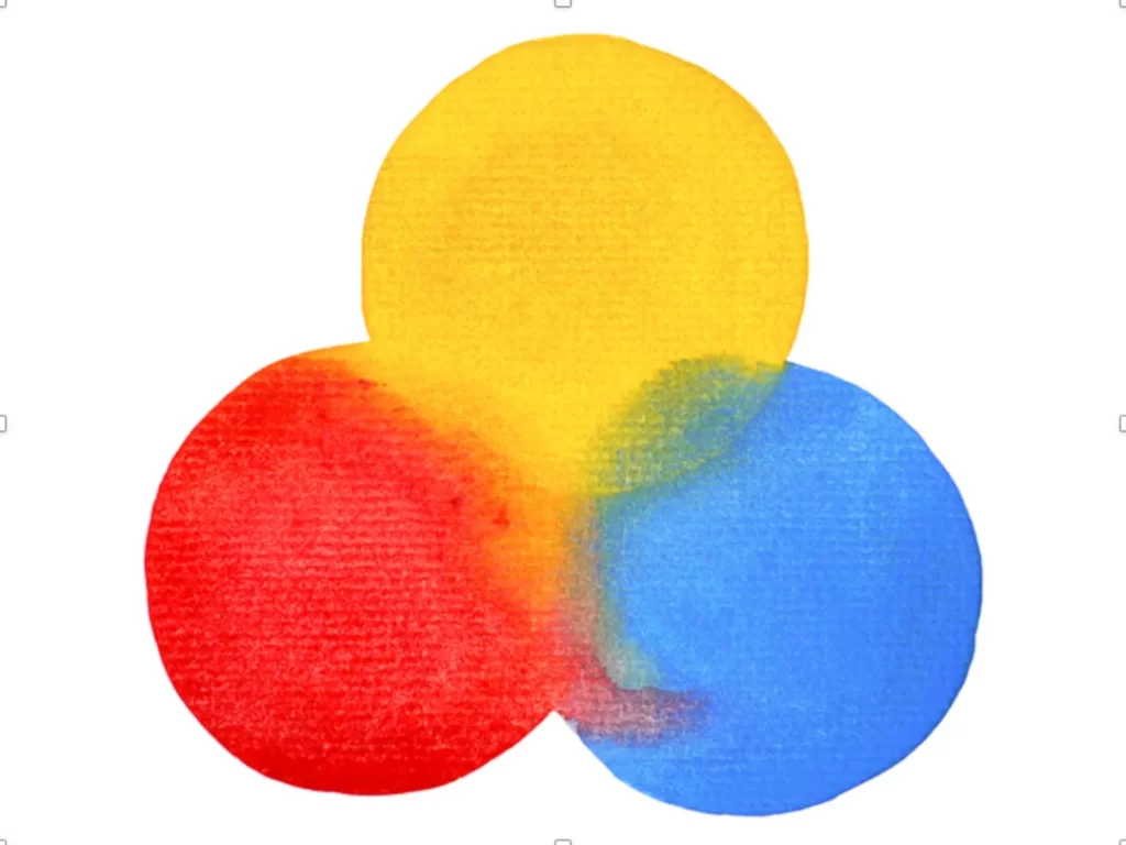
As a colour psychology expert, I can attest to the importance of primary colours – red, blue, and yellow – in forming the basis of every colour palette. These fundamental hues are the cornerstone of colour theory and design, as they are pure, undiluted shades that give rise to all other colours.
Red, the initial primary colour, exudes warmth and intensity, eliciting emotions of passion, excitement, and vigour.
Brands often incorporate red to instil a sense of urgency, making it an excellent option for stimulating action or emphasising immediacy.
In contrast, blue offers a serene and soothing quality, often linked to intellect, trustworthiness, and dependability. This makes it a favoured choice among tech companies seeking to project professionalism and expertise.
Finally, yellow, with its vibrant and uplifting nature, is associated with joy, optimism, and ingenuity. The food industry frequently employs yellow to incite appetite and generate enthusiasm.
These three primary colours lay the groundwork for all other hues, rendering them indispensable to colour theory and design. By varying the proportions of red, blue, and yellow, designers can produce a limitless spectrum of colours, each evoking distinct emotions and impressions.
For instance, blending red and blue yields purple, a colour commonly connected to royalty, opulence, and inventiveness. Combining blue and yellow results in green, a shade often tied to nature, growth, and equilibrium.
Grasping the significance of primary colours and their place in colour theory is vital for designers and marketers aiming to develop impactful branding and design elements.
By commencing with primary colours and experimenting with diverse combinations and ratios, designers can fashion visually striking and emotionally evocative designs that convey brand messaging and motivate action.
Ultimately, by mastering colour theory and design, businesses can distinguish themselves from rivals, leave a lasting impression, and propel growth and success.
Secondary Colours
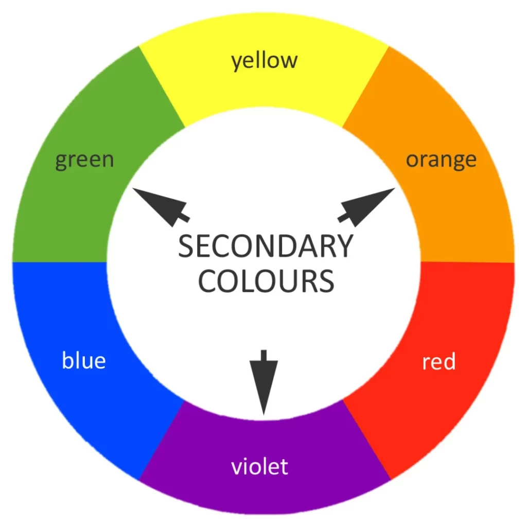
These are created when we mix two primary colours, resulting in a new shade that blends the characteristics of its parent colours.
For example, when we mix red and blue, we get purple – a colour that combines the fiery energy of red with the calming influence of blue. Mixing blue and yellow together creates green, giving off a fresh and natural vibe while evoking a sense of harmony and growth.
But hold on; there are specific rules and ratios to follow when creating secondary colours! By mixing equal parts of two primary colours, we get a secondary colour that's pure and balanced.
However, we can adjust the balance of the primary colours to create secondary colours that lean more towards one parent colour or the other. For instance, adding additional red to blue results in a warmer and more vibrant purple, while adding more blue to red creates a cooler, more calming purple.
Now, we can remember a third secondary colour – orange! This vibrant hue is created by mixing red and yellow and is often associated with energy, enthusiasm, and excitement. Orange is a popular choice to create a sense of urgency or stimulate the appetite, making it a go-to for the food industry.
Tertiary Colours
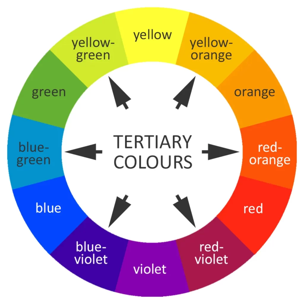
Did you know that mixing primary and secondary colours can create tertiary colours? These new colours combine the traits of both parent colours and add even more depth and complexity to a palette, allowing designers to create detailed and intricate designs.
Let me show you some examples! When we mix red with purple, we get magenta – a bold, vibrant colour with a sense of elegance and sophistication. Mixing blue with green gives us teal, which evokes the calm and fresh vibe of nature and the ocean. And when we combine yellow with green, we get lime – a colour that's both bright and zesty yet also has a sense of balance and calmness.
To create tertiary colours, we follow the same rules and ratios as when making secondary colours. By combining equal parts of a primary and a secondary colour, we get a tertiary colour that is harmonious and balanced. However, by changing the ratio of the primary and secondary colours, we can create tertiary colours that lean more towards one parent colour or the other, resulting in a unique and custom-made hue.
When designers and marketers master the art of colour theory and design, they can create eye-catching designs that effectively communicate their brand message and resonate with their target audience.
They can create intricate and nuanced designs that convey complex emotions, moods, and impressions using primary, secondary, and tertiary colours. Mastering colour theory and design is crucial to building a solid brand identity that stands out and drives business growth and success.
Colour Theory in Different Cultures
Colours carry different meanings across the globe, influencing branding strategies significantly. For instance, red symbolises prosperity and joy in China, often linked with positive events like weddings. This contrasts with Western cultures, where red might signify danger.
In India, saffron is a hue tied to spirituality and purity, diverging from its perception as a shade of happiness in other contexts. Brands expanding internationally must research cultural meanings, ensuring their colour palettes resonate globally.
This awareness not only avoids missteps but also strengthens brand appeal internationally.
Beyond the colour red, other hues hold varied connotations across regions. In Japan, white is associated with purity and used in both weddings and funerals, signifying life's cycle.
Green represents growth and harmony in Western societies, yet in Indonesia, it can be considered a prohibitive colour in certain scenarios. Yellow, symbolising warmth and courage in numerous cultures, is linked to envy in certain parts of Europe.
By appreciating these varied interpretations, brands effectively engage multiple demographics. This practice crafts messages that respect cultural sensitivities and enhance brand integrity worldwide.
The Psychology of Colour in Branding
A business's colours for its brand can significantly impact how consumers perceive it. Colours can evoke emotions and even influence purchasing decisions. Let's take a closer look at the psychology of colours in branding.
Red
Red is undoubtedly one of branding and design's most potent and attention-grabbing colours. It is a colour that evokes strong emotions and has been shown to impact consumer behaviour significantly.
The use of red in branding is widespread, and it has been used by some of the world's most recognisable brands, including Coca-Cola, Netflix, and Lego. Coca-Cola, for example, has built its brand identity around the iconic red and white colour palette, which is instantly recognisable and evokes feelings of happiness and enjoyment.
Similarly, Netflix uses red to create a sense of excitement and anticipation, while Lego uses it to convey a sense of fun and creativity.
The power of red in branding extends beyond just consumer perception. According to a study by the University of Illinois, red can increase appetite and stimulate hunger, making it a compelling choice for food and beverage brands. Additionally, a study by the University of British Columbia found that wearing red can increase confidence and perception of status, making it a practical choice for luxury brands.
However, while red is undoubtedly a powerful colour, it is also essential to use it appropriately and in moderation. Using too much red in a design or branding can be overwhelming and may have the opposite effect of what you intended, turning off customers and driving them away. Therefore, it is vital to strike a balance and use red to effectively communicate your brand message while remaining visually appealing and engaging.
Blue

Blue is a colour that exudes calmness, stability, and intelligence. It is one of the most commonly used colours in branding and design thanks to its ability to convey trustworthiness and reliability. According to a study by the University of British Columbia, blue can also increase creativity and stimulate the mind, making it a compelling choice for brands that want to evoke a sense of intelligence and expertise.
Some of the world's most recognisable brands, including Facebook, Dell, and Ford, use blue in their branding. Facebook, for example, uses a calming shade of blue as its primary colour, which conveys a sense of trust and dependability, helping to establish the social media giant as a credible and trustworthy platform. Similarly, Dell uses blue to create a sense of professionalism and expertise, while Ford uses it to convey a sense of quality and dependability.
The use of blue in branding extends beyond just consumer perception. According to a study by the University of Rochester, blue can increase productivity and efficiency, making it a practical choice for brands that want to promote a sense of productivity and focus. Additionally, blue has been shown to have a calming effect on the mind and can reduce stress and anxiety, making it a popular choice in the healthcare industry.
However, like any colour, using blue appropriately and in moderation is essential. Overusing blue in a design or branding can create monotony and may fail to capture the target audience's attention. Therefore, it is necessary to use blue to effectively communicate your brand message while remaining visually appealing and engaging.
Green

Green is closely associated with nature and evokes tranquillity, growth, and harmony. According to a study by the University of Georgia, green can increase feelings of calmness and relaxation, making it a compelling choice for brands that want to create a sense of wellness and balance.
Some of the world's most recognisable brands, including Whole Foods, Starbucks, and Animal Planet, use green branding. Whole Foods, for example, uses green in its branding to convey a sense of health and naturalness, making it a popular choice for the organic and natural food industry. Similarly, Starbucks uses green branding to create a sense of calmness and relaxation. In contrast, Animal Planet uses it to convey a sense of connection to nature and the environment.
The use of green in branding extends beyond just consumer perception. According to a study by the University of Essex, exposure to green environments can improve cognitive function, attention, and mood. Additionally, green has been shown to have a soothing effect on the mind. It can reduce stress and anxiety, making it an ideal choice for brands promoting relaxation and well-being.
Yellow

Yellow is a vibrant and lively colour often linked with happiness, optimism, and positive energy. It evokes joy and enthusiasm, making it a popular choice in marketing and branding.
Many companies choose to incorporate yellow into their branding strategies because it communicates a sense of positivity and optimism to their target audience. Customers who see yellow are more likely to associate it with happiness and cheerfulness.
McDonald's is one of the most recognisable brands that use yellow in their branding. The fast-food giant's iconic golden arches are instantly recognisable and associated with familiarity, comfort, and joy. The use of yellow in McDonald's branding is intentional and strategic, as the colour stimulates the appetite and evokes a sense of happiness and contentment.
National Geographic is another example of a brand that uses yellow in its branding. The iconic yellow rectangle with the National Geographic logo is instantly recognisable and associated with adventure, exploration, and discovery. The colour yellow, in this context, represents the sun, warmth, and the natural world, all of which are themes that are important to the National Geographic brand.
Orange
Orange is a super playful and fun colour that radiates energy and enthusiasm. It's often associated with creativity, excitement, and adventure.
Many brands use orange in their branding because it can convey a sense of joy and enthusiasm to their customers. When people see the colour orange, they associate it with a lively and upbeat vibe that can capture their attention and leave a lasting impression.
Nickelodeon is one such brand that uses orange in its branding. The television network for kids has been using orange in its logo since the 1980s. The playful, bright orange colour is perfect for their young audience and helps create a sense of fun and excitement around their programming.
Fanta is another famous brand that uses orange in its branding. The soft drink company uses a bright orange colour for its packaging, which evokes a sense of fun and playfulness. Fanta's orange branding is instantly recognisable and has helped the company stand out from other soft drink brands.
Finally, Harley-Davidson is a brand that uniquely uses orange. The iconic motorcycle company uses an orange and black colour scheme in its branding, which gives a sense of toughness and ruggedness while also representing the freedom and adventure of the open road.
So there you have it! The colour orange is a powerful tool that brands use to convey a sense of creativity, fun, and enthusiasm to their customers. When used correctly, it can help create a solid emotional connection with the target audience and drive engagement and loyalty.
Purple

Purple is a colour often associated with royalty, luxury, and creativity. It's a regal colour that exudes a sense of elegance and sophistication.
Many brands use purple in their branding because it can convey a sense of luxury and creativity to their customers. When people see the colour purple, they often associate it with a high-end, premium product or service.
Cadbury is an excellent example of a brand that uses purple in its branding. The iconic Cadbury Dairy Milk chocolate bar is wrapped in a deep purple packaging that's become synonymous with the brand. The use of purple is intentional, as it helps convey a sense of premium quality and indulgence that's associated with chocolate.
Hallmark is another brand that uses purple in its branding. The greeting card company uses a bright, playful shade of purple to evoke a sense of creativity and imagination. Using purple in this context helps create a warm, inviting atmosphere that encourages people to express themselves through heartfelt messages and sentiments.
Finally, Yahoo is a tech brand that uses purple in its branding. The company uses a deep, rich purple colour in its logo and website design, which gives a sense of creativity and innovation. Using purple is a strategic choice that helps Yahoo stand out from other tech brands and positions the company as a leader in the industry.
In conclusion, the colour purple is a powerful tool that brands use to convey a sense of luxury, creativity, and innovation to their customers. When used effectively, it can help create a solid emotional connection with the target audience and drive engagement and loyalty.
Pink

Pink is a feminine and romantic colour that exudes a sense of love and compassion. It's often associated with nurturing and understanding and creates a warm and welcoming atmosphere.
Many brands use pink in their branding because it can convey a sense of femininity and compassion to their customers. When people see pink, they often associate it with a caring and nurturing vibe that can help build trust and loyalty.
Victoria's Secret is an excellent example of a brand that uses pink in its branding. The lingerie retailer uses a soft, blush pink colour in its branding and advertising, which helps create a sense of femininity and romance. The use of pink is intentional, as it's meant to appeal to their target audience of women looking for comfortable lingerie.
Barbie is another brand that uses pink in its branding. The iconic doll is famous for its pink packaging and accessories, which have become synonymous with the brand. The use of pink is meant to evoke a sense of playfulness and fun, which is perfect for a toy that encourages creativity and imagination.
Finally, Breast Cancer Awareness is a charity that uses pink in its branding. The organisation uses a bright, vibrant shade of pink to raise awareness for breast cancer and inspire compassion and support. Using pink is a strategic choice that helps the organisation stand out and make a lasting impact in the fight against breast cancer.
Black
Black is a sophisticated and powerful colour that embodies elegance and luxury. It's often associated with power, exclusivity, and prestige.
Many brands use black in their branding because it can convey a sense of sophistication and luxury to their customers. When people see black, they associate it with a high-end, premium product or service.
Chanel is an excellent example of a brand that uses black in its branding. The fashion brand is known for its classic black-and-white logo, which has become synonymous with the brand. The use of black is intentional, as it helps convey a sense of luxury, sophistication, and timelessness associated with the brand.
Nike is another brand that uses black in its branding. The sportswear company uses a sleek, minimalist black colour in its logo and advertising, which gives a sense of power and confidence. Using black is a strategic choice that helps Nike stand out from other athletic brands and positions the company as a leader in the industry.
Finally, Apple is a tech brand that uses black in its branding. The company uses a sleek, minimalist black colour in its product designs, which gives a sense of sophistication and exclusivity. Using black is a strategic choice that helps Apple stand out from other tech brands and positions the company as a premium brand associated with innovation and luxury.
White

White is an immaculate, pure colour with a sense of simplicity and clarity. It's often associated with purity, innocence, and cleanliness.
Many brands use white in their branding because it can convey a sense of simplicity and purity to their customers. When people see the colour white, they often associate it with a minimalist and modern vibe that can create a strong impression.
Apple is an excellent example of a brand that uses white in its branding. The tech company uses a sleek, minimalist white colour in its product designs, which gives a sense of simplicity and purity. The use of white is intentional, as it helps Apple stand out from other tech brands and positions the company as a premium brand associated with innovation and simplicity.
Adidas is another brand that uses white in its branding. The sportswear company uses a clean, white colour in its logo and advertising, which gives a sense of purity and freshness. Using white is a strategic choice that helps Adidas stand out from other athletic brands and positions the company as a leader in the industry.
Finally, Wikipedia is a website that uses white in its branding. The online encyclopedia uses a minimalist, white colour scheme in its website design, which gives a sense of simplicity and clarity. The use of white is a strategic choice that helps the website's content stand out and be easily readable, as it provides a clean and simple backdrop for the text.
The Psychological Impact of Neutral Colours
Neutral colours often play supportive roles in branding, yet they hold unique psychological impacts, conveying calm and stability. Shades like grey and beige often evoke neutrality or understated elegance.
Brands in the technology sector, like Apple, use neutrals to enhance product emphasis without overwhelming the visual field. In interior design, these hues suggest sophistication and timelessness.
Companies like Uniqlo leverage these colours to evoke modernity while maintaining a broad appeal. The subdued nature of neutrals provides a versatile backdrop, giving prominence to other design elements, allowing them to stand out.
Neutrals also serve as effective balancing acts in vivid branding palettes, providing a base that highlights bold accent colours. Beige might communicate comfort and simplicity, offering a warm, welcoming undertone.
Grey tones can suggest professionalism and formality, as seen in corporate sectors where they convey authority without aggression.
These colours, when used effectively, streamline visual communication, allowing brands to maintain sophistication. Companies in finance and healthcare often utilise neutral palettes to build trust and stability, ensuring that their services feel dependable and consistent to the audience.
Choosing the Right Branding Colours for Your Business
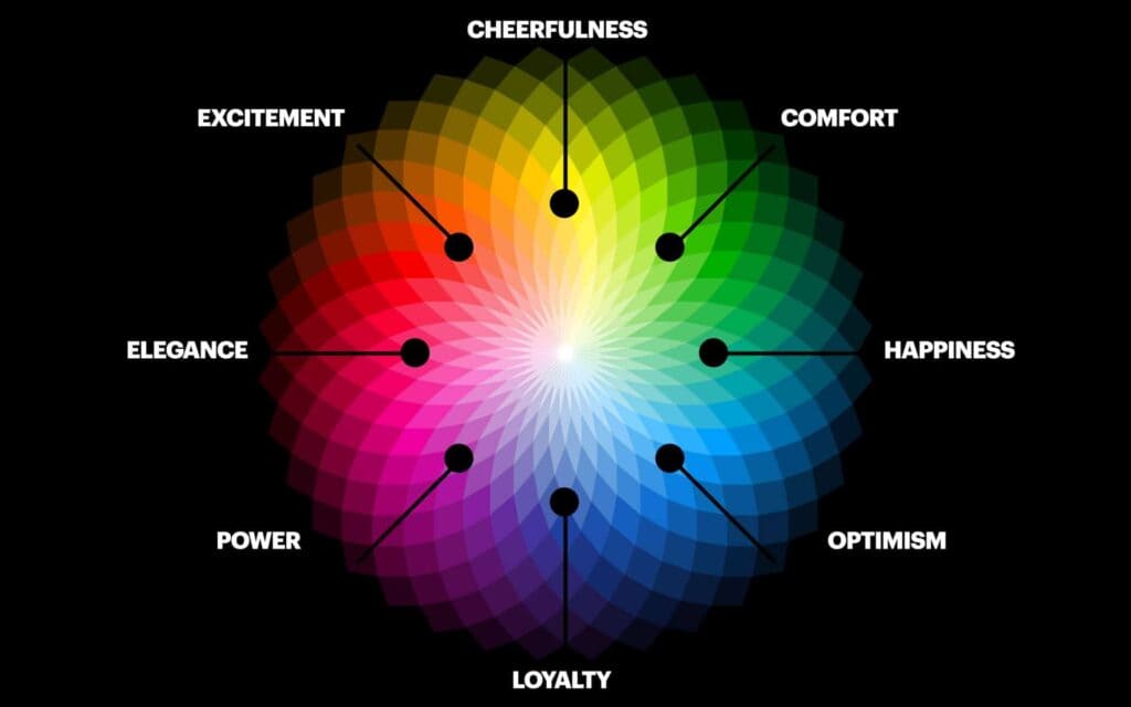
Choosing the right branding colours for your business can be a daunting task. However, choosing colours that accurately represent your brand and resonate with your target audience is essential. Here are some tips to keep in mind when selecting branding colours for your business:
Consider Your Brand Personality
When choosing branding colours, your brand personality should be on your mind. Your colours should reflect your brand's personality and the emotions you want your customers to feel when interacting with your brand. For example, a high-end luxury brand might choose black and gold to convey a sense of exclusivity and sophistication.
Understand Your Target Audience
Truly understanding your target audience is a foundational prerequisite when selecting branding colours that will resonate with them.
Each colour holds a distinct and nuanced set of emotions, impressions, and responses, rendering it paramount for businesses to choose colours that deeply resonate with their intended audience. For example, if the target audience is primarily women, using colours like pink or purple is ideal. These hues have a strong cultural association with femininity and can evoke emotions of elegance, grace, and sophistication.
When selecting branding colours, it is also essential to consider the broader context of colour psychology.
Research has shown that colour can significantly impact brand recognition, with 80% of consumers recognising a brand through colour alone. Furthermore, a study by the University of Winnipeg found that people judge products within 90 seconds of initial viewing. This highlights the undeniable importance of selecting branding colours that effectively communicate the intended message and create a positive and lasting impression.
However, while specific colours may hold universal associations, such as red with passion or blue with trustworthiness, cultural factors can also play a pivotal role in how colours are perceived. For instance, in Western cultures, white is commonly associated with purity and innocence, while in some Eastern cultures, it is linked to death and mourning.
Similarly, yellow is seen as a cheerful and optimistic colour in some cultures, while in others, it is associated with cowardice and betrayal. Therefore, businesses need to carefully evaluate their target audience's cultural background and tailor their branding colours accordingly to create a deeper connection with their audience.
Moreover, businesses can also leverage colour combinations to enhance their branding efforts. Complementary colours, such as red and green, are often used to create visual interest and contrast. In contrast, analogous colours, such as blue and green, evoke a sense of harmony and balance. Businesses can fine-tune their branding efforts and create a lasting impression by experimenting with different colour combinations and observing their impact on their target audience.
Consider Your Industry

Different industries have developed unique colour palettes that have become closely associated with them. For instance, the tech industry is often associated with the colours blue and white, which tech giants like IBM, HP, and Dell commonly use.
This is because blue is linked to trust, intelligence, and reliability, making it an ideal choice for tech brands that want to convey a sense of professionalism and expertise. Similarly, white is associated with simplicity and clarity, which aligns well with the tech industry's focus on innovation and efficiency.
On the other hand, the food industry often uses bold and vibrant colours like red and yellow to stimulate appetite and create a sense of excitement. For example, fast-food chains like McDonald's and KFC have built their brand identity around the iconic combination of red and yellow, which elicits feelings of hunger and craving. This colour palette has become closely associated with the food industry, making it challenging for new brands to stand out and differentiate themselves.
Therefore, when choosing branding colours for your business, it is essential to consider the colours commonly used within your industry and find a way to differentiate yourself while still fitting within the industry's colour palette. For instance, if you are in the tech industry, you could experiment with different shades of blue or use complementary colours like orange or green to create visual interest and stand out from your competitors. Similarly, if you are in the food industry, consider using a different colour palette or experimenting with shades of red and yellow to create a unique brand identity that stands out.
It is also worth noting that the colours used in branding can significantly impact consumer behaviour and perception. For example, a study by the University of Rochester found that the colour red can increase the perceived attractiveness of a product, while green can increase the perceived product value. Therefore, choosing colours that align with your brand message and desired consumer response is essential.
Test Your Colours

Selecting the right branding colours for your business is crucial in building a solid brand identity. However, it is equally important to test your chosen colours to ensure they resonate with your target audience and effectively communicate your brand message. After all, the goal of branding is to create a connection with your audience and inspire loyalty and trust.
One effective way to test your branding colours is by conducting surveys or focus groups with your target audience. These methods allow you to gather feedback on your colour choices and assess their impact on consumer perception and behaviour. By asking participants about their impressions of your brand and how your colours make them feel, you can gain valuable insights into the effectiveness of your branding efforts and identify areas for improvement.
Additionally, it is vital to consider the context in which your branding colours will be used. For example, the incredible colours on your website or social media channels may translate poorly to print materials like business cards or brochures. Therefore, testing your colours across different mediums is essential to maintain their impact and effectiveness.
It is also worth noting that colour trends and preferences can shift over time, making it essential to revisit your branding colours periodically and adjust as necessary. For instance, if your target audience's tastes have shifted towards more muted and natural tones, you may need to update your branding colours to remain relevant and resonate with your audience.
Colour Trends in Branding
Branding trends in colour evolve quickly, influenced by societal shifts and technological advances. Pastels, for example, have gained traction in recent years, softening the branding of tech startups and lifestyle brands.
Meanwhile, gradients add depth and modernity, popularised by companies like Instagram. Beyond aesthetics, these trends reflect broader cultural moods, such as a desire for tranquillity in turbulent times.
Brands looking to stay current must balance their identity with trend adoption, selectively integrating contemporary hues to refresh their appeal without losing essence.
Current trends are seeing a move towards metallic tones like gold and silver, adding a luxe feel that captivates audiences in the tech and automotive sectors. These colours suggest innovation and elegance while maintaining a futuristic edge.
Furthermore, earth tones such as terracotta and sage are making inroads in lifestyle brands, evoking sustainability and warmth. As environmental consciousness becomes more important, incorporating these shades helps brands align with eco-friendly values.
Observing these trends, brands can refresh their image, ensuring they resonate with modern consumer values and aesthetic preferences.
The Economic Impact of Colour Choices
Strategic colour placements can improve a company’s market position, evidenced by rebrands leading to increased sales. For example, Tropicana's logo change led to initial confusion among customers, yet adjusting their colour choices retained familiarity and clarity in packaging.
On the other hand, Coca-Cola's iconic red not only establishes brand recognition but also stimulates purchase intent, supported by psychological studies linking red with appetite increase.
These powerful associations highlight how colour substantially influences consumer behaviour, reinforcing the importance of thoughtful colour integration in branding strategy to promote economic growth.
Beyond sales increases, colour choices can affect a brand’s equity and market positioning. Colour makes products memorable, facilitating repeated customer engagement.
Historically, Tiffany & Co.’s distinct robin's egg blue solidified its luxury status, driving demand through brand association.
In retail, impulsive buys can result from visually striking displays. Research shows that products highlighted in appealing colours catch attention faster, invariably boosting profits.
Strategic partnerships, like Pantone's annual colour collaborations with brands, further leverage colour appeal, tapping into consumer trends and enhancing market relevance.
The Dos and Don'ts of Using Branding Colours
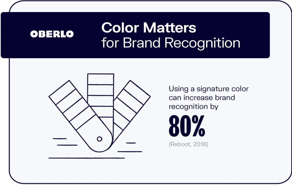
Using branding colours effectively is crucial in building brand recognition and resonating with your target audience. Here are some dos and don'ts to keep in mind when using branding colours:
Dos
- Use your branding colours consistently across all marketing materials, including your website, social media, and print materials.
- Use contrasting colours to make your branding colours pop and stand out.
- Use white space to give your branding colours room to breathe and draw attention to them.
Don'ts
- Use too many colours in your branding, which can be overwhelming and confusing for your audience.
- Use colours that clash or don't complement each other, which can create a negative impression of your brand.
- Use colours that are too similar to your competitors, making it difficult for your brand to stand out.
In Conclusion
Colour is a powerful tool for building brand recognition and conveying emotions and messages to your target audience. Choosing the right branding colours for your business requires careful consideration of your brand personality, target audience, and industry. By following the dos and don'ts of branding colours, you can effectively use colour to build your brand and resonate with your customers. So, use the power of colour to take your branding to the next level!

