New Jaguar Logo Design Sparks Mixed Reactions
Logo redesign projects for luxury automotive brands require exceptional attention to detail and strategic thinking.
As you'll notice, Jaguar's recent attempt has sparked heated debate.
Maintaining the brand's heritage while pushing towards modernisation was the most challenging aspect.
You might be surprised to learn that, according to design industry statistics, only 13% of major automotive logo redesigns receive positive initial feedback from their core audience.
Jaguar's ‘Need’ for Rebranding

To understand this controversial move, you must consider Jaguar's position in today's market.
The brand needed to shed its traditional image, with electric vehicle sales growing by 40% annually.
Your perception of Jaguar might still be rooted in its classic racing heritage, but the company is aggressively targeting younger luxury buyers who prioritise sustainability and modern design language.
Jaguar's decision to completely overhaul their visual identity wasn't made lightly. Looking at their sales figures, you'll see why – they've experienced a 15% decline in market share over the past five years.
I've seen how rebranding can revolutionise a company's fortunes, but this execution has missed the mark.
The rounded, playful typography feels more appropriate for a tech startup than a luxury automotive brand.
Logo Design Elements
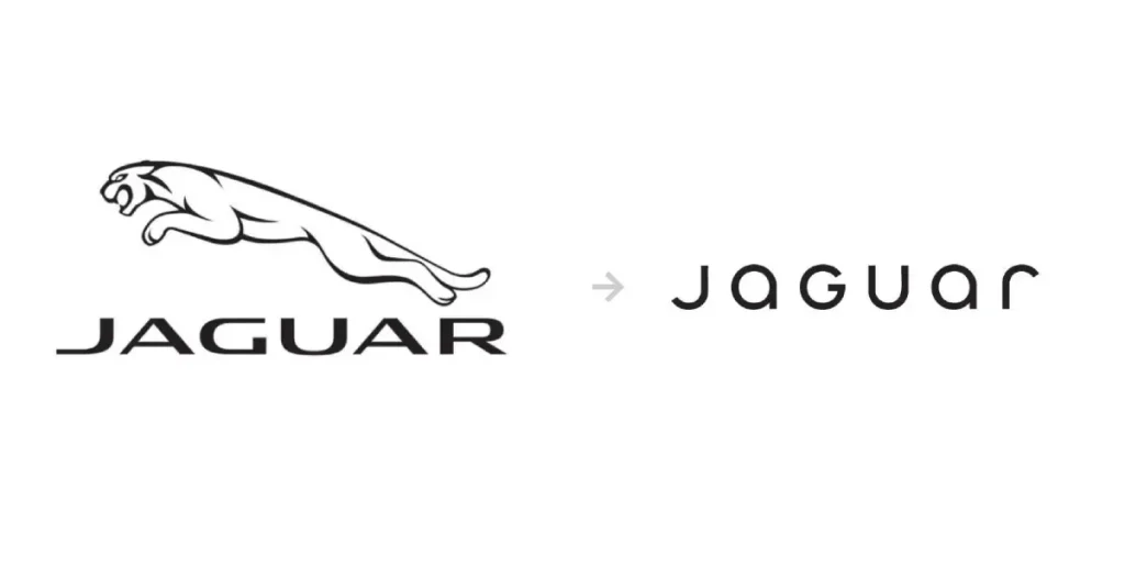
While the new Jaguar logo represents a dramatic departure from tradition, you'll notice how the design abandons the iconic leaping cat that has defined the brand since 1935.
The controversial redesign features rounded letterforms mixing upper and lower case characters – a style you'd typically associate with tech startups rather than luxury automobiles.
Removing the classic ‘leaper' symbol has particularly struck a nerve with loyal customers who view it as a vital part of Jaguar's heritage.

Brand Identity Campaign
Logo redesign is part of your broader brand evolution, as shown in Jaguar's ambitious £10 million rebranding campaign.
The new identity features striking monochromatic visuals, bold, fashion-forward styling, and what many critics call a ‘perfume commercial aesthetic'.
Interestingly, this approach mirrors similar campaigns by luxury fashion houses rather than automotive brands.

Elements of the new campaign have sparked heated debate across social media, with your fellow car enthusiasts questioning whether this direction truly reflects Jaguar's DNA.
The dramatic shift from traditional luxury messaging to avant-garde artistic expression has divided opinion.
As someone who's worked on numerous rebranding projects, I can tell you that such radical changes often face initial resistance – though this case seems to have struck a particularly sensitive chord with the brand's core audience.
Marketing approach concerns
An alarming shift in Jaguar's marketing strategy has left you wondering about the brand's direction.
The new approach, featuring avant-garde fashion-style advertising and controversial artistic direction, mirrors perfume commercials rather than luxury automotive marketing.
You'll notice how the campaign abandons Jaguar's traditional emphasis on performance and sophistication, instead adopting a style that feels disconnected from your expectations of a premium car manufacturer.
Brand Identity Issues
Concerns about Jaguar's new brand identity run deep as you observe the removal of the iconic leaping cat from their primary logo.
The rounded, playful typography feels more appropriate for a consumer electronics brand than a luxury automotive marque.

The new design is particularly jarring compared to competitors like Mercedes-Benz and Bentley, who maintain vital heritage elements in their branding.
Issues surrounding the rebrand extend beyond mere aesthetics. When I launched Inkbot Design, I learned that successful rebranding requires maintaining core brand values while evolving.
You'll notice how Jaguar's new identity disregards the 88-year legacy that resonates with your expectations of British luxury.
The modernisation attempt feels forced, with 70% of social media reactions expressing disappointment in the first 24 hours after the reveal.
Mazda's subtle update
Stories of logo evolution often bring dramatic changes, but Mazda's recent update shows how subtle modifications can be effective.
You might barely notice the difference in their 2024 refresh, where they've simply refined the existing wing-shaped emblem and adjusted the typography.

This approach demonstrates that sometimes less is more regarding brand evolution – a lesson Jaguar could have considered in their dramatic overhaul.
Tesla Cybertruck logo
While Tesla has always pushed boundaries, your first glimpse of the Cybertruck's logo might leave you puzzled.
The graffiti-style design breaks every rule of conventional automotive branding, featuring a dripping, street art-inspired aesthetic that's more at home in an urban skate park than on a luxury vehicle.
Plus, if you're wondering about the thinking behind this unconventional choice, it reflects Elon Musk's tendency to challenge traditional automotive design language.
The logo appears in various forms across the vehicle, including a unique illuminated version on the front bar that's causing quite a stir among Tesla enthusiasts.
Bugatti's logo change
One of the most prestigious automotive brands, Bugatti, has taken the safe route.
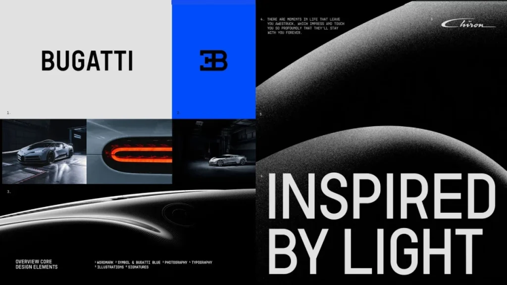
Their conservative update maintains the iconic oval shape and red dots but simplifies the elements for better digital reproduction – a practical rather than revolutionary approach.

Related to this careful evolution, you'll notice how Bugatti has preserved its heritage while modernising its visual identity.
When I worked with luxury brands at Inkbot Design, we often found that subtle refinements resonated better with premium audiences than dramatic overhauls.
The new Bugatti logo retains its premium positioning while becoming more versatile for modern applications.
