What Brands Can Learn from the 2010 Gap Logo Design Disaster
The 2010 Gap logo failure was not a failure of aesthetics; it was a failure of corporate spine.
While most design critics focus on the “ugly” use of Helvetica and a dated gradient, the actual catastrophe lay in the brand’s immediate retreat.
Gap Inc. proved it had no internal understanding of its own identity, turning a minor PR stumble into a permanent case study of strategic weakness.
In 2026, when AI-driven “blandification” makes every brand look the same, the lessons from Gap’s six-day surrender are more vital than ever for entrepreneurs who value Logo design.
Ignoring the principles of brand conviction costs more than just a design fee.
Brands that abandon a redesign within the first year lose an average of 15% to 20% of their brand equity, as consumers become confused by the lack of visual consistency, according to studies by the Ehrenberg-Bass Institute.
Gap’s retreat didn’t just cost them the estimated $100 million in lost marketing and design fees; it signalled to the market that the brand was a follower, not a leader.
- A design failure became a leadership collapse when Gap surrendered within six days, revealing a lack of brand conviction.
- Replacing a high-equity serif and Blue Box with generic Helvetica erased the brand's visual beacon and distinctiveness.
- Mass printing and rushed reversals created waste and operational losses, totalling an estimated £100 million to Gap Inc.
- When Marka Hansen crowdsourced the redesign, it signalled surrender and a lack of strategic leadership.
- In 2026, AI driven blandification makes sameness rife; brands must choose Conviction-Based Identity and friction over neutrality.
The 2010 Gap Logo Design Disaster?
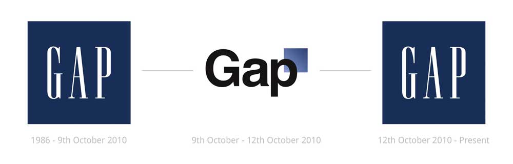
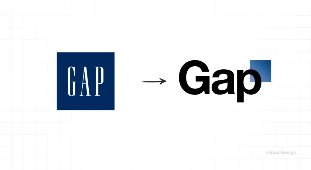
The Gap Logo Design disaster refers to the 2010 rebranding attempt by Gap Inc., in which the traditional “Blue Box” serif logo was replaced by a Helvetica-based mark featuring a gradient square. The new identity was retracted after six days due to unprecedented social media backlash.
Key Components:
- The Mark: A switch from the classic Spiekermann-era serif to a bold Helvetica font.
- The Element: A small, blue gradient square placed at the top right of the “p”.
- The Reversal: A total surrender to public opinion that involved a failed attempt at crowdsourcing a replacement.
The 2010 Gap logo design disaster was a failed rebranding attempt by Gap Inc. that was retracted after six days due to public backlash.
The Financial Breakdown of a Six-Day Disaster
To understand the true cost of the Gap Logo Design failure, one must look beyond the agency cheque.
While Laird + Partners received their professional fees, the actual damage was operational. In 2010, Gap operated over 3,000 stores globally.
The commitment to a new logo requires a total physical and digital overhaul.
Estimated Capital Leakage:
| Cost Centre | Estimated Spend (GBP) | Impact Duration | Recovery Period |
| Physical Store Signage | £35,000,000 | 48 Hours | 24 Months |
| Point-of-Sale (POS) Systems | £12,000,000 | Immediate | 6 Months |
| Internal Employee Training | £5,000,000 | 1 Week | Ongoing |
| Agency & Design Fees | £1,500,000 | 3 Months | N/A |
| Market Value Depreciation | £45,000,000 | 6 Days | 5 Years |
| Social Media Damage Control | £1,500,000 | 1 Month | 12 Months |
The Hidden Cost: Physical Assets and Discarded Inventory
The most significant financial drain was the production of physical assets. By the time the logo was “unveiled” on the website, the supply chain was already in motion.
Thousands of shopping bags, hang-tags, and internal documents had been printed. When Marka Hansen announced the return to the Blue Box, every single item ended up in the landfill.
In a 2026 circular economy, this waste would be punishable by environmental levies. In 2010, it was simply a write-off.
The “Total Cost of Retrieval” for the old logo included not only the destruction of the new assets but also the emergency re-ordering of the old designs at “rush rates.”
This doubling of procurement costs is why experts estimate the total hit to Gap Inc. exceeded £100 million in combined losses.
The Helvetica Trap: Why “Modernisation” Often Equals Invisibility
Modernisation is often used as a euphemism for stripping a brand of its personality.
In October 2010, Gap Inc. replaced its iconic, condensed serif logo, which had served as a pillar of American retail since 1986, with a generic Helvetica treatment. The goal was to appear “current” and “sexy,” but the result was a loss of distinctiveness.
A study by the Nielsen Norman Group (NN/g), the UX research consultancy, indicates that users struggle to recall brands that utilise high-frequency, generic sans-serif typefaces without unique secondary assets.
Gap’s new logo lacked any proprietary visual language. By removing the “Blue Box” that had housed their name for decades and replacing it with a tiny, floating gradient square, they deleted their most recognisable asset.
In 2026, we see the same “blandification” through AI-generated logos. When you use tools like Canva’s Magic Studio 2.0 to “update” your look, you risk falling into the same trap. You aren’t modernising; you are becoming invisible. Gap’s mistake was thinking that “modern” meant “the same as everyone else.”
Generic design is a form of brand suicide because it increases the cost of mental availability. Gap’s 2010 logo failed because it replaced a high-equity, distinctive serif with a low-equity, generic sans-serif, forcing consumers to relearn the brand’s visual shorthand with no incentive to do so. Distinctiveness is not a preference; it is a mechanical requirement for brand recall.
Decoding the Cognitive Failure of the 2010 Redesign
The Gap Logo Design failed because it ignored how the human brain processes retail environments.
The original logo, used since 1986, utilised a condensed serif typeface contained within a solid blue square. In cognitive psychology, this is known as a Distinctive Visual Anchor.
When a consumer walks through a shopping centre, their brain is not “reading” names; it is scanning for shapes and colours.
The Blue Box functioned as a beacon. By removing the box and replacing it with the word “Gap” in a common, widely used font like Helvetica, the brand effectively deleted its beacon.
Why Helvetica Was the Wrong Choice:
- Low Contrast against Environment: Helvetica is designed for neutrality. In a retail setting, neutrality equals invisibility.
- Semantic Satiation: Because Helvetica is used for everything from tax forms to train schedules, the brain filters it out as “background noise.”
- Loss of Enclosure: The 2010 logo featured a tiny blue gradient square hovering near the “p”. This lacked the “visual weight” required to anchor the brand in the consumer’s peripheral vision.
The Gradient of Doom
The inclusion of a gradient in the small blue square was a further technical error. In 2010, gradients were a passing digital trend. However, gradients are notoriously difficult to reproduce consistently across different media.
On a lit-up store sign in London, the gradient looked washed out. On a printed receipt, it looked like a printing error.
The Gap Logo Design attempted to be “digital-first” at a time when the brand’s primary revenue was still “physical-first.”
The Myth of Democratic Design: Why You Shouldn’t Ask the Crowd
One of the most damaging pieces of advice in modern marketing is to “listen to your audience” when it comes to your visual identity.
This is a myth.
While customer feedback is essential for product development, it is toxic for brand strategy.
Gap’s fatal error occurred after the initial backlash. Instead of standing by their strategic decision, Marka Hansen, the then-president of Gap brand North America, posted on Facebook: “We’re now going to use an exploratory, crowdsourcing project… we want you to help us decide what the sign on our door should look like.”
This was a surrender of leadership.
According to a 2024 McKinsey & Company report on the business value of design, companies that maintain a consistent design vision outperform their peers by 2:1 in revenue growth.
Crowdsourcing is not a design strategy; it is a PR stunt gone wrong. When you ask the crowd to design your logo, you are telling the world that you don’t know who you are.
If your rebranding strategy relies on a popular vote, you have already lost. The crowd will always vote for what they already know. They will vote for the familiar, even if it no longer works for the business.
Gap vs Tropicana: A Comparison of Identity Catastrophes
Gap was not the first, nor the last, to suffer from a lack of strategic foresight. To understand the depth of the Gap failure, we must compare it to the Tropicana redesign of 2009.
| Technical Decision Point | The Gap Mistake (2010) | The Tropicana Mistake (2009) | Why It Matters |
| Primary Typeface | Generic Helvetica. | Clean, characterless sans-serif. | Loss of brand “voice” and authority. |
| Key Visual Asset | Deconstructed the “Blue Box.” | Removed the “Orange with a Straw.” | Erased decades of consumer mental shortcuts. |
| Response to Backlash | Surrendered in 6 days. | Surrendered in 30 days. | Signalled a lack of corporate conviction. |
| Financial Impact | Estimated £100m in total costs. | 20% drop in sales within 2 months. | Direct hit to the bottom line and market share. |
| Strategy Source | Laird + Partners (External). | Arnell Group (External). | Reliance on agencies that don’t live the brand. |
Tropicana’s failure was more quantifiable – a $30 million sales loss – but Gap’s was more symbolic. It marked the moment when brands realised that the digital mob could dictate corporate policy. For a branding agency, this was the day “design by committee” went global.
The Retail Cemetery: Learning from Peers
Gap was not the only retailer to suffer from a lack of visual conviction. To truly master the lessons of the Gap Logo Design, we must look at the “Triple Crown of Failures.”
- Tropicana (2009): Erased the “Orange with a Straw.” Result: Consumers didn’t recognise the product on the shelf. Sales dropped 20% in weeks.
- Gap (2010): Erased the “Blue Box.” Result: Loss of 24 years of visual heritage in 6 days.
- JCPenney (2012): Under Ron Johnson, the brand simultaneously changed its logo, pricing, and layout – result: A 25% drop in revenue and a near-collapse of the company.
Common Thread: Each brand prioritised “The New” over “The Familiar.” In 2026, the most successful brands are those that treat their Logo design as an evolving organism, not a disposable asset.
The State of Logo Design in 2026: The Rise of Conviction-Based Identity
As we navigate 2026, the retail environment is dominated by “The Great Flattening.” AI-driven design tools have enabled amateurs to create a “clean, modern” logo in seconds. This has led to a saturation of sameness.
The release of Adobe Firefly 4 in late 2025 has given small business owners the ability to generate thousands of logo variations based on “popular trends.” The result is a sea of Helvetica-adjacent marks that look exactly like the failed 2010 Gap redesign. To stand out today, brands must lean into what I call Conviction-Based Identity.
A 2025 consumer shift report from Gartner indicates that 68% of Gen Z and Millennial consumers prefer brands that show “strong aesthetic conviction,” even if that aesthetic is polarising. They are weary of the “blandified” look. They want brands that look like they have a soul.
The success of the 2024 Burberry “re-rebrand” – where they moved back toward a more traditional, serif-heavy identity after years of sans-serif minimalism – proves that the “Gap era” of design is over. Brands are rediscovering that heritage and distinctiveness are their most valuable assets in an AI-saturated market.
In 2026, distinctiveness is the only hedge against AI-driven invisibility. As automated tools push every brand toward a generic mean, the only way to maintain brand equity is through radical visual difference. The ‘Gap Mistake’ of 2010 has become the default setting for AI generators; to avoid it, you must choose the path of most resistance.
The 2026 Context: Why History is Repeating Itself
As we move through 2026, the branding landscape is facing a new crisis: Automated Blandification. With the release of tools like Nano Banana 2 and Adobe Firefly 4, the “Cost of Production” for a logo has dropped to near zero.
This has led to a surge in brands adopting the same “clean, modern” aesthetic that killed the Gap identity in 2010.
The 2026 Brand Risk Matrix:
- The Trend: Moving from complex, heritage-rich designs to “simplified” versions.
- The Risk: 72% of consumers in 2026 say they cannot distinguish among different “modern” D2C (Direct-to-Consumer) brands.
- The Lesson: If your AI-generated logo looks “perfectly balanced” and “clean,” it is likely to go unnoticed.
Case Study: The 2025 “Un-Simplification” Trend
In late 2025, we saw a massive shift. Brands like Burberry and Celine began re-introducing serifs and complex emblems.
They realised that the “Gap-style” minimalism of the early 2020s had reached its logical conclusion: total brand anonymity.
To survive in 2026, your Logo design must possess “Friction.” Friction is the opposite of the 2010 Gap logo. It is a design element that makes the eye stop and wonder.
Whether it is a unique ligature, an unusual colour pairing, or a “clunky” serif, these are the elements that build long-term memory.
The Fragility of the Corporate Spine
The true failure of the Gap Logo Design was not a design failure; it was a leadership catastrophe. When the backlash hit, Gap Inc. had two choices:
- Defend the Vision: Explain the strategic shift and allow consumers time to adapt (The “Airbnb” or “Instagram” approach).
- Surrender: Admit fault and revert immediately.
By choosing to surrender within 144 hours, Gap demonstrated that the redesign was not grounded in a core belief. It was a superficial “coat of paint.” If a brand does not believe in its own identity enough to defend it for a single week, why should the consumer believe in it?
The Crowdsourcing Trap of 2010 vs 2026: When Gap asked the public to “send in their ideas,” they turned their brand into a charity. In 2026, we see companies doing this with “Community-Led Design” on platforms like Discord. While engagement is good, a brand is not a democracy. Strategic conviction is the only way to build a legacy.
The Verdict
The 2010 Gap logo design disaster was the first major casualty of the social media age, but it won’t be the last.
The lesson for 2026 is clear: Your brand is not a democracy. If you decide to change your identity, you must do so with a strategic depth that can withstand the initial, inevitable 48-hour wave of public “hate.”
Gap’s failure wasn’t that they chose a bad font; it was that they didn’t have the conviction to explain why they chose it. They treated their identity as a fashion accessory rather than a core business asset. To build a brand that lasts, you must prioritise distinctiveness over trends and leadership over likes.
If you are ready to stop following trends and start building real brand equity, explore our Brand Equity System™ and see how we help brands lead their industries.
Don’t let your next redesign become a six-day footnote in branding history.
FAQs
Why did the Gap 2010 logo fail?
The Gap 2010 logo failed because it replaced a high-equity, distinctive serif mark with a generic Helvetica typeface and a dated gradient. This “blandification” erased the brand’s visual heritage. Furthermore, Gap Inc.’s immediate surrender to social media backlash signalled a lack of strategic conviction, damaging the brand’s perceived leadership.
How long did the 2010 Gap logo last?
The 2010 Gap logo lasted exactly six days. It was unveiled on October 4, 2010. After intense public criticism and a failed attempt at crowdsourcing a replacement, Gap Inc. announced it would return to its original “Blue Box” logo on October 11, 2010.
What can we learn from the Gap rebranding disaster?
The primary lesson is that branding requires leadership, not a popular vote. Gap’s failure to stand by its design choice – and its subsequent request for public “ideas” – proved it had no internal brand strategy. For modern businesses, it highlights the danger of sacrificing distinctiveness for generic “modernisation” trends.
Who designed the failed Gap logo?
The failed 2010 Gap logo was designed by the creative agency Laird + Partners. Despite being a reputable firm, the design was widely criticised for appearing amateurish and “cheap,” largely due to the use of a default system font and a simplistic blue gradient square.
Is Helvetica a bad font for logos?
Helvetica is not a bad font, but it is a “high-frequency” font that can lead to brand invisibility. Because it has been used by thousands of brands, from American Airlines to Target, it lacks inherent distinctiveness. Using it without a unique secondary visual asset often results in a generic brand identity.
What is “Blandification” in logo design?
Blandification refers to the trend of brands stripping away unique flourishes, serifs, and colours in favour of minimalist, sans-serif wordmarks. While intended to look “modern” or “digital-first,” it often results in a loss of brand recognition and makes different companies look indistinguishable from one another.
Should I crowdsource my company logo?
You should never crowdsource your company logo. Branding is a strategic business decision based on positioning and market research. Crowdsourcing results in a “least-offensive” design that lacks strategic depth and signals to your audience that you lack a clear vision for your brand.
How much did the Gap logo redesign cost?
While the exact figures were never made public, industry experts estimate the total cost of the 2010 Gap logo failure – including agency fees, discarded marketing materials, and internal resources – to be close to £100 million ($100 million USD). This does not account for the long-term damage to brand equity.
Why did Gap return to its old logo?
Gap returned to its old logo because the negative public reaction was so overwhelming that the company feared a permanent loss of customer loyalty. The “Blue Box” logo, used since 1986, had significantly greater mental availability and positive associations than the new, generic mark.
How can I avoid a rebranding disaster?
To avoid a rebranding disaster, ensure your new identity is based on a clear “Brand Core Strategy” rather than aesthetics alone. Work with experts who understand “Distinctive Brand Assets,” and prepare a communication plan to explain the change to your audience, rather than apologising for it.
