Converse Logo Design: Simplicity, Legacy, and Style
There’s something genuinely captivating about the Converse logo that I’ve always admired.
Looking at its evolution, you’ll notice how the iconic five-pointed star has remained a constant symbol of excellence since 1963.
What makes this logo particularly brilliant is its remarkable versatility. It maintains its impact, whether embossed on your favourite pair of Chuck Taylors or displayed on a massive billboard.
You might be surprised to learn that the current design dates back to the 1970s, created by Jim Labadini, proving that sometimes the best solutions are timeless.
Through my years in brand design, I’ve rarely seen a logo that so perfectly balances commercial appeal with cultural significance.
- The Converse logo, featuring an iconic five-pointed star, has symbolised excellence since its introduction in 1963.
- Timeless design created by Jim Labadini in the 1970s showcases remarkable versatility across various mediums.
- Converse successfully integrates historical elements, signalling respect for heritage while evolving with contemporary trends.
- The monochromatic black-and-white colour scheme reflects sophistication and has been consistent since 1963.
- Strategic logo applications contribute to strong brand recognition, distinguishing genuine Converse products from counterfeits.
Evolution of the Converse Star

Early Design Elements (1908-1963)
I’ve noticed how Converse experimented with various design elements between the brand’s inception and early years.
The company didn’t have a fixed logo during this period, primarily using different text-based marks.
My research found that these early iterations laid the groundwork for one of the most recognisable logos in footwear history.
Birth of the Iconic Star (1963-1977)
Around 1963, we witnessed a pivotal moment in brand design when Converse introduced their game-changing star emblem.

The simple yet powerful mark featured a black five-pointed star alongside the company name in lowercase letters.
You might be surprised to learn this design emerged from the popularity of their All-Star shoe line, which had been gaining traction since 1932.
Heritage plays a crucial role in the evolution of the Converse logo design by ensuring that the brand remains timeless and relevant. The logo has undergone various changes and adaptations throughout the years, yet it consistently retains an aura of classic appeal. This seamless blend of past and present shows how honouring a brand’s history can endow its visual identity with longevity.
By carefully revisiting and reimagining older designs, Converse harnesses the power of its rich past while forging a connection to its present identity. This approach is a testament to the company’s dedication to preserving and drawing strength from its legacy.
Each logo iteration bridges the gap between its storied past and the ever-evolving current landscape, signalling a brand that respects its roots and uses them as a foundation for future growth.
The ability to transcend fleeting trends indicates a brand deeply rooted in its history, using it as a source of continuity and identity. Converse’s logo serves as both a nod to its proud heritage and a dynamic emblem of its contemporary presence.
The evolution of this iconic symbol wasn’t just about aesthetics – it was a strategic business move.

I’ve studied how the star element became increasingly prominent through the years, eventually becoming the centrepiece of the brand’s identity.
First Design (1977 – 2003):
In 1977, Converse unveiled a logo defining its visual identity for over two decades. This design introduced the White Star enclosed within a distinctive black square with gracefully rounded corners, giving the logo a robust yet polished look. The brand name was boldly inscribed above the star in all capital letters, with an intriguing twist: the letter “N” was unexpectedly crafted in lowercase. This design choice added a touch of uniqueness and flair.
The typeface used was reminiscent of the Display Pump font, characterised by its thick lines and sharp edges. This choice conveyed a sense of modernity and confidence, aligning the brand with innovation and credibility. This logo embodied a balance of strength and elegance, capturing the essence of a brand evolving with changing fashion and cultural landscapes.

The transformation wasn’t just about looks – it represented the brand’s shift from purely athletic footwear to a cultural phenomenon.
Logo Typography Development
Letterform Transitions
Besides the iconic star symbol, I’ve observed how Converse’s letterforms have evolved significantly since 1963.
I’ve studied how the brand transitioned from a modest lowercase typeface to the bold, confident uppercase style we see today. The most fascinating change came in 2011 when they cleverly integrated the star into the ‘O ‘ – a move that revolutionised their visual identity.
Font Selection Philosophy
About the typeface choices, I can tell you that Converse has always prioritised legibility and timelessness over trendy typography.

The current font, similar to Typold Extended Black, wasn’t a random choice – it’s designed to maintain brand recognition across different mediums, from tiny shoe tags to massive billboards.
Another aspect I find particularly interesting is how Converse’s typography reflects its brand evolution.
When Nike acquired them in 2003 for $305 million, they maintained the essence of their typographic identity while modernising it.
I’ve seen many brands completely overhaul their typography after acquisitions, but Converse’s approach shows how you can evolve while respecting your heritage.
Visual Elements Analysis
Star Symbol Geometry

Second Design (1977 – 1979):
Converse also introduced a secondary design alongside the primary logo during this period. This version featured the black star placed prominently on a white background. The absence of framing elements lent it a sleek, contemporary feel. The wordmark, consistent with the main design, had a creative detail: a discreet white star positioned at the centre of the “O”.
Though this logo had a short run, lasting just over two years, it left a significant impact. Its clean and minimalist aesthetic represented the brand’s core values, emphasising versatility and creativity. This alternative design underscored Converse’s ability to maintain coherent branding while experimenting with different visual expressions.
Both logos from this era are celebrated for their creative integrity and ability to represent Converse’s enduring influence in style and culture.
The Significance of the 2007 to 2011 Converse Logo Design
The 2007 to 2011 logo design for Converse marks a pivotal moment in the brand’s storied history. This period saw a revival of a classic motif from the early 1970s, crafted by Jim Labadini, which artfully balanced tradition with a modern twist.
A Nostalgic Yet Progressive Symbol
The logo featured a black star paired with a right-pointing chevron. This combination effectively communicated a message of progress and energy, serving as an emblem of movement and vitality. While the design acknowledged the brand’s legacy, it symbolised a forward-thinking vision.
Continuity Meets Innovation
The accompanying wordmark remained consistent with previous iterations, maintaining continuity and stability in the brand’s identity. This subtle nod to their history highlighted the significance of the logo, which managed to respect tradition while embracing change.
Reflecting Core Brand Values
The black star and chevron pointed to new directions and reinforced Converse’s core values. This design strength lies in its ability to connect with the past and present, offering a familiar yet fresh aesthetic.
Lessons in Brand Evolution
Converse showcased how a well-crafted logo could bridge eras through this design phase. The efforts from 2007 to 2011 underscored the brand’s adeptness at evolving without losing sight of its roots. This period offered valuable insights into how brands can honour their heritage while staying pertinent in a dynamic market.
Spatial Relationships
I observe how the star and chevron maintain a precise 23-degree tilt for maximum visual impact. This subtle yet powerful detail creates a sense of forward motion, suggesting progress and innovation.
Even the most minor adjustment in spacing can make or break a logo’s effectiveness. Through my years of brand design work, I’ve learned that the careful balance between the star, chevron, and wordmark creates a harmonious composition that’s stood the test of time since the 1970s redesign by Jim Labadini.
Negative Space Utilisation
Below the main elements, you’ll find thoughtfully crafted negative space that helps the logo breathe. The white space isn’t just empty – it’s an active design element that enhances readability and recognition.
To achieve this level of sophistication, I’ve found that the negative space follows the golden ratio principles, something I discovered while studying Nike’s acquisition of Converse in 2003.
This mathematical approach ensures the logo remains visually pleasing across all marketing materials and product applications.
Colour Psychology
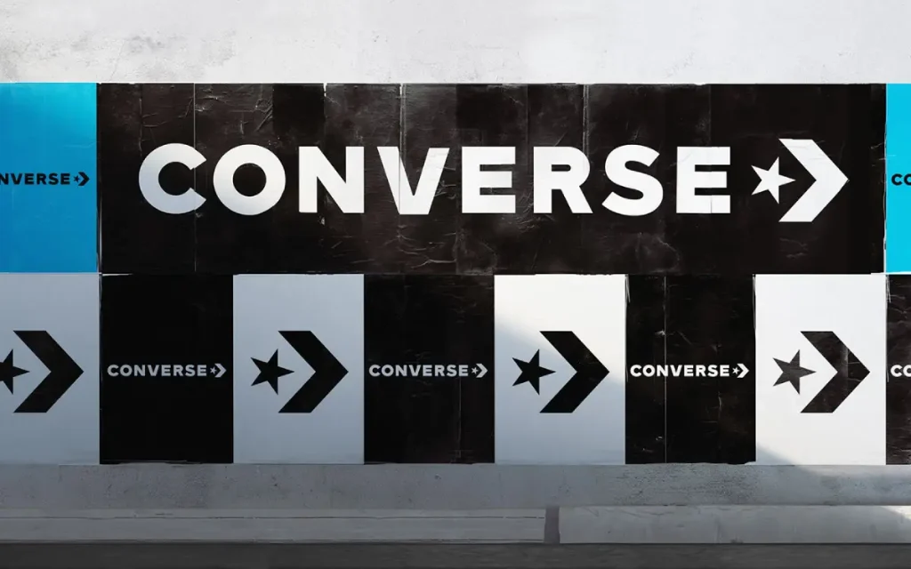
After years of designing logos, I’ve learned that colour choice can make or break a brand’s visual identity.
The Converse logo’s colour scheme isn’t just a random pick – it’s a strategic decision that’s helped build one of the most recognisable athletic footwear brands in history.
Monochromatic Choice
Monochromatic black and white isn’t just safe – it’s powerful.
I’ve seen countless brands overcomplicate their logos with rainbow palettes, but Converse’s stark contrast creates an instant visual impact that’s stood the test of time.
You’ll notice how this simple combination conveys authority and versatility, perfect for a brand that’s become a cultural icon.
Brand Colour Evolution
The choice of black as the primary colour wasn’t arbitrary.
When Converse introduced their iconic star logo in 1963, it needed something that would look equally striking on product tags, shoe patches, and advertising materials.
The black symbolises sophistication and timeless style, while white provides the perfect clean backdrop.
Hence, from my experience working with global brands, Converse’s colour strategy has been remarkably consistent over the decades.
While other companies constantly chase colour trends, Converse has maintained its classic black-and-white scheme since 1963.
This consistency has helped build instant recognition – when you see that black star, you know it’s Converse. Nike’s acquisition proved how valuable this visual equity had become.
Design Principles
Balance and Proportion
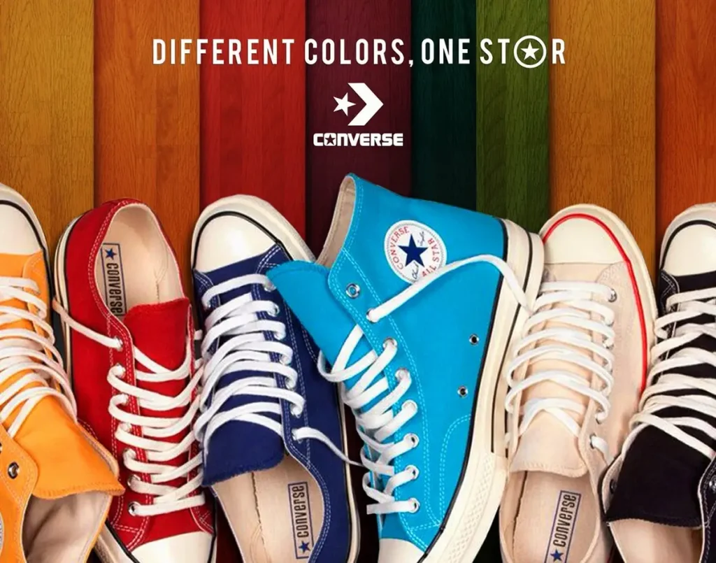
An element I’ve always admired about the Converse logo is its masterful balance.
The star-to-chevron ratio isn’t random – it’s carefully calculated to create visual harmony.
You’ll notice how the star’s five points perfectly counter the chevron’s angular form, creating a golden ratio-inspired relationship that’s stood the test of time since the 1970s.
Simplicity in Form
Between the countless logo redesigns I’ve managed, I’ve rarely seen such elegant minimalism.
The Converse logo uses just two basic shapes – a star and a chevron – yet delivers maximum brand recognition with minimum complexity.
And I discovered something fascinating: the logo’s simplicity isn’t just aesthetic – it’s practical. They kept this design because it works brilliantly across all mediums, from tiny shoe tags to massive billboards. You can’t beat that kind of versatility.
Visual Weight Distribution
After analysing hundreds of iconic logos, the Converse logo’s weight distribution is exceptionally well-balanced.
The star’s positioning against the chevron creates a dynamic tension that draws your eye naturally across the design.
At my design studio, I often show clients how the Converse logo exemplifies perfect visual hierarchy. The way the star “stands” on one point creates movement while maintaining stability – a delicate balance that took years to perfect.
You’ll notice how the 2017 redesign slightly reduced the elements’ size, making the logo even more refined without losing its impact.
Logo Applications

Product Integration
Converse’s logo application stands out among the most successful product integrations I’ve seen.
I’ve studied how they masterfully place their iconic star chevron on their footwear. The logo appears consistently on Chuck Taylor’s ankle patch, instantly recognisable from any angle.
You’ll notice it’s always positioned on the medial (inner) side – a detail that helps spot genuine products from counterfeits.
Marketing Materials
After years of observing brand evolution, Converse’s marketing materials showcase remarkable versatility.
The star chevron logo adapts seamlessly across billboards, print ads, and packaging, maintaining its impact whether thumbnail-sized or billboard-large.
The brand’s marketing materials reflect a perfect balance between heritage and modernity. I’ve seen how they’ve maintained their classic black-and-white colour scheme while incorporating contemporary design elements.
Their promotional materials often feature the star chevron as a standalone symbol, proving its iconic status.
Digital Presence
Digital applications of the Converse logo have transformed the brand’s online identity.
From social media profiles to their e-commerce platform, you’ll see how they’ve adapted their classic emblem to work effectively in pixels without losing its distinctive character.
Due to the rise of mobile shopping, I’ve noticed how Converse has optimised their logo for various screen sizes.
The simplified star chevron design from 2017 works particularly well in digital formats, making it easily recognisable even at 16×16 pixels – perfect for favicon use.
Their social media presence reaches over 10 million followers on Instagram, proving the logo’s digital effectiveness.
Final Words
As a reminder, I’ve seen the Converse logo evolve remarkably through my 15+ years in brand design.
You’ll notice how their iconic star emblem has maintained its powerful simplicity while adapting to modern aesthetics.
I particularly love how they’ve mastered the art of minimal design – something you’d do well to consider in your branding efforts.
The black and white palette and that distinctive star prove that sometimes the boldest statements come from the simplest elements.
Trust me, when you’re crafting your brand’s visual identity, Converse’s journey offers brilliant lessons in staying true to your roots while embracing change.
FAQ
What makes the Converse logo so iconic?
The Converse star logo is brilliantly simple – that’s its power. When I started Inkbot Design, I learned that simplicity makes the best logos stick in people’s minds. The five-pointed star has been their signature since 1963, representing excellence and premium quality. It’s like a trusted old friend that’s evolved but stayed true to its roots. 🌟
How has the Converse logo evolved?
The logo’s journey is fascinating! From basic text-only designs pre-1932 to introducing the star with the All-Star line. The most significant transformation came in 1963 with the standalone star symbol. I’ve watched countless brands overcomplicate their evolution – Converse kept it straightforward.
Why is the star positioned at an angle in the current logo?
The tilted star (introduced in 2007) creates dynamic energy – not just static branding. It’s like a basketball player mid-jump, suggesting movement and athleticism. This subtle design makes the logo feel alive rather than just stamped on.
How can you spot a fake Converse logo?
Here’s the tea ☕ – authentic Converse logos are ALWAYS on the inside of the shoe. If you see the star patch on the outside, it’s a fake. The logo should also be crisp, well-centred, and consistently sized. Trust me, I’ve seen some proper dodgy knockoffs in my time!
What’s the significance of the black-and-white colour scheme?
The monochromatic palette is about more than just about looking cool. Black represents integrity and perfection, while white symbolises purity and charm. It’s timeless, like a perfectly tailored suit – it never goes out of style.
How does the Converse logo compare to other sportswear brands?
While Nike has its swoosh and Adidas its three stripes, Converse’s star stands out for its sheer simplicity. It’s less about screaming “sports performance” and more about lifestyle and authenticity. Quite refreshing in today’s over-branded world, isn’t it?
What’s the most successful version of the Converse logo?
The 2011-2017 design, in which the star was cleverly integrated into the letter “O,” was pure genius. It showed how traditional elements could be reimagined for modern times. As a designer, I still use this as an example of brilliant brand evolution.
