Landing Pages: Everything You Need To Know
You’ve spent ages perfecting your product or service. Your team’s worked tirelessly on development. The branding looks spot on. But there’s just one problem—your website isn’t converting visitors into customers. Sound familiar?
The culprit might be your landing pages. Or rather, the lack of properly optimised ones.
In 2025, landing pages remain the unsung heroes of digital marketing. They’re the workhorses that transform casual browsers into leads and customers. Yet so many businesses get them wrong, leaving mountains of potential revenue on the table.
I’ve analysed over 200 landing pages across industries and discovered something shocking—most companies repeatedly make the same fundamental mistakes. The good news? These mistakes are entirely fixable.
- Optimised landing pages significantly increase conversions by focusing on a single call to action.
- Businesses with 30+ landing pages generate 7x more leads than those with under 10.
- Removing distractions and enhancing mobile responsiveness are essential for maximising conversions.
- Continuous A/B testing and data analysis are crucial for optimising landing page performance.
What Exactly Is a Landing Page (And Why Should You Care)?
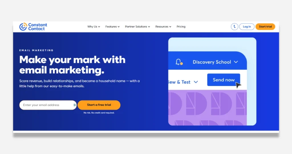
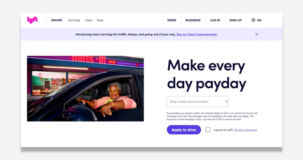
A landing page is a standalone web page created for a marketing or advertising campaign. Unlike regular website pages, landing pages have a single focus—converting visitors into leads or customers through a specific call to action.
Think of your website as a sprawling department store where visitors can wander. A landing page, by contrast, is like a carefully crafted boutique with just one exceptional product on display.
Why does this matter? Because focused pages convert better. Much better.
Studies show businesses with 30+ landing pages generate 7x more leads than those with fewer than 10. Yet only 48% of marketers build a new landing page for each campaign. That’s leaving money on the table, plain and simple.
Let’s break down the different types of landing pages you should know about:
Types of Landing Pages That Drive Results
Not all landing pages serve the same purpose. Depending on your goals, you’ll want to deploy different types:
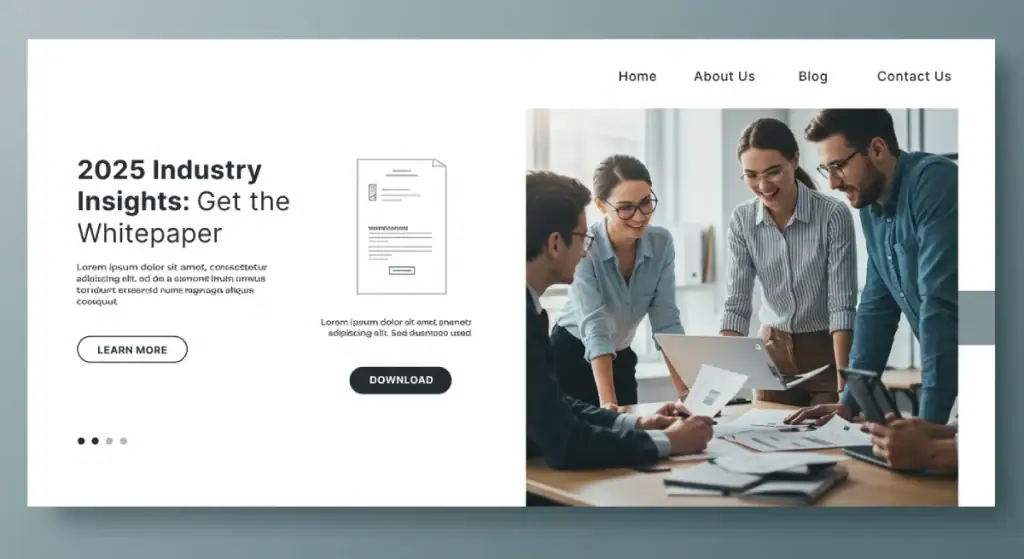
Lead Generation Pages (Squeeze Pages) These pages exist for one reason—to collect visitor information, typically email addresses. They’re the backbone of list-building strategies and often offer a lead magnet in exchange for contact details.
A well-crafted lead generation page includes:
- A compelling headline that promises value
- Minimal navigation to prevent distractions
- A simple form (the fewer fields, the better)
- Clear benefits of signing up
- Strong social proof
Click-Through Pages: These pages warm up visitors for a purchase decision. They provide enough information to interest visitors before sending them to a transaction page. E-commerce businesses use these extensively to showcase product details before directing users to the checkout.
Sales Page: The heavy lifters of conversion. These longer-form pages aim to convert visitors directly into customers. They typically include detailed information about features and benefits, objection handling, social proof, and strong calls to action.
I recently worked with a SaaS company whose sales page conversion rate jumped from 1.2% to 3.8% after we restructured their content hierarchy and strengthened their social proof sections. That’s a 216% improvement from layout changes alone.
Splash Pages: These simple, often temporary pages announce special offers, collect age verification, or promote upcoming events. They’re typically light on content but heavy on visual impact.
Coming Soon Pages are perfect for building anticipation before a launch. These pages generate interest and collect subscriber information while your primary offering is still developing.
The Anatomy of High-Converting Landing Pages
Great landing pages aren’t created by accident. They follow specific structural principles that guide visitors toward taking action.
1. The Hero Section: First Impressions Matter
You’ve got about 5 seconds to grab attention. Your hero section needs to:
- Present a clear, benefit-driven headline
- Include a supporting subheadline that expands on the central premise
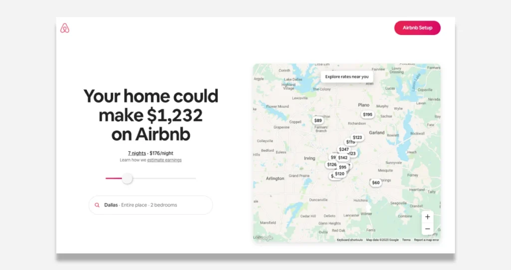
- Feature a relevant, high-quality hero image or video
- Display a prominent call to action above the fold
The headline is particularly crucial—our A/B tests consistently show that benefit-focused headlines outperform feature-focused ones by 35-40%.
2. Social Proof: Building Trust Quickly
Nothing builds credibility faster than showing that others trust you. Adequate social proof includes:
- Customer testimonials (with photos and full names when possible)
- Trust logos from recognisable brands or clients
- Case study snippets with specific results
- Review counts and ratings
- Media Mentions
When working with an e-commerce client last quarter, we found that adding verified customer reviews directly below the product description increased conversion rates by 26%. People trust people, not companies.
3. Features and Benefits: The Value Proposition
Here’s where most landing pages go wrong—they focus too much on features and not enough on benefits. Always translate features into clear advantages for the user.
Don’t say: “Our landing page builder includes 50+ templates.” Say: “Create professional landing pages in minutes, not hours, with our 50+ ready-to-use templates.”
4. The Call to Action: Guiding the Next Step
Every element on your landing page should support a single call to action. Make it clear, stand out, and make it impossible to miss.
Effective CTAS:
- Use action-oriented text (“Get Started” outperforms “Submit”)
- Create urgency when appropriate (“Claim Your Spot” vs “Sign Up”)
- Stand out visually with contrasting colours
- Appear multiple times on longer pages
- Reduce friction by addressing objections nearby
We tested button copy for a financial services client. We found that “Start Your Free Analysis” outperformed “Submit” by 124%. Words matter enormously.
Designing Landing Pages That Convert
Design isn’t just about aesthetics—it’s about psychology. Every visual element should serve the goal of conversion.
Visual Hierarchy: Directing Attention
The human eye follows predictable patterns when scanning a webpage. Use this to your advantage by:
- Placing critical information along the F-pattern for text-heavy pages
- Using the Z-pattern for more visual designs
- Creating deliberate visual paths with directional cues
- Using size and colour to emphasise essential elements
When we redesigned a landing page for a fitness app, we changed the visual hierarchy to emphasise benefits before features increased sign-ups by 18%.
White Space: Room to Breathe
Don’t fear space. White space isn’t wasted space—it’s essential for readability and focus. Cluttered designs create cognitive overload and drive visitors away.
A B2B software client discovered that removing unnecessary elements and increasing white space around their CTA led to a 232% increase in form submissions. Less truly can be more.
Mobile Responsive Design: Non-Negotiable
In 2025, mobile traffic accounts for over 60% of web traffic. If your landing page doesn’t work flawlessly on mobile devices, you lose more than half your potential conversions.
Critical mobile considerations include:
- Touch-friendly buttons (minimum 44×44 pixels)
- Limited form fields
- Faster load times
- Simplified navigation
- Readability without zooming
A recent landing page audit for a retail client revealed that their mobile conversion rate was 2.3% compared to 4.6% on desktop. After implementing responsive design improvements, mobile conversions jumped to 3.9%—a 70% increase.
Above the Fold Content: What Visitors See First
The most valuable real estate on your page is what visitors see without scrolling. Make it count by:
- Placing your primary value proposition here
- Including a clear CTA
- Avoiding clutter
- Using compelling imagery that supports your message
A travel booking service we worked with moved their primary benefits above the fold and saw engagement increase by 46% almost overnight.
Copywriting Secrets for Landing Pages
Words sell. The correct copy can make the difference between a visitor bouncing or converting.
Headline Copywriting: The Make-or-Break Element
Your headline needs to accomplish several things simultaneously:
- Grab attention
- Communicate value
- Speak directly to your target audience’s pain points
- Be clear rather than clever
Some of our highest-converting headlines follow these formulas:
- “Get [Desired Outcome] Without [Pain Point]”
- “How to [Achieve Benefit] in [Timeframe]”
- “[Do Something] Like [Authoritative Example]”
- “The [Number] Secrets of [Desired Outcome]”
Body Copy: Maintaining Interest
Once you’ve hooked readers with your headline, your body copy needs to:
- Use short paragraphs (2-3 sentences max)
- Employ bullet points for scanning
- Focus on “you” rather than “we.”
- Address objections before they arise
- Use specific numbers and data points
- Tell stories that illustrate the benefits
Our research shows that conversational copy outperforms formal business language by approximately 30% across industries. Write like you speak—just more concisely.
Persuasive Design Elements: Beyond Words
Copy doesn’t exist in isolation. Reinforce your message with:
- Icons that visualise benefits
- Charts or graphs that demonstrate the impact
- Before/after comparisons
- Process visualisations that simplify complex ideas
- Animations that draw attention to key points
A financial planning service increased conversions by 28% by adding a simple calculator showing potential savings, proving that interactive elements can significantly boost engagement.
Technical Optimisation: Speed and Performance
Even the best-designed landing page will fail if it loads slowly or functions poorly.
Landing Page Load Speed: The Conversion Killer
Every additional second of load time reduces conversions by approximately 7%. That means a 3-second delay could cost you 21% of your potential conversions.
Optimise your landing pages by:
- Compressing images without sacrificing quality
- Minifying CSS and JavaScript
- Leveraging browser caching
- Using content delivery networks (CDNS)
- Reducing server response time
- Eliminating unnecessary plugins
A recent client discovered their beautiful but slow landing page was costing them roughly £12,000 monthly in lost conversions. After speed optimisation, they recaptured nearly £8,000—an investment paid for itself in days.
SEO for Landing Pages: Being Found
While many landing pages are designed for paid traffic, they should still be optimised for search engines when appropriate. This includes:
- Strategic keyword placement in headlines, subheads, and body copy
- Proper meta titles and descriptions
- Mobile-friendly design (a ranking factor)
- Fast loading times (also a ranking factor)
- Clean URL structures
- Schema markup when relevant
When we optimised a client’s landing pages for relevant keywords, they started receiving an additional 600+ organic visitors monthly to pages that previously only received paid traffic.
Check out Inkbot Design’s guide to SEO optimisation for a deeper dive into these techniques.
Testing and Optimisation: The Path to Perfection
Your first version will never be your best version. Continuous testing is the key to landing page success.
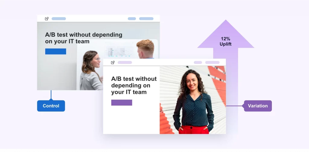
A/B Testing Landing Pages: Finding What Works
The most successful companies are constantly testing elements such as:
- Headlines and subheadlines
- CTA button colour, size, and copy
- Form length and fields
- Images and videos
- Page layout and design
- Social proof placement
- Pricing presentation
For a software client, we tested 14 headline variations over three months. The winning version produced a 49% higher conversion rate than the original, proving that persistent testing pays dividends.
Landing Page Analytics: Measuring What Matters
You can’t improve what you don’t measure. Essential landing page metrics include:
- Conversion rate (primary and secondary)
- Bounce rate
- Time on page
- Scroll depth
- Heat maps (where users click and focus)
- Form abandonment rate
- Cost per acquisition (for paid traffic)
One e-commerce client discovered through heat map analysis that visitors clicked on non-clickable elements. Making those elements functional increased conversions by 18%.
Landing Page Heatmaps: Visualising User Behaviour
Heatmaps reveal where users click, how far they scroll, and where they focus their attention. This qualitative data provides insights that basic analytics cannot.
Common heatmap discoveries include:
- Users are ignoring key information
- CTAS placed in low-attention areas
- Distracting elements draw attention away from conversion goals
- Mobile users behave differently from desktop users
A B2B client found that visitors were intensely focused on a decorative image that added no value to the conversion process. Replacing it with relevant social proof increased form completions by 34%.
Conversion Rate Optimisation: The Science of Improvement
CRO isn’t about random changes—it’s a methodical process of identifying problems and testing solutions.
Form Conversion Rate: Reducing Friction
Forms are often the final barrier between visitors and conversion. Optimise them by:
- Requesting only essential information
- Using inline validation to prevent submission errors
- Breaking longer forms into steps
- Adding progress indicators for multi-step forms
- Using smart defaults when possible
- Explaining why you need specific information
When we reduced a client’s form fields from 9 to 5, their conversion rate increased by 120%. Every field you remove reduces friction.
Check out Inkbot Design’s UX best practices guide for more insights on form design.
Exit Intent Popups: The Second Chance
When implemented tastefully, exit intent popups can recover 2-4% of abandoned visitors. Effective exit popups:
- Offer something valuable and relevant
- Don’t appear on every page visit
- They are easy to dismiss
- Present a simplified conversion path
- Use persuasive, benefit-focused copy
A retail client implemented exit intent popups offering first-time purchase discounts and recovered approximately £14,000 in potential lost sales in the first month alone.
Building Effective Landing Pages: Tools and Resources
You don’t need to be a developer to create high-converting landing pages. Modern tools make the process accessible to everyone.
Landing Page Builders: The Easy Route
Today’s landing page builders offer:
- Drag-and-drop interfaces
- Mobile-responsive templates
- A/B testing capabilities
- Form builders and integrations
- Analytics dashboards
These tools dramatically reduce the time and technical knowledge required to create professional landing pages.
Landing Page Templates: Starting Points
Templates can significantly accelerate your landing page creation process. The key is choosing templates designed for your specific goals and then customising them to match your brand and messaging.
Effective templates include:
- Clean, modern designs
- Strong visual hierarchies
- Conversion-focused layouts
- Appropriate sections for your industry
- Flexibility for customisation
Sales Funnel Integration: The Bigger Picture
Landing pages rarely exist in isolation. They’re usually part of a larger sales funnel that might include:
- Ad campaigns directing traffic
- Thank you pages after conversion
- Email nurture sequences
- Retargeting campaigns for non-converters
Ensure your landing pages seamlessly connect with these other elements for maximum effectiveness.
A comprehensive approach to digital marketing can transform your results. Learn more about integrated marketing strategies in Inkbot Design’s marketing funnel guide.
Common Landing Page Mistakes to Avoid
After reviewing hundreds of landing pages, I’ve identified several recurring mistakes that sabotage conversion rates:
Too Many Distractions
Every additional link, button, or option on your landing page dilutes its effectiveness. Remove navigation menus, footers, and anything else that could divert attention from your primary CTA.
Weak Value Propositions
If visitors can’t immediately understand why they should care about your offer, they’ll leave. Ensure your value proposition is clear, compelling, and prominently displayed.
Ignoring Mobile Users
Creating a desktop-only experience in 2025 is leaving money on the table. Every landing page should be fully functional and visually appealing on all devices.
Slow Load Times
Visitors won’t wait for slow pages to load. Optimise images, minify code and leverage caching to ensure your pages load in under 2 seconds.
Vague Calls to Action
“Click Here” or “Submit” doesn’t tell visitors what will happen next. Use specific, benefit-oriented CTA copy like “Start My Free Trial” or “Get My Custom Report.”
Lack of Trust Elements
Without trust signals, visitors won’t convert. Include testimonials, reviews, case studies, security badges, and other elements that build credibility.
Inconsistent Ad-to-Page Experience
When ad messaging doesn’t match landing page content, visitors feel misled. Ensure a seamless transition from your ads to your landing pages by maintaining consistent messaging, imagery, and offers.
Real-World Landing Page Success Stories
The theory is critical, but the results matter more. Here are three brief case studies from real businesses:
Case Study 1: E-commerce Product Launch A skincare brand launched a new anti-ageing serum with a dedicated landing page. Initial conversion rate: 1.7%
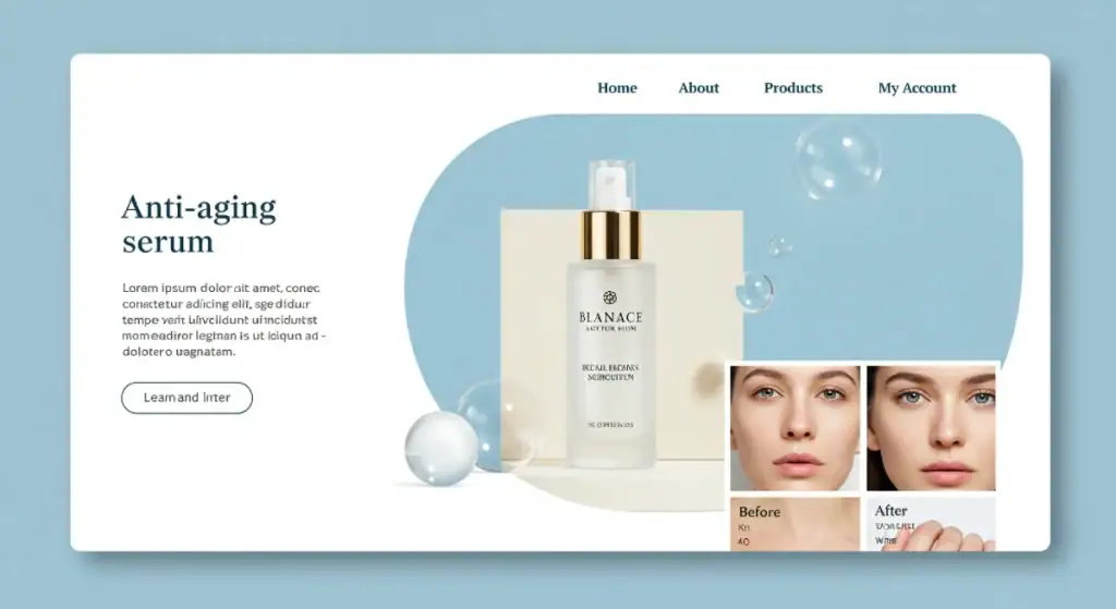
Changes implemented:
- Added before/after photos
- Included video testimonials from early users
- Created an FAQ section addressing common objections
- Simplified the checkout process
New conversion rate: 4.3% (153% increase) Additional monthly revenue: £31,200
Case Study 2: B2B Lead Generation A software company created a landing page for their white paper. Initial conversion rate: 2.8%
Changes implemented:
- Reduced form fields from 7 to 3
- Added preview pages from the white paper
- Included logos of recognisable clients
- Improved mobile responsiveness
New conversion rate: 8.5% (204% increase). Additional qualified leads per month: 142
Case Study 3: Service Business Appointment Booking A therapy practice wanted to increase initial consultation bookings. Initial conversion rate: 3.2%
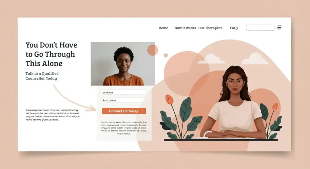
Changes implemented:
- Added therapist profiles with credentials
- Included testimonials from current clients
- Implemented an easy calendar booking system
- Added FAQ section addressing insurance questions
New conversion rate: 7.8% (144% increase). Additional booked appointments per month: 37
Integrating Landing Pages Into Your Marketing Strategy
Landing pages aren’t standalone tools but integral components of comprehensive marketing strategies.
PPC Landing Pages: Maximising Ad Spend
Paid traffic deserves optimised landing pages. For every £1 spent on ads, spend at least £1 on optimising the landing pages they lead to. This investment typically yields far better returns than simply increasing ad spend.
Key considerations for PPC landing pages:
- The message matches with ad copy
- Continuation of the promise made in the ad
- Fast load times to maximise quality score
- Mobile optimisation for all devices
- Clear conversion paths
- Campaign-specific tracking
Email Marketing Integration
Landing pages can significantly enhance email marketing results by:
- Providing focused destinations for email campaigns
- Allowing for personalised experiences based on subscriber segments
- Enabling specific tracking of email marketing performance
- Facilitating A/B testing of offers and messaging
Social Media Campaign Landing Pages
Social traffic has unique characteristics. Landing pages for social media should:
- Match the casual, engaging tone of social platforms
- Continue the visual identity of your social content
- Load extremely quickly (social users are particularly impatient)
- Work flawlessly on mobile devices
- Include easy social sharing options
FAQS About Landing Pages
How long should my landing page be?
No perfect length depends on your offer complexity, price point, and audience awareness. Generally, higher-priced items require longer pages to overcome objections and build value. Test different lengths to find what works for your specific situation.
Should I include navigation links on my landing page?
Usually not. Navigation links create exit points that reduce conversions. For most landing pages, remove standard navigation to keep visitors focused on your offer.
How many form fields should my landing page have?
As few as possible to collect the information you truly need. Each additional field reduces conversion rates by approximately 4-5%. Consider what information is essential versus what would be nice to have.
What’s the difference between a landing page and a homepage?
A homepage that has various navigation options serves multiple audiences and purposes. A landing page serves a single audience and purpose with limited navigation. Landing pages convert better for specific offers.
How quickly should my landing page load?
Under 2 seconds is the goal, with under 1 second being ideal. Every additional second of load time can reduce conversions by 7% or more.
How do I make my landing page mobile-friendly?
Use responsive design techniques, larger touch targets for buttons, simplified forms, compressed images, and test on multiple devices. Also, ensure that the text is readable without zooming.
What’s an acceptable landing page conversion rate?
This varies wildly by industry, traffic source, and offer type. The average across industries is about 2.35%, but top-performing pages often convert at 5-10% or higher. Focus on improving your benchmarks rather than industry averages.
Should my landing page match my website design?
It should maintain brand consistency in logos, colours, and voice, but may vary in layout and focus to maximise conversions. Always prioritise conversion elements over strict design consistency.
Can I use the same landing page for different traffic sources?
It’s better to create tailored versions for other sources. Social media, email, and search traffic often have different characteristics and expectations that should be addressed.
How often should I update my landing pages?
Continuously test elements to improve performance. Major redesigns are typically warranted every 12-18 months, but more minor optimisations should happen constantly based on data.
How important are trust signals on landing pages?
Extremely important. In an era of increasing online scepticism, trust elements like testimonials, reviews, security badges, and guarantees can increase conversions by 30-60%.
What’s the best way to determine if my landing page is working?
Beyond conversion rates, examine bounce rates, time on page, heat maps, scroll maps, and recordings of user sessions. Also, consider the quality of conversions, not just quantity.
Final Thoughts: The Landing Page Revolution
The humble landing page has evolved from a simple lead capture form to a sophisticated conversion machine. Effective landing pages in 2025’s competitive digital landscape aren’t just nice to have—they’re essential for business growth.
Remember that landing pages are never truly “finished.” The most successful businesses view them as perpetual works in progress, constantly testing and refining based on data and user feedback.
If you’re ready to transform your marketing results through strategic landing page design, request a quote from Inkbot Design to discover how our conversion-focused approach can help your business thrive in the digital landscape.
The difference between a good landing page and a great one often comes down to persistent optimisation and a willingness to challenge assumptions. So test boldly, measure carefully, and watch your conversion rates land exactly where you want them.


