How Kellogg’s Logo Design Evolved Over 100+ Years
You’ve seen it thousands of times. That iconic red script on your breakfast table. The signature that’s welcomed you to morning for generations. But behind that familiar Kellogg’s logo lies a story of transformation that few people know about.
What started as a simple signature in 1906 has become one of the most recognised brand symbols in the world, worth billions. The evolution of this iconic mark reveals powerful lessons about brand adaptation and longevity that any business owner would pay thousands to learn.
I’m about to show you how a cereal company that started in a small town in Michigan created a visual identity so powerful that it transcended breakfast foods to become a global cultural icon. And why the subtle shifts in their logo design over a century tell us how great brands survive and thrive through changing times.
The decisions behind each redesign weren’t random—they were calculated moves that protected brand equity while keeping pace with cultural shifts. This is the untold story of how Kellogg’s visual evolution mirrors the perfect brand growth strategy.
- The Kellogg's logo has evolved from a simple signature in 1906 to a globally recognised brand symbol.
- Each logo redesign reflects strategic thinking to maintain brand equity while adapting to cultural shifts.
- The distinctive red colour stimulates appetite and enhances visibility on crowded grocery shelves.
- Kellogg's emphasises consistency with slight variations, maintaining recognition while adapting to modern design trends.
- The logo's design balances heritage with contemporary relevance, crucial for sustaining consumer trust.
Origin Story: The First Signature (1906)
The Kellogg’s logo story begins with simplicity. In 1906, W.K. Kellogg signed his name on each package of Corn Flakes, creating the first official logo: his signature with “I know” written above it. This wasn’t just an ego trip but a genius trust play.
Context: Battle Creek, Michigan, in the early 1900s, was a health-food hotspot. The breakfast cereal market was emerging, and W.K. Kellogg competed directly with his brother John Harvey Kellogg’s Sanitarium Health Foods. The signature was a personal guarantee in a market filled with questionable health claims and copycat products.
His signature and “I know” tagline communicated: “I stand behind this product.” This personal touch established trust when brand loyalty was becoming a concept. It was marketing brilliance masked as simplicity.
The Early Evolution (1907-1916)
By 1907, the signature evolved to include “Kellogg’s” in a more stylised form, maintaining the handwritten aesthetic but becoming more standardised.
Strategic thinking: This shift made the logo more recognisable and straightforward to reproduce across growing product lines. As the company expanded beyond Corn Flakes, it needed a unifying brand element that could work across multiple products.
The logo became more prominent on packaging while maintaining the personal touch. This represented Kellogg’s transition from a one-person operation to an established food company while keeping the founder’s quality guarantee.
The Iconic Red (1920s-1955)
The 1920s saw Kellogg’s introduce the distinctive red colour that would become a permanent fixture of their brand identity.
Visual changes: The signature remained but was now presented in bold red. The typography became more consistent and recognisable. The “K” began to take on greater prominence.
Strategic thinking: Red creates urgency and stimulates appetite – perfect for a food brand. It also ensured high visibility on increasingly crowded grocery shelves. During this period, mass marketing took off, and Kellogg’s needed to stand out in print advertisements and store shelves.
This period also saw the introduction of the first Kellogg’s mascots, including “Cornelius Rooster” (later known as Cornelius Cock) for Corn Flakes, laying the groundwork for character-based marketing that would later become central to their brand strategy.
Modernisation and Consistency (1955-1970s)
The 1960s and 70s saw further refinement as Kellogg’s moved toward greater visual consistency across their expanding product lines.
Visual changes: The signature became more standardised, less like actual handwriting and more like a designed script font. The oval became more consistent, and the logo gained cleaner lines and better reproduction quality.
Strategic thinking: This period coincided with Kellogg’s international expansion. They needed a logo that would translate well across cultures while maintaining recognition. The more standardised approach allowed for a consistent brand presence globally.
The cleaning up of the logo also reflected broader design trends of the era, favouring more systematic, reproducible corporate identities. Kellogg’s was keeping pace with modern corporate identity practices while preserving its heritage elements.
The Big Refinement (1995)
1995 brought significant refinement to the template for the modern Kellogg’s logo.
Visual changes: The signature was further stylised, with more consistent letter sizes and spacing. The oval became more perfectly proportioned. The entire logo gained a subtle 3D effect with shading and highlights, giving it more visual presence.
Strategic thinking: This update responded to the digital age’s dawn, creating a logo that would reproduce well on websites and digital media. The refinements also made the logo more adaptable to various packaging formats as product lines expanded.
This update honoured tradition while bringing the brand into the digital era – reflecting Kellogg’s position as both a heritage brand and a contemporary market leader.
The Modern Era: 2012 Refresh
In 2012, Kellogg’s introduced a refreshed logo that trimmed away excesses while maintaining core recognition elements.
Visual changes: The signature lost some of its flourishes for a cleaner look. The 3D effects were reduced for a flatter appearance. Colours became more vibrant and consistent. The “TM” mark was repositioned for less visual interference.
Strategic thinking: This update aligned with the flat design trend sweeping digital interfaces. Simplification made the logo legible on small mobile screens and social media avatars. The cleaner approach reflected the company’s pivot toward health-conscious messaging, suggesting transparency and simplicity.
This refresh showed Kellogg’s adapting to digital requirements and changing consumer values around food – fundamental as they faced increasing scrutiny about nutrition and ingredients.
Latest Evolution: 2022 Minimal Refresh

The most recent update in 2022 continued the simplification trend.
Visual changes: Further flattening of the design with minimal drop shadows. More consistent typography with slightly increased spacing. A brighter red for better digital reproduction. The overall silhouette remained intact, preserving decades of brand equity.
Strategic thinking: This subtle refresh keeps Kellogg’s current with minimal design trends without alienating loyal customers. It performs better across digital platforms while maintaining instant recognition in physical retail spaces.
The timing aligned with Kellogg’s corporate restructuring, as the company announced plans to split into three separate businesses – the refreshed logo signalling evolution while maintaining continuity.
Psychology Behind the Elements
Kellogg’s logo leverages several powerful psychological elements:
The red colour Creates urgency, stimulates appetite, and suggests energy – perfect for a breakfast brand promising to start your day right. The specific shade of red also stands out brilliantly against the predominantly blue and green colours many competitors use.
The oval shape Subconsciously suggests completeness and satisfaction. It also reminisces a plate or bowl, subtly reinforcing the food connection. The enclosure of the name within the oval creates a sense of protection and quality assurance.
The signature Maintains the founder’s personal touch, suggesting authenticity and accountability even as the company grew into a global corporation. The handwritten style suggests a human element in an increasingly mechanised food system.
Consistency with variation: The core elements have remained recognisable for over a century, building immense brand equity, while small evolutions keep the brand contemporary without losing recognition.
Competition and Market Positioning
Kellogg’s logo strategy has consistently positioned them as the premium mainstream cereal brand:
- While Post used more illustrated, character-driven packaging, Kellogg’s maintained a more sophisticated, consistent brand architecture with the red oval unifying diverse product lines.
- General Mills embraced a more corporate, straightforward typographic approach. Kellogg’s preserved the founder’s signature, maintaining the personal touch as they grew.
- When healthier alternatives emerged in the market, Kellogg’s adapted by simplifying their logo rather than completely overhauling it – suggesting evolution rather than revolution, maintaining trust while acknowledging changing consumer preferences.
Throughout its history, Kellogg’s has generally led rather than followed design trends in its category, often being the first to implement changes that competitors would later adopt.
Public Reception and Controversies
Kellogg’s logo changes have been remarkably controversy-free compared to many other global brands. This success can be attributed to their evolutionary rather than revolutionary approach.
The most significant public reactions have not been to logo changes but to how the logo has been applied to new product categories – notably when Kellogg’s expanded into “healthier” options while maintaining the same trustworthy visual identity.
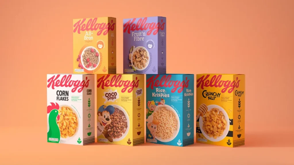
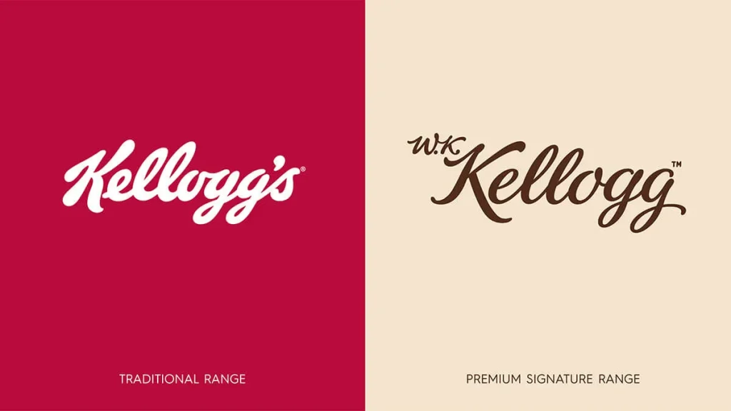
Some critics have argued that using the familiar, trusted Kellogg’s logo on heavily sweetened products creates a health halo effect that misleads consumers. The company has addressed this by creating sub-brands with distinct visual identities while maintaining Kellogg’s endorsement through the red oval.
Current Logo Effectiveness
The current Kellogg’s logo succeeds on multiple levels:
- It maintains century-old recognition while appearing as a contemporary
- It works effectively across physical and digital touchpoints
- It scales from tiny mobile icons to massive signage
- It conveys heritage and quality through its consistent elements
- It provides a flexible architecture for sub-brands and new products
In today’s fragmented media landscape, the logo’s instant recognition gives Kellogg’s a significant advantage. The simple oval silhouette is recognisable even when partially visible or from a distance – crucial in physical retail environments and cluttered digital spaces.
Future Projection
Based on current trends and Kellogg’s trajectory, we can expect future logo evolution to continue the simplification path while preserving the core elements:
- Further simplification to perform better in the most minor digital contexts (app icons, favicon, etc.)
- Potential variable logo system that adapts to different contexts while maintaining recognition
- Increased flexibility for sustainability messaging as packaging continues to evolve
- Subtle design system evolution to accommodate the company’s restructuring into separate business units
The challenge will be maintaining the universal recognition of the red oval while allowing sufficient differentiation between the company’s increasingly diverse business units and product categories.
Key Lessons from Kellogg’s Logo Evolution
- Evolution beats revolution. Kellogg’s demonstrates the power of incremental change over dramatic overhauls, preserving brand equity while staying current.
- Core visual assets are priceless. The red oval and signature have become so valuable through consistent use that changing them would be foolish, regardless of design trends.
- Simplicity ages well. The relatively simple core elements have allowed Kellogg’s to adapt its logo across technologies, from printed cardboard to digital interfaces.
- Personal touches matter. The signature element humanises what could otherwise be a very corporate identity.
- Visual system thinking beats one-off design. Kellogg’s success comes from its logo being part of a broader visual system that can flex across products while maintaining recognition.
- Colour ownership is powerful. By consistently owning their particular shade of red in the category, Kellogg’s created instant recognition even when the logo is seen peripherally.
- Design for the ecosystem, not just the logo. Kellogg’s logo works because it was designed with packaging, advertising, and product architecture in mind – not as an isolated symbol.
Kellogg’s logo evolution teaches us that the most successful brand identities aren’t necessarily the most creative or cutting-edge. Still, those who balance heritage with contemporary relevance create familiar assets that become part of the cultural landscape.
FAQs: How The Kellogg’s Logo Design Evolved Over 100+ Years
When was the first Kellogg’s logo created?
The first official Kellogg’s logo was introduced in 1906, shortly after W.K. Kellogg founded the company. It featured his signature as “Kellogg’s,” establishing the handwritten script style that would become the foundation of the brand’s visual identity for over a century.
How many significant redesigns has the Kellogg’s logo undergone?
The Kellogg’s logo has undergone approximately 6-7 significant redesigns. However, there have been numerous minor tweaks and refinements between these major changes. The most significant evolutions occurred in the 1950s, 1970s, and early 2000s.
Why did Kellogg’s maintain the handwritten script style throughout its history?
Kellogg’s maintained the handwritten script because it created a sense of personal guarantee and authenticity. The signature-based design suggested that W.K. Kellogg stood behind each product’s quality, establishing consumer trust. This personal touch became too valuable to abandon, even as design trends changed dramatically over the decades.
What was the most controversial logo change in Kellogg’s history?
The most controversial change came in 2012 when Kellogg’s simplified their logo significantly, removing some decorative elements and making the script appear more standardised. This modernisation received mixed reactions from brand loyalists who felt the logo lost some of its character and warmth in favour of digital-friendly simplicity.
How did the colour scheme of Kellogg’s logo evolve?
The Kellogg’s logo began primarily in black and white, as was common in early 20th-century printing. The signature red colour was introduced in the 1950s and has remained the primary brand, though exact shades have been refined. Various product lines have featured different background colours while maintaining a consistent red signature.
Did Kellogg’s ever experiment with entirely different logo designs?
During the 1960s, Kellogg’s experimented with more geometric, modernist logo alternatives that departed from the signature script. However, consumer testing showed that recognition and trust decreased significantly without the familiar handwritten element, leading the company to return to variations of the script logo.
How did digital media influence Kellogg’s logo design?
Digital media forced Kellogg’s to simplify their logo for better reproduction at smaller sizes on screens. The 2012 redesign addressed digital needs by reducing the complex curves and flourishes that didn’t render well in pixels. They also created a more standardised version for consistent reproduction across digital platforms.
What elements of the original 1906 logo still exist in today’s design?
The core concept of a flowing, connected script spelling “Kellogg’s” remains from the original design. The distinctive capital “K” with its loop and the apostrophe after the “g’s” has persisted throughout every iteration, maintaining brand recognition even as other aspects evolved.
How does Kellogg’s logo vary internationally?
While the core script logo remains consistent globally, Kellogg’s has made subtle adaptations for international markets. In some Asian markets, for example, the logo appears with slight modifications to complement local language packaging better. The company has maintained remarkable global consistency while allowing for cultural adaptations when necessary.
What was the strategic reasoning behind Kellogg’s most recent logo update?
The most recent major update focused on creating a more versatile logo suitable for traditional packaging and digital environments. The simplification aimed to maintain the brand’s heritage while ensuring clarity across all platforms, especially on mobile devices where many consumers now interact with brands.
How has the Kellogg’s logo influenced other food brand logos?
Kellogg’s signature-style logo pioneered handwritten scripts to convey authenticity in food products. Competitors and brands in different categories have adopted similar approaches, using flowing scripts to suggest craftsmanship and personal attention. This approach has become particularly common in premium and organic food products seeking to convey artisanal quality.
Did the Kellogg’s logo ever feature graphic elements besides the script?
While the primary Kellogg’s corporate logo has remained focused on the script, product-specific logos often incorporated graphic elements. The most notable was the sunrise graphic behind the script on many packages beginning in the 1980s, symbolising breakfast and morning freshness. These supporting graphics have changed more frequently than the core script element.


