The 7 Graphic Design Elements That Sell Products
Have you ever noticed how some products practically leap off the shelves while others gather dust? Yeah, me too. And here’s the thing—it’s rarely about the product itself. It’s about how it’s presented.
I’ve spent years watching businesses throw money at average design and wonder why their conversion rates are in the toilet. The harsh truth? Your product might be revolutionary, but if your design elements aren’t aligned with what makes humans click “buy now,” you’re leaving serious money on the table.
Today, I’m breaking down the seven graphic design elements that drive sales—not just the ones that look pretty in your portfolio. These elements speak directly to the decision-making parts of the brain and trigger purchasing behaviour.
- Effective graphic design directly impacts sales; it's not just about aesthetics but strategic communication.
- Understanding and implementing colour psychology, visual hierarchy, and typography significantly enhances conversion rates.
- Consistent visual elements across channels build trust and confidence, crucial for successful customer engagement.
Why Design Elements Matter More Than You Think
Before diving into the specific elements, let’s get something straight—design isn’t decoration. It’s communication. Every visual choice you make either strengthens or weakens your message.
A recent study showed that users form opinions about your product in just 50 milliseconds based on visual appeal alone. That’s faster than you can say “conversion rate.” And with attention spans shrinking yearly, those first impressions matter more than ever.
When I work with clients, I first ask: “Are you designing to impress other designers, or are you designing to sell products?” Because there’s a massive difference between the two. Award-winning design doesn’t always move product. But product-moving design? That’s what pays the bills.
The elements we will cover work because they align with how the human brain processes information and makes decisions. They create visual pathways that guide potential customers from awareness to interest to desire to action—what we call the AIDA model in marketing.
Let’s break down these seven elements and see how each contributes to creating designs that don’t just look good but actively drive sales.
Element 1: Strategic Colour Psychology

Colour isn’t just about what looks nice—it’s about triggering specific emotional and psychological responses that drive action.
When discussing colour in design, we’re discussing strategic emotional manipulation (in the best possible way). Each colour triggers different psychological responses:
- Red creates urgency and excitement—perfect for clearance sales or limited-time offers
- Blue builds trust and security—ideal for financial products or services
- Green suggests growth, health, and wealth, effective for wellness products or investment services
- Black communicates luxury and exclusivity, essential for premium offerings
But here’s where most designers get it wrong—they choose colours based on personal preference or brand guidelines without considering the psychological impact on purchasing behaviour.
I worked with a health supplement company that switched its primary button colour from a calm blue to an energetic orange. Just that single change increased their click-through rate by 32.5%. Why? Orange creates a sense of enthusiasm and affordability that aligns perfectly with their target market’s motivations.
The key is understanding the emotional state your customer needs to be in to make a purchase and then using colour to create that state. For impulse purchases, high-energy colours like red and orange reduce hesitation. For high-consideration purchases, trust-building blues and greens minimise anxiety.
Your colour palette isn’t just a design choice—it’s a conversion strategy.
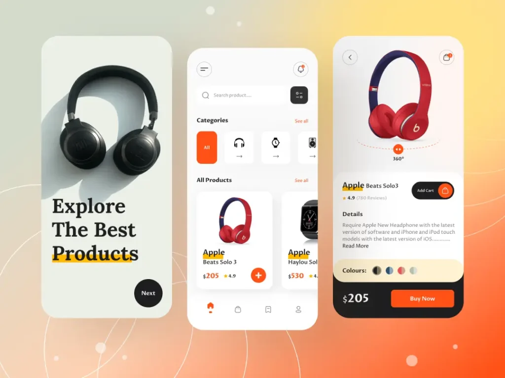
Element 2: Visual Hierarchy That Guides the Eye

Visual hierarchy isn’t just about making important things bigger—it’s about creating a deliberate visual journey that leads to conversion.
Think about how you naturally scan a webpage or packaging. Your eyes don’t move randomly—they follow predictable patterns influenced by size, position, colour contrast, and white space.
Top designers use this knowledge to create “conversion pathways”—visual routes that guide the eye from entry point to call-to-action with strategic precision.
Here’s how to implement this effectively:
- Identify your primary conversion goal (what specific action do you want users to take?)
- Position your most important element (usually your headline) at the dominant entry point.
- Use size, colour contrast, and directional cues to guide attention to your supporting element.s
- Create a clear visual endpoint at your call-to-action
A brilliant example of this comes from a recent ecommerce client. Their product page was beautifully designed, but wasn’t converting. Analysis showed their “Add to Cart” button blended into the overall design—it wasn’t the clear visual endpoint of the page. We applied strong contrast, increased button size, and added subtle directional cues that pointed toward it. Conversions jumped 27% in the first week.
The secret is that effective visual hierarchy doesn’t feel manipulative to the user—it feels helpful. It creates a sense of clarity and ease that removes friction from the buying process.
When working with visual hierarchy, remember that it’s not about what elements you want users to see first—it’s about creating a visual flow that aligns with their natural decision-making process.
Element 3: Typography That Builds Trust and Readability

Typography isn’t just about font selection—it’s about making information frictionless and building credibility through visual communication.
Let’s be clear: if your customers can’t easily read and process your copy, they won’t buy. Period. But typography goes beyond basic readability—it communicates subtle messages about your brand’s reliability, authority, and attention to detail.
I’ve tested countless landing pages and found that typographic choices directly impact trust metrics and conversion rates. Here’s what works:
- A clear type hierarchy establishes information importance and creates scanning efficiency
- Appropriate font pairing signals brand personality while maintaining readability
- Proper spacing (leading, tracking, margins) reduces cognitive load
- Consistent type treatment builds subconscious trust through attention to detail
One of my clients in the luxury watch market struggled with credibility despite having exceptional products. Their typography was a mishmash of trendy fonts with inconsistent spacing and poor contrast. We implemented a refined typographic system with a primary serif font for headlines (communicating heritage and craftsmanship) and a clean sans-serif for body copy (ensuring readability). Their average order value increased by 15% with no other changes.
The most effective typography creates “cognitive ease”—it allows customers to focus on your offer rather than struggling to process information. When typography creates cognitive friction, it triggers a subconscious warning signal that something isn’t quite right about your brand.
For maximum impact, ensure your typography matches your brand positioning. Luxury products demand refined, sophisticated typography. Value-oriented products need clear, straightforward type treatments that emphasise savings and benefits.
Element 4: White Space as a Conversion Tool

White space (negative space) isn’t empty space—it’s a powerful conversion element that focuses attention and creates perceived value.
Most amateur designers make the fatal mistake of filling every available pixel with information, believing more is better. It’s not. Strategic emptiness is often your most powerful design element.
Here’s why white space directly impacts sales:
- It creates focus by isolating key elements (like product images or CTAS)
- It increases perceived value (luxury brands use abundant white space)
- It improves information retention by reducing cognitive overload
- It creates a visual breathing room that makes decision-making easier
I worked with a skincare brand that transformed its packaging design by increasing white space by 40%. The product didn’t change, but sales increased by 24% because the new design communicated premium quality and allowed key benefits to stand out.
The science behind this is fascinating—our brains process visually simple information more fluently, and this processing fluency creates positive associations with the product. When we can easily process information about an offering, we subconsciously view that offering more favourably.
When using white space strategically, think about it as an active element rather than a passive background. Ask yourself: “What am I highlighting by surrounding it with emptiness?” The elements you choose to isolate with white space automatically become focal points.
For products with many features or complex information, use white space to create visual groupings that chunk information into digestible sections. This makes complex products feel more approachable and understandable, which are key factors in reducing purchase anxiety.
Element 5: Imagery That Triggers Emotional Response
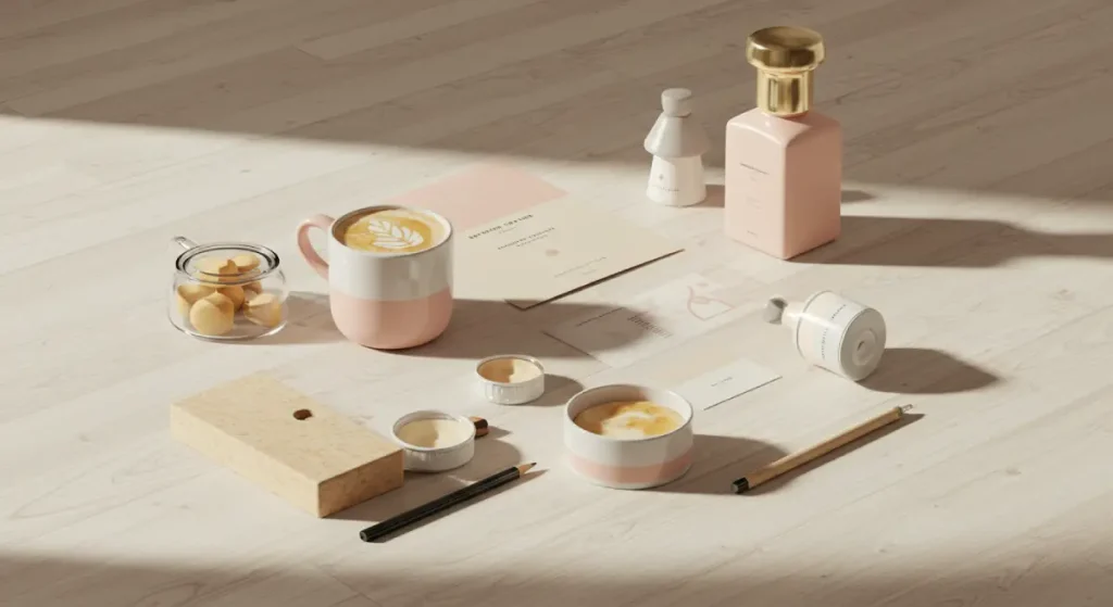
Product imagery isn’t just about showing what you’re selling—it’s about triggering specific emotional responses that overcome purchasing hesitation.
The human brain processes images 60,000 times faster than text. More importantly, images bypass rational thought and connect directly to emotional decision-making centres, where purchasing decisions happen.
The most effective product imagery does three things simultaneously:
- Shows the product clearly (reducing uncertainty)
- Demonstrates key benefits (answering “What’s in it for me?”)
- Triggers emotional response (creating desire)
When I audit underperforming product pages, inadequate imagery is often the primary conversion killer. Here’s what consistently works:
- Context imagery showing the product in use (creates mental ownership)
- Before/after comparisons (concretely demonstrate benefits)
- Emotional trigger images that connect to core motivations
- Multiple angles and zoomed details (reduces purchase uncertainty)
A fitness equipment client struggled with online sales until we completely revamped their imagery strategy. Instead of just showing their resistance bands against white backgrounds, we created a series of images showing real people (matching their target demographic) using the products in authentic home settings. We focused on capturing genuine expressions of accomplishment. Sales increased by 86% within two months.
Remember that humans are primarily visual creatures driven by emotional responses, not logical analysis. Your imagery should speak directly to your product’s emotional benefits, not just its features or appearance.
Product photography is an investment with incredible ROI when done strategically. Quality imagery creates confidence, reduces return rates, and increases perceived value—all factors directly impacting your bottom line.
Element 6: Layout That Reduces Decision Friction

Page layout isn’t just about aesthetics—it’s about creating a frictionless decision-making environment that leads to purchase.
Every element in your layout either facilitates or impedes the customer’s journey toward conversion. The most effective layouts create what psychologists call “processing fluency“—the ease with which people can process information.
High processing fluency creates positive associations with your product and reduces the perceived effort required to make a purchase decision. Here’s how to achieve it:
- Create a precise visual flow from problem to solution to action
- Use grid systems to create order and cohesion
- Chunk information into digestible sections
- Maintain consistent spacing and alignment
- Position decision points (like CTAS) at natural endpoint locations
I recently redesigned a software company’s pricing page that was visually attractive but performing poorly. Analysis showed that the pricing tiers were arranged horizontally, forcing users to mentally compare features across a vast space. We restructured the layout vertically, allowing easier feature comparison, and highlighted the recommended plan with subtle contrast. Conversion to paid plans increased by 41%.
The science behind effective layout design comes down to cognitive load theory—the idea that our working memory has limited capacity. When a layout requires too much mental effort to process, it creates decision fatigue, and the easiest decision becomes “I’ll think about it later” (which usually means never).
The best layouts aren’t necessarily the most creative or visually impressive—they’re the ones that create the most straightforward path to understanding and action. They anticipate questions, provide answers at the right moments, and guide users naturally toward conversion points.
Element 7: Visual Consistency That Builds Confidence
Visual consistency across touchpoints isn’t just about brand recognition—it’s about building the confidence necessary for purchase decisions.
Human psychology research shows that consistency signals reliability, and reliability builds trust. When your visual elements maintain consistency across all customer touchpoints, you subtly communicate that your product or service is equally reliable.
However, consistency goes beyond just using the same logo and colours. Proper conversion-driving consistency includes:
- Consistent visual treatment of similar information types
- Predictable interface patterns that reduce learning curves
- Cohesive visual language that feels like a unified system
- Recognition triggers that reinforce previous positive associations
I worked with a multi-channel retailer whose online conversions were significantly lower than those of their brick-and-mortar stores. The issue? Their in-store visual merchandising was clean, premium, and confidence-inspiring, while their website felt like a completely different brand—cluttered, discount-oriented, and visually chaotic.
We realigned their digital presence to match the in-store experience through consistent typography, spatial relationships, colour application, and photography style. Online conversion rates increased by 31% as customers began experiencing the same brand regardless of channel.
This “visual trustworthiness” concept is crucial for new brands or complex products. When every visual element feels like part of a thoughtfully designed system, it creates a subconscious sense that the product is equally well-designed and trustworthy.
To implement this effectively, create and adhere to detailed brand guidelines that specify basic elements like colour and typography and more nuanced aspects like image treatment, spacing relationships, and component design.
How These Elements Work Together: The Multiplier Effect
While these seven elements drive conversions individually, their real power comes from working together as an integrated system.
I call this the “design multiplier effect”—when all seven elements align, they don’t just add value; they multiply it. A product with strong imagery but poor typography will underperform. A product with excellent colour psychology but a cluttered layout will convert below its potential.
The brands that consistently outperform in the market understand that conversion-driven design isn’t about individual elements but creating a cohesive visual ecosystem where each element reinforces the others.
A real-world example illustrates this multiplier effect: I worked with a premium food delivery service that invested heavily in beautiful photography but saw lacklustre conversion rates. Their design elements were strong, but did not work as a system.
We created an integrated design approach where:
- Colour psychology establishes appetite appeal and premium positioning
- Typography reinforced quality while ensuring readability
- White space was created to focus on key benefits and food imagery
- Visual hierarchy guides eyes from the problem (hunger, lack of time) to the solution (delicious, convenient food)
- The layout reduced decision complexity and highlighted subscription options
- Consistency across web, packaging, and delivery materials built confidence
The result was a 78% increase in conversion rate and, more importantly, a 42% increase in customer lifetime value as the cohesive design system built stronger brand attachment.
Implementing These Elements in Your Design Process
Now that you understand the seven elements that drive product sales, how do you implement them? Here’s a practical framework I use with my clients:
- Start with customer motivation, not design trends. What emotional state drives purchase in your category? Design to create that state.
- Map the decision journey. Identify key information needs and potential objections at each stage.
- Create a hierarchy based on decision importance. What information impacts purchase decisions the most? Please give it a visual priority.
- Test with real users. Observe how people interact with your design, not how you think they should.
- Measure what matters—track conversion metrics, not just engagement or aesthetic feedback.
Remember that effective design isn’t about following rigid rules—it’s about understanding and applying principles thoughtfully to your business challenges. The elements I’ve shared are proven frameworks, not restrictive formulas.
I’ve seen businesses transform their results by making seemingly small design changes informed by these principles. A subscription box company increased renewal rates by 22% by rethinking its unboxing experience using these seven elements. An ecommerce store reduced cart abandonment by 34% by applying these principles to their checkout process.
The bottom line is this: graphic design elements aren’t just aesthetic choices—they’re business tools that directly impact your bottom line. When you understand their psychological impact and apply them strategically, you transform a design from a cost centre into a revenue driver.
Want to see how these elements could transform your product’s performance? Request a quote for a comprehensive design audit to identify specific opportunities to increase conversions through strategic design.
FAQS About Graphic Design Elements That Sell Products
How do I know which colours drive the most sales for my product?
Start by understanding your customers’ emotional motivations when purchasing. Trust-building blues work best for security-focused purchases (insurance, data backup). For impulse buys or limited-time offers, urgency-creating reds and oranges typically outperform. The most reliable approach is A/B testing different colour schemes while measuring conversion rates.
Is minimalist design always better for driving sales?
Not necessarily. While clean designs with ample white space typically outperform cluttered alternatives, the optimal level of design complexity depends on your audience and product category. High-consideration purchases often benefit from more information (thoughtfully organised). In contrast, impulse purchases convert better with simpler designs that reduce decision friction.
Should my product packaging design match my website design exactly?
They shouldn’t be identical, as each medium has different functional requirements. Still, they should feel cohesively related through consistent colour psychology, typography, imagery style, and overall brand personality. This cross-channel consistency builds trust that drives purchase decisions.
How often should I update my product’s design elements to maximise sales?
Major redesigns should be approached cautiously and data-driven, typically every 2-3 years, unless performance metrics indicate problems. However, continuous minor optimisations based on user testing and conversion data should be ongoing. Evolution is generally safer than revolution when it comes to design that sells.
Which design element typically has the most significant impact on conversion rates?
In my experience, visual hierarchy consistently shows the strongest direct correlation to conversion improvement. When users can instantly understand what’s important and where to focus their attention, decision friction decreases, and conversion rates climb. However, the element with the most room for improvement varies by brand.
How do I balance on-trend design with proven conversion elements?
Incorporate trends selectively in ways that don’t interfere with the seven core conversion elements. Use trends in secondary design elements while keeping your primary conversion drivers (hierarchy, layout, CTAS) grounded in proven principles. This gives your design a contemporary appeal without sacrificing performance.
Do these design elements work across all industries and price points?
The psychological principles behind these elements are universal, but their specific application varies by context. Luxury products demand more white space and refined typography. In contrast, value-oriented products need strong colour contrast and explicit benefit visualisation. The principles remain constant while execution adapts.
How do I know if my current design is limiting my sales potential?
Look for these warning signs: high bounce rates, low time-on-page, abandoned carts, or conversion rates below industry benchmarks. More directly, conduct user testing with your target audience and watch for confusion or hesitation in the purchase process—these often indicate design problems.
Should I prioritise mobile or desktop design for maximum sales impact?
While mobile traffic continues to grow, most industries’ conversion rates are higher on desktops. The ideal approach is a responsive design that maintains the seven key elements across all devices, with special attention to simplified visual hierarchy and touch-friendly interaction on mobile.
How do I convince my team to invest in design improvements for sales growth?
Frame design is a business investment, not a creative expense. Present case studies showing conversion impact from design changes, start with small A/B tests to demonstrate ROI, and always tie design discussions to business metrics rather than subjective preferences.
The Element of Action
The most powerful designs don’t just communicate—they motivate action. Each of the seven elements we’ve explored works together to reduce friction, build confidence, and guide customers toward purchase decisions.
Remember that great design isn’t about winning awards or following trends—it’s about creating visual systems that solve business problems and drive revenue growth. The brands that understand this distinction consistently outperform their competition.
Whether you’re launching a new product or optimising an existing one, these seven graphic design elements provide a framework for creating visuals that don’t just attract attention—they convert it into sales.
Ready to transform your product’s performance through strategic design? The team at Inkbot Design specialises in creating conversion-focused design systems that drive measurable business results. Let’s design not just for the eyes but for action.


