The Fanta Logo History: What Every Rebrand Got Right & Wrong
Most corporate rebrands are exercises in vanity, dressed up in marketing nonsense.
They talk about “new energy” and “brand synergy” when they really mean the new CEO’s nephew had a bright idea in the shower.
We’re told a new logo signals a bold new direction. More often than not, it just signals a board meeting where someone used the word “irrelevant.”
But sometimes, if you cut through the corporate chatter, the history of a single logo can teach you more than a dozen marketing textbooks.
The Fanta logo is one of those. It’s a fascinating, messy, and incredibly useful story of a brand born from chaos that has spent 80 years trying to figure out exactly what it is.
For any entrepreneur or business owner who’s ever sweated over their own logo, Fanta’s journey is a masterclass in what to do. And more importantly, what not to do.
- The Fanta logo evolved from a wartime necessity, not a grand vision, highlighting the importance of practicality in branding.
- Fanta's 1970 redesign created a fun identity that resonated; consistency built immense brand equity over decades.
- The chaotic brand image in the 2000s revealed the critical need for a unified global identity.
- The 2023 logo correction indicates that companies can learn from missteps and adapt to maintain brand relevance.
The Unlikely Origin: A Logo Born From Wartime Necessity (1940s-1950s)
You can’t talk about Fanta without talking about where it came from. It’s not a pretty, focus-grouped story.
The Context You Can’t Ignore: Fanta’s WWII Story
Fanta was created in Nazi Germany during the Second World War. Not by choice, but by necessity. The head of Coca-Cola’s German operation, a man named Max Keith, could no longer get the syrup from the US due to the trade embargo.
His factories were about to go silent. So, he improvised. He scrounged up whatever leftovers he could find—fruit shavings, apple pomace, whey from cheesemakers—and created a new fizzy drink to keep the business alive.
He told his team to use their imagination, their “Fantasie” in German. The name stuck.
The point here isn’t a history lesson. It’s that the brand wasn’t born from a grand vision. It was a patch job. A survival tactic.
The First “Official” Fanta Logo (1955): Simple, Dark, and Angular
After the war, Coca-Cola reclaimed the brand. The first proper, post-war Fanta logo appeared around 1955.
What was it like?
It was simple. Just the word “Fanta” in a dark, angular, sans-serif font. No colour, no fluff, no personality. It was purely functional. It did one thing: it identified the product on a bottle.
That’s it.
Lesson for Entrepreneurs: Your First Logo Just Needs to Do Its Job
This is your first and most important lesson if you’re starting a business. We see entrepreneurs spend months, sometimes years, agonising over their first logo. They want to tell their entire life story. They want it to be “iconic” from day one.
Rubbish.
Your first logo doesn’t need to be iconic. It needs to be legible. It needs to be clear. It needs to not look utterly terrible on your website or business card. Its primary job is identification.
When you have zero brand recognition, clarity beats cleverness every single time. Fanta’s first logo was boring, but it worked.
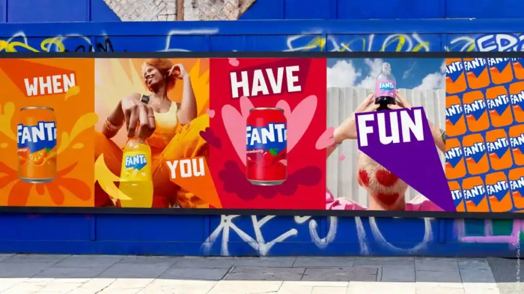
Finding its Personality: The Iconic “Fun” Identity (1970-2000)
For years, Fanta ambled along. But in the early 1970s, something changed. Coca-Cola decided to give Fanta a real personality. This is where the story gets interesting for designers.
The 1970 Redesign: The Birth of the Classic Fanta Wordmark
This is the Fanta logo most people over 30 remember. A designer, reportedly a man named Wilson Zaria, created a custom typeface that was the complete opposite of the stiff, formal logos of the past.
It was round. It was bouncy. The letters looked like they were made of something soft and pliable. The word itself had a sense of movement and energy. For the first time, the logo didn’t just say Fanta; it felt like Fanta. It looked like fun in a bottle.
The Hidden Genius: The Orange, the Leaf, the Brand
It wasn’t just the font. The redesign often included a simple graphic element: three oranges nestled next to the wordmark, with a single green leaf.
This was the stroke of genius.
- It communicated flavour instantly. You knew it was orange without reading a single word.
- It added a splash of colour and life.
- It created a flexible visual system. The wordmark could be used alone or with the oranges.
This wasn’t just a logo. It was a coherent visual identity.
They stuck with this. For the better part of three decades, this was Fanta. That logo was on bottles, cans, posters, and TV ads across the world. It became so deeply ingrained in the public consciousness that the logo was the product.
That’s brand equity. It’s the priceless, intangible value you build through sheer consistency. It’s the mental shortcut a customer’s brain makes right before they buy. Fanta built a mountain of it with this one design.
And then, they started chipping away at it.
The Digital Blur & Fragmentation: A Messy 21st Century (2000s)
The new millennium arrived, and with it, a corporate panic about looking old. “Digital” was the buzzword, and brands scrambled to look like they belonged on a computer screen.
The 2008 “Splash” Logo: Chasing a Dated Trend
Around 2008, a new primary logo started rolling out. The soft, round letters were replaced with a more generic, slanted typeface. It was often placed inside a circle with an orange slice and a big, cartoony “splash” effect.
It was trying so hard to look energetic and modern. But it ended up looking like a stock graphic from a 2005 PowerPoint presentation. It lost every bit of the unique, custom-drawn charm of the 1970 design. It felt cheap.
It could have been the logo for Sunkist, or Tango, or any generic supermarket own-brand orangeade.
My Observation: The Curse of Global Inconsistency
The real problem during this era wasn’t just one bad logo. It was the lack of one logo.
If you travelled in the 2000s, you’d find a different Fanta in every country. Some had the splashy logo. Some had a weird, bubbly wordmark. Some still had variations of the old classic. It was absolute chaos.
This is an unforgivable sin for a global brand from The Coca-Cola Company. A brand is a promise of consistency. If your product looks completely different in Spain than it does in Germany, you don’t have one global brand.
You have a hundred little brands that happen to share a name. You’ve destroyed your equity.
The Great “Re-imagining”: A Sharp Turn with the 2017 Rebrand
By the mid-2010s, Fanta’s identity was a mess. The company knew it. So they hired Koto’s design studio to do what corporations love: create a single, unified “global brand identity.
Enter the “Cut-Out” Fanta Logo
The result, launched in 2017, was a radical departure.
It was an all-caps, sans-serif font that looked like it was cut from paper with a craft knife. It was sharp, angular, and deliberately “un-corporate.” The letters were contained in a circle, often with a subtle leaf shape at the top.
It was clean. It was modern. And it looked nothing like any Fanta that had come before it.
The Official Reason vs. The Real Reason
The official line was that this new look was “bold, vibrant, and playful,” designed to capture the teen market. It was part of Fanta’s new status as a billion-dollar brand within Coca-Cola’s portfolio.
Let’s apply some healthy cynicism here.
The real reasons were likely more pragmatic.
- Solve the Consistency Problem: They needed one logo and one identity that could be rolled out globally to end the chaos. This design was the tool for that.
- Streamline Everything: A simple, flat-colour logo is infinitely easier and cheaper to print on cans, bottles, boxes, and marketing materials than a complex one with gradients and splashes.
- A Desperate Play for “Cool”: The brand was seen as a bit childish. The sharp edges and bold typography were a clear attempt to inject some “edgy” credibility and chase the elusive teenage demographic.
Did It Work? The Great Debate.
On the one hand, the design was a success. It was distinctive. It worked beautifully on a phone screen or an Instagram post. It gave the brand a unified, modern toolkit. Problem solved, right?
Not quite.
It sacrificed all the warmth and friendliness that the brand had built over the decades. The 1970s logo was your cheerful friend. The 2017 logo was the cool kid in the corner who thinks they’re too good for you. It felt cold and a little aggressive.
A Painful Lesson in Audience Perception
Here’s an anecdote. I once had a very traditional family-run bakery client who wanted a rebrand like this. They wanted something “sharp and modern” to attract a “younger crowd.”
I had to sit them down and ask: “Do your current customers, the ones who have kept you in business for 40 years, want to buy their scones from a brand that looks like a tech start-up? Or do they want to buy from a brand that feels warm, reliable, and smells like fresh bread?”
They got the point. Fanta, perhaps, forgot who its core audience was. It was so busy chasing the kids that it risked alienating everyone who actually grew up drinking the stuff.
The 2023 Correction: A Return to Form (Mostly)
Fast forward to 2023. Another new Fanta logo starts appearing. This wasn’t a minor tweak. It was a significant strategic shift.
Unveiling the Current Fanta Logo
The latest logo takes the foundation of the 2017 design but sands off all the hard edges. The sharp, cut-out letters are replaced with cleaner, slightly friendlier shapes. It keeps the bold, capitalised look but feels less like a weapon. The harsh circle is gone, allowing the wordmark to stand on its own.
Crucially, it unifies the brand with Coca-Cola by adopting the same visual language as the flagship Coke and Sprite brands. It’s now clearly part of the family.
What It Fixes: A Strategic Retreat
This new design is a tacit admission that the 2017 version went too far.
It fixes the “coldness” problem by being more approachable. It fixes the “disconnected” problem by visually aligning with Coke. It keeps the “modern and unified” benefits of the previous rebrand but injects a little more of the “fun” personality back in.
It is, essentially, a correction. An attempt to find the sweet spot between the classic fun of the 70s and the modern utility of the 2010s.
The Real Takeaway: Even Giants Make U-Turns
For any business owner, this is comforting. One of the biggest corporations in the world, The Coca-Cola Company, launched a global rebrand that cost millions, and within six years, they decided it wasn’t quite right and changed it again.
It is okay to get it wrong. It is okay to correct your course. It’s better to admit a design isn’t working and fix it than to stubbornly stick with a mistake because you’ve already invested in it.
Brutal Truths from Fanta’s Logo History for Your Business
Let’s boil it all down. What can you, a small business owner, actually learn from Fanta’s messy journey?
- Start Simple, Then Evolve. Don’t spend a year designing the “perfect” logo before you’ve even made your first sale. Fanta started with a boring-but-functional wordmark. Get something clear and professional, then get to work.
- Equity is Earned, Not Bought. The 1970 logo became iconic because Fanta used it consistently for 30 years. That kind of recognition is priceless. When you have a design that works, don’t throw it away on a whim.
- Consistency is Non-Negotiable. Fanta’s biggest failure was allowing its brand to fracture into a dozen different logos. A fragmented brand is a weak brand. Your logo, colours, and tone of voice should be the same everywhere. No excuses.
- Rebrand with Purpose, Not Panic. Don’t change your logo because you’re bored or because you saw a cool trend on Pinterest. Ask yourself: What business problem am I trying to solve? Don’t do it if you don’t have a clear, strategic answer.
- Don’t Sacrifice Your Soul for “Cool.” The 2017 Fanta rebrand was objectively “cool.” But it lost the brand’s friendly soul. Understand what your customers love about you before you change the very things that attracted them.
Fanta’s history shows that a logo is never truly “finished.” It’s a living part of your business that has to adapt. But those adaptations need to be smart, strategic, and respectful of your origins.
Getting this right isn’t easy. It requires an objective eye and a deep understanding of the line between timeless design and passing fads. If you’re wrestling with these questions for your own brand, it’s often the point where getting outside input is critical.
A professional look at your logo isn’t just an expense; it’s a strategic investment. Explore what a proper logo design process involves.
Conclusion
The Fanta logo isn’t a simple story of good design versus bad design. It’s a real-world story of a brand grappling with its own identity for eight decades. It’s about survival, personality, confusion, overcorrection, and a search for balance.
Your logo isn’t a precious piece of art to be hung on a wall. It’s a hard-working commercial tool. It’s the face of your business, the first handshake with a new customer.
Treat it with the strategic respect it deserves.
Frequently Asked Questions (FAQs)
What was the very first Fanta logo?
The first “official” logo after World War II, around 1955, was a very simple, dark, and angular sans-serif wordmark. It was purely functional, designed simply to identify the product on the bottle.
Why is the 1970s Fanta logo considered iconic?
The 1970s logo, with its custom round and bouncy typeface, was the first to give the brand a distinct “fun” personality. It felt energetic and friendly, and when combined with the three-orange graphic, it created a powerful and memorable visual identity that the company used consistently for decades, building immense brand equity.
Why did Fanta change its logo so dramatically in 2017?
The 2017 “cut-out” redesign was primarily a strategic move to solve two problems. First, create a unified global identity to fix the brand’s inconsistent look across different countries. Second, to give the brand a more “edgy” and modern feel to appeal to a younger, teenage demographic.
Was the 2017 Fanta rebrand a success?
It’s debatable. It succeeded in creating a unified, modern, and digitally-friendly brand asset. However, many critics and consumers felt it sacrificed the brand’s traditional warmth and friendliness for a “cool” aesthetic that felt cold and corporate.
What is the current Fanta logo?
The current logo, introduced in 2023, is an evolution of the 2017 design. It keeps the bold, all-caps look but smooths out the sharp, angular edges, making it feel more approachable. It was designed to feel more aligned with the other major Coca-Cola brands like Coke and Sprite.
What’s the main lesson for a small business from Fanta’s logo history?
The biggest lesson is to value consistency. While evolution is necessary, throwing away decades of brand equity for a fleeting trend can be a mistake. Build on what works, ensure your brand looks the same everywhere, and only undertake a major rebrand to solve a clear business problem.
Who designed the Fanta logos?
Different designers and agencies were involved over the years. The iconic 1970 wordmark is often credited to designer Wilson Zaria. The 2017 angular redesign was created by the London-based studio Koto. The most recent 2023 update was led by The Coca-Cola Company’s in-house design team.
How did Fanta get its name?
The name comes from the German word “Fantasie,” meaning “imagination.” During WWII, the head of Coca-Cola’s German plant, Max Keith, urged his team to use their imagination to create a new drink from the scarce ingredients available, and the name “Fanta” was born from this suggestion.
Why did Fanta have so many different logos around the world in the 2000s?
This was due to a decentralised marketing strategy where different regions had the autonomy to create their own branding. This led to a fragmented and inconsistent global identity, which the 2017 rebrand was specifically designed to fix.
Is the Fanta logo a flat design?
The 2017 and 2023 logos are prime examples of flat design. They use simple shapes, solid colours, and lack gradients, shadows, or other 3D effects. This makes them versatile, easy to reproduce, and very effective for digital screens.
Observing how giants like Coca-Cola navigate their branding is one thing. Applying those hard-won lessons to your own business is another. It takes a clear eye to see what needs to evolve and what precious equity needs to be protected.
If you’re ready for a brutally honest conversation about your own brand’s visual identity, that’s what we do. See our approach to logo design, or cut to the chase and request a quote for a direct assessment.
For more no-nonsense observations, feel free to browse our other articles.


