The 13 Key Features of Exceptional Website Design
I will call it for 90% of you – your website is the face of your business. It is what people see first before they decide whether or not to come in. Just as you would not let your physical store look run-down and uninviting, you cannot afford a poorly designed website.
Any brand and marketing strategy needs a modern, user-friendly site; it tells people who you are, what you do and why you are great at it. Fantastic web design captures attention, sustains interest and converts people into customers or fans.
This guide takes a comprehensive look at what goes into making a truly exceptional website design that doesn’t just look good but also provides an outstanding user experience. So grab a coffee, get comfortable and be prepared to make changes!
- Effective website design captures attention quickly, making strong first impressions essential for retaining visitors.
- Balancing beautiful aesthetics with user-friendly functionality ensures a seamless and engaging experience.
- Continuous optimisation and inclusivity are vital for adapting to user needs and maintaining accessibility.
- The Undeniable Power of First Impressions
- Let Users Explore With Ease
- Bite-Sized Content Snacking
- Crystal Clear Calls-to-Action
- Effortless Readability & Accessibility
- Embracing the Art of Storytelling
- The Power of Social Proof
- Interactivity & Microinteractions
- Creating Connection Through Consistency
- Balancing Personality & Purpose
- Continuous Iteration & Optimisation
- The Vital Role of Performance
- Accessible Inclusivity For All
- Conclusion
- Exceptional Website Design FAQs
The Undeniable Power of First Impressions
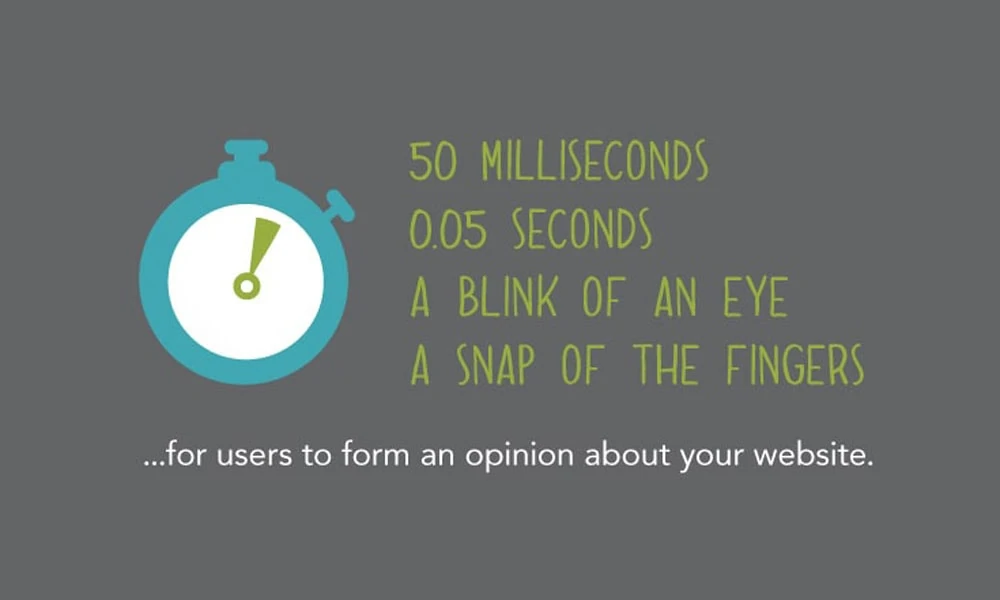
Are you aware of the saying – you’ll never get a second opportunity to make a first impression? Well, that’s entirely true for websites. Studies show that within 50 milliseconds (0.05 seconds!) of landing on your website, people form an opinion about whether they’ll stay or leave.
That initial look needs to dazzle them. The visual design, navigation, and messaging must work together seamlessly to create an incredible first impression. If visitors don’t instantly understand what your site is about and what’s in it for them, you’ve already lost a massive chunk of potential customers and leads.
The “Pretty” Part Of Design
Good looks do matter in these critical few seconds. Attention-grabbing visuals like images and videos, neat typefaces, vibrant colours, and ample white space can give designs an up-to-date feel and polish. But this isn’t just about making things look nice.
The “Functional” Part Of Design
Functionality makes exceptional website design possible, but it often goes unnoticed. Can users figure out what the site is for right away and navigate there effortlessly? Is everything presented in a way that makes sense based on how we think with our brains? Are vital actions such as contacting or buying from you only one click away?
For a successful first impression, beauty must be joined by intelligence, which is why companies spend so much time perfecting each pixel.
Let Users Explore With Ease
Once someone decides to hang around on your website, the design must make exploration easy and enjoyable. Nobody wants to feel confused, lost, or frustrated. Removing barriers and creating an intuitive, self-guided journey is mandatory.
The Importance of Clear Navigation
The navigation menu is arguably one of the most critical pieces of the whole website. It shapes the entire user experience by allowing visitors to quickly find their way to the different sections and pages that are relevant to them.
An exceptional nav menu avoids overwhelming visitors with too many choices upfront. It only displays the most essential destinations. It's intelligently organised into logical categories and sections. It remains consistent in its location and styling across all web pages, so users never have to think about where to look for it.
Content Organisation is Key
Behind that straightforward navigation is a carefully planned site architecture and content hierarchy. Designers obsess over how pages are structured and linked together because it determines the flow.
The golden rule is that related content should be chunked together in ways that make sense to human minds. For instance, you'd group your service offerings rather than just listing every single one individually. A nested hierarchy helps people narrow their focus from broader categories to specifics without getting lost.
The content should be broken into easily scannable sections within each page with clear headings, callouts, and visual cues. Too many enormous blocks of text will quickly overwhelm visitors and cause them to bounce. Which brings us to…
Bite-Sized Content Snacking
Thanks to our smartphone-induced lack of attention span these days, we're all content snackers now. We don't want to read giant walls of text – we prefer to skim and snack on bite-sized bits of information quickly.
This has hugely shaped how exceptional website designs present and lay out content. Large uninterrupted text sections are being phased out in favour of:
- Short paragraphs (2-4 sentences max)
- Intuitive chunking of info into sections
- Plentiful use of subheadings, bullets, and spacing
- Data visualisations like charts, graphs, and infographics
- Well-chosen images or icons to reinforce key points
- Annotated screenshots, galleries, and slideshows
- Simple summary callout boxes and quotes
This accessible content snacking creates a more lightweight, visually-driven, less intimidating and engaging experience. It makes consuming information almost effortless rather than feeling like a chore.
But be careful not to go overboard into BuzzFeed territory with nothing but random memes and GIFs. A cohesive balance of text, visuals, and white space is ideal.
Crystal Clear Calls-to-Action
Every page needs a clear call-to-action (CTA) that tells people exactly what you want them to do next. Otherwise, you risk visitors getting confused, lost, or just giving up and leaving.
Effective CTAs are designed to be impossible to miss or ignore. They might be big, bright buttons or banners that grab your eye with contrasting colours and clever copy. They could be linkable banners or tiles highlighting your top services or products in context. Some use animated effects like subtle pulsing or movements to draw attention.
Just make sure your CTAs have the following:
- Actionable instruction text (“Get a Free Audit” instead of “Click Here”)
- Clean, simple design that stands out
- The purposeful placement where eye-tracking studies show users look
- Consistent styling and location across pages
- Easy access no matter the device or screen size
CTAs are your chance to guide visitors further down your funnel, so take advantage of the opportunity! Make it super clear and easy for them to take the desired action.
Effortless Readability & Accessibility

Have you ever landed on a website only to immediately feel a headache? Awful colour combinations, microscopic text sizes, jarring fonts and styling make reading or consuming content painful.
That's a considerable usability failure that exceptional design avoids at all costs. Reading online must be comfortable and effortless, regardless of device or screen size.
Optimised for Any Screen or Device
In our multi-device world, a website has to look and function flawlessly across desktops, laptops, tablets, and smartphones. The experience can't be compromised or limited based on the screen dimensions.
Responsive design is an absolute must these days. Every element needs to resize and reflow seamlessly to create an optimised layout for the current screen estate. Images and media need to scale appropriately, too. This ensures the site is entirely usable from any device or window size.
Better Text Readability
The correct font sizes, weights, spacing, line heights, and colours on the text front enhance readability and accessibility.
For instance, did you know that using 100% black text on a white background is more complicated to read than dark grey on a light background? Subtle techniques like that reduce visual strain.
Designers carefully calculate ideal character counts per line (aim for 60-75 chars). They balance having large enough text while maintaining comfortable line and paragraph spacing so things don't look cramped.
Excessive underlines, italics, and text effects are avoided since they impair readability and accessibility. Smart typographic scale and hierarchy are implemented to create perfect content flow and distinction between headers, text, captions, etc.
Improved Accessibility
Building accessibility into designs helps ensure optimal experiences for users with disabilities or constraints like vision, hearing, mobility, or cognitive limitations.
This covers everything from alt-text for images, proper heading structures, keyboard navigation capabilities, colour contrast ratios, video captions, and avoiding layouts that could trigger certain conditions.
The bottom line is that focusing on readability and inclusivity opens your website up to a much larger potential audience. It's just good practice.
Embracing the Art of Storytelling
Customers crave authenticity, personality, and an emotional connection in an ocean of digital clutter and noise. Exceptional website design recognises this and embraces the power of storytelling.
Infusing Brand Character
It's more than just slapping your logo on some web pages. Top-notch design breathes life into your brand's unique identity and voice through purposeful visuals, tone, and microcopy.
The colour palette, typography, illustration styles, iconography, photography choices, animation effects – every aspect is carefully crafted to align with and reinforce your brand personality. Are you a quirky, playful brand or more polished and sophisticated? It should be evident.
The words used in calls-to-action, button labels, form fields, system messages, etc., also shape that consistent brand voice. Is your tone conversational or more formal and business? Punchy and clever or straightforward and matter-of-fact?
By weaving brand character throughout your website, you create a cohesive, resonant, and memorable experience for visitors.
Injecting Narrative Flow
Another way standout designs engage people is by thoughtfully guiding them through your brand's core story across different pages and sections.
You might start by immediately painting the bigger picture of your “why” on the homepage – your mission, purpose, and the meaningful difference you strive to make. Then, progressively unveil your unique approach, expertise, and proof points as users navigate further.
This narrative structure helps users feel like they're being told an engaging, visually-driven story rather than being blasted with random facts. It transports them along a more emotional journey aligned with your underlying messaging.
Getting Personal
Ultimately, people connect with people – not faceless companies or products. By humanising your brand with actual names, faces, and behind-the-scenes insights, you make it easier for visitors to relate.
Staff bio pages with casual headshots and quirky facts. Videos showing your workspace and teammates in action. Pull-back-the-curtain glimpses into your creative process or company culture. Using sincere, down-to-earth language can help forge a more personal bond.
This carefully injected humanity makes your brand feel approachable, trustworthy, and honest, unlike the slick, polished, but soulless corporate facades to which users are numb.
The Power of Social Proof

The nagging question is in every visitor's mind – can I trust and believe what this website claims? Some reassurance and validation from others go a long way.
Innovative website designs leverage different forms of social proof to build credibility, trust, and confidence. Here are a few powerful examples:
Client Testimonials & Reviews
It's one thing for you to tout how amazing your products or services are. It's far more impactful and convincing when that praise comes directly from other customers and clients.
Give a voice to your biggest fans! Showcase brief text testimonials, video reviews, star ratings, and glowing case studies. Just make sure they're authentic and not faked.
Industry Accreditations & Badges
If your business or team has earned industry certifications, credentials, awards or other stamps of official recognition – put them on display! These are instant trust signals that show you're legit.
Social Stats & Live Counters
Prominently featuring stats on subscribers, customers, downloads, clients, or other relevant numbers can indicate popularity and generate some FOMO appeal.
Live counters or numbers that dynamically tick upwards are even more engaging as you can watch the proof grow in real-time.
Media Mentions & Logo Showcases
Getting coverage from respected media outlets, publishers, blogs, or influencers immediately ups the credibility factor. Highlight their logos and quotes to capitalise on their reputation.
The same concept applies to logos of any big-name clients, partners or affiliates you've worked with. A visual showcase of who trusts and associates with you is powerful.
Interactivity & Microinteractions
We live in an era where users expect digital experiences to feel alive, responsive and engaging. Exceptional website designs deliver exactly that through intentional injections of interaction and microinteractions.
Scroll-Triggered Effects & Animations
As visitors start to scroll down your pages, you have an opportunity to grab and hold their attention with exciting scroll effects. Content can animate, images lazy-load in, and small surprising moments delight users.
These effects can be purely ornamental and decorative or used meaningfully to reveal more information or highlight essential sections progressively. Just keep them performant and avoid overdoing it.
Hover Effects, Cursors & Tooltips
Even those tiny hover states are chances to flex some creative muscle. Simple glows, content previews, zooms, rotates, and tooltip overlays enhance that tiny delight factor when mousing around.
Often an afterthought, the cursor can even become an area for expression with custom styles, animations and functionality. For example, it can be transitioned between different branded shapes or icons.
Feedback with Sounds & Motion
Nothing makes an interface feel more interactive than audio and microinteractions. Button presses, menu toggles, scrolling, and form inputs can kick off little bursts of movement, motion, and sound effects.
These small feedback flourishes are used judiciously to make the whole experience feel polished, responsive and high-fidelity. It creates a sense of tangibility and enhances perceived usability across touchpoints.
Immersive Media & Elements
On the bigger scale, you have opportunities to fully immerse users with elements like video modal popups, 3D/WebGL scenes, 360 panoramas, and even augmented reality (AR) activations.
For instance, home furnishing brands could allow users to virtually stage sample furniture items within an AR room view on their phone. Vacation rentals could also embed rich 360° video tours of properties.
It adds a new dimension to the browsing experience when creatively incorporating immersive, exploratory components.
Creating Connection Through Consistency
Think about some of the most iconic, instantly recognisable brands globally. What about their visual identity makes it so distinctive and memorable?
More often than not, it boils down to design consistency. Every piece of that brand, from its logo and colour palette to the smallest digital detail, aligns and reinforces a cohesive, interconnected experience.
A Unified Visual Language
For a website, this means defining and adhering to a comprehensive set of design patterns, user interface components, and branding guidelines spanning every page and element. Things like:
- Color treatment for text, backgrounds, buttons, separators
- Established typographic hierarchy of header styles, body copy, etc.
- Grid layouts, spacing systems, container sizes
- Unified illustration, icon and imagery styles
- Tones and voices for microcopy and descriptive text
- Signature animations, transitions, microinteractions
The defined constraints help form a unified “visual language” that makes navigation feel innate. Users can quickly adapt to the environment and focus on consuming your core content.
Cross-Channel Design Systems
More advanced brands take it further with meticulously documented design systems that establish overarching guidelines for digital products beyond websites.
This scalable framework and component library ensures a cohesive, recognisable experience across websites, apps, software, marketing channels and more. Wherever that brand appears, it feels instantly familiar and “on-brand.”
When this systemic consistency is achieved, it amplifies the overall brand resonance, builds trust over time, and even helps maximise things like efficiency and code maintainability.
Balancing Personality & Purpose
All this creative expression and visual pizazz is worthless if it doesn't service your website's fundamental goals and objectives. It's far too easy for designs to become self-indulgent works of art rather than living, breathing, user-centred tools.
That's why the best website designs skillfully interweave personality and purpose – striking a balance between memorable aesthetics and optimised utility.
Start With a Solid Foundation
Every great design starts by understanding the overarching objectives, user needs, context, and priorities to be addressed. Market research, stakeholder workshops, analytics audits, heuristic reviews – whatever techniques yield meaningful insights.
With that strategy and purpose well-defined upfront, interface inventions and visual treatments can be crafted intentionally to facilitate those desired outcomes and behaviours.
For example, if your e-commerce goals prioritise driving more add-to-cart actions, that could shape a UI personally tailored to fast product discovery, precise pricing info, attention-grabbing deals, streamlined checkouts and more.
Solving Real User Pain Points
Ultimately, if your website fails to solve real user problems and successfully make their lives easier, its core purpose has failed, no matter how visually stunning.
The best designs are founded on empathy – a deep understanding of audience members' frustrations, motivations, goals, mental models and behaviours. The solutions seek to alleviate their pains and create a more streamlined, calming and productive experience.
For example, user testing reveals visitors find your checkout process clunky and confusing. The design could then get an overhaul with:
- A visual progress tracker to reduce anxiety over how many steps are left
- Persistent display of order summary details to instil confidence
- inline validations with friendly microcopy to prevent errors upfront
- distraction-free field focus states and layouts for mobile thumbs
- clarity around security seals, policies and guarantees to build trust
Every single layout, visual treatment and interaction is thoughtfully engineered to smooth out previous stumbling blocks and areas of unnecessary friction.
Continuous Iteration & Optimisation

Even the most exceptionally designed websites are never “finished” or perfect. Technology, standards, behaviours and trends constantly evolve, requiring iterations and optimisations.
Constantly Be Testing & Experimenting
You must do more than just set and forget a website after an initial launch. Ongoing measurement and experimentation are crucial to find opportunities to refine and enhance the user experience over time.
Leverage engagement metrics, heatmaps, user testing findings, sales data, and other insights to hypothesise where pain points or areas for improvement exist. Then, it will be validated through methodical A/B tests, slowly rolling out iterations while measuring the impact.
Swapping the order of content sections may increase key conversion rates. Switching to a long-form, single-page layout decreases bounce rates for a particular audience segment. Or adding explainer animations unlocks comprehension. The data-driven tweaks, no matter how small, compound into compounding experience optimisations.
Keeping Up With Best Practices
Design standards and patterns have an annoying tendency to gradually become obsolete as technology capabilities, user preferences, and competitive landscapes shift.
What feels modern, innovative and delightful today could easily seem outdated and janky in a few years as best practices evolve. Which makes continuously auditing and upgrading your website's core components essential.
Navigation patterns need to adapt to emerging device norms and mental models. Visual styles must remain contemporary and aligned with changing brand identity guidelines. Performance optimisations are perpetual efforts in the race to stay fast despite increasing complexity.
Indeed, outstanding designs are never static – they're living, breathing entities that demand nurturing through progressive enhancements fueled by ongoing research, testing and development.
The Vital Role of Performance
Let's be blunt – even if you crafted the most beautiful, usable, and innovative website design in the world, it's worthless if it loads and performs like a slug.
Page speed and performance are vital, impacting everything from usability and engagement to SEO rankings, revenue, and user satisfaction. Yet, it still needs to be addressed or made an afterthought on too many projects.
Every Millisecond Counts
Users form opinions about your website incredibly fast. Within just a few milliseconds, they're making judgments about credibility, quality and whether it's even worth waiting around.
That's why optimising load times needs to be an upfront priority for exceptional design. Unoptimised images, cumbersome code, sluggish servers, and myriad other factors can grind the experience to a halt if you are not obsessed with it.
Advanced techniques like hierarchical HTTP caching, CDNs, resource prioritisation, code minification, and the latest web performance APIs help combat bloat and speed delivery. But it's an ever-evolving battle as assets and functionality grow more complex.
Accounting for Device & Connection Diversity
It's about more than speedy performance on high-end computers in ideal conditions. Design teams must thoroughly pressure-test under real-world constraints faced by large swaths of their audiences.
That means building with an innate awareness of device capabilities, network throttling, high/low power modes, reduced data scenarios, spotty connectivity and more. The experiences need to be resilient and accessible regardless of tech limitations.
“Resilient” could mean utilising wise bundling only to serve code applicable to the current browser/device. Or leveraging sophisticated service worker caching so return visits bypass intensive network requests. Or they are implementing PRPL strategies for universal deployability.
It's easier to naively build for perfection rather than be conscientious of global variance and create truly universal web experiences. Exceptional design factors this from the ground up.
Accessible Inclusivity For All

We opened this guide by stressing websites need to “wow” new visitors within 50 milliseconds to keep them interested. Well, consider this – over a billion people worldwide have some form of disability that could seriously hamper their ability to access, perceive or navigate websites.
If your website doesn't consider basic accessibility principles from the start, you're ignoring a massive potential audience right out of the gate. Not very “exceptional”.
Following WCAG & Inclusive Design
At a bare minimum, designers need to adhere to guidelines and standards laid out by the W3C's Web Content Accessibility Guidelines (WCAG). This covers things like:
- Ensuring sufficient colour contrast ratios for legibility
- Building consistent navigation and focus handling
- Maximising compatibility with screen readers, magnifiers, etc.
- Providing transcripts or captions for multimedia content
- Allowing content to be resized up to 200% without layout breakage
- Indicating all functionality is available without requiring a mouse
- Accounting for individuals with seizure triggers and distractions
It establishes a solid accessibility baseline explicitly tailored for the challenges faced by those with visual, auditory, mobility, speech, cognitive or neurological disabilities.
But exceptional designers don't stop there – they embrace the fuller practice of inclusive design. This human-centric methodology aims to proactively accommodate the broadest spectrum of human diversity in its considerations beyond just the minimum compliance checklists.
Raising the Bar To Universal Accessibility
The most innovative and forward-thinking teams actively seek out extreme “edge cases” to design for – from users with severe situational or permanent disabilities to older demographics facing age-related impairments to whatever unconventional conditions you can imagine.
Universal design doesn't treat accessibility as an afterthought or checkbox but as an essential core creative constraint. It challenges teams to rethink fundamental interface and interaction patterns from numerous alternative perspectives.
Instead of over-relying on tiny text labels, a website could utilise more universal symbols and iconography to bridge language barriers. Advanced voice controls, and commands are implemented instead of navigating menus through repetitive tabbing or clicking.
The more you broaden your lens and proactively include diverse perspectives in your process, the more inclusive (and exceptional) the final experiences become for one and all.
Conclusion
Phew, that was a colossal deep dive into what separates mediocre websites from exceptionally compelling ones! If there's one key takeaway, outstanding design is more than just making interfaces look pretty. It's a thoughtful, strategic, holistic practice that requires obsessive attention to detail.
From nailing those crucial first impressions and effortless user journeys to leveraging storytelling and microinteractions that forge emotional connections, every design choice needs to align with concrete objectives and facilitate seamless user experiences.
Of course, aesthetics remain paramount in crafting distinctive personality and resonant branding systems. But those eye-catching visuals must be purposefully interwoven with carefully calculated layouts and content choreography optimised for usability, accessibility and high performance.
This harmonic convergence of beauty, thoughtful problem-solving, and unwavering craftsmanship defines exceptional website design in today's world. Designs that aren't just delightful indulgences but powerful tools connecting users with your brand narrative in resonant, meaningful ways.
So keep all these facets in mind as you craft your exceptional online presence! It's a tall order, but stick to a human-centric, meticulous, holistic process, and the results will be well worth the investment.
Exceptional Website Design FAQs
Which part of great site design is the most essential?
No single factor stands out above all else — many elements must come together cohesively. Still, optimising for fast load times, intuitive navigation and impactful first impressions are arguably among the most critical components for keeping visitors engaged.
How often should websites be redesigned or updated?
Website redesigns every 2-3 years are recommended to keep pace with evolving technologies and design standards and maintain a modern, relevant user experience. More minor refreshes like content updates or UX tweaks should be ongoing.
How much should companies budget for exceptional website design?
It varies widely, but generally expect to pay $15,000 – $50,000+ for an outstanding custom-built site by a reputable agency or team of professionals. Basic template designs can be sold for $3,000 – $10,000 on the lower end; they won’t be as unique or tailored. Ecommerce sites or very complex builds quickly pass $100K.
What skills are needed for exceptional web design?
A designer must possess cross-disciplinary skillsets spanning user experience (UX), user interface (UI), visual design, front-end development, content strategy and even some marketing/branding — or work closely within a specialised collaborative team. Essential technical skills include HTML/CSS/JavaScript plus tools like Sketch/Adobe XD/Figma/etc.
How important is mobile responsiveness?
Hugely! Mobile devices now account for over half of global website traffic; non-responsive sites get penalised by Google & other search engines. An exceptional design must use responsive/mobile-first methods to fluidly adapt content & layouts for the best usability at any screen size/device type.
What is a design system, and why is it useful?
A design system is a comprehensive library containing reusable components, patterns, and documentation/guidelines which define an overarching design language + brand experience. It ensures consistency, scalability, faster production and seamless designer-to-developer handoffs. Airbnb, IBM, Salesforce & others invest heavily in robust design systems.
How can AI and new technologies enhance web design?
Artificial intelligence can aid designers in numerous ways — automating tasks like asset optimisation, generating design mockups from text descriptions, running accessibility audits, and even coding production-ready UI components from design files. New capabilities around voice interfaces, augmented/virtual reality (AR/VR), 3D modelling/animation t, tools, etc., also expand the realm of what’s possible.
What are some examples of websites with exceptional design?
Apple, AirBnB, Dropbox, Stripe, MailChimp, Intercom, Squarespace, Typeform … there are many more companies whose desktop/mobile web designs are often lauded as exceptional. Sites that excel at usability, brand storytelling/micro-interactions/animation/loading performance, and pushing innovative UI patterns tend to get celebrated.
Where can I find web design inspiration and resources?
Curated galleries like awwwards.com, httpster.net, brutalistwebsites.com and others showcase award-winning innovative UI/UX examples. Design publications like Smashing Magazine, YouTube channels like DesignCourse, blogs from companies like InVision or Adobe XD, and sites like Dribbble / Behance / CodePen are also great resources!
Are certifications or formal training needed for web design?
The answer is no. This is because numerous self-taught designers have gained excellent skills through online courses, tutorials, books and actual practice projects. Nevertheless, such abilities can be demonstrated with certificates obtained from programs run by colleges/universities and courses offered by Google, Adobe, etc., while still learning corporate standard processes/methodologies.
