Cadbury Logo Design: A 200-Year Journey Through British Branding
In 1824, a man signed his name on a piece of paper. That signature would eventually be worth billions.
Look – most people think Cadbury is just about chocolate. But I’m going to show you why that’s dead wrong.
I remember sitting in my office at Inkbot Design, staring at a Dairy Milk wrapper. Something clicked. This wasn’t just some fancy purple packaging with a swirly font. This was 200 years of business psychology, weaponised design, and brand warfare – all wrapped up in a single signature.
Here’s the thing:
Every year, thousands of brands try to reinvent themselves. 81% of them fail. Their redesigns tank. Their customers revolt. They lose millions.
But Cadbury? They’ve done it FOUR times. Successfully. Each time, making their brand stronger.
In the next 10 minutes, I will explain precisely how they did it. You’ll learn:
- The psychological reason they chose purple (it’s not what you think)
- How a simple signature became a weapon against counterfeiters
- The exact process they used to modernise without losing their soul
- Why their latest redesign cost £1M+ (and was worth every penny)
Look, I’ve helped build hundreds of brands at Inkbot Design. But what has Cadbury achieved? That’s different. That’s masterclass level.
🔰 TL;DR: You’re about to discover how Cadbury turned a simple signature into one of the most recognised logos in history and the exact principles they used to do it. This isn’t just about pretty fonts – it’s about building something that lasts centuries.
- Cadbury's logo evolution spans 200 years, reflecting branding's psychological and practical aspects beyond just chocolate.
- The successful incorporation of purple colour symbolises luxury and has become a key brand asset since 1905.
- Cadbury has undergone four major redesigns, balancing brand heritage with modernisation while maintaining recognition.
- The 2020 refresh improved digital legibility, demonstrating the brand's adaptability to contemporary design challenges.
The Birth of a Chocolate Empire (1824-1905)
The story begins in 1824 when John Cadbury opened his first shop in Birmingham’s Bull Street. At this point, the ‘logo’ was his signature, used to sign documents and mark packages. This wasn’t unusual for the time – many of today’s major brands began this way, with the founder’s handwriting serving as the first brand mark.
John Cadbury’s Original Signature
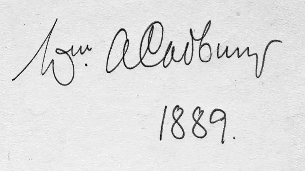
The original Cadbury signature was more than just a name on paper. It represented the personal guarantee of quality that John Cadbury stood behind. The flowing script, characteristic of Victorian penmanship, would later influence the brand’s visual identity for generations.
In those early days, packaging was relatively simple. Products were often wrapped in paper with hand-written labels; the ‘brand mark’ was whatever the shop assistant wrote on the package.
However, this personal touch helped establish the intimate connection between the Cadbury family and their products. This connection remains crucial to the brand’s identity today.
Early Commercial Adaptations
The need for a more standardised visual identity became apparent as the business grew. The late Victorian era saw the first attempts to transform John Cadbury’s signature into a commercial logotype.
This coincided with the Art Nouveau movement, which heavily influenced the decorative elements added to the basic script.
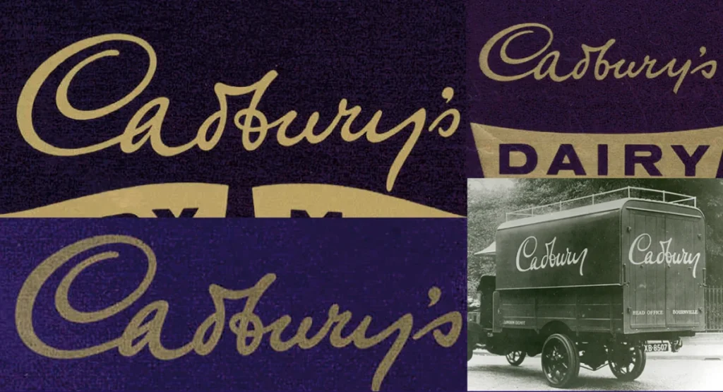
The first standardised Cadbury logotype appeared in the 1870s, featuring elaborate swirls and flourishes typical of the period. This wasn’t just an aesthetic choice – it was also practical, helping to prevent forgery in an era when brand counterfeiting was rampant.
The Purple Revolution (1905-1950)
The most significant development in Cadbury’s visual identity came in 1905 with the introduction of the now-famous purple colour. This decision, made by George Cadbury, would prove to be one of the most important in the company’s history.
The Introduction of Cadbury Purple
The choice of purple wasn’t arbitrary. During the early 20th century, purple was associated with luxury and royalty, thanks to its historical significance and the high cost of purple dye.
The specific shade chosen – Pantone 2685C – was selected to honour Queen Victoria, who had recently passed away.
Introducing this distinctive purple colour marked a turning point in Cadbury’s brand identity. It wasn’t just about the logo anymore – the colour became a brand asset. This was a revolutionary concept at the time. Cadbury was one of the first companies to understand and leverage the power of colour in branding.
Wartime Adaptations
World War II forced many brands to adapt their visual identities due to material shortages, and Cadbury was no exception. The signature purple packaging had to be temporarily abandoned due to restrictions on dye materials.
However, this period demonstrated the strength of Cadbury’s brand identity – even without their signature purple, their products remained recognisable thanks to the distinctive script logo.
The post-war period saw a triumphant return to purple and a simplified version of the script, reflecting the modernist design principles gaining popularity in the 1940s and ’50s.
Modernisation and Global Recognition (1950-2000)
The second half of the 20th century brought new challenges and opportunities for the Cadbury brand. The rise of international markets and the latest printing technologies necessitated further logo evolution.
The Script Evolution
In the 1950s, Cadbury introduced a more flowing script design that would become the foundation for their modern logo. This version maintained the connection to the original signature while being more suitable for reproduction across various mediums.
The mid-century also saw the first serious attempts to standardise the logo’s use across all products and markets. This was crucial for building global brand recognition but presented challenges in markets with different alphabets and reading directions.
Global Brand Standardisation
The late 20th century saw Cadbury expand into numerous international markets, each with its design traditions and cultural preferences. The challenge was to maintain brand consistency while respecting local sensibilities.
This period saw the introduction of strict brand guidelines governing the use of both the script logo and the signature purple colour. These guidelines helped ensure that a Cadbury product was instantly recognisable whether you were in Britain, Australia, or India.
Contemporary Refinements (2000-Present)
The digital age brought new challenges for the Cadbury logo. The intricate script that had served the brand well in print needed to be adapted for screens of all sizes.
Digital Age Adaptations
The early 2000s saw subtle refinements to improve the logo’s legibility on digital platforms. The script was slightly simplified, and the spacing was adjusted to ensure it remained clear even at small sizes. However, these changes were so carefully executed that most consumers never noticed them.
The 2020 Refresh
The most recent update to the Cadbury logo, unveiled in 2020, represents the most significant change since the introduction of the purple colour. The new design maintains the essential character of the script while making it more contemporary and digital-friendly.
The refresh included subtle but essential changes:
- Refined letter connections for better flow
- Adjusted spacing for improved legibility
- Optimised weight distribution for digital displays
- Enhanced scalability for various applications
Design Elements Analysis
The Cadbury logo’s success lies in carefully balancing several key design elements.
Typography Deep Dive
The current Cadbury script is a masterpiece of typography. While it appears effortlessly flowing, every curve and connection has been carefully considered. The logo maintains the personal, handwritten feel of the original signature while functioning effectively as a corporate symbol.
The script’s characteristics include:
- Varying line weights that create dynamic movement
- Connected letters that enhance flow and readability
- Subtle adjustments to spacing that maintain legibility at all sizes
- A slight forward slant that suggests progress and momentum
Colour Psychology
Cadbury’s purple (Pantone 2685C) has become so closely associated with the brand that the company has legally protected it in many markets. The colour’s psychological associations include:
- Luxury and premium quality
- Creativity and imagination
- Mystery and intrigue
- Royalty and heritage
Impact on Modern Brand Design
The Cadbury logo’s evolution offers valuable lessons for contemporary designers and brands.
Lessons for Contemporary Designers
The key takeaways from Cadbury’s design journey include:
- The importance of maintaining core brand elements while evolving
- The value of owning a distinctive brand asset (in this case, purple)
- The balance between heritage and contemporary relevance
- The need for technical adaptation while preserving brand essence
[lasso asin=”0007325576″ box=”0007325576″ classname=”lasso-ll-do-not-delete-57922″ id=”312176″ link_id=”57922″ look=”box” ref=”amzn-chocolate-wars-from-cadbury-to-kraft-200-years-of-sweet-success-and-bitter-rivalry”]
Future Considerations
Looking ahead, the Cadbury logo faces new challenges:
- Adaptation to emerging digital platforms
- Sustainability considerations in packaging and design
- Maintaining relevance for new generations while honouring heritage
- Balancing global consistency with local market needs
Conclusion
The evolution of Cadbury’s logo is a testament to the power of thoughtful brand evolution. From John Cadbury’s signature to today’s globally recognised symbol, each change has been made with careful consideration of both heritage and future needs.
For designers and brand strategists, the Cadbury story demonstrates how to maintain brand equity while adapting to changing times. It shows that successful brand evolution isn’t about revolution but rather careful evolution that respects the past while embracing the future.
As we look ahead, Cadbury’s logo continues to exemplify how heritage brands can remain relevant in the digital age while maintaining their distinctive character. It’s a reminder that in branding, as in chocolate-making, the best results come from carefully balancing tradition with innovation.
FAQs
When did Cadbury first use their signature purple colour?
Cadbury first introduced their iconic purple in 1905, when George Cadbury selected it to honour Queen Victoria. Initially, it wasn’t just any purple – Cadbury used a range of purple shades before settling on today’s trademarked Pantone 2685C. The decision to use purple, traditionally associated with royalty and luxury, helped distinguish Cadbury from competitors who primarily used red and brown packaging at the time.
How many major logo redesigns have Cadbury undergone since 1824?
Cadbury has undergone four significant logo redesigns since 1824:
1824-1870s: John Cadbury’s original signature
1870s-1905: First standardised commercial logotype
1905-1950s: Introduction of purple and Art Nouveau influence
1950s-2000: Modernised flowing script
2020: Latest digital-optimised refresh
What font does Cadbury use in their current logo?
Cadbury’s current logo doesn’t use a standard font – it’s a custom-designed script based on William Cadbury’s signature from the 1920s. The letterforms have been carefully refined to improve legibility while maintaining the handwritten character. While similar fonts exist, the exact Cadbury script is proprietary and protected by trademark.
Can other companies use Cadbury Purple?
Cadbury owns the trademark for their purple shade (Pantone 2685C) but only for chocolate products. This came after a lengthy legal battle with Nestlé in 2012. However, other companies can use this purple shade for non-chocolate products. The trademark explicitly covers “the colour purple (Pantone 2685C) as shown on the application form, applied to the whole visible surface of the packaging of the goods.”
Why did Cadbury update their logo in 2020?
Digital considerations primarily drove the 2020 logo refresh. The update:
Improved legibility across digital platforms
Enhanced scalability for small screens
Optimised the logo for social media
Simplified certain elements while maintaining brand recognition
Reduced production costs across different mediums
How has Cadbury’s logo influenced modern brand design?
Cadbury’s logo has influenced modern brand design in several ways:
Pioneered the use of colour as a brand asset
Demonstrated successful heritage brand modernisation
Showed how to maintain brand recognition across global markets
Established the value of signature-based logos
Proved the importance of protecting brand assets legally
Did World War II affect Cadbury’s logo and branding?
Yes, World War II significantly impacted Cadbury’s branding. During wartime rationing, the company temporarily abandoned their signature purple packaging due to dye material shortages. They used simplified designs and alternative colours, demonstrating how strong brands can maintain recognition without their primary visual elements.
How does Cadbury’s logo vary across different countries?
While Cadbury maintains global brand consistency, there are subtle variations across markets:
Arabic markets: Additional Arabic script version
India: Slightly bolder letterforms for better visibility
Australia: Occasional market-specific sub-brands The core purple and script style remain constant across all markets.
What makes Cadbury’s signature script so effective?
The effectiveness of Cadbury’s script lies in several design elements:
Variable line weight creating natural flow
Optimal letter spacing for readability
Forward slant suggesting movement and progress
Connected letters maintain the handwritten feel
The balance between decoration and legibility
Has Cadbury ever completely changed their logo design?
No, Cadbury has never completely abandoned their core design elements. Instead, they’ve evolved their logo gradually, maintaining key elements like:
Script-style letterforms
Flowing, connected letters
Purple colour scheme
Forward-leaning movement This consistency has been key to maintaining brand recognition.
How long did it take to develop the 2020 logo update?
The 2020 logo refresh took approximately 18 months from initial concept to final implementation. This included:
6 months of research and development
3 months of design iterations
6 months of testing across different media
3 months of global market testing and refinement
What role did technology play in Cadbury’s logo evolution?
Technology has significantly influenced Cadbury’s logo development:
1800s: Hand-drawn reproductions
The early 1900s: Lithographic printing enabled consistent reproduction
The 1950s: Photo typesetting allowing better control
The 1980s: Digital design tools enabling precise refinements
2020s: AI-assisted optimisation for digital platforms

