
Top 10 Famous Typography Artists for Inspiration
Let's face it. Typography is everywhere.
On your cereal box. In the ad, you just scrolled past. On the street sign, you nearly missed while daydreaming.
But most people never give it a second thought.
I used to be one of those people. Typography was just… there. Until the day it wasn't.
I was sitting in a coffee shop, nursing my third espresso, when a woman at the next table pulled out a sketchbook. She starts drawing letters. Not just any letters. These were alive. Dancing. Breathing.
I was transfixed.
That moment changed everything. It sent me down a rabbit hole of serifs, ascenders, and kerning I'm still exploring today.
And you know what? The deeper I dive, the more I realise how much typography shapes our world.
So, buckle up. We're about to meet ten typographic titans who've left an indelible mark on visual culture. These aren't just artists. They're magicians who transform the alphabet into pure visual poetry.
Ready to have your mind blown? Let's dive in.
🔰 TL;DR: Discover the stories behind ten famous typography artists who've shaped the visual world around us. Learn how their unique approaches can inspire your creative journey, regardless of your skill level. Prepare to be amazed, challenged, and motivated to see letters in a new light.
- Typography shapes our world, influencing how we perceive information and design.
- Meet notable artists like Herb Lubalin and Neville Brody, who pushed boundaries in typography.
- Each artist showed typography is not just functional but can also evoke emotion and create experiences.
- Typography journeys begin with observation, experimentation, and a willingness to break rules.
1. Herb Lubalin: The Rebel With a Cause
Herb Lubalin was more than just a typography artist. He was a revolution in human form.
Born in 1918, Lubalin came of age when typography was rigid, rule-bound, and boring. But Herb? He had other ideas.
The Man, The Myth, The Legend
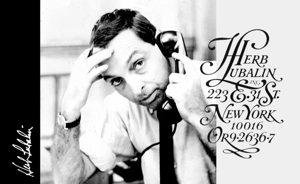
Lubalin looked at letters and saw possibilities. He saw emotion, drama, and storytelling potential, whereas others saw static shapes.
His work in magazines like Eros, Fact, and Avant Garde became legend. He didn't just design type. He sculpted it.
Take his logo for Mother & Child magazine. It's not just letters. It's a visual representation of the bond between parent and child. Pure. Genius.
Why Lubalin Matters

Lubalin taught us that typography is about more than just about readability. It's about feeling. He showed us that letters could evoke emotions as powerful as any painting or photograph.
🚀 Pro Tip: Next time you're working on a design, ask yourself: “What emotion am I trying to convey?” Then, let that guide your typographic choices.

- Hardcover Book
- Snyder, Gertrude (Author)
- English (Publication Language)
2. Neville Brody: The Digital Pioneer
If Lubalin was the past, Neville Brody was the future. Born in 1957, Brody came of age just as computers were revolutionising design.
And boy, did he run with it.
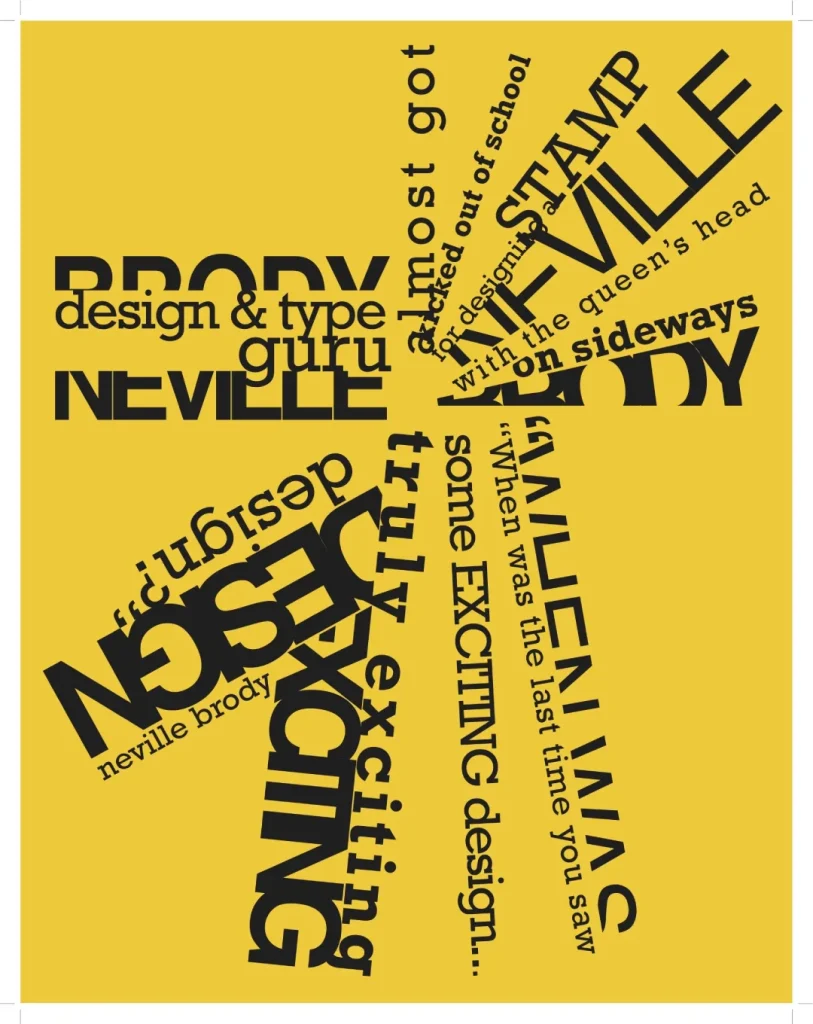
From Punk to Pixels
Brody cut his teeth in the punk scene, designing album covers that screamed rebellion. But his work for The Face magazine in the 1980s put him on the map.
He took the DIY ethos of punk and translated it into typography. The result? Edgy, experimental designs that looked like nothing else on the newsstands.
Breaking the Digital Mould
As design software evolved, Brody was always one step ahead. He embraced the digital revolution, creating fonts that pushed the boundaries of what was possible.
His typefaces, like FF Blur and FF Pop, aren't just fonts. They're statements—challenges to the status quo.
💡 Mind-Bending Fact: Brody's FF Blur font was created by blurring a sans-serif typeface. Talk about thinking outside the box!
Brody's Legacy
Brody showed us that typography mustn't be perfect to be powerful. Sometimes, it's the imperfections that make it unforgettable.
🎨 Creative Challenge: Take a classic font and distort it digitally. How does it change the mood? The message? The impact?

- Hardcover Book
- Shaughnessy, Adrian (Author)
- English (Publication Language)
3. Paula Scher: The Map Maker
Paula Scher isn't just a typography artist. She's a cartographer of the imagination.
Born in 1948, Scher has spent decades proving that type can be as expressive as any other art form.

From Album Covers to City Maps
Scher made her name designing album covers in the 1970s and 80s. But it's her later work that sets her apart.
Her typographic maps are mind-bending masterpieces. Imagine entire cities, countries, and even continents rendered in text. It's information overload in the best possible way.
The Power of Play
What sets Scher apart is her sense of playfulness. She's not afraid to have fun with type, to push it to its limits and beyond.
Her work for the Public Theater in New York is a perfect example. Bold, brash, and impossible to ignore. It's typography that demands attention.

Scher's Secret Sauce
Scher's work reminds us that typography isn't just about communicating information. It's about creating experiences.
🎭 Thought Experiment: What would it look like if your life was a typographic map? What words would be most prominent? Smallest? Most colourful?

- Scher, Paula (Author)
- English (Publication Language)
- 520 Pages – 05/30/2024 (Publication Date) – Unit Editions (Publisher)
4. Stefan Sagmeister: The Provocateur
Stefan Sagmeister isn't interested in playing it safe. He's here to provoke, challenge, and occasionally, shock.
Born in Austria in 1962, Sagmeister has built a career on pushing boundaries and asking uncomfortable questions.
Typography as Performance Art
Sagmeister doesn't just design type. He lives it.
For one project, he carved letters into his skin. For another, he arranged 250,000 Euro cents to spell out “Obsessions make my life worse and my work better.”
It's typography as performance art, and it's utterly captivating.
The Beauty of the Unexpected
What makes Sagmeister's work so powerful is its unexpectedness. He'll use anything and everything as a canvas for type: bananas, buildings, his own body.
The result? Typography that stops you in your tracks and forces you to think.

Sagmeister's Challenge to Us All
Sagmeister's work is a reminder that great typography isn't just about choosing the correct font. It's about finding new ways to make letters speak.
🧠 Mind-Bender: What's the most unexpected surface you could use for typography? How would it change the message?

- Things I have learned in my life so far, Updated Edition
- Product type: ABIS BOOK
- Brand: Harry N. Abrams
5. Jessica Hische: The Letter Lover
In a digital design world, Jessica Hische is keeping the art of hand-lettering alive and thriving.
Born in 1984, Hische represents a new generation of typographers who blend traditional techniques with modern sensibilities.

The Daily Drop Cap
Hische first made waves with her “Daily Drop Cap” project. Every day for a year, she designed a new ornamental letter and shared it online.
It was a masterclass in creativity, consistency, and the sheer joy of letterforms.
From Dropcaps to Wes Anderson
Hische's talent soon caught the eye of big names. She's designed film titles for Wes Anderson, book covers for Dave Eggers, and even a postage stamp for the US Postal Service.
Her style? Elegant, playful, and unmistakably human.

The Power of Practice
What sets Hische apart is her dedication to her craft. She's living proof that with enough practice, anyone can turn letters into art.
✍️ Daily Challenge: Pick a letter. Any letter. Now, draw it in 10 different styles. Repeat tomorrow with a new letter. Watch your skills grow.

- Hardcover Book
- Hische, Jessica (Author)
- English (Publication Language)
6. Jonathan Barnbrook: The Political Provocateur
Jonathan Barnbrook isn't just a typographer. He's a visual activist.
Born in 1966, Barnbrook has spent his career proving that typography can be a powerful tool for social and political commentary.

Fonts with a Message
Barnbrook's fonts are more than just beautiful. They're loaded with meaning.
Take his font “Drone”. A tiny explosion accompanies each letter, a stark reminder of the human cost of drone warfare.
Or “Patriot”, a font that mimics the redacted documents of government agencies. It's typography that makes you think.
The Bowie Connection
Barnbrook is best known for his long collaboration with David Bowie. He designed the album covers for Bowie's final four albums, including the iconic “★” (Blackstar).
These designs are masterclasses in using typography to enhance and amplify musical themes.

Barnbrook's Wake-Up Call
Barnbrook's work is a powerful reminder that typography isn't neutral. It can carry messages, provoke thoughts, and even inspire action.
🎵 Musical Challenge: Pick your favourite album. What would it look like if you redesigned the cover using only typography? How would you capture the essence of the music?
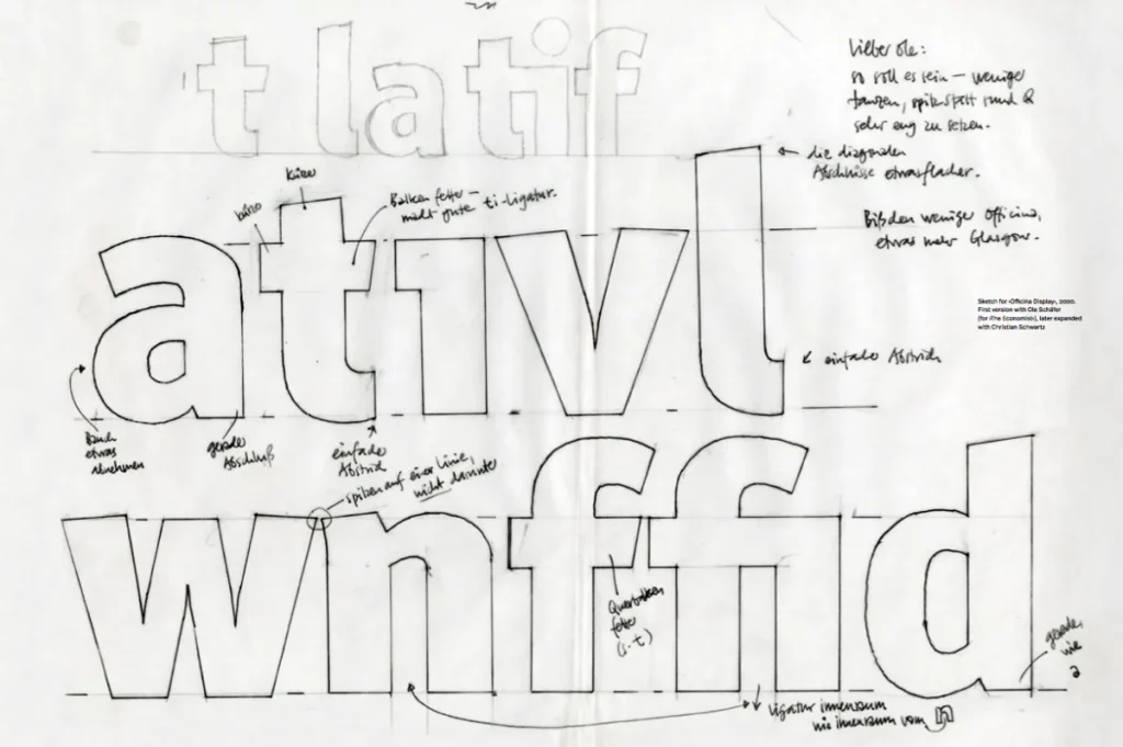
7. Erik Spiekermann: The Typography Evangelist
If typography had a rockstar, it would be Erik Spiekermann.
Born in 1947, Spiekermann has been spreading the gospel of good type for decades. Designer, author, entrepreneur – he's done it all.
The Font Machine
Spiekermann has designed some of the most widely used typefaces in the world. Meta, Officina, ITC Officina – chances are, you've seen his work without realising it.
His fonts are like well-tailored suits: elegant, functional, and timeless.
From Deutsche Bahn to The Economist
Spiekermann's influence extends far beyond the design world. He's shaped the visual identity of major brands and institutions, from Germany's national railway to The Economist magazine.
His secret? Understanding that typography isn't just about looking good. It's about solving problems.

The Teacher and the Troublemaker
What sets Spiekermann apart is his passion for sharing knowledge. Through books, lectures, and workshops, he's inspired countless designers to take type seriously.
And he's not afraid to ruffle feathers. His Twitter feed is a masterclass in typography critique (and the occasional rant).
🚂 Travel Thought: Pay attention to the signage next time you're in a train station or airport. How does the typography help (or hinder) navigation? What would Spiekermann say?

- Hardcover Book
- Johannes Erler (Author)
- English (Publication Language)
8. Louise Fili: The Elegant Traditionalist
Louise Fili's work whispers with elegant authority in a world of loud, attention-grabbing graphics.
Born in 1951, Fili has built a career in creating typography that feels both timeless and fresh.

From Book Covers to Bistros
Fili designed book jackets – over 2000 of them. However, her work in branding and packaging design showcases her typographic talents.
Her designs for restaurants and food products are a feast for the eyes. They evoke a sense of vintage charm without ever feeling outdated.

The Art of the Swash
Its graceful curves and intricate details characterise Fili's style. She's a master of the swash – those elegant flourishes that turn letters into art.
But it's never ornamentation for its own sake. Every curl and loop serves the overall design.
Fili's Timeless Appeal
Fili's work reminds us of the enduring power of classic typography in an age of rapidly changing design trends.
🍝 Tasty Task: Imagine you're opening a new restaurant. Design a logo using only typography. How would you capture the essence of your cuisine through letterforms alone?

- Hardcover Book
- Fili, Louise (Author)
- English (Publication Language)
9. David Carson: The Grunge Guru
David Carson would lead the charge if typography had a punk rock rebellion.
Born in 1954, Carson turned the design world upside down in the 1990s with his unconventional, often illegible layouts.
Surfing the Wave of Innovation
Carson came to design late, after a career as a professional surfer. Maybe that's why his work feels so fluid, so willing to break the rules.
His layouts for Ray Gun magazine became iconic. Text flowed across pages in ways that defied logic – and readability. But it looked amazing.
The Beauty of Chaos
Carson's philosophy? “Don't mistake legibility for communication.” He showed that typography could be expressive, emotional, and even chaotic.
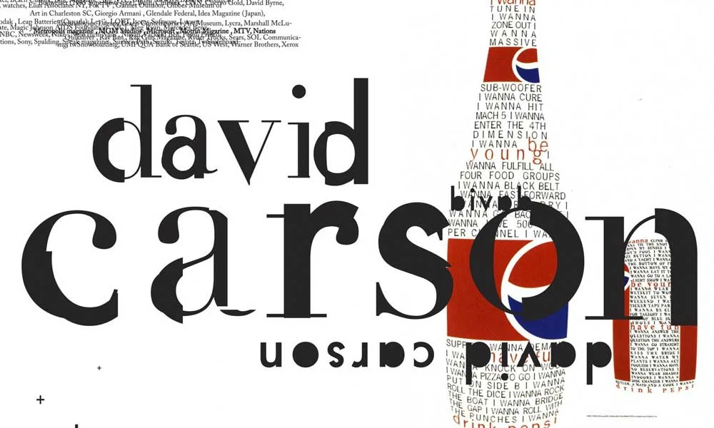
His work can be challenging to read. But it always makes you feel something.
Carson's Lasting Impact
While the grunge aesthetic Carson pioneered may have faded, his influence hasn't. He showed us that rules are made to be broken – and sometimes, that's how you make magic.
🎨 Chaotic Creation: Take a paragraph of text and lay it out in the most unconventional way possible. How does it change the way you perceive the content?

- Hardcover Book
- Marvin Scott Jarrett (Author)
- English (Publication Language)
10. Marian Bantjes: The Ornamental Alchemist
Last but certainly not least, we have Marian Bantjes – the woman who turns typography into pure visual poetry.
Born in 1963, Bantjes has carved out a unique niche with her intricate, ornamental style.
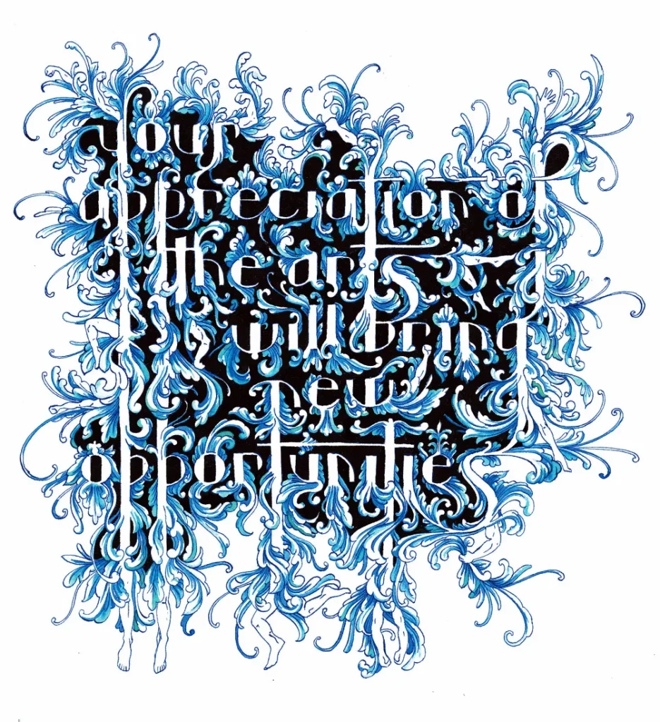
From Commercial Art to Fine Art
Bantjes started her career in book typesetting, but her personal work is breathtaking. She creates complex patterns and illustrations using type as her building blocks.
The result? Pieces that blur the line between typography and fine art.

The Devil in the Details
What sets Bantjes apart is her attention to detail. Her work rewards close inspection – the longer you look, the more you see.
She's proof that even the most basic letterforms can become something extraordinary in the right hands.
Bantjes' Beautiful Challenge
Bantjes reminds us that typography isn't just about communicating information. It can be a form of expression in its own right.
🔍 Microscopic Mission: Take a single letter and turn it into a detailed illustration. How many different ways can you embellish it while still keeping it recognisable?

- Hardcover Book
- English (Publication Language)
- 260 Pages – 09/30/2013 (Publication Date) – Metropolis Books (Publisher)
Other Notable Typography Artists & Typographers
Claude Garamond
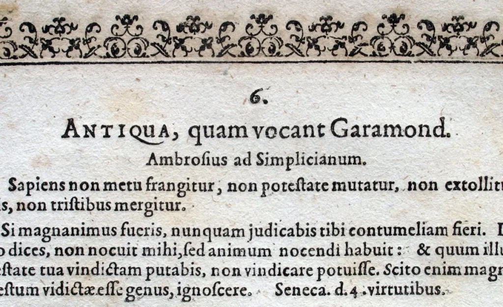
Claude Garamond holds a notable place in the history of typography, mainly shaping the design standards of printed text as we see them today. As a French typographer from the 16th century, his work laid the foundation for modern type aesthetics.
Foundation and Influence
Garamond was trained under the skilled guidance of Antoine Augereau, which honed his abilities and set him on a path to innovation. His contributions were a turning point in typographic design, as he introduced unprecedented elegance and readability at the time.
Iconic Typography and Legacy
Garamond, the typeface named after him, was initially created for King François I. This typeface is celebrated for its balance between readability and beauty, and it has been a staple in publications for centuries. Its classic style continues to influence modern typefaces, demonstrating the timeless nature of Garamond's designs.
Claude Garamond's legacy endures through the widespread use of his typefaces and the path he paved for future typographers, blending artistry with functionality in the print world.
Matthew Carter

Matthew Carter has made profound contributions to the world of typography, shaping how we read text on paper and screens today. As a British type designer active in the contemporary era, his work has become synonymous with some of the most widely recognized digital and print fonts.
Early Foundations and Influences
Carter's journey into typography began with an internship at the prestigious Joh. Enschedé in The Netherlands, which laid a strong foundation in traditional type design techniques. This experience helped him bridge the gap between classical typographic principles and modern technology.
Notable Typeface Creations
Carter's creative genius is evident in the design of several iconic typefaces, including:
- Georgia
- Verdana
- Tahoma
- Bell Centennial
Each font was crafted with specific goals, such as screen readability and clarity in small print, demonstrating his keen understanding of evolving user needs.
Influence Across Media Platforms
Carter's fonts have been extensively utilized across major media outlets around the globe. His work for influential publications like Time, The Washington Post, The New York Times, and Newsweek showcases his fonts' versatility and impact on the presentation of information.
Legacy and Continued Relevance
Through his foundry, Carter & Cone, Matthew Carter has cemented his reputation as a pivotal figure in modern typography. His contributions are celebrated in talks and lectures, such as his insightful TED Talk “My Life in Typefaces,” where he shares his journey and the stories behind his influential designs.
Carter's typefaces have become integral to digital communication, ensuring his legacy in typography will continue to influence designers and readers alike for generations to come.
Tobias Frere-Jones

A prominent American type designer, Tobias Frere-Jones, has significantly contributed to contemporary typography. His formal training took place at the Rhode Island School of Design, and he currently operates his foundry, Frere-Jones Type.
Frere-Jones has created several influential fonts that have left a considerable mark on design aesthetics:
- Gotham: Known for its clean, modern look, this typeface gained popularity for its versatile use in various media.
- Interstate: Inspired by highway signage, this font is favoured for its clarity and functionality.
- Archer: Developed in collaboration with Jonathan Hoefler, Archer offers a more playful and inviting serif style.
Frere-Jones’ design prowess has extended to high-profile projects for prestigious publications and institutions such as The Boston Globe, The New York Times, Cooper-Hewitt National Design Museum, and the Whitney Museum.
For more insights into his work and ongoing projects, check out Frere-Jones Press.
Jonathan Hoefler

Jonathan Hoefler is renowned in the typography world for crafting several iconic typefaces. Among his most notable creations are:
- Hoefler Text: A classic serif font celebrated for its elegant design and versatility in print.
- Requiem: It is known for its sophisticated and historical influence and is perfect for traditional and formal projects.
- Archer: A friendly and modern slab serif developed in collaboration with Tobias Frere-Jones, offering a unique mix of readability and charm.
These typefaces have become staples in various design projects, showcasing Hoefler’s skill in blending aesthetics with functionality.
Wrapping It Up: Your Typography Journey Starts Now
We've travelled through time and space, from the rebellious spirit of Herb Lubalin to the ornate wonders of Marian Bantjes.
Each of these ten artists has shown us a different facet of typography's power:
- To evoke emotion
- To challenge perceptions
- To communicate complex ideas
- To create experiences
- To provoke thought
- To solve problems
- To preserve tradition
- To break rules
- To express individuality
But here's the thing: you don't need to be a design prodigy to start exploring typography.
Every one of these artists started somewhere. They practiced. They experimented. They failed. And then they tried again.
So, what's stopping you?
Your Call to Action
- Start noticing typography everywhere you go. In ads, on packaging, in the books you read.
- Experiment with different fonts in your everyday documents. How does changing the typeface change the mood?
- Try hand-lettering. You don't need fancy tools – a pen and paper will do.
- Break the rules. Take a page from David Carson and see what happens when you ignore conventions.
- Share your creations. Join online communities of typography enthusiasts. Get feedback. Learn. Grow.
Remember: every master was once a beginner. Your typography journey starts with a single letter.
So go on. Make your mark.
FAQs: Demystifying the World of Typography
What exactly is typography?
Typography is the art and technique of arranging type to make written language legible, readable, and appealing when displayed.
Do I need special software to start exploring typography?
Not necessarily! While professional designers use tools like Adobe Illustrator, you can start with simple word processors or pen and paper.
What's the difference between a font and a typeface?
Are there rules for good typography?
There are principles, like readability and hierarchy, but as our top 10 list shows, rules are often made to be broken!
Can typography influence how people perceive a message?
Absolutely! Typography can convey tone, emotion, and even credibility. It's a powerful communication tool.
How has digital technology changed typography?
Digital tools have made typeface design more accessible and allowed experimentation. However, many designers still value traditional techniques.
What's the most important thing to consider when choosing a font?
Context is critical. Consider your audience, the medium, and the message you're trying to convey.
Last update on 2025-10-18 / Affiliate links / Images from Amazon Product Advertising API

