10 Simple Design Principles to Create Stunning Graphics
Right now, you're drowning in a sea of mediocre visuals that look like a toddler with a broken crayon designed for them. Your graphics are bleeding potential, leaking credibility, and pushing away the exact customers you're trying to attract.
But what if I told you that with just 10 elementary design principles, you could transform your visual content from “meh” to magnetic?
These aren't complicated, theoretical nonsense that'll make your head spin. Top brands and world-class designers use battle-tested, immediately applicable strategies to create graphics that don't just catch eyes—they chain them to the screen.
In the next few minutes, I will hand you the playbook that will elevate your design game from amateur hour to a professional-grade aesthetic that makes people stop, stare, and act.
Are you ready to turn your graphics into your secret weapon?
- Key design principle: Ensure a solid focal point for effective communication and visual hierarchy in graphics.
- Lines as tools: Use lines to guide viewer focus and enhance visual composition in various media.
- Utilise colour: Choose colours intentionally to evoke emotions and establish a desired mood in your designs.
- Balance elements: Achieve visual interest through symmetrical and asymmetrical balance while maintaining coherence in layout.
1 – Find a focus

The most critical trait of effective graphic design is a solid focal point. Without a clear focus, a design lacks purpose and fails to connect with its audience.
A focal point gives the viewer's eye a place to rest and something to latch onto within the composition. It draws attention to the most vital elements and creates a visual hierarchy. The rest of the design should complement and support the focal area without competing.
When creating a graphic design, identify the core message or idea you want to communicate. This will guide you in choosing an appropriate focal point encapsulating that concept. For example, if you are designing a poster for an upcoming concert, the focal area could be a large image of the musical act. An advertisement may also include a product shot or brand logo.
Real-world examples show the impact of a well-defined focal point. Apple's use of a single product image against a minimalistic background directs immediate attention to its sleek design. Coca-Cola frequently employs its iconic red and white logo centrally in adverts, ensuring attention focuses on the brand.
In graphic design, strategic focal points such as these ensure that the core message resonates quickly and effectively with audiences. This technique streamlines communication and enhances the viewer's retention of key elements.
Once you determine the main focal point, use design techniques to emphasise it. Strategically adjust the scale, contrast, colour, and other elements to make the focal area stand out. For instance, make it significantly larger or brighter than the surrounding details. Lead the viewer's eye toward the focal point with lines, frames, or the natural flow of the composition.
A solid focal point draws attention and gives the entire design cohesion and impact. It enables you to express the purpose or message more effectively. When the focal area aligns with the core concept, it immediately connects with the viewer.
The company logo makes an ideal focal point for business owners creating graphics for their brands, products, or services. Consistently highlighting the logo as a central design element improves brand recognition. It also provides opportunities for branding across digital platforms, which aids SEO and marketing efforts. A practical focal point is the key to graphic designs that leave a lasting visual impression.
Moreover, strategic focal points aid in storytelling. National Geographic covers regularly feature striking wildlife imagery as the primary focus, drawing viewers into the narrative. This approach captivates interest and initiates the story, inviting viewers to explore related content more deeply.
Such careful planning allows focal points to become powerful tools for engagement, bridging the gap between first impressions and comprehensive understanding.
2 – Use lines

Visual content comprises lines, whether a painting, photograph or even the text you are reading. These lines can be straight, angled, curved, or zig-zagged. While we may not consciously notice them, lines are the building blocks of all visual media.
Lines are incredibly versatile design elements. Straight lines can convey order, structure, and simplicity. Curved and wavy lines imply fluidity, rhythm, and movement. Zig-zags and scattered lines can create excitement, energy, and tension within a composition. Lines direct our eyes throughout an image and highlight the most critical parts. This makes them invaluable for guiding the viewer's focus.
One of the most common uses of lines is as leading lines. These direct the viewer's gaze towards a specific point of interest or the main focal point. For example, a photograph may use linear perspective with converging lines to draw focus to a central subject. Flowcharts and diagrams rely on leading lines to visually walk people through information.
Leading lines are a great tool, but only some designs will lend themselves to literal lines. A skilled designer can still imply direction and movement to control focus, even without clear lines. Careful arrangement of graphic elements and judicious use of contrast, colour, and space allows a designer to direct the eye just as well.
Pay attention to the existing lines and shapes within your visual content. A row of people, the edge of a building, or repeating graphic elements can all act as lines within the composition. Leverage these to create flow and prioritise the critical parts of your design. With practice, you can intuitively use lines, shapes, and placement to guide the viewer's eye and create a visual hierarchy.
Advanced Uses of Lines in Design
Lines serve more than just static purposes in advanced design contexts. In interactive media, lines guide user interaction and create pathways that enhance usability.
In augmented reality (AR) applications, designers use flowing lines to mimic real-world perspectives and direct user focus within immersive experiences. In virtual reality (VR), lines set boundaries and scopes, aiding users in navigating virtual spaces. Thus, lines enhance visual appeal and improve interaction, driving effective communication through design.
3 – Scale

Scale is a fundamental principle of graphic design that refers to the size of individual elements relative to one another and the composition as a whole. The scale helps establish hierarchy, direct the viewer's attention, and convey meaning and relationships between visual components.
When elements are appropriately scaled, viewers can easily make sense of the composition. For example, when drawing an elephant next to a dog, it makes intuitive sense to draw the elephant much larger to communicate their relative sizes. While this example relies on realism, the scale can also be manipulated expressively.
The scale does not have to represent real-world sizes accurately. By dramatically enlarging or reducing elements, designers can emphasise essential details, downplay others, and create visual harmony. For instance, expanding a part of an object can focus attention on its textures and intricacies. Reducing the number of less significant elements helps pronounce primary subjects.
Scale also organises information. More prominent elements are perceived as being more important than smaller ones. A title set in a big, bold font conveys primacy over body text. Icons, logos, and other graphic symbols can be scaled to denote significance.
Additionally, uniformity of scale contributes to unity and consistency. The layout appears more cohesive when the sizes of repeating elements, such as icons and graphic accents, are consistent. Proportion comes into play here, too – features scaled harmoniously to create a sense of balance.
In summary, scale manipulations establish hierarchies, direct focus, communicate relationships, organise information, and bring visual coherence to a design. Masterful scale use requires designers to consider elements' meaning, weight, and connections.
4 – Colour
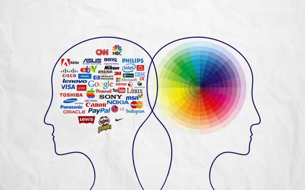
Colour is essential for any graphic design project. The colours you choose establish specific moods, evoke emotions, create atmospheres, and convey symbolic meanings. In short, colour can make or break a design.
When selecting colours, resist throwing in random hues to make your design appear more vibrant. Instead, choose shades that intuitively match the overall concept you want to get across. Complementary or analogous colours often work well together, creating visual harmony.
You can use colour filters and editing tools to find the perfect colour palette for your design. But make intentional choices that enhance the emotions and ideas you want to express.
Monochromatic colour schemes can also be very effective. Using different tones, tints, and shades of a single hue gives a design sophistication and depth. For example, an event poster with other blacks, greys, and silvers has a classic, formal aesthetic.
Likewise, dropping the contrast of images creates a soft, calm mood. So, if you're designing something peaceful and understated, try desaturating the colours.
In summary, colour should not be an afterthought in graphic design. Leverage its psychological power to evoke the right tone for your project. A thoughtful, intentional use of colour takes your design from mediocre to masterful.
Psychological Impact of Colours
Colours wield significant psychological influence, affecting mood and perception.
Blue often imparts calm and trust, which tech companies like IBM and Facebook widely utilise. Red conveys urgency and excitement, making it apt for brands like Netflix and Red Bull, aiming for energetic engagement.
Studies indicate that 90% of initial product judgments are based on colour alone. This innate power highlights why aligning colour choices with brand values is essential, ensuring the desired emotional connection with audiences.
5 – Balance out the elements

A balanced design is critical to creating visual interest and appealing aesthetics. When elements are thoughtfully composed, viewers are drawn into the image and intrigued to take a closer look. Graphic designers have two primary tools to strike the ideal balance: symmetrical and asymmetrical.
Symmetrical balance reflects identical design components across an axis, vertically or horizontally. The composition appears neat, ordered, and poised by evenly distributing elements in this mirror-image style.
Symmetry exudes a sense of sophistication and harmony. However, the most straightforward balancing technique, strict balance, can sometimes be unexciting or overly rigid.
A more dynamic option is asymmetrical balance. This approach achieves balance by carefully counterposing unequal visual weights across the design. Smaller, lighter, or simpler forms on the other offset larger, darker, or more detailed elements on one side.
Asymmetry injects visual tension, variety, and vitality into a layout. The composition is integrated through the thoughtful use of contrasting shapes, colours, and negative space. Since asymmetry mirrors the irregularity found in nature, designs feel organic, spontaneous, and full of motion.
Most designers artfully mix symmetrical and asymmetrical balance within their graphics. Areas of symmetry establish order and structure, while asymmetric spots create flair. Together, they form a satisfying give-and-take that engages viewers' eyes. Experiment with the interplay of symmetry and asymmetry to produce maximally appealing and absorbing visual balance.
Case Studies on Design Balance
The concept of balance is exemplified in designs from top firms like Pentagram. In HSBC's branding, symmetrical lines embody stability, echoing the bank's trust-focused identity.
Conversely, asymmetrical design finds favour in media, where it introduces dynamism. The BBC employs asymmetric layouts in web interfaces to draw interest without overwhelming the audience.
These examples demonstrate that whether through symmetry or asymmetry, balance is fundamental to engaging, practical design that communicates core messages without chaos.
6 – Repeat design aspects
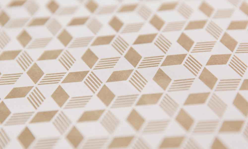
Contrary to popular belief, strategic repetition of specific design elements can help maintain consistency and cohesion in a design scheme. Rather than avoiding duplication at all costs, designers can thoughtfully reuse particular visual styles, motifs, layouts, or graphic elements more than once within a project.
When planned intentionally, repeating critical aspects of a design is an effective way to tie disparate parts of the work into a unified whole. For example, a designer might choose a specific colour palette, font, graphical motif, or layout template to repeat across multiple project components.
Using the same navigation style at the top of several website pages or echoing an accent colour on a brochure's front and back cover can create repetition that makes the work feel cohesive.
Repetition is especially crucial when designing multi-page layouts like books, magazines, websites and other publications where consistency across sections is essential. Since creating unique designs for every page is not feasible, repeating certain elements creates flow and continuity.
Readers can more easily make connections and transitions between sections when aspects of the methods are familiar. Flipping between pages with distinct designs can feel disjointed and disconnect the content.
Thoughtful repetition ultimately saves time and effort while enhancing the overall harmony of the work. Designers can establish efficient systems and repeated styles rather than reinventing the wheel for each new page or component. When done right, repetition can feel more varied and exciting. Little touches that echo and reinforce each other can make a big difference in tying a project into one unified vision.
7 – Leverage the white space
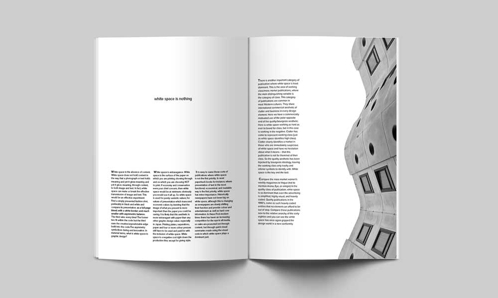
White space is often overlooked or even feared in design. Many view expansive empty areas as wasted real estate that should be filled. However, when used strategically, white space can transform a cluttered design into one that breaches elegantly.
White space brings much-needed breathing room to layouts, guiding the viewer's eye towards key elements without distraction. It creates visual harmony and balance, allowing the essential aspects to shine. Like musicians use rests and pauses to shape melodies, designers employ white space to punctuate visual rhythms.
Implementing white space effectively takes thoughtful planning. One approach is to scale down graphic elements and images, providing a comfortable frame around them. You can also isolate a dominant image or headline in ample open space to draw attention. White space helps focus each composition within the whole.
Remember, white space is not merely a blank filler waiting to be occupied. It has a purpose and function. The amount of white space is a deliberate choice that impacts how information and ideas are communicated. Don't fear white space or try to eliminate it. Instead, view it as a design element you can leverage to craft an experience for the viewer.
While it takes practice to incorporate white space skillfully, the rewards are ample. Thoughtful use of empty areas results in designs that feel uncluttered, luxurious, and easy on the eyes. White space brings composition room to breathe and directs the viewer's gaze. Once you embrace its power, your designs will benefit greatly.
8 – Align the elements in the design
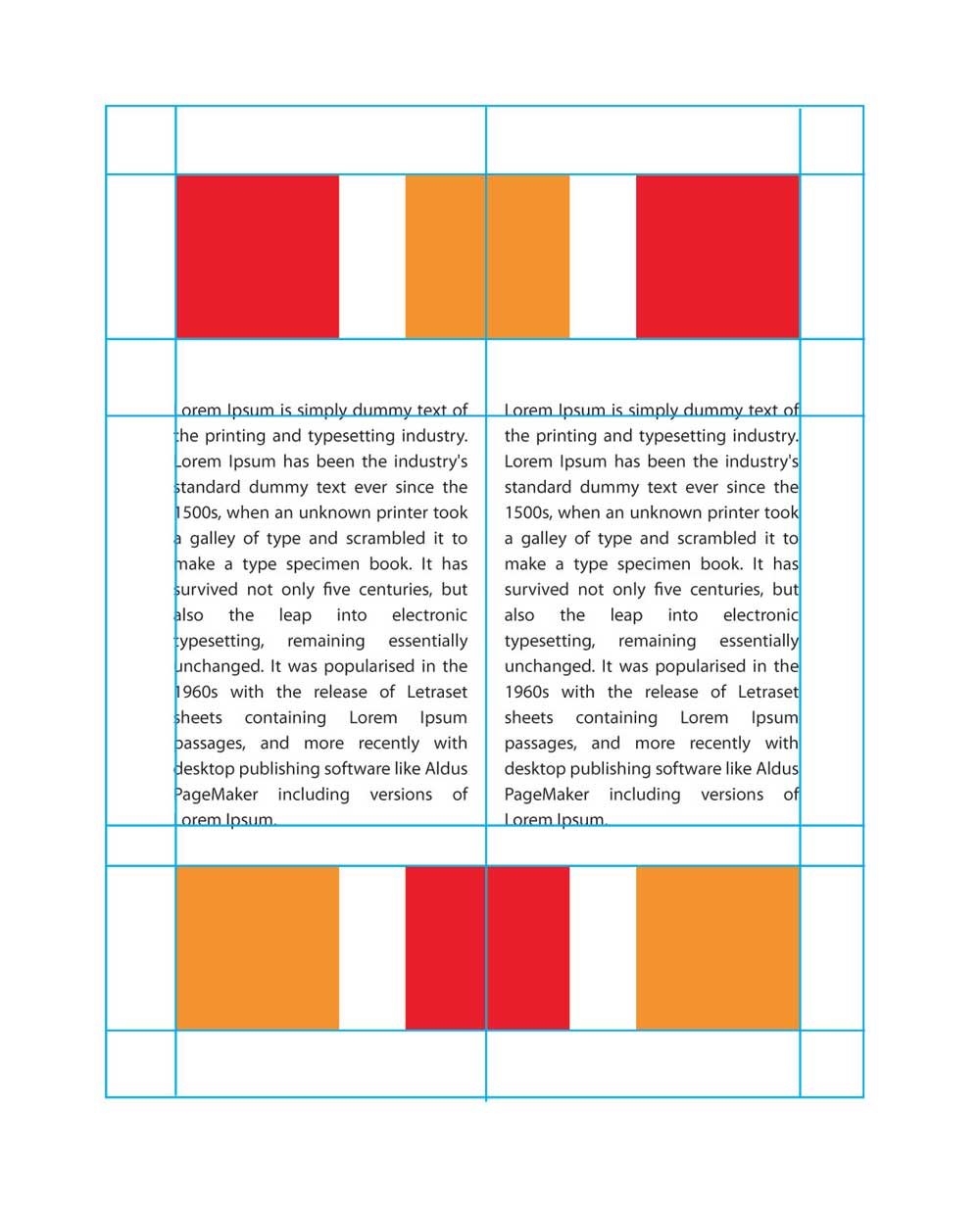
Creating a visually appealing design requires careful attention to the placement and alignment of elements on the page. When composing a design with multiple components, it is crucial not to scatter items without thought randomly. Doing so results in a cluttered and chaotic appearance that is unpleasing to the eye.
Proper alignment is critical for transforming a sloppy design into elegance and order. Precisely lining up images, text boxes, headlines, and other elements makes the layout look crisp and intentional. It creates a sense of harmony and visual flow for the viewer to follow as they scan the page.
In addition to aesthetics, alignment aids organisation and draws attention to critical areas. For instance, if a design contains various graphics, charts and photographs, aligning them properly gives each one its space. This prevents them from blending into a loud, distracting mass of visuals competing for the viewer's focus.
Alignment also helps identify where to place pockets of white space in the composition. Skilful use of empty areas gives the eyes a place to rest while preventing the design from feeling too crowded. Careful alignment ensures no awkward gaps are left, as this can break the fluidity of the layout.
Overall, meticulous alignment of all elements creates order out of chaos. It is one of the most vital steps in transforming a busy page into a masterfully designed, visually captivating work that engages rather than overwhelms the beholder. Align thoughtfully, and watch your creation shift from mediocrity to magnificence.
9 – Play with the contrast
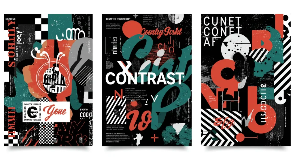
Contrast is a powerful design tool that dramatically influences how viewers experience and interpret your work. By thoughtfully manipulating contrast, designers can guide the eye, create a visual hierarchy, and evoke certain emotions and associations.
There are two main ways to utilise contrast in design:
- Increasing contrast draws attention and creates emphasis. When an element differs starkly from its surroundings, it immediately captures interest. Bold colours popping against a muted background, large types amongst small, or unique shapes in a sea of rectangles all use contrast to highlight and accentuate. This is useful for calling attention to a call-to-action, orienting the viewer, or denoting importance. However, high contrast can become chaotic or overwhelming when overused.
- Decreasing contrast unifies and smooths. When adjacent elements share similar or gradually differing attributes like colour, scale, or style, they visually cohere into a harmonious whole. Soft gradients, low saturation, repeating patterns, and consistent sizing utilise low contrast to create comfortable, elegant designs. However, too little difference can result in a design that lacks hierarchy, interest, or energy.
Skilled designers learn to strike the right balance, using contrast to draw the eye while preventing chaos or monotony selectively. They might boost the difference between sections to divide information or reduce the distinction between minor elements to declutter.
Contrast adds visual nuance and interest when thoughtfully implemented. Still, it must be carefully balanced to avoid distraction or confusion. Testing different contrast levels allows designers to control the visual experience and reach their desired intent.
10 – Use elements that complement
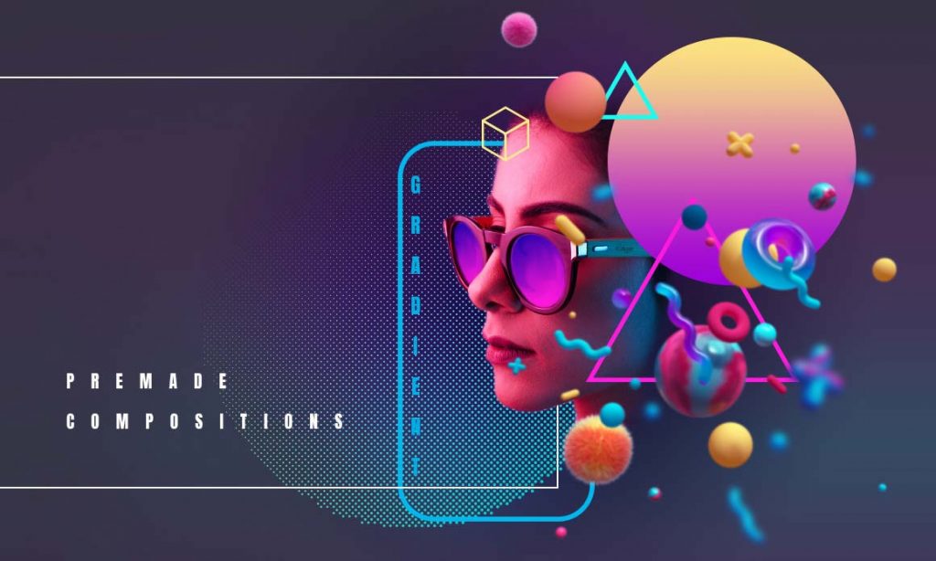
Creating a cohesive and aesthetically pleasing design requires carefully considering how visual elements work together. One of the most common mistakes is using images, graphics, fonts, or other features that clash instead of complementing one another. When elements are poorly matched, it creates visual dissonance that disrupts the overall composition.
To avoid this issue, designers must intentionally select features that enhance each other. Using multiple images, choose similar styles, colour palettes, perspectives, or themes. Pictures shot from similar angles or distances will blend more seamlessly.
Stick to two or three complementary colours in graphics, fonts, and other visuals. Use similar font families across headlines, body text, and other typographical elements.
The goal is to create unity across the design, where each component feels connected. Well-paired visual features will align in everything from mood to aesthetics, supporting the overall message or purpose.
Thoughtfully blending complementary elements makes the composition feel cohesive, polished, and purposeful. It demonstrates skilful attention to how to design fundamentals like colour, typography, white space, proportions, and more can work in harmony.
Taking the time upfront to carefully select and align visual features will result in a robust and unified composition. It elevates the design from a random assortment of elements to a strategic and aesthetically pleasing presentation of information.
Insights into Design Principles
The ten principles outlined above provide a strong foundation for creating compelling and appealing graphic designs. By focusing on unity, variety, hierarchy, proportion, balance, emphasis, rhythm, scale, movement, and economy in your plans, you can craft visually interesting work that communicates crucial information and ideas to your audience.
Though there are countless techniques and best practices to learn in the design world, mastering these core principles will take you far. A deep understanding of the elements that make designs cohesive and purposeful will enable you to make confident decisions as you bring your creative visions to life.
Whether you are an experienced designer seeking to refine your skills or just starting your design journey, reference these principles as guideposts. Let them steer you as you experiment with different compositional choices and visual treatments. They will lend professional polish and intentionality to your designs when thoughtfully applied, setting you up for success.
So, take these foundational guidelines to heart. Immerse yourself in how unity, variety, hierarchy, proportion, balance, emphasis, rhythm, scale, movement, and restraint influence perceptions and engage viewers. As you gain experience and refine your aesthetic, you may build upon these principles with your personalised take.
But their essence will provide you with a robust, adaptable framework applicable to any design scenario you encounter as your skills progress.


