13 Key Logo Design Techniques That Top Brands Use
Hey there, logo design enthusiast! Are you tired of feeling like your logo creations are just… meh?
Well, buckle up because I'm about to lay down 13 key logo design techniques that will transform your designs from drab to fab.
I've been in the logo design game for 20 years. And let me tell you, I've seen it all – the good, the bad, and the downright ugly.
But through it all, I've learned something or two about creating a killer logo that makes your brand stand out.
So, listen up whether you're a seasoned designer or a newbie just starting. These techniques are going to change the way you approach logo design forever. No more settling for second-best, my friend.
- Simplicity is crucial; classic logos like Nike and Apple exemplify recognisable, clean designs.
- Utilise negative space to create balance and elegance, enhancing your logo's visual impact.
- A successful logo should be versatile, maintaining clarity across various applications and contexts.
- Infuse symbolism into designs to reflect your brand’s values and mission, creating emotional connections.
- Prioritise distinctiveness to ensure your logo stands out among competitors and is instantly recognisable.
1. Simplicity 🤸♀️
Let's start with the basics, shall we? When it comes to logo design, simplicity is vital. I can't tell you how many times I've seen just… busy logos.
The thing is, the most successful logos are often the most simple. Think about it – the Nike swoosh, the Apple logo, the Twitter bird. These icons are instantly recognisable, and that's because they're clean, minimal, and easy on the eyes.
So, when brainstorming logo ideas, resist the urge to cram in every element you can think of. Instead, focus on creating a streamlined, sophisticated design that is easy to remember. 🤓
2. Negative Space 🕳️

Speaking of simplicity, let's talk about the power of negative space. Negative space is the empty area surrounding your logo's main elements, and it can be just as important as the design itself.
I'll always remember the time I was working on a logo for a new tech startup. The client wanted something that looked “futuristic and innovative,” so they kept piling on the elements – gradients, 3D effects, the works. But it just looked like a hot mess.
Then, I had a lightbulb moment. I stripped away all the unnecessary elements and focused on the negative space. Suddenly, the logo came to life! The empty areas between the shapes created a sense of balance and elegance that the cluttered design had been lacking.
The moral of the story? Don't be afraid to let your logo breathe. Use negative space to draw the eye to the most important parts of your design and create a sense of visual harmony. 🎨
3. Versatility 🧠
I know what you're thinking: “But how can I create a memorable logo if I have to keep it simple and minimal?” Well, my friend, that's where versatility comes in.
One of the hallmarks of a truly great logo is its ability to adapt to different contexts and applications. Think about it – your logo must look as sharp on a business card as on a massive billboard.
I'll never forget the time I was working on a logo for a law firm. The client wanted something “traditional and prestigious,” but they also wanted it to work for their digital marketing materials. Yikes! Talk about a tall order.
But you know what I did? I focused on creating a clean, timeless, and easily scalable design. No crazy gradients or unnecessary embellishments – just a simple, elegant mark that could shine in any setting.
The key is to keep your logo design flexible and adaptable. That way, you can ensure that your brand looks consistent and cohesive, regardless of where it appears. 📐
4. Symbolism 🕊️

One of the most powerful tools in a logo designer's toolkit is the ability to infuse your design with symbolic meaning. After all, the best logos aren't just pretty pictures – they're visual representations of a brand's values, mission, and identity.
I remember this one time I was working on a logo for a non-profit organisation that helped rescue and rehabilitate injured birds. The client wanted something that was both visually striking and deeply meaningful.
So, I started playing around with different bird silhouettes and shapes. And you know what I landed on? A simple, elegant bird icon comprises two overlapping shapes – one representing the organisation's mission to protect birds and the other symbolising the act of restoration and healing.
The result? A logo that was not only visually stunning but also packed with emotional resonance. Every time someone saw that logo, they couldn't help but feel a sense of connection and understanding.
So, when you're brainstorming logo ideas, don't just focus on creating something that looks cool. Think about the deeper meaning and symbolism behind your design. What story do you want to tell? What values do you want to convey? 🕯️
5. Distinctiveness 💫

Now that we've covered the importance of simplicity, negative space, versatility, and symbolism, let's talk about the final piece of the puzzle: distinctiveness.
The best logos aren't just visually appealing but instantly recognisable. Think about the McDonald's golden arches or the Coca-Cola script. These logos are so distinctive that you can spot them from a mile away.
I remember this one time I was working on a logo for a new tech startup. The client wanted something “modern and innovative,” but when I presented my initial designs, they just looked… well, generic.
So, I returned to the drawing board and started digging into what made this startup unique. What was their brand personality? What sets them apart from the competition? Once I understood those elements, I could create a unique logo.
The key is to find a way to make your logo stand out from the crowd. Whether it's a unique colour palette, an unexpected shape, or a playful typographic treatment, your logo must have something special that makes it instantly recognisable.
Remember, your logo is the face of your brand – it's the first thing people see when they encounter your business. So, make sure it's a face worth remembering! 💫
6. Timelessness 🕰️
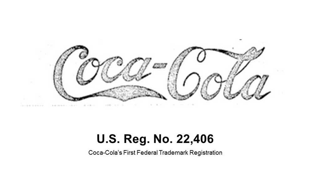
Now that we've covered the importance of distinctiveness let's talk about another crucial element of logo design: timelessness.
The best logos aren't just eye-catching now – they're designed to stand the test of time.
Think about the Coca-Cola or IBM logos – these designs have been around for decades and still look as fresh and relevant today as they did back then.
The key is to create a logo that transcends fleeting trends and fads. Instead of chasing the latest design craze, focus on creating a design that will stand the test of time. That way, your brand can maintain a consistent, cohesive image for years.
7. Storytelling 📚

The best logos aren't just pretty pictures – they're visual representations of a brand's unique story and personality.
I remember this one time I was working on a logo for a new sustainable clothing line. The client wanted something “eco-friendly and modern,” but they also wanted it to reflect the brand's rich history and commitment to ethical manufacturing.
They aren't just empty vessels – they carry the stories and values of the brands they represent. So, when designing a logo, don't just focus on the aesthetics – think about the more profound meaning and significance behind your design.
What story do you want to tell? What values do you want to convey? By tapping into the power of storytelling, you can create a visually stunning, deeply resonant, and memorable logo.
8. Adaptability 🌪️
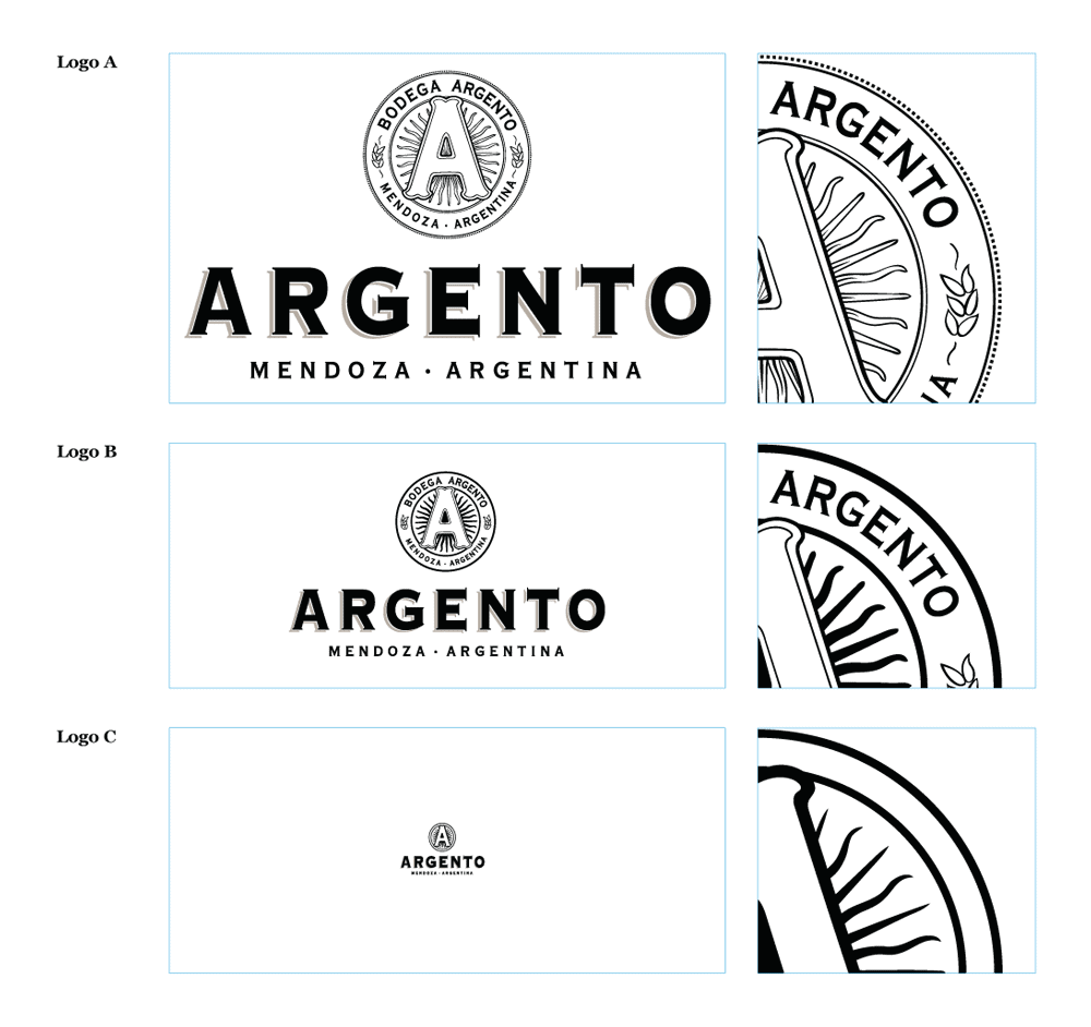
The world of branding is constantly evolving, and your logo needs to be able to keep up.
Your logo must adapt and evolve, whether changing trends, new digital platforms, or shifting consumer preferences.
I remember this one time I was working on a logo for a fitness studio. The client wanted something “sleek and modern,” but they also wanted it to work across various mediums – from social media posts to workout gear.
So, instead of just creating a static design, I focused on creating a flexible and adaptable logo. I played around with different colour variations, iconography, and typographic treatments to ensure that the logo could seamlessly transition between various applications and contexts.
The result? A logo that was not only visually striking but also incredibly versatile. Whether plastered on a billboard or printed on a t-shirt, the logo maintained a consistent, cohesive look and feel.
The key is to create a logo designed to evolve and adapt as your brand grows and changes. By incorporating elements of flexibility and versatility, you can ensure that your logo remains relevant and impactful, no matter what the future holds.
9. Minimalism 🧘♂️
Something must be said for simplicity's power in a world constantly bombarding us with visual noise. And when it comes to logo design, minimalism is a true superpower.
The best logos aren't the ones that try to do too much. They're the ones who dare to embrace simplicity and let the design breathe. You can create a visually stunning and impactful logo by focusing on clean lines, negative space, and a streamlined aesthetic.
So, the next time you're tempted to pile on the bells and whistles, step back and ask yourself: “How can I make this simpler and more elegant?” Trust me, your clients (and your audience) will thank you.
10. Geometric Shapes 🔺️
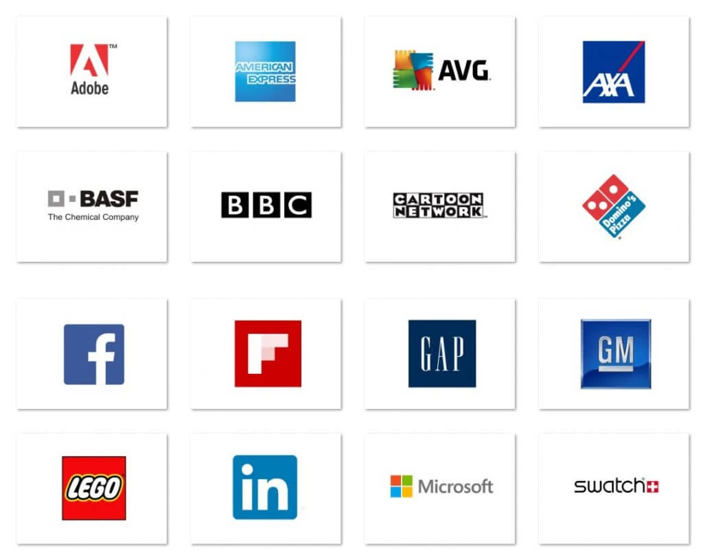
All right, let's talk about something that's near and dear to my heart: geometric shapes. Regarding logo design, something about those clean, precise lines and angles gets me fired up.
I've seen geometric logos work wonders for all industries – from tech startups to eco-friendly brands to high-end fashion labels.
The key is to find the right shape (or combination of shapes) that perfectly encapsulates your brand's personality and values. Is your brand all about precision and efficiency? Try a square or a rectangle. Is it more about dynamism and innovation? A triangle or a hexagon is the way to go.
So, the next time you feel stuck in your logo design process, don't be afraid to embrace the power of geometry. After all, sometimes, the most straightforward solutions are the most impactful.
11. Asymmetry 🌀
Let's talk about something more unconventional: asymmetry.
While symmetry is often touted as the gold standard of design, there's something to be said for the power of asymmetry. And when it comes to logo design, a little bit of asymmetry can go a long way.
The thing about asymmetry is that it has this incredible power to grab people's attention and keep them engaged. It challenges the eye and forces the viewer to explore the design, discovering new layers of meaning and nuance with each glance.
So, the next time you feel stuck in your logo design process, don't be afraid to break away from symmetry and embrace a bit of asymmetry. Who knows – it might just be the key to creating a truly unforgettable, one-of-a-kind logo.
12. Playfulness 🎢
Let's talk about something that's a little bit… well, playful. Regarding logo design, there's this misconception that it has to be all serious and buttoned-up. But you know what I say? Screw that!
I remember this one time I was working on a logo for a new kids' toy company. The client wanted something “fun and engaging,” but they also wanted it to be “professional and trustworthy.”
So, I started playing with various playful, whimsical elements – bright colours, quirky shapes, and even a little animation. And you know what? The more I embraced that sense of playfulness, the more the logo came alive.
You see, the thing about playfulness is that it has this incredible power to capture people's attention and spark their imagination. That extra dash of personality can take a logo from “just another design” to “something I can't stop looking at.”
Think about some of the most iconic logos – the Pixar lamp, the MTV lightning bolt, the Wendy's girl with the pigtails. These logos aren't just visually striking and brimming with fun and energy, making them completely unforgettable.
So, the next time you feel stuck in your logo design process, don't be afraid to let your inner child run wild. Experiment with bright colours, unusual shapes, and even a little movement. After all, the best logos aren't just beautiful – they're also fun.
13. Iterative Refinement 🔍
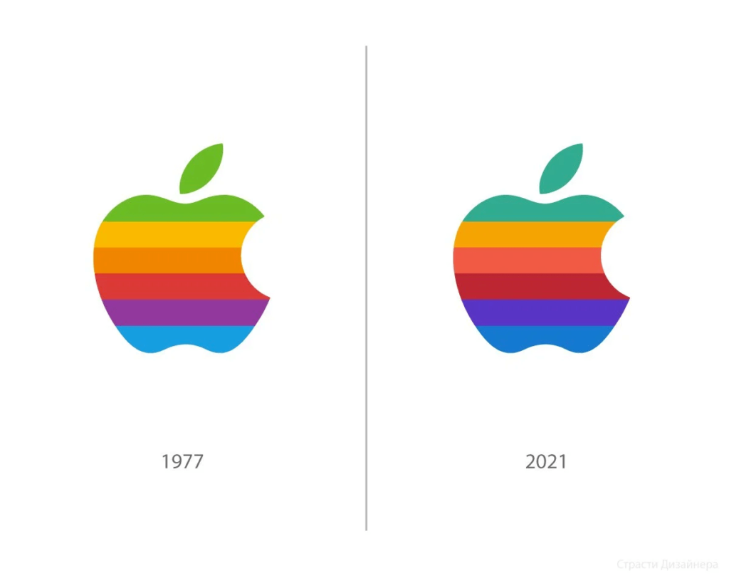
Alright, last but certainly not least, let's talk about the power of iterative refinement. Creating a killer logo is not just about that initial flash of inspiration – it's about the hard work, the trial and error, and the relentless pursuit of perfection.
The key is to embrace the refinement process and avoid getting attached to your first (or even your tenth) draft. The best logos are the ones that have been meticulously crafted and polished, with every last detail carefully considered and refined.
Sometimes, less really is more. By embracing the power of negative space and letting your logo breathe, you can create a visually stunning and impactful design.
So, the next time you're tempted to pile on the bells and whistles, step back and ask yourself: “How can I make this simpler and more elegant?” Trust me, your clients (and your audience) will thank you.
Conclusion: The Logo Design Masterclass 🏆
Well, there you have it, folks – 13 fundamental logo design techniques to transform your creations from drab to fab. From embracing simplicity to exploring the power of playfulness, we've covered a lot of ground today.
But you know what the real secret is? It's not about following rigid rules or creating the “perfect” logo. It's about tapping into your creativity, experimenting with different approaches, and never being afraid to try something new.
After all, the best logos aren't just visually stunning – they're also deeply rooted in the unique personality and values of the brand they represent. And that's what I love most about this industry – the opportunity to take a client's vision and bring it to life in a truly unforgettable way.
So, whether you're a seasoned designer or a newbie just starting, I hope these techniques have inspired you to push the boundaries of what's possible. Because at the end of the day, the only limits are the ones you set for yourself.
If you ever need extra help, you know where to find me. 😉
FAQs
How do I choose the right colour palette for my logo?
When it comes to colour, the key is to choose a palette that reflects your brand's personality and values. Consider using colours that evoke specific emotions or ideas, and make sure they work well together. Avoid overly trendy or busy colour schemes, favouring a more streamlined, timeless approach.
How do I create a logo that's versatile and scalable?
Versatility and scalability are essential for any successful logo design. Focus on creating a simple, elegant design that can be easily adapted to different mediums and applications. Avoid overly complex elements or details that may get lost at smaller sizes. Feel free to experiment with different versions or iterations of your logo to ensure it remains effective across various contexts.
How can I make my logo more memorable and distinctive?
Distinctiveness is vital when creating a truly memorable logo. Look for ways to infuse your design with unique, eye-catching elements that set it apart. This could involve using unexpected shapes, playing with negative space, or incorporating subtle symbolic references. The goal is to create a visually striking logo that is significant and connected to your brand.
How do I know when to refresh or update my logo?
Deciding when to update your logo is a delicate balance. On one hand, you want to maintain a consistent, recognisable brand identity over time. On the other hand, you also need to ensure your logo remains relevant and aligned with your evolving business needs. As a general rule of thumb, consider refreshing your logo every 5-10 years to keep it fresh and modern while preserving the core elements your audience has come to know and love.
I'm struggling to come up with logo ideas. Where can I find inspiration?
When you're stuck, looking beyond your industry for inspiration is essential. Explore design galleries, follow influential creatives on social media, and take note of logos that resonate with you. Pay attention to the elements that make them effective, and see how to apply those principles to your design work. And don't be afraid to experiment and try new things – some of your most unexpected ideas could be your best.


