10 Things High-Converting Websites Do Differently
Have you ever landed on a website and reached for your wallet before realising what happened?
That’s no accident, my friend.
It results from careful planning, strategic design, and a deep understanding of human psychology.
I remember the first time I launched a website for my business. It looked gorgeous. Sleek design, fancy animations, the works. I was so proud of it.
But you know what?
It converted about as well as a vegan trying to sell steaks at a BBQ convention.
That’s when I realised that a pretty website isn’t always profitable.
So, I rolled up my sleeves, dug into the data, and discovered what really drives website conversions.
And let me tell you, it was eye-opening.
Today, I’m going to share those insights with you. By the end of this post, you’ll know precisely what high-converting websites do differently – and how you can apply those same principles to your site.
Let’s dive in, shall we?
- High-converting websites focus on user experience, clear messaging, and strategic design to engage users effectively.
- They utilise social proof, including customer testimonials and real-time stats, to build trust and credibility with visitors.
- Effective use of persuasive copy and compelling CTAs significantly enhances conversion rates on high-converting websites.
- Continuous A/B testing and optimisation help refine strategies, ensuring websites meet customer needs over time.
1. They Nail the First Impression
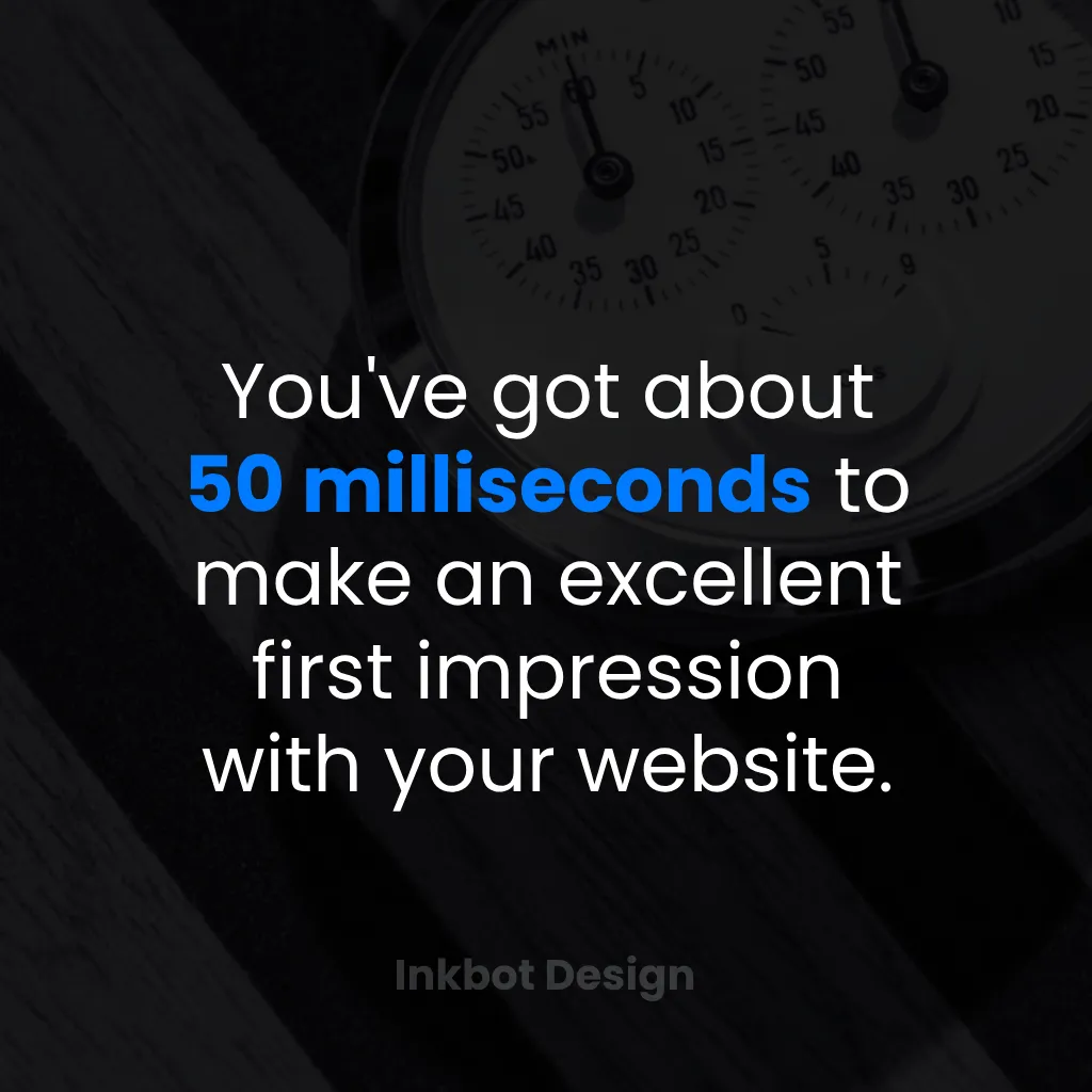
You know what they say about first impressions, right?
Well, in the digital world, you’ve got about 50 milliseconds to make one. That’s faster than you can say “bounce rate”!
Here’s what high-converting websites do to nail that crucial first moment:
They Load Fast. Like, Really Fast.
📊 According to a study by Google, 53% of mobile site visitors leave a page that takes longer than three seconds to load.
High-converting websites are obsessed with speed. They:
- Optimise images
- Minimise code
- Use content delivery networks (CDNs)
- Prioritise above-the-fold content
Thing is, it’s not just about raw speed anymore. Google has become a bit more sophisticated, and so have your visitors.
They refer to this as Core Web Vitals. Sounds techy, I know, but it’s just common sense when you break it down.
First, there’s LCP. That’s how fast the main bit of your page loads.
The hero image, the big headline. The stuff people actually came to see.
Then you’ve got INP. This one’s about responsiveness.
When someone clicks a button, does it react instantly? Nothing kills confidence like a button that plays dead for a second.
And finally, CLS. This stops the page from jumping about while it loads.
You know when you go to tap a link and an advert suddenly pops in, and you tap that instead?
That’s bad, CLS. It’s infuriating, and it makes you look amateur.
Nailing these isn’t just about pleasing Google for better rankings; it’s also about providing a seamless user experience. It’s about not annoying your visitors into leaving.
A smooth experience keeps them around long enough to actually make a purchase.
Pro Tip: Use Google’s PageSpeed Insights to check your site’s loading time. If it’s more than 3 seconds, you’ve got work to do!
They’re Clear About What They Offer
There are no guessing games here. The moment a visitor lands on the site, they know:
- What the product/service is
- Who it’s for
- What problem does it solve
Remember my fancy first website? It looked great, but visitors had to play detective to determine what I was selling. Not ideal.
They’re Mobile-Friendly
By 2026, over 60% of web traffic is expected to come from mobile devices. If your site isn’t mobile-friendly, you’re telling more than half your potential customers to get lost.
High-converting websites utilise a responsive design that displays beautifully on any device.
2. They Speak Their Customers’ Language
Have you ever visited a foreign country where you didn’t speak the language? It’s confusing. Maybe even a bit scary?
That’s how your visitors feel when your website uses jargon they don’t understand.
High-converting websites don’t do that. They speak the customer’s language.
They Use Clear, Benefit-Driven Copy
No fancy words. No industry jargon. Just clear, compelling copy that focuses on benefits, not features.
For example:
❌ “Our proprietary algorithm utilises advanced machine learning techniques to optimise your workflow.”
✅ “Our software saves you 10 hours a week by automating boring tasks.”
See the difference?
They Tell a Story
Humans are hardwired for stories. High-converting websites leverage this by weaving their product or service into a narrative that resonates with their audience.
It could be the founder’s story of overcoming challenges. Or a customer’s journey from frustration to success.
Whatever it is, it hooks the reader and evokes a response.
They Address Pain Points Head-On
High-converting websites are open to their customers’ problems. They tackle them head-on.
They say, “We know you’re struggling with X. We’ve been there too. Here’s how we can help.”
This shows empathy and builds trust. It tells the visitor, “These people get me.”
3. They Design for Conversion, Not Just Aesthetics
Remember my beautiful, yet underperforming, first website? It was all style, no substance.
High-converting websites strike a balance. They look good, sure. But every design element serves a purpose.
They Use a Clear, Logical Layout
There is no need for fancy designs or complex navigation. High-converting websites employ a simple and intuitive layout that guides visitors toward the desired action.
Key elements include:
- A prominent value proposition above the fold
- Clear navigation
- Strategically placed calls-to-action (CTAs)
- Easily scannable content (more on this later)
They Leverage White Space
White space isn’t wasted space. It’s breathing room for your content.
High-converting websites use white space to:
- Improve readability
- Draw attention to critical elements
- Create a sense of sophistication and trust
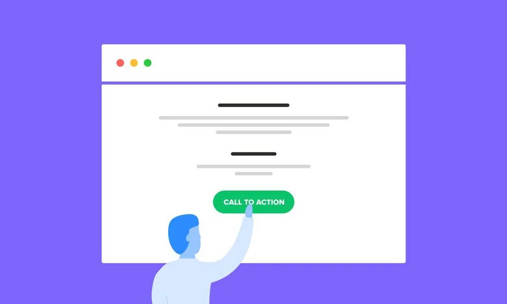
They Use Contrasting Colours for CTAs
Your call to action is the moneymaker. It needs to stand out.
High-converting websites use contrasting colours for their CTAs. They practically leap off the page, screaming, “Click me!”
However, remember that contrast doesn’t necessarily mean a clash. The colour should still fit with your overall brand palette.
They Establish a Clear Visual Hierarchy
Top sites also direct your eyes like a magician. It’s not an accident what you see first.
It’s all by design.
It’s called visual hierarchy. And the best sites do it so well, you don’t even notice.
Think about it. The headline is massive.
The important benefits are in bold. The CTA button is a bright, standout colour.
Your eye is naturally drawn from one to the next.
They utilise common eye-tracking patterns, such as the ‘F-pattern’ for text and the ‘Z-pattern’ for more visually oriented pages. They know how you scan.
The primary objective is to make the path forward as frictionless as possible. They’re building a route for your eyes to follow, leading you straight from the main promise to the ‘Buy Now’ button.
It feels effortless because they’ve done all the thinking for you.
4. They Provide Social Proof (Lots of It)
We, humans, are a sceptical bunch. We don’t like to be the first to try something new.
That’s where social proof comes in.
High-converting websites leverage social proof to show visitors, “Hey, lots of people like us. You can trust us, too!”
They Display Customer Testimonials
These are real words from real customers. That’s powerful stuff.
High-converting websites feature testimonials prominently. They choose testimonials that:
- Address specific benefits or pain points
- Come from relatable customers (not just big-name clients)
- Include full names and photos (when possible) for added credibility
They Showcase Logos of Well-Known Clients or Media Features
Nothing says “we’re legit” like a row of recognisable logos.
Whether it’s clients they’ve worked with or publications they’ve been featured in, high-converting websites aren’t shy about showing off their credentials.
They Display Real-Time Stats
“Join 10,000+ happy customers!”
“2,387 projects completed this month.”
Numbers like these provide instant credibility. They show that others actively choose and benefit from the product or service.
They Incorporate User-Generated Content (UGC)
And let’s talk about a more powerful kind of proof. The stuff you don’t create yourself.
Yes, testimonials from major clients are beneficial. But they’re still polished, aren’t they?
What really moves the needle is User-Generated Content. UGC, for short.
I’m talking about real photos and videos from actual customers using your stuff in their real, messy lives. You can embed an Instagram feed or create a gallery right on your product pages.
Some studies indicate that nearly 80% of people claim this type of content significantly influences their purchasing decisions.
Why? Because it’s authentic.
It proves that your product works in the real world, not just in a fancy photo studio.
It builds a level of trust that you just can’t buy with a marketing budget.
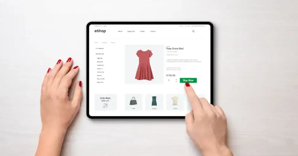
5. They Make It Easy to Take Action
Have you ever visited a restaurant with a menu that spans 20 pages? It’s overwhelming, right?
High-converting websites don’t treat their visitors that way. They make it clear what action they want the visitor to take – and they make it super easy.
They Use Clear, Compelling CTAs
There are no “Submit” or “Click Here” buttons here. High-converting websites use action-oriented, benefit-driven CTAs.
For example:
❌ “Submit”
✅ “Start Saving Time Now”
They Reduce Friction
Every extra step in the conversion process allows the visitor to change their mind.
High-converting websites minimise friction by:
- Keeping forms short (ask only for essential information)
- Offering multiple payment options
- Providing guest checkout options for e-commerce sites
They Use Smart Pop-Ups
Now, I know what you’re thinking. “Pop-ups? Aren’t those annoying?”
They can be. But when used strategically, they can also be incredibly effective.
High-converting websites use pop-ups that:
- Are triggered by user behaviour (e.g., exit-intent pop-ups)
- Offer genuine value (like a discount code or free resource)
- They are easy to close (no hunting for that tiny ‘x’ button)
6. They Optimise for Search Engines AND Humans
Here’s a secret: The best SEO is just a good user experience.
High-converting websites don’t stuff keywords or use black hat tactics. They create helpful, relevant content that satisfies search engines and human visitors.
They Use Descriptive, Keyword-Rich URLs
Compare these two URLs:
❌ www.example.com/page1234
✅ www.example.com/best-project-management-tools
Which one tells you (and Google) what the page is about?
They Create In-Depth, Valuable Content
Gone are the days of 300-word blog posts stuffed with keywords.
High-converting websites publish comprehensive, authoritative content that thoroughly answers their audience’s questions.
(Kind of like this post you’re reading right now 😉)
They Optimise for Local Search
For businesses with a physical presence, local SEO is crucial.
High-converting websites:
- Claim and optimise their Google My Business listing
- Include location-specific keywords in their content
- Encourage and respond to customer reviews
7. They Build Trust and Credibility

In the world of online business, trust is currency. Without it, you’re dead in the water.
High-converting websites go out of their way to build trust with their visitors.
They’re Transparent About Their Business
No smoke and mirrors here. High-converting websites are upfront about:
- Who they are
- Where they’re located
- How to contact them
They have clear “About Us” and “Contact” pages. They might even include photos and bios of team members.
They Provide Clear Policies
Nothing builds trust like clarity. High-converting websites have easy-to-find, easy-to-understand policies for:
- Returns and refunds
- Privacy and data protection
- Terms of service
This also means being dead straight about data. That annoying cookie banner everyone hates?
High-converting sites turn it into a trust signal.
They don’t just use some confusing legal text hoping you’ll click ‘accept all’.
Instead, they have clear, simple banners that explain in plain English what they’re tracking and why, giving you a proper choice. It’s not just about ticking a box for GDPR anymore.
It shows you respect your visitor’s privacy. And when you show that kind of respect upfront, people are far more comfortable giving you their card details down the line.
They Display Security Badges
If you’re asking for sensitive information (such as credit card details), show visitors that it’s safe to share.
High-converting websites prominently display security badges and SSL certificates, especially on checkout pages.
8. They Use Persuasive Copywriting Techniques
Words have power. And high-converting websites wield that power like a pro.
They Use the AIDA Formula
AIDA stands for Attention, Interest, Desire, and Action. It’s a classic copywriting formula that still works wonders.
Here’s how it looks:
- Attention: Grab the reader with a compelling headline
- Interest: Pique their curiosity with intriguing details
- Desire: Show them how your product/service will improve their life
- Action: Tell them exactly what to do next
They Leverage Scarcity and Urgency
FOMO (Fear of Missing Out) is real, folks. And it’s a powerful motivator.
High-converting websites use scarcity and urgency tactics like:
- Limited-time offers
- Low stock warnings
- Countdown timers
But here’s the thing: It has to be genuine. Fake scarcity tactics will backfire faster than you can say “snake oil”.
They Address Objections Head-On
Every potential customer has objections. “It’s too expensive.” “It won’t work for me.” “I don’t have time.”
High-converting websites address these objections. They tackle them head-on.
They might have an FAQ section that addresses common concerns. Or they might weave objection handling into their primary copy.
9. They Continuously Test and Improve

Most people don’t realise that high-converting websites aren’t born. They’re made. Through constant testing, tweaking, and improving.
They Use A/B Testing
A/B testing is like a scientific experiment for your website. You create two versions of a page, send traffic to both, and see which one performs better.
High-converting websites are constantly testing things like:
- Headlines
- CTA button colours and text
- Image placement
- Pricing structures
And while we’re on testing, the pros don’t just stop at A/B.
They often employ a technique called multivariate testing. It’s like A/B testing on steroids.
See, A/B testing tells you if Page A is better than Page B. It’s a simple way to determine which one is more effective.
Multivariate testing lets you test loads of little changes all at once. You can test three different headlines, two images, and two button colours simultaneously to find the best combination.
Yes, it requires more traffic to yield a reliable result, so it’s not suitable for beginners. But the payoff is huge.
You don’t just learn that one page is better. You learn why.
It’s a whole other level of insight.
They Analyse User Behaviour
It’s not enough to look at conversion rates. You need to understand why people are (or aren’t) converting.
High-converting websites use tools like heatmaps and session recordings to see how visitors interact with their sites.
They Ask for Feedback
Sometimes, the best way to find out what your visitors want is to… ask them.
High-converting websites use surveys, feedback forms, and direct customer interviews to gather insights.
10. They Focus on Post-Conversion Optimisation
The sale isn’t the end. It’s just the beginning.
High-converting websites know that a happy customer will likely become a repeat customer – and a brand advocate.
They Provide Excellent Customer Support
Nothing kills conversions like lousy word-of-mouth. High-converting websites invest in top-notch customer support to ensure their customers’ satisfaction.
They Use Email Marketing Wisely
Once someone converts, high-converting websites use email marketing to:
- Onboard new customers
- Provide valuable content
- Encourage repeat purchases
- Ask for referrals
They Encourage Reviews and Testimonials
Remember the social proof we discussed earlier? This is where it comes from.
High-converting websites actively encourage satisfied customers to leave reviews and testimonials.
Conclusion: It’s Your Turn to Convert Like Crazy
Phew! We’ve covered a lot of ground, haven’t we?
From nailing that crucial first impression to focusing on post-conversion optimisation, we’ve explored the key strategies that set high-converting websites apart.
Now, I won’t lie to you. Implementing all of this takes work. It takes time. And yes, it might involve some trial and error.
But here’s the thing: every strategy we’ve discussed is learnable and doable. You don’t need to be a tech genius or a design wizard to create a high-converting website.
What you do need is a willingness to put your visitors first. To think deeply about their needs, pain points, and desires. To communicate clearly and build trust.
Do that, and you’ll be well on your way to creating a website that doesn’t just look good – but converts like crazy.
So, what are you waiting for? Take one strategy from this post and implement it on your website today. Then another tomorrow. And another the day after that.
Before you know it, you’ll have a high-converting website that turns visitors into customers, customers into fans, and fans into vocal advocates for your brand.
And when that happens? You may want to prepare for a surge in new business.
Good luck, and happy converting!
FAQs
How long does it take to create a high-converting website?
It depends on your starting point, but expect it to be an ongoing process. Optimisation can take 1-3 months, but top-performing sites continuously test and improve.
Do I need a professional to create a high-converting website?
While professionals can be helpful, many strategies can be implemented independently with some learning and effort.
What’s the most essential element of a high-converting website
There’s no single most important element, but clear, benefit-driven messaging and easy-to-use navigation are crucial.
How often should I update my website?
Regularly. Aim for minor updates (like new content) weekly or bi-weekly and major reviews quarterly.
Can I use these strategies for any type of website?
Yes, these principles apply to most websites, though the specific implementation may vary based on your business type and goals.
How do I know if my website is converting well?
Compare your conversion rate to industry benchmarks to gauge its effectiveness. The average across industries is about 2.35%, but this varies widely.
What’s a reasonable conversion rate?
It depends on your industry and type of conversion, but generally, anything above 5% is considered suitable for most industries.
How important is mobile optimisation?
Extremely. With 60% of web traffic from mobile devices, a mobile-friendly site is no longer optional.
Can social proof make that much difference?
Absolutely. Research indicates that 92% of consumers consult online reviews before making a purchase.
Is it worth investing in professional copywriting?
If the budget allows, yes. Good copy can significantly impact conversions. If not, focus on being clear, concise, and benefit-focused in your writing.
How do I choose the right colour for my CTA buttons?
It’s less about the right colour and more about contrast. Your CTA should stand out from the rest of your page. Test different options to see what works best.
Can pop-ups help conversion rates?
When used strategically, yes. Exit-intent pop-ups, for example, can recover 10-15% of lost visitors.

