7-Up Logo Design: A Fizzy Journey Through Branding Evolution
Have you ever caught yourself staring at a 7-Up can, mesmerised by that cool, crisp logo?
I have.
And let me tell you, it’s not just the sugar high talking.
There’s a fizzy tale of branding genius behind that green and white emblem. It’s a story with more twists and turns than a rollercoaster ride after downing a six-pack of the stuff.
I’m not saying you must be a soft drink tycoon to learn from this. Far from it.
As someone who’s helped countless businesses find their visual voice through Inkbot Design, I can tell you the principles behind 7-Up’s branding success are as applicable to your corner shop as they are to a multinational corporation.
We’re about to dive deep into the effervescent world of 7-Up’s logo evolution. And trust me, by the end of this fizzy journey, you’ll be bubbling with ideas to give your brand a refreshing makeover.
Let’s pop the cap on this branding adventure, shall we?
| Detail | Information |
|---|---|
| Brand Name | 7-Up |
| Founding Year | 1929 |
| Founders | Charles Grigg, Edmund Ridgway, Frank Gladney |
| Headquarters Location | Plano, Texas, USA |
| Current Owner | Keurig Dr Pepper (USA); PepsiCo (International) |
| Estimated Value | Not publicly disclosed |
| Main Product | Lemon-lime flavored soft drink |
| Notable Features | Caffeine-free, reformulated multiple times |
- Simplicity is Key: The 7-Up brand demonstrates that a simple, clear design can create a powerful impact.
- Brand Evolution: 7-Up has adapted its logo over nearly a century to remain relevant and engaging.
- Storytelling Through Design: Each logo iteration tells a unique story, reflecting the product and cultural trends.
- Digital Adaptability: The latest 7-Up logo illustrates the importance of being visually effective across various digital platforms.
The Sparkling Origins: 7-Up’s Logo Genesis
It’s 1929. The world’s reeling from the stock market crash, but in St. Louis, Missouri, a certain Charles Leiper Grigg is about to make soft drink history.
Grigg introduces “Bib-Label Lithiated Lemon-Lime Soda” to the world. Catchy, right?
It’s about as catchy as a wet fish.
No wonder it only took two weeks for Grigg to wise up and rebrand to “7-Up Lithiated Lemon-Lime.
But here’s where it gets interesting:
The Original 7-Up Logo: Simplicity in a Bottle
The first 7-Up logo was as straightforward as they come. Black text on a white background. No frills, no fuss.
Just “7-up” in a bold, serif font.
Why “7-Up”? Theories abound:
- Seven ingredients
- pH level of 7
- 7-ounce bottles
- Grigg’s lucky number
The truth? We may never know. But that air of mystery? Pure branding gold.
Lesson #1: Sometimes, Less Is More
In a world of over-complicated logos, 7-Up’s original design stands out for its simplicity.
It’s a reminder that your brand doesn’t need bells and whistles to make an impact.
Sometimes, all you need is:
- Clear typography
- A dash of mystery
- Confidence in your product
The Fizzy Fifties: 7-Up Logo Gets a Facelift
Fast forward to the 1950s.
Rock ‘n’ roll is shaking things up, and 7-Up decides it’s time for a logo that can jive with the times.
Enter the “Bubble” Logo
In 1953, 7-Up introduced its iconic “bubble” logo.
Picture this:
- The “7-Up” text
- Encased in a red square
- With playful bubbles dancing around it
It’s fun. It’s fresh. It’s fizzy.
Everything the drink aspires to be captured in a straightforward design.
The Power of Visual Metaphor
This logo wasn’t just pretty to look at. It was working overtime:
- Bubbles = Carbonation
- Red circle = Energy and excitement
- Playful design = Appeal to a younger audience
It’s a masterclass in visual storytelling.
Without a single word, this logo tells you exactly what to expect when you crack open a bottle of 7-Up.
Lesson #2: Your Logo Should Tell a Story
Your logo isn’t just a pretty face for your brand. It’s a silent storyteller.
Ask yourself:
- What does my logo say about my product?
- Does it evoke the right emotions?
- Is it memorable enough to stick in consumers’ minds?
The Groovy Sixties and Seventies: 7-Up Gets Psychedelic
The 1960s rolled around, and suddenly, everything’s a bit… groovy, baby.
7-Up, constantly aware of every trend, decides to get hip with the times.
The “Psychedelic” Era
In 1968, 7-Up unveiled a logo that looks like it’s been hanging out at Woodstock:
- Swirling, psychedelic patterns
- Bold, almost illegible typography
- A riot of colours that’d make your eyes water
Was it a bit much? Maybe.
But it captured the spirit of the times perfectly.
The “Uncola” Campaign
This era also saw the birth of the famous “Uncola” campaign.
7-Up positioned itself as the anti-establishment choice in a cola-dominated world.
The logo reflected this rebel spirit:
- Upside-down text
- Unconventional colour schemes
- A general “stick it to the man” vibe
Lesson #3: Don’t Be Afraid to Shake Things Up
7-Up’s willingness to radically alter its branding teaches us a valuable lesson:
Sometimes, you need to risk it for the biscuit.
Consider:
- Is your brand becoming stale?
- Could a radical change reinvigorate your image?
- Are you willing to take calculated risks?
Remember, though: there’s a fine line between trendy and try-hard.
Make sure any changes align with your core brand values.
The Sleek Eighties and Nineties: 7-Up Streamlines
As the world sobered up from the psychedelic sixties, 7-Up decided it was time for a more polished look.
The “Modern” Era
The late 70s and 80s saw 7-Up adopt a cleaner, more corporate aesthetic:
- Simplified “dot” between “7” and “Up”
- Sleeker typography
- A return to the classic green and red colour scheme
This was 7-Up growing up, shedding its rebellious image for something more… respectable.
The Introduction of the “Cool Spot”
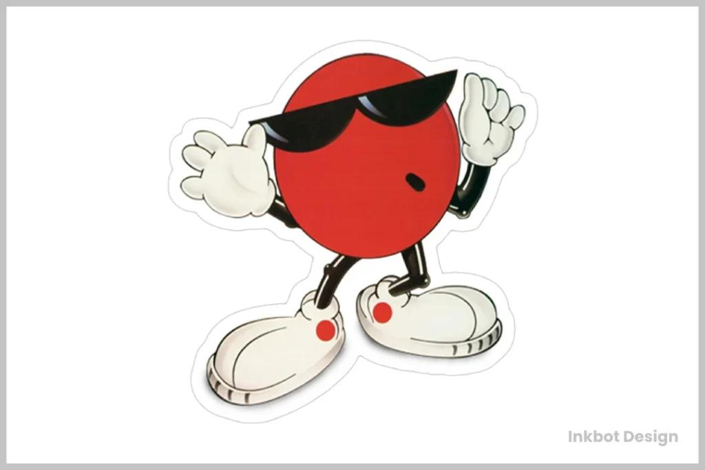
But 7-Up couldn’t completely abandon its playful roots.
Enter “Cool Spot” – a sunglasses-wearing red dot who became the brand’s mascot.
Cool Spot was:
- Charismatic
- Fun
- The perfect blend of 7-Up’s mature logo and youthful spirit
Lesson #4: Evolution, Not Revolution
7-Up’s transition from psychedelic rebel to corporate cool-kid teaches us:
Brand evolution should be gradual, not jarring.
Think about:
- How can you update your brand without alienating existing customers?
- What elements of your brand are timeless, and which need refreshing?
- How can you balance professionalism with personality?
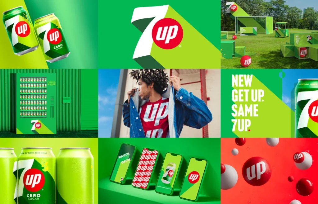
The New Millennium: 7-Up in the Digital Age
As we hit the 2000s, 7-Up faced a new challenge: staying relevant in the digital era.
The “Dynamic” Logo
In 2014, 7-Up unveiled a logo that screamed, “I’m hip with the kids!”:
- 3D effects
- Dynamic “bursting” design
- A fresh, vibrant green
This logo was designed to pop on digital screens, from smartphones to billboards.
The Power of Adaptability
But here’s the clever bit:
This logo was designed to be adaptable.
It could be simplified for print or made more complex for digital applications.
Lesson #5: Design for Digital, But Don’t Forget Traditional Media
In today’s world, your logo needs to work across multiple platforms:
- How does your logo look on a tiny smartphone screen?
- Does it translate well to large-scale advertising?
- Is it flexible enough to adapt to different media?
Remember: a great logo looks good everywhere, from business cards to billboards.
The Present Day: 7-Up’s Logo in 2026
As of 2024, 7-Up’s logo continues to evolve, reflecting current design trends while maintaining its core identity.
The “Minimalist” Approach
The latest iteration of the 7-Up logo embraces minimalism:
- Flatter design
- Simplified typography
- Subtle gradients for depth
According to a 2023 study by LogoLounge, 78% of major brands have moved towards more straightforward, more versatile logo designs in the past five years.
Sustainability in Branding
Interestingly, 7-Up has also incorporated sustainability into its branding:
- Use of eco-friendly green shades
- Incorporation of recycling symbols in packaging design
- Emphasis on natural ingredients in marketing materials
A 2024 Nielsen report found that 73% of consumers are willing to change their consumption habits to reduce environmental impact, making this a smart move for 7-Up.
Lesson #6: Stay True to Your Roots, But Keep an Eye on the Future
7-Up’s latest logo teaches us:
- Simplicity is critical in the digital age
- Your brand should reflect current values and concerns
- Never lose sight of your core identity
Ask yourself:
- How can your logo evolve to meet current design trends?
- Does your branding reflect your company’s values and commitments?
- Are you balancing tradition with innovation?
The Fizzy Finale: What Can We Learn from 7-Up’s Logo Evolution?
Phew! What a journey, eh?
We’ve travelled through nearly a century of branding history, all through the lens of a fizzy drink.
But here’s the kicker:
This isn’t just about 7-Up.
It’s about you. Your brand. Your business.
The Big Picture: Branding Lessons from 7-Up
- Simplicity Sells: From its earliest days to its latest iteration, 7-Up has understood the power of simplicity.
- Adapt or Fizzle Out: 7-Up has consistently evolved its brand to stay relevant.
- Tell Your Story: Every version of the 7-Up logo tells a story about the product and the times.
- Be Bold: Sometimes, you need to take risks to stand out.
- Stay True to Your Core: 7-Up has maintained its core identity despite all its changes.
- Think Digital: In today’s world, your brand needs to pop on screens of all sizes.
- Reflect Your Values: Modern branding goes beyond aesthetics – it communicates your company’s values.
Putting It Into Practice: Your Brand, Your Rules
Now, I know what you’re thinking.
“But I’m not a multi-million dollar soda company!”
And you’re right. You’re not.
But here’s the secret:
These principles apply whether you’re selling fizzy drinks or financial advice.
At Inkbot Design, we’ve helped businesses of all sizes apply these lessons:
- A local bakery that simplified its logo, leading to a 30% increase in brand recognition
- A tech startup that rebranded to reflect its eco-friendly values, resulting in a 25% boost in customer engagement
- A family-owned hardware store that modernised its logo for digital platforms, seeing a 40% increase in online sales
You don’t need a 7-Up-sized budget to create a brand that fizzes with personality and pops with professionalism.
Your Call to Action: Give Your Brand Some Fizz
So, here’s my challenge to you:
Take a long, hard look at your brand.
Is it falling flat?
Could it use a bit more bubble?
If you’re ready to give your brand the 7-Up treatment – to make it simpler, bolder, more adaptable, and more you – it’s time to take action.
Remember, your brand is more than just a logo.
It’s your story, your values, your promise to your customers.
Tell that story well, and who knows?
Maybe one day, we’ll be writing a brand study about you.
Now, if you’ll excuse me, all this talk of 7-Up has made me thirsty.
Time to crack open a cold one and toast to the power of great branding!
Cheers! 🥤
FAQs: Quenching Your Thirst for 7-Up Logo Knowledge
Who designed the original 7-Up logo?
The original 7-Up logo was likely designed in-house, though the exact designer is unknown. Charles Leiper Grigg, the inventor of 7-Up, likely had significant input.
How many times has the 7-Up logo changed?
The 7-Up logo has undergone significant changes since its inception in 1929, with at least ten significant redesigns over the past century.
Why did 7-Up choose green as its primary colour?
Green was chosen to represent the crisp, fresh flavour of the lemon-lime soda. It also helped distinguish 7-Up from its cola competitors.
What’s the significance of the red dot in the 7-Up logo?
The red dot, introduced in the 1970s, represents a cherry. It adds a contrasting colour and becomes the basis for the “Cool Spot” mascot.
Has 7-Up ever wholly abandoned its original logo design?
While 7-Up has made significant changes, elements of the original design, such as the primary text structure, have been maintained throughout its history.
How does 7-Up’s logo differ internationally?
While the core design remains consistent, there are slight variations in different countries to account for local tastes and cultural preferences.
What’s the most controversial 7-Up logo design?
The psychedelic designs of the late 1960s were perhaps the most controversial, representing a radical departure from previous designs.
How has digital technology influenced 7-Up’s logo design?
Recent designs have prioritised simplicity and scalability to ensure the logo looks good on various digital platforms, from mobile apps to social media.
Is the current 7-Up logo trademark protected?
Yes, the 7-Up logo and brand are trademark-protected and owned by Keurig Dr Pepper in the United States and PepsiCo in the rest of the world.
How does 7-Up’s logo compare to other soft drink brands?
7-Up’s logo stands out for its use of green, setting it apart from the reds commonly used by cola brands. Its simplicity and distinctive “bubble” element make it highly recognisable.
Has 7-Up ever used its logo to support social causes?
Yes, 7-Up has modified its logo for various campaigns, including limited-edition designs supporting environmental causes and social initiatives.
What’s the future of the 7-Up logo?
While we can’t predict the future, trends suggest 7-Up will continue to simplify its logo, focusing on versatility for digital platforms while maintaining its core brand identity.


