The Xbox Logo: How Microsoft Fought, Stumbled, and Won
Let’s be honest. Most corporate logo histories are polished nonsense.
They’re retroactive fairy tales, written by marketing departments to make a series of panicked decisions, lucky accidents, and committee-driven compromises sound like a divinely inspired master plan.
They talk about “synergy” and “brand resonance”, when the reality was usually a designer with a deadline and a half-eaten sandwich.
The history of the Xbox logo is different.
It’s one of the few honest stories left. It’s a brutal, awkward, and fascinating journey of a corporate behemoth trying to be cool, failing, trying again, and eventually carving out an identity through sheer force of will.
It’s a story of scars. Those scars hold all the essential lessons for any entrepreneur or business owner staring at a blank page and wondering how to stamp their identity onto the world. Forget the polished case studies. This is the real thing.
- Accidental Design: The original Xbox logo's vibrant green stemmed from a designer's quick choice, making it memorable and distinct.
- Evolution Over Revolution: The Xbox 360 logo refined existing elements to appeal to a broader audience while retaining brand identity.
- Brand Maturity: The Xbox logo’s latest versions focus on simplicity and confidence, allowing the name to carry the brand’s weight.
- Strategic Redesign: Any logo change should be purpose-driven, aligning with a clear strategic vision rather than mere aesthetic trends.
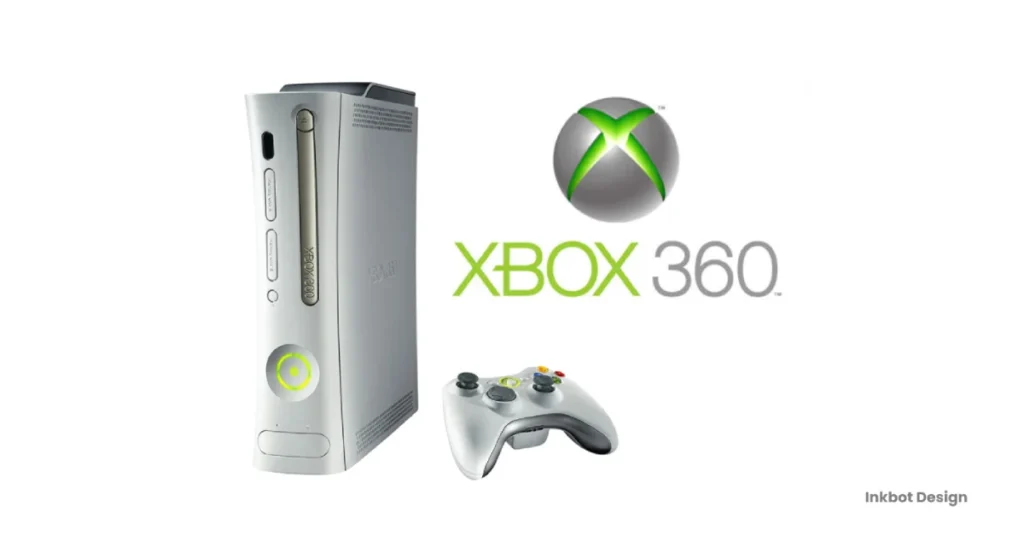
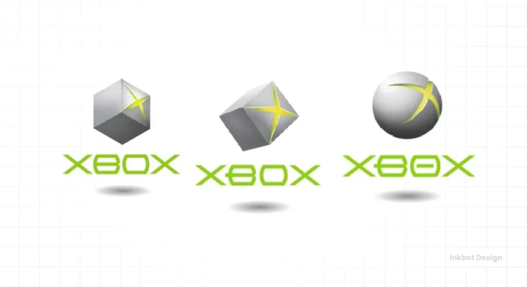
The Big Green Monster (2001): The Original Xbox Logo
This is where it all began. Not with a whisper, but with a loud, aggressive, slightly obnoxious roar.
A Logo Born from Panic and “Nuclear Green”
First, the context. In the late 90s, Microsoft was the king of boring. They made spreadsheets and operating systems. They were the taxman of the tech world. Meanwhile, Sony and Nintendo owned the living room. They were cool.
Microsoft wanted in. Their entry weapon was the ‘DirectX Box’, a project name that, thankfully, got shortened to Xbox. The whole project was a frantic, high-stakes gamble. And the logo reflects that perfectly.
The story shows that designer Horace Luke, in a rush, grabbed the only marker he could find to sketch the concept. It was a fluorescent green Sharpie. That acidic, almost radioactive green wasn’t the product of a dozen strategic workshops about “vibrancy” and “youthful energy.” It was an accident.
And it was the best thing that could have happened.
That “nuclear green” became the brand’s single most recognisable asset. It was jarring. It was different from Sony’s slick blue and Nintendo’s playful red. It screamed, “We are not like them.”
The “X” Itself: A Gash in the Universe
Look at that original logo. The wordmark is pure late-90s futurism. It’s jagged, aggressive, almost a caricature of what someone in 1999 thought the future would look like.
But the real genius was the symbol. A 3D sphere, which was familiar enough. But this one had a great, glowing green gash torn into its surface. An ‘X’ that looked less like a letter and more like a wound. A fissure. A scar on the face of the gaming establishment.
It wasn’t elegant. It certainly wasn’t subtle. Your mum wouldn’t have called it “nice”.
It was perfect.
It communicated power, technology, and a hint of something alien and dangerous. It was everything Microsoft’s core brand wasn’t.
I once worked with a startup founder who was terrified of his logo being “too much.” He wanted something safe, palatable, something that wouldn’t offend anyone. I told him the goal isn’t to be inoffensive; it’s to be memorable. Being ignored is a far worse fate for a new business than being considered “a bit much” by a few people who would never buy from you anyway.
What You Should Steal From This Era
There are two massive takeaways here for anyone building a brand.
- Character Over Perfection. The first Xbox logo is clumsy. The 3D rendering is dated. The font is cheesy. But it had more character in its little finger than a hundred bland, minimalist corporate marks have in their entirety. For a new brand, a strong, divisive personality is infinitely more valuable than quiet, forgettable perfection.
- Don’t Sanitise Your Story. The Sharpie story is fantastic because it’s real. It shows humanity and urgency. Microsoft could have fabricated a story about a focus group that chose green. They didn’t. Your business’s real origin, the struggles and the lucky breaks, is your best marketing material. Don’t bury it under a pile of corporate jargon.
The Refined Contender (2005): The Xbox 360 Sphere
Four years is a long time in technology. The original Xbox had done its job: it had kicked the door down. But it was still seen as a niche, hardcore gamer’s machine. With the Xbox 360, Microsoft wanted more. They wanted the living room. They wanted your whole family.
The brand had to grow up.
Growing Up, But Not Too Much
The challenge was immense. How do you evolve a brand built on raw aggression into something more welcoming, without losing the soul that made it successful? How do you invite new people to the party without alienating the guests who built the house?
The answer was an evolution, not a revolution. They kept the core concepts—the ‘X’, the sphere, the colour green—but refined every element.
Dissecting the Sphere and the “Nexus”
The 2005 logo for the Xbox 360 is a masterclass in strategic brand evolution.
The sphere is still there, but it’s sleeker. The harsh gash is replaced by a more elegant, embedded ‘X’. The gradients are smoother, and the lighting is more sophisticated. It feels less like a weapon and more like a portal. It’s futuristic, but in an inspiring, Apple-esque way, not a scary, Terminator way.
But the absolute masterstroke was connecting the logo directly to the hardware. The power button on the 360 console and its controller was a physical, glowing replica of the logo. They called it the “Nexus.”
Suddenly, the logo wasn’t just a picture on a box. It was the button you pressed to enter the experience. It was tactile. It was the centre of the universe. This simple act created a powerful, cohesive loop between the brand and the product.
The wordmark changed, too. The jagged, comic-book font was retired. In its place came a clean, soft, lowercase sans-serif. It was friendly. Approachable. It said, “It’s okay, I don’t bite anymore.”
This is where you see the real power of a holistic brand identity, not just a standalone mark. Getting this right and ensuring every touchpoint, from the product to the packaging, feels like it comes from the same place, is the core of effective logo design.
The Brutal Lesson in Cohesion
Here’s the thing most entrepreneurs miss. Your logo is not an island.
It’s not a piece of art to be admired in isolation. It has to work. It needs to be legible on a tiny app icon, look good embroidered on a shirt, and make sense on the side of a building.
The Xbox 360 identity worked well because it was conceived as a system. The logo informed the product design, reinforcing the brand, which was reflected in the marketing. It was a complete thought.
Too many businesses come to a designer wanting a “cool logo.” What they should be asking for is a functional brand asset. One that can be the cornerstone of a consistent, recognisable visual identity across everything they do.
The Minimalist Turn (2013): The Xbox One and the Flat Design “Correction”
The world changed between 2005 and 2013. The iPhone happened. Apps happened. And with them, the dominant design aesthetic shifted dramatically. The glossy, 3D, skeuomorphic look of the 2000s suddenly felt ancient.
Flat design was the new law of the land. And every brand, big or small, faced a choice.
Chasing Trends or Leading the Pack?
For Microsoft, this wasn’t just about following fashion. Their company-wide design language, known as Metro (or Modern UI), was one of the pioneers of this flat, clean, typography-focused aesthetic. Windows 8 and Windows Phone were built on it.
The Xbox 360 logo, with its gradients and gloss, looked entirely out of place in Microsoft’s new universe. It wasn’t a question of whether they should change, but how.
They had a highly recognisable, much-loved symbol. Flattening it risked throwing away years of brand equity. However, keeping it would mean that their flagship entertainment brand would look like a relic from a bygone era.
From Sphere to Simple Glyph
The Xbox One logo was the result of that choice.
The sphere was simplified. The 3D depth was gone, replaced by a solid, single-colour glyph. The subtle lighting effects were stripped away. The wordmark was updated to be a little sharper and more mature, but the hero was the symbol.
The Pros:
- Versatility: This new, simpler mark was infinitely more flexible. It worked beautifully on screen, in digital ads, and as a small icon. It was clean and modern.
- Consistency: It aligned the Xbox brand with the rest of Microsoft’s product portfolio, creating a more unified corporate look.
The Cons:
- Personality Loss? Here’s my pet peeve. Did they sand off too much of the character in the rush to simplify? The 360 sphere had a tangible, object-like quality. The new glyph was clean, but also a little… corporate. A little sterile.
I’ve seen this happen countless times. A business with a quirky, beloved logo gets successful and decides it needs to “professionalise.” They hire a big agency that sells them on a “cleaner, more modern identity.” They flatten the logo, swap the characterful font for a generic sans-serif, and strip out every ounce of personality that customers connected with in the first place. They end up with a technically ‘better’ logo by design school standards, but utterly forgettable in the real world.
The Uncomfortable Truth About Redesigns
The lesson here is critical. You must redesign for a strategic reason, not a stylistic one.
Microsoft had a powerful strategic reason: their entire company was moving to a new design philosophy. The Xbox had to come along for the ride.
What’s your reason? Is your business model changing? Are you targeting an entirely new audience? Has your logo become technically unusable in the modern digital world? These are good reasons.
“Because flat design looks modern” is not a good reason. “Our competitor just redesigned their logo” is an even worse one. A brand refresh is a powerful tool, but it’s also a dangerous one. Use it purposefully, or you risk confusing your audience and destroying the recognition you’ve worked so hard to build.
The Current Era (2019-Present): The Xbox Series X/S and the Refined Glyph
After the major surgery of 2013, the following change was far more subtle. It was so subtle that many people probably didn’t even notice it. But this tiny tweak speaks volumes about brand maturity.
The Final Polish: It’s All About the Wordmark
When the Xbox Series X and S were announced, the logo that came with them looked, at first glance, identical to the Xbox One’s. The glyph—the flat sphere with the ‘X’—was carried over. It was now established. Recognisable. It didn’t need changing.
The change was in the wordmark—the text.
The designers replaced the previous font with a new one. It’s stronger. The letterforms are more geometric, more evenly weighted. It feels substantial and confident. It’s less of a logo and more of an architectural statement.
Why This Tiny Tweak Matters So Much
This is what brand confidence looks like.
The original Xbox logo had to scream to be heard. The 360 logo had to be a shining, attractive object. The One logo had to prove it was modern.
The current Xbox logo doesn’t have to do any of that. The brand is now so established that it can speak calmly, assuredly.
The focus has shifted. The primary brand identifier is now the word “Xbox” itself. The glyph has become a secondary supporting element, a seal of quality. This is the endgame for any brand: to reach a point where your name alone carries all the weight, meaning, and emotion. Think of Nike. The word is now more potent than the Swoosh that supports it.
For a business owner, the takeaway is this: in the early days, your visual identity (logo, colours) does the heavy lifting. It has to tell your story, grab attention, and communicate your value. As you build trust and recognition over the years, that burden shifts to your name. Your logo can then afford to become simpler, more refined, more confident. It no longer needs to shout.
A System, Not Just a Symbol
Today, the Xbox logo doesn’t live in a vacuum. It’s the anchor point for a massive, sprawling design system.
It has to work for Xbox Game Pass, with its distinctive visual style. It has to work for Xbox Cloud Gaming. It has to work on game cases, websites, broadcast graphics, and as a tiny favicon in a browser tab.
The logo’s simplicity is its strength. It’s a flexible, reliable asset that can be deployed across a vast “ecosystem.” (I hate that word, but in this case, it’s depressingly accurate). It’s a quiet anchor in a vibrant, ever-changing game art sea.
If your ambition is to build an ecosystem around your business—with multiple products, services, or sub-brands—you need to think this way from the start. You need more than just a logo. You need a visual strategy. That’s a much bigger conversation, and it’s where the real work of branding begins. If you’re ready for that conversation, you can request a quote to see what’s involved.
The Unseen Lessons from the Cutting Room Floor
The logos that make it to the public are only half the story. The ideas that get rejected are often just as revealing.
The Logos That Weren’t
Early explorations for the original Xbox brand included all sorts of bizarre concepts. Some looked like chrome alien artefacts. Others were sleek, metallic designs that looked more like a premium car brand than a games console.
The fact that Microsoft rejected these “safer,” more traditionally corporate designs in favour of the raw, green-slashed sphere tells you everything about their strategy. They knew they couldn’t out-cool Sony by copying them. They had to be something entirely new. They chose disruption over assimilation.
This is a lesson in courage. Playing by the incumbent’s rules is a losing game when you’re the underdog. You have to create your own.
Colour Theory: It’s Not Just “Xbox Green”
That original acidic Sharpie green was a weapon. It was designed to shock.
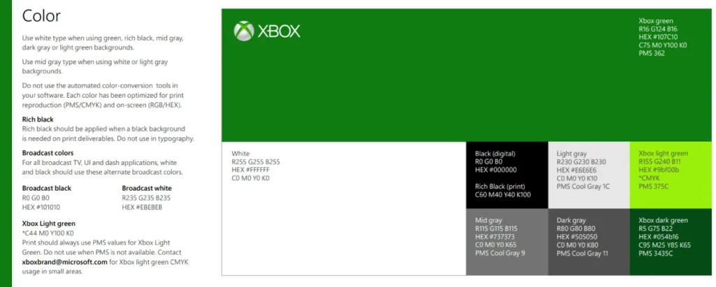
Over time, that green has been subtly refined. It’s still “Xbox Green,” but today’s version is a slightly more sophisticated, digitally native hue. It’s less “toxic waste” and more “glowing screen.”
More importantly, the brand is no longer defined by a single colour. The wider Xbox ecosystem now uses a broad palette. White, black, and grey form the confident, neutral base, allowing the vibrant colours of the games themselves to take centre stage. The Xbox brand provides the stage, not the whole show.
This shows an understanding that a mature brand identity is often about stepping back and creating a framework for other content to shine within. Your brand doesn’t always have to be the loudest in the room.
The Final Takeaway: Your Logo’s Scars Are Its Story
So, what have we learned from this twenty-year journey of a digital ‘X’ in a box?
The evolution of the Xbox logo is not a tidy, linear progression towards some platonic ideal of “good design.” It’s a messy, reactive, and ultimately successful story of adaptation.
It started loud and ugly because it needed to. It got slick and friendly because it wanted to grow. It flattened out because the world it lived in changed. And now, it’s quiet and confident because it has earned the right to be.
Your brand’s journey will be just as messy. Your first logo might be rough. You’ll make mistakes. You’ll have to adapt to markets you never anticipated.
Don’t be afraid of that. Don’t chase a mythical state of perfection from day one. Embrace the awkward phases. Learn from the scars. Because those scars aren’t blemishes. They are the proof that you survived. They are the map of where you’ve been.
They are your story.
Need More Than Just a History Lesson?
We spend our days dissecting this stuff, not for fun, but to help businesses like yours make the right strategic moves. If you want this kind of brutally honest thinking applied to your brand identity, that’s what our logo design service is for.
You can get a straight-to-the-point quote here if you’ve heard enough talk and want to know what it would take.
Frequently Asked Questions (FAQs)
What was the very first Xbox logo?
The first Xbox logo, from 2001, featured a 3D sphere with a glowing, acid-green “gash” or fissure in the shape of an ‘X’. It was paired with a jagged, futuristic wordmark designed to look aggressive and disruptive.
Why is the Xbox logo green?
The iconic Xbox green was famously an accident. During the initial design phase, designer Horace Luke used a fluorescent green Sharpie marker—reportedly one of the few pens available then—to sketch the concept. The distinctive, jarring colour stuck and became a core part of the brand’s identity.
What does the Xbox symbol mean?
Initially, the ‘X’ slashed into a sphere represented the “DirectX Box” name, signifying a piece of hardware that would unlock a new dimension of gaming. Over time, it evolved. The Xbox 360’s “Nexus” symbolised the console as the centre of the entertainment universe. Today, the refined glyph acts as a simple, confident seal of quality for the entire Xbox ecosystem.
How many times has the Xbox logo changed?
There have been four major iterations of the Xbox logo:
The original (2001)
The Xbox 360 sphere (2005)
The flat Xbox One glyph (2013)
The current version with the refined wordmark (2019)
What is the main difference between the Xbox One and Series X logos?
The primary difference is subtle and focuses on the wordmark, not the symbol. The ‘X’ glyph is nearly identical. However, the “XBOX” text was redesigned for the Series X/S era with a stronger, more balanced, geometric font, signalling brand maturity and confidence.
Who designed the original Xbox logo?
The original Xbox logo resulted from a team effort. Still, the core concept is often attributed to designers Horace Luke and Seamus Blackley, who were instrumental in the original Xbox project’s frantic, fast-paced development.
Why did the Xbox logo switch from 3D to flat?
The switch to a flat design in 2013 with the Xbox One was a strategic decision to align the gaming brand with Microsoft’s company-wide “Metro” (or “Modern UI”) design language. This aesthetic in Windows 8 prioritised clean typography and simple, flat graphics, making the old glossy 3D logo look dated.
Is the Xbox logo considered a good logo?
Yes, the Xbox logo is considered highly effective by most branding metrics. Its strength lies in its evolution, recognisability, and the powerful brand equity it has built. While the original might be considered dated by today’s standards, its character was perfect for its time. The current logo is a strong example of a mature, flexible brand mark.
What font is the Xbox logo?
The current Xbox wordmark uses a custom font created specifically for the brand, “Xbold.” It was designed to be clean, geometric, and highly readable across print and digital applications.
What can a small business learn from the Xbox logo’s history?
The key lessons are:
A strong personality is better than bland perfection, especially when new.
Don’t be afraid to evolve your brand as your strategy changes, but do it for a real reason, not just to follow a trend.
Think of your logo as part of a cohesive system, not an isolated image.
Authenticity is compelling; your real story is more interesting than a fabricated one.

