50 Simple Logos That Prove Less is More
Okay, let’s get one thing straight. The world of design, especially logo design, is drowning in complexity. It’s a swamp of overthinking, over-designing, and, frankly, over-compensating.
Too many entrepreneurs and small business owners fall into the trap of believing that a logo needs to be an intricate tapestry, weaving in every single strand of their company’s story, mission, and their nan’s favourite colour.
Wrong. Utterly wrong.
The brutal truth? Simple logos win. They always have, and they always will.
This isn’t going to be an academic lecture filled with jargon; you need a dictionary to decode it. This is a showcase of clarity. Proof. Fifty instances where “less is more” isn’t just a pithy quote but a fundamental business advantage. You’re in the right place if you’re an entrepreneur or a small business owner tired of the usual fluff and looking for what actually works.
- Simple logos enhance instant recognition, easing cognitive processing for consumers.
- Clarity in design leads to better memorability, helping logos stick in crowded markets.
- Timeless logos avoid trends, ensuring longevity and brand integrity over time.
- Versatile logos perform well across various applications, maintaining their impact in different sizes.
Why Simple Logos Pack Such a Punch

Ever wonder why some logos… stick? Meanwhile, no matter how many bells and whistles they’re adorned with, others evaporate from memory faster than a politician’s promise. The answer, more often than not, is simplicity.
Instant Recognition: The Brain Likes It Easy
Your brain is a remarkably efficient machine. It’s wired to take shortcuts and process information with the least effort. Simple logos play right into this.
Cognitive fluency – it’s a fancy term, but the concept is basic. The simpler the form, the faster your brain processes it. Less visual information means less work. Less work means quicker understanding.
Think about the Nike swoosh. You see it. You get it. There’s no instruction manual and no decoding required. It’s immediate. That’s the power.
Memorability: Sticking in a Crowded Market
What’s easier to remember: a single, clear idea or a shopping list of ten different things?
It’s the same with logos. Less to remember means it’s easier to recall. A simple, strong mark has a much better chance of lodging itself in someone’s brain than a visual cacophony.
Try it yourself. Picture a fussy, overly detailed logo from a small company you encountered last week. Struggling? Thought so. Now, picture the Apple logo. See the difference?
Timelessness: Avoiding the Trend Trap
Design trends come and go. What’s cutting edge today is embarrassingly dated tomorrow. Chasing the latest design fad for your logo? You might as well set your money on fire.”
Simplicity, however, has a habit of enduring. Clean lines and clear concepts – these things don’t age poorly. They mature.
I remember a client from around 2015. Insisted on a logo crammed with all the trendy tropes of the time – swooshes (not the good kind), gradients, a fussy script font. It looked “modern” for about five minutes. By 2018, it was an eyesore. They had to redo the entire thing. Cost them double, all because they chased a fleeting trend instead of embracing timeless simplicity. Lesson learned? The expensive way.
Versatility: Works Anywhere, Any Size
A great logo has to be a chameleon. It must look good on a massive billboard, a tiny app icon, the side of a van, a business card, or even embroidered on a shirt.
Complex logos? They fall apart at this hurdle. Those intricate details turn into a muddy smudge when scaled down. Those beautiful gradients become a printing nightmare.
Simple logos, on the other hand, are robust. They’re adaptable. They maintain their integrity and recognisability, no matter where you put them. We always stress versatility when designing logos; it’s a non-negotiable. If it doesn’t work everywhere, it doesn’t work.
The “Less is More” Showcase: Examples That Prove The Point
Right, let’s get to the meat of it. I’m not going to list 50 logos like some dull inventory. The number isn’t the point. The principle is. I’ll group them by the kind of simplicity they master. Some are global giants – you’ll know them. Others might be less ubiquitous but are no less brilliant in their distillation of a brand into a simple, powerful mark.
The goal here is to show you why these simple logos work, so you can stop thinking about adding more to your own and start thinking about taking things away.
The Power of Pure Typography
Sometimes, the strongest statement is just the name itself, rendered in a way that’s both distinctive and dead simple. No icons, no fluff. Just type.
1. Google. It’s evolved, hasn’t it? From a slightly fussy serif to a clean, custom sans-serif. Instantly recognisable. The colours do some lifting, sure, but the simplicity of the letterforms is key.
2. FedEx. The gold standard. Not just for the clever hidden arrow (look between the E and x – can’t unsee it, can you?), but because the typography is bold, clear, and utterly no-nonsense. That arrow is a masterclass in using simplicity to convey speed and precision.
3. Coca-Cola. Okay, it’s a script, which can be complex. But it’s one thing. It’s a unique typographic signature that has barely changed in over a century. Its consistency and distinctiveness make it simple in its own way. It owns that script.
4. Uber. Went through a few wobbles, but their current wordmark is strong, modern, and unapologetically bold. Just the name. Says it all.
5. Braun. Think Dieter Rams. Bauhaus principles. The typography is clean, geometric, and functional. It feels engineered, which is perfect for the brand.
6. 3M. Three characters. Basic, sturdy, industrial. No messing.
7. CNN. Just three letters. The way they connect is simple, yet creates a contained, authoritative mark.
8. Vogue. An elegant, high-contrast serif. It whispers luxury and timeless style. The simplicity of the type is the brand.
9. The Guardian. Their custom typeface is weighty and serious, giving the masthead (and logo) an unmistakable presence. Simple, but far from bland.
10. Kleenex. The typography has a softness to it, but it’s clear, legible, and familiar. It does its job without fuss.
The takeaway here? Don’t underestimate the power of a well-chosen or custom-designed font. Sometimes, that’s all you need.
Iconic Geometric Shapes
Circles, squares, triangles. They’re the building blocks of our visual world. Universal, instantly understood, and incredibly powerful when used well in a logo.
1. Mitsubishi. Three diamonds. Simple. It is rooted in the company’s history, but the geometric clarity makes it globally recognisable.
2. Chase Bank. That abstract octagonal mark. It feels solid, encompassing, and secure. All are conveyed with a few simple blue lines.
3. Target. Could it be any simpler? A red bullseye. Bam. You see it from a mile off. It’s playful, direct, and unmissable. The name and the logo are one.
4. Adidas. Adidas has always used simple geometry, whether it’s the three stripes or the trefoil. The three stripes, in particular, are so basic yet so owned by the brand.
5. Apple. The silhouette of an apple. One bite taken out. That bite is crucial – it stops it from being just any apple. It adds intrigue to an otherwise universally simple shape. Genius.
6. Pepsi. A circle. Evolving colours and a wave inside, yes, but the fundamental form is a simple circle. It’s been simplified over the years, shedding fussy details.
7. Mastercard. Two interlocking circles. Red and yellow. Signalling connection and interaction. Dead simple. Globally understood.
8. National Geographic. The yellow rectangle. A window onto the world. It’s so ridiculously simple, yet so potent. It frames their incredible photography and signals adventure and discovery.
9. PBS (Public Broadcasting Service). The profiles form a whole. It speaks of diversity, humanity, and perspective. Simple, clever, and meaningful.
10. Olympics. Five interlocking rings. Representing the continents. A universal symbol of unity and competition. Each ring is a simple circle.
Geometry works because it’s fundamental. It doesn’t rely on cultural interpretation. It just is.
Abstract Marks That Stick
These logos aren’t trying to be a literal picture of something. They’re using form, colour, and suggestion to evoke a feeling, an idea, a core brand attribute. And the best ones are deceptively simple.
1. Nike. The “swoosh.” It’s not a shoe. It’s not an athlete. It’s movement, speed, energy, and aspiration. One of the most powerful yet simplest abstract marks ever created. Cost them $35 in 1971. Chew on that.
2. McDonald’s. The Golden Arches. Originally part of their restaurant architecture, simplified into an ‘M’. Universally recognised. You could be anywhere in the world, see that simple yellow curve, and know what you’re getting.
3. Airbnb. The “Bélo.” A sort of abstract ‘A’ that also looks like a heart, a location pin, a person with open arms. It’s meant to signify belonging. Simple form, layered (but not complicated) meaning.
4. Spotify. Those three slightly curved lines in a circle. Suggests sound waves, streaming, and dynamism. Instantly recognisable on your phone screen.
5. Chanel. The interlocking Cs. Coco Chanel’s initials. Pure elegance, status, and symmetry. Achieved with two simple letterforms.
6. Mercedes-Benz. The three-pointed star. Representing the company’s ambition for its engines to dominate land, sea, and air. A powerful concept distilled into a simple, balanced mark.
7. Audi. Four interlocking rings. Symbolising the merger of four auto companies. Simple and clean, it conveys strength and unity.
8. Unilever. The big ‘U’ is made up of many tiny icons representing their diverse brands and commitment to sustainability. From a distance, it’s a simple U. Up close, there’s more. But the primary read is simple. A clever way to handle inherent complexity.
9. Twitter/X. The original Twitter bird was a simple, friendly icon. The new ‘X’ is even more stark – a bold, almost brutalist statement. Love it or hate it, it’s undeniably simple and makes an impact.
10. WWF (World Wildlife Fund). The panda. Uses negative space brilliantly (we’ll get to that). The shapes are simplified and stylised but instantly recognisable and emotive.
Abstract doesn’t mean vague. It means distilled. These marks connect on an emotional level precisely because they’re not trying to spell everything out.
Clever Use of Negative Space
This is where design gets really smart. Using the space around and between elements to create meaning. It’s subtle, often surprising, and when done well, incredibly effective. It’s the design equivalent of a witty aside.
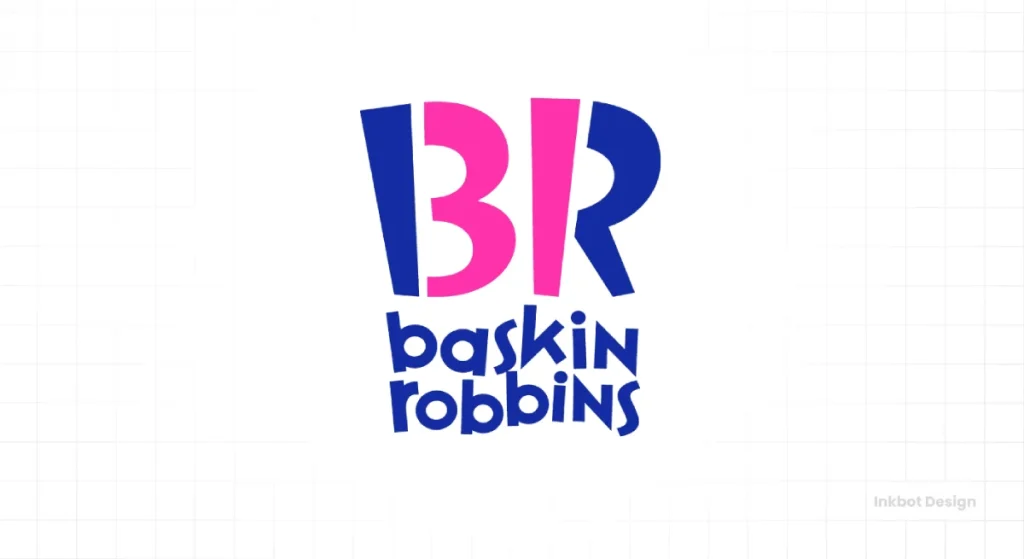
1. Baskin-Robbins. Look closely at the “BR” in their logo. The pink parts of the letters cleverly form the number “31,” representing their original 31 flavours.
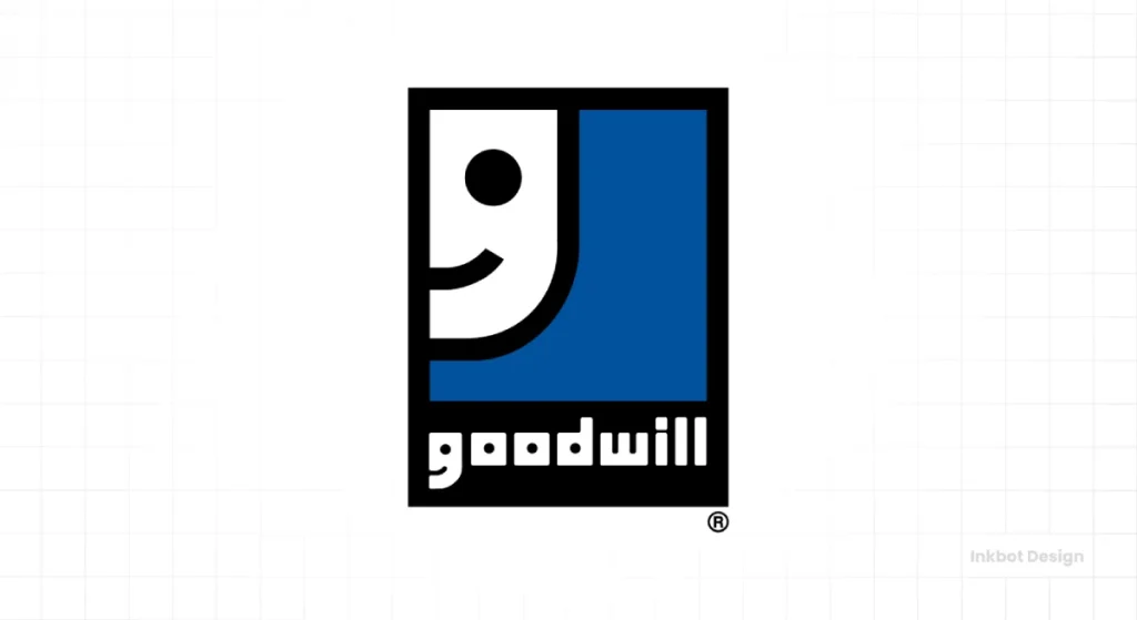
2. Goodwill. The smiling face icon in the Goodwill logo is widely recognised. The upper half of that face is actually a stylised lowercase ‘g’ – the first letter of Goodwill – seen in profile.
3. Toblerone. The Matterhorn mountain is obvious. But look closer at the mountain. There’s a bear hidden in the negative space, referencing Bern, the “City of Bears,” where Toblerone was created.
4. Tostitos. The two ‘t’s in the middle of the “Tostitos” wordmark are designed as two people dipping a tortilla chip (the dot on the ‘i’) into a bowl of salsa.
5. NBC (National Broadcasting Company). The peacock. The coloured feathers are obvious, but the negative space in the centre forms the peacock’s head and body. A classic that’s endured.
6. USA Network. The ‘S’ isn’t explicitly there; it’s created by the ligature of the ‘U’ and ‘A’. Simple, clever, and makes the letters work harder.
7. London Symphony Orchestra. The letters LSO are also stylised to depict a conductor with a baton. It’s fluid, elegant, and perfectly captures the essence of an orchestra.
8. Hope for African Children Initiative. The map of Africa is the obvious container. But the negative space creates the profiles of a child looking up at an adult. Powerful and emotive.

9. MyFonts. The ‘M’ and ‘y’ are clear. But look at the palm of the ‘M’ – it forms a hand. Subtly suggesting touch, creation, and the human element in type.
10. The Guild of Food Writers. A spoon is clearly visible. The negative space within the spoon’s outline forms the nib of a fountain pen. Food and writing are perfectly combined.
Negative space logos are satisfying because they engage the viewer. There’s a moment of discovery, an “aha!” that makes the logo more memorable and clever.
Single Letter / Monogram Brilliance
Sometimes, powerfully and distinctively rendered, one letter is all it takes. It’s the ultimate in brevity.
1. Motorola. The iconic “batwing” M is a powerful and timeless single-letter mark, instantly recognisable and conveying a sense of innovation.
2. Suzuki (S). A strong, sharp, stylised ‘S’. Instantly recognisable, especially in the automotive world.
3. Yahoo! The expressive ‘Y’ (often seen with its accompanying exclamation mark) has been a long-standing and distinctive single-letter mark in the tech landscape.
4. Pinterest. The ‘P’ is also designed to look like a map pin. Perfectly encapsulates the core function of the platform. Simple, relevant, clever.
5. WordPress. The ‘W’ in a circle. Clean, modern, and widely recognised by anyone who’s ever built a website.
6. Kmart. The classic, big red ‘K’ was an instantly recognisable and effective single-letter retail brand mark for many years, demonstrating simplicity and boldness.
7. Netflix. The big red ‘N’. Initially, it was just the wordmark. That single letter, often stylised like a ribbon, is enough. Instantly recognisable on your TV or phone.
8. Beats by Dre. The ‘b’ is also designed to look like a pair of headphones on a circular head. Simple, iconic, and directly related to the product.
9. Facebook (Meta). The lowercase’ f’ in its blue square was iconic. The new Meta infinity loop also aims for that simple, abstract recognisability.
10. Electrolux. The long-standing stylised ‘E’, often enclosed in a circle and featuring a distinctive “notch” or break, represents the global appliance brand.
A monogram has to be incredibly well-designed to stand alone. It needs character and distinctiveness, all within the confines of a single letter or a few initials.
Common Excuses for Complicated Logos (And Why They’re Rubbish)
I’ve heard them all. The justifications for cramming more and more into a tiny visual space. Most are born from fear, misunderstanding, or plain bad advice. Let’s dismantle a few.
“Our business is complex, the logo needs to show that.”
This is a classic. And it’s nonsense. Your logo is an identifier, a visual shorthand. It is not, and should never be, an explainer video or a detailed inventory of every service you offer.” Clarity first. Your logo needs to be clear and recognisable. You explain the complexity of your business in your messaging, your website copy, your sales conversations – not by committee-designing a logo that looks like a puzzle no one can solve.
Think about General Electric. Their business operations are mind-bogglingly complex, spanning aviation, healthcare, and energy. Their logo? A simple, elegant monogram. It doesn’t try to show a jet engine, an MRI scanner, and a wind turbine. It just says “GE.”
“We need to stand out with something really different/detailed.”
Different, yes. Detailed? Usually, a massive mistake. Here’s the thing: simplicity is different in a world saturated with visual noise, where everyone is shouting. A clear, confident, simple logo can cut through the clutter far more effectively than something that looks like it’s trying too hard.
If your only strategy for being “different” is to add more visual clutter, you’ve already lost the plot. You’re not standing out; you’re just contributing to the noise.
“Simple looks cheap / like we didn’t spend much.”
This one always gets my blood boiling. It’s a fundamental misunderstanding of design value. The truth? Achieving powerful, meaningful simplicity is complicated. It takes skill, experience, and strategic thinking.
Any amateur can throw a dozen elements onto a canvas. It takes a professional to distil a brand’s essence into a simple and resonant mark. Frankly, anyone who thinks simple looks cheap doesn’t understand that good design is good business. It’s not an expense; it’s an investment.
“My competitor has [X, Y, Z] in their logo, so we need it too.”
Oh, dear. The “keeping up with the Joneses” approach to branding. This is a surefire way to look like a follower, not a leader. Stop fixating on your competitors’ actions and start thinking about your customers and your unique value. Your logo should be an authentic reflection of your brand, not a watered-down imitation of someone else’s. Originality and clarity build memorable brands, not mimicry.
So, How Do You Get a Simple, Effective Logo?

It’s not about waving a magic wand (or worse, using some cheap logo generator and expecting miracles). It’s a process. A thoughtful one.
Define Your Core Message. Brutally.
Before you even think about visuals, you need to be crystal clear on your message. What is the absolute one thing you want your logo to hint at or your brand to stand for? You’re not there yet if you find yourself listing five different concepts. Dig deeper. Be brutal in your editing. Simplicity in the logo starts with simplicity in the strategic thought behind it. One core idea. That’s your target.
Focus on a Single Strong Idea
Once you have that core message, the design should focus on conveying that with a single, strong visual idea. Not two ideas crammed together. Not three clever tricks. One. It could be a unique typographic treatment. A memorable geometric shape. A clever use of an initial or abstract mark. Whatever it is, let that one idea shine. Don’t dilute its power by trying to make it do too many jobs.
Embrace Constraints: Colour, Elements, Fonts
Constraints are your friend in the pursuit of simplicity. They force creativity.
- Colour: Limit your palette. Many of the most iconic logos in the world use just one or two colours. This not only aids simplicity but also improves versatility and can reduce printing costs.
- Elements: Fewer elements almost always lead to a stronger impact. Every single line, dot, or curve should justify its existence. If it’s not adding something vital, get rid of it.
- Fonts: Don’t use three different fonts in your logo. Please. Pick one (maybe two, if a tagline is truly essential and distinct) that perfectly captures the brand’s personality.
Test for Scalability and Application Early
This is crucial. Before you fall in love with a design, test it. How does it look tiny, like a browser favicon or a social media profile picture? Can you still tell what it is? How does it look huge, on a mock-up of a trade show banner? Does it hold its own? What about different applications? Will it be embroidered cleanly on a shirt? Will it work as a single-colour reversed-out version on a dark background? If it starts to fall apart in these tests, it’s likely not simple or robust enough.
Work With a Designer Who Gets Simplicity (And Isn’t Afraid to Push Back)
This is key. You need a designer who understands the power of simplicity, not just one who can execute your every whim. A good designer will ask tough questions. They’ll challenge your assumptions. They’ll push back if you’re heading towards complexity for complexity’s sake. They’ll guide you towards an aesthetically pleasing and strategically sound solution.
Find a designer who isn’t afraid to tell you when an idea is too much, or when your desire to include the kitchen sink is going to drown the entire message.
That’s our approach at Inkbot Design; frankly, it leads to better logos.
I had a client once, but he was absolutely wedded to this idea for his new catering company logo. He wanted a chef’s hat, a whisk, a rolling pin, a stylised representation of his signature dish (a complex paella, no less), and the company name in a flowing script, all intertwined with a vine of tomatoes.
He was convinced it told his “whole story.” It was a visual car crash.
Gently (at first, then more directly), I had to explain that it was telling no story because no one would be able to decipher it. We eventually landed on a beautifully simple typographic mark with a subtle, clever nod to a chef’s knife in one of the letterforms. He later admitted it was the best decision he made.
He said, “I wanted the Eiffel Tower, their company history, and a pigeon all in a 2cm square. Some battles are worth fighting, and I’m glad you fought that one for me.”
The Risk of Too Simple? Or Just Plain Bad?
Now, there’s a caveat. Simplicity isn’t an end in itself. It’s a means to an end: clarity, memorability, impact. There’s a fine line.
The Fine Line: Simple vs. Generic
Simplicity needs to be distinctive. A plain black square isn’t a logo; it’s a shape. Unless you’re a conceptual artist making a statement about the void, it’s probably not going to cut it.
Your simple logo still needs an idea. A spark. Something that makes it uniquely yours. Target can get away with a red circle because they are Target; they’ve invested billions in making that simple mark synonymous with their brand.
A new startup can’t just plonk a blue triangle on their letterhead and call it a day unless that triangle is incredibly clever or has some profound, easily communicated meaning.
The “My Kid Could Draw That” Fallacy
Ah, the classic critique of simple, abstract, or geometric logos. “My five-year-old could have drawn that!” Yes, perhaps they could have replicated the final mark.
But could they have gone through strategic thinking, the iterative design process, the dozens (or hundreds) of rejected concepts, refinement, and understanding of visual balance, negative space, and typographic nuance to arrive at that powerfully simple solution? Unlikely.
Simple isn’t low effort. It’s about the thinking, the distillation, the strategic choices that lead to that simple form. You’re paying a designer for that, not just the ability to draw a circle.
When Simplicity Fails: Lack of Meaning or Connection
A simple logo must still resonate with your audience and align with your brand’s core values and personality.
If you’re a cutting-edge tech company aiming to convey innovation and dynamism, a very traditional, static, simple serif lettermark might feel disconnected, even if it’s “simple.
If you’re a children’s toy company, an ultra-minimalist, severe black-and-white logo might be simple, but it might fail to connect with your target audience or convey a sense of playfulness. Simplicity must serve the brand, not just be simple for simplicity’s sake.
Conclusion: Cut the Clutter. Seriously.
Your logo is arguably the hardest-working component of your brand identity. It’s often the first impression and the visual cue that will (you hope) stick in people’s minds. Don’t handicap it by making it lazy with unnecessary complexity. Don’t make it fight for attention through a fog of its own making.
Take a long, hard, honest look at your current logo. Or the ideas you have for a new one. Is every single element, every line, every colour, every flourish, pulling its weight? Does it absolutely need to be there? If not, what can you strip away? Be ruthless.
Simplicity in logo design isn’t just a stylistic choice; it’s a strategy. And it works.
FAQs
What makes a simple logo effective?
A simple logo is effective because it’s easier to recognise, remember, and reproduce across various platforms. Its clarity allows for quick mental processing and stronger brand recall.
Are simple logos always better than complex ones?
Generally, yes, for most businesses. Simple logos are more timeless, versatile, and memorable. While some heritage brands might have more intricate emblems that work for them, startups and modern businesses almost always benefit from simplicity.
How many colours should a simple logo have?
Ideally, one or two. Some great, simple logos use three, but limiting the colour palette enhances simplicity, reduces potential printing issues, and strengthens brand recognition.
Can a simple logo still be unique?
Absolutely. Uniqueness in a simple logo comes from a strong core concept, clever use of form or negative space, or distinctive custom typography, not from adding more elements.
What are some famous examples of simple logos?
Nike (swoosh), Apple (bitten apple), McDonald’s (golden arches), FedEx (with the hidden arrow), Target (bullseye) – these are all prime examples of powerful, simple designs.
Is a minimalist logo suitable for all types of businesses?
For the vast majority, yes. From tech startups to cafes, from consultants to retail. The key is ensuring the style of simplicity aligns with the brand’s personality (e.g., playful simplicity vs. sophisticated simplicity).
How much does a simple logo design cost?
The cost isn’t about the perceived “amount” of design but the quality of thinking, experience, and skill involved in creating a truly effective, simple mark. It can range from a few hundred pounds for a very basic execution to many thousands for work from experienced designers or agencies who undertake deep strategic work. Remember, “simple” doesn’t mean “easy” or “quick” to design well.
What’s the difference between a simple logo and a generic logo?
A simple logo has a clear, distilled idea and is distinctive. A generic logo is often simple due to a lack of idea or distinctiveness – think a basic swoosh that isn’t Nike or a generic globe icon.
How can I simplify my existing logo?
Start by identifying the core elements. What’s the one thing that truly matters? Then, remove anything superfluous – extra colours, gradients, thin lines, fussy details, multiple fonts. Ask if each element needs to be there. An evolutionary simplification is often better than a radical redesign if you have existing brand equity.
Do simple logos work well for digital platforms?
Extremely well. They are easily scalable for app icons, favicons, social media profiles, and responsive website designs, maintaining clarity even at very small sizes.
Why is “less is more” a good principle in logo design?
“Less is more” leads to logos that are easier to understand, remember, and apply. It strips away distractions, focusing on a core message or visual idea, making the logo more impactful and often more timeless.
What if my industry peers all have complex logos?
That could be a fantastic opportunity for you. A simple, clear, confident logo can make you stand out significantly in a crowded market full of visual noise. Don’t follow the herd if the herd is overcomplicating things.
See enough? If your brand’s visual identity isn’t cutting it, it’s time for a more direct approach. Explore our logo design services or request a quote if you’re ready for some straight talk about your logo. For more no-nonsense design insights, please browse our other articles.

