Top 10 Script Logos: Create Unforgettable Brands
Have you ever stared at a logo and felt… something? That’s not by accident, my friend.
I remember the day I launched Inkbot Design. There I was, a chap with more ambition than sense, trying to cobble a logo that didn’t look like a toddler and drew it on a sugar rush.
Spoiler alert: It was rough.
But here’s the kicker – that struggle led me down a rabbit hole of logo design that changed everything. And today, we’re diving deep into the world of script logos. Don’t just use any script logos, mind you. We’re talking about the crème de la crème, the top 10 that’ll make your brand pop faster than a champagne cork at a millionaire’s wedding.
So, buckle up. Whether you’re a design newbie or a seasoned pro, you’ll see logos in a new light by the end. And who knows? You might just create the next iconic script logo.
Let’s roll.
🔰 TL;DR: Discover the power of script logos through our top 10 picks. Learn why they work, how to create them and unlock the secrets to crafting memorable brand identities. Whether you are a design novice or a seasoned pro, this guide will elevate your logo game. Spoiler: It’s not about perfection; it’s about personality.
- Script logos evoke strong emotions and personality, making brands more approachable and memorable.
- A successful script logo balances legibility and style, ensuring it remains impactful across various platforms.
- Understanding your brand and audience is crucial in crafting a script logo that genuinely resonates.
What Makes a Script Logo Tick?
Before we dive into our top 10, let’s get our heads around what makes a script logo work. It’s not just about pretty handwriting, folks.
The Power of Personality
Script logos are like the extroverts of the design world. They don’t just sit there; they practically leap off the page and shake your hand. They’ve got personality in spades.
Take Coca-Cola. That swirly, iconic script isn’t just a logo; it’s a time machine. One glance, and you’re transported back to your first sip, the fizz tickling your nose. That’s the power of a well-crafted script logo.
Emotion in Every Curve
Here’s a nugget of wisdom I picked up: Emotions sell. And script logos? They’re emotional powerhouses.
Think about it. The flowing lines, the personal touch – like getting a handwritten note in a world of typed emails. It makes your brand feel human, approachable, and, dare I say it, lovable.
Versatility: The Unsung Hero
Now, here’s where it gets interesting. A great script logo isn’t just pretty; it’s a chameleon. It must look as good on a billboard as on a business card.
I learned this the hard way with Inkbot Design. Our first logo looked smashing on screen but turned into an unreadable mess on smaller items. Lesson learned: Versatility is king.
The Top 10 Script Logos That’ll Make Your Jaw Drop
All right, enough preamble. Let’s dive into the good stuff. These script logos don’t just catch the eye – they grab, shake, and leave it forever changed.
1. Coca-Cola: The Godfather of Script Logos
🥤 Why It Works:
- Timeless design (barely changed since 1886)
- The perfect balance of legibility and flair
- Instantly recognisable, even from a distance
Fun Fact: The Coca-Cola logo was created by Frank Mason Robinson, the bookkeeper of the company’s founder. Talk about hidden talents!
2. Disney: Magic in Every Curve
🏰 Why It Works:
- Captures the essence of childhood wonder
- Versatile across various media
- The ‘D’ with its swooping tail is iconic in its own right
Insider Tip: Notice how the ‘i’ is dotted with a circle. That’s no accident. It’s designed to be easier to read from a distance.
3. Instagram: Modern Script for the Digital Age

📸 Why It Works:
- It perfectly balances modern and nostalgic vibes
- Highly legible despite its script nature
- Adapts well to different colour schemes
Did You Know? The Instagram logo underwent a massive redesign in 2016, but the script element remained. That’s how crucial it is to their brand identity.
4. Virgin: Bold and Unapologetic
✈️ Why It Works:
- Exudes confidence and rebellion
- Simple yet distinctive
- Versatile across Virgin’s diverse brand portfolio
Brand Lesson: Virgin’s logo proves that script doesn’t always mean delicate. It can be bold, brash, and brilliant.
5. Cadbury: Sweetness in Every Letter
🍫 Why It Works:
- Evokes a sense of indulgence and luxury
- The flowing script mimics melting chocolate
- Stands out in the crowded confectionery market
Sweet Insight: The Cadbury logo is based on the signature of William Cadbury, one of the company’s founders. Talk about a personal touch!
6. Kellogg’s: Breakfast Table Staple
🥣 Why It Works:
- Friendly and approachable design
- The ‘K’ is instantly recognisable
- Conveys a sense of tradition and trust
Cereal Trivia: The Kellogg’s logo has remained essentially unchanged since 1906. That’s some serious staying power!
7. Barbie: Playful Perfection
👧 Why It Works:
- Captures the fun and femininity of the brand
- The ‘B’ doubles as a heart shape
- Highly adaptable across various product lines
Doll Dilemma: Barbie’s logo has undergone several tweaks, but the script style has remained constant. It’s part of the brand’s DNA.
8. Harrods: Luxury in Every Loop
🛍️ Why It Works:
- Exudes sophistication and exclusivity
- The intricate script reflects the store’s attention to detail
- Stands out in the high-end retail space
Posh Pointer: The Harrods logo is often displayed in gold, further emphasising its luxury positioning.
9. Paul Smith: Fashion Forward Script
👔 Why It Works:
- Combines simplicity with a touch of quirkiness
- Reflects the brand’s blend of classic and modern
- The handwritten style adds a personal touch
Style Secret: The slightly imperfect nature of the Paul Smith logo adds to its charm, much like the brand’s approach to fashion.
10. Cartier: Timeless Elegance
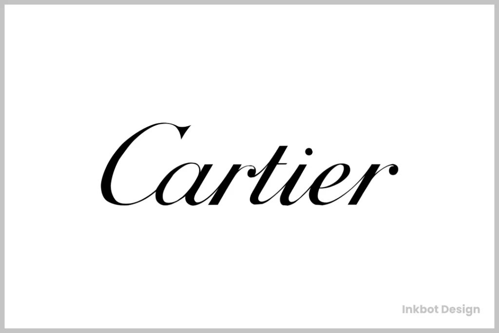
⌚ Why It Works:
- Epitomises luxury and craftsmanship
- The script is both delicate and confident
- Perfectly balanced, much like their timepieces
Luxe Lesson: Cartier’s logo proves that sometimes, less is more. It’s simple yet undeniably high-end.
The Science Behind Script Logo Magic
Now, I know what you’re thinking. “Alex, these logos are great, but how do I create one that doesn’t look like a drunk spider crawled across the page?”
Fair question. Let’s break it down.
The Psychology of Curves
There’s actual science behind why we’re drawn to curved logos. A 2013 study found that people prefer curved visual objects over angular ones. Why? They’re perceived as softer and more approachable.
In the cut-throat business world, a little approachability goes a long way.
Consistency is Key
I picked up a nugget of wisdom while building Inkbot Design: Consistency is your best friend. Your script logo must look good everywhere – from billboards to bottle caps.
Pro Tip: Design your logo in black and white first. If it works without colour, it’ll work with anything.
Legibility vs. Style: The Eternal Battle
Now, here’s where it gets tricky. You want your logo to be stylish, sure. But if no one can read it, what’s the point?
I once had a client insist on an intricate logo resembling ancient hieroglyphics. It looked great on paper, terrible on… well, everything else.
The sweet spot? The logo is readable but exciting enough to warrant a second look.
Creating Your Own Script Logo: A Step-by-Step Guide

All right, let’s get practical. You’ve seen the best; now, let’s create your masterpiece.
Step 1: Know Your Brand
Before you think about putting pen to paper (or cursor to screen), know your brand inside out.
- What’s your brand personality? Playful? Luxurious? Rebellious?
- Who’s your target audience?
- What emotions do you want to evoke?
Step 2: Sketch, Sketch, Sketch
Start with a good old pen and paper. Why? It’s faster more natural, and you can explore ideas without getting bogged down in technicalities.
When rebranding Inkbot Design, I filled three notebooks with sketches. Overkill? Maybe. But that 100th sketch? Pure gold.
Step 3: Digitise and Refine
Once you’ve got a solid concept, it’s time to go digital. Use software like Adobe Illustrator or Inkscape to create a vector version of your logo.
Pro Tip: Keep your anchor points to a minimum: the fewer points, the smoother your curves.
Step 4: Test, Test, Test
Your logo might look great on your 27-inch monitor, but how does it look on a business card? Or is it embroidered on a cap?
Test your logo in various sizes and applications. If it works across the board, you’re onto a winner.
Step 5: Get Feedback (But Don’t Let It Rule You)
Show your logo to people. Get their honest opinions. But remember, you can’t please everyone. Trust your gut.
Words of Wisdom: “Design is intelligence made visible.” – Alina Wheeler
FAQs: Your Burning Script Logo Questions, Answered
Can a script logo work for any type of business?
While script logos can work for many businesses, they’re particularly effective for brands wanting to convey elegance, creativity, or a personal touch. They might not fit the best for ultra-modern tech companies or industrial brands.
How do I ensure my script logo is legible?
Keep it simple, avoid overly intricate designs, and test it at various sizes. You’re on the right track if you can read it clearly when small.
Should I hire a professional designer or try to create a script logo myself?
If you have design skills, give it a go! But investing in a professional designer (like those at Inkbot Design 😉) can make a difference for best results, especially for established businesses.
How often should I update my script logo?
A well-designed script logo can last decades with minor tweaks. Major rebrands typically happen every 7-10 years, but if your logo works well, don’t fix what isn’t broken.
Can I trademark my script logo?
Absolutely! It’s a smart move to protect your brand identity. Consult with a legal professional to guide you through the process.
What’s the difference between a script and a signature logo?
Script logos are any logos that use a cursive or handwritten style, while signature logos precisely mimic a personal signature. All signature logos are script logos, but not all are signatures.
Are there any industries where script logos are trendy?
Script logos are common in fashion, beauty, food and beverage, and luxury industries. They’re also famous for personal brands and artisanal products.
How do I choose the right font for my script logo?
Consider your brand personality and target audience. Test different fonts to see which best represents your brand. Remember, you can always customise a font to make it unique.
Can I use a script logo for my website favicon?
It’s possible but challenging. Script logos often don’t scale well to very small sizes. Consider creating a simplified version or using an initial for your favicon.
How do colour choices affect my script logo?
Colours can dramatically change the perception of your logo. Bright colours make it feel more playful, while muted tones convey elegance. Always consider colour psychology in your design.
Is it essential for my script logo to be unique?
Absolutely! Your logo is a vital part of your brand identity. While drawing inspiration from others is okay, your final design should be yours.
How do I balance creativity with professionalism in my script logo?
It’s all about understanding your brand and audience. A law firm’s script logo will likely be more restrained than a children’s toy brand. Find the sweet spot that represents your brand accurately.
Wrapping It Up: Your Script to Success
There you have it, folks. The ins and outs of script logos, from the icons that defined industries to the nitty-gritty of creating your own.
Remember, a great logo isn’t just about looking pretty. It’s about encapsulating your brand’s essence in a powerful image. It’s about creating something that resonates with your audience and stands the test of time.
Whether you’re a startup finding your feet or an established brand looking to refresh, a well-crafted script logo can be your secret weapon. It’s the handshake before the conversation, the smile before the pitch.
So, what are you waiting for? Get out there and make your mark. Literally.
And hey, if you find yourself stuck or want professional eyes on your design, that’s what we’re here for at Inkbot Design. Because at the end of the day, your logo isn’t just ink on paper – it’s your brand’s first impression. Make it count.
Now, go forth and conquer the world of script logos. I’ll be here, probably doodling the next big thing. Or at least trying to. 😉

