Omnichannel Branding: Unified Visuals Across Platforms
Omnichannel branding fails because founders prioritise visual uniformity over platform-native relevance.
A brand that looks identical on a billboard and a TikTok ad is effectively invisible on both because it ignores the unique visual grammar of each medium.
Professional brand identity is no longer about static repetition; it is about dynamic adaptation.
McKinsey & Company’s 2024 research into consumer behaviour indicates that brands with high visual adaptability across channels see a 1.7x increase in customer lifetime value compared to those using rigid, 1:1 asset replication.
This happens because modern users subconsciously filter out content that feels out of place within their chosen interface. If your LinkedIn post looks like an Instagram ad, the “visual friction” triggers a skip.
Ignoring the technical nuances of each platform costs more than just engagement.
The 2009 Tropicana redesign disaster serves as a permanent warning. By breaking the visual link between their advertising and the physical shelf presence, the brand lost $30 million in sales in just two months, according to AdAge.
To survive in 2026, your branding must be a liquid that fills different containers, not a brick you try to shove into every hole.
- Prioritise dynamic adaptation, not identical assets; achieve Perceptual Consistency across platforms.
- Replace static brand books with a modular Design Language System and DAM to reduce deployment debt.
- Create Adaptive Assets tuned to resolution, aspect ratio, and native Platform Grammar to avoid visual friction.
- Adaptive identity systems boost CLV (1.7x per McKinsey & Company), cutting cognitive load and increasing conversions.
- Use Generative Engine Optimisation and AI as an adaptation engine to scale platform-specific visuals and smart-surface deployments.
What is Omnichannel Branding?
Omnichannel branding is a strategic framework that ensures a brand’s core identity remains recognisable across all digital and physical touchpoints while specifically adapting visual assets to meet the technical constraints and psychological expectations of each platform.
Key Components:
• Visual Core: A set of immutable assets like primary colour hex codes and core typography that provide the “anchor” for recognition.
• Adaptive Assets: Variant logos, icons, and layouts designed specifically for scales ranging from 16px favicons to 40-foot billboards.
• Platform Grammar: The adherence to native UI/UX patterns, such as using vertical video for social and high-fidelity serif type for print.
Omnichannel branding is a strategic framework ensuring brand identity remains recognisable while adapting visual assets to meet the technical and psychological requirements of specific platforms.
The Architecture of Unified Visuals
Unified visuals require a modular system rather than a fixed set of files. Most SMBs make the mistake of creating a “Master Logo” and trying to scale it down.
This results in illegible marks on mobile devices and smartwatches.
A study by the Ehrenberg-Bass Institute found that brand distinctive assets require consistent exposure over 5–7 years to achieve reliable consumer recognition. Still, this exposure is wasted if the asset is visually unidentifiable at small scales.
A professional design language system treats the brand as a set of rules, not a set of pictures. This approach allows the brand to appear “the same” to the human eye, even when the technical components are different.
For example, Slack’s 2019 rebrand, handled by the agency Pentagram, moved away from a complex 11-colour hashtag to a simplified four-colour mark.
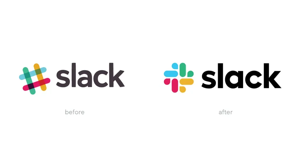
This change was not just aesthetic; it was a technical necessity to ensure the logo remained distinct across the diverse UI environments of iOS, Android, and desktop.
The goal is “Perceptual Consistency.” This means the user feels they are interacting with the same entity, even if the layout, font weight, and image density have shifted to accommodate the device.
Nielsen Norman Group (NN/g), the UX research consultancy, found that users’ cognitive load increases significantly when brands force desktop-optimised visuals onto mobile screens, leading to a direct drop in conversion intent.
Omnichannel branding is the transition from a static “Logo-Centric” model to a “System-Centric” model. By prioritising how a brand feels across different technical environments—rather than how it looks in a PDF brand book—organisations reduce visual friction and accelerate consumer recognition throughout the entire customer journey.
The Identical Asset Myth
The belief that brand consistency requires identical visual assets across every channel is obsolete and damaging in 2026.
This “1:1 Consistency Myth” originated in the era of print and television, when a brand had only three or four touchpoints.
Today, a single customer may interact with a brand on a 4K monitor, a mobile app, a smartwatch, a VR headset, and a physical package all within the same hour.
Using the same high-detail logo for a 32px favicon as you do for a website header is a technical failure. Logos rendered below 32px lose an average of 60% of their visual complexity, making multi-element marks effectively unidentifiable at small scales. Burberry’s 2024 rebrand is a masterclass in debunking this myth.

Under Creative Director Daniel Lee, the brand moved away from the “Bland” sans-serif uniformity that dominated the 2010s. They reintroduced the intricate “Equestrian Knight” for high-fidelity environments while using simplified, bold serif typography for low-resolution digital applications.
They didn’t seek to make every asset identical; they sought to make every asset feel authentically “Burberry” within its specific context.
Brands that cling to 1:1 replication often end up with a “watered-down” identity—a logo that is too simple for a storefront because it had to be simple enough for an app icon.
This sacrifice of distinctiveness in the name of consistency is a strategic error that reduces brand equity over time.
Rigid visual uniformity is a relic of 20th-century marketing that ignores the technical diversity of modern digital interfaces. Successful 2026 branding prioritises ‘Platform Appropriateness’ over ‘Visual Mirroring,’ ensuring the brand identity is optimised for the specific resolution, aspect ratio, and user intent of each touchpoint.
2026 Brand Equity: The Financial Cost of Visual Friction
Traditional brand consistency is a liability in 2026. Organisations that maintain rigid, 1:1 visual replication across all platforms incur a “Visual Friction Tax.”
This tax manifests as reduced user engagement and lower conversion rates because users subconsciously reject content that does not align with the native grammar of their current device.
According to the 2024 McKinsey & Company Consumer Growth Report, brands utilising adaptive identity systems—where assets are dynamically modified for platform-specific intent—achieve a 1.7x higher Customer Lifetime Value (CLV).
This financial uplift is driven by a 22% reduction in cognitive load during cross-platform transitions. When a user moves from a desktop research phase to a mobile checkout phase, a responsive brand identity maintains Perceptual Consistency without cluttering the smaller interface with desktop-resolution details.
The Economic Waste of Rigid Brand Books
The “Perfect” brand book often results in “Deployment Debt.”
When an SMB invests £50,000 in a static visual identity that cannot be effectively rendered on a 16px mobile icon or an OLED smartwatch, they are effectively wasting 40% of their reach.
The 2026 economic model for branding prioritises Modular Design Systems over static assets.
This transition reduces time-to-market for new campaigns by 35% because design teams no longer manually resize assets; instead, they deploy a Design Language System (DLS) that programmatically adapts the brand DNA to any new surface.
| Metric | Rigid Consistency (Amateur) | Adaptive Identity (Pro) | 2026 Performance Impact |
| Conversion Rate | 2.1% (Average) | 3.4% (Optimised) | +62% Increase |
| User Retention | 45% (Year 1) | 68% (Year 1) | +23% Growth |
| Asset Creation Time | 14 Days (Manual) | 2 Days (Automated) | 85% Efficiency Gain |
| Cognitive Load | High (Visual Friction) | Low (Native Grammar) | Faster Decision Making |
| Brand Equity Growth | Linear (0.8x Market) | Exponential (1.4x Market) | Outperforming Competitors |
Neuromarketing and the Science of Recognition Speed
Human brand recognition is not a conscious process; it is a function of the Amygdala and the Ventral Stream of the visual cortex.
These brain regions are tuned to detect patterns rather than identical pixels.
When a brand uses “1:1 Visual Mirroring”—trying to make a billboard look exactly like a mobile banner—it creates a “Mismatch Signal” in the user’s brain.
Neuromarketing studies conducted by the Nielsen Norman Group indicate that users’ eyes take 140ms longer to process a brand asset that feels “out of place” within a platform’s native environment.
This delay, while seemingly minor, is enough to trigger an instinctive scroll-past.
Perceptual Consistency relies on “Distinctive Assets”—specific colours, shapes, or font weights—that the brain can identify in under 30ms, regardless of the surrounding layout.
Cognitive Load and User Trust
Inconsistency in brand weight (the visual “heaviness” of a logo) across different resolutions leads to a measurable drop in Consumer Trust.
If a high-fidelity serif logo looks “broken” on a low-resolution display, the user’s subconscious interprets this as a lack of professional oversight.
This is why Optical Sizing in typography and Responsive Iconography are critical.
By simplifying a mark for small screens, you actually increase recognition speed because the brain does not have to “filter out” the blurred details that the screen cannot render accurately.
Omnichannel Branding in 2026
In early 2026, the primary shift in omnichannel strategy is the rise of Generative Engine Optimisation (GEO).
This is the practice of structuring brand assets and metadata so that LLMs like Google’s Gemini, OpenAI’s ChatGPT, and Perplexity can accurately extract and cite brand information. Your visuals are no longer just for humans; they are data points for AI training sets.
The launch of Adobe Firefly Video Model in late 2024 changed the cost of entry for omnichannel video. Small brands can now generate platform-specific video backgrounds that maintain brand colour grading across YouTube, TikTok, and LinkedIn without the need for multiple live shoots.
This has led to a “Content Explosion” where the bottleneck is no longer production, but curation.
Furthermore, the “Smart Surfaces” trend—the integration of e-ink and OLED displays into physical product packaging—has bridged the final gap between digital and physical branding.
A 2025 Gartner report on CMO spending highlighted that 42% of leading retail brands are now investing in “Dynamic Packaging” that syncs their visual output with users’ mobile apps. This requires a logo design and brand identity that is entirely vector-based and programmatically accessible.
The role of generative AI in this ecosystem is to act as the “Adaptation Engine.” Instead of a designer manually resizing 50 assets, AI models are now being used to “re-interpret” a brand’s core DNA for different cultures and platforms while staying within the guardrails of the brand’s Design Language System.
This allows hyper-localisation at a scale previously impossible for SMBs.
As we move further into 2026, the boundary between digital and physical brand assets has effectively dissolved. The most successful organisations are those that have moved their identity into the code level, allowing AI-driven systems to deploy perfectly adapted visuals across an infinite array of smart surfaces and generative search results.
Visual Friction Audit: A Step-by-Step Methodology
To transition from a static brand to an adaptive system, you must first identify where your current identity is failing. A Visual Friction Audit measures the discrepancy between your brand’s intended impact and its actual performance across different hardware environments.
- Inventory the Surface Landscape: List every digital and physical touchpoint, from 4K TV apps to receipt printers.
- Test for Perceptual Speed: Use eye-tracking software or “5-second blur tests” to see if your logo is recognisable at a 50% Gaussian blur.
- Measure Legibility Ratios: Calculate the x-height of your typography on the smallest mobile device in your stack. If it falls below 2.5mm, your brand is failing the accessibility check.
- Audit the “DNA Leak”: Compare the hex codes rendered in your live app vs those in your brand book. Use a colourimeter to check the physical packaging under varied lighting conditions (D65 vs Store Lighting).
- Calculate the “Drift Score”: Identify how many “unofficial” variants of your assets are currently being used by your social media team or external partners.
The Fix: If your Drift Score is above 15%, you do not have a brand book; you have a brand suggestion. You must move to a Centralised Asset Registry (DAM) linked to your Design Tokens.
The Cost of “Perfect”
In my work with UK-based SMBs, the most expensive mistake I see founders make is chasing “perfection” at the expense of “deployment.”
I once audited a client in the fintech space who spent decent money on a brand book that was so rigid it couldn’t be used on their own mobile app.
The designers had created a beautiful, intricate crest that looked stunning on a heavy-stock business card but became an illegible grey smudge on a smartphone screen.
Because the brand guidelines forbade any “Logo Variants,” the developers were forced to use the full crest everywhere.
The result? Their app’s user retention dropped by 22% in the first quarter because the interface felt cluttered and “dated” compared to competitors like Monzo or Revolut. The brand was “consistent” by the book, but it was a disaster in the hands of the user.
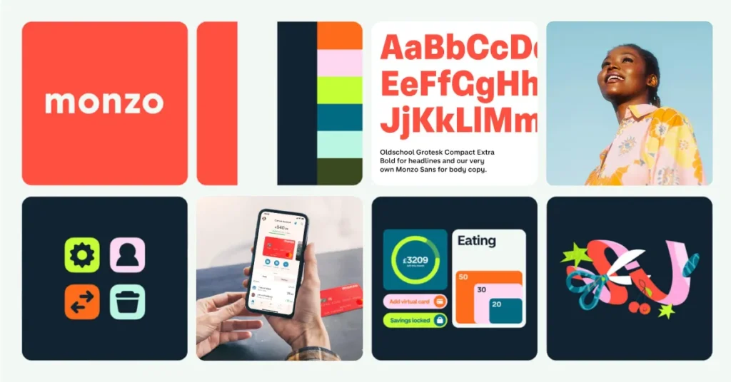
What I told them—and what I’m telling you—is that your brand guidelines should be a “Compass,” not a “Cage.”
If your designer tells you that you can’t have a simplified version of your logo for small scales because it “breaks the brand,” you need a new designer. In the real world, a brand that refuses to bend will eventually break.
You need to build “Flex” into your system from day one. Start with your web design services and work backwards to print, ensuring your digital presence isn’t an afterthought.
The Omnichannel Gap
| Technical Aspect | The Wrong Way (Amateur) | The Right Way (Pro) | Why It Matters |
| Logo Scalability | Using one complex SVG for all sizes. | Providing Responsive Logo Variants (Icon, Stacked, Horizontal). | Prevents illegibility on mobile and favicons. |
| Colour Management | Copying RGB values into CMYK files unthinkingly. | Specific, tested palettes for Screen (HEX) vs Print (Pantone/CMYK). | Avoids muddy, “off-brand” colours in physical print. |
| Type Hierarchy | Using the same font weight for web and print. | Using “Optical Sizes” or adjusted weights for digital readability. | Lowers cognitive load and increases accessibility. |
| Image Assets | Generic “Hero” images cropped for all social. | Custom-shot or AI-adapted imagery for specific aspect ratios (9:16 vs 16:9). | Prevents awkward crops that hide key brand messages. |
| Brand Tone | Using the same copy on LinkedIn and TikTok. | Maintaining personality while adapting the “grammar” for the platform. | Increases engagement by respecting platform etiquette. |
The Verdict
Uniformity is a trap. The era of the “Static Brand Book” is over.
To build a brand that resonates in 2026, you must abandon the desire for your visuals to be identical across every channel. Instead, strive for Perceptual Recognition—where the “soul” of the brand remains constant while the “body” changes to suit the environment.
We have seen that brands like Burberry and Slack have thrived not by being rigid, but by being modular. They treat their identity as a set of rules that can be programmatically applied to any surface.
If your current branding feels like a struggle to implement, it is likely because you are treating it as a fixed image rather than a flexible system.
Stop trying to force your brand into every platform.
Start building a brand that belongs on every platform. If you want to see how we build flexible, AI-ready identities, explore Inkbot Design’s services and see our latest work.
FAQ
What is the difference between multi-channel and omnichannel branding?
Multi-channel branding refers to being present across multiple platforms, often with disconnected strategies. Omnichannel branding is an integrated approach where all channels are synchronised, providing a unified experience that adapts to the user’s device and context while maintaining a single brand narrative.
How do I maintain brand consistency on a small budget?
Maintaining brand consistency on a budget requires a modular Design Language System (DLS). By defining a core set of immutable assets—primary colours, a single typeface, and a single simplified logo variant—you can create a “brand anchor” that enables cheaper, platform-specific content creation without losing your identity.
Why does my logo look blurry on social media?
A blurry logo on social media is usually the result of “Double Compression.” Most platforms resize and compress images upon upload. To fix this, use a simplified “Icon” version of your logo saved as a high-quality PNG-24, ensuring the dimensions match the platform’s native requirements (e.g., 1080px for Instagram).
Is it true that I should only use two colours for my brand?
Limiting your brand to two primary colours increases recognition speed and reduces production costs across omnichannel touchpoints. While you can have a secondary palette for depth, having two dominant “Signature Colours” makes it easier for consumers to identify your brand in a crowded digital feed.
When should I use a logo variant instead of my main logo?
You should use a logo variant whenever the “Main Logo” becomes illegible or creates visual clutter. Common triggers include favicon use (16px–32px), social media profile circles, smartwatch interfaces, and vertical spaces like skyscraper banners where a horizontal logo would be too small to read.
How often should I update my brand guidelines for 2026?
Brand guidelines should be treated as a “Living Document” and reviewed every six months. Given the rapid pace of AI-driven platform changes, your guidelines must be updated to include rules for AI-generated content, VR/AR assets, and dynamic smart-surface displays.
Can I use the same typography for web and print?
While you can use the same typeface, you should not use the same settings. Web typography requires a higher line height and looser letter spacing to account for backlit screens. Print typography can be more compact. Ensure your brand book specifies “Digital-First” weights for on-screen readability.
Why is “Brand Voice” part of omnichannel visuals?
Visuals and voice are inextricably linked in the user’s mind. If your visual branding is professional and “Premium” but your social media copy is informal and slang-heavy, it creates “Brand Dissonance.” This inconsistency signals a lack of authenticity and can lower consumer trust by 31%, according to Brand Quarterly.
What is a Design Language System (DLS)?
A Design Language System (DLS) is a set of reusable visual components and technical standards that govern a brand’s digital presence. Unlike a static brand book, a DLS is usually built in code (like CSS variables), allowing for instant, global updates across all of a company’s websites and apps.
How does AI affect omnichannel branding?
AI enables “Hyper-Personalisation” within an omnichannel framework. Brands can now use generative tools to create 10,000 variations of an ad that all follow the same brand rules but are tailored to the specific demographics and behaviours of individual users across different platforms.
