Top 10 Luxury Fonts: Elevate Your Brand with Elegance
I remember the day I lost a £50,000 client.
It wasn’t because of our pitch. It wasn’t because of our pricing.
It was because of the font.
Yeah, you read that right—a bloody font.
We’d spent weeks preparing a proposal for a high-end jewellery brand. Our strategy was solid. Our ideas were innovative. But when we presented our deck, the client’s marketing director took one look and said:
“This doesn’t feel… luxurious enough.”
I was gobsmacked. 🤯
But here’s the kicker: he was right.
We used a standard sans-serif font throughout our presentation. It was clean and legible but lacked that je ne sais quoi that screams “luxury”.
That day, I learnt a valuable lesson: Every detail matters in luxury branding. And fonts? They’re not just details. They’re silent brand ambassadors.
🔰 TL;DR: Discover the top 10 luxury fonts that can transform your brand’s visual identity. Learn to choose and use these fonts effectively, even on a budget. Perfect for entrepreneurs, marketers, and design enthusiasts looking to add a touch of elegance to their projects.
- Fonts are vital in luxury branding, acting as silent brand ambassadors that influence perception.
- The right luxury font can elevate your brand, enhancing your image regardless of your business size.
- Selecting a luxury font requires alignment with your brand personality, industry, and readability.
- Achieving a luxurious look is possible on a budget by using free alternatives and creative design choices.
Why Luxury Fonts Matter (And Why You Should Care)
Let’s get one thing straight:
Fonts aren’t just about looking pretty.
They’re about communication.
They’re about emotion.
They’re about perception.
In a 2023 study, 78% of participants associated specific fonts with higher-priced, premium products. That’s right – before they even read a word, people were making judgments based on the shape of the letters.
But here’s the thing:
You don’t need to be Gucci or Rolls-Royce to benefit from luxury fonts.
Whether you’re a solopreneur building your brand or a startup aiming for the stars, the right font can elevate your image and set you apart.
So, buckle up. We’re about to dive into the world of luxury fonts. By the end of this post, you’ll know:
- The top 10 luxury fonts that can transform your brand
- How to choose the right luxury font for your needs
- Tips for using luxury fonts effectively (even if you’re not a designer)
- How to get that high-end look without breaking the bank
Ready? Let’s make your brand look like a million bucks. 💰
The Top 10 Luxury Fonts: Elegance at Your Fingertips
1. Didot: The Classic Choice
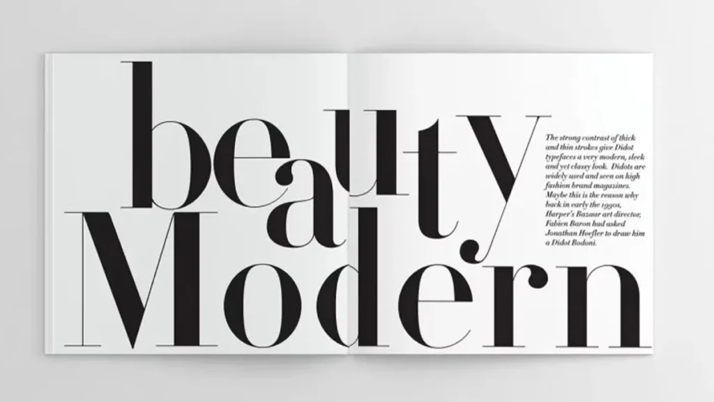
Why it’s luxurious: Didot is the little black dress of fonts. It’s timeless, elegant, and always in style.
Best used for: High-fashion brands, upscale magazines, and luxury product packaging.
Pro tip: Pair Didot with a simple sans-serif for body text to create a stunning contrast.
2. Baskerville: Refined and Sophisticated
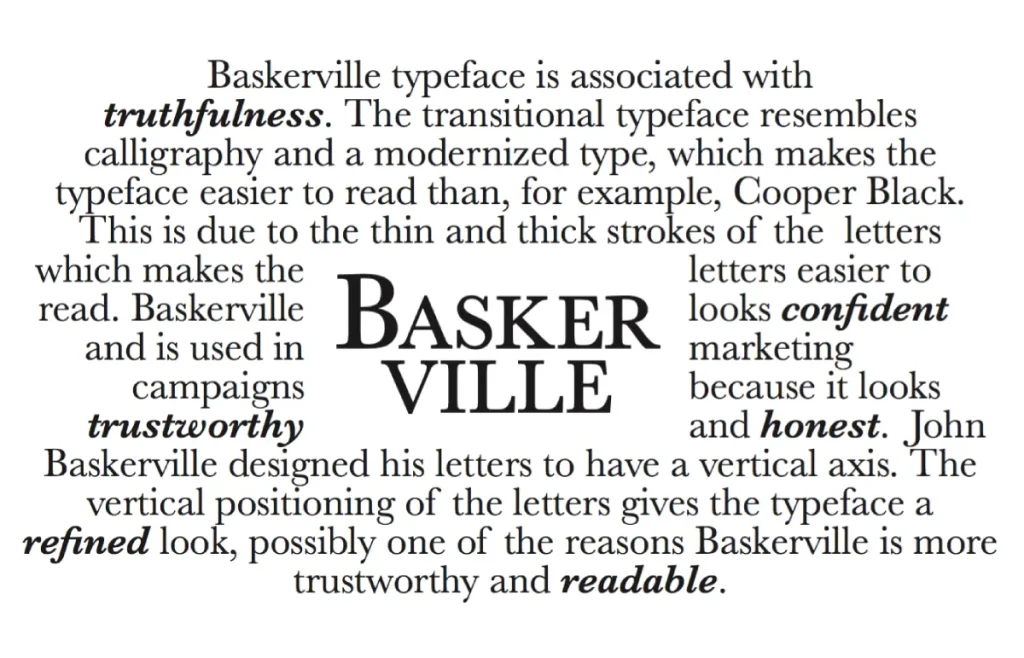
Why it’s luxurious: Baskerville exudes refinement. It’s the font equivalent of a perfectly tailored suit.
Best used for: Law firms, financial services, and high-end real estate.
Pro tip: Use Baskerville for headings and meaningful quotes to add gravitas to your content.
3. Optima: Modern Elegance

Why it’s luxurious: Optima perfectly balances classic and contemporary.
Best used for: Luxury skincare brands, spas, and premium food packaging.
Pro tip: Optima looks stunning in all caps for short, impactful statements.
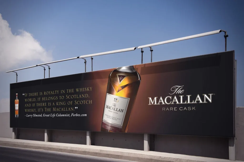
4. Bodoni: Bold and Beautiful

Why it’s luxurious: With its high contrast between thick and thin strokes, Bodoni demands attention.
Best used for: Fashion brands, luxury hotels, and high-end restaurants.
Pro tip: Use Bodoni sparingly for maximum impact – it’s a scene-stealer!
5. Copperplate Gothic: Understated Power
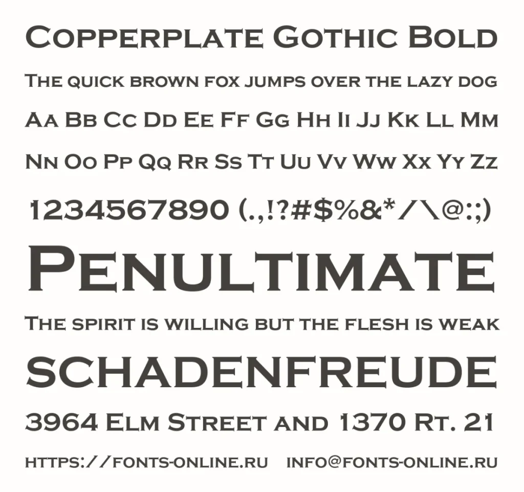
Why it’s luxurious: Copperplate Gothic whispers authority and tradition.
Best used for: Banks, investment firms, and luxury watchmakers.
Pro tip: This font works wonders for logos and short phrases. Avoid using it for long blocks of text.
6. Trajan: Timeless Grandeur
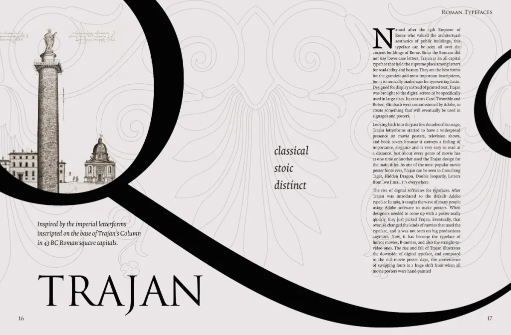
Why it’s luxurious: Inspired by Roman stone carvings, Trajan exudes timeless elegance.
Best used for: Movie posters, book covers, and luxury event invitations.
Pro tip: Trajan looks best in all caps. Use it for titles and essential headings.
7. Garamond: Subtle Sophistication
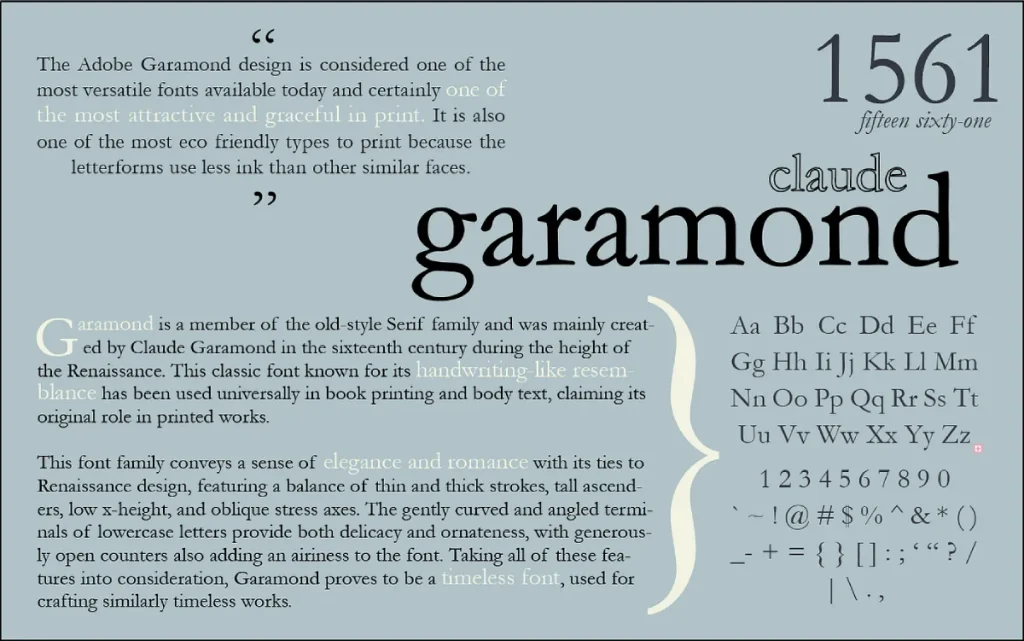
Why it’s luxurious: Garamond is the quiet aristocrat of fonts – refined without being showy.
Best used for: Luxury book publishers, art galleries, and premium wine labels.
Pro tip: Garamond is highly readable and perfect for longer text pieces in upscale publications.
8. Futura: Modern Luxury
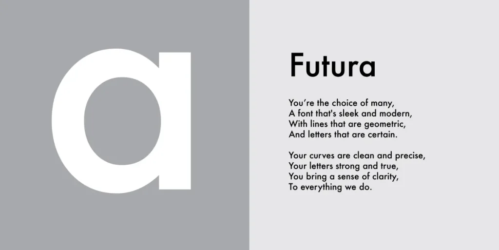
Why it’s luxurious: Clean, geometric, and forward-thinking, Futura is a luxury for the 21st century.
Best used for: Tech startups, modern art museums, and premium car brands.
Pro tip: Futura pairs beautifully with more traditional serif fonts for a modern-meets-classic look.
9. Hermès: Bespoke Elegance

Why it’s luxurious: Created for the iconic fashion house, Hermès embodies French luxury.
Best used for: High-end fashion brands, luxury travel companies, and premium lifestyle products.
Pro tip: While not freely available, investing in this font can instantly elevate your brand’s perceived value.
10. Gotham: Contemporary Class
Why it’s luxurious: Made famous by Obama’s presidential campaign, Gotham is the new face of sophisticated modernity.
Best used for: Upscale urban brands, luxury real estate, and premium tech products.
Pro tip: Gotham’s versatility works well in headings and body text.
Choosing the Right Luxury Font: It’s Not Just About Looking Pretty
Here’s a secret:
The most expensive font in the world won’t do you any good if it doesn’t align with your brand.
Choosing a luxury font is like choosing a bespoke suit. It needs to fit you.
Here’s how to make sure you’re making the right choice:
- Know your brand personality. Is your brand traditional or modern? Playful or serious? Your font should reflect this.
- Consider your industry. What fonts are your competitors using? How can you stand out while still meeting industry expectations?
- Think about readability. A font might look gorgeous in a logo, but can people read it in body text?
- Test, test, test. Don’t just rely on how the font looks on your computer screen. Test it in various sizes, on different devices, and in print.
- Consider font pairing. Most brands use more than one font. How will your luxury font pair with other typefaces?
Remember: a truly luxury brand isn’t about following trends. It’s about setting them.
Choose a font that resonates with your unique brand voice, and you’ll be on your way to creating a genuinely luxurious visual identity.
How Does Typography Reflect Different Historical Eras and Attitudes?
Typography serves as a visual timeline, capturing the essence of various historical periods and the prevailing attitudes of those times. Each era boasts its distinctive style, evident in the fonts and typefaces synonymous with specific decades.
Historical Eras:
- Art Deco: Characterised by bold geometric shapes and elegant lines, reflecting the opulence and innovation of the early 20th century.
- Seventies: Featuring playful, flowing fonts that evoke a feeling of freedom and experimentation.
Attitudes and Identities:
- Rebelliousness vs. Elegance: Typography can denote a rebellious spirit, marked by rugged and bold lettering, in contrast to refined and elegant typefaces that signify sophistication and luxury.
Market Positioning:
Typography also acts as a visual cue for brand positioning in the market. Simple and functional fonts often suggest accessibility and practicality, while luxurious and intricate lettering can imply exclusivity and premium quality.
Typography is not just a matter of aesthetics; it’s a dynamic art form that communicates more profound messages about time, attitude, and identity.
Using Luxury Fonts Effectively: Less is More

Here’s where most people go wrong:
They choose a luxury font and plaster it everywhere.
Big mistake. Huge.
Using luxury fonts effectively is an art. It’s about creating impact through restraint.
Here are some tips to help you use luxury fonts like a pro:
- Use it for headlines and essential text. Your luxury font should be the star of the show. Use it for headers, titles, and key phrases.
- Pair it with a simpler font. Use a more straightforward font for body text. This creates contrast and makes your luxury font stand out.
- Mind your spacing. Luxury fonts often benefit from a bit more breathing room. Don’t be afraid of white space.
- Size matters. Many luxury fonts look best when they’re large. Don’t be afraid to go big and bold.
- Consistency is key. Once you’ve chosen your luxury font, use it consistently across all your branding materials.
Remember: luxury is about quality, not quantity. Use your chosen font sparingly and strategically for maximum impact.
Historical figures and pivotal events have played substantial roles in shaping the use of specific fonts, often reflecting broader societal movements and cultural identities.
Political Statements and Font Choices
During Obama’s presidency, his campaign’s decision to use the Gotham font wasn’t merely aesthetic. This typeface was chosen for its modern, strong character, representing transparency and a forward-thinking vision, resonating well with the themes of hope and change that Obama championed. Such a choice speaks volumes about how fonts can embody political ideals and influence public perception.
Iconic Urban Legacies
In London, the introduction of Johnston Sans in 1916 for the Underground system was a groundbreaking decision. Its clean lines and distinctive circular ‘O’ were designed to promote clarity and ease of reading in a bustling metropolitan setting. This typographical choice became synonymous with the city’s identity, illustrating how fonts can become embedded within a cultural framework.
Evolutions in Transport Fonts
The Paris Métro has undergone several typographical transformations, reflecting its evolving identity. Initially embracing the ornate Art Nouveau style, it shifted to the Alphabet Metro’s all-caps design and now uses Parisine, a modern yet potentially transient font. Each transition highlights historical moments where cultural shifts and technological advancements influenced font selection.
These examples underscore the profound impact historical figures and events have on the typography that surrounds us daily, marrying form with function and narrative with necessity.
The Budget-Friendly Approach: Luxury Doesn’t Have to Cost a Fortune
Now, I know what you’re thinking:
“This sounds great, but I can’t afford to drop hundreds of pounds on a font!”
I hear you. And here’s the good news:
You don’t have to.
There are plenty of ways to get that luxury look without breaking the bank:
- Free alternatives: Many luxury fonts have free options that capture a similar feel. For example, Playfair Display is a free alternative to Didot.
- Google Fonts Google Fonts offers a range of sophisticated typefaces for free. Merriweather and Cormorant are great options.
- Bundle deals: Many font foundries offer bundle deals where you can get multiple luxury fonts for a discounted price.
- Student discounts: Many font retailers offer significant discounts if you’re a student (or know one).
- Open-source fonts like Libre Baskerville offer a luxurious feel and are free to use.
Remember: true luxury isn’t about how much you spend. It’s about how you use what you have.
You can create a luxurious look on any budget with creativity and intelligent choices.
Case Study: From Bland to Grand

Let me tell you about Sarah.
Sarah runs a small bakery specialising in artisanal bread. Her products were top-notch, but her branding? Not so much.
Her logo used Comic Sans (I know, I know), and her packaging was forgettable.
We worked together to overhaul her visual identity. Here’s what we did:
- Choose a luxury font: We selected Baskerville for the logo and essential headings.
- Paired it wisely: We paired Baskerville with the clean, modern Montserrat for body text.
- Redesigned packaging: We used the new fonts to create elegant, minimalist packaging designs.
- Consistency across touchpoints: We ensured consistent use of the new fonts from business cards to the website.
The result?
Within three months, Sarah’s sales increased by 35%. She started getting orders from high-end restaurants and was featured in a national food magazine.
All from changing a font. Well, and some killer bread, of course.
The Future of Luxury Fonts: What’s Next?
The world of typography is constantly evolving. So, what’s next for luxury fonts?
Here are some trends to watch:
- Variable fonts: These adaptable fonts can change weight, width, and slant dynamically. They offer incredible flexibility for responsive design.
- Custom typography More brands are investing in bespoke fonts. This trend is likely to continue as brands seek to differentiate themselves.
- Retro-modern hybrid Fonts that blend classic elegance with modern twists are gaining popularity.
- Sustainable typography As sustainability becomes more important, we see fonts designed to use less ink when printed.
- AI-generated fonts Artificial intelligence is starting to play a role in font design, creating unique typefaces based on specific parameters.
Remember: trends come and go. The key is to choose fonts that align with your brand values and resonate with your audience.
Conclusion: Your Font, Your Future
We’ve covered a lot of ground, haven’t we?
From the top 10 luxury fonts to choosing and using them effectively, you’re now armed with the knowledge to elevate your brand’s visual identity.
Remember:
- Fonts are more than just letters. They’re silent brand ambassadors.
- Choosing the right luxury font is about alignment with your brand, not just aesthetics.
- Using luxury fonts effectively is an art of restraint and strategic application.
- You don’t need a huge budget to achieve a luxurious look.
So, what’s next?
Take a look at your current branding. Is it saying what you want it to say? Is it conveying the level of quality and sophistication that your products or services deserve?
If not, it might be time for a font makeover.
Start small. Experiment with one of the luxury fonts we’ve discussed in a single project. See how it feels and how it resonates with your audience.
Remember that day I lost a £50,000 client because of a font? Well, it taught me a valuable lesson. And since then, paying attention to these details has won us clients worth ten times that amount.
Your font choice could be the difference between blending in and standing out, between being forgotten and unforgettable.
So go on, give luxury fonts a try. Your brand’s future might depend on it.
FAQs: Your Burning Questions Answered
Can I use luxury fonts for my small business, or are they only for big brands?
Absolutely! Luxury fonts can elevate any brand, regardless of size. The key is choosing a font that aligns with your brand identity and using it effectively.
How many luxury fonts should I use in my branding?
Less is more. Stick to one or two luxury fonts paired with a simpler font for body text.
Are there any free luxury fonts available?
Yes! While many luxury fonts have a price tag, free alternatives like Playfair Display or Cormorant can give you a similar look.
Can changing my font make a difference to my business?
Absolutely. As shown in the case study, the right font can significantly impact your brand’s perception, potentially leading to increased sales and opportunities.
How often should I update my brand’s fonts?
There’s no set rule, but a good guideline is to reassess your typography every 3-5 years or when you undergo a significant brand refresh.
Can I use luxury fonts on my website, or are they only for print?
Many luxury fonts work well both in print and on screen. Just ensure you’re using web-safe versions of the fonts for your website.
What’s the difference between serif and sans-serif fonts in terms of luxury?
Traditionally, serif fonts (like Baskerville) have been associated with luxury due to their classic feel. However, many sans-serif fonts (like Futura) can also convey luxury with their clean, modern look.
How do I know if a font is truly “luxury”?
Luxury fonts often have specific characteristics: high contrast between thick and thin strokes, elegant curves, and a sense of timelessness. However, context and usage also greatly influence how “luxurious” a font appears.
Can I modify a luxury font to make it unique to my brand?
It depends on the font’s license. Some allow modifications, while others don’t. Always check the terms of use before making any changes.
How do I ensure my luxury font is readable on different devices and screen sizes?
Test your chosen font across various devices and sizes. Many luxury fonts also come with different weights (light, regular, bold), which can help with readability at different sizes.
Are there any industries where luxury fonts might not be appropriate?
While luxury fonts can work in many contexts, there might be better choices for brands aiming for a highly casual, approachable, or playful image. Always consider your target audience and brand personality.
How do luxury fonts impact accessibility in web design?
Some luxury fonts, especially those with very thin strokes, can be challenging for people with visual impairments. Always consider accessibility and provide alternatives or adjustable font sizes where necessary.


