Improving Your Web Design: A Comprehensive Guide
Are you prepared to follow a path towards bettering your web design skills? Then, this is the correct place for you.
In this guide that covers it all, we will go deep into the world of web design and learn everything from basic methods to those advanced tricks which make sites outstanding.
- Web design is vital for creating a strong online presence and encouraging user engagement.
- Utilising a grid system and responsive design enhances layout and user experience across devices.
- Continuous testing and iteration allow for ongoing improvements and optimisation in web design.
- The Significance of Web Design
- Mastering the Basics: Layout and Structure
- Colour Theory: Painting the Digital Canvas
- Typography: More Than Just Words
- The Power of White Space
- Navigation: Guiding Your Users
- The Art of Visual Hierarchy
- Images and Graphics: Worth a Thousand Words
- Animation: Bringing Your Design to Life
- The Need for Speed: Performance Optimisation
- Accessibility: Design for Everyone
- Mobile-First Design: Small Screens, Big Impact
- The Psychology of Web Design
- Trends in Web Design: Staying Current Without Chasing Fads
- Testing and Iteration: The Key to Great Design
- Conclusion: Your Web Design Journey Continues
- FAQs on Improving your Web Design
The Significance of Web Design
Let us talk about why web design matters before we get into details. In this age where everything is digitalised, people perceive your website as their first meeting point with potential customers. It is the online representation of your shop, whose appearance should be good and excellent.
However, great web designs are not just meant to make things look pretty (even though it does). They are created to foster an intuitive, captivating, and unforgettable experience for the user, ensuring they get through your site without much effort and that they still want more after reading some articles here and there.
The Influence of a Great Web Design
- It makes you look professional
- It makes people want to read your stuff
- It helps them feel comfortable giving you their contact information or credit card numbers.
- Makes people recognise your brand
- It helps search engines understand what your site is about and rank it accordingly (SEO)
Now that we’ve covered the “why,” let’s dig into the “how”!
Mastering the Basics: Layout and Structure
The Grid System: Your Next Best Ally
Have you ever wondered why some sites look so clean? Well, here is the secret: they use grids. It all comes down to using a grid system for your design. This is because it helps align things, creating balance and ensuring uniformity throughout every page.
Think about setting up a garden. You would not just throw plants around aimlessly, would you? No! You should plan where everything will go, establish paths and cluster similar plants together. That’s precisely what grids do to web designs.
Responsive Design: Not One Size Fits All
Once upon a time, we could only design for one screen size, but those days are gone. Nowadays, people browse smartwatches and substantial desktop monitors; therefore, our designs must adapt. This is where responsive design comes in.
This concept resembles a chameleon since it changes with its surroundings. A good website should be viewable from any device regardless of size, whether a small mobile screen or a large widescreen monitor. However, this doesn’t mean merely shrinking things down; instead, rearranging elements to offer optimum experience on each device.
Colour Theory: Painting the Digital Canvas

Web page colour selection should not be based solely on favourite choices. The psychology of colours significantly influences people’s perception and interaction with websites.
Creating a Colour Scheme
Start by selecting a primary colour that represents your brand. Then, use contrasting colours to establish a hierarchy. Simplicity is key: two or three primary colours and accent hues can do wonders.
Accessibility and Colour
Speaking about colour, let's consider accessibility for a moment. Did you know that 8% of men and 0.5% of women have some sort of colour blindness? So make sure your colours do not exclude anyone!
Use tools like WebAIM’s Contrast Checker to verify if your text can be read against background colours; don’t rely only on colour but also utilise patterns, shapes, labels, etc., to convey critical information.
Typography: More Than Just Words
Typography is a skill that aims to make written words legible, understandable, and attractive. In internet architecture, it serves as a valuable device for establishing levels of importance, directing the viewers’ eyes, and setting the mood for your text.
Choosing the Appropriate Fonts
While choosing fonts, you should think about the following:
- Legibility: Is it easy to read at different sizes?
- Character: Does it reflect your brand’s identity?
- Flexibility: Can it be used for headings as well as body copy?
Professional tip: Use up to two or three typefaces. An overabundance of different fonts may clutter your design, making it look unprofessional.
Font Pairing – The Dynamic Duo
Matching fonts is just like playing Cupid. You need them to go well together and not compete with each other while striving for attention. To achieve this, designers often combine serifs (like Times New Roman) with sans-serif ones (like Arial).
Here's a quick guide to get you started:
| Heading Font | Body Font | Style |
| Roboto | Open Sans | Modern and clean |
| Playfair Display | Lato | Elegant and sophisticated |
| Montserrat | Merriweather | Professional and readable |
The Power of White Space
The area between the elements in a design is called white space or negative space. It is not simply an ‘empty’ space but an influential design element.
Importance of White Space
- Enhances legibility
- Highlights key components
- Lends a tidy, contemporary appearance to your design
- Eases cognitive processing for users
Think about white space as the silences between words in a dialogue. If there were no silences, everything would blend and be unintelligible. This same rule can be applied to web design.
Navigation: Guiding Your Users
Navigation functions like a map of your website. It should be straightforward, constant and simple to understand; otherwise, users may leave because they need help finding what they want.
Types of Navigation
- Top navigation: The traditional horizontal menu is at the page's top.
- Side Navigation: vertical menu often used on content-heavy sites or dashboards.
- Footer navigation: Extra links are at the bottom of the page.
- Hamburger menu: a three-line icon that shows menu options commonly found in mobile designs when clicked.
Best Practices for Navigation
- Keep it simple and clear
- Use descriptive labels
- Highlight current page
- Make it consistent across your site
- Ensure it is easily accessible on all devices
The Art of Visual Hierarchy
Visual hierarchy is all about arranging elements to show their order of importance. It's like conducting an orchestra – directing the user's attention to create a harmonious experience.
Creating Visual Hierarchy
- Use size to emphasise the importance
- Play with colour and contrast
- Employ white space strategically
- Use typography to create levels of information
- Leverage the F-pattern and Z-pattern of eye movement
Remember, guiding users through your content naturally and intuitively is the goal.
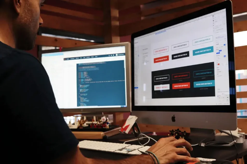
Images and Graphics: Worth a Thousand Words
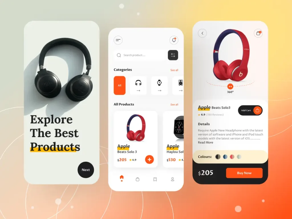
Images and graphics can build or destroy your web design; they can also emphasise a point, break up text, and establish an emotional bond with the audience.
Selecting Appropriate Pictures
- Ensure that they are of high quality and related to the topic.
- Consider using custom-made drawings or symbols for a distinctive appearance.
Alt Text and SEO
- Accessibility is essential, so always remember to provide alt text.
- Optimise file sizes to speed up loading times.
The Ascendancy of Vector Graphics
Vector graphics are resolution-independent, i.e., they appear clear at any size; this makes them perfect for logos, icons and illustrations. Furthermore, they usually have smaller file sizes than raster images, which is good for site speed.
Animation: Bringing Your Design to Life
Adding a few subtle animations may help with improving your web design. However, as the saying goes, great power also brings great responsibility. Overdo them, and they will annoy or distract users.
Types of Animation in Web Design
- Hover effects
- Loading animations
- Scrolling effects
- Micro-interactions (such as button state changes)
Best Practices for Animations on Websites
- Keep it light and meaningful
- Make sure it doesn’t weigh down your website speed
- Ensure that it’s reachable (certain users might want reduced motion)
- Test across different devices to ensure smoothness of performance
The Need for Speed: Performance Optimisation
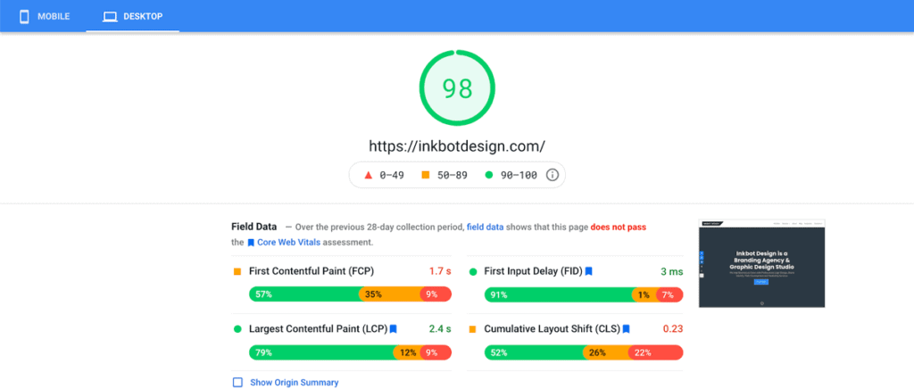
A beautiful website that takes forever to load is worthless. People are impatient: they will leave if your site doesn’t load in a couple of seconds.
Methods for Speed Optimisation
- Compress pictures and apply the correct formats (JPEG/WebP for photos and PNG/SVG for transparent graphics)
- Minify CSS, JavaScript, and HTML
- Utilise browser caching
- Think about a Content Delivery Network (CDN)
- Decrease server response time
Keep in mind that user experience and SEO hang on every millisecond.
Accessibility: Design for Everyone
Web accessibility guarantees impaired individuals can perceive, comprehend, navigate and interact with websites. In several jurisdictions, it is not a luxury but a mandatory requirement.
Key areas to consider for web Accessibility
- Ensure there is adequate colour contrast.
- Give textual alternatives for non-text content.
- Make all functionalities available from the keyboard.
- Assist users in navigating and finding information.
- Enhance the readability of text.
In as much as accessibility is meant to serve people living with disabilities, it also enhances usability for all users. This means that SEO can enjoy some benefits, too. It’s a double victory!
Mobile-First Design: Small Screens, Big Impact
Nowadays, only designing for desktops is a bad idea, considering over fifty per cent of web traffic comes from mobile devices. Mobile-first design involves beginning the design process with the smallest screens in mind and scaling up.
Advantages of Mobile-First Design
- Compels you to concentrate on essential content and functionality
- Enhances user experience across multiple devices
- Can contribute to quicker loading speeds
- Correlates with Google’s mobile-first indexing
Keep in mind that mobile-first does not mean mobile-only. Your design should still appear visually appealing and operate optimally on bigger screens.
The Psychology of Web Design
Making designs more effective can involve understanding how users think and act. Let’s go over some essential psychological principles.
Hick’s Law
According to Hick’s Law, the more choices there are and the more complex they are, the longer it will take to decide. That is why, in web design, options should be simplified for users. For instance, an all-at-once presentation of every option may be substituted with progressive discloser, which gradually unveils information.
The Serial Position Effect
This principle states that people best remember the first and last items in a series. This can be applied to web design by placing the most essential details at either end of lists or sections containing content.
The Von Restorff Effect
Another name for this principle is the isolation effect; it says that if one thing differs from everything else, people will probably recall it better than others. You could use this in your design by highlighting call-to-actions or critical information.
Trends in Web Design: Staying Current Without Chasing Fads
Website design trends shift periodically, but they should be adopted to improve the user’s experience rather than mere popularity.
Popular Web Design Trends
- Dark mode
- Simplicity and space
- Bigger fonts
- Micro-interactions
- Unsymmetrical designs
- Three-dimensional features
Bear in mind that not all trends are suitable for every site. Consider your brand image, target demographic and objectives before embracing them.
Testing and Iteration: The Key to Great Design

No design attempt is likely to be perfect when it is the first one, even if you are experienced. That is why there is testing and iteration.
Kinds of Testing
- A/B Testing: Find which performs better between two versions of a design.
- Usability Testing: Watch real users interact with your design.
- Heat Mapping: Observe where users click and how far they scroll.
- User Surveys: Obtain direct feedback from your audience.
Refine and improve your design using these test findings. Remember, designing for the web is not something done once and forgotten about; it’s an ongoing process.
Conclusion: Your Web Design Journey Continues
Web design is multifaceted, from the basic layout and colour theory to the psychology of design and the importance of testing.
However, excellent web design is more than just making things look pretty. It’s about creating intuitive, engaging and memorable experiences. You should know your users well enough so that you can come up with designs that meet their needs beyond what they expect.
So, as you move on in this journey of becoming a web designer, always learn more and keep experimenting, but remember to put the user at the centre of everything you do. With time, practice and persistence, you will soon start building unique digital experiences.
Now, let us go out there and start designing! The internet is waiting for your creative mind to take charge because its possibilities are infinite. Have fun while doing this!
FAQs on Improving your Web Design
Typically, how long do website designs take?
The time for web designing can vary widely depending on complexity, ranging from simple sites that take a few weeks to large intricate ones that take several months.
Do I have to know how to code if I want to be a web designer?
It is optional for a person who wants to become a web designer to learn coding, although it may be helpful. Most designers use visual design tools and work with developers who handle coding.
What is the difference between web design and web development?
Web design deals with a site's appearance and user experience, while web development involves implementing designs through programming and other technical means.
How often should I update my website’s design?
Every year, it is recommended that you review your website’s design with significant updates every two or three years to keep up with changing technology and aesthetics trends.
Regarding importance, what would you rank first amongst various web design elements?
User experience (UX) is considered by many people to be the most crucial element since it directly affects how users interact with and perceive your site, but all other elements also matter.
How can I make my website different from others in the same field/industry/sector as me?
To ensure uniqueness, one should establish an individual brand identity; moreover, high-quality visuals ought not to be forgotten either; additionally, the proper user experience must never be ignored at any cost; finally, valuable original content has always proven beneficial when used appropriately.
Is it better to create a custom design or use templates?
Whether one prefers working off pre-existing designs or developing entirely new ones depends solely on their specific requirements and resource availability. Smaller enterprises tend to utilise ready-made themes more frequently than larger organisations since they offer greater flexibility.
How crucial is mobile responsiveness in web design?
Given that more than half of all internet traffic originates from handheld devices, it is imperative that a mobile-friendly layout becomes vital for SEO purposes and enhanced UX across various screen sizes.
What are some tools used by professional web designers?
Adobe Creative Suite (Photoshop, Illustrator, XD), Sketch, Figma, and InVision, plus different prototyping and wireframing software, are among the commonly used applications during this process.
How do I choose colours for my website?
When selecting colours to use on your site, think about things such as what best represents your brand identity, who I am targeting with your content, and how different people will react based on their cultural background or personal preferences and wavelengths.
What’s the best way to learn web design?
To get hands-on skills, combine theoretical knowledge acquired through reading books, attending online courses, watching tutorials, etc., with practical experience gained by starting off redesigning existing sites before later progressing into developing your projects.
