Logo File Formats: Everything You Need to Know
You’ve done it. You’ve invested in a professional logo.
After rounds of feedback and approvals, the designer sends you the final assets in a zip folder. You open it, and your heart sinks a little.
Inside is a chaotic jumble of files: logo_CMYK.ai, logo_RGB.png, logo_white.svg, logo_final_final.eps.
What are these? Which one goes on the website? Which one do you send to the t-shirt printer? In a moment of panic, you grab the one you recognise—the JPG—and start using it for everything.
This is when a crisp, professional brand looks cheap and amateurish.
The problem isn’t the files. It’s that nobody explains this stuff in plain English. This guide will fix that. We’re not going to talk about Bezier curves or dithering.
We will give you a simple mental model to choose the correct file every time, without having to become a graphic designer.
- Choose logo files by purpose: print needs vector, digital needs raster or SVG for crispness and performance.
- Understand vector vs raster: vectors scale infinitely (AI, EPS, PDF, SVG); rasters are pixel-based (PNG, JPG, GIF).
- Always obtain master vector files (AI/EPS/PDF); they are essential for print, large formats, and future editing.
- Use SVG or PNG for web (SVG best); avoid JPG for logos and never resize small raster files for print.
Stop Thinking About Files. Start Thinking About Purpose.
Here’s the secret: the file extension doesn’t matter as much as the job you need the logo to do.
You don’t need to know the technical history of an Encapsulated PostScript file. You just need to see if you’re putting your logo on something physical or digital.
That’s it. That’s the entire foundation.
Every logo you use will exist in one of two worlds:
- The Physical World (Print): Business cards, flyers, billboards, company vans, embroidered shirts, coffee mugs. Anything you can physically touch.
- The Digital World (Screens): Your website, social media profiles, email signatures, online ads, mobile apps. Anything viewed on a screen with pixels.
Using a digital file for a print job is the fast track to a blurry, pixelated mess. A massive print file for your website will slow it to a crawl. The medium dictates the format.
The Only Technical Divide You Must Understand: Vector vs. Raster
All those confusing file acronyms fall into one of two families: Vector or Raster. If you understand this one difference, you understand 90% of what you need to know.
Vector Files: The Master Blueprint
Think of a vector file as a recipe. It’s not a finished cake; it’s a set of mathematical instructions on how to make the cake. “Draw a line from point A to point B, make it 2px thick, and colour it blue.”
Because it’s a set of instructions, you can scale it to any size imaginable—from a tiny pen to the side of a skyscraper—and it will be perfectly sharp. The computer just re-reads the instructions and redraws them flawlessly.
- Key Trait: Infinitely scalable with zero loss of quality.
- Best For: All print applications, signage, apparel, and any situation you need versatility.
- Standard Vector Formats: AI, EPS, PDF, SVG.
This is your master file. It’s the single most important asset you own for your brand identity.
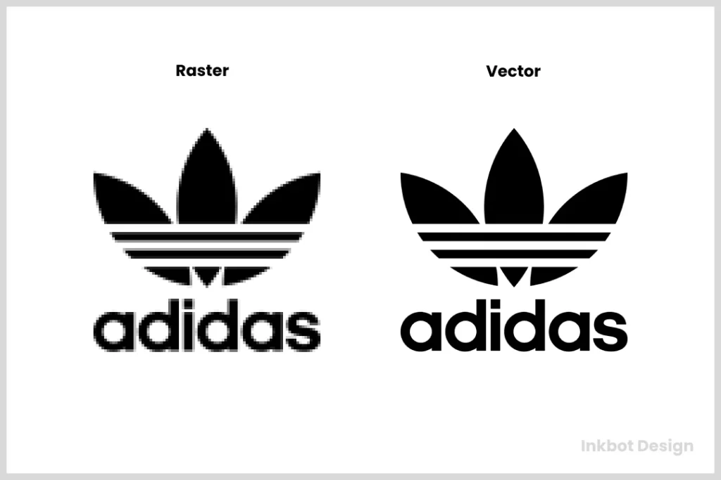
Raster Files: The Digital Snapshot
Think of a raster file as a mosaic. It’s a grid of thousands of tiny coloured squares, also known as pixels. A photograph is a perfect example of a raster image.
It looks great at its intended size. But if you try to make it bigger, you’re not adding more detail; you’re just making the individual squares larger. The result is the ugly, blocky effect we call pixelation. You cannot scale a raster image up without losing quality. Period.
- Key Trait: Made of a fixed number of pixels. Loses quality when enlarged.
- Best For: All digital applications like websites, social media, and online advertising.
- Common Raster Formats: JPG, PNG, GIF.
These files are built for the screen, with relatively predictable display sizes.
Quick Reference Table: Vector vs. Raster at a Glance
| Feature | Vector | Raster |
| Made Of | Mathematical paths & points | A fixed grid of pixels |
| Scalability | Infinite, with no quality loss | Poor; it becomes pixelated when enlarged |
| Best For | Print: Business cards, flyers, signs | Web: Websites, social media, ads |
| Common Formats | AI, EPS, PDF, SVG | PNG, JPG, GIF |
| Analogy | A recipe or blueprint | A photograph or mosaic |
Your Logo File Format Cheatsheet: The Core Files Decoded
Now, look at the specific files in that zip folder and translate them from designer-speak to plain English.
The Vector All-Stars (For Scaling & Print)
These are your most valuable files. Guard them carefully.
- AI (Adobe Illustrator): This is the master file, the source code of your logo. It was created in Adobe Illustrator, the industry-standard software for logo design. It is fully editable by any professional designer. You will likely never open this file, but you must have it. Not getting the AI file from your designer is like buying a house but not getting the keys.
- EPS (Encapsulated PostScript): This is the universal vector format. Think of it as a reliable old workhorse. While a bit dated, almost every professional print shop or sign maker can open an EPS file. It’s a fantastic fallback option if a vendor can’t handle a modern AI or PDF file.
- PDF (Portable Document Format): You know PDFs for documents, but they are also incredibly powerful for graphics. A PDF can save everything in vector format, perfectly preserving lines, colours, and scalability. Many printers now prefer a high-quality PDF over an EPS for things like flyers and brochures. It’s a versatile and reliable format for sharing proofs and going to print.
- SVG (Scalable Vector Graphics): This is the modern hero of logo formats, specifically for the web. An SVG is a vector file written in code (XML) that browsers can read. Your logo will look crisp on every screen, from a standard laptop to a 5K retina display. It’s also typically a tiny file size. If your website platform supports it (WordPress does), use an SVG for your logo.
The Raster Workhorses (For Screens & Web)
These files are your day-to-day assets for digital marketing.
- PNG (Portable Network Graphics): The absolute king of web logos for one reason: transparency. A PNG file can have a transparent background. This means you can place your logo on a coloured website header, a photo, or a presentation slide, and you won’t get an ugly white box around it. Use a PNG for almost every web application. It uses “lossless” compression, keeping things sharp without degrading quality.
- JPG/JPEG (Joint Photographic Experts Group): This is the file format you’re most familiar with. It’s fantastic for photographs because its “lossy” compression can make complex images into tiny file sizes. But that same compression is brutal for logos. It creates fuzzy, artefact-ridden messes around sharp lines and text. Resist the urge to use a JPG for your logo unless you have no choice. It does not support transparency. That “just send me the JPG” request makes designers quietly weep.
- GIF (Graphics Interchange Format): The old-timer. The GIF format is limited to only 256 colours and is outdated, mainly for static logos. Its only modern use case is for straightforward, looping animations. Unless your logo is animated, you can ignore the GIF file.
The Anatomy of a Professional Logo Package
When hiring a designer, you’re not buying a pretty picture. You’re investing in a suite of professional assets. A proper logo package signifies a professional who understands your future needs.
Here is what you should expect to receive.
The Non-Negotiable Files
- Master Files: The original, editable source files. This should be an AI file and often an EPS as a backup.
- Print-Ready Files: High-resolution vector files ready for printers. Usually EPS and/or a print-quality PDF.
- Web-Ready Files: A collection of optimised raster files for screen use. This means various sizes of PNGs (with transparency) and SVGs.
Essential Colour Variations
A logo needs to work on any background. You absolutely need:
- Full Colour: Your primary, standard logo.
- All-White: A monochrome version in solid white to be used on dark backgrounds or photos. This is often delivered as a white PNG.
- All-Black: A monochrome version in solid black for single-colour documents or applications.
Logo Package Express
Stop wasting hours on the most boring part of your job. This is the machine that does it for you. It automatically generates over 200 perfectly named and organised logo files in minutes. Charge for a premium package without the mind-numbing work.
As an Amazon Partner, when you buy through our links, we may earn a commission.
A Quick Word on Colour Spaces: CMYK vs. RGB
You might see “CMYK” or “RGB” in the filenames. It’s more straightforward than it sounds.
- RGB (Red, Green, Blue) is for screens. It uses light to create colour. Your monitor, phone, and TV all use RGB.
- CMYK (Cyan, Magenta, Yellow, Black) is for print. It uses ink on paper to create colour.
A professional designer will provide files in both colour spaces. The RGB files are for your website and social media, while the CMYK files you’ll send to the print shop for your business cards. This is why colours can look slightly different on screen versus on paper.
The “Nice-to-Have” Extras
A great designer goes a step further and might also include:
- A simple brand guide PDF explaining the file types.
- Pre-sized favicon versions for your website’s browser tab.
- Pre-cropped versions for social media profile pictures.
This level of thoroughness is standard in every professional logo design package we deliver. It’s about setting the client up for success.
Common Scenarios: Which Logo File Do I Use For…?
Let’s make this brutally practical. Here are the most common situations and the exact file to use.
- My Website Header?
- Best: SVG. It will be perfectly sharp on all devices and load quickly.
- Good: PNG. The go-to if your site builder doesn’t support SVG. Ensure it’s a “PNG-24” for high quality.
- My Social Media Profile (Facebook, Instagram)?
- Best: A high-resolution PNG. Social media sites compress images heavily, so start with the highest quality file possible.
- My Business Cards from Vistaprint?
- Best: A vector PDF or EPS. The printer’s website will specify, but they will always require a vector format for professional quality. Uploading a JPG here will result in fuzzy, cheap-looking cards.
- A T-shirt or Company Uniform?
- Best: A vector EPS. The screen printer or embroiderer needs the vector paths to create stencils or stitch patterns. Sending them a PNG is a recipe for disaster.
- An Email Signature?
- Best: A small, optimised PNG. You want a small file size so you’re not clogging up people’s inboxes. 15-30kb is a good target.
- A Microsoft Word Document or a PowerPoint Presentation?
- Best: A PNG. It handles transparency well and is easy to insert and resize within the document.
- Sending to a Magazine for a Print Ad?
- Best: A print-ready, high-resolution PDF or EPS in the CMYK colour space. They will provide the exact specifications.
The 4 Biggest Logo File Blunders (And How to Avoid Them)
You’ll be ahead of 99% of small businesses if you can avoid these four common mistakes.
- Using a Low-Resolution JPG for Print. This is the cardinal sin. It guarantees a blurry, pixelated result and screams “amateur.” Always provide a vector file (EPS, PDF, AI) to any print vendor.
- Saving a JPG as a PNG and Expecting Transparency. Taking a JPG with a white background and re-saving it as a PNG does not magically make the background transparent. The transparency needs to be created from the source file.
- Stretching a Small Raster File. Never take a small PNG or JPG and drag the corner to make it bigger. You are just enlarging the pixels, resulting in a blocky mess. If you need a larger version, return to the original vector file.
- Not Demanding the Master Vector Files. This is the most critical mistake. If a designer only gives you JPGs and PNGs, they have not finished the job. You must have the AI or EPS source file. Without it, you don’t own your logo; you’re just leasing a picture of it.
Your Next Move: Audit Your Logo Files in 60 Seconds
Stop reading for a moment. Go open the folder where you keep your logo files.
Do you see a file that ends in .ai, .eps, or .svg?
Suppose the answer is yes, congratulations. You have a professional, scalable logo.
If all you see are files ending in .jpg or .png, you have a problem. You don’t have a professional logo—you have a picture of one. It’s a brand asset with a built-in time bomb. The moment you need to print a large sign or create a sharp presentation, you’ll be stuck.
This is a foundational piece of your brand identity. It’s worth getting right.
If you looked in your folder and only found pixels, it’s time to fix that. A brand is too important to be built on a blurry foundation. When you’re ready for a versatile, professional logo that works everywhere, every time, you know where to find us.
Explore our Logo Design services or request a quote to get the needed assets.
Frequently Asked Questions (FAQs)
What is the single best file format for a logo?
There isn’t one. The best format depends entirely on the use case. For print and scalability, an AI or EPS vector file is best. For web use with a transparent background, a PNG is best. For ultimate sharpness on modern websites, an SVG is best.
Why did my logo look blurry on my business cards?
You almost certainly provided the printer with a low-resolution raster file (like a JPG or PNG) instead of a vector file (EPS, AI, or PDF). Printers need vector formats to print sharp lines.
Can I just use Canva for my logo?
You can, but be aware of the limitations. While Canva allows you to download files like PNGs and SVGs (with a Pro account), the initial design process may not have the same rigour as working with a professional designer, and the originality of the design elements can be a concern for trademarking.
What’s the difference between DPI and PPI?
DPI stands for “Dots Per Inch, ” a print-related term referring to the density of ink dots on paper. The standard for quality printing is 300 DPI. PPI stands for “Pixels Per Inch” and is a screen-related term. The long-time standard for web was 72 PPI, though this is less relevant now with high-resolution “retina” displays.
How do I get a transparent version of my logo?
The most common transparent logo file is a PNG. A professional designer should provide this as part of your standard logo package. You cannot save a JPG as a PNG to make the background transparent.
My designer only sent me a JPG. What should I do?
Contact them immediately and request the complete logo package, explicitly asking for the master vector files (AI and EPS formats). This is a standard deliverable. If they refuse or want to charge extra, it’s a major red flag.
Why does my logo colour look different on my website vs. my flyers?
This is due to the difference between colour spaces. Websites use the RGB (Red, Green, Blue) light-based colour model, while print uses the CMYK (Cyan, Magenta, Yellow, Black) ink-based model. Some colours simply cannot be perfectly replicated between the two. A good brand guide will provide colour values for both systems.
What is a favicon?
A favicon is the small icon on a web browser’s tab next to the page title. It’s typically a simplified version of your logo, saved as a small PNG or ICO file.
Can a JPG have a transparent background?
No. The JPG format does not support transparency. If you need a logo with a transparent background for web use, you must use a PNG or SVG.
What file format should I use for an email signature?
Use a small, optimised PNG. It should be high-quality to look sharp, but small enough in file size (under 50kb is a good goal) to not annoy your recipients.
What is the difference between a logo and a brand?
A logo is a visual symbol that identifies your business. A brand is your business’s entire experience, perception, and reputation. Your logo is a critical part of your brand identity, but it’s not the whole brand.
Do I need to know how to use Adobe Illustrator?
No. As a business owner, you must have the master AI file to provide to any designer or vendor who needs to work with your logo. It is their tool, but your asset.


