What the Coca-Cola Logo Can Teach You About Brand Discipline
The Coca-Cola logo is likely the most valuable piece of handwriting in history.
Billions of dollars in brand equity are tied up in those two looping, cursive words. It’s recognised by an estimated 94% of the world’s population, making it more familiar than the Christian cross.
But its success isn’t magic. It isn’t the result of some mystical design formula locked away in an Atlanta vault.
It’s the product of a few brutally simple principles that most businesses, big and small, are too impatient, too distracted, or too enamoured with trends to follow.
This isn’t just another history lesson that regurgitates facts you can find on Wikipedia. This is a breakdown of a commercial weapon.
We will pull it apart, see what makes it tick, and identify the actionable lessons you can steal for your brand. What makes Coke’s logo work is what your logo is missing.
- Iconic logo born from practical handwriting and clarity, not gimmicks—legible Spencerian script created by bookkeeper Frank Robinson.
- Relentless consistency and an ownable "Coke Red" compounded brand equity over 130+ years, resisting trendy redesigns.
- Build a system around your mark—clarity, appropriateness and disciplined consistency matter more than flashy creativity.
It All Started With Good Handwriting, Not a Grand Design Strategy
The origin of the Coca-Cola logo is almost disappointingly practical. No high-priced branding agency, mood boards, or months-long creative exploration existed.
It was 1886. The inventor, a pharmacist named John S. Pemberton, had the drink. What he didn’t have was a name or a logo.
The Man Behind the Script: Frank Mason Robinson
Enter Frank Mason Robinson. He was Pemberton’s bookkeeper and business partner. Crucially, he was not a designer. He was a man of ledgers and numbers, but had two key insights.
- He created the name. Robinson suggested “Coca-Cola,” believing the two ‘C’s would look well in advertising. It was a simple, alliterative choice driven by practicality.
- He wrote the logo. The now-iconic script wasn’t a font downloaded from a library. It was Robinson’s handwriting, penned in a popular business script of the era.
The chosen typeface was Spencerian script. This wasn’t an artistic choice; it was the de facto standard for formal correspondence and bookkeeping in the late 19th century. It was chosen because it was considered elegant, professional, and legible.
The most enduring visual identity in the world wasn’t born from a quest for a deep brand story. It was born from a bookkeeper’s neat handwriting, solving the problem of needing a clear, readable name for a new product.
Deconstructing the Unbreakable Core: What You’re Actually Looking At
To understand its power, you have to look past its familiarity. We see it so often that we stop seeing it. Let’s break down the two core components that give the logo its unshakeable foundation.
The Typography: More Than Just a Font
That famous script is the soul of the brand. Spencerian script, developed in the mid-1800s, was designed to be written quickly and legibly with a steel-pointed pen. Its entire DNA is about flow, rhythm, and human movement.
This has a profound psychological effect. It doesn’t feel like a cold, corporate stamp created by a machine. It feels personal. It feels like a signature. This imbues it with a sense of authenticity and tradition that a geometric, sans-serif font could never achieve.
The Coca-Cola script is a testament to character in an age where startups and tech giants are racing towards minimalist, soulless wordmarks. It’s warm, inviting, and nostalgic. It feels human, a rare and valuable commodity in modern branding.
The Colour: How “Coke Red” Became a Global Standard
Like the script, the iconic “Coke Red” has fiercely practical origins. In the early days, Coca-Cola syrup was often transported in barrels. To help customs officials and tax agents quickly distinguish them from barrels of alcohol, the Coke barrels were painted bright red.
It wasn’t a choice born from a focus group about passion or energy. It was a logistical solution.
Over time, that utilitarian choice was codified. The specific shade, often cited as close to Pantone 484 C, became inseparable from the brand. Today, red doesn’t just signal excitement or hunger; for billions of people, that specific shade of red means Coca-Cola.
The lesson here is critical for any business owner. Your brand colour doesn’t need a deep, mystical meaning. What it needs is to be owned. Coca-Cola achieved this not through a clever story, but through a century of relentless, unwavering consistency.
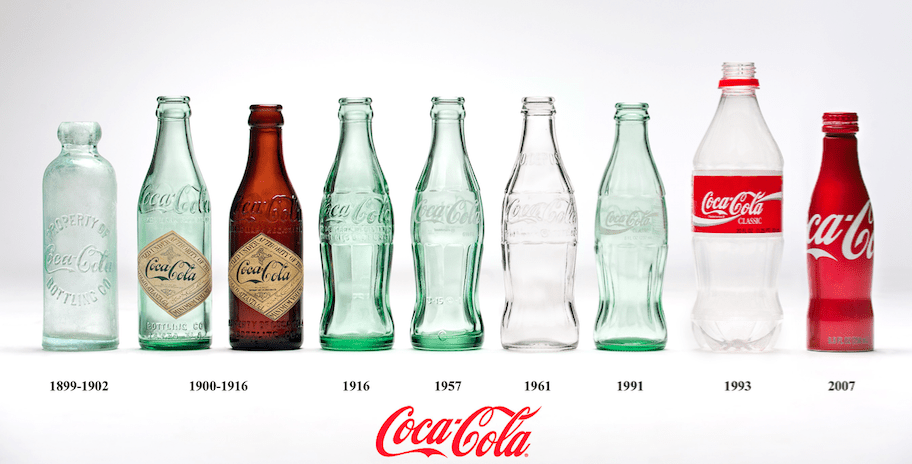
A Century of “Don’t Fix It”: The Evolution (or Lack Thereof)
The true genius of the Coca-Cola logo isn’t in its initial design. It’s in the iron-willed discipline the company has shown for over 130 years by refusing to change it substantially.
This is where most brands fail. They get bored. A new marketing director comes in and wants to make their mark. They chase a new trend. Coca-Cola, with one catastrophic exception, has held the line.
The Early Years (1886-1940s): Minor Tweaks, Major Consistency
Yes, there were minor variations in the first few years. The very first 1886 version was plain. But by 1887, the foundational script we know today was essentially in place.
For the next half-century, the changes were minuscule—a slight lengthening of the tails, a subtle refinement of the letter connections. The work was that of a craftsman polishing a masterpiece, not a revolutionary trying to reinvent it. They knew what they had, and their job was to preserve it.
The “Dynamic Ribbon”: Adding a Layer Without Breaking the Foundation
By the mid-20th century, the brand needed more flexibility. How could they create a cohesive look across bottles, cans, trucks, and billboards without messing with the core logo?
In 1969, they introduced the “Arden Square” logo, which placed the script inside a red box. More importantly, this era gave us the “Dynamic Ribbon Device”—that iconic white wave that underlines the script.
This was a stroke of genius.
The wave could be used with the logo, under the logo, or as a standalone graphic element. It added a modern sense of energy and movement to the brand’s visual language without altering the signature.
This is the correct way to evolve a heritage brand. You add supporting assets to create a flexible system. You don’t perform open-heart surgery on the primary mark. This is a crucial lesson for any business struggling with a dated logo. Perhaps you don’t need a new logo, but a stronger brand system around the one you have. Developing such a system is a core part of any professional logo design process.
The Catastrophe of “New Coke”: What Happens When You Panic
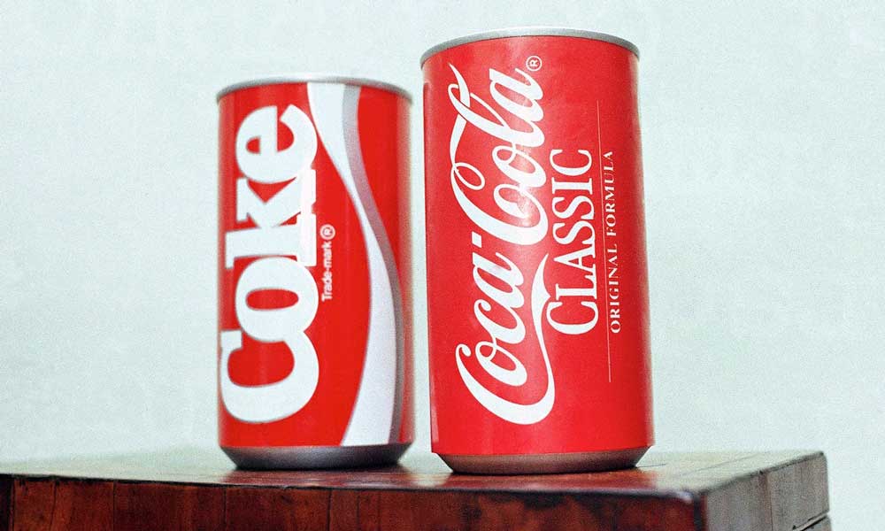
Then came 1985. Fearing market share loss to Pepsi, Coca-Cola’s management made the single greatest marketing blunder of the 20th century. They changed the formula and launched “New Coke.”
And to go with this new formula, they sidelined the classic script. The packaging for New Coke often featured a more modern, bold, sans-serif wordmark simply reading “Coke.” It was a jarring, angular departure from the flowing, familiar script.
The public reaction was swift and vicious. The outrage wasn’t just about the taste. Consumers felt betrayed. They had a deep, personal, emotional connection to Coca-Cola; its visual identity was a huge part of it. They didn’t just reject a new drink; they rejected the abandonment of their brand.
Within 79 days, the company capitulated, returning the original formula as “Coca-Cola Classic,” complete with the Spencerian script logo. They learned a complex and expensive lesson: your logo isn’t just a graphic on your balance sheet. It lives in the hearts and minds of your customers.
The Business Lessons Every Entrepreneur Needs to Steal
The history is fascinating, but for you, the business owner, it’s only valid if it provides a roadmap. Here are the four core principles behind the logo’s success that you can apply directly to your branding.
Lesson 1: Choose Clarity Over Cleverness
Frank Robinson’s logo was designed to do one job: state the product’s name clearly and elegantly. It doesn’t contain a hidden symbol of a fizzy drink. It’s not an ambigram. The two ‘C’s don’t form a secret shape.
It’s just the name, written beautifully.
Too many entrepreneurs want their logo to be a clever puzzle. They try to bake in multiple meanings and visual puns. The result is often a cluttered, illegible mess. Before you ask if your logo is clever, ask if it’s clear. Can people read your company’s name at a glance, on the side of a van, or as a tiny social media avatar? Solve for clarity first.
Lesson 2: Consistency is More Valuable Than Creativity
Imagine if Coca-Cola changed its logo every five years to keep up with design trends. The 70s would have brought a bubbly disco font. The 90s might have been a grunge-inspired scrawl. The 2010s would have been a soulless sans-serif.
They would have squandered over a century of brand equity. Every single dollar spent on marketing, packaging, and signage—all of it—has gone into reinforcing one single, consistent mark. That is the very definition of a compounding investment.
Pick a strong, appropriate logo and commit to it when starting. Whenever you’re tempted to “refresh” it, you propose resetting the recognition clock and lighting your previous marketing budget on fire.
Lesson 3: Build a System, Not Just a Mark
The Dynamic Ribbon is proof that you can have flexibility and consistency simultaneously. The Coca-Cola logo is the script. The Coca-Cola brand identity system includes the script, the specific red, the dynamic ribbon, bottle shapes, and a secondary typeface.
This system makes their marketing feel fresh and varied while the core brand remains unchanged.
Don’t just get a logo file from a designer and call it a day. Think about the system. What are your brand colours? What are your primary and secondary fonts? What are the basic rules for how your logo should and should not be used? Building this simple framework is the difference between a logo and a brand. If you’re unsure where to start, getting a quote for a professional design package can clarify what goes into building a complete visual system.
Lesson 4: Your Brand is an Emotion, Not a Product
The “New Coke” disaster proved that people don’t just buy a product; they buy what it represents. For millions, the classic Coca-Cola logo represents tradition, family, happiness, and nostalgia. The Spencerian script is the visual trigger for all those emotions.
What emotion do you want your customers to feel when interacting with your business?
Is it trust? Speed? Luxury? Innovation? Friendliness?
Now look at your logo. Does its design—the colour, the typography, the style—actually support that feeling? A playful, hand-drawn logo might send the wrong signal if you want to be seen as a cutting-edge tech firm. A cold, corporate-blue wordmark might feel alienating if you’re a family-owned bakery. The design must serve the emotion.
Inside Coca-Cola: A Ceo’s Life Story
You’ve only read theories on leadership. This is the playbook from a CEO who actually did it. It’s the first-ever inside story of how Coca-Cola’s tarnished brand was rebuilt. Get the real-world lessons on crisis management, global expansion, and winning ethically from a 30-year veteran.
As an Amazon Partner, when you buy through our links, we may earn a commission.
Busting the Myths: No, There Are No Hidden Messages
You can’t discuss the Coca-Cola logo without addressing the urban legends. For decades, people have claimed to see hidden, often inappropriate, images and words within the flowing script.
Let’s be clear: it’s nonsense.
These claims are a classic case of pareidolia, the human tendency to see patterns and familiar shapes in random arrangements. It’s the same phenomenon that makes us see animals in clouds. There is no evidence that Frank Robinson or any subsequent designer intentionally hid anything in the logo.
Frankly, it’s one of my biggest pet peeves. This focus on “secret messages” distracts from the real, and far more instructive, story. The true secret of the Coca-Cola logo isn’t subliminal seduction. The secret is hiding the “redesign” button from the marketing department for over 100 years. That takes far more discipline and provides far more value.
So, Should Your Logo Be a Spencerian Script?
After all this, you might think the key to a timeless logo is a cursive font.
The answer is almost certainly not.
The most important lesson from the Coca-Cola logo is not to copy its style, but to internalise the principles behind its success. A 21st-century software-as-a-service company using a 19th-century script would look ridiculous and out of touch.
The principle isn’t “use a script font.” The principle is appropriateness. Robinson chose a script appropriate for a professional, high-quality product in his time.
Your job is to choose a visual identity that is appropriate for your industry, your audience, and your era, and then apply the other two timeless principles:
- Clarity: Make sure it’s legible and easily understood.
- Consistency: Stick with it, relentlessly, for years.
The Coca-Cola logo is a product of its time. Your logo must be your product.
The Coca-Cola logo is an icon. But it was born from practicality and forged in the fires of corporate discipline. It became a global symbol not because it was exceptionally creative on day one but consistent for the next 50,000 days.
So the next time you feel the itch to chase the latest design trend or “refresh” your perfectly good logo, stop.
Don’t ask, “What’s the hot new style?”
Instead, ask yourself the question Coca-Cola’s leaders (mostly) have for 135 years: “Is this something I can commit to for the next several decades?”
That’s the question that builds empires.
FAQs About the Coca-Cola Logo
Who designed the first Coca-Cola logo?
The first Coca-Cola logo was created in 1886 by Frank Mason Robinson, the bookkeeper and partner of Coca-Cola’s inventor, John S. Pemberton.
What font is the Coca-Cola logo written in?
It is not a standard font. It was hand-drawn by Frank M. Robinson in Spencerian script, a popular handwriting style for business and formal correspondence in the late 19th century.
Why is the Coca-Cola logo red?
The practice originated from a practical need. Red paint was used on Coca-Cola barrels to easily distinguish them from barrels of alcohol for tax and customs officials. The colour was later standardised and became a core part of the brand identity.
Has the Coca-Cola logo ever changed?
The core script logo has remained remarkably consistent since 1887. There have been minor refinements over the decades, but no major redesigns, with the notable exception of the “New Coke” era in 1985, which was quickly reversed due to public outcry.
What is the white ribbon or “wave” under the Coca-Cola logo?
This is called the “Dynamic Ribbon Device.” It was introduced in 1969 as a supporting graphic element to create a unified brand look across packaging and advertising, without altering the core logo script.
Are there hidden messages in the Coca-Cola logo?
No. Claims of hidden or subliminal messages in the logo are widely considered myths and examples of pareidolia, the human tendency to perceive familiar patterns in random shapes.
What was the “New Coke” logo?
During the brief “New Coke” marketing campaign in 1985, the company used a more modern, bold, sans-serif typeface that spelt out “Coke.” It was a dramatic departure from the classic script and was abandoned when the company reintroduced “Coca-Cola Classic.”
What makes the Coca-Cola logo so effective?
Its effectiveness comes from a combination of factors: a distinctive and legible script, an intense and ownable colour (Coke Red), and over a century of unwavering consistency, which has built unparalleled global recognition and emotional connection.
Can my business use a script font like Coca-Cola?
While you can, it’s crucial to consider if it’s appropriate for your industry and audience. The lesson from Coca-Cola isn’t to copy its style, but to apply its principles: choose a transparent, appropriate logo for your business that you can commit to using consistently for a long time.
What is the specific colour code for “Coke Red”?
While Coca-Cola has its own proprietary colour standard, it is generally considered close to Pantone 484 C or PMS 185.
Why did Frank Robinson choose the name “Coca-Cola”?
He suggested the name, believing that the two “C”s would look striking and memorable in advertising, a simple but effective principle of alliteration.
Is the Coca-Cola logo trademarked?
The Coca-Cola script logo is one of the world’s most famous and heavily protected trademarks. It was first registered with the U.S. Patent Office in 1893.
The Coca-Cola logo proves that a strong visual identity isn’t about chasing trends but building an asset through clarity and discipline. If you’re ready to stop guessing and start building a brand identity with that same strategic foundation, look at the logo design services we offer at Inkbot Design. We build brands designed to last.
