How to Create a Brand Mood Board (7 Steps & Examples)
Have you considered how the best brands can create a consistent visual identity that immediately connects with their target audience?
Those companies may have used a brand mood board as their secret weapon.
This influential instrument is not only for large corporations; it is a game-changer for businesses of all sizes because words alone cannot shape the look and feel of a brand as it does.
In this extensive guide, we shall examine how to create a brand mood board – what they are, why they matter and how one can make such boards that fully capture the essence of your brand.
- Brand mood boards visually capture a brand's personality, guiding design and ensuring consistency across all marketing materials.
- They save time and resources by providing a clear visual direction, reducing revisions and misaligned designs.
- Mood boards help evoke emotional connections, allowing brands to resonate deeply with their target audience.
- Regularly updating mood boards ensures they reflect the evolving identity and spirit of the brand accurately.
- What Is a Brand Mood Board?
- Why Your Brand Needs a Mood Board
- Elements of a Brand Mood Board
- How to Create Your Brand Mood Board
- Digital vs. Physical Mood Boards
- Tools for Creating Brand Mood Boards
- Brand Mood Board Examples
- The Power of Colour in Brand Mood Boards
- Typography: The Voice of Your Brand
- Imagery: Painting a Thousand Words
- Common Mistakes to Avoid
- Bringing It All Together: Creating a Cohesive Brand Mood Board
- Conclusion: Your Brand's Visual Story
- FAQs
What Is a Brand Mood Board?
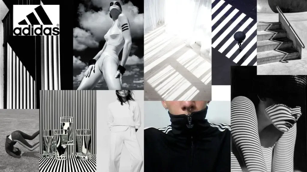
At its core, a brand mood board visually represents your brand's personality.
It is comparable to a collection of pictures, colours, textures and typography that work together to narrate your brand's narrative.
Regard it as an imagery session for generating ideas – a method for gathering and arranging thoughts that will determine the aesthetic appeal of your brand.
However, there is one thing: a mood board isn’t only about being beautiful. It’s also a strategic instrument which allows you to:
- Establish a visual path for your brand.
- Express the character of your brand.
- Ensure uniformity in all marketing materials.
- Motivate the design team (or yourself if you’re wearing all hats)
Are you aware that our brains can process images 60,000 times faster than text? This is why sometimes a picture may tell more than a thousand words – this is also what can be achieved by your business’ mood board.
Why Your Brand Needs a Mood Board
You may be thinking, “Do I need a mood board? Can’t I just wing it?” Well, you can — but here’s why you shouldn’t:
- Aim of Vision: A mood board aims to make your visual identity as a brand clear. It acts as a guidepost for all your design solutions.
- Consistency is Key: All these visual pieces shall work together to produce one harmonious effect upon the eye, giving rise to this consistent brand experience.
- Time and Money Saver: By establishing what direction visuals should take ahead of time, you’re bound to save yourself many hours plus resources. Say goodbye forever to many revisions or designs that do not match the brand!
- Emotional Connection: An artfully composed mood board lets you tap into those emotions people should trigger when they see or think about your company’s branding. And let’s face it – decisions are based on feelings.
- Stakeholder Buy-In: Need buy-in from colleagues or clients who can’t grasp where you’re heading? Supplement written ideas with some visually presented ones in the form of a moodboard; it works wonders!
Spending time developing corporate identity boards eventually pays off because statistics show that firms with solid brands earn 26% more than their counterparts. That isn’t chicken feed!
Elements of a Brand Mood Board

So, what does a brand mood board consist of? Let’s take it apart:
1 – Colour Palette
Your colour palette is the basis for your visual identity. Choose colors that:
- Express your brand’s personality.
- Resonate with your target audience.
- Go well together
Pro Tip: Stick to 3-5 primary colours and throw a few accent ones into the mix for variety.
2 – Typography
Fonts speak volumes about who you are as a business or individual, so choose wisely. Are you sleek and modern? Classic and timeless? Fun and quirky?
Consider:
- Font combinations (headings vs body text)
- Weight variations within one typeface family
- Serif versus sans-serif
3 – Images
Images are the soul of a moodboard! Examples include:
- Different photography styles (editorial, documentary, portrait…)
- Illustrations or drawings (hand-drawn vs digital)
- Textures/patterns (grunge, bokeh, geometric…)
Choose images that inspire the emotions you want people to associate with your brand.
4 – Logo & Brand Marks
If you have a logo already designed, include it on this board! If not, now would be a great time to experiment with different logo concepts that align with the overall visual direction.
5 – Textures & Patterns
These elements add depth and interest to any design system – whether used sparingly in the background or presented front-and-centre as statement pieces.
6 – Iconography
If icons are part of your brand language, show examples here so everything stays visually consistent across touchpoints!
How to Create Your Brand Mood Board
Ready to roll up your sleeves and create your brand mood board? Here's a step-by-step guide:
1. Define Your Brand Personality

Before you start finding images for your brand mood board, let’s talk about one thing: your brand personality.
This is not just about picking pretty pictures; it is about capturing what you are and believe in.
Pause for a moment.
Do you represent elegance and gracefulness? Does sophistication characterise every interaction that involves you?
On the other hand, could it be that you have an amusing side to life – always ready to turn ordinary moments into magical ones? Or maybe minimalism feels right where everything should appear simple yet sleek?
Starting with 3-5 words that best describe your corporate entity's centre part (personality) would be good enough.
These words will guide all visual decisions made during this exercise and inform any design elements adopted and every message conveyed.
Don’t forget that the mood board needs to go beyond being visually appealing – it should mirror the deep-down spirit behind your brand.
Therefore, take some time off before starting any creative work to know yourself better.
2. Know Your Audience
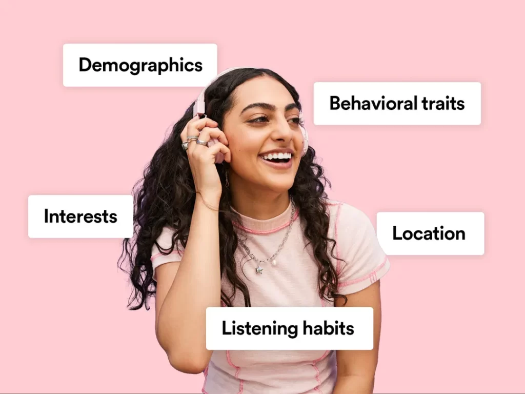
Start at square one: demographics.
Who are they? What’s their age range, gender, and location?
But don’t stop there. Go deeper into psychographics — what motivates them? What are their interests, values, and lifestyles?
This is where you find the emotional triggers and aspirations that can turn a basic mood board into a powerful connection.
Consider what they like to see. What colours do they love? What shapes or styles do they tend to go for? What does their social media feed look like, and what kind of content do they engage with most often?
Your mood board needs to speak their language and reflect their wants.
This is your chance to connect your brand and the people who matter most — every visual decision should be a conscious step towards winning over their hearts and minds.
So ensure your mood board doesn’t just represent your brand; it needs to resonate deeply with the audience you’re here to serve.
Ultimately, your mood board should be like a symphony of visuals that meets your audience’s expectations while speaking directly to their dreams.
And if you get this right, you’re not just presenting a brand; you’re crafting an experience which feels personal & authentic.
3. Gather Inspiration

Now, this is where the magic begins. It’s time to gather the raw materials for your brand’s visual identity by finding inspiration for your mood board.
But here’s the thing: don’t just look at the usual suspects. Instead, consider it a treasure hunt that could reveal ideas from every corner of your life.
Start close to home. Go down Pinterest rabbit holes, where creativity hangs on walls like an art gallery made up of what-ifs. Browse design sites like Behance or Dribbble, where designers put their best work out there for feedback (and sometimes just for fun). These places are great — but don’t stop there.
Pick up a glossy magazine and get lost in the clash of colours between pages, or consider the radical typography choices in editorial design that always make you squint. But why limit yourself to ink and paper?
Go outside. Take in nature's shades of green from a hike or walk around town; study patterns found in a forest or on the beach; consider the harmony of colours during sunrise or sunset; take in the chaotic beauty of life bustling through a city street. These organic elements can give a brand an authentic feel grounded in place.
And don’t overlook art and photography — how different strokes can capture emotion on canvas, how narratives can be told through lenses alone. Each brushstroke can move you toward something new with your brand; every click of a shutter might signal an entirely different direction. The idea is to collect without judging, so look with love.
The key is breadth over depth. Inspiration isn’t only hiding where we expect it to be — it’s everywhere else, too… if only we’d open our eyes!
4. Curate Your Collection
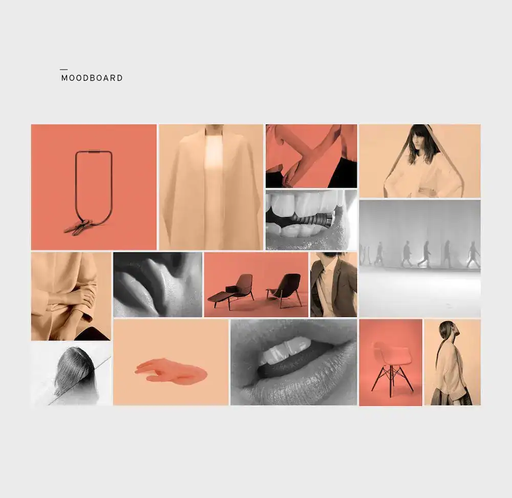
And now, we come to the most exciting part — curating the mood board.
At this stage, you turn your raw inspiration into a story that aligns with your brand’s identity.
But there’s one thing you should know about curation: it’s not only about choosing visually pleasing things but also about making selections that reflect what you stand for as a brand and how you want people to perceive you.
Revisit your collection first. Look at each item through the lens of your brand personality.
Does it resonate with who you are and what you believe in? This is about finding pieces that truly represent the core of your brand, its values, and its unique voice.
Then, think about the relationships between different parts of this composition. A mood board is not simply a pile of unrelated pictures; it’s like an orchestra where every note supports each other.
Consider balance and harmony — how colours interact with textures or styles blend, creating a cohesive look. If something doesn’t fit — cut it out! It would help if you had clearness here, not messiness.
Any brand should be emotional. While curating, ask yourself: “What kind of emotions can these items evoke?”
Whether it’s warmth, trust, excitement, or innovation, ensure that chosen things cause desired feelings among the target when they face your logo design examples. This serves as an emotional blueprint for one’s identity.
But remember: less is more in curation work, too!
Concentrated mood boards appear much more robust than cluttered ones filled with irrelevant details, pulling attention away from the main message developed here.
Remember that the value lies not in how many parts were used but in the story they told together.
5. Arrange Your Mood Board
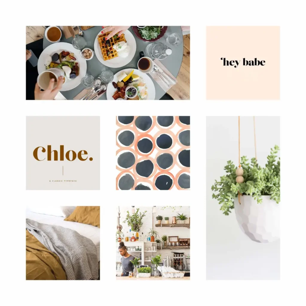
Now that you have carefully selected the essential features of your brand, it is time to give structure to creative chaos.
Whether a physical board or digital canvas, arranging a mood board is as important as the elements themselves.
This is where storytelling becomes an art form – your design should be more than just visually appealing; it must communicate.
Start by grouping similar items. Think of this step as creating clusters of thoughts speaking the same language.
When objects sharing standard features like colour, style, or emotion are placed together, they enhance one another’s effect.
This approach establishes a coherent aesthetic and highlights underlying issues towards which your brand should strive. It implies forming areas with significance that connect with the main idea.
Next comes visual hierarchy considerations – everything on your mood board doesn’t have to shout for attention immediately.
Decide which among them shall play leading roles in representing the brand's identity most powerfully and place them prominently within a layout.
Balance is essential; note how colours blend across various parts texture-wise to avoid making certain sections heavy or too light (sparse).
Strive to achieve a rhythm that feels both natural and inviting.
Remember: A mood board should be more than just a collage—an active blueprint showcasing who you are and what you stand for as a brand.
Each placement, group, or colour choice represents volumes about your personality and values.
6. Get Feedback
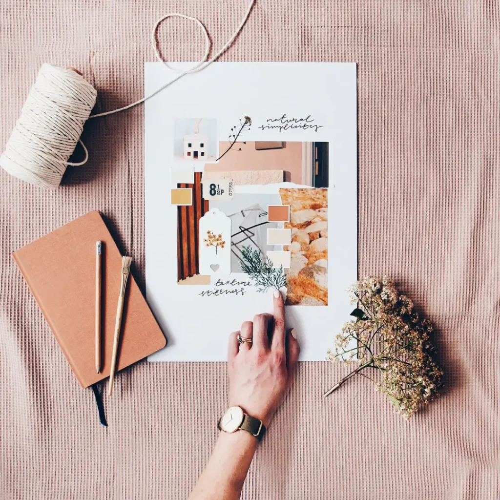
Exhibit your mood board to a few trustworthy people – coworkers aware of your brand's goals, friends with new perspectives and customers in your target audience.
Each of these groups looks at your work through a different set of eyes. They will notice things you didn’t, interpret things differently, and offer thoughts to help focus and improve your vision.
But here’s the thing—do not just ask for feedback. Ask the right questions instead.
Instead of asking if they like it or not, find out:
- What emotions does it make them feel?
- Does it connect with the values and personality you want to convey?
- Does it look consistent and tell a compelling story?
- Is there anything that feels out-of-place or could be better?
Feedback is not about validation; it’s about discovery. It’s about seeing how your vision comes across to others, how strongly it resonates, and where its impact might be limited.
So welcome criticism — even when it hurts.
7. Refine and Finalise
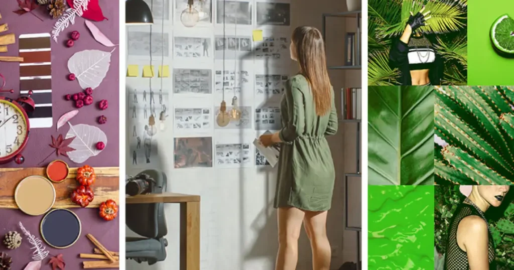
Begin with going over the feedback that you have received. You should seek out common ideas and suggestions.
What did your friends, coworkers, or potential clients say consistently?
Do certain features require some adjustment? Are there any colours that missed the point or textures which don’t fit well enough with your brand`s character?
Use this chance to polish things up, make them smoother, and enhance differentials, turning a good mood board into a great one.
But don’t change anything only for the sake of changing it. Have each modification made driven by intentionality to help you tell sharper stories about your brand
A well-designed moodboard isn’t about adding all ideas or inspirations collected; it’s more like selecting the most related to the identity behind a particular brand.
Digital vs. Physical Mood Boards
It’s fair to question the relevance of physical mood boards nowadays. But the answer is yes! Both have their strengths and weaknesses:
Digital Mood Boards are…
- Simple to share and collaborate with
- Easy to edit and update
- Can use digital-specific features (such as animations)
But…
- There’s no ‘tactile’ experience.
- Textures may be less effectively captured.
Physical Mood Boards are…
- Tangible and interactive
- Great for presentations in person
- May include physical samples (for instance, fabric swatches)
However, they…
- Are not as shareable or editable
- It takes more time to make
The right decision depends on what you need or want; many companies use both.
Tools for Creating Brand Mood Boards
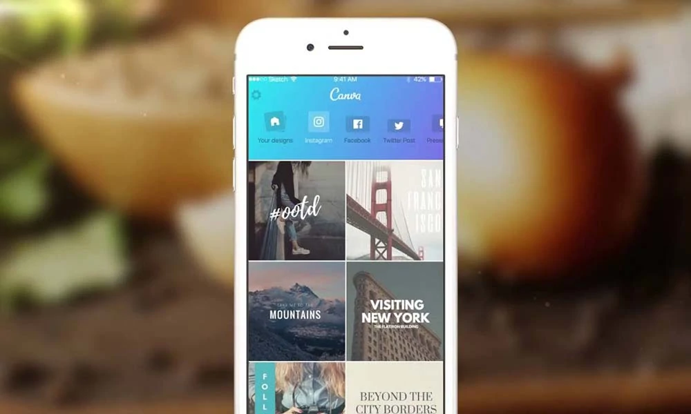
Whether you're a design pro or a complete novice, there are tools out there to help you create stunning mood boards:
Digital Tools
- Canva: User-friendly with lots of templates
- Adobe Creative Cloud: Professional-grade tools for designers
- Milanote: Great for collaborative mood boarding
- Pinterest: Excellent for gathering and organising inspiration
Physical Tools
- Cork boards and pins: Classic and versatile
- Foam boards: Sturdy and easy to transport
- Magazines and scissors: Old-school but effective
- Fabric swatches and paint chips: Great for capturing textures and colours
Brand Mood Board Examples
Let’s take a look at some examples to get your creative juices flowing:
The Minimalist Maven: Less is More
What if you created a brand mood board for a high-end, minimalist furniture company? The colour scheme might be all neutrals – clean white, soft grey, warm beige.
The images could have clean lines, empty spaces, and lots of wood and stone.
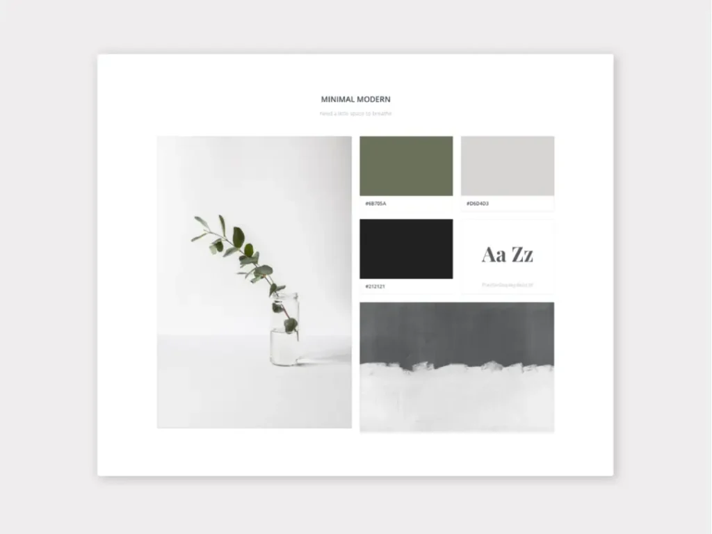
Typography would be sans-serif and simple. Key phrases could include “simplicity is the ultimate sophistication” or “form follows function.”
This mood board feels very calm and sophisticated. It’s like a zen garden for your eyes that invites you to appreciate simplicity.
The Eco Warrior: Green and Clean
Next up: A mood board for an eco-friendly cleaning product brand.
Fresh greens and clean blues with earthy brown accents would dominate the colour palette here.
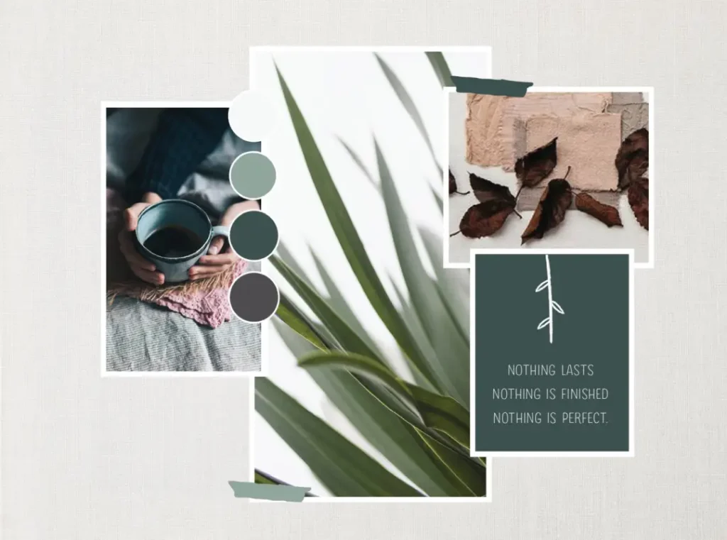
Think lush plants, sparkling water, and happy families laughing in spotless homes. Typography would probably be friendly and organic – maybe even hand-drawn.
Textures could include natural fibres and recycled paper.
“Clean and green” or “kind to nature, tough on dirt” might be critical phrases here. This mood board feels like fresh air, promising a cleaner home and planet.
The Vibrant Visionary: Colour Explosion
Now, let’s do a complete 180 with this mood board for a creative agency specialising in bold, innovative designs.
This board should be all about bright colours — electric blue next to hot pink next to lime yellow! Abstract art mixed with dynamic patterns mixed with pictures of people looking ecstatically wild.
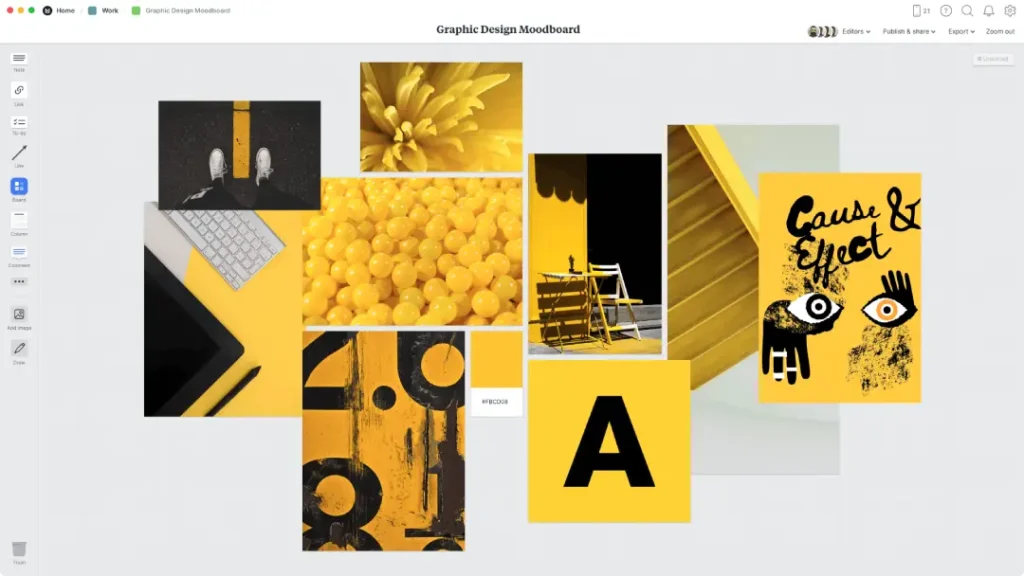
Typography should push the limits of legibility; textures might include glossy finishes or metallic accents. Key phrases could be “dare to be different” or “creativity unleashed.”
This mood board is a fireworks show for your eyes — exciting and impossible to look away from.
The Luxe Lifestyle: Opulence Redefined
Next up: A mood board for a high-end jewellery brand.
The colours here are deep and rich — royal blue, emerald green, amethyst purple, etc.
Picture gorgeous gemstones, models dripping in diamonds, and interiors that belong to the “Lifestyles of the Rich & Famous.” Typography should be classic and clean with maybe a touch of Art Deco.

Textures include sumptuous velvet and polished metals; key phrases might be “timeless elegance” or “wear your legacy.” This mood board wants to whisk you to glamour and exclusivity.
The Tech Trailblazer: Future Forward
Lastly, let’s create a mood board for a cutting-edge tech startup. Think sleek lines, cool greys, and electric blues.
Abstract representations of technology like circuit boards or data visualisations; pictures of diverse teams collaborating in modern workspaces.
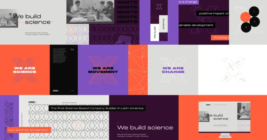
Typography should be clean and futuristic – maybe with some sci-fi inspiration thrown in there – while textures might include smooth glass and brushed metal.
Phrases such as “innovate or die” or “the future is now” could work well here. This mood board is like a glimpse into tomorrow that promises innovation and progress.
The Power of Colour in Brand Mood Boards
Colour is among the most powerful tools in your mood board.
It can create feelings, establish a mood, and ensure instant recognition.
Let’s take a closer look at the psychology of colour and how it can be effectively used in your mood boards:
Red: Passion and Energy Red is eye-catching and thrilling. It is perfect for brands that want to be seen as daring, young or adventurous. But do not use too much of it – red can become overpowering.
Blue: Trust and Stability Blue is calming and gives confidence. That’s why many financial institutions, healthcare providers or tech companies choose this colour for their logos or websites. Some shades may suggest airiness (light blue), while others are professionalism (deep blue).
Green: Growth and Harmony Green symbolises nature, growth, and balance. Use it if you’re an eco-friendly brand, health & wellness business or financial service provider looking for trust signals. It also represents wealth/ money.
Yellow: Optimism and Clarity Yellow stands for sunshine – happiness & optimism come along with this association! Brands desiring friendliness should use yellow as often as possible. Just don’t forget about moderation – too much yellow hurts eyes!
Purple: Luxury and Creativity Purple has always been associated with royalty (wealth) but also has something to do with imagination/ creativity and thus suits artistic/innovative brands well.
Orange: Enthusiasm and Adventure Orange means enthusiasm mixed up with adventure; its dynamic brightness makes people act fast! Companies that want to look fun-loving, confident, and slightly unconventional adopt this colour quickly.
Pink: Femininity and Compassion Pink brings femininity into play, nurturing compassion side by side. It can be soft, mellow or bold bright, depending upon what shade you choose from its spectrum.
Brown: Reliability and Comfort Brown reminds us about being reliable, comfortable, stable, warm-hearted, earthy, natural, approachable, honest, sincere, down-home, traditional, friendly, trustworthy, and dependable.
Black: Sophistication and Power Black is sleek, powerful, sophisticated, mysterious, authoritative, strong, serious, elegant, formal, prestigious, exciting, thrilling, and exhilarating.
White: Purity and Simplicity White is pure, clean, and straightforward. It’s often used to create a sense of space in design or provide clarity.
Remember, you should select colour combinations for your brand identity that represent its character and can easily catch your target customer's attention.
Typography: The Voice of Your Brand
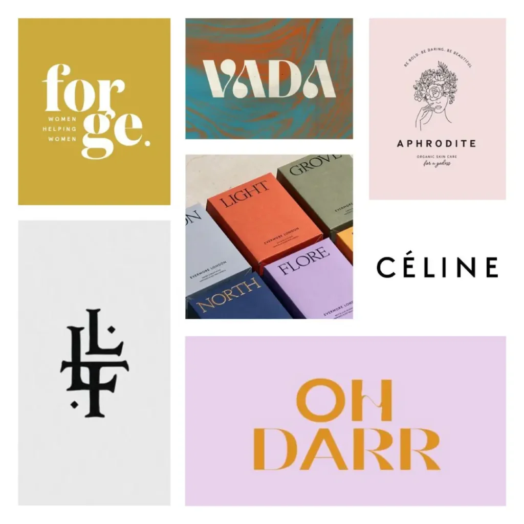
As much as colour sets the mood, typography gives a brand a voice.
The fonts used can tell volumes about the personality of a brand. Here are different types of fonts that we can include in our brand mood board:
- Serif Fonts: Tradition and Reliability Serifs are those little lines you see at the ends of characters. These fonts are always associated with tradition, respectability, and reliability. They work well for established publishing, law or finance brands.
- Sans-Serif Fonts: Modern and Clean Sans-serif fonts do not have small lines like serif ones; this makes them appear fresh, clean, and direct to the reader’s eye. Companies in technology or startups often use this typeface because it looks current but still friendly.
- Script Fonts: Elegance and Creativity If you want your text to look like someone wrote it on paper, script font is an elegant choice for fashion brands or creative fields where personalisation matters most, such as beauty salons, etc.
- Display Fonts: Unique and Memorable Display fonts are designed to be attention-grabbing, so they’re often employed for headlines or logos that need some extra oomph behind them; these can get wild, though, too — anything goes here!
When selecting what styles should go onto our mood boards, let us remember how well each pair pairs together visually; one common way designers achieve this is by using contrasting weights within the same family groupings while maintaining unity overall.
Imagery: Painting a Thousand Words
Choosing the right pictures for your mood board could narrate your design’s story in a second. Here are some examples to consider:
- Photography: Authenticity portrayed through photos. These images can show your products, staff or scenes representing your brand’s lifestyle. Opt for visuals in the same manner, like bright and airy or moody and dramatic.
- Illustrations: Distinctive and Versatile Unique illustrations have great potential to make brands look different from others. They are handy when dealing with abstract ideas or creating a playful, friendly atmosphere.
- Patterns & Textures: Adding More Dimension Patterns add rhythm whilst textures bring more life into any design; thus, both can be used together to create an interesting composition on the mood board.
- Icons & Symbols: Simplification of Abstract Icons or symbols are essential elements that help simplify complex thoughts quickly and memorably. They work best for tech businesses or organisations that deal with intangible concepts.
- Abstract Art: Emotional Appeal without Figurative Representation Unlike figurative images, abstract pictures can trigger feelings and associations indirectly but powerfully. This makes them suitable for companies seeking to appear inventive or creative.
Common Mistakes to Avoid
Even those who are highly skilled can falter while making brand mood boards. Here are some things to keep in mind:
- Making it too complex: Remember that a good mood board clarifies, not confuses.
- Not paying attention to the brand strategy: Your mood board should support your overall brand strategy instead of merely being attractive.
- Copying what competitors have done: Your mood board should be yours – you may draw inspiration from others, in any case.
- Overlooking the audience: Always consider your target market when choosing visual elements.
- Lack of coherence: All the components must blend well together.
- Failure to be practical: Consider how different mediums (web, print, packaging, etc.) will carry your visual elements.
Bringing It All Together: Creating a Cohesive Brand Mood Board

Since we have already taken a look at the components, let us discuss a brand mood board that brings them together:
- Choose a Central Theme Start by selecting an idea or emotion that best represents your brand. This is the string that will connect all of your elements.
- Create a Visual Hierarchy. Make sure that the most essential elements are given prominence over others. These could be the leading brand colour, central tagline or critical imagery.
- Balance Your Elements Endeavor to achieve pleasing colour, typography and imagery balance. Too much dominance by one element might overshadow another.
- Consider Flow: Arrange these pieces to intuitively guide people’s eyes around them while following a logical sequence telling a story about your brand.
- Leave Some White Space Do not overcrowd every inch of this board with content. Leaving some empty areas helps highlight key points and gives the design a more refined touch.
- Test Different Layouts: Try different arrangements for these items on your board; you never know what might come from using unusual placements!
- Seek Feedback Share with others once done creating this mood board; their reactions can offer helpful perspectives, enabling clearer sight towards the realisation of intended goals.
However, a good brand mood board should be unified and motivational, too. It must reflect your true identity and the energising spirit behind it.
Conclusion: Your Brand's Visual Story
A brand mood board is not only a set of attractive pictures – it’s a powerful means of narrating your brand visually. It would be best to create an elaborate mood board to establish a solid and lasting brand identity that will resonate with your audience.
It should always be borne in mind that the brand mood board is an ever-evolving document. With changes occurring in your brand, its visual representation should change, too. You should frequently return to this board and modify it until it still captures your brand's spirit.
So, are you prepared to astonish everyone with a stunning brand mood board? This tutorial equips you with the necessary skills for creating an individual visual identity based on the acquired knowledge. Have fun while making a mood board!
FAQs
What is the recommended frequency for updating a brand mood board?
There are no specific rules about this. However, it would be better to check your mood board at least once a year or whenever there is a significant change in your brand.
Can I create a brand mood board if I am not a designer?
Definitely! Although design skills may be handy, anyone can create a mood board. You can start with easy-to-use applications like Canva or use physical corkboards.
How many images should I put on my brand mood board?
Rather than quantity, focus on quality. Select 5-10 high-resolution pictures that genuinely reflect the personality and style of your brand.
Do I have to include my competitors’ branding in my mood board?
While it is right for you to know what your competitors are doing, their identity should not form part of what makes up your unique brand representation through this tool or its elements thereof.
Can I use copyrighted images in my mood board?
Yes, but only when they’re meant for internal usage, i.e., inspiration. But if such materials are used externally, e.g., during the creation of public-awareness materials, then ensure that rights over them are obtained or that you produce yours instead.
How do you choose which colours go into making a company moodboard?
Consider the character of your business, industry standards, colour psychology and the target audience's preference. Adobe Color is one such software that can help generate complementary palettes among different hues for brands.
Is it necessary to hire someone, or can I do it myself?
A professional may bring more skills and knowledge. Still, it is only sometimes required since having a clear vision and enough time commitment could yield the same results when creating a practical guideline alone.
How can you ensure that what you've put on the moodboard works well in other media?
Consider various contexts, such as digital platforms or print materials and large formats, while selecting items for this document. Try showing samples of these applications to ensure they fit into different spaces easily without distorting their original design intent.
What if I want two styles on my brand guide but need to know which suits best?
Suppose it’s difficult for me to decide between two options. Should I create two separate guides and then ask people around who might be interested in giving opinions based on their likes and dislikes towards each option presented during the review session? This way helps one to see the pros & cons alongside each other, thus facilitating clearer understanding.
How do I communicate with a designer using my branding guide?
When working with designers or agencies, this board acts as an excellent reference point through which clients’ visual preferences can be shared effectively, making it easier for them to deliver what the customer wants at the first attempt.

