The £5,000 Creative Logo vs. The £50 Version (What You're Really Paying For)
When you say you want a “creative logo,” you probably don't know what you're asking for.
You think you’re asking for originality and flair. Your words signal to a professional designer that you haven’t thought deeply about your business.
It’s one of the most common requests, and one of the most misguided. And it’s the primary reason so many businesses end up with logos that are, ironically, utterly generic.
The solution isn't to ask for more creativity. It's to understand what the word means in a commercial context.
- Understand Creativity: "Creative" logos should solve business problems, focusing on effectiveness rather than mere originality.
- Key Pillars: A successful logo is distinctive, appropriate, and functional; creativity emerges from these qualities.
- Invest Wisely: High-quality logos require strategic thinking and professional expertise, preventing future brand issues and costs.
Let’s Be Clear: What “Creative” Actually Means in a Logo
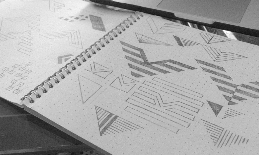
Forget the image of a tortured artist waiting for a lightning bolt of inspiration. That’s a myth sold in films.
Creativity in branding isn’t about self-expression. It’s about effectiveness.
It’s Not About Being “Arty”
A logo isn't a painting to be hung in a gallery. It’s a functional tool designed to work. It has a job to do. It must be legible when tiny, recognisable from a distance, and printable with a cheap pen.
An “arty” logo that is complex, difficult to reproduce, or illegible is a creative failure. Full stop.
It’s About Solving a Problem
The real question is: what business problem are you trying to solve?
Are you struggling to stand out in a crowded market? Is your target audience mistaking you for a competitor? Do customers not understand what you do?
A genuinely creative logo is a clever solution to one of these problems. It communicates your core idea in an instant. The creativity is in the thinking, not the illustration.
The Three Pillars of a Genuinely Creative Logo
Instead of asking for “creative,” judge the work against these three pillars.
- Distinctive: Does it stand out from your competitors? Or does it look like you copied their homework?
- Appropriate: Does the design’s feel—the colours, the typography—fit your industry and your audience? A solicitor's office shouldn't have a logo that looks like it belongs on a children's bouncy castle.
- Functional: Is it simple, scalable, and versatile? Can it work in one colour? Does it look good on a screen and a printed invoice?
If a logo ticks these three boxes, it is, by definition, a success. The “creativity” is a byproduct of that success.
The Cardinal Sins: Why Most Attempts at a Creative Logo Fail Miserably
Most businesses don’t have a bland logo because their designer is bad. They end up with one because their process is broken. It usually comes down to one of these four mistakes.
Sin #1: You Wrote a Useless Brief (The “Make it Pop” Fiasco)
A designer is not a mind reader.
When you provide a brief with vague instructions like “I want something modern and fresh,” or the truly unforgivable “just make it pop,” you are setting the project up for failure. You're forcing the designer to guess.
When designers have to guess, they will default to what is safe. They will fall back on current trends. The result is a generic logo that looks like a dozen others. Your vague brief has actively killed the potential for authentic creativity.
Sin #2: You Went Bargain Hunting in the Creative Gutter
Here's the rub: you get what you pay for.
Logo contests and £50 design gigs are not sources of professional creativity. They are factories for recycled ideas and generic iconography. A study found that many logos from a popular contest site contained unoriginal, stock-based concepts [source].
These platforms create a system where speed trumps thought. It's a race to submit something—anything—that looks plausible. There is no strategy, research into your competitors, or understanding of your business.
I once spoke to a startup founder who was delighted he’d secured a “bargain” logo for £100 through a contest. Six months later, he received a cease-and-desist letter.
His “unique” logo was almost identical to a registered trademark in a neighbouring industry. The cost of the rebrand, reprinting everything, and the legal advice dwarfed his initial “savings.
It's a false economy.
Sin #3: You’re Chasing Fleeting Trends
Remember all those tech startups in the late 2010s with lowercase, sans-serif wordmarks? Or the explosion of minimalist, geometric animal logos?
Trends are fashionable clichés. A logo built on a trend instantly dates your business. It screams “we were founded in 2022” and will look tired by 2026. A genuinely creative logo is timeless. It sidesteps trends by focusing on your unique brand idea, not what everyone else is doing.
Sin #4: You Let a Committee Steer the Ship (Straight into an Iceberg)
Design by committee is where good ideas go to die.
When everyone from the CEO to the marketing intern’s cousin has a say, you will end up with the safest, most compromised, and most boring option. Every sharp edge gets rounded off. Every bold idea gets watered down until it offends no one and, as a result, inspires no one.
One person, the final decision-maker, needs to own the project. Trust the professional you hired.
A Practical Framework for Getting a Logo That’s Actually Creative
If you avoid the sins above, you're already halfway there. Now, here’s the constructive part.

Step 1: Stop Thinking About a Logo. Start Thinking About Your Brand.
Before thinking about visuals, you need to answer some fundamental questions.
Who are you? Who are you for? What do you stand for? Why should anyone care?
Your logo is not your brand. It’s a tiny, visual shortcut to your brand. If the brand thinking weakens, the logo will be meaningless, no matter how “creative” it looks.
Step 2: Write a Killer Creative Brief (The Anti-“Surprise Me” Guide)
A great brief is the most essential document in the design process. It’s not a restriction on creativity; it's its foundation. It gives the designer the correct problems to solve.
Your brief must answer these questions with clarity:
- The Business: What do you do, in simple terms? What is your history?
- The Goal: What is this logo for? A rebrand? A new company launch? What problem must it solve?
- The Audience: Be specific. “Everyone” is not an audience. Define their age, values, and expectations.
- The Competitors: Who are your top 3-5 competitors? What do their logos look like? What do you like or dislike about them?
- The Feeling: List 3-5 adjectives that should describe your brand (e.g., “premium, reliable, traditional”) and 3-5 that should not (e.g., “cheap, playful, loud”).
- The Mandatories: What must be included? The company name? A specific colour?
A brief like this eliminates guesswork. It empowers the designer to be genuinely creative within strategic boundaries.
Step 3: Find the Right Kind of Designer
Now that you have your brief, you must find a professional who can execute it.
Freelancer vs. Agency: What’s the Difference?
A good freelance designer can be a brilliant partner, offering a personal touch and deep involvement. An agency typically brings a broader team—strategists, project managers, multiple designers—which can be ideal for larger, more complex branding projects.
The title isn’t what matters. The quality of their thinking does.
What to Look for in a Portfolio (Hint: It’s Not Just Pretty Pictures)
Don't just flick through looking at the final logos. Look for case studies. A great designer's portfolio will show the process.
They will explain the client's problem, show their thinking, and justify their final design strategically. They talk about the “why” behind the work. That’s how you know you’re hiring a strategic partner, not just a pair of hands.
Step 4: Master the Feedback Process
When the initial concepts arrive, do not react with “I like it” or “I don't like it.” Personal taste is irrelevant.
Go back to the brief.
Ask objective questions:
- “Does this design solve the primary problem we defined in the brief?”
- “Does its tone of voice align with our brand adjectives?”
- How does this differentiate us from the competitor logos we identified?”
This is how you have a productive conversation. You’re collaborating on a strategic goal. You get better results when you trust the process and the professional you’ve hired. That's why our logo design services are built around this strategic partnership.
Deconstructing “Creativity”: Let’s Look at What Works
True creativity in logo design is often about a simple, clever idea executed perfectly.
The Obvious-in-Hindsight Solution
The FedEx logo is the classic example. The hidden arrow between the ‘E' and ‘x' is a stroke of genius. It’s not “arty.” It’s a subliminal promise of speed, direction, and precision—the core of their business. That’s creativity that works.
The Clever Metaphor
Look at the Amazon logo. The arrow from ‘a' to ‘z' isn't just a smile. It communicates their core value proposition: they sell everything, from A to Z. It’s a simple visual that tells a huge story.
The Power of Pure Simplicity
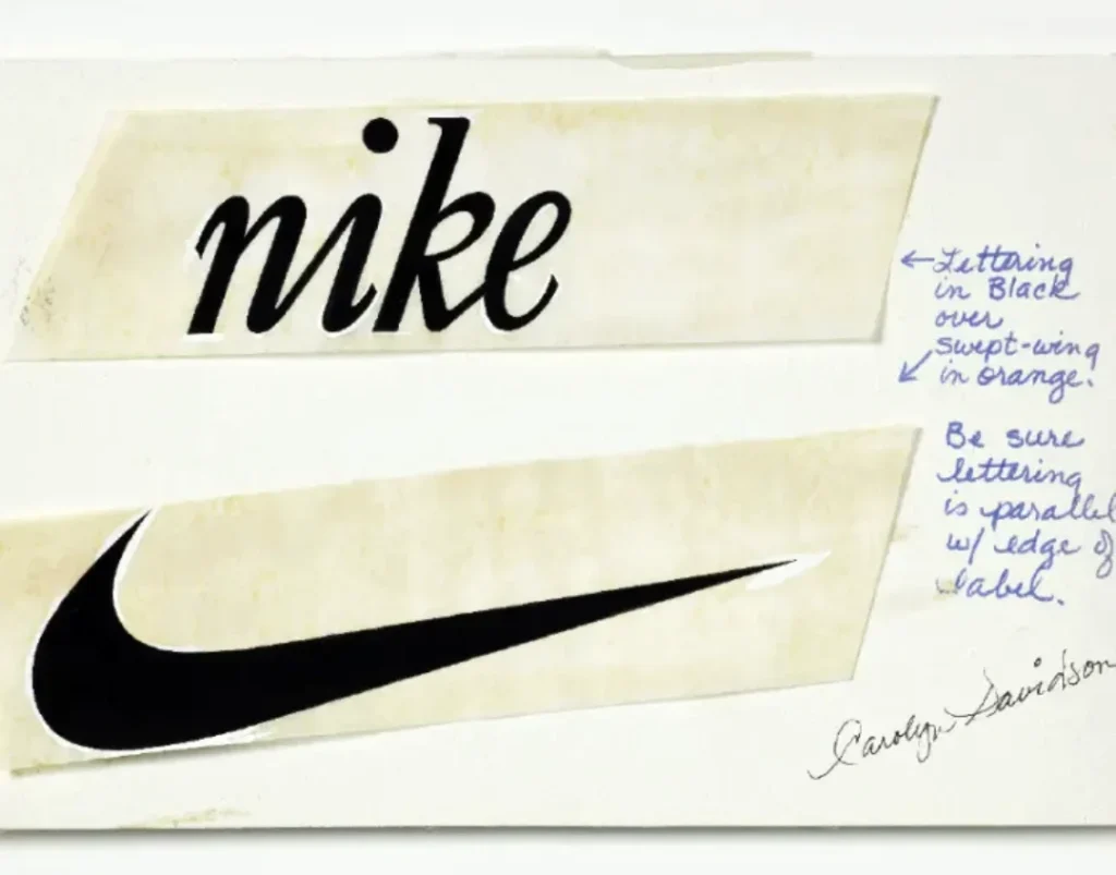
The Nike swoosh is just a tick. But it’s a tick imbued with decades of meaning about victory, movement, and attitude. It didn't start as iconic. It became iconic because it was simple, distinct, and applied consistently to a powerful brand.
I remember a client in the haulage business. They wanted a “dynamic and powerful” logo. They pictured trucks, eagles, maybe lightning bolts. It was a recipe for a cluttered mess.
We talked them back from the brink. The final design was a simple, bold letter ‘H' where the crossbar was subtly shaped like a motorway lane.
It was clean, clever, and communicated “transport” without screaming. That’s the job.
The meeting where we presented it smelled faintly of burnt coffee, but the idea was fresh.
What You’re Really Paying For (And Why It’s Worth It)
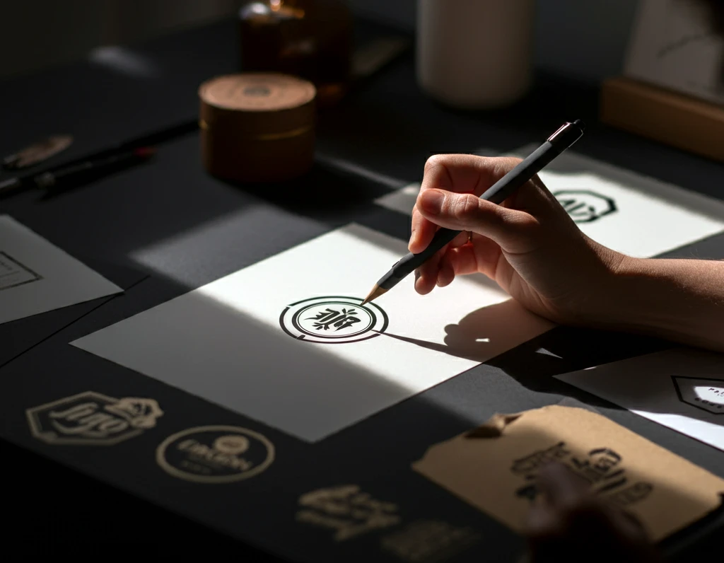
When a business owner sees a four-figure quote for a logo, they often baulk. It’s understandable if you think you’re just buying a picture.
But you're not.
You’re Not Buying a JPEG
You’re not paying for the 30 minutes the designer took to draw the final version.
You’re Buying Experience and Immunity from Mistakes
You are paying for the 10,000 hours the designer spent honing their craft. You’re paying for their typography, colour theory, and design history knowledge. You’re paying for their ability to see the strategic pitfalls you can’t, and to steer you away from them. You are buying insurance against a bad decision.
The True Cost of Getting It Wrong
A poor logo can lead to customer confusion, a lack of memorability, and the perception of being unprofessional. The cost of a rebrand isn't just the fee for the new design. It's the cost of replacing every van, every sign, every uniform, every business card, and every piece of packaging.
For a large company, rebranding can cost millions. For a small business, it can still efficiently run into the tens of thousands—a crippling expense that could have been avoided by investing properly the first time.
The Final, Blunt Truth
Stop asking for a “creative logo.”
Start demanding an effective one. A logo that is distinctive, appropriate, and functional.
Do the hard work upfront. Define your brand. Write a clear, strategic brief. Hire a professional whose thinking you respect, not whose price is the lowest.
When you do that, the right kind that builds your business will be baked in from the start.
Let's Get Specific
Exploring ideas for your brand is the first step. Our blog is full of these kinds of observations to get you thinking.
If you want this level of strategic thinking applied directly to your business, that’s what our logo design services are for.
When you’re ready to start the conversation with a proper brief, you can request a quote here.
Frequently Asked Questions (FAQs)
What is the most essential part of getting a creative logo?
The most critical part is the creative brief. A clear, strategic brief that outlines your business, audience, competitors, and goals is the foundation for any successful design project. It guides the designer and ensures the creativity is focused on solving the correct problems.
How much should a professional logo design cost in the UK?
Costs vary widely. A freelance designer might charge anywhere from £500 to £5,000+, while an agency project typically starts in the low thousands and goes up significantly. The price reflects the designer's experience, process, and project scope. Be wary of anything that seems too cheap.
What’s the difference between a logo and a brand identity?
A logo is a single visual mark. A brand identity is the entire visual system that represents your brand. This includes the logo and your colour palette, typography, photography style, and rules for how to use them (brand guidelines).
Is using a logo maker or a contest site a bad idea?
For a serious business, yes. These options typically provide generic, non-exclusive, or trend-based designs without strategic thinking. You risk getting an unoriginal, forgettable logo or infringing on existing trademarks.
How many revisions should I expect for a logo design?
Most professional designers include a set number of revision rounds (e.g., 2-3) in their initial quote. The goal of a good process is to minimise the need for extensive revisions by getting the strategy right from the start.
What file formats do I need for my new logo?
You need vector files (.ai, .eps, .svg). These are infinitely scalable without losing quality. You should also receive raster files (.jpg, .png with a transparent background) for everyday use on websites and documents.
Should my logo show what my company does?
Not necessarily. This is called a descriptive logo. An abstract logo (like Nike's) or a wordmark can be just as, or even more, effective. The key is that the logo's feeling is appropriate for your business, not that it's a literal drawing of your product.
How do I know if my logo is “timeless”?
A timeless logo is typically simple, avoids trendy fonts or effects, and focuses on a core idea. Ask yourself: if you saw this logo in 10 years, would it still look relevant or dated? Simplicity and distinctiveness are the best defence against ageing.
Can I just use a nice font for my logo?
Yes. This is a wordmark or logotype (like the Google or Coca-Cola logos). A beautifully crafted and unique wordmark is a perfect solution for many businesses. The creativity lies in choosing or customising a typeface that perfectly captures the brand's personality.
What's the biggest mistake people make when giving design feedback?
The biggest mistake is giving subjective feedback based on personal taste (“I just don't like the colour blue”). Effective feedback is objective and tied to the project brief (“The brief specified our brand is energetic, but this shade of blue feels too corporate and calm”).

