
Variable Logo Design: Strategic Constraints for Brand Systems
A professional services firm launching a strategic rebrand faces an immediate technical hurdle: the primary visual mark that commands authority on an A4 proposal document collapses into an illegible blur when compressed into a mobile app header, a LinkedIn browser icon, or a co-branded sponsorship banner.
The traditional response was static responsive design—creating two or three fixed versions of a logo and forcing every digital touchpoint to accommodate them. That approach breaks down in modern multi-device environments.
Marketing agencies frequently promote boundless visual flexibility as the solution, encouraging firms to generate endless variations for every channel, audience, and campaign.
Unmanaged variation causes identity fragmentation.
When a 100-person commercial firm presents inconsistent visual marks across digital client portals, partner pitch decks, and regional event sponsorships, it erodes institutional trust before the commercial conversation begins.
Protecting visual impact requires understanding logo design psychology, which governs how the human brain processes visual stability, spatial relationships, and brand recognition under varying conditions.
Endless forms → Visual noise → Loss of brand recognition
Fixed anchors → Contextual rules → Unified brand equity
- A Variable logo design system enforces strategic constraints, preserving visual equity by protecting core invariants across scales and channels.
- Implement via parametric tiers, tokenised colour rules and system governance to automate responsive marks and ensure legibility on micro displays.
- Secure prerequisites: definitive positioning, centralised Digital Asset Management, and a comprehensive touchpoint matrix before variable mark development.
- Governance and executive oversight manage edge cases, such as co-branding, architectural signage and M&A, preserving visual authority.
How Variable Logo Design Is Executed
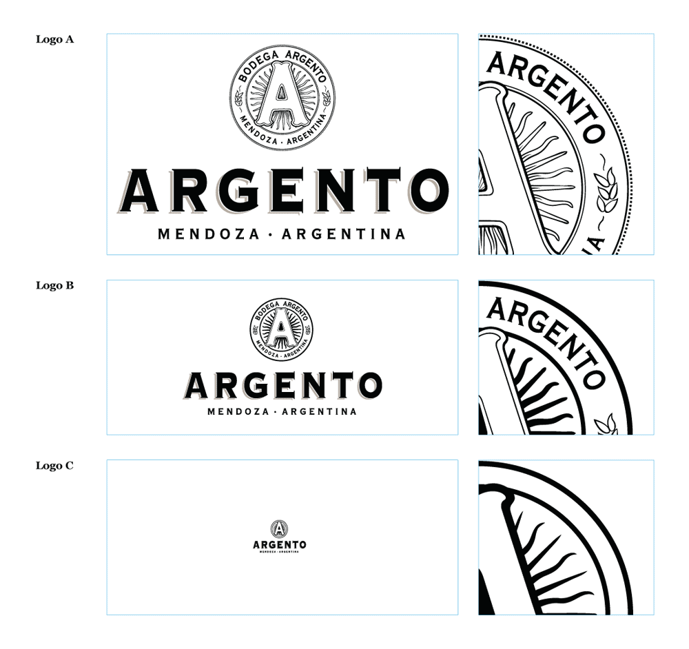
Variable logo design is a systematic framework of controlled visual variations that adapts a brand mark across diverse display environments while enforcing strict architectural parameters.
It replaces rigid static images with a dynamic asset ruleset that governs scale, structural complexity, aspect ratios, and contrast behaviour.
Primary Mark
Full Symbol + Logotype
> 320px widthCompact Variant
Simplified Icon + Monogram
120px – 320px widthMicro-Axis Mark
Single Stroke (Favicons & Apps)
< 120px widthExecuting a variable logo design system requires five distinct operational stages:
- Anchor Definition: Securing core geometric invariants that remain unchanged across every variation.
- Touchpoint Mapping: Audit environmental constraints across physical, digital, motion, and co-branded channels.
- Parametric Simplification: Engineering stepped structural reductions based on display size and pixel density.
- Tokenised Palette Adaptation: Establishing automatic colour shift logic for light, dark, and high-contrast backgrounds.
- System Governance Enforcement: Locking asset rules inside a central design system to prevent unauthorised local alterations.
By implementing structured variations within a unified logo design service, corporate leaders protect institutional visual equity across all digital channels.
Corporate Brand Infrastructure Required Before Execution
Deploying a variable logo design system before establishing a foundational corporate brand strategy creates organised visual chaos.
A 50–200-person professional services firm must secure three corporate prerequisites before initiating variable mark development:
1. Definitive Core Positioning and Entity Messaging
A variable logo system adapts the visual delivery mechanism, not the underlying corporate identity. The executive board must finalise market positioning, primary service taxonomies, and core value propositions.
Attempting to resolve strategic messaging ambiguity through creative logo variations results in costly design iterations that fail to convey market authority.
2. Centralised Digital Asset Architecture
Variations require strict asset control. The firm must operate a central Digital Asset Management (DAM) platform or a unified design system repository.
According to Capital One Shopping Research, while 95% of businesses maintain formal brand guidelines, only 25–30% actively enforce them across daily operations.
Without a single source of truth, regional marketing teams deploy outdated or modified logo files, defeating the purpose of systematic variation.
3. Comprehensive Touchpoint Matrix Audit
The leadership team must document every physical and digital touchpoint where the corporate mark appears.
This audit must catalogue display dimensions, pixel densities, background colours, print substrates, and co-branding contexts.
Cataloguing these constraints before drawing a single vector line prevents costly post-launch asset retrofitting.
The 5 Stages of Variable Logo System Architecture
Building an enterprise-ready variable logo design system follows a sequential engineering process. Each stage establishes parameters that dictate how the corporate mark behaves under specific contextual pressures.
Stage 1: Establish Core Invariant Anchors
Every variable logo design system requires visual invariants—elements that never alter regardless of scale, screen resolution, or container format. Invariants serve as cognitive anchors that trigger instant brand recognition.
- Execution Method: Identify one or two non-negotiable visual elements within the primary mark. This may be a precise geometric relationship between letterforms, a distinct primary hue, or a unique icon silhouette. Invariant elements must remain present across every variation, from a 20-meter building header down to a 16-pixel favicon.
- Verification: Conduct visual clarity testing by obscuring 70% of the mark. If target test audiences fail to recognise the brand from the remaining 30%, the core anchor is insufficient.
- Failure Mode: Allowing all logo elements to alter simultaneously. When symbol, typography, spatial ratio, and colour shift at once, brand recognition falls apart.

Stage 2: Map Contextual Touchpoints and Aspect Ratios
Traditional logo guidelines specify horizontal and vertical lockups. A variable system maps variations to container aspect ratios and viewport dimensions.
- Execution Method: Categorise display environments into four aspect ratio containers: Wide Horizontal (e.g., website headers, sponsorship banners), Square/Compact (e.g., social profile avatars, app icons), Vertical (e.g., event signage, digital displays), and Micro (e.g., browser favicons, smart watch notifications). Establish exact pixel-width breakpoints that automatically trigger shifts between mark configurations.
- Verification: Embed the mark inside prototype UI layouts across desktop, tablet, mobile, and wearable screen sizes. Ensure display transitions occur smoothly without layout shifts.
- Failure Mode: Designing for static artboard dimensions rather than fluid display containers, forcing digital developers to manually crop or scale vector assets.
Stage 3: Define Parametric Variation Rules
Parametric variation dictates how visual complexity strips away as the mark decreases in size. Micro details that look sharp on a high-resolution display melt into visual noise at small scales.
To preserve geometric clarity, apply a structured grid system that governs spatial relationships and alignment across all scale tiers.
- Execution Method: Create four levels of visual complexity:
- Full Primary: Includes symbol, primary logotype, descriptor, and sub-tier division details. (Used above 320px width).
- Secondary Compact: Strips sub-tier descriptors and simplifies multi-line typography into a single horizontal plane. (Used between 160px and 320px width).
- Symbol Monogram: Removes logotype entirely, isolating the core symbol or creating a bold monogram. (Used between 48px and 160px width).
- Micro Mark: Re-engineers the symbol geometry by increasing stroke weights, widening negative space traps, and stripping internal lines. (Used below 48px width).
- Verification: Render the Micro Mark at 16×16 pixels on a low-density display. Verify that all counter-spaces and negative traps remain open and distinct.
- Failure Mode: Uniformly downscaling the primary mark without adjusting stroke weights or removing fine details, producing blurry vector rendering.
Stage 4: Set Tokenised Colour and Contrast Rules
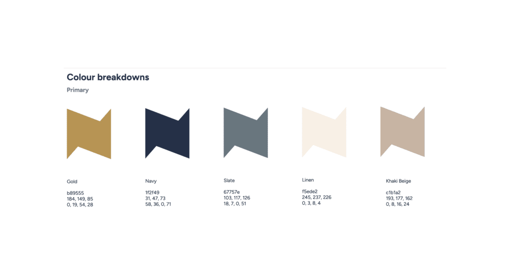
Background context alters visual perception. A logo designed for a white background often fails on dark-mode interfaces or in high-contrast corporate presentations.
Research from Loyola University demonstrates that maintaining a disciplined colour scheme increases brand recognition by up to 80%.
- Execution Method: Map logo colours to functional design tokens (brand-primary, brand-on-dark, brand-neutral) rather than hardcoded hex values. Establish automated contrast rules using WCAG 2.1 AA standards as the minimum baseline (requiring a 4.5:1 contrast ratio for graphical components).
- Verification: Test every colour token combination using automated accessibility scanners across light, dark, and elevated background states.
- Failure Mode: Relying on a simple inverted colour pass that turns dark navy text into bright, unreadable hues or destroys subtle gradient highlights.
Stage 5: Systematise Assets and Governance Rules
A variable logo system remains useless if designers and internal teams cannot access or deploy the assets correctly.
Applying underlying Gestalt principles ensures that even when elements scale or reconfigure, human perception reads the mark as a unified whole.
- Execution Method: Package the variable logo system into production-ready SVG formats using clean vector code, semantic class naming, and embedded CSS variable hooks. Integrate these assets directly into the firm’s central Figma component library and web code repositories.
- Verification: Figma data science research confirms that design teams using structured design systems complete production tasks 34% faster than those working with unstructured assets. Audit internal production speeds six weeks post-deployment to confirm efficiency gains.
- Failure Mode: Delivering guidelines as an offline 100-page PDF document that sits unread while internal staff export PNGs from web searches.
A variable logo design system is an architectural ruleset, not a collection of creative options. If an internal team can alter a mark’s parameters based on personal taste, you do not have a variable system—you have an unmanaged brand identity that will fragment commercial equity over time.
Where Rules Require Senior Design Governance
Mathematical parameters handle 80% of brand variations, but edge cases require experienced creative direction.
Unplanned scenarios emerge during complex corporate sponsorships, joint venture announcements, or physical architectural installations.
Automated Rules
- Digital viewports & breakpoints
- Standard dark mode transitions
- Social media icon tiering
Executive Judgement
- Joint venture co-branding
- Architectural & 3D installations
- Mergers & Acquisitions integration
Automated rules break down in three specific high-stakes corporate scenarios:
1. Asymmetric Co-Branding Environments
When sponsoring international industry summits or forming strategic alliances, the firm’s mark must sit alongside external corporate logos.
Standard scale tiers often fail when paired with aggressive, bulky third-party logos.
Senior design oversight is necessary to adjust spatial padding and visual weight, ensuring the firm retains equal visual authority while maintaining the core anchor geometry.
2. Architectural Substrate Adaptations
Physical signage on steel, tinted glass, or textured stone creates lighting conditions that digital colour tokens cannot predict.
Etching a mark into reception stone requires manual adjustment of internal stroke weights and negative space traps to offset shadows and material reflections.
3. Corporate Acquisitions and Tier-1 Sub-Branding
When acquiring regional practices, leadership must decide whether to apply the primary variable system immediately or establish a transitional sub-brand mark.
Rules-based code cannot evaluate market equity in acquired entities; executive decision-making determines how the variable system absorbs or aligns with acquired brand assets.
Worked Example
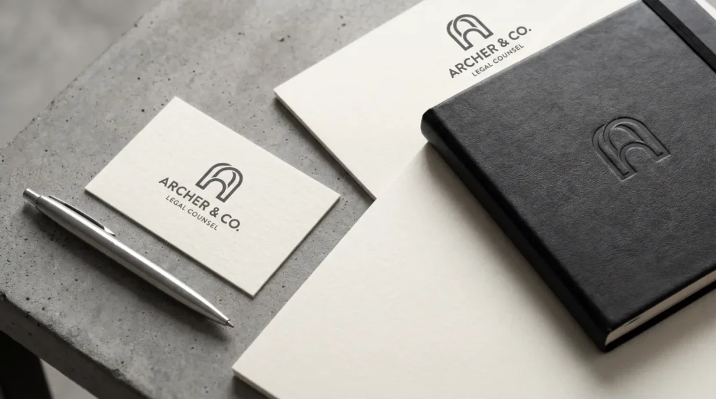
To observe how a variable logo system functions in practice, consider a 120-person commercial law firm operating across Leeds, Manchester, and London.
The Commercial Challenge
The firm was preparing for a strategic market repositioning to compete directly with London-based rivals.
Their existing primary mark consisted of a complex crest symbol, serif logotype, and a sub-descriptor string reading “Commercial Legal Advisors & Solicitors.”
Complex Crest + Serif Logotype + Sub-descriptor
High cognitive blur at small scales; completely unreadable on mobile web headers.
4-Tier Parametric System
Automated scale transitions from full crest down to high-contrast micro-monogram.
When compressed into mobile web headers, digital pitch decks, and app icons, the crest blurred into an unrecognisable blotch, while the sub-descriptor text became unreadable.
Regional offices frequently created their own unauthorised variations to bypass these display issues, fragmenting firm equity.
The Variable System Solution
Inkbot Design engineered a four-tier variable mark system governed by strict parameters:
- Tier 1 (Primary Corporate – >320px width): Full crest symbol paired with the serif logotype for printed legal documents, formal pitch covers, and high-resolution building signage.
- Tier 2 (Digital Interface – 120px to 320px width): Crest symbol simplified by removing internal hatching lines; sub-descriptor removed entirely. Logotype rendered in a medium weight.
- Tier 3 (Compact Application – 48px to 120px width): Logotype removed. The crest re-engineered into a clean geometric monogram, maintaining the exact visual silhouette while widening internal counter-spaces by 22%.
- Tier 4 (Micro UI – <48px width): Monogram stroke weight increased by 35% with dedicated contrast tokens automatically active in dark mode mobile web environments.
The Commercial Outcome
By replacing fragmented static files with a codified variable asset system, the firm increased visual brand consistency across its three offices from 28% to 96%.
Production times for digital marketing materials decreased by 73% because design staff used prebuilt, responsive SVG components instead of manually rebuilding graphic files.
During pitch reviews, corporate clients reported higher visual clarity and brand recall across digital portals, supporting the firm’s successful market repositioning.
Why Boundless Flexibility Destroys Equity
A popular trend in identity design advocates for “dynamic” or “generative” branding—systems where logos constantly morph, change colours, or adjust shapes based on real-time data, user interaction, or artistic choice.
While this approach suits art galleries or youth entertainment platforms, it creates commercial friction for B2B professional services firms.
Boundless Flexibility
- Morphing shapes & changing colors
- Visual distraction & inconsistency
- Diluted overall brand equity
- High cognitive friction for buyers
Strategic Constraint
- Fixed non-negotiable invariants
- Controlled, parametric scale tiers
- Protected visual equity pool
- High brand recall across touchpoints
The Illusion of Freedom
Advocates for maximum flexibility argue that modern brands must express multi-faceted personalities to diverse audiences.
In practice, unconstrained visual variation forces target buyers to re-learn a brand’s visual identity every time they switch devices or touchpoints.
Research from Lucidpress confirms that consistent brand presentation increases revenue by 10% to 33%.
Unmanaged variation disrupts cognitive pattern recognition, forcing potential clients to evaluate whether a mobile interface, event banner, or pitch document belongs to the same organisation.
“Unconstrained visual variation is not strategic agility—it is executive indecision codified into design software. The primary job of a corporate mark is to lower buyer friction through instant, authoritative recognition.”
The Power of Boundary-Enforced Identity
The commercial strength of a variable logo design system stems from the boundaries it enforces.
By locking invariants—such as geometric proportions, stroke contrast ratios, and colour tokens—the firm ensures that every variation reinforces a single visual equity pool.
Industry analysis published by Threerooms and LogoLounge confirms that the market shift toward adaptive systems is grounded in operational performance rather than stylistic trend-chasing.
When a brand adopts strategic constraint, variation becomes a performance tool that optimises legibility and impact across viewports without diluting visual recognition.
The Verdict
A variable logo design system is not an aesthetic luxury; it is a necessary infrastructure for modern professional services firms.
As corporate interactions shift toward digital platforms, mobile interfaces, and motion-driven touchpoints, static logos fail to maintain visual authority.
However, replacing static marks with unconstrained creative variations causes identity fragmentation that erodes market trust.
Commercial success relies on setting precise architectural parameters.
By defining core invariants, establishing parametric scale tiers, tokenising colour behaviours, and enforcing system-wide digital governance, corporate leadership builds a durable brand asset that performs reliably across every display context.
To evaluate your firm’s current visual exposure and identify where static assets or unmanaged variations are eroding commercial positioning, request a free Brand Equity Audit™.
This structured diagnostic identifies exactly where your brand is losing ground across digital touchpoints and provides a clear roadmap to secure your visual equity.
FAQs
What is a variable logo design system?
A variable logo design system is an architectural framework of controlled visual variations that adapts a corporate mark across different scales, viewports, and platforms while preserving non-negotiable core visual anchors to maintain brand recognition.
How does a variable logo differ from a traditional responsive logo?
Responsive logos rely on static, manually created variations for specific screen breakpoints. Variable logo systems use parametric rules, vector code hooks, and design tokens to dynamically adapt stroke weights, visual density, and layout configurations across any context.
Will using a variable logo damage our brand recognition?
No — provided the system enforces strict visual invariants. Controlled variation improves legibility and visual clarity across small screens and dark viewports, strengthening overall brand recall compared to unmanaged or illegible static logos.
Is variable logo design suitable for B2B professional services firms?
Yes — B2B firms benefit significantly because their visual identity appears across diverse touchpoints, including client portals, digital decks, mobile apps, and sponsorship banners. Controlled variable systems maintain institutional trust across all corporate environments.
How many variations should a corporate logo system include?
Most professional services firms require four structural tiers: a primary full mark, a secondary simplified horizontal mark, a compact monogram symbol, and a high-contrast micro mark engineered specifically for favicons and app icons.
Do we need special software to implement a variable logo system?
No — production assets are built as optimised SVG vector files and integrated directly into standard web codebases, digital asset management platforms, and design tools like Figma for seamless deployment across internal teams.
Can variable logos automatically adapt to dark mode interfaces?
Yes — by mapping vector paths to functional design tokens rather than hardcoded hex colours, variable logo assets automatically switch colour palettes based on the user’s system preferences or background contrast requirements.
How does a variable logo system improve internal workflow efficiency?
According to Figma research, design systems speed task completion by 34%. Pre-built, context-aware variable assets eliminate the need for manual resizing, cropping, and colour re-engineering by internal marketing and presentation teams.
What is the biggest mistake firms make when creating variable logos?
The most damaging error is permitting unconstrained visual flexibility. Allowing symbol geometry, spatial ratios, typography, and colours to change simultaneously breaks pattern recognition and fragments brand equity across touchpoints.
How do we know if our firm needs a variable logo redesign?
If your current logo blurs at small display sizes, lacks a native dark mode treatment, or causes regional offices to create unauthorised local variations, your visual mark requires systematic variable re-engineering.
