The Strategic Role of Typography in Branding
You spent weeks on your logo. You agonised over colour palettes. You probably A/B tested your call-to-action buttons.
But your font? You picked it in 30 seconds from a dropdown menu. It was “clean” or “professional,” which was good enough.
Here's the problem: That 30-second choice tells your customers you're cheap, untrustworthy, unprofessional, or just plain wrong for them. And it's doing it every second they're on your website, looking at your proposal, or reading your packaging.
I'm a designer. I've built brands for over a decade. And frankly, the way most small businesses handle typography drives me mad.
- The Ransom Note: Use three, four, or even five different fonts because you think they look “creative.” It doesn't. It seems chaotic, desperate, and completely amateur.
- Illegibility for Style: Picking some “elegant” script font that is utterly unreadable below 30px. Your brand message is not a Victorian wedding invitation. If I have to squint to read your pricing, I'm gone.
- The Context-Blind Choice: Using a font you like, with zero thought for what your audience expects. A children's nursery using a heavy, industrial slab-serif? A high-finance consultancy using Comic Sans? (Yes, I've seen it). It's a catastrophic mismatch.
Typography isn't the decorative icing on your brand cake. It's the flour. It's the structural, foundational ingredient that holds the entire experience together. It's the cornerstone of your brand identity, and most businesses build on sand.
This isn't a guide about “kerning” or “ligatures.” This is a guide about how typography in branding is a core business function that builds trust, conveys personality, and directly impacts your bottom line.
- Typography is foundational to brand identity, shaping perception and trust before any product interaction.
- Choose fonts deliberately: two families max or one superfamily to ensure consistency and hierarchy.
- Prioritise legibility and readability—test fonts on real phones and in real-world lighting conditions.
- Match font personality to audience and market; mismatch creates cognitive dissonance and devalues the product.
- Respect licensing: use appropriate desktop, web, or app licences; paid or custom fonts can be strategic assets.
Your Font Is Your Brand's Voice

Think of it this way: What would it sound like if your brand walked into a room and started speaking?
Is it shouting in a bold, condensed sans-serif (like an action movie poster)? Is it whispering with authority in a classic, light serif (like a university professor)? Is it friendly, warm, and approachable (like a rounded, bubbly script)?
You wouldn't hire a voice-over artist with a high-pitched, squeaky voice to represent your law firm. So why are you letting a flimsy, generic font do the same job on your website?
I had a client—a small, artisanal bakery. Their products were incredible. Expensive, high-quality, organic. But their branding? They were using Papyrus.
Yes, Papyrus. The font of choice for low-budget travel agents and James Cameron's Avatar.
Their visual voice was screaming “cheap, new-age, 1990s amateur.” It created a massive disconnect with the $12 sourdough loaf they were selling. Customers were confused before they even tasted the product.
We switched them to a single font family: a warm, rounded serif with a slightly playful feel (something like Recoleta). Instantly, the brand looked like the product tasted. It felt artisanal, premium, and trustworthy. Perceived value went through the roof.
That's the power of typography in branding. It sets the expectation before the customer even engages with your product.
The 60-Second MBA in Font Psychology
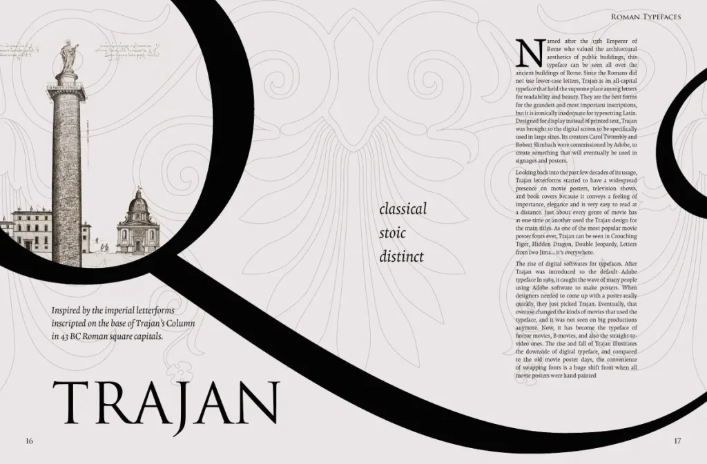
This isn't fluff. It's cognitive science. The human brain is hardwired to associate shapes with emotions and concepts. Sharp, jagged shapes feel aggressive or energetic. Soft, round shapes feel friendly and safe. This applies directly to the letters we read.
You only need to understand the “Big 5” categories for business owners. Everything else is detail.
I've seen business owners spend an hour debating a $50 invoice. Then, they'll pick a font that defines their entire brand's personality in 10 seconds because “it looks nice.” The priorities are backwards.
This table breaks down the business personality of each font category.
The 5 Font Families & Their Business Personalities
| Font Category | The “Personality” & Vibe | Best For… | Real-World Example |
| Serif | Traditional, Authoritative, Reliable, Respectable, Classic, Expensive. The little “feet” (serifs) make it great for long-form reading. | Law firms, financial institutions, universities, publishers, luxury brands, and any business built on trust and history. | The New York Times, Tiffany & Co., Google (their old logo), and universities like Yale. |
| Sans-Serif | Modern, Clean, Simple, Minimalist, Approachable, Neutral, Tech-focused. “Sans” just means “without” serifs. | Tech startups, agencies, e-commerce, modern lifestyle brands, any business that wants to feel current and unfussy. | Google (their current logo), Microsoft, Netflix, Spotify, and almost every tech company. |
| Slab Serif | Confident, Bold, Sturdy, Creative, Quirky, Industrial. These are serifs that are thick, blocky “slabs.” | Creative agencies, tech companies wanting to stand out (e.g., Slack), manufacturing, and brands that want to feel solid and modern. | Sony, Volvo, Mailchimp (their old wordmark), Honda. |
| Script | Elegant, Personal, Luxurious, Feminine, Creative, Whimsical. Designed to look like handwriting. | Photographers, wedding planners, artisanal food products, luxury fashion, anything needing a human touch. | Coca-Cola (a custom script), Instagram (their logo), Cadillac, Ford. |
| Display | Loud, Stylised, Thematic, Quirky, Niche, Attention-Grabbing. These are not for body text. They are for logos and headlines. | Posters, event branding, logos, packaging, any brand that needs to shout its unique personality. | Disney, Lego, Mailchimp's current chunky brand font (Cooper Black-ish). |
Deconstructing the Greats: Why Their Typography Works
Let's look at how massive companies use typography in branding as a strategic weapon.
1. Coca-Cola (Custom Spencerian Script)
Coca-Cola's logo is not just a font; it is the brand. The flowing, dynamic Spencerian script was first penned in 1886.
- What it says: Nostalgia, tradition, timelessness, and joy.
- Why it works: It's so distinctive that they can remove the words “Coca-Cola” and just use the “dynamic ribbon” or a portion of the script, and you still know what it is. It has become a global synonym for the product. They will never change it, because to do so would destroy over 100 years of brand equity.
2. Google (Product Sans)
In 2015, Google famously switched from a classic Serif logo (Catull) to a custom-designed Sans-Serif font called Product Sans.
- What it says: Simple, accessible, modern, friendly, and clean.
- Why it works: The old serif logo felt dated and academic. It didn't work well on tiny mobile screens. The new font is clean, mathematically simple (perfect for a tech company), and scales beautifully from a 1-inch watch face to a 50-foot billboard. It reflects their mission: to make information universally accessible and straightforward.
3. Dior (High-Contrast Didone Serif)
Look at the Dior logo. It's a high-contrast serif (specifically, a Didone or Modern style). It has skinny, delicate lines mixed with strong, thick strokes.
- What it says: Luxury, elegance, expense, sophistication, exclusivity.
- Why it works: The font looks expensive. The delicate, thin strokes feel fragile and refined, implying high fashion and couture. You would never use this font for a hardware store. It perfectly aligns the brand's visual voice with its $4,000 handbags.
4. Mailchimp (Cooper Black-style)
When Mailchimp rebranded, they went all-in on a chunky, rounded, slightly retro font that feels like a modern Cooper Black.
- It says: Friendly, informal, fun, quirky, and human.
- Why it works: Email marketing often intimidates its core market (small businesses, entrepreneurs). Their biggest competitors (like Salesforce) look corporate, blue, and sterile. Mailchimp's typography screams, “We're not scary! We're the fun, creative ones!” It differentiates them in a sea of corporate sameness.
These companies didn't just “pick a font.” They designed a voice that aligns perfectly with their mission, audience, and market position.
The Unforgivable Sin: Illegibility vs. Readability
This is the part most SBOs get catastrophically wrong. They confuse style with function.
- Legibility: Can I instantly tell the difference between an ‘e' and a ‘c', or an ‘r' and an ‘n'? This is about the design of the individual letters.
- Readability: Is this 1,000-word blog post comfortable to read? Or does it give me a headache? This is about how the font is used—the size, the line spacing (leading), and the letter spacing (tracking).
I once consulted for a B2B tech startup. Their website looked “elegant.” They used a skinny, light-grey sans-serif font. Their designer's 27-inch iMac looked beautiful.
The text was invisible on a customer's 5-year-old Android phone in a bright room.
They were getting massive drop-offs on their mobile checkout page. They thought it was a UX bug or a problem with the payment processor. It wasn't. It was a typographical problem. Customers literally couldn't read the fields they were supposed to fill in.
The Golden Rule: Style never trumps clarity. Full stop.
If your customers can't read your message, you have no message. Your cool, stylistic font is actively costing you money. Always, always, always test your fonts on a real phone, in real-world conditions (like a sunny day), before you commit.
Building a Typographic System (So You Don't Look Like a Mess)
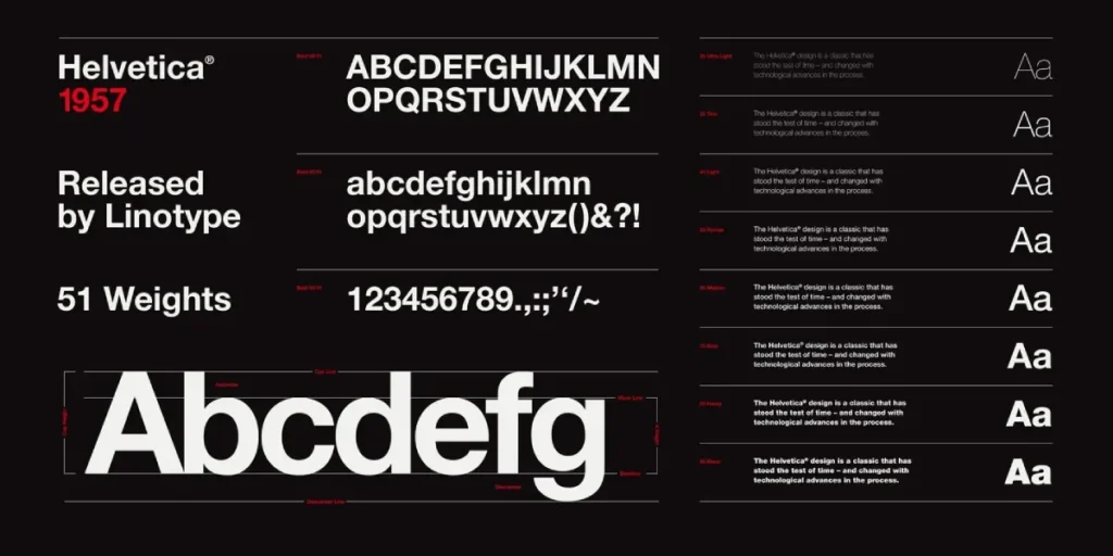
You don't just pick one font. You build a system. This is what separates professionals from amateurs. A good system creates hierarchy, guides the user's eye, and maintains consistency.
It's simple:
- Your Headline Font (H1, H2): This is your “voice” font. It can be your Display, Slab Serif, or a bold version of your primary font. Its job is to grab attention and state the main idea.
- Your Body Font (Paragraphs): Your “workhorse” font. Its job is to be read. It must be highly readable. This is often a simple Serif (like Garamond, Merriweather) or Sans-Serif (like Open Sans, Inter, Roboto).
- Your Accent Font (Buttons, Quotes): Sometimes you have a third font for small, specific uses. Often, this is just an italic or bold version of your body font.
The Art of Font Pairing
This is where most people get it wrong and create the “ransom note” effect.
- The Easiest Rule (Can't Go Wrong): Don't pair different fonts. Just use one font family that has many different weights. Use the Bold or Black weight for headlines and the Regular weight for body text. This is called a “superfamily.” It's professional, clean, and impossible to mess up. (e.g., Using Montserrat Bold for headlines and Montserrat Regular for text).
- The Classic Rule (Contrast): If you must pair, pair fonts that are very different. The classic combo is a strong Serif Headline with a clean Sans-Serif Body, or vice versa. The contrast creates a clear hierarchy.
- The Bad Rule (What Amateurs Do): Never pair two similar fonts. Don't pair two different scripts. Don't pair two different “techy” sans-serifs. The tiny differences create a vibrating, uncomfortable visual tension. It just looks like a mistake.
Typography in branding is about creating a deliberate, consistent system. Stick to two font families. Maximum.
The Business of Fonts: Licensing, Cost, and Where to Find Them
Here's the part that can get you sued.
You can't just download a “cool font” from a random website and use it for your business. Fonts are software, and they have licenses. Using a font without the correct license is software piracy.
- Free Fonts (e.g., Google Fonts, Font Squirrel):
- Pros: They are free for commercial use, web-safe, and have a huge library. They are the workhorses of the internet.
- Cons: They can be overused. Using Open Sans or Montserrat won't make you stand out, though it will make you look professional.
- Paid Fonts (e.g., Adobe Fonts, MyFonts.com, Commercial Foundries):
- Pros: You get something more unique and exclusive. They often have more weights, styles, and features, giving you a richer brand toolkit.
- Cons: They cost money. And licensing can be a nightmare.
- Custom Fonts (e.g., Google's Product Sans, Netflix's Netflix Sans):
- Pros: 100% unique to your brand. Becomes a priceless brand asset.
- Cons: Costly. We're talking $50,000 – $500,000+ for a global brand, not for small businesses.
Read the License!
This is the most crucial takeaway. A “Desktop License” lets you install the font on your computer to design a logo or a print brochure. A “Web License” enables you to embed the font on your website (and you often pay based on monthly pageviews). An “App License” lets you embed it in a mobile app.
These are not interchangeable. Using a font you bought for your logo on your website without a web license is a breach of contract and can lead to hefty fines. When in doubt, stick to Google Fonts or have a designer handle it.
My Typographic Sin Sheet: 7 Mistakes That Scream ‘Amateur'
I've put my biggest frustrations into a simple checklist. If you're guilty of these, you're signalling “amateur” to every potential customer.
The Typographic Sin Sheet
| The Sin | Why It's Bad | The 2-Minute Fix |
| 1. The Ransom Note | Using 4+ different fonts. It's chaotic, confusing, and shows you have no cohesive brand strategy. | Stick to two font families. Max. One for headlines, one for body. Or just use one superfamily. |
| 2. The Unreadable Script | Your “elegant” script font is unreadable on a mobile phone or by anyone over 40. | Test on a real phone. If you have to zoom or squint, scrap it. Use scripts for accents only, not for information. |
| 3. The ‘Default' | Use Times New Roman, Arial, or Calibri. | These fonts don't say “professional”; they say “I didn't bother to change the default setting in Microsoft Word.” |
| 4. Stretching & Distorting | Squashing or stretching a font to “make it fit” a box. | This is a design crime. It destroys the font's proportions and looks horribly unprofessional. |
| 5. Bad Kerning | The spacing between letters is all wrong. The classic is ‘r' and ‘n' merging to look like ‘m' (e.g., ‘burn' looks like ‘bum'). | It makes your text look sloppy and can be genuinely hard to read. |
| 6. The “All-Caps” Paragraph | WRITING FULL PARAGRAPHS OF TEXT IN ALL CAPS BECAUSE YOU THINK IT'S EMPHATIC. | IT'S NOT EMPHATIC; IT'S ANNOYING. IT'S THE VISUAL EQUIVALENT OF SHOUTING AND 10-15% SLOWER TO READ. |
| 7. Poor Contrast | Light grey text on a white background. Or dark blue text on a black background. | You're making your customers work to read your message. It fails accessibility standards (WCAG) and will drive users away. |
If your brand is guilty of more than two of these, you're not just looking amateurish; you're actively creating friction for your customers.
If you're stuck in this mess, don't guess. It's time to fix it professionally. Request a quote, and let's get your brand's voice sorted.
The Next Step: How to Actually Choose Your Brand Fonts
Okay, here's your practical, step-by-step process—no design degree required.
Step 1: Define Your Brand Adjectives
Forget fonts for a minute. Write down 3-5 adjectives that describe your brand's personality. Not your personality, your brand's. Are you “Reliable, Traditional, Secure”? Or “Fun, Quirky, Modern”? Or “Elegant, Luxurious, Refined”?
Step 2: Look at Your Competitors
Go to your top 3 competitors' websites. What fonts are they using? (You can use a browser extension like “WhatFont” to identify them). Are they all using the same “techy” sans-serif? Are they all using a “classic” serif? Find the pattern.
Step 3: Find the Gap
Now, how can you differentiate? If everyone in your space uses a cold, corporate sans-serif, a warm, approachable serif (like Merriweather), or a clean, modern slab-serif, it will make you stand out as more human and established. Don't copy. Find your own lane.
Step 4: Test Your Adjectives
Go to Google Fonts. You can type your brand name and filter by category (Serif, Sans-Serif, etc.). Find 3-4 fonts that feel like the adjectives you wrote in Step 1.
Step 5: The “Word” Test
Type your brand name. Now type a complete sentence, like “We make high-quality products for smart people.” Look at it.
- Look at it big (as a headline).
- Look at it small (as body text).
- Look at it in bold and italics.
- Most importantly: Look at it on your phone.
Does it hold up? Does it still feel like your adjectives? Does it feel trustworthy? Is it easy to read?
This process—moving from abstract adjectives to a tangible, tested font system—is the core of what we do. It's not just ‘picking fonts'; it's strategic design. This is where professional brand identity services become an investment, not an expense.
Your Voice is Your Business
Your typography is working for you or against you every single day.
It's not just “text.” It's the first impression. It's the silent communicator of your brand's core values. It's telling your customers if you're a trustworthy expert, a cheap amateur, a cutting-edge innovator, or a friendly local shop.
Stop letting a lazy, default font choice define your business. Start treating your typography with the same seriousness you treat your balance sheet. Because, in the end, one absolutely affects the other.
Your brand's voice is too important to leave to chance.
If you're ready to build a brand that speaks to the right customers in the right voice, Inkbot Design is where you start. Explore our brand identity services to see how we build brands that mean business. Or, if you want to dive deeper, check out our other posts on branding and design.
FAQs on Typography in Branding
How many fonts should I use for my brand?
Two font families, maximum. A common and safe approach is one for headlines and one for body text. Even better? Use one “superfamily” (a font with many weights like light, regular, bold, black) and use the different weights for hierarchy.
What's the difference between legibility and readability?
Legibility is about the design of individual letters. Can you easily tell ‘c' from ‘e'?
Readability is about the comfort of reading a block of text. This is affected by font size, line height, and line length.
What is a serif vs. a sans-serif font?
Serif fonts have small “feet” or lines attached to the ends of the letters (e.g., Times New Roman). They feel traditional, authoritative, and classic.
Sans-serif fonts do not have these feet (“sans” means “without”). They are clean, modern, and simple (e.g., Arial, Helvetica).
Can I just use a free Google Font for my logo?
You can, but be aware that thousands of other businesses are likely using that same font. Creating a unique, memorable, and protectable brand makes it much harder to create. It's excellent for web body text, but a paid or custom font is better for a logo.
Why is a font like Comic Sans so hated?
Comic Sans is “hated” by designers because it's often misused. It's a “casual” font designed for a specific, informal context (like comic book speech). When it's used for a business proposal, a doctor's warning, or a legal document, the tone of the font completely mismatches the message.
What is a “font license”?
A font is software. A license is a legal agreement that permits you to use the software. You need different licenses to use a font on your website (web license), in a logo (desktop license), or in an app (app license).
Is it worth paying for a font?
If it's the perfect font to express your brand's unique personality and helps you stand out from competitors, then yes. It's a one-time investment in a core brand asset.
What's the most important thing to test when choosing a font?
Readability on a mobile phone. Your “elegant, thin” font might look great on your 27″ desktop, but it could be completely unreadable on a 5″ screen in a bright room, where most customers will see it.
What is “typographic hierarchy”?
It's a system for visually organising your text to guide the reader's eye. It tells them what's most important (your H1 headline, which is big and bold), what's secondary (your H2 subheadline), and what's the main content (your body text).
My font looks “squashed.” How do I fix it?
You've likely distorted it to “make it fit” a box. Never do this. It's a cardinal sin of design. Instead, use a “Condensed” version of the font family or rewrite the shorter text.


