
25 Famous Fitness Logos: What Works, What Doesn’t, and Why
Stop what you’re doing. If you’re about to launch a fitness brand and your logo folder contains anything that looks like a flexing bicep, a generic kettlebell silhouette, or a featureless humanoid mid-stride, delete it. Now.
We need to talk.
Most articles that list “famous logos” are just digital scrapbooks. They show you the picture, state the obvious, and move on. It’s visual junk food. This is not one of those articles.
This is a breakdown of the strategic thinking—the good, the bad, and the brutally effective—behind 25 of the most recognisable fitness logos on the planet.
We're not here to admire the pretty pictures. We're here to dissect what works, what doesn't, and what you, as an entrepreneur, can steal for your own brand.
The goal isn't to copy them. It's to understand the why behind them.
- Avoid clichés: Generic icons like dumbbells hinder brand recognition; opt for abstract concepts or unique designs instead.
- Emphasise core values: A logo should reflect your brand’s identity and resonate with your target audience’s aspirations.
- Focus on simplicity: A memorable logo is clean, scalable, and effective across various platforms, reinforcing brand visibility.
The Core Conflict: Why Most Fitness Logos Fail
The fitness industry is pathologically addicted to clichés. The temptation to pick a logo that screams “WE DO FITNESS!” is immense. A dumbbell icon feels safe. A heart-rate line feels relevant. An abstract running man feels energetic.
They also feel completely, utterly forgettable.
This is the trap of generic invisibility. By trying to appeal to everyone with a prominent symbol, you create a brand that excites no one. Your logo becomes white noise in a deafeningly loud market.
The logos that cut through the noise don't just say “fitness.” They are built on three pillars:
- Simplicity: They can be drawn from memory. They are clean, clear, and instantly recognisable.
- Story: They represent a core idea or a feeling, not just a physical object or action.
- Scalability: They look as good on a giant billboard as a tiny app icon on your phone.
Let's see these principles in action.
Part 1: The Titans of Apparel – Selling an Idea, Not Just Clothes
Apparel brands don't sell cotton and spandex; they sell aspiration. Their logos are symbols of an identity their customers want to adopt.
1. Nike: The Power of an Abstract Symbol
The “Swoosh” is perhaps the most famous logo on this list. Designed in 1971 for a mere $35 by student Carolyn Davidson, it represents the wing of the Greek goddess of victory, Nike. More importantly, it conveys fluid motion and speed without showing a single person or product. It’s a feeling, distilled into a single, perfect mark.
The Takeaway: You don't need a literal image. A simple, abstract shape can carry immense meaning if backed by a powerful brand.
2. Adidas: The Legacy of Three Stripes
The three stripes are constant, whether classic “Trefoil” or the modern slanted bars. They began as a functional element to provide stability on the shoe but evolved into an unmistakable brand identifier. The logo works because of its relentless consistency over decades.
The Takeaway: A simple, geometric element, repeated consistently, can become a world-famous identifier.
3. Under Armour: Aggressive & Symmetrical
The intertwined U and A perfectly symbolise strength and protection—”Under Armour.” It's symmetrical, aggressive, and almost weapon-like. It visually communicates performance and durability, which aligns perfectly with the brand's original promise to athletes.
The Takeaway: Look for ways your brand name's initials can be combined into a powerful, symbolic mark.
4. Lululemon: The Controversial ‘A’
Many people see the stylised ‘A' of “Athletically Hip,” the company's original name. Others see the Greek letter Omega. The logo's strength is its soft, fluid shape, perfectly reflecting the yoga-inspired movement it is built on. It feels premium and feminine without being patronising.
The Takeaway: Your logo’s shape should echo the feeling of your product or service—hard lines for intensity, soft curves for flow.
5. Reebok: The Delta of Change
Reebok has had several logos, but its shift to the Delta symbol in 2014 was significant. The three sides represent the physical, mental, and social changes that happen through fitness. It’s a mark that attempts to tell a deeper story about transformation.
The Takeaway: A logo can represent your brand’s philosophy, not just its name.
6. Puma: A Leap of Faith
It’s a silhouette of a leaping puma. Simple. Direct. It’s one of the few literal animal logos that works flawlessly because it embodies the exact attributes the brand wants to project: speed, agility, and predatory grace.
The Takeaway: If you use a literal symbol, make sure it is a perfect metaphor for your brand's core values.
7. Gymshark: The Modern Icon
The aggressive, stylised shark head is a masterclass in modern branding. It's edgy, instantly recognisable, and speaks directly to a younger generation of serious gym-goers. It feels less like a corporate logo and more like the insignia for an exclusive club.
The Takeaway: Don't be afraid to create a logo with attitude if your target audience can handle it.
Part 2: The Gyms & Studios – Building a Tribe
A gym logo isn't just a sign on a door. It's the badge of a community. It must represent the experience and the type of person who trains there.
8. Gold’s Gym: The Old School Original
The “Muscle Man” logo is a piece of fitness history. Designed in the 70s, the simple line art of a bald weightlifter is iconic. It’s unapologetically old-school and represents the brand’s heritage as a no-frills bodybuilding mecca. While it might look dated, its legacy gives it unmatched authority.
The Takeaway: A logo authentically representing your niche and history can become an untouchable classic.
9. Equinox: Luxury in Typography
There is no symbol. There is no icon. Just the word “EQUINOX” in a custom, high-contrast sans-serif font. The “O” is often used as a standalone mark. It’s clean, premium, and confident. It says “we are an exclusive, high-end experience,” and the price tag confirms it.
The Takeaway: A well-chosen wordmark can convey more luxury and confidence than any symbol. It's often the best choice for a premium brand.
10. Planet Fitness: Approachable & Unintimidating
The purple and yellow colour scheme, the friendly bubble font, and the planet-ringed thumb in the “Judgement Free Zone” logo all work together to scream “safe” and “non-threatening.” It’s the antithesis of the hardcore gym aesthetic, and that’s precisely why it’s so successful.
The Takeaway: Your logo should welcome your ideal customer and, just as importantly, gently repel those who aren't a good fit.
11. CrossFit: The Brand as a Warning Label
The CrossFit wordmark is bold, condensed, and often contained within a box. It looks less like a brand and more like a stamp on industrial equipment. It feels raw, functional, and devoid of fluff—a perfect visual match for the high-intensity, back-to-basics methodology.
The Takeaway: A purely typographic logo with an industrial feel can communicate intensity and a no-nonsense approach.
12. Orangetheory Fitness: The Science of the Splat
The orange “splat” logo represents the burst of energy and post-workout “afterburn” central to their scientific sales pitch. It's abstract but memorable, and the single-colour focus makes the brand instantly recognisable across all marketing.
The Takeaway: Tying your logo to your unique selling proposition (USP) creates a powerful mental link for customers.
13. F45 Training: Functional & Formulaic
The “F” within the shield-like mark is simple and athletic. The logo for F45 (Functional 45 minutes) is as direct and systematic as the workouts themselves. It feels like a sports team emblem, fostering community and shared effort.
The Takeaway: A logo that resembles a team crest can be highly effective for building a tribe-like community.
14. Barry's: Red Room Urgency
Formerly Barry's Bootcamp, the simple, bold, sans-serif wordmark is often rendered in red or white. The key is the context: the chevron (>) and the association with the “Red Room.” The brand's identity is more about the atmosphere, and the logo is a clean, confident stamp on that experience.
The Takeaway: Sometimes the logo's job is to get out of the way and let the brand experience do the talking.
Part 3: The Equipment & Tech – Performance in Plain Sight
A logo must communicate precision, reliability, and innovation for hardware and software.
15. Peloton: The Mark of Motion
The wordmark is clean, but the “P” is often used as the icon. Its shape cleverly forms a bike pedal and a circle of motion, representing the cyclical nature of the workout and the community. It’s a simple, innovative, and scalable mark.
The Takeaway: A great logo often has a clever “aha!” moment hidden within its design.
16. Rogue Fitness: Industrial Strength Wordmark
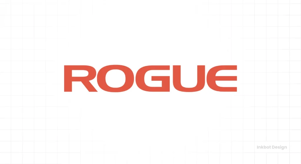
No symbols needed. The thick, stencil-style wordmark for Rogue is all about heavy-duty, industrial strength. It looks like it was spray-painted onto a shipping container full of barbells. It perfectly captures the brand's position as a serious, American-made strength equipment supplier.
The Takeaway: The character of your font choice alone can tell your entire brand story.
17. Fitbit: The Data Dot
The modern Fitbit logo uses a simple, friendly wordmark. The key element is the “dot” pattern often accompanying it, representing the data points it tracks. The new logo's upward-pointing caret (^) signifies improvement and progress.
The Takeaway: Your logo can incorporate elements that hint at the data or technology behind your product.
18. Bowflex: The Engineering of Fitness
The Bowflex logo has evolved but has always centred on a bold, somewhat futuristic wordmark. The name combines “bow” and “flex,” and the logo's sharp angles and clean lines juxtapose its equipment's engineered, mechanical nature.
The Takeaway: A logo for a technical product should feel engineered and precise.
19. WHOOP: Clean, Confident Typography
Like Equinox, WHOOP relies on an all-caps, custom wordmark. It’s straightforward. The brand is about data and performance optimisation for serious athletes. The logo doesn't need to be flashy; its confidence comes from its stark simplicity. It says “we are the data,” and that's all that matters.
The Takeaway: A minimalist wordmark is often the strongest choice when your product is the hero. A professional logo design can make all the difference in achieving this effect.
Part 4: The Fuel – Trust, Science, and Simplicity
Supplement and nutrition logos must convey efficacy, safety, and scientific credibility.
20. Myprotein: The Sharp Form
The Myprotein logo uses a bright, vibrant colour palette and a sharp, geometric M form. Paired with a clean, uppercase wordmark, it feels modern, accessible, and less intimidating than many hardcore supplement brands.
The Takeaway: Abstract shapes and bright colours can make a brand feel more accessible and lifestyle-oriented.
21. Optimum Nutrition: The Gold Standard
The “ON” monogram, often rendered in gold, is paired with a strong wordmark. The brand's key product is “Gold Standard 100% Whey.” The logo directly reinforces the product name and the idea of premium quality and market leadership. It’s a seamless link between brand identity and flagship product.
The Takeaway: If your brand name or product has a strong visual hook (“Gold”), use it directly in your logo.
22. GNC: The Outdated Pill
General Nutrition Centers' three-letter logo is recognisable due to its ubiquity in malls across America. However, the design, often contained in a pill-like shape, feels dated. It's a classic example of a legacy brand whose logo is known through sheer presence, not design excellence.
The Takeaway: Recognition does not equal quality. A dated logo can signal a dated brand, which can be a significant liability.
23. Legion Athletics: A Lesson in Clarity
Legion uses a strong, modern serif font. It feels more like a financial institution or a university than a supplement company. This is intentional. The brand is built on scientific transparency and no-nonsense formulas. The logo communicates stability, authority, and trust—precisely what consumers want from their supplements.
The Takeaway: Defy your industry's design trends to stand out. If everyone uses futuristic fonts, use a classic one to signal trust.
Part 5: The Challenge – An Identity Forged in Mud
For event-based brands, the logo is a medal. It’s a badge of honour that participants wear with pride.
24. Spartan Race: The Helmet of Hardship
The logo is a Spartan helmet. It's literal, powerful, and instantly communicates everything the brand stands for: toughness, discipline, and overcoming brutal obstacles. Participants get this logo on t-shirts and medals, turning them into walking billboards for the brand’s ethos.
The Takeaway: For a lifestyle or event brand, create a logo that people proudly wear to symbolise their achievement.
25. Everlast: The Choice of Champions
A classic. The sturdy, no-nonsense wordmark with the arrow-like element on the ‘E' is synonymous with boxing. It's bold and enduring. The logo doesn't need a major overhaul because it perfectly reflects the brand's core attributes: durability and heritage. It feels like it belongs in a black-and-white photo of Muhammad Ali.
The Takeaway: A timeless wordmark can outlast any trend, building immense brand equity over generations.
Key Takeaways: What Your Fitness Logo Actually Needs
Scrolling through these 25 logos reveals a few powerful, recurring truths. If you're designing a logo for your fitness business, forget the trends and focus on these principles.
Ditch the Clichés
Not one of the truly iconic brands on this list uses a generic bicep or dumbbell. They use abstract concepts (Nike), typography (Equinox), or clever metaphors (Puma) to stand out.
Choose a Lane: Gritty, Premium, or Approachable?
You cannot be all three. Rogue and Gold's Gym own “gritty.” Equinox and WHOOP own “premium.” Planet Fitness owns “approachable.” Your logo is the first signal of who you are. Choose wisely.
Prioritise a Wordmark if You're New
Nike can get away with just a Swoosh because they spent billions making it famous. You haven't. A strong, memorable wordmark is your most valuable asset for a new business. It builds name recognition directly. A symbol can come later.
Ensure It Works Everywhere
Your logo will live on your website, your Instagram profile picture, your staff's t-shirts, and maybe even the end of a dumbbell. It must be legible and impactful at every size, in full colour and, crucially, in plain black and white.
Don't Settle for a Generic Identity
Your logo is not just a decoration; it is a strategic tool.
It's the face of your business, the first impression you make, and a symbol of your promise to your clients. A cheap, generic logo communicates an inexpensive, generic business.
Investing in a professional, thoughtful design process is one of the highest-leverage decisions you can make in the early days of your brand. It forces you to understand who you are and who you serve.
If you’re ready to build a brand that stands out instead of blending in, it might be time to talk to professionals. Look at the process behind a professional logo design and see what goes into creating a truly effective brand identity.
Frequently Asked Questions About Fitness Logos
What is the best type of logo for a new gym?
A strong wordmark (a logo based on the gym's name) is often the best starting point for a new gym. It builds name recognition directly. You can pair it with a simple symbol, but the name should be the hero until your brand is well-established.
What colours are best for a fitness logo?
Colours like orange, red, and yellow convey energy and passion. Black, grey, and metallics can feel premium, industrial, and serious. Blues and greens can feel more focused on wellness and health. The right choice depends entirely on your brand's target audience and personality.
Should my logo include a fitness symbol like a dumbbell?
It's generally advised to avoid overly literal and cliché symbols like dumbbells, flexing arms, or heart-rate lines. They are overused and will make it difficult for your brand to stand out. Focus on a unique concept that reflects your brand's specific mission.
How important is the font in a fitness logo?
Typography is critical. A thick, bold, industrial font (like Rogue's) communicates strength and grit. A clean, minimalist sans-serif font (like Equinox's) communicates luxury and modernity. The font choice alone can define your brand's entire personality.
What makes a fitness logo memorable?
Simplicity is the key to memorability. A simple, clean, and clever design is much easier for the human brain to recall than a complex and detailed one. Think of the Nike Swoosh or the Lululemon symbol.
Can I design my own fitness logo?
While it's possible with online tools, it's often a mistake. Professional designers don't just draw a picture; they engage in a strategic process to create a unique and compelling brand asset that works across all platforms. A poorly designed logo can make a business look amateurish.
What is the difference between a gym logo and a fitness apparel logo?
A gym logo must represent a physical space and community—a “badge” for a tribe. An apparel logo must be more of a fashion statement—something people want to wear to project an identity. Apparel logos often need to be simpler to work well on clothing.
How much does a professional fitness logo cost?
The cost can vary dramatically, from a few hundred to thousands of pounds or dollars. The price depends on the designer's experience, the project's scope, and the strategic process's depth. It should be viewed as an investment in a core business asset.
My business has a long name. How can I make a good logo?
If you have a long name, you have a few options: create a strong wordmark with excellent typography, develop an acronym or monogram (like “ON” for Optimum Nutrition), or create a distinct symbol that can eventually stand on its own once the brand is established.
How often should I update my fitness logo?
You shouldn't need to update it often if it's well-designed. A classic, timeless logo can last for decades. A brand refresh might be required every 7-10 years to modernise slightly, but constant significant changes will destroy brand recognition.
Your brand deserves more than a cliché. If you're tired of blending in and ready to build a powerful, memorable visual identity, it's time to get a professional perspective. Request a no-obligation quote from Inkbot Design today and see how a strategic design process can transform your business.

