Business Stationery Essentials: A Guide for Entrepreneurs
A physical piece of paper has power in a world of fleeting DMs, disappearing stories, and transient browser tabs. It has weight. It lasts.
Yet most businesses treat their stationery—business cards, letterheads, invoices—like a chore. It’s an afterthought, a box to be ticked off with the cheapest, quickest template available.
That’s a critical error.
This isn’t about being nostalgic or old-fashioned. It’s about creating tangible proof that you’re a serious operation. It’s about a physical handshake in a digital world. This guide tells you what you need to look like you mean business.
- Stationery is a tangible brand touchpoint that signals professionalism and permanence in a digital-heavy world.
- Master four core items: business card, letterhead, envelope, and compliment slip for consistent brand legitimacy.
- Design fundamentals—hierarchy, readable typography, ample white space, and strict consistency—are non-negotiable.
- Use proper materials, correct print settings (CMYK, bleed), and vector logos; favour local printers for quality control.
Why Does Stationery Still Matter in 2026?

Many will tell you it’s a dead art. That everything is digital. They’re missing the point entirely. The less physical mail we get, the more impact a high-quality, branded envelope has when it lands on a desk.
It’s a Physical Handshake in a Digital World. An email can be deleted with a click. A website tab can be closed and forgotten. But a well-designed business card or a weighty letterhead sits on a desk. It gets picked up. It gets felt. This tangible quality gives your brand a permanence that digital interactions can’t replicate.
It Screams “Professional” (Or “Amateur”) The difference between a proposal printed on a crisp, 120gsm letterhead with a beautifully printed logo and one run off on flimsy copy paper with a pixelated header is staggering. One says, “We are meticulous and successful.” The other says, “We’re cutting corners.” Your potential clients notice, even if only subconsciously.
The Unspoken Legitimacy Factor. There is an inherent authority to an official-looking document. A contract, an invoice, or a formal letter presented with a professional, cohesive brand identity carries more psychological weight. It builds trust and signals that you are an established, legitimate entity.
It Reinforces Your Brand, One Piece at a Time. Apple doesn’t spend billions on branding only to ship its $3,000 laptop in a plain brown box. The unboxing experience, documentation, and simple getting-started card are all part of the same brand story. Your stationery does the same job on a smaller scale. Every piece is a touchpoint that reinforces who you are.
The Non-Negotiable Stationery’ Core Four’ for Any Serious Business
Before thinking about gold foil or die-cut shapes, you must master the basics. These are the four pillars of any professional stationery suite. Get these right, and you’re 90% of the way there.
1. The Business Card: Your Pocket-Sized Ambassador

Remember the business card scene in American Psycho? The obsession over “bone” colouring and “Silian Rail” typeface? It’s a satire, of course, but it taps into a fundamental truth: people notice the details.
Its Real Job: A business card’s primary job is not to be a Rolodex entry. It’s to make a first impression and be a physical reminder of your conversation. It should feel good in the hand and be effortless to read.
The “Kitchen Sink” Card: This is my number one pet peeve. Cramming every possible information onto a 3.5 x 2-inch rectangle—multiple phone numbers, a fax number (in 2026!), every social media handle, a QR code, and a list of services. It looks desperate and cluttered. It screams, “I don’t know what’s important.”
Essential Information Only:
- Your Name
- Your Title
- Company Name & Logo
- One Phone Number
- One Email Address
- Your Website
That’s it. Anything else is noise. Let the card guide them to your website, where all the other information lives.
Design & Material Tips: Stick to a standard size (around 85mm x 55mm in the UK). Use a heavy paper stock—nothing less than 350gsm (grams per square metre). It should feel substantial, not flimsy. And for the love of all that is holy, leave plenty of white space. A crowded design is the visual equivalent of someone who won’t stop talking.
2. The Letterhead: The Official Uniform for Your Words
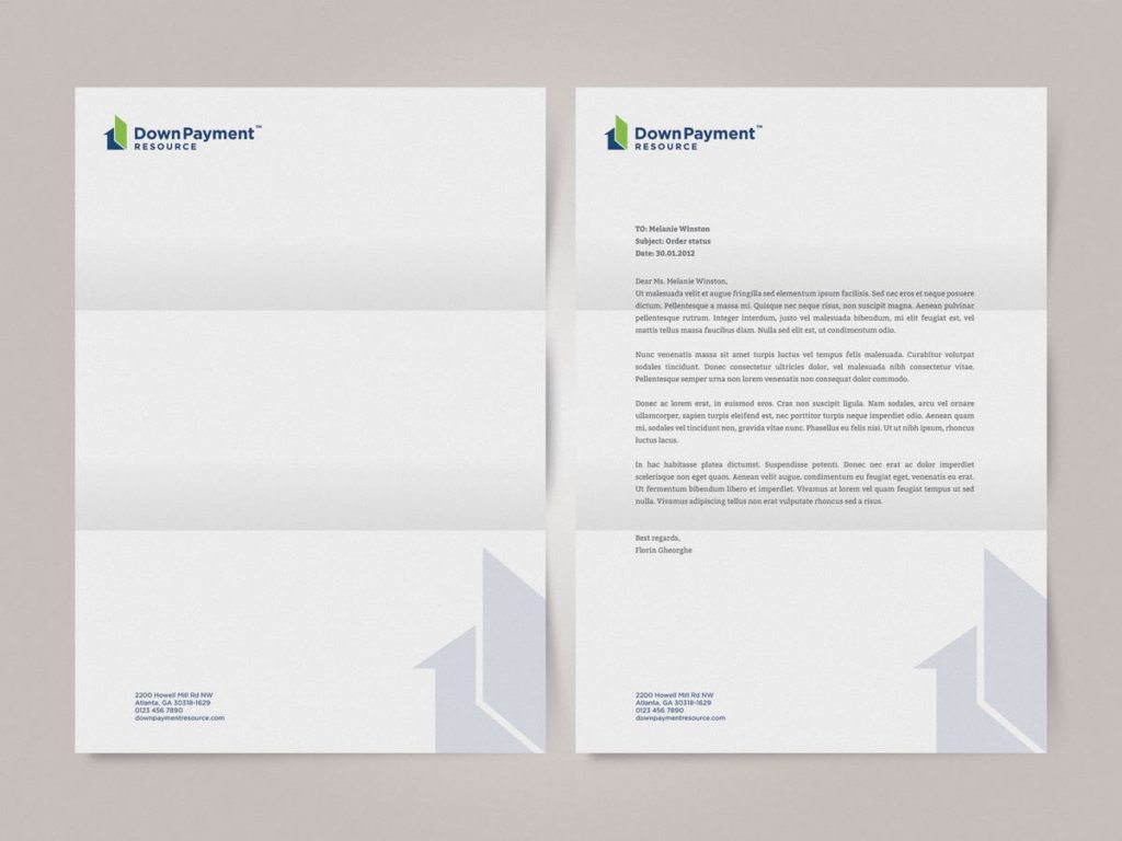
Your letterhead is what turns a simple document into official correspondence. It’s the vehicle for your most important messages: proposals, quotes, contracts, and formal announcements.
Its Real Job: To lend authority and professionalism to your printed communications. It provides a consistent framework that makes your documents instantly recognisable and credible.
The Microsoft Word 97 Look: You’ve seen it. A fuzzy logo squashed into the header and some generic blue text in the footer, all created with WordArt. This instantly devalues whatever message is printed on the page. It’s the business equivalent of showing up to a board meeting in a stained t-shirt.
Essential Information to Include:
- Company Logo & Name
- Physical Address (or at least City/Country)
- Website & Email
- Phone Number
- Company Registration and/or VAT Number (often a legal requirement in the footer)
Design & Material Tips: Use a high-quality paper, typically 100-120gsm, that feels better than standard printer paper. It must also be uncoated to run through a desktop printer without smudging. The design should be clean, unobtrusive, and perfectly consistent with your business card.
3. The Envelope: The First Thing They Actually See
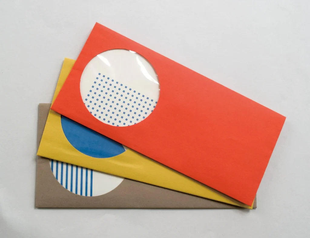
The best proposal in the world is useless if the envelope it arrives in looks like junk mail and gets thrown in the bin. A branded envelope signals that its contents are essential.
Its Real Job: To get your letter opened and to make a professional impression before the recipient has even seen what’s inside.
Essential Information: Keep it minimal. Your company logo and a return address are all you need, usually on the back flap or top-left corner. The front is for the recipient and postage.
Design & Material Tips: The most common sizes are DL (fits A4 folded in thirds), C5 (fits A4 folded in half), and C4 (fits A4 unfolded). The paper stock should ideally match the feel and colour of your letterhead to create a cohesive package.
4. The Compliment Slip: The Polite Corporate Nod
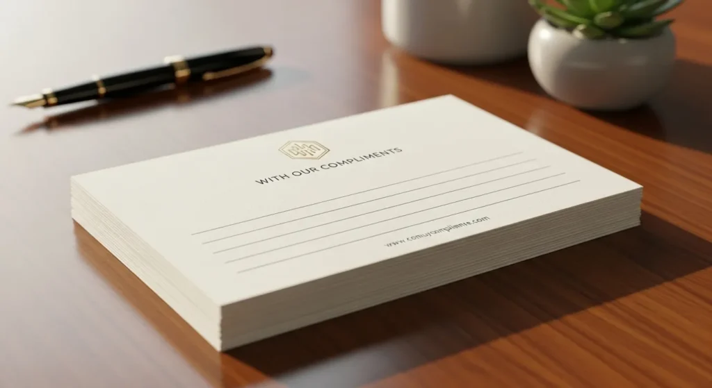
A compliment slip is a small, informal note. It’s less formal than a full letterhead but more professional than a sticky note.
Its Real Job: Add a quick, personal, handwritten touch when sending something impersonal like a brochure, a payment, or a product sample. A simple, “Thanks for your time today!” on a branded slip is a powerful relationship-building tool.
Essential Information: Use the phrase “With Compliments” or something similar, as well as your logo and core contact details.
Design & Material Tips: Usually DL sized (210mm x 99mm), the design’s main feature should be blank space. The entire point is to have room to write. Use a paper stock of around 120-150gsm that is uncoated and easy to write.
Digital Stationery: The Modern (And Often Forgotten) Counterpart
My second major pet peeve is the digital-physical disconnect. A business has a stunning set of printed materials, but its emails and digital documents look entirely different. This jarring inconsistency erodes brand trust. Your brand identity must be seamless.
The Professional Email Signature
Think of your email signature as a digital business card attached to every message you send.
Its Purpose: To provide key contact information in a clean, professional, and consistent format.
What It Needs (And What It Doesn’t):
- Needs: Your Name, Title, Company, Phone, Website Link.
- Doesn’t Need: Inspirational quotes, your life story, or five social media icons. Pick one, if any, that is most relevant to your business (e.g., LinkedIn for a B2B consultant).
The Big Mistake: Using a single, large image file for your entire signature. Many email clients block images by default, leaving your recipient with a big, ugly empty box. Keep the text as live text and use a small, optimised logo image.
Branded Presentation & Proposal Templates

Sending a proposal using the default Microsoft PowerPoint or Google Slides theme is a missed opportunity. It makes your high-stakes document look generic.
Why They Matter: A branded template shows you care about the details. It frames your brilliant ideas within your professional identity, reinforcing your brand from the first slide to the last.
What They Need: You don’t need a complex design. You need a branded title slide, a clean content slide with your logo placed unobtrusively, and a final slide with your complete contact information. Consistent brand fonts and colours are mandatory.
Invoice & Quote Templates
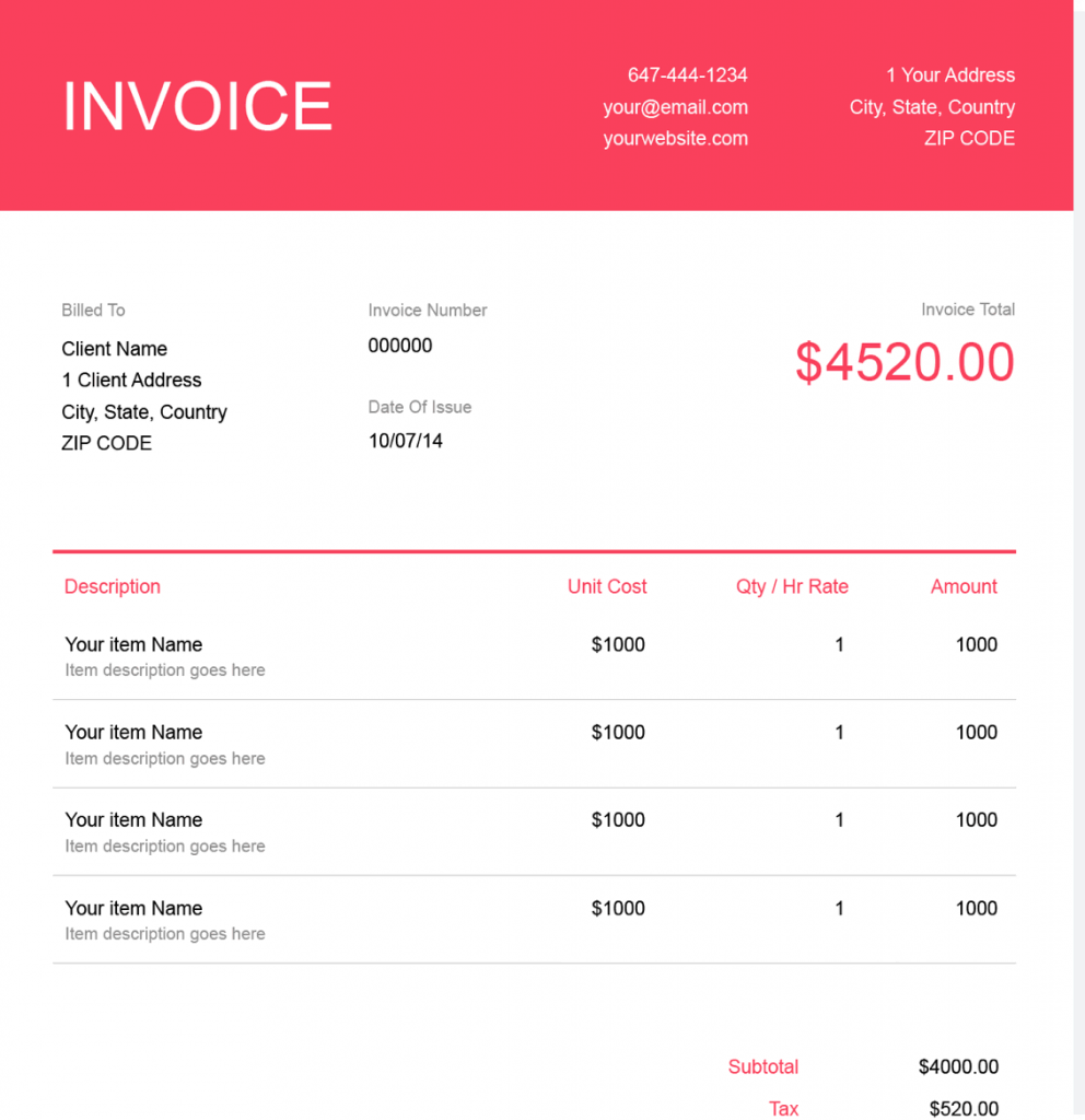
The last brand touchpoint a client often has with you is the invoice. It’s the document they use to pay you. Make it look as professional as the work you did to earn it.
What They Need: A clean, easy-to-read layout that clearly displays your logo, company details, a breakdown of services, the total amount due, and payment instructions. Use a system like Xero, QuickBooks, or FreshBooks to generate professional templates, but ensure you customise them with your brand’s font and logo.
Key Design Principles (Without the Fluffy Art-School Talk)
You don’t need a degree in design to understand what works. These are the four foundational rules.
Hierarchy: Tell Their Eyes Where to Go. The most crucial piece of information should be the most visually prominent. On a business card, that’s your or your company’s name. Use size, bolding, and placement to create a clear path for the reader’s eye. Don’t make everything the same size.
Typography: Don’t Be Boring, But Be Readable. Stick to one or two brand fonts. A “serif” font (with the little feet, like Times New Roman) can feel classic and authoritative. In contrast, a “sans-serif” font (like Helvetica or Arial) feels modern and clean. The key is readability. If it’s hard to read, it’s a bad choice, no matter how “stylish” it looks.
White Space: The Most Important Part of the Design. White space (or negative space) is the empty area around text and images. Amateurs try to fill every millimetre. Professionals use white space to give their design room to breathe. It signals confidence and makes the essential elements stand out. A lack of white space looks cheap.
Consistency: The Boring Rule That Builds Brands. This is the most important rule of all. Your business card’s logo, colours, and fonts must match your letterhead, which must match your email signature and your website. This repetition is what builds brand recognition and trust. Nailing this consistency is the core of any professional stationery design project.
Materials & Printing: Where the Magic (or Mess) Happens

Poor material choices and bad printing can ruin a great design.
Paper Stock & Weight (GSM, Explained)
GSM stands for “Grams per Square Metre.” It’s a measure of paper density and weight. Higher GSM means thicker, heavier paper.
- Standard Printer Paper: 80-90gsm. Flimsy. Avoid.
- Good Letterheads: 100-120gsm. Has a quality feel without being too thick for printers.
- Excellent Compliment Slips: 120-150gsm. Sturdy and nice to write on.
- Professional Business Cards: 350-400gsm. This is non-negotiable. It should feel stiff and substantial, not bend easily.
For paper type, “uncoated” has a natural, matte finish and is best for anything you need to write on. “Silk” or “satin” has a slight sheen and is excellent for making colours pop on business cards.
Fancy Finishes: Use Sparingly, If at All
This is where my third pet peeve comes in: gimmicks before substance. Special finishes like Spot UV (a glossy varnish on specific areas), embossing (raising part of the design), or foil stamping can be beautiful.
But they are seasonings, not the main ingredient.
These finishes only work when they enhance an already excellent, simple design. They cannot fix a bad one. Get your layout, typography, and paper stock right first. Then, consider a subtle finish if it aligns with your brand. Sites like Moo.com have made these finishes accessible, which also means they’re easy to overuse.
Choosing a Printer: Your Local Shop vs. The Online Giants
- Online Printers (Vistaprint, Moo, etc.): They are often cheap and fast, which is great for small budgets and standard jobs. The downside can be inconsistent quality control and limited customisation.
- Your Local Printer: Building a relationship with a local print shop is invaluable. You can see and feel paper samples, get expert advice, and have much better oversight on the final product. It may cost a bit more, but you often get what you pay for in peace of mind.
The Most Common (And Costly) Stationery Mistakes We See

Avoiding these common pitfalls will save you time, money, and embarrassment.
Designing for Screen, Not Print (RGB vs. CMYK) Computer screens create colour with light (Red, Green, Blue – RGB). Printers create colour with ink (Cyan, Magenta, Yellow, Black – CMYK). They are fundamentally different. A vibrant blue on your screen can look like a dull purple when printed if the files aren’t set up correctly in CMYK.
Using a Low-Resolution Logo (The Cardinal Sin). You pull the logo from your website and put it on your business card design. It looks fine on screen, but it’s fuzzy and pixelated when it prints. This is the ultimate mark of an amateur. You must always use a vector version of your logo (.ai, .eps, or .svg file) for print. It can be scaled to any size without losing quality.
Forgetting About “Bleed” If your design has a colour or image that goes right to the edge of the page, you need to extend that design past the trim line. This extra margin is called a “bleed.” The printer prints on oversized paper and then trims it down, ensuring no ugly white slivers are at the edge. Every professional printer requires this.
The “DIY to Save Money” Fallacy: Trying to save a few hundred pounds by designing your own stationery often leads to thousands spent on reprinting, or worse, thousands lost in potential business because your brand looks unprofessional. The simplest way to avoid these exact pitfalls is to invest in professional design. Getting a quote is often the first step to understanding the real value. You can request a quote from our team to see what’s involved.
So, What’s the Takeaway?
Business stationery isn’t dead. It’s a filter.
A tangible, well-executed brand asset gets you noticed in a world overflowing with digital noise. Poor stationery filters you out and marks you as an amateur. Great stationery signals that you are competent, professional, and obsessed with the details that matter.
It’s a physical piece of your brand’s integrity. Please don’t treat it like an afterthought. Treat it like the powerful business tool it is.
FAQs about Business Stationery
What is the most essential piece of business stationery?
For networking, the business card is number one. The letterhead is necessary for official correspondence and building legitimacy—the two work together as the core foundation.
How much does professional stationery design cost?
Costs vary widely based on the designer’s experience and the project’s scope. A basic package (card, letterhead) might start from a few hundred pounds. At the same time, a comprehensive suite with multiple items and brand guidelines will be a larger investment.
Can I use an online template for my business stationery?
You can, but it often looks generic and may not be set up correctly for high-quality printing. A template won’t provide the unique, strategic identity that professional design delivers, making it harder for your business to stand out.
What’s the difference between embossing and debossing?
Embossing creates a raised impression on the paper stock, pushing the design from the surface. Debossing creates a depressed impression, pushing the design down into the paper.
What is the standard business card size?
The standard size in the UK and most of Europe is 85mm x 55mm. In the US and Canada, it’s slightly different at 3.5 inches x 2 inches (approximately 89mm x 51mm).
What information should NOT be on my business card?
Avoid unnecessary clutter. Don’t include a fax number, multiple phone numbers for the same person, a long list of services, or every social media handle you own. Keep it focused.
Why is paper weight (GSM) important?
Paper weight communicates quality. A flimsy, low-GSM business card feels cheap and disposable. A heavy, high-GSM card feels premium and substantial, creating a better subconscious impression.
What is a vector logo, and why do I need one?
A vector file (like .ai, .eps, or .svg) uses mathematical equations to create your logo, meaning it can be scaled to any size—from a business card to a billboard—without losing quality. A pixel-based file (like .jpg or .png) will become blurry and pixelated when enlarged.
Should my digital stationery match my print stationery?
Absolutely. Consistency is key to building a strong brand. The fonts, colours, and logo used in your email signature, invoices, and presentations should be identical to those on your printed materials.
Do I really need a compliment slip?
While not as critical as a business card or letterhead, a compliment slip is an excellent tool for adding a personal touch. For businesses that regularly send out physical products, documents, or samples, it’s a highly recommended and professional addition.
Your stationery isn’t just paper; it’s a proxy for your professionalism. It’s working for you—or against you—long after the meeting.
If you’ve realised your brand’s tangible assets could be working harder, look at our foundational work. Explore our stationery design services to see how a cohesive system can be built. Then, browse the rest of the Inkbot Design blog for more practical branding advice.


