Print Design: 10 Things Every Business Still Needs in 2026
Digital-only brand ecosystems are commercially incomplete; professional services firms that abandon tangible corporate print collateral sacrifice deep cognitive recall and weaken high-value client trust.
When a mid-market UK consultancy or legal practice transitions entirely to digital interfaces, the brand loses its physical permanence in the offices of enterprise buyers.
Relying exclusively on email, PDF downloads, and web applications exposes an organisation to the volatile mechanics of digital ad platforms and crowded email inboxes.
High-value enterprise buyers require tangible validation before entering long-term, multi-million-pound service agreements.
The financial cost of neglecting physical touchpoints is clear. A 2026 market report estimated the global print advertising market at $55.26 billion, up from $53.35 billion in 2025.
This growth confirms that market leaders are reinvesting in physical media to bypass digital saturation. To execute a comprehensive corporate rebrand that protects and scales market share, corporate leaders must build a cohesive physical presence.
Developing a sophisticated brand identity design ensures your organisation projects institutional authority across every physical and digital interaction.
- Maintain premium physical print collateral to create institutional trust and lasting sensory anchors for high-value enterprise clients.
- Use data-driven personalised print and ABM mailers to bypass digital saturation and deliver substantially higher response rates and ROI.
- Enforce production standards: PMS colour matching, premium substrates, and sustainable materials to ensure brand consistency and meet procurement requirements.
What Is Print Design and Its Business Impact?
Print design is the strategic process of planning, structuring, and producing visual content on physical substrates to communicate specific corporate messages, establish brand equity, and drive targeted human behaviours.
Key Components:
- Substrate selection defines the weight, texture, and tactile response of the physical media.
- Typographic architecture establishes readable hierarchies across fixed physical dimensions using precise grid systems.
- Production management governs colour accuracy across Pantone matching systems, finishing treatments, and structural die-cuts.
Corporate print design provides tangible brand assets that establish institutional trust, enhance client recall, and convert high-value accounts via physical touchpoints.
10 Essential Print Design Assets for 2026
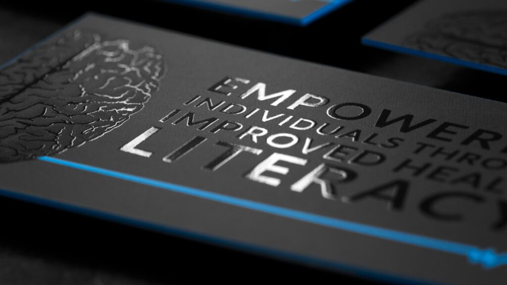
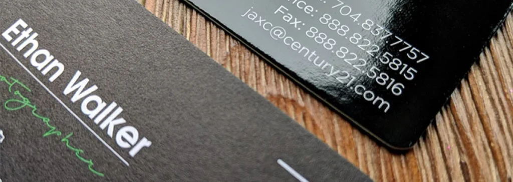
Tactile Executive Business Cards
How do business cards survive in a digital workplace?
Executive business cards establish immediate interpersonal trust during high-level corporate introductions.
When an agency produces an executive card on 600gsm cotton substrate, with duplex bonding and a debossed logomark, the physical object changes the nature of the interaction.
A 2025 report indicated that updating graphic design software and workflows reduced print reruns by 63% through better reproduction accuracy, ensuring that intricate tactile finishes match the digital file exactly.
The physical exchange creates a lasting sensory anchor that digital contact sharing cannot replicate.
High-Value Account-Based Marketing (ABM) Mailers
What drives direct mail success in corporate business development?
Account-Based Marketing mailers deliver highly personalised information to selected enterprise executives. Industry research from 2025 reported that targeted direct mail delivered a 161% return on investment.
These assets use programmatic printing data to address the recipient’s specific market challenges.
Custom-printed packaging ensures the materials reach the executive desk rather than being filtered out by administrative gatekeepers.
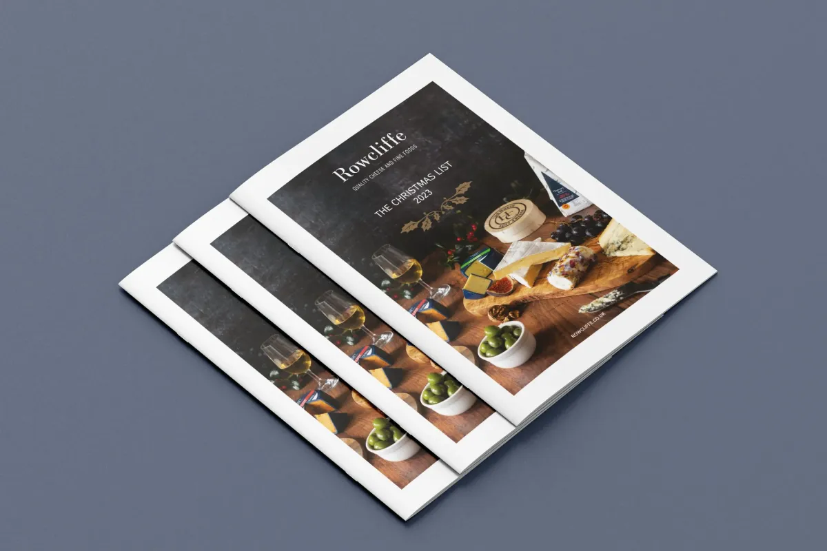
Premium Corporate Capabilities Brochures
Why do buyers still read printed capabilities brochures? Printed corporate brochures provide an uninterrupted reading environment for analysing complex service offerings.
Corporate buyers read physical documents more slowly than they do on digital screens, which improves information retention and comprehension.
Using a heavy cover stock with a soft-touch laminate finish communicates corporate stability and attention to detail. This physical asset remains a vital tool for board-level review sessions during long vendor selection processes.
Physical Brand Guidelines Manuals
How does a physical manual align internal corporate culture?
Printed brand guidelines manuals act as the definitive reference point for internal teams and external partners.
When an organisation distributes a bound, physical edition of its brand principles, the document establishes institutional permanence.
Teams treat physical manuals with greater respect than digital files, leading to better compliance with brand guidelines. This physical anchor ensures consistency across multinational offices during a major corporate rebrand.
Bespoke Client Onboarding Welcome Kits
What reduces buyer remorse after signing a high-ticket contract?
Premium onboarding kits welcome new enterprise clients with carefully curated physical items.
These boxes contain structured project roadmaps, legal agreements, and executive gifts packaged in custom-engineered containers.
Presenting a physical onboarding kit validates the buyer’s financial commitment and sets a professional tone for the upcoming engagement.
This operational step directly improves client retention rates and encourages early-stage referrals.
Institutional Annual Reports and Stakeholder Reviews
How do public and private firms demonstrate transparency? Institutional annual reports communicate financial performance and corporate governance to shareholders and regulatory authorities.
A printed report with a clear editorial layout and high-quality binding reflects corporate transparency and accountability.
The report’s physical weight mirrors the firm’s financial stability. Board members value physical documents for annotation during strategic planning sessions.
Environmental Graphics and Office Wayfinding Systems
Why does spatial design impact client perception during onsite visits?
Office wayfinding systems and environmental graphics display corporate identity across corporate headquarters and regional offices.
Laser-cut acrylic signage, etched glass partitions, and dimensional logomarks transform physical workspaces into branded environments.
Clear spatial typography improves visitor experience while reinforcing market positioning to employees and visiting executives.

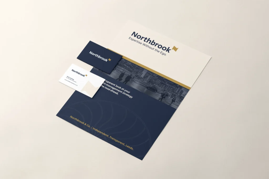
Premium Corporate Stationery and Formal Letterheads
What establishes legal authority in formal business correspondence?
Branded business stationery and letterheads provide the structural framework for contracts, proposals, and official announcements. Using watermarked paper with metallic foil accents elevates everyday communication into an extension of the brand identity.
Recipients treat printed letters with greater urgency than digital notices, thereby speeding up response times for formal documents.
Custom Large-Format Pitch Presentations
How do pursuit teams stand out during competitive bidding scenarios?
Large-format pitch portfolios and physical presentation boards support advisory teams during final shortlist presentations.
Bringing custom-printed display materials into a client boardroom shows thorough preparation and dedication to the account.
These physical boards provide a continuous visual anchor for your core arguments, while slide decks change on-screen.
Special Edition Monographs and Thought Leadership Books
How do professional services firms establish undisputed industry authority? Hardcover thought-leadership books position senior partners as leading experts in their fields.
Publishing a beautifully bound volume of proprietary research sets a consultancy apart from competitors who rely on short blog posts.
Distributing these books at major industry events creates a long-lasting marketing asset that executives keep on their office shelves for years.
“Abandoning physical print design reduces a brand’s presence to a single pixel on a crowded screen. True market authority requires physical presence, structural weight, and sensory engagement to win enterprise contracts.”
The Myth of the Paperless Corporate Rebrand
Corporate leadership teams often transition to digital-only branding to eliminate print logistics and lower immediate production costs.
This strategic move creates digital isolation because digital spaces are increasingly crowded and expensive to occupy.
A 2026 report estimated total US print advertising expenditure at $8.0 billion, demonstrating that leading market actors refuse to cede physical territory to digital-only competitors.
Relying entirely on digital channels dilutes brand equity because digital interfaces lack tactile differentiation.
A standard PDF presentation looks identical regardless of whether it comes from a solo practitioner or a global consultancy. Physical print collateral breaks this digital commoditisation by introducing texture, weight, and craftsmanship into the sales cycle.
Firms must combine their digital applications with premium physical components to build trust with their target audience.
The State of Print Design in 2026
Modern print production relies on targeted personalisation, advanced workflow automation, sustainable material sourcing, and integrated digital connectivity.
The industry has moved away from mass-produced, identical print runs toward highly precise, data-driven outputs. A 2026 industry publication confirmed that personalised direct mail campaigns generate response rates up to 135% higher than static, unpersonalised mailings.
This shift allows professional services firms to match the precise audience targeting of digital advertising within a physical medium.
Recent data from the United States Postal Service (USPS) shows that 68% of consumers are more likely to engage with personalised physical messages than generic mail.
Modern digital printing technologies enable brands to personalise text, imagery, and offers for individual recipients without slowing production.
This capability transforms direct mail from a broad awareness tool into a highly targeted acquisition channel for account-based marketing teams.
Furthermore, updating backend workflows significantly improves the business performance of design agencies and commercial printers. A 2025 global report on print industry workflows found that print businesses that updated their graphic design software were 45% more likely to report higher efficiency.
The same study found that 63% of operators reported that modern software updates reduced print reruns by improving reproduction accuracy across complex substrates.
These technological updates ensure that brand assets translate perfectly from digital design environments to final physical promotional products.
Sustainability has also moved from an optional corporate social responsibility initiative to a core operational requirement.
Modern enterprise procurement teams require print assets to use FSC-certified recycled stocks, vegetable-based inks, and biodegradable finishing laminates. These sustainable choices allow firms to deliver high-end tactile experiences while meeting strict environmental standards.
Print Production Strategies
| Strategic Choice | The Wrong Way | The Right Way | Why It Matters |
| Business Cards | Standard 300gsm silk stock with generic digital print. | 600gsm duplex cotton stock with debossed typography. | Establishes immediate institutional trust during executive meetings. |
| Direct Mail | Generic bulk mail drops are sent to broad mailing lists. | Programmatic personalised mail pieces driven by CRM data. | Delivers a 135% higher response rate by addressing specific buyer challenges. |
| Capabilities Brochures | Low-cost thin paper stocks using standard saddle-stitch binding. | Heavy cover stocks featuring soft-touch lamination and perfect binding. | Projects corporate stability and reflects the premium value of services. |
| Color Standards | Relying on uncalibrated RGB files for commercial printing. | Enforcing strict Pantone Matching System (PMS) colour specifications. | Ensures brand consistency across all global offices and collateral. |
| Sustainability | Using non-recyclable plastic coatings and toxic solvents. | Specifying FSC-certified recycled stocks and vegetable inks. | Aligns corporate values with modern enterprise procurement requirements. |
| Digital Integration | Creating isolated print documents with no digital follow-up. | Adding custom QR codes linked to personalised landing pages. | Increases website visits by 68% and leads by 53% via integrated campaigns. |
Why Relying Only on Digital Weakens Brand Equity
Relying entirely on digital channels dilutes corporate brand equity and separates professional services firms from premium enterprise accounts.
Physical media acts as an institutional trust signal that digital interfaces cannot replicate. This guide demonstrates that print design remains a core strategic pillar for organisations to navigate a major market repositioning phase.
Incorporating high-end tactile touchpoints into your business development strategy directly increases client engagement and establishes long-term market authority.
The global print market expansion to $55.26 billion in 2026 proves that leading organisations continue to value physical collateral.
To protect your market position and eliminate friction in client acquisition, you must audit your physical brand assets alongside your digital platforms.
Review your current client-facing literature to ensure every touchpoint reflects your firm’s expertise.
Identify where your brand presentation falls short of enterprise expectations. Request a free Brand Equity Audit™ at https://inkbotdesign.com/services/brand-audits/ to get a structured diagnostic that identifies exactly where your brand is losing commercial ground and what to do about it.
Why Print Design Remains Relevant in 2026
Why is print design still relevant for businesses in 2026?
Print design provides physical brand touchpoints that digital channels cannot replicate. It creates a lasting sensory anchor that bypasses digital noise and builds trust with high-value enterprise clients.
How does print collateral support a digital marketing strategy?
Coordinating print and digital channels increases campaign performance. Industry data shows that combining targeted direct mail with digital campaigns increases response rates by 63% and website traffic by 68%.
What paper weight is recommended for premium business cards?
Premium executive business cards should have a minimum weight of 600 gsm. Using duplex-bonded cotton stocks provides a distinct tactile feel that signals institutional quality.
What is the ROI of direct mail campaigns for B2B firms?
Direct mail campaigns achieved an average return on investment of 161% according to 2025 marketing reports. Response rates average 3.63%, rising to 4.67% during peak seasonal campaigns.
How can a business ensure colour consistency across print and digital media?
Firms must establish strict Pantone Matching System specifications within their brand guidelines. This step ensures accurate colour reproduction across different printing substrates and fabrication methods.
What are the environmental requirements for print design in 2026?
Modern print production requires FSC-certified recycled substrates, vegetable-based inks, and biodegradable laminates. These components allow brands to create premium physical items while meeting environmental standards.
How does personalised direct mail compare to standard mailings?
Personalised direct mail generates response rates up to 135% higher than static mailings. Incorporating data-driven personalisation improves consumer engagement and response rates.
What is the purpose of an enterprise capabilities brochure?
A printed capabilities brochure provides an uninterrupted reading experience for reviewing complex services. It serves as a permanent reference document for board members during procurement evaluations.
Why should corporate guidelines be printed?
Printing your brand guidelines manual establishes internal alignment and cultural permanence. Internal teams achieve higher compliance with physical manuals than with digital documents.
How do environmental graphics affect corporate offices?
Environmental graphics and office wayfinding systems turn physical workspaces into branded environments. They improve the on-site client experience and reinforce corporate identity to employees.
What is the definition of print-on-demand market growth?
The global print-on-demand market was valued at $8.16 billion in 2025 and is projected to reach $19.8 billion by 2029. This growth highlights the increasing enterprise demand for flexible print production.
