Successful Logo Design in 15 Simple Steps
Look, most logos are forgettable.
They’re slapped together, overcomplicated, or so generic that they could belong to any random business. And guess what? A weak logo costs you customers before they even give you a chance.
Think about the brands you remember—Nike, Apple, McDonald’s. Their logos aren’t just images; they’re triggers. Instant recognition. Instant trust. Instant authority.
But here’s the thing: designing a successful logo isn’t about being a world-class artist or spending a fortune. It’s about understanding what works. And I will show you exactly how to do it—in 15 simple, no-fluff steps.
By the end of this, you won’t just have a logo. You’ll have a brand asset that grabs attention, builds trust, and makes your business impossible to ignore. Let’s get to work.
- Simplicity is paramount; effective logos have minimal elements for easier recognition and versatility across sizes.
- Memorable logos involve unique shapes, vibrant colours, and evocative imagery to enhance brand recognition.
- Visual impact can be boosted through bright colours, bold fonts, and clever use of negative space.
- Utilise colour psychology to shape perceptions; each colour conveys specific emotional associations that connect with consumers.
- Your logo should represent your business meaningfully, using relevant symbols and unique identities for lasting connections.
- 1. Simplicity is Key
- 2. Make it Memorable
- 3. Ensure Visual Impact
- 4. Brand it Through Colour Psychology
- 5. Represent Your Business
- 6. Make it Scalable
- 7. Make it Timeless
- 8. Design Consistency
- 9. Adaptability
- 10. Ownership & Protection
- 11. Design Originality
- 12. Audience Appeal
- 13. Designer Skill
- 14. Design Process Matters
- 15. Validation Testing
- Conclusion
- Successful Logo Design FAQs
1. Simplicity is Key
The iconic brand logos, such as Apple, Nike, and McDonald's, feature simple graphics. Complex logos with too many elements and details are complicated to shrink down for different applications and won't stand out at smaller sizes.
Simplicity should be the primary goal when designing a logo. Adhere to the designer mantra that less is more regarding symbols.
Aim for simplicity because simple logos are more memorable and have longevity.
Lindsey Andrews, Designer & Brand Strategist
Keep it Simple Guidelines.
- Stick to one or two colours.
- Use only 1-3 elements.
- Avoid gradients, shadows, and intricate details.
- Can it be recognised when shrunk down? If not, simplify.
The simpler you keep your logo design from the start, the more flexibility and longevity it will have as your business grows.
2. Make it Memorable
Your logo serves as the face of your brand, imprinting your company on customers' minds. Your logo needs to be memorable to be effective at building brand recognition. Some keys factor that make logos more memorable include:
Memory Boosting Logo Techniques
- Unique shapes, concepts or styles
- Puns & Wordplay
- Vibrant, contrasting colours
- Contain movement or animation
- Evocative imagery that tells a story
Coming up with something unique in logo design is challenging, but that distinctiveness goes a long way in cementing that memory link with your brand.
3. Ensure Visual Impact
You want your logo to grab the viewer's attention immediately, whether they see it briefly or have more time to take it in. Some elements that can boost visual impact include:
- Bright, vivid colours: Optical opposites like red/green or orange/blue pops make exciting colour combos.
- Bold fonts: Avoid thin, delicate fonts and use thick, bold styles instead.
- Negative space: Clever use of negative space brings the logo to life.
- Dimensional elements: Shadows, dimensions and perspectives add depth.
Compare the logo options below. The vibrant colours, sense of dimension, custom font, and negative space give Option B much more visual impact.
“I add visual interest through unexpected colour combinations, playful shapes, or elements that convey motion.”
Sarah Lopez, Logo Designer
Prioritising visual impact sets your logo apart from dull, forgettable designs.
4. Brand it Through Colour Psychology
Did you know the colours you use in your logo can influence how consumers perceive your brand?
Colour psychology taps into subconscious associations people form with different hues.
When designing your logo, carefully consider what qualities you want your brand to embody, and then choose colours that will shape that brand image.
Essential Colour Meanings in Branding
| Colour | Emotions & Psychological Associations | Common Brand Examples |
|---|---|---|
| Red | Passion, excitement, urgency, energy, love, aggression | Coca-Cola, YouTube, Red Bull |
| Blue | Trust, security, professionalism, calmness, reliability | Facebook, IBM, PayPal |
| Yellow | Optimism, warmth, happiness, friendliness, caution | McDonald's, IKEA, Snapchat |
| Green | Health, nature, growth, wealth, sustainability | Starbucks, Whole Foods, Animal Planet |
| Orange | Enthusiasm, creativity, warmth, playfulness, confidence | Fanta, Harley-Davidson, Nickelodeon |
| Purple | Luxury, creativity, royalty, wisdom, spirituality | Cadbury, Hallmark, Twitch |
| Black | Sophistication, power, elegance, exclusivity, mystery | Chanel, Nike, Apple |
| White | Simplicity, purity, cleanliness, minimalism, peace | Apple, Tesla, Adidas |
| Grey | Neutrality, balance, professionalism, timelessness | Mercedes-Benz, Apple, Wikipedia |
| Pink | Femininity, compassion, youthfulness, romance, playfulness | Barbie, Victoria’s Secret, Baskin Robbins |
| Brown | Earthiness, stability, reliability, warmth, tradition | UPS, Hershey's, M&M's |
See how easy it is to change brand perceptions through colour alone? Factor in meanings behind colours as you start ideating logo concepts to help steer impressions in your favour.
Colour Theory in Logo Design
Complementary colour schemes, like blue and orange, create visual harmony and can enhance brand appeal.
Contrasting colours make elements stand out, reinforcing recognition and memory retention.
Understanding colour temperature helps convey brand tone—warm hues like red and yellow evoke excitement and energy, while cool hues like blue and green suggest calm and trust.
Implementing colour theory principles allows brands to craft logos that connect emotionally with their audience.
Optimising these emotional triggers through deliberate colour choices can strengthen a brand's messaging and consumer perception, making the logo more impactful overall.
5. Represent Your Business
Your logo should ideally communicate something about your brand, products or services through imagery, icons, font style or other elements woven in. Subtle symbolism goes a long way in making a lasting connection with customers if key brand characteristics come across.
For example, Roost Motel incorporated a rooster icon, travel elements like luggage tags and road route graphics, and a custom font reminiscent of road trip truck stop signs tying directly back to their roadside motel services.
“Ideally, the logo identifies something intrinsic about the brand whether through name, icons, fonts, imagery or some kind of meaning.”
Diego Rodriguez, Brand Identity Designer.
Don't settle on a generic logo that could represent any business. Customers appreciate symbols with relevant touches, bringing more profound meaning to the brand identity.
6. Make it Scalable
Logos appear on everything from massive billboards to tiny mobile screens, so they must remain legible and impactful in every size. Avoid intricate details and complex gradients that won’t translate when scaled down.
Test logo designs at their actual size and shrink them down before finalising to address any issues. Elements should remain identifiable and not bleed together when minimised.
Scalability Tips
- Outline key elements vs intricate lines.
- Use solid, simple iconography.
- Max 2-3 colours without gradients
- Thick fonts over delicate, thin styles
- Flat design with no complex textures
Building in scalability from the early concept phase eliminates significant headaches as you grow and apply your logo across endless touchpoints.
7. Make it Timeless
Not trendy – timeless. Great logos maintain their relevance and impact decade after decade without drastic changes. They have longevity because they don’t box themselves into a specific period.
“I avoid bold colours, super thick lines and anything too quirky so the logo ages gracefully vs ending updated quickly.”
Noah Allen, Logo Design Specialist
Some hallmarks of a timeless logo include:
- Classic colour palette
- Simple, clean lines
- Balance of text & image
- Touch of custom personality
Give your logo the flexibility to evolve with your brand over the years without constant revamps. Timelessness gives it the best-staying power.
“Keep it simple and classic, so I'm not redoing it every couple of years when styles change.”
Lindsay Walsh, Brand Designer
Historical Examples of Timeless Logos
Logos like Coca-Cola and Shell have remained almost unchanged for decades.
Coca-Cola's flowing script has been a steady element since the 1900s, becoming a key part of its brand identity.
Similarly, the evolution of the Shell logo from a more realistic shell design to a stylised emblem has preserved its recognition while adapting to modern aesthetics.
Both logos reveal the power of strategic refinement without losing core elements, helping maintain their status as iconic symbols. These logos are prime examples of how adaptability within a timeless framework strengthens brand legacy.
Modern Trends in Logo Design
Recent trends like minimalist logos and monochrome colour palettes have gained popularity.
These trends provide clean and adaptable designs that retain their appeal across various formats. Timeless logos can subtly integrate these elements, maintaining their core while adopting a modern edge.
Embracing trends like responsive logos is beneficial for adaptability. These designs automatically adjust to different screen sizes and orientations, ensuring your logo remains effective across digital platforms.
For example, using a more straightforward graphic on mobile screens helps maintain recognisability.
Integrating these modern elements can enhance usability while preserving a logo's timeless nature, ensuring it meets contemporary expectations without compromising its essence.
Effectively balancing traditional design principles with modern trends creates a visually cohesive brand presence that remains relevant in today's fast-paced visual landscape.
8. Design Consistency
Your logo will exist within a complete brand identity system, including business cards, packaging, website, uniforms, fleet vehicles, interior signage, swag, and more. While each design piece may have its flair, cohesiveness in look and feel ties it all together.
“I establish a style guide early covering acceptable logo usage, colour variations, fonts, graphic elements so future collateral stays consistent.”
Diego Rodriguez, Brand Identity Designer.
Consistency Boosters
- Defined colour palette
- Limited font choices
- Common visual theme
- Clear usage guidelines
- Shared design elements
Maintaining design consistency strengthens brand recognition as customers see common visual threads matching that iconic logo at every touchpoint.
9. Adaptability
While consistency creates familiarity, future flexibility ensures your logo can evolve with changing business needs.
Innovative logo design considers adaptability upfront by creating versatile assets like:
- Vector logo file types
- Alternate layout configurations
- Approved colour variants
- Custom brand fonts
Vector files are infinitely scaled without distortion when printing on anything. Format adaptability, like horizontal/vertical orientations, works for different collaterals. Extended colourways expand options. Custom fonts extrapolate brand style.
“I design logos to have built-in flexibility to adapt as companies grow and need change.”
Sarah Lopez, Logo Designer
10. Ownership & Protection
Don’t undermine all your strategic design efforts by overlooking legal ownership and protection!
Register federal trademark protection with the USPTO to defend your visual assets. File the simple application yourself or hire an intellectual property lawyer for about $1500.
Also, check for URL availability matching your business name early to acquire matching domains. Finally, explore creative commons usage if sourcing any stock imagery to ensure full ownership rights.
Handling the paperwork gives you legal standing to protect that valuable brand equity in your custom logo design work. Don’t risk leaving it vulnerable to competitors or trademark infringers!
Legal Implications of Trademark Infringement
Trademark infringement can have significant consequences, including costly lawsuits and brand damage.
For instance, in the early 2000s, Apple faced legal issues with The Beatles' Apple Corp over trademark rights, highlighting the importance of ownership clarity. Such cases illustrate securing trademarks early to avoid disputes and safeguard brand assets.
Legal battles, such as the dispute between Adidas and Tesla over similar three-stripe designs, indicate the importance of unique trademark features.
A comprehensive trademark can prevent other businesses from adopting similar designs, providing a competitive edge and protecting brand integrity. Early and thorough legal action can safeguard against potential brand identity dilution.
11. Design Originality
While inspiring mood boards have their place in sparking creative ideas, developing an original logo from scratch results in the most robust intellectual property protection and brand equity.
Fully customised concepts also have the flexibility to directly tie back to your unique business versus trying to force fit some pre-made logo.
“I start by better understanding the company vision, identity, offerings, target audience and brand story so I can craft something meaningful and wholly original.”
Lindsey Andrews, Designer and Brand Strategist.
Custom creations feel truly owned from day one and come with full ownership rights—Prioritise original designs for the deepest brand connections and IP protections.
Common Mistakes in Logo Design
Over-cluttering with too many elements often undermines a logo’s effectiveness.
Simple designs remain more impactful and recognisable across platforms. Another standard error is following trends too closely, which dates the logo quickly.
Lastly, ignoring scalability limits your logo's versatility, making it challenging to use across different media.
Another pitfall is failing to test logos in real-world applications, which can lead to surprises when they do not look as expected across different platforms. Incorporating feedback from a varied audience during the design phase helps identify issues.
Ignoring cultural contexts can also alienate international audiences, so ensuring the design resonates universally is important.
12. Audience Appeal
Knowing your target consumer inside and out allows you to design a logo that speaks directly to their preferences and needs.
Research demographics like age brackets, income levels, geography, gender split, and psychographics related to personalities and lifestyles. Customer insights help shape visuals and messaging that resonate best with your defined audience.
For example, adventure clothing company Sherpa Outdoors attracts free-spirited explorers with their mountain-inspired logo and mantra “Where Life Happens”. The visual identity appeals right to the heart of their customer base.
“I get in the mindset of my client’s target audience to conceptualise a logo that will appeal to their sensibilities.”
Noah Allen, Logo Design Specialist
13. Designer Skill
There's no substitute for the expertise of a talented graphic designer when creating a logo.
Logo design draws on a specialised blend of creative and strategic skills built through years in the field. Their seasoned perspective steers ideation while technical abilities produce polished deliverables.
Red flags of amateur logo design include:
- Cookie-cutter templates
- Minimal original artistry
- Lacking scalability foresight
- No audience insights baked in
- Overlooking legal protections
My early career mentors taught me how to think beyond aesthetics to the whole brand strategy behind impactful logo development.
Diego Rodriguez, Brand Identity Designer.
Experienced designers innately focus on achieving that elusive winning combination of visual appeal and strategic smarts built into your new logo.
14. Design Process Matters
More so than many design projects, logo creation follows a defined process to ensure no critical step gets overlooked (because the implications are so lasting and far-reaching for your brand!)
The approach considers many perspectives, tests assumptions and solutions, and ultimately surfaces the optimal logo direction aligned to growth goals when executed methodically.
While creative iterations happen throughout, the structured path keeps everything on track:
Logo Design Process Overview
- Brand Strategy Alignment
- Market/Audience Research
- Creative Brief Development
- Concept Design Phase
- Presentation &Client Feedback
- Iterative Refinements
- Final Deliverable Formats
- Style Guide Creation
- Trademark Filing
“I invest so much upfront time in that brand strategy and research phase, so by the time I start designing, I've already identified the core elements that will make that logo successful for who it needs to reach.”
Lindsey Andrews, Designer & Brand Strategist.
Trusting the proven process (vs rushing into concepts too quickly) sets your logo up for the highest chance of delighting stakeholders and engaging audiences.
15. Validation Testing
How do you know when you finally have the perfect logo design to launch? Validate logo concepts with your target audience!
Share three to five logo options and ask for feedback on the following:
- Level of appeal/connection
- How well it communicates your brand
- Intended emotions/messages conveyed
- How likely are they to engage with your brand based on the logo
Expose your concepts to at least 15-20 people across your key buyer personas. Let testing indicate the frontrunner poised to achieve broad consumer appeal so you can proceed confidently.
“I take top concepts back to customer focus groups for that critical qualitative validation piece before locking in the final logo,” said Sarah Lopez, Logo Designer.
Now that you’re armed with insider tips behind designing a winning logo, you’ll be prepared to develop a custom visual identity poised to delight customers and drive real business growth.
Remember to tap into an experienced graphic designer to bring out the full potential while focusing on high-level strategic direction. Here's to launching your smash hit of a logo into the world!
Conclusion
A company's logo symbolises everything from brand identity to values to reputation. Though small, their impact on consumer perceptions is outsized in your marketing success.
Many considerations factor into crafting a logo perfectly primed for your business needs, from simplicity and scalability to originality and audience resonance.
But the design challenge gets easier when you break down these fifteen key ingredients outlined here, spanning strategy, aesthetics, psychology and testing.
Remember that extra effort in determining your custom logo sets the visual standard for every future touchpoint while crystallising your unique brand in consumers’ minds.
Now, they set out to create a mark as iconic as Nike’s Swoosh or Apple's Apple. Because you never get a second chance to make a first impression.
Successful Logo Design FAQs
What makes an effective logo?
An effective logo is simple in design yet loaded with strategy. It stands out visually while representing brand identity. The best logos are memorable, timeless, adaptable and convey critical messages through deliberate colour psychology and carefully crafted typography and graphic elements.
How much does a reasonable logo cost?
Professional logo design fees range wildly from $200 to $1500+, depending mainly on the level of customisation. Brand strategy alignment, audience research, concept iterations and licensing all play into pricing. Quality over cost is advised to get a stellar logo made to order for your needs.
Can I design a logo myself?
It's possible to DIY a logo through user-friendly sites like Canva. However, strategic expertise and technical mastery come from hiring a professional graphic designer versed specifically in the nuances of impactful logo creation.
What makes a strong brand logo?
Simplicity, memorability and visual impact create a strong brand logo that makes a lasting impression, conveying your company's purpose and values. Consistent use of the logo then cements connection and familiarity.
How do you evaluate logo design concepts?
When scaled small, logo design iterations can be evaluated based on visual interest, originality, alignment to brand identity benchmarks, font and colour psychology, flexibility, and recognition—also, test concepts directly with your target audience to identify the most appealing options before finalising.

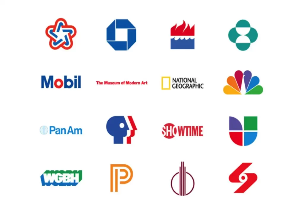
I see so many articles on logo design that are far too simplified, imo. Designing a logo for a small local business don’t necessarily follow the same “rules” as designing a logo for a multibillion-dollar corporation. While some of the ideas may cross over, there are often very different approaches. For example, small local businesses often want a logo that communicates quite literally what services they provide and can often be complex and contain text as well. Using examples like PBS, Mobil or the NBC peacock are not appropriate for designers learning the ropes. Those are established corporations and often their logos evolved over the decades because of established identities.