The CASH Formula for a Winning Ecommerce Page
Most people think they have a traffic problem. “I just need more visitors.” Wrong.
Your problem isn’t traffic—it’s conversion.
Imagine 1,000 people walk into your store, but only one buys. That’s what’s happening on your website right now. You’re leaking money because your page is built to look good, not sell.
The brutal truth? Your product doesn’t matter if your page sucks.
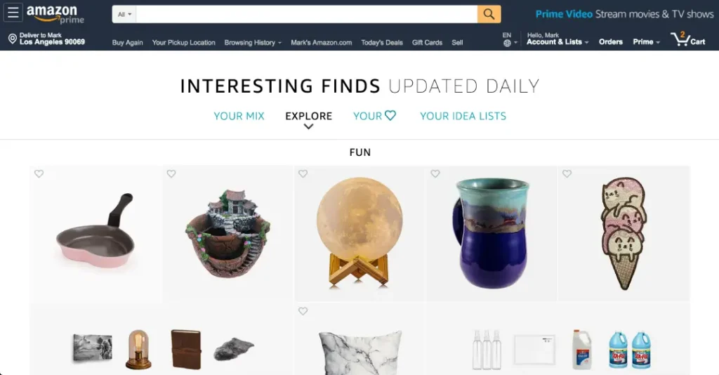
Amazon didn’t become a trillion-dollar company because it had the best products. They became a trillion-dollar company because they engineered pages that made people buy.
So, here’s the formula—no fluff, no theory. Just the exact structure of a winning ecommerce page that turns visitors into customers (and customers into repeat buyers). Let’s get into it.
- Focus on conversion, not just traffic; a poor page structure leads to lost sales.
- Implement C.A.S.H: Clarity, Authority, Simplicity, and Hooks for effective ecommerce pages.
- Use social proof, compelling offers, and clear CTAs to build trust and drive conversions.
- Regular audits and A/B testing ensure continuous improvement and adapt to user behaviour.
Why Most Ecommerce Pages Suck (And How to Fix It)

Everyday, countless entrepreneurs dive into ecommerce, eager to share their products with the world. Yet, many of them hit a wall. The culprit? Their ecommerce pages. Understanding why most ecommerce pages stumble can unlock the door to success. Let’s break it down.
The Problem with Clarity
If a visitor can’t grasp what your page is about within three seconds, you’ve lost them. It’s like going to a party and not knowing anyone. You want to leave right away. Your ecommerce page should instantly communicate value and purpose.
Here’s how to improve clarity:
- Use a clear and concise headline.
- Showcase your main product benefits upfront.
- Use simple images that illustrate your offering.
Imagine you’re scrolling through a website on your phone. You’re busy and don’t have time to decode complex language or scroll endlessly. If the message is straightforward, you’re more likely to stick around.
Trust Issues: The Authority Dilemma
Another reason ecommerce pages fall flat? A lack of authority. When visitors land on your page, they need immediate reassurance. How do you build that trust?
Here’s what you can do:
- Display trust badges or certifications.
- Showcase testimonials from genuine customers.
- Highlight media mentions or awards.
People don’t just want promises; they want proof. After showing initial success with social proof, I included a testimonial video from a happy customer on my page. The moment visitors saw that, the trust levels skyrocketed. The result? A direct uplift in sales.
Simplicity is Key
A cluttered ecommerce page is like a busy street during rush hour; no one knows where to go. When there are too many choices, potential customers feel overwhelmed. You want to guide them, not confuse them.
Here are strategies to enhance simplicity:
- Limit product options to a select few.
- Use clear and straightforward calls-to-action (CTAs).
- Maintain consistent branding throughout your page.
The Power of Hooks
At the heart of a successful ecommerce strategy is the hook. Your offer needs to grab and hold a visitor’s attention. The right offer can make or break a sale.
Here’s how to craft hooks:
- Use bold, compelling language.
- Focus on benefits, not just features.
- Create irresistible offers (like free shipping or limited-time discounts).
Time for Action: Fixing Your Page
So, how do you apply these insights? Here’s a quick roadmap to fixing your ecommerce page:
- Audit Your Current Page: Identify where clarity, authority, simplicity, and hooks are lacking.
- Get Feedback: Conduct user testing. Ask real visitors how they interpret your page. What confuses them?
- Iterate and Revise: Based on feedback, make immediate and concise adjustments.
- Analyse and Reflect: After implementing changes, check your analytics. Are visitors staying longer? Are they converting?
These steps will turn your neglected ecommerce pages into conversion machines.
Shift your mindset. Your product isn’t the problem; it’s how you present it. Use the tips to revise your approach and watch your ecommerce page transform from a dull brochure into an engaging sales powerhouse.
The Winning Ecommerce Formula: C.A.S.H.
Now that we’ve tackled the common pitfalls of ecommerce pages, it’s time to shift gears and focus on what works. Enter the winning formula: C.A.S.H. This neat acronym packs four powerful principles that can transform your ecommerce presence from drab to fab. Let’s dive into each component to see how you can apply them.
C – Clarity – You Lose Them If They Don’t “Get It” in 3 Seconds

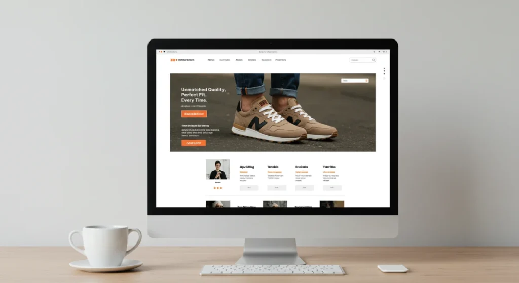
Imagine you’re browsing online, searching for the perfect pair of shoes. You land on a site and instantly see a jumble of text and images. What do you do? You bounce, right? That’s why clarity is paramount.
Why It Matters:
- Visitors need to understand your value proposition instantly.
- The first three seconds can make or break the interaction.
Think of your headline as a neon sign. It needs to shine bright and communicate your offer effectively. For instance, instead of saying “Sneakers for Every Occasion”, try “Elevate Your Style with Our All-Day Comfort Sneakers”. This hits harder and makes the purpose clear right away.
Tips to Enhance Clarity:
- Use bullet points for benefits.
- Highlight unique selling propositions (USPs).
- Ensure clear branding and consistent messaging.
A – Authority – People Trust Results, Not Promises
Raw claims mean little without proof. In ecommerce, authority builds trust. Customers who see credibility are likelier to pull the trigger on a purchase.
Key Elements of Authority:
- Testimonials from real customers.
- Expert endorsements or certifications.
- Case studies demonstrating success.
Building Authority:
- Feature user-generated content prominently.
- Use established third-party endorsements.
- Share stats that support your quality.
Remember, while flashy promises may catch attention, credibility keeps customers returning.
S – Simplicity – Fewer Choices, More Conversions
Have you ever gone to a restaurant with an overwhelming menu? Too many options can lead to decision paralysis. The same applies to ecommerce. Simplicity is your friend.
Why Simplicity Works:
- Fewer choices lead to less confusion.
- It narrows down user focus and increases satisfaction.
Here’s how to keep it simple:
- Limit product variations in a category.
- Use intuitive navigation menus.
- Streamline the checkout process as much as possible.
Quick Wins for Simplicity:
- Organise products by best sellers or categories.
- Use focus-group testing to determine the most desired features.
- Maintain a clean and uncluttered layout.
Remember, the easier you make the shopping experience, the likelier your customers will convert.
H – Hooks – The Right Offer Is 80% of the Game
Finally, let’s talk about hooks—the game-changing offers that get people to take action. Your hook is what makes your product irresistible.
What Makes a Great Hook:
- Clear value propositions.
- Limited-time offers or exclusive deals.
- Strong calls to action (CTAs).
Strategies for Crafting Hooks:
- Tap into customers’ pain points and show how your product solves them.
- Use compelling language that creates urgency.
- Test and iterate different hooks to see what resonates.
Hooks are all about grabbing attention and motivating action. They can turn a casual browser into a loyal buyer in the blink of an eye.
Final Thoughts on C.A.S.H.
Putting C.A.S.H. into practice can drastically improve your ecommerce game. Start implementing these principles today. Focus on clarity, build authority, keep things simple, and craft magnetic hooks. You’ll soon find that your ecommerce pages are far more effective.
Invest time in refining these elements, and watch your conversions climb! It’s not just about having great products; it’s about how you present them.
Step-By-Step: How to Build a Page That Prints Money

We’ve established the importance of clarity, authority, simplicity, and hooks. Now, let’s put it all together. In this section, I’ll guide you through the step-by-step process to craft a page that attracts visitors and turns them into customers. If done right, your ecommerce page can practically print money!
Headline That Hooks – Make Them Stop Scrolling in 5 Words or Less
The first impression counts, especially in ecommerce. Your headline must encapsulate what you’re offering in five words or less. It’s your golden ticket to capture attention.
Why It Matters:
- First impressions are critical; often, that’s all the time you get.
- A strong headline stands out amidst the noise of online content.
To create an attention-grabbing headline, consider your customers’ pain points and how your product addresses them.
Tips for Crafting Your Headline:
- Use strong, evocative language.
- Focus on one significant benefit.
- Incorporate numbers or statistics to pique interest.
For instance, instead of “Comfortable Running Shoes for Everyone,” try “Run Faster: Unmatched Comfort Awaits.” This version speaks directly to the desire for speed and comfort, making viewers suddenly interested.
Offer That Sells Itself – Value Stacking and Making “No” Impossible
Once you’ve got their attention, it’s time to present an offer that’s too good to refuse. Value stacking transforms an introductory offer into an irresistible package, highlighting why your product is a must-have.
What is Value Stacking?
- Combining multiple benefits creates more perceived value.
- Making customers feel they’re getting more than just a single product.
How to Create a Compelling Offer:
- Highlight complementary products or add-ons.
- Provide a risk-reversal strategy, like a money-back guarantee.
- Create tiered packages so customers can see the value of spending more.
Remember, your goal is to create an environment where customers feel that saying “no” to your offer would be a missed opportunity.
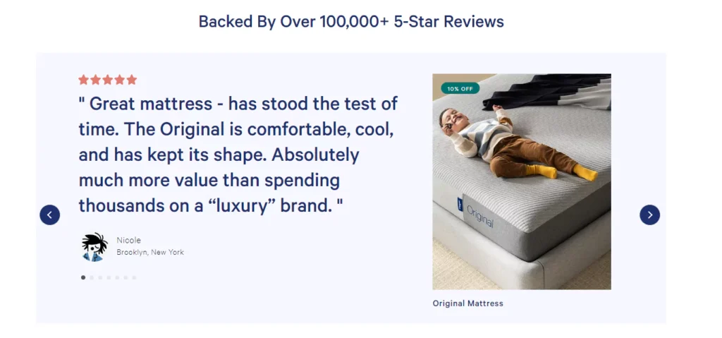
Social Proof That Hits Hard – 3 Types of Proof That Move the Needle
Social proof acts as a trust signal. Customers want to know that others have had positive experiences with your product. Without trust, all your hard work can go down the drain.
Types of Social Proof to Consider:
- Testimonials: Short statements from happy customers can validate your product’s effectiveness.
- Reviews and Ratings: A solid four or five-star rating can reassure the undecided.
- User-Generated Content: Showcase real customers using your product in action, maybe through photos or videos.
On my site, I include a section dedicated to testimonials where customers share their experiences. This content humanises the brand and significantly boosts trust, increasing conversions.
Tips for Social Proof:
- Keep testimonials short and relatable.
- Feature diverse customers to resonate with different groups.
- Regularly update with fresh content.
The goal is to leverage social proof, creating an environment where new visitors feel reassured and eager to buy.
Scarcity & Urgency That Converts – Without Looking Scammy
Scarcity and urgency are powerful psychological triggers but tread carefully. You want to create a sense of need without coming across as desperate.
Effective Use of Scarcity:
- Highlight limited-time offers or discounts.
- Show how many items are left in stock (but only if it’s genuine).
How to Implement Scarcity & Urgency:
- Create countdown timers for time-sensitive discounts.
- Use phrases like “While stocks last” to indicate limited availability.
- Use seasonal promotion ties to create urgency around specific events.
By implementing these strategies effectively, you increase your chances of making the sale, but always ensure the offer is truthful.
CTA That Closes – A Button Isn’t Enough—You Need This
The last step in your money-printing page is your Call to Action (CTA). This button can make or break your conversion rates, so it needs to be nothing short of compelling.
Key Elements of an Effective CTA:
- Use action-oriented verbs like “Buy Now,” “Join,” or “Get Started.”
- Make the button visually stand out on the page.
- Consider placement; place CTAs strategically throughout the page.
CTA Best Practices:
- Test various wording and placements.
- Ensure the benefit is clear (e.g., “Get X% Off Today”).
- A/B test different designs to see what resonates.
Building a profitable ecommerce page is no easy feat, but by following these steps, you’re setting yourself up for success. When you focus on creating a headline that hooks, an offer that sells itself, solid social proof, a scarcity that converts, and a powerful CTA, you’re not just capturing attention—you’re driving sales.
The 80/20 Rule of Ecommerce Success

By now, you’ve equipped yourself with the knowledge to build a compelling ecommerce page. But here’s where the magic happens: understanding the 80/20 principle.
In ecommerce, this principle reveals that roughly 20% of your page’s elements drive 80% of your sales. Let’s explore how to identify those crucial components, conduct a quick audit, and leverage data to fuel growth.
Why 20% of Your Page Is Doing 80% of the Work – The Elements That Drive Sales
You might be thinking, “Wait, only 20%?” It sounds counterintuitive, but it’s true. A few key areas on your page are often heavy lifters regarding conversions.
What to Focus on:
- Value Proposition: This is your USP (Unique Selling Proposition), so customers should choose you over competitors. Make it prominent.
- CTAs (Calls to Action): As mentioned previously, effective CTAs can significantly influence purchasing decisions.
- Product Descriptions: Well-written descriptions that highlight benefits and features without being overbearing.
- Images & Videos: Visual content is key in ecommerce. High-quality photos and engaging videos showcase products effectively.
Maximise Impact:
- Identify which pages generate the most sales and traffic.
- Evaluate the components of these pages—find the common factors.
- Monitor the analytics to track which elements resonate best with your audience.
This allows you to channel your efforts into high-impact areas and optimise for better conversion rates.
The 2-Minute Audit to Spot Weak Links – Fix These, and Your Conversion Rate Skyrockets
Ready to make significant improvements without doing an overhaul? Here’s a simple audit you can conduct in just two minutes:
Quick Steps for Your Audit:
- Evaluate Your Homepage: Does your value proposition stand out?
- Is it visible above the fold?
- Can someone decipher what you offer in just a few seconds?
- Check Your CTAs: Are they obvious and compelling?
- Test different phrasing (e.g., “Join Now” vs. “Start Your Free Trial”).
- Assess Product Pages:
- Are product descriptions focused on benefits rather than features?
- Do images or videos provide a clear understanding of the product?
- Mobile Responsiveness:
- Check how your page looks on mobile. Is it user-friendly?
- Loading Speed:
- Use tools like Google PageSpeed Insights to assess loading times.
I remember conducting a similar audit on my site and discovered that my CTAs weren’t prominent enough, leading to missed opportunities. After repositioning them above the fold, my conversion rates increased dramatically.
Take Action:
- List the changes needed based on this audit.
- Prioritise one or two fixes weekly until you see significant improvement.
This quick audit ensures you’re addressing weak links without overwhelming yourself.
The Ecommerce Growth Loop – How Top Brands Scale Using Data
Now that you know how to identify and audit key components, let’s discuss how to grow systematically using data. Top ecommerce brands thrive on data to make informed decisions and foster growth.
How Data Drives Growth:
- Customer Behaviour Insights:
- Analysing customer interactions on your site. Determine where they drop off and what keeps them engaged.
- A/B Testing:
- Testing variations of your page elements allows you to see what works best. For instance, try different headlines—see which one draws more clicks.
- Sales Trends:
- Keep a close eye on sales metrics. Identify which products are most popular and leverage that for cross-selling.
- Email Marketing Analytics:
- Measure open rates and conversion rates from email campaigns. This data shows how effectively you engage your audience.
Getting Started with Data:
- Set up Google Analytics for comprehensive insights.
- Use conversion tracking in your ads to measure success.
- Implement tools like Hotjar to understand user interactions and heat maps to identify where users click.
Utilising these data points creates a continuous growth loop: you learn, optimise, sell, and repeat.
Focus your efforts on high-impact areas, keep optimising, and watch your ecommerce business flourish. The path to ecommerce success isn’t just about hard work; it’s about working smart.
Stop Guessing. Test, Optimise, Repeat.
We’ve explored the mechanics behind building a strong ecommerce page. Now it’s time to get serious about growth. Guessing won’t get you anywhere. Instead, you need a structured test, optimise, and repeat plan.
Let’s delve into the fundamentals of effective tracking, testing, and actionable strategies that can supercharge your conversions.
The Only Metrics That Matter – Obsess Over These Numbers
When it comes to ecommerce success, not all metrics are created equal. You need to focus on the numbers that truly influence your bottom line. Here are the key metrics you should be keeping an eye on:
- Conversion Rate:
- The percentage of visitors who make a purchase. It’s the ultimate measure of your page’s effectiveness.
- Average Order Value (AOV):
- This tells you how much, on average, each customer spends. Increasing the AOV means more revenue without increasing traffic.
- Cart Abandonment Rate:
- Monitor this attentively. A high rate could indicate issues in the checkout process that need addressing.
- Traffic Sources:
- Understand where your visitors come from—are they organic, paid, or referral traffic? This will help tailor your marketing efforts.
- Customer Lifetime Value (CLV):
- This metric tells you how much a customer will spend on their relationship with your brand.
Take Action:
- Set up a dashboard that tracks these metrics in real time.
- Use analytics tools like Google Analytics or software like Hotjar for deeper insights.
- Regularly review and celebrate improvements, even the small ones!
This data-driven focus can turn confusion into clarity and guide you toward practical improvements.
How to A/B Test Like a Million-Dollar Store – Small Tweaks, Massive Impact
Now that you know your key metrics, it’s time to employ A/B testing effectively to amplify your results. A/B testing allows you to compare two versions of a webpage or element to determine which performs better.
Steps for Effective A/B Testing:
- Identify What to Test:
- Start small! Focus on specific elements like headlines, CTAs, or product images.
- Create Variations:
- Design your “B” version. Keep changes minimal to isolate the effect of your tweaks.
- Split Traffic:
- Direct 50% of your traffic to the original version (A) and 50% to the new version (B).
- Collect Data:
- Allow enough time for the test, usually a week or two, to gather meaningful data.
- Analyse Results:
- Look at your conversion rates or other metrics to see which version performed better.
A/B Testing Tips:
- Only test one change at a time to accurately measure its impact.
- Use statistical significance calculators to determine if the results are conclusive.
- Don’t forget to document your tests for future reference!
This structured approach to A/B testing turns uncertainty into strategic progress.
The One-Week Plan to Double Your Conversions – Actionable Steps You Can Implement Today
Now, let’s gear up for a focused week aimed at driving conversions up. Follow this actionable plan for maximum results!
Day 1: Audit Your Current Page
- Review all the essential metrics.
- Perform a quick audit based on the previous sections’ guidelines.
Day 2: Identify One Major Friction Point
- Look for slow loading times, lengthy checkouts, or unclear CTAs.
- Use analytics tools to spot exact drop-off points.
Day 3: Implement Changes
- For instance, simplify your checkout process or adjust a product description.
- Ensure that the changes have a clear purpose based on your audit.
Day 4: Design an A/B Test
- Choose a single element to test based on Day 2’s findings, like different CTAs.
- Create your version B.
Day 5: Launch Your A/B Test
- Split your traffic equally and start the test.
- Promote your site to increase traffic if necessary during this week.
Day 6: Gather Data
- Monitor the test and track any differences in metrics.
- Use heatmaps to see where users engage most on the page.
Day 7: Review and Optimise
- Analyse the results of your A/B test.
- Make a decision based on data, rolling out the winning element across your site.
By the end of the week, you’ll have made significant strides toward increasing conversions.
By effectively honing in on meaningful metrics, A/B testing, and rolling out a structured plan, you can stop guessing and start generating accurate results.
Final Thoughts: You Don’t Have a Product Problem. You Have a Page Problem.
If your sales aren’t where you want them to be, it’s likely not your product’s issue—it’s your page. Many entrepreneurs place the blame on their products when, in reality, the presentation makes all the difference.
The Misconception: Blaming the Product
In the quest for success, it’s easy to fall into the trap of thinking your product isn’t good enough. I’ve met countless business owners who gave up on perfectly viable products simply because their website wasn’t converting. The reality is that a great product can fail if it’s not showcased correctly.
Common Misconceptions Include:
- “If only I had a better product, I would sell more.”
- “More features will make people interested.”
- “My competitors are stealing customers because their product is superior.”
The Importance of Presentation
Presentation is everything in ecommerce. Your page needs to engage visitors and compel them to take action. Let’s explore the key areas where presentation can make a difference and how to create a page that truly converts.
Key Elements to Focus On:
- Visual Appeal: First impressions matter. Use high-quality images and videos to showcase your product from different angles.
- Clear Messaging: Ensure your value proposition is front and centre. Customers should understand what makes your product unique without having to do any digging.
- User Experience (UX): A smooth navigation experience keeps potential buyers on your page longer. Make it easy for them to find what they want.
Understanding User Behaviour
Another crucial aspect of optimising your page is understanding how users behave on your site. Tools like Hotjar or Google Analytics can help you track user interactions and identify bottlenecks.
Key Behaviours to Monitor:
- Click patterns: Where are users clicking the most?
- Time spent on pages: Are visitors spending enough time on product descriptions?
- Bounce rate: Are users leaving quickly? If so, investigate why.
For example, customers frequently drop off at the checkout page. If that happens, it’s crucial to analyse the reasons behind it. The checkout process may be complicated, or unexpected shipping costs may appear too late.
Take Action:
- Implement tools to gather insights about your site.
- Regularly rejuvenate your content based on data feedback.
- Test variations of your page elements to see what resonates most with visitors.
The Power of Continuous Improvement
The journey doesn’t end after you’ve made some updates to your page. Continuous improvement should be the mantra for any successful ecommerce business. Testing, optimising, and evolving your page is vital to adapt to the always-shifting online marketplace.
Key Strategies for Continuous Improvement:
- Conduct Regular Audits: Review your site and its metrics to identify weaknesses.
- Stay Committed to A/B Testing: Even successful sites can benefit from ongoing testing to discover new improvements.
- Engage with Your Customers: Solicit feedback directly from your customers about their experience on your site. You’d be surprised at what you learn!
I remember when I implemented a routine check-up of my website every three months. This kept the site fresh and caught minor issues before they became significant problems.
Final Words of Encouragement
So, as we wrap up this deep dive, remember that the next time you feel discouraged about your sales, take a step back and evaluate your page rather than the product itself. Your product might be incredible, but converting that potential into sales relies heavily on how you present and market it.
You can transform your page and, in turn, your business. Focus on clear, compelling visuals, authentic messaging, and an optimal user experience. Use analytics to guide your improvements, and never underestimate the impact of continuous adjustments.
So, get out there! Assess your page, make changes, and watch your conversions soar. Your product deserves to shine; the proper presentation can make that happen!


