Verizon Logo Design Evolution: From Bell to Swoosh
You’re casually scrolling through your phone, barely paying attention, when suddenly – something catches your eye. It’s bold, it’s red, it’s unmistakably Verizon.
But hold on a second… didn’t it look different just a short while ago?
Welcome to the fascinating world of corporate logo evolution, where multi-billion dollar companies engage in high-stakes design decisions with their visual identity. And let me tell you, Verizon has been updating their look more often than most of us update our wardrobes.
You might be wondering, “Why should I care about logos?” Well, buckle up because I’m about to show you why Verizon’s logo journey is the most captivating story you never knew you needed to hear.
This isn’t just about aesthetics and typography. This is about strategic moves, market dominance, and the kind of brand competition that makes the fiercest sports rivalries look tame in comparison.
So, grab your favourite beverage, get comfortable, and prepare for an eye-opening exploration into how a telecom giant used its logo to transform from a Bell System offshoot to an aspiring media powerhouse.
Trust me, you’ll see that little red checkmark in a new light when we’re done. You might even find yourself paying more attention to the logos around you, wondering what stories they have to tell.
Are you ready to see how a simple logo can shape the destiny of a corporate giant? Let’s dive in and uncover the power of visual branding, one logo at a time.
- Logo Evolution: Verizon's branding reflects its journey from a Bell System offshoot to a formidable media player, adapting with market demands.
- Red Branding: The aggressive red colour has been a signature trait, setting Verizon apart in the telecom landscape.
- Consumer Engagement: The latest logo's positive reception shows Verizon's efforts to attract younger audiences and rebrand itself in the streaming era.
The Origin Story: Bell Atlantic’s Baby Steps
It’s 1983. The internet is a pipe dream, mobile phones are the size of bricks, and Bell Atlantic was born from the ashes of Ma Bell’s breakup. Their first logo? A black bell inside a ring, with “Bell Atlantic” slapped next to it in a sans-serif font: real groundbreaking stuff, folks.
But here’s the kicker – it wasn’t about innovation. It was about familiarity. In a world where AT&T’s bell logo was as recognisable as Coca-Cola, Bell Atlantic played it safe. They said, “Hey, we’re new, but we’re still part of that Bell family you know and tolerate.”
The Late 90s Identity Crisis
Fast forward to 1997. The internet’s blowing up, cell phones are shrinking, and Bell Atlantic’s feeling the heat. Cue the rebrand.
Out with the old bell, in with… a wave? They used the whole “we’re riding the digital wave” metaphor. The new logo featured a sleek, wavy “A” in “Atlantic, ” adding funky blue and green gradients. It screamed, “We’re hip! We’re with it! Please don’t leave us for those flashy new tech companies!”
Was it successful? It’s as successful as using “groovy” in a sentence today. It felt forced like your dad trying to dab at a family barbecue.
The Birth of Verizon: A Red-Hot Mess
2000 rolls around. Bell Atlantic merges with GTE, and boom – Verizon is born. The new company, new logo. And boy, did they swing for the fences.
Picture this: The word “Verizon” in a chunky, italic font, with a massive red checkmark/slash thing swooping over it. It looked like a graphic design student’s first attempt at creating a “dynamic” logo.
But here’s the genius part – it was so bad, it was good. That red slash was impossible to ignore. It screamed, “We’re here, loud, and coming for your market share.” In a sea of blue telecom logos, Verizon went full tomato. And it worked.
The strategy? Stand out at all costs. They were the new kid on the block with deep pockets and a chip on their shoulder. This logo said, “Subtlety is for losers. We’re here to dominate.”
The 2015 Glow-Up: Less Is More (Boring)
Fast forward to 2015. Smartphones rule the world, and Verizon decides it’s time for a grown-up logo. Out goes the italic font and the swoosh. A sleek, simple design comes: “Verizon” in a no-nonsense font, followed by a small red checkmark.
On paper, it’s a smart move. It is clean, modern, and works well on tiny phone screens. But let’s be honest – it’s about as exciting as a telecom company’s terms of service.
The strategy here was clear: position Verizon as a mature, reliable tech company, not just a phone service. They wanted to play with the big boys – your Apples, your Googles. But trying to look sophisticated, they lost some of that in-your-face energy that made them stand out.
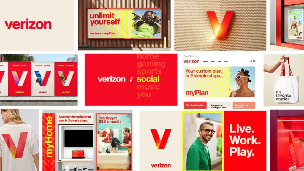
The 2024 Netflix Wannabe
Now we’re in 2024, and Verizon’s at it again. The new logo? A glowing red “V” that looks suspiciously like Netflix’s “N”. They saw Netflix’s success and thought, “Hey, if we can’t beat ’em in streaming, we can at least steal their style.”
But here’s the thing – it’s not a total flop. 70% of consumers had a positive reaction to it. It’s vibrant, eye-catching, and screams, “We’re not just your grandpa’s phone company anymore.”
The strategy is clear: Verizon’s trying to rebrand itself as a media company, not just a telecom giant. They say, “We’re not just the pipes; we’re the content flowing through them.” It’s a bold move, but it might be wild enough to work in a world where every company is trying to be a tech company.
The Psychology Behind the Madness
Let’s break this down:
- Red: It’s been Verizon’s calling card from day one. It’s aggressive, it’s energetic, it’s impossible to ignore. In a sea of corporate blue, Verizon’s red is like a bull in a china shop – subtle as a sledgehammer but effective.
- The Checkmark: From the swoosh to the tiny tick to the glowing “V”, Verizon’s always had some form of checkmark. It’s saying, “We’ve got you covered. We’re reliable. We’re the right choice.” It’s subliminal messaging 101.
- Font Evolution: They’ve gone from chunky and loud to sleek and minimalist. It’s the corporate equivalent of trading in your flashy sports car for a Tesla – still cool but more grown-up.
The Competition: A Game of Logo Leapfrog
Verizon’s logo evolution hasn’t happened in a vacuum. They’ve been playing a constant game of one-upmanship with AT&T and T-Mobile.
AT&T went minimalist before it was cool, ditching its bell logo for a simple globe in 2005. T-Mobile has stuck with its magenta identity, proving that sometimes, if it isn’t broken, don’t fix it.
Verizon’s approach? Be the chameleon. They’ve adapted their look more times than a chameleon in a Skittles factory, always trying to position themselves as the most modern, most reliable choice.
The Lessons: What Every Brand Can Learn
- Bold Moves Pay Off: Verizon’s early red branding was a risk that became their signature. Don’t be afraid to zag when others zig.
- Evolve or Die: Each logo change aligned with significant shifts in tech and Verizon’s business model. Your brand should reflect who you are now, not who you were a decade ago.
- Simplicity Wins… Usually: The 2015 logo proves that sometimes, simpler is better. But the 2024 update shows that some flair can go a long way.
- Know Your Audience: Verizon’s latest logo is a hit with younger audiences. They’re not just updating their look but fishing for new customers.
- Consistency is Key: Verizon has kept elements of their identity through all the changes – red and the checkmark concept. It’s evolution, not revolution.
The Bottom Line
Verizon’s logo journey is a masterclass in brand evolution. They’ve gone from a Bell System baby to a telecom giant to a wannabe media empire, and their logo has morphed every step of the way.
Have they always nailed it? Hell no. But they’ve always been bold, always been recognisable, and always been unmistakably Verizon.
In the cutthroat telecom world, where the product is often intangible, the logo becomes the product. It sticks in people’s minds when choosing a carrier or deciding whether to jump ship.
Verizon’s logos aren’t just pretty pictures – they’ve been battle flags in a war for market dominance. Each iteration has been a statement: “This is who we are now. This is why you should choose us.”
As we look to the future, one thing’s clear – Verizon’s not done evolving. In a world where today’s tech giant can be tomorrow’s cautionary tale, staying relevant is a constant battle. Their logo will keep changing, adapting, and trying to convince you that out of all the options out there, they’re still the right checkmark to choose.
So, what’s the takeaway for other brands? Simple. Your logo isn’t just a pretty face – it’s your war paint. It’s the first thing customers see and the last thing they remember. Make it count. Make it adaptable. And for the love of all that is holy, don’t be afraid to shake things up when the market demands it.
In the end, Verizon’s logo evolution isn’t just about aesthetics. It’s about survival. In the jungle of American capitalism, it’s adapt or die. And Verizon? They’re not just surviving – they’re thriving. One logo at a time.
FAQs on the Verizon Logo Design
What’s the deal with the first Verizon logo?
Verizon’s OG logo dropped in 2000 when Bell Atlantic and GTE had a corporate love child. Picture this: a chunky red checkmark with “Verizon” in lowercase letters. It screamed, “We’re new, bold, and coming for your phone bill.”
How many times has Verizon changed its logo?
Verizon’s been playing logo musical chairs since 2000. We’re talking about three significant facelifts: the original 2000 design, the 2015 glow-up, and the 2024 Netflix wannabe. They’ve tried to look cooler each time than your neighbour’s new iPhone.
Why did Verizon ditch the checkmark in 2024?
Verizon finally realised that looking like a completed to-do list wasn’t cutting it. They axed the checkmark and went full “V” mode. They’re saying, “We’re not just your grandma’s phone company – we’re hip, we’re with it, and we stream stuff too!”
Is Verizon’s new logo just a Netflix ripoff?
Let’s not sugarcoat it – Verizon’s 2024 logo looks like Netflix’s cooler, redder cousin. But hey, if you can’t beat them in the streaming game, you might as well steal their style.
What’s with the obsession with red in Verizon’s logos?
Red’s been Verizon’s ride-or-die since day one. It’s like the corporate equivalent of a power tie – it screams, “Look at me, I’m important!” Verizon’s red is like a bull in a china shop in a sea of blue telecom logos. Subtle? No. Effective? You bet.
How has Verizon’s logo strategy changed over time?
Verizon’s logo journey is like watching a teenager grow up. They started loud and in-your-face, then tried to look all sophisticated and grown-up, and now they’re having a quarter-life crisis trying to be the cool kid again. It’s corporate puberty at its finest.
What’s the psychology behind Verizon’s logo evolution?
It’s all about mind games, baby. The checkmark said, “We’ve got you covered.” The simple 2015 design screamed, “We’re reliable, like your favourite pair of jeans.” Now, the glowing “V” is yelling, “We’re not just calls; we’re Netflix and chilling too!” It’s subliminal messaging 101.
How does Verizon’s logo compare to those of its competitors?
In the telecom logo Olympics, Verizon’s been playing leapfrog with AT&T and T-Mobile. While AT&T went minimalist and T-Mobile stuck to its magenta guns, Verizon’s been the chameleon – constantly changing, always trying to look fresher than last week’s avocado toast.
What’s the biggest fail in Verizon’s logo history?
Remember that 2015 logo? Yeah, the one that looked like a corporate robot designed it. It was about as exciting as watching paint dry. Verizon tried to look all grown-up, like the boring uncle at a family barbecue.
How has Verizon’s logo impacted its brand recognition?
Let’s be honest – Verizon’s logo changes have been like a game of corporate whack-a-mole. But here’s the kicker: it’s worked. You can spot that red a mile away, whether you love or hate it. It’s like the telecom version of the Bat-Signal.
What can other brands learn from Verizon’s logo evolution?
Verizon’s logo journey is a masterclass in brand evolution. The lesson? Don’t be afraid to change, but don’t lose your identity. It’s like getting a new haircut – you want to look fresh, but you still want your mom to recognise you at the airport.


