Top 10 News Logos Of The Most Iconic Media Brands
An image can be louder than all the noise in a world engulfed by information.
News logos that work best aren’t just pretty pictures; they’re promises. Promises of credibility, perspective, and a sure way to see our messy world.
Beyond corporate branding, these visual shorthand symbols have become cultural touchstones — engendering trust (or distrust) at first glance.
But which logos prove themselves over time? Which ones burn themselves into the back of our brains?
Let’s discuss the icons wrapped around the news — shapes and colours that frame how we understand current events. They’re not just logos. They are signposts with which to navigate the information superhighway.
So, do you think you know what’s on the news already?
- News logos signify credibility and trust, serving as essential symbols in a cluttered information landscape.
- Design simplicity and effective colour choices greatly enhance logo recognition and emotional connections with audiences.
- Logos evolve with technology and viewer preferences, maintaining relevance while adapting to digital platforms.
1. CNN: The Red Revolution
When you think of breaking news, you probably imagine the bright red CNN logo flashing before your eyes. Here’s why that logo is so effective.
In terms of minimalism, CNN’s logo is a master class. Three letters, one colour – it isn’t much more straightforward. But don’t be fooled by its simplicity; this logo is heavyweight in the news world.
Why Red?
Have you ever wondered why CNN went with such an intense shade of red? It’s not just to grab your attention (although it certainly does that). Red signifies urgency, excitement and energy – all things they want people to associate with their coverage of breaking stories.
The chunky sans-serif font used for the wordmark isn’t only legible from afar and conveys an air of strength and trustworthiness – as if saying “believe me”.
2. BBC: A Royal Affair in Broadcasting
The BBC logo is like the Queen’s English broadcasting emblems – proper, respected, and instantly recognisable.
BBC means British Broadcasting Corporation. However, you might not realise that these three little letters have turned into an internationally recognised symbol of journalistic integrity.
Black boxes enclose the BBC’s letters in its logo. This design shouts “stability” and “structure”, which is just right for a news organisation that prides itself on being an anchor amidst turbulent current events.
Even though the current emblem uses black boxes, the BBC has never been afraid of playing around with colours throughout its history, from classic black-and-white schemes until recent times when they experimented with different hues while still keeping their signature look intact.
3. Fox News: Fair and Balanced… in Design
The Fox News logo is an American media symbol, like or hate it. Let us take apart this divisive yet famous design.
Bold statements are Fox News’ modus operandi — and the logo is no different. The brand’s identity is represented by deep blue shades that exude confidence and conservatism.
The emblem contains stylised searchlights, seen in Fox News’ “Shining a Light” on important issues. But does it also put itself in the spotlight? Either way, this is an intelligent visual metaphor.
The font used for the letters in “Fox News” combines contemporary sleekness with traditional authority – like wearing a power suit up top and trendy sneakers below.
4. Al Jazeera: A Calligraphic Conversation
The logo for Al Jazeera is a beautiful combination of modern design and Arabic calligraphy. The emblem says much about the identity and mission of the network.
What sets this logo apart is that it features the network’s name written in stylised Arabic script. Far from being mere writing, this approach to calligraphy honours the deep cultural traditions of Arab countries worldwide.
Clean lines and a simple colour scheme make this design globally appealing while still distinctly Arabic-looking. In other words, it represents how Al Jazeera aims to provide news with an international outlook.
5. Reuters: The Dots That Connect the World
Although Reuters’s logo appears simple, there is more than meets the eye. They symbolise connecting information globally – isn’t that smart?
This grey does not only look good; it was chosen to represent trustworthiness, seriousness, and profundity – everything people expect from news agencies.
The font employed by this company’s emblem design is neat and minimalistic. They tell us, “We’ll tell you what happened without any unnecessary details.”
6. The New York Times: Old School Cool
The New York Times logo is like a classic leather jacket—it never goes out of style.
The logo is set in blackletter or Gothic-style font, dating back to the newspaper’s beginnings in 1851. It’s an old-school shoutout within a constantly changing media landscape.
While other news organisations have updated their logos, The New York Times has primarily stayed the course. This consistency says much about the paper’s dedication to traditional journalism values.
It’s not just a brand identifier but synonymous with quality reporting. When you see that Gothic script, you know you’re getting some real-deal journalism.
7. The Guardian: A Breath of Fresh Air
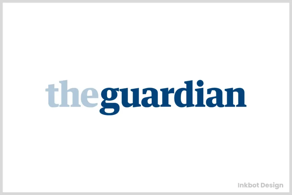
The Guardian’s logo redesign in 2018 could only be described as a breath of fresh air, or rather more like opening the windows after a long winter – refreshing and bold.
The Guardian did away with its old medieval-style emblem for a sleeker look. Think of it as an exchange for a tweed jacket for a trendy bomber; both are still classy, just one has a modern twist.
It is no coincidence that The Guardian picked a bright blue hue for its logo. This colour is energetic, trustworthy and easily distinguishable among other news organisations’ more conservative logos.
Using lowercase letters was a brilliant move for the designers because this gives off an inviting vibe. It’s almost like saying, “Hey! We’re serious about journalism but not too serious.”
8. MSNBC: Where Cable Meets the Web
The logo boasts the famous NBC peacock with a twist recognising this broadcaster’s background in traditional media. Think of it as putting on your family crest over your hoodie.
MSNBC’s all-capital, chunky text does not feel weak or meek. It shouts out the news instead of murmuring about them.
Those pretty multicoloured bird feathers look nice and stand for different views coming together under one roof at MSNBC. It is similar to seeing fair coverage promised in pictures!
9. Associated Press: The News Wire Classic
The logo of AP has been the same for many years, and it is still in use. It serves its purpose as much now as it did then because of its simplicity. This permanence is comforting during an era when everything is constantly changing in news media.
For most news organisations, publishing an AP article means that they can be trusted. The little emblem at the bottom or top right corner of a report or program shows that this information came from a credible source. Two letters in a circle communicate so much authority, don’t they?
The Associated Press logo demonstrates what is known as “design by not designing.” The company used a basic circle with “AP” written inside it to convey its authority without being flashy about it. In other words, this mark understands how to speak softly while carrying a big stick.
10. NPR: Sound Design in Visual Form
NPR (National Public Radio) is an audio-based institution; however, its logo speaks volumes visually.
The NPR logo uses lowercase letters that appear to be moving. This may be a reference to the quick pace of news and the dynamic quality of radio.
In a world of vibrant logos, NPR’s black and white design stands out, as if it were shooting a film in monochrome – it makes a statement.
The space between and around the letters in the NPR logo tells their story; they say, “We aren’t only about what is said but also about what is left unsaid.”
The Psychology Behind News Logos
Having toured the top 10 news logos, it’s time to look into what psychology makes them so effective.
Colour is important
Has anyone ever pointed out to you that most news logos are blue? It’s not just a coincidence – blue represents trust, professionalism and calmness, which are all things that news organisations want their viewers or readers to feel.
Keep it simple, stupid.
In the fast-paced world of breaking stories, simplicity is vital. Many news logos choose basic designs that can be easily recognised even if they’re on television screens or social media icons as small as postage stamps.
Fonts have feelings, too.
The typography of news logos is chosen very carefully because it needs to say just right. Serif fonts imply tradition and authority, while sans-serif ones seem more modern and personable.
The Evolution of News Logos

Logos are ever-changing like the news and are never static. They change over time, with technology, and as viewer tastes change.
Print to Pixels
In this digital age, many news logos that were born in print have had to adapt, simplify and optimise for all screen sizes, from giant billboards to smartwatch faces.
Animated Logos: Static Designs Come Alive
With the advent of digital platforms, news organisations created animated versions of their logos. These moving symbols add an extra interaction layer – especially on online and broadcast media.
Responsive Design: One Logo, Many Forms
Logos need to be flexible in the era of responsive web design. Many news organisations now have multiple versions of their logo, each optimised for different contexts and screen sizes.
The Future of News Logos
What is going to happen with news logos in the future? Here are some thoughts:
More Interaction
As AR and VR become more popular, news logos can be experienced rather than just seen. For example, imagine a CNN logo in a virtual space you can walk around!
AI-Generated Logos
Taking advantage of AI development, we could have real-time adapting logos that change depending on what they’re showing or the viewer’s preferences.
Personalisation
Might we get news logos that alter slightly according to who views them during this age of personalised content? It’s not impossible.
The Impact of Logos on News Credibility
A news organisation’s logo is not just an attractive symbol. It can play a huge role in determining how credible the news it presents appears to the audience.
First Impressions Count
A good logo design can instantly convey professionalism and reliability, like a firm handshake at the beginning of a meaningful conversation.
Recognition and Trust
Logos that are seen more often tend to be trusted more easily. That’s why established media companies are usually reluctant to change their logos dramatically.
Awareness across Cultures
If a news outlet operates worldwide, it should consider different cultural perceptions of its logo. Some symbols may have positive connotations in one country but offend people in another.
Creating an Effective News Logo

What would you do if asked to create a new news organisation logo? Here are some things to think about:
Make it clear
In the fast news world, your symbol should appear immediately. Avoid complex designs that might not stand out among others.
Be versatile
Whether viewed on a big TV screen or as a small mobile app icon, your emblem should look great both ways. Consider where else it might show up and how.
Go for timelessness over trendiness.
News logos need to last forever, regardless of design trends. Strive for something that will still feel new many years later.
Showcase your values
What is important to you as a journalist? Your symbol ought to represent this. Are you loud and reckless or quiet and thoughtful? Let people know through the design.
The Role of Colour in News Logos
We have covered colour psychology. Now, let us look closer into the usage of various shades in news logos:
Red: The Colour of Urgency
Utilised by CNN and others, red catches attention and creates urgency. This is perfect for organisations that pride themselves on being first with breaking news.
Blue: Trust and Professionalism
Many news organisations trust Blue as it conveys stability and professionalism. It’s a safe choice that rarely offends.
Black: Sophistication and Authority
The New York Times logo uses black, which implies sophistication, authority and timelessness. It’s a bold choice that stands out.
Multicolour: Diversity and Dynamism
Logos like NBC’s peacock, incorporating many colours, can represent diversity of thought or dynamism. They’re eye-catching and memorable.
Typography in News Logos
The news logo’s font selection is essential. It’s not just readability; it’s about getting the right message across.
Serif vs Sans-Serif
Fonts with little feet (serifs) often give an impression of being traditional or authoritative. On the other hand, sans-serif fonts can look cleaner and more up-to-date.
Custom Typography
Many news organisations design their logos using unique lettering styles. This way, they ensure their emblem stands out and does not resemble any other brand employing the same typeface.
Uppercase vs Lowercase
A logo’s atmosphere can significantly affect whether all letters are capitalised. Capitalised ones generally suggest power, while small-case ones may seem friendlier.
Conclusion
As we have observed, news logos are more than mere decorative designs. They are potent symbols that establish reliance, authority and brand recognition in the blink of an eye. Every logo we’ve examined – starting with CNN’s straightforwardness and ending with The New York Times’ traditional elegance – narrates the story of the media outlet behind it.
Such is their impact on our visual culture that these emblems have become almost like old acquaintances – familiar faces that keep us posted about what’s happening in the world. They have been growing together with new technologies and shifting viewer preferences while preserving their essential features.
Considering this, it is thrilling to think about how news logos will likely transform in future times. Could there be interactive AI-generated ones that keep pace with events happening worldwide? Alternatively, will time-honoured versions remain intact, signalling constancy among ever-changing media?
Well, one thing is undeniable: within the fast-paced universe of journalism wherein data streams 24/7 while eyeballs race for attention, no other period calls for a memorable logo more strongly than now! It acts like an anchor, letting people navigate through info overload visually, providing trust in otherwise unclear waters of contemporary media.
Therefore, next time you come across any such iconic news logo, take some seconds to appreciate the thoughts put in during its creation process and the creativity employed. Even though they say a picture speaks a thousand words here within context, being worth those many words may be valid after all
FAQs
What is the reason for news logos being blue?
Most frequently, it’s because trust, professionalism and tranquillity are conveyed by this colour – all of which news organisations wish to project.
How often do news organisations change their logos?
While there’s no fixed frequency at which these entities change their logos, usually, they don’t make drastic changes as consistency breeds familiarity, which in turn creates trust. Instead, they make minor updates or refreshments.
What qualities make a news logo effective?
A good news logo should be simple yet memorable, versatile (looking good when scaled down or up), and, most importantly, reflect what the organisation stands for.
Are animated logos becoming more common in news media?
With digital platforms on the rise, many news outlets have adopted animated versions of their logos that can be used in videos or on websites.
How important is a logo to a news organisation’s brand?
A logo is vital to any company’s brand identity; for most people, it’s usually the first thing they notice about an organisation. It could help build credibility with viewers who may otherwise not trust them based on name recognition alone.
Do news logos look different in different countries?
While some international broadcasters maintain consistent branding across borders, others may alter design features slightly so as not to offend sensibilities abroad but still maintain relevance locally where necessary.
How has the digital age affected news logo design?
The digital revolution has simplified logo designs, making them more adaptable to various screen sizes, thus promoting legibility on smaller devices such as smartphones or tablets while at the same time ensuring readability remains intact even when viewed on larger screens like desktop computers.
Can a poorly designed logo hurt a news organisation’s credibility?
Yes, if you are not careful enough, graphic representation might ruin your reputation, especially among potential clients who will view this move as lacking professionalism from your side.


