
Top 20 Best 3 Letter Logos From Famous Brands Explained
Three-letter logos are not a shortcut to prestige – they’re a wager on brand equity you’ve already built.
Every professional services firm that rebrands to initials without first checking whether those initials have a standalone meaning in its sector is spending design budget to become less recognisable, not more.
That’s the uncomfortable truth competitors’ listicles skip over. IBM, BBC, CNN, HBO – these lettermarks work because the brands behind them were already dominant.
The letters didn’t create the recognition. The recognition made the letters viable. Before you commission a monogram mark for your firm, that distinction matters enormously.
This article covers 20 of the best 3-letter logos from world-famous brands. These specific design principles make each one work, and – more importantly for anyone considering a rebrand – the honest decision framework for when adopting a lettermark is commercially sound and when it isn’t.
If strategic logo design decisions at your firm are being made based on aesthetic preference rather than brand equity position, this is the analysis you need to read first.
- Three-letter logos work only when the brand already has substantial recognition; the letters trigger recall, they do not create recognition.
- Design must be strategic: bespoke typography, negative space, containers and scalability tested at 16×16 to 512×512 determine commercial effectiveness.
- Conduct a brand recognition audit with target buyers; if initials lack standalone meaning, build recognition first and retain the full name during transition.
What Are 3 Letter Logos?
A 3-letter logo is a lettermark or monogram logo – a typographic identity mark built from three initials or abbreviated letters representing a brand name rather than spelling it out in full.
Lettermarks are a subtype of typographic logos, distinct from wordmarks, and are commonly used when a brand name is long, complex, or difficult to reproduce at small sizes.
Key components:
- The letterforms themselves – the typeface, weight, and spacing of the three characters are the entire visual system
- The relationship between letters – whether they’re separated, interlocked, stacked, or continuous determines the personality of the mark.
- The absence of a descriptor – a pure lettermark relies entirely on prior recognition to communicate what the brand does
Three-letter logos are lettermark logos using a brand’s initials as the primary mark; they succeed commercially only when the parent brand already has established name recognition.
The 20 Best 3 Letter Logos from World-Famous Brands
These 20 examples represent the global benchmark for lettermark identity design. Each one is analysed for what specifically makes it work – not just aesthetically, but commercially.
1 – IBM: The Striped Lettermark That Redefined Corporate Identity
IBM’s striped logo, created by Paul Rand in 1972, is the definitive case study in lettermark design as a system rather than a symbol.
Rand replaced IBM’s solid letters with thirteen horizontal stripes, creating a mark that simultaneously referenced television scan lines (IBM’s computing heritage), suggested speed and forward movement, and produced a visual rhythm that made the three letters impossible to ignore at any size.
IBM’s own corporate history confirms that the Rand striped logo has served as the standard-bearer of the IBM brand continuously since 1972. That is over five decades without a structural redesign – an extraordinarily rare achievement in corporate identity.
The lesson for any firm considering a lettermark: IBM didn’t become IBM because of the logo. Paul Rand was brought in after IBM had spent 25 years establishing itself as the dominant force in business computing. The lettermark accelerated recognition of an entity that already had recognition to accelerate.
IBM’s striped lettermark works because Paul Rand understood that a logo doesn’t communicate – it triggers recall. The thirteen stripes turn three common letters into an unmistakable visual event. That only functions when your audience already knows what IBM means. The mark is a retrieval cue, not an introduction.
2 – BBC: Three Blocks, One of the World’s Most Recognised Marks
The BBC lettermark – three solid-white letters in three solid-black rectangular blocks – is among the most replicated and referenced identity systems in broadcast history.
The BBC’s own history credits Abram Games with creating the first on-air television symbol for the BBC, establishing the visual logic of contained, separated letterforms that have defined BBC identity across every subsequent redesign.
The genius of the BBC mark is its absolute adaptability. The block structure allows each letter to be treated independently or as a unified system. The BBC has adapted the mark across hundreds of sub-brands, regional variations, and digital formats without ever losing the core architecture.
For professional services firms, the BBC mark illustrates a principle worth noting: the container (the block) does as much structural work as the letterform inside it. If you’re evaluating lettermark options, the relationship between the letter and its spatial context is not a secondary consideration.
The BBC lettermark’s three-block structure is a masterclass in systematic identity design. Abram Games created a format flexible enough to carry every BBC sub-brand for decades without modification. The constraint – three letters, three boxes – became the system’s strength. Constraints imposed at the identity level create consistency that brand guidelines alone cannot enforce.
3 – CNN: The Continuous Strip Monogram
CNN’s logo is a monogram of its three letters, designed as a single continuous strip of letterforms rather than three discrete characters. The design communicates the brand’s editorial positioning – continuous, unbroken news delivery – through the structure of the letters themselves, not a tagline or colour choice.
The continuous strip design is documented in CNN’s own brand history as a deliberate device to suggest forward momentum. Whether viewers consciously register that meaning is secondary to the fact that the mark is formally distinctive in any context where it appears.
CNN’s lettermark also demonstrates the value of a mark that functions as pure form. Strip away the name recognition, and the CNN monogram reads as a confident, self-contained piece of lettering – something very few lettermarks achieve.
CNN’s monogram works because the letters aren’t three separate characters that follow each other – they’re one continuous form that happens to be legible as three letters. That formal decision gave CNN a mark that serves as both a logo and a piece of graphic design. Most lettermarks achieve one of those things. CNN achieves both.
4 – HBO: The Record Icon Embedded in Typography
HBO’s identity has evolved across several iterations, but the core logic remains consistent: three letters with a visual device that references the brand’s content category.
The “record” icon embedded in early HBO typography linked the letterform directly to recording, broadcasting, and premium entertainment – a semantic anchor that purely typographic lettermarks lack.
HBO demonstrates that a 3-letter logo can carry a visual metaphor without becoming an icon or pictorial mark. The letterforms remain the primary element; the device is embedded within them, not placed alongside them.
5 – UPS: The Shield as a System
United Parcel Service’s mark – the UPS shield – is technically a lettermark within a symbol system.
The three letters are set within a shield form that simultaneously conveys delivery, protection, and reliability. Paul Rand also designed the UPS shield in 1961, creating a mark that has remained in continuous use (with refinements) for over six decades.
UPS illustrates the value of a containing device for lettermarks. When three letters alone don’t carry sufficient visual weight or semantic meaning, a geometric container – shield, circle, square – can supply the structural confidence the letterforms themselves cannot.
6 – BMW: The Roundel as Identity Architecture
BMW’s roundel mark – the blue and white quadrants inside a black ring with BMW lettering – is technically a combination of a lettermark and an abstract symbol.
The blue-white quadrants are documented in BMW’s own brand history as referencing the Bavarian state colours. However, BMW notes that the popular myth that they represent a spinning propeller is a retrospective association, not the original design intent.
BMW’s mark demonstrates that lettermark legibility can coexist with a strong visual device without one overwhelming the other. The three letters are never ambiguous; the roundel is never just decoration.
7 – KFC: The Problem with Rebranding Away from a Name
KFC’s transition from “Kentucky Fried Chicken” to the lettermark is one of the few documented cases where an abbreviation strategy created measurable commercial tension.
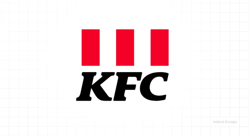
The full name carried category descriptors: “Kentucky” (provenance), “Fried” (preparation method), and “Chicken” (product category). The lettermark KFC stripped all three.
KFC’s commercial performance since the rebrand has been tracked extensively, though the lettermark adoption is rarely cited as a causal factor.
The lesson for professional services firms is the risk of category-stripping. When your full name communicates what you do and who you serve, abbreviating to initials removes information that prospects use to self-qualify.
8 – H&M: The Ampersand as Brand Shorthand
H&M – Hennes & Mauritz – demonstrates that a lettermark doesn’t need to be three distinct alphabetical characters. The ampersand, embedded between two letters, creates a mark that conveys plurality and connection within the typographic system.
The H&M mark has operated across dozens of markets and hundreds of product categories without structural modification.
Its simplicity is a function of the retail contexts in which it appears: H&M needs to work at billboard scale, on shopping bags, on digital thumbnails, and on clothing labels simultaneously. The ampersand-lettermark achieves this without a supporting visual system.
9 – Caterpillar: Bold Recognition Through Colour
The Caterpillar logo’s robust design transcends mere aesthetics; it encapsulates the essence of the brand’s promise. The bold, three-letter emblem, accented by a noticeable yellow triangle, communicates a narrative of reliability and strength.
Known for manufacturing top-tier earthmoving and construction equipment, this logo reinforces the company’s robust and steadfast image.
Symbolism and Design Elements
- Strength and Structure: The bold, uppercase typography of the logo exudes durability and confidence, aligning perfectly with the brand’s reputation for producing resilient machinery.
- The Yellow Triangle: This isn’t just a design whim. Introduced in 1989, the triangle embodies optimism, support, and energy. Its presence brings an element of intrigue. It could symbolise a mountain of earth to be moved or a peak to be scaled, suggesting readiness and capability.
Extended Applications
Since the mid-1990s, the brand has successfully leveraged this logo beyond machinery, expanding into clothing and footwear. Here, the same elements of toughness and adventure are seamlessly translated into high-traction, rugged products.
CAT Footwear and lifestyle products have been produced under licence by Wolverine Worldwide since 1994. The same bold CAT wordmark and yellow triangle travel cleanly from machinery to boots and apparel, proving the equity works in both heavy industry and consumer retail.
The emblem thus serves as a versatile and enduring symbol, equally compelling on a pair of work boots as on heavy machinery.
The Caterpillar logo fuses powerful symbolism with strategic design, succinctly conveying the brand’s mission of dependability and pioneering spirit.
10 – AOL: The Lettermark That Became a Cautionary Tale
AOL (America Online) operated one of the most recognised lettermarks of the 1990s internet era. The AOL mark demonstrated that lettermark recognition could be built rapidly in new categories when the brand was the category-defining entity.
AOL’s subsequent decline in brand equity – from a category-defining internet company to a legacy service provider – is documented extensively in the business literature.
The lettermark survived the decline in recognition but couldn’t prevent it. This is the inverse of the IBM lesson: IBM built equity, and the lettermark reinforced it; AOL built a lettermark alongside rapid category growth, and when category growth reversed, the lettermark couldn’t sustain what the category had created.
11 – DHL: Yellow as a Lettermark System
DHL’s identity demonstrates the value of environmental colour in lettermark recognition.
The DHL mark – three red letters on yellow – achieves instant recognition in logistics contexts not primarily because of the letterforms but because of the DHL vehicle fleet and uniform colour palette that has been maintained consistently across decades.
DHL’s brand recognition in the logistics sector illustrates that a lettermark’s recognition infrastructure can be built through physical brand touchpoints – vehicles, uniforms, packaging – as effectively as through advertising.
12 – UBS: Financial Sector Lettermark Discipline
UBS (Union Bank of Switzerland) operates a lettermark identity worth studying, especially given the sector it serves.
Financial services firms face the same challenges as professional services firms in the UK: category-level trust, regulatory environments, and a client base that uses brand recognition as a proxy for institutional stability.
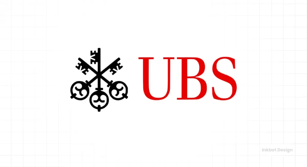
UBS’s lettermark – clean, unmodified serif characters – communicates a deliberate absence of visual noise.
In financial services, the argument runs, restraint is a credibility signal. This is a legitimate design rationale, but it only functions when the letters themselves are already meaningful to the audience.
A newly formed financial services firm adopting a clean three-letter mark doesn’t project restraint – it projects anonymity.
13 – ITV: The Television Network That Abandoned Its Lettermark
ITV (Independent Television) provides one of the clearest UK examples of a lettermark that was deliberately replaced. ITV adopted a new identity in 2013, moving away from a pure lettermark to a colour-system identity in which the lettermark became secondary to a dynamic colour field.
ITV’s rebrand is documented in the UK design press as a deliberate strategy to shift the brand from a single network identity to a multi-platform content identity. The lettermark ITV was retained, but no longer carried the full identity weight.
This is a relevant precedent for professional services firms: a lettermark built in one competitive environment may not serve a brand adequately in another.
14 – NBC: The Peacock and the Letters
NBC (National Broadcasting Company) presents a case in which the lettermark and the pictorial device have alternated in prominence throughout the brand’s history. The NBC peacock – introduced in 1956 to promote colour television – eventually eclipsed the lettermark as the primary brand identifier.
NBC’s identity history demonstrates that lettermarks and pictorial marks can coexist within a brand system, with relative prominence shifting as the brand’s communication priorities change.
For professional services firms, this model is relevant when the firm’s name is widely known, but its initials lack cultural weight.
15 – MTV: The Lettermark as Cultural Artefact
MTV (Music Television) is one of the rare cases where the lettermark itself became a cultural object independent of the broadcast content.
The oversized, painted M with MTV lettering created a mark that artists, designers, and audiences used as a canvas – the M was routinely modified, decorated, and redrawn in licensed and unlicensed contexts.
MTV’s identity approach – commissioning a mark flexible enough to be treated as a design canvas – is directly opposite to the consistency-above-all doctrine taught in most brand programmes.
It worked for MTV because cultural participation was the brand’s core value. For a professional services firm, it would be commercially catastrophic.
16 – PWC: The Professional Services Lettermark Done Correctly
PricewaterhouseCoopers’ rebrand to PwC in 2010 is worth examining because it represents one of the few professional services lettermark decisions that were documented with explicit public justification.
PwC retained the full name as a legal and formal entity name while adopting the abbreviated lettermark for commercial communications.
The PwC rebrand was accompanied by a significant visual identity investment – the red brand mark, the typographic system, the wordmark treatment – that ensured the lettermark was never operating alone.
PwC’s brand recognition in professional services was already extensive before the rebrand; the lettermark was a simplification of an existing mark, not an attempt to create recognition from initials.
17 – SAP: The Tech Sector Lettermark Advantage
SAP’s three-letter mark operates in an environment – enterprise technology – where lettermarks are the dominant convention.
SAP, IBM, HP, EMC, SAS – the enterprise tech sector has normalised three-letter identity marks to the degree that a full wordmark would read as anomalous.
This sector-level convention effect matters: in markets where lettermarks are the norm, adopting one has different implications than adopting one in markets where full wordmarks dominate.
Professional services in the UK are predominantly a wordmark sector. Law firms, accounting firms, and consulting firms overwhelmingly trade under their full names or partners’ surnames.
A lettermark in this context is a deliberate differentiator – but differentiation only works when the differentiation is visible, and the letters are already meaningful.
18 – SKY: Broadcasting Identity Across Borders
Sky’s lettermark has operated across UK, European, and Australian markets as a brand that expanded a domestic broadcaster into a multi-territory media company.
The Sky mark demonstrates that a three-letter identity can scale geographically when the letters are phonetically neutral – “Sky” reads consistently across language groups, unlike many British professional services firm names.
For professional services firms with international growth ambitions, this is a relevant consideration in the lettermark decision framework.
If the abbreviated letters read differently or carry unintended associations in target markets, a lettermark rebrand can create barriers rather than removing them.
19 – RCA: The Historical Benchmark
The Radio Corporation of America’s lettermark – operating primarily in the mid-twentieth century – established many of the visual conventions that subsequent lettermark designers built on.
RCA’s typographic choices, colour applications, and identity system architecture influenced the professional identity design standards that Paul Rand and others later codified.
RCA’s mark is historically significant as evidence that three-letter identity marks achieved commercial recognition before the concept of “brand identity” as a professional discipline existed.
The recognition infrastructure that made RCA’s mark work was built through product distribution and retail presence, not through brand strategy.
In 2026, building that kind of recognition through product presence alone is categorically more difficult, which makes adopting a lettermark without existing brand equity more commercially risky, not less.
20 – V&A: The Victoria & Albert Museum Mark
One of my favourites, the Victoria & Albert Museum in London, has an iconic logo that I am a massive fan of. The logo design has changed over the years, but they have always kept the essence of what it is to be a museum.
The museum is famous for its exhibitions, which showcase a variety of works. The museum has many exhibits, including Egyptian antiquities, the British Empire, Victorian fashion and design, and more.
The V&A logo expertly balances a classic and modern identity through its innovative design approach. Created by the Pentagram founder Alan Fletcher in 1989, the emblem exemplifies how strategic visual exclusion can lead to distinctiveness.
By omitting the left-hand stroke of the letter ‘A’ and condensing the letters to incorporate the ampersand, the logo achieves a unique form that feels familiar and fresh.
The design’s thin, Bodoni-like serifs and a pronounced contrast in stroke thickness add a layer of timeless sophistication.
Combining traditional serif elements with a minimalist, modern twist ensures the logo remains elegant and contemporary.
The Myth: Three Letters Make Your Brand Look Established
This was good advice when the professional services firms copying IBM had the same recognition foundation as IBM.
The advice was based on a reasonable observation: the most prestigious organisations in the world used lettermarks. If you use a lettermark, you look like them.
The flaw is the direction of causation. IBM, UBS, EY, KPMG, and PwC use lettermarks because they spent decades building name recognition before the marks became primary. The lettermark is the output of brand equity, not its input.
In 2026, a professional services firm rebranding to three initials without first auditing whether those initials have a standalone meaning in its target sector is not projecting a sense of establishment.
Prospects presented with an unfamiliar three-letter mark in a category they associate with full names will interpret the ambiguity as risk. In professional services, where buyer trust is the primary commercial variable, perceived ambiguity is commercially costly.
Before any lettermark rebrand, conduct a brand recognition audit across your target buyer panel. If fewer than 40% of warm prospects can correctly associate your initials with your firm without a descriptor, your letters carry insufficient equity to operate as a standalone mark.
Fix the recognition infrastructure first. Rebrand the mark second.
Design Principles That Separate the Best 3 Letter Logos from the Rest
Typography Is the Entire System
In a three-letter logo, the typeface is not a stylistic choice-it is the primary vehicle for the brand’s personality. IBM’s Rand letterform carries authority, rhythm, and systematic thinking in the horizontal stripe treatment.
The BBC’s contained block letters communicate institutional permanence. CNN’s continuous strip communicates momentum.
The typographic principles that govern effective lettermark design are specific: kerning (the spacing between letters) must be precise to the point where the three characters read as a unified mark rather than three adjacent letters; weight must be appropriate to the contexts in which the mark will appear (thin letterforms fail at small sizes; ultra-bold letterforms lose legibility at large sizes); and personality must be consistent with the brand’s sector positioning.
For professional services firms, the typographic decision is the lettermark decision. A sans-serif mark communicates modernity and clarity. A serif mark communicates heritage and authority. Neither is inherently superior – but the choice must be deliberate, not defaulted to.
Negative Space and Visual Efficiency
Effective lettermark design treats the space around and between letters as actively as the letterforms themselves. The FedEx mark – technically not a three-letter logo, but the classic teaching example – embeds an arrow in the negative space between the E and x.
That embedded arrow communicates directional delivery without adding a single additional visual element.
Three-letter logos have limited real estate. Every design decision must justify itself within the three letterforms.
A contained device (like UPS’s shield), an embedded visual metaphor (like HBO’s record icon reference), or a continuous form (like CNN’s strip) all achieve differentiation within the lettermark’s formal constraints.
Scalability Is a Technical Requirement, Not a Design Virtue
A lettermark that works at business card scale but fails at favicon dimensions has not been designed – it has been started.
The five-to-seven-exposure threshold for brand recognition cited by Zippia operates across every context in which the mark appears: website header, email signature, LinkedIn profile, document footer, and presentation title slide.
Designing a three-letter logo without testing it at 16×16, 32×32, and 512×512 simultaneously is designing for the portfolio presentation, not for commercial use. The mark must hold at every scale at which it will appear.
When a 3-Letter Logo Works (and When It Doesn’t)
| Decision Point | The Wrong Way | The Right Way | Why It Matters |
| Rationale for adopting a lettermark | “IBM uses initials, so should we” | Audit whether your initials carry standalone recognition in your sector before making the decision | IBM’s lettermark success is inseparable from IBM’s prior recognition infrastructure – copying the output doesn’t copy the input |
| Typography selection | Default to a ‘professional’ typeface from a stock library | Commission a bespoke or licensed typeface treatment that is sector-appropriate and distinctively weighted | Off-the-shelf letterforms produce off-the-shelf recognition; a professional services firm competing on expertise cannot afford generic design |
| Colour selection in financial/legal sectors | Default to blue because the sector uses blue | Audit colour ownership in your specific sector segment and select a palette that is both credible and distinctive | Blue dominates the Fortune 500 by colour (43% per Transform Magazine, 2019); in a blue-dominant sector, blue letterforms create category camouflage |
| Testing the mark | Present two or three options to internal stakeholders | Test candidate marks with your actual target buyers – cold prospects from your ICP, not internal teams | Internal stakeholders have a recognition context that cold prospects do not; testing internally measures familiarity, not effectiveness |
| Scalability verification | Design at business card / A4 scale | Design and test simultaneously at 16px (favicon), 32px, 200px, and full-resolution print scale | Lettermarks that work at presentation size frequently fail at digital-asset scale; the five-to-seven-exposure cycle operates across all contexts simultaneously |
| Transition management | Launch the new lettermark and retire the full name immediately | Maintain the full name as a secondary element for a minimum of twelve months post-launch | Recognition transfer requires exposure; removing the full name before the lettermark has achieved standalone recognition creates a gap that takes years to close |
| AI / digital entity considerations | Treat the mark as a visual-only asset | Test how the abbreviated name appears in AI-generated content, search results, and third-party publications before launch. | LLM brand entity resolution favours full entity names; a lettermark that performs well visually may create entity disambiguation problems in AI-mediated discovery environments |
3 Letter Logo Design: What the Comparison Table Doesn’t Cover
The Interlocking Monogram vs the Separated Lettermark
Two distinct approaches dominate the 3-letter logo landscape: the interlocking or overlapping monogram (where letters are physically connected or overlapping) and the separated lettermark (where letters operate as adjacent but distinct characters).
The interlocking monogram – seen in luxury contexts, in heritage brand identities, and in some financial services firms – communicates continuity, complexity, and craft. The separated lettermark – more common in technology, broadcasting, and global services firms – communicates clarity, precision, and scale.
For professional services firms, the choice maps roughly to the brand’s competitive positioning: firms competing on heritage and relationship depth tend toward the monogram approach; firms competing on systematic methodology and measurable outcomes tend toward the separated lettermark.
Neither is inherently superior – but the choice must be consistent with the rest of the brand’s positioning, not made independently of it.
When to Work With a Design Studio vs When Not To
The three-letter logo decisions that go wrong most often are the ones made without a design brief.
A design brief for a lettermark project should include: sector positioning, target buyer profile, recognition benchmarks, colour ownership audit, scalability requirements, and a clear articulation of what the mark must communicate that the full brand name does not.
Without that brief, a design studio – however skilled – is producing a lettermark that aligns with its assumptions about your brand, not with your commercial requirements.
See Inkbot Design’s 100 famous logos analysis for a comprehensive reference set of what commercially effective identity marks look like across sectors.
For further reading on how abstract vs pictorial logos compare as strategic choices, and the case for minimalist logo design in professional services contexts, those articles address the decision framework in more detail.
The Verdict
The best 3-letter logos in the world belong to brands that were already famous. That is not a coincidence – it is the mechanism.
IBM, BBC, CNN, HBO, UPS: every canonical lettermark success story begins with a recognition infrastructure built over years or decades before the abbreviated mark became the primary identity.
The professional services firms that commission a lettermark rebrand without that foundation are not positioning their brand for the next phase of growth. They are spending a design budget to make an already underrecognised brand harder to identify.
This article has covered 20 of the world’s most referenced three-letter logos and isolated the specific design and strategic conditions that make each one work. The list is instructive. The pattern is consistent. The letters themselves are never the story – the equity behind them is.
If your firm is planning a rebrand ahead of a growth phase, acquisition, or market repositioning, the starting point is not a design brief. It’s a brand equity audit.
The Brand Equity Audit™ at Inkbot Design is a structured diagnostic that identifies exactly where your brand is losing commercial ground – including whether your current identity is working hard enough to support your commercial objectives, and whether a lettermark decision is strategically sound for your specific recognition position.
Request yours at inkbotdesign.com/services/brand-audits/.
CEOs and MDs of UK professional services firms: if you’re considering a rebrand to initials, the question worth asking your board before you commission the design work is this – do your initials mean anything to a cold prospect, and if not, what are you building the rebrand on?
FAQs
What is a 3-letter logo called in design terminology?
A three-letter logo is formally classified as a lettermark logo – a typographic identity mark built from initials or abbreviated letters representing a brand name. Lettermark logos are a subtype of typographic logos, distinct from wordmarks, and are specifically suited to contexts where a full brand name is difficult to reproduce clearly at small sizes.
Why do so many large corporations use three-letter logos?
Large corporations use three-letter logos because the marks are compact, scale efficiently across digital and print media, and communicate institutional confidence. These advantages only materialise, however, when the three letters already carry brand recognition, which large corporations have built over decades of market presence, before the lettermark becomes the primary mark.
What’s the difference between a monogram and a lettermark?
A lettermark uses letters as typographically distinct, clearly legible characters arranged sequentially. A monogram interlocks, overlaps, or combines two or more letters into a single composite form where individual characters may not be separately identifiable. IBM is a lettermark; a traditional family crest initial device is typically a monogram.
How does IBM’s striped logo work visually?
IBM’s striped logo, designed by Paul Rand in 1972, replaces solid letterforms with thirteen horizontal stripes that pass through all three letters simultaneously. The stripes create visual rhythm, reference IBM’s computing heritage, and make the mark unmistakable at any size. IBM’s corporate history confirms that the mark has served as the primary brand identifier continuously since 1972.
When should a professional services firm use a lettermark instead of a full wordmark?
A professional services firm should consider a lettermark only after establishing that its abbreviated initials are recognised as a standalone mark among its target buyer panel. A lettermark serves as a recall mechanism for a brand prospects already know – not as an introduction to one they don’t. Firms in early-stage growth or entering new markets typically perform better commercially with a full wordmark.
What file formats are required for a professional three-letter logo?
A professionally produced lettermark requires SVG (Scalable Vector Graphics) for web applications, AI (Adobe Illustrator) for print and editorial use, PNG with transparent background for digital applications, including email signatures and presentations, and high-resolution JPEG for photographic contexts. Delivering only a rasterised format – JPEG or PNG without the vector source – means the mark cannot be scaled without quality loss.
How should a three-letter logo be tested before final approval?
A three-letter logo should be tested at a minimum of 16×16 pixels (favicon), 200×200 pixels (social profile), and full print resolution before approval. It should be tested in both colour and single-colour applications, on light and dark backgrounds, and in the specific contexts in which it will most frequently appear – website header, email signature, document cover page.
Does colour matter as much as the letterforms in a three-letter logo?
In many contexts, colour does more recognition work than the letterforms themselves. Exploding Topics reports that 39% of Fortune 500 companies use blue as their primary logo colour. In sectors where a specific colour is dominant, letterform distinctiveness must compensate for its ubiquity. For professional services firms in blue-dominant markets, colour differentiation at the lettermark level is a genuine competitive consideration.
What is the recognition infrastructure problem for lettermark logos?
Recognition infrastructure refers to the accumulated brand awareness – built through client relationships, market presence, content, and commercial activity – that makes abbreviated initials meaningful to a prospect without additional context. A lettermark that lacks recognition infrastructure produces no recognition response in a cold audience. The letters IBM, BBC, and CNN carry recognition because of decades of market presence that preceded their adoption as primary identifiers.
How long does it take for a new lettermark to achieve standalone recognition?
One survey cited by Zippia reports it takes five to seven exposures to a logo before a customer reliably remembers the brand. For professional services firms with low cold-audience exposure frequency – where most prospects encounter the brand through referrals or limited-touch digital channels – achieving that threshold may take significantly longer than for high-frequency consumer brands. Firms should plan for a minimum twelve-month transition period before retiring the full wordmark.
What is the AI entity recognition risk for lettermark logos?
Large language models resolve full entity names more reliably than abbreviated lettermarks because full names carry more disambiguating context. A firm operating as “Crawford Management Group” is more easily resolvable by an AI system than “CMG”, which may refer to multiple entities across multiple sectors. As AI-mediated brand discovery becomes more prevalent in professional services – through AI-generated reports, voice search, and AI overview results – lettermark entity ambiguity becomes a commercial risk worth auditing before committing to a rebrand.
What’s the first step before commissioning a three-letter logo redesign?
A brand recognition audit among your specific target buyer panel is the required first step. The audit must establish whether your abbreviated initials carry a standalone meaning for cold prospects in your sector – not among current clients or internal team members who already have recognition context. If the audit reveals insufficient recognition infrastructure, building that foundation should precede any lettermark investment.
