Abstract vs Pictorial Logos in SaaS Branding
The most resilient SaaS brands avoid literal pictorialism because it creates a “cognitive ceiling” for the brand’s future growth; abstract marks are the only logical choice for high-growth tech companies seeking long-term equity.
If you are building a software company with the intent to scale, choosing a logo that literally depicts your current tool is a strategic error. It anchors your brand to a specific function, making future pivots or expansions feel disjointed to your audience.
According to research by Kantar (formerly Millward Brown), brands that redesign their visual identity within 3 years of launch, without maintaining core distinctive assets, lose an average of 15% in brand recognition equity.
For a SaaS startup, this loss is often fatal. Founders frequently fall into the trap of wanting their logo to “explain” what the software does. They want a gear for “tools,” a cloud for “storage,” or a chat bubble for “communication.”
This desire for immediate clarity often leads to a generic visual identity. You end up looking like every other “me-too” product in an overcrowded market.
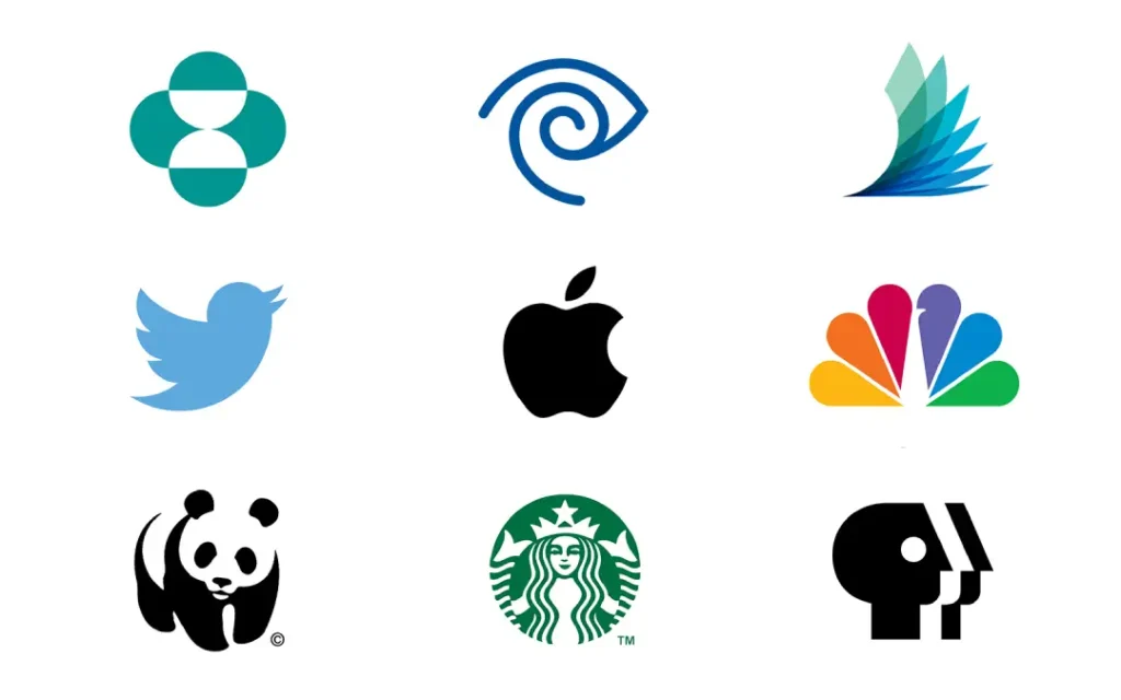
To build a lasting entity, you need to study Famous logos and understand that the most powerful marks—from Nike’s swoosh to Apple’s bitten fruit—do not describe what the company sells. They represent an idea that the company eventually owns.
- Abstract marks preserve long-term brand elasticity, preventing metaphor debt and costly redesigns; avoid literal pictorial logos for SaaS growth.
- Abstract logos scale technically: superior favicon legibility, simpler paths, and stronger trademark protection; see Airbnb and Apple.
- Micro‑SaaS or fixed point solutions can use pictorial marks for semantic priming, but they risk genericity and rapid obsolescence on pivots.
- With tools like Adobe Firefly 3 and Canva’s Dream Lab, avoid AI-made literalism; choose human-crafted abstract marks to prevent misclassification and blandification.
What Are Abstract vs Pictorial Logos?
Abstract logos are non-representational symbols that use geometric forms to convey a brand’s essence, whereas pictorial logos use recognisable, literal imagery to represent the brand or its primary function.
Key Components:
- Abstract Marks: Use shape, line, and colour to create a unique visual “hook” without referencing a real-world object.
- Pictorial Marks: Rely on a stylised version of a tangible object, such as a bird (Twitter) or an apple (Apple).
- SaaS Context: The choice determines whether the brand is perceived as a specific tool or a versatile platform.
Abstract logos represent concepts through non-representational geometry, while pictorial logos use literal symbols; for SaaS, abstract marks offer superior brand elasticity and long-term recognition.
Why “Explaining Your Product” Is Bad Design
The myth that a logo must explain a product’s function is a leftover from the early days of industrial trade, where illiterate consumers needed a visual shorthand for what was inside a crate.
In 2026, your logo does not need to do the heavy lifting of your marketing copy. Its job is to be a distinctive, memorable trigger for the brand experience.
Many SaaS founders believe that a literal icon aids user onboarding. They argue that if a user sees a “check mark” in the logo, they will instinctively know it is a task management app.
However, the Nielsen Norman Group (NN/g), a leading UX research consultancy, has found that while literal icons can provide minor initial clarity, they lack the “memorability headroom” required for long-term brand building.
When you use a literal icon, you are competing with every other app in that category using the same metaphor. If you are the 500th project management tool to use a “tick,” you are effectively invisible. Furthermore, literalism creates “metaphor debt.”
If your SaaS pivots from a “cloud storage” tool to a “collaborative AI workspace,” that cloud icon suddenly becomes a legacy weight that confusingly misrepresents your current value proposition.
Literal pictorial logos create a cognitive ceiling for SaaS brands by anchoring the identity to a specific, often temporary, product function. This “metaphor debt” forces expensive redesigns when the company inevitably scales or pivots, whereas abstract marks provide the necessary elasticity to encompass a brand’s evolution without losing historical equity.
Abstract Marks: The Engineering of Brand Elasticity
Abstract logos are the gold standard for SaaS because they are “meaning-neutral” at birth. This allows the brand to “pour” its meaning into the mark over time through consistent service delivery and marketing.
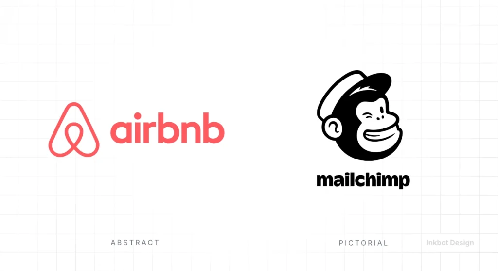
Think of the Airbnb “Bélo” symbol. When it was first released in 2014, it was met with widespread confusion. Critics didn’t know if it was a heart, a location pin, or something else entirely.
Today, after years of consistent application, that abstract mark represents a global platform for belonging. Because it wasn’t a literal “house” or “bed,” Airbnb could expand into “Experiences” and “Boutique Hotels” without the logo feeling restrictive. This is the power of our logo design services: we build marks that grow with you.
Technically, abstract marks often perform better in modern software environments. They are typically simpler in construction, which means they retain their integrity at favicon sizes (16px) or as small profile pictures on social media.
A complex pictorial logo, like a detailed illustration of a server rack, turns into an unidentifiable smudge at small scales.
- Scalability: Abstract shapes are easier to “hint” and render in low-resolution environments.
- Distinctiveness: It is easier to trademark a unique geometric arrangement than a common object.
- Longevity: Geometric principles are less subject to design trends than illustrative styles.
Pictorial Marks: When Literalism Actually Works
While I generally advocate for abstract marks in SaaS, there are specific scenarios where pictorial logos are the superior choice.
This usually occurs when a brand wants to use “semantic priming”—a symbol that evokes a specific emotional response or personality trait that is difficult to convey through geometry alone.
The most famous example in tech is the Twitter bird (pre-X). The bird symbolised “chirping” short bursts of information and felt light, fast, and social. It gave a cold piece of software a friendly, living personality.
For “Micro-SaaS” tools that serve a very narrow, specific niche and have no intention of pivoting, a pictorial mark can provide a shortcut to category association.
However, even in these cases, the pictorial mark must be highly stylised. A literal, photographic-style illustration is a hallmark of amateur design.
If you look at various types of logos, the successful pictorial ones are abstract versions of the objects they represent. They follow the “Pictorial Superiority Effect”—a phenomenon documented in cognitive psychology where pictures are more likely to be remembered than words, but only if they are distinctive enough to be coded as a unique entity.
While pictorial marks offer a shortcut to emotional resonance and category association, they are best suited for niche SaaS products with a fixed value proposition. For any brand with platform ambitions, the risk of “metaphor debt” far outweighs the initial benefit of literal clarity, making stylised abstraction a safer long-term investment.
The 2026 SaaS Logo Audit: Abstract vs Pictorial
To decide which direction is right for your 2026 branding strategy, you must audit your long-term roadmap. If you intend to remain a “point solution”—a tool that does one thing perfectly forever—a pictorial mark might be your best friend. If you intend to become an ecosystem, abstract is your only path.
| Feature | Abstract Logo | Pictorial Logo |
| Primary Goal | Recognition through geometry | Recognition through metaphor |
| Brand Elasticity | High (Can encompass any pivot) | Low (Tied to initial product) |
| Favicon Legibility | Excellent (Simple paths) | Variable (Complex icons fail) |
| Trademark Strength | Very High | Medium (Common objects are harder) |
| Best For… | Ecosystems, Platforms, AI Tools | Niche Tools, Consumer Social |
Understanding the wordmark vs logomark relationship is also vital.
In 2026, most SaaS brands are moving toward a “responsive” identity where the logomark (the symbol) must work independently of the wordmark.
This is where abstract marks truly shine. They function as a “digital avatar” that doesn’t need the brand name to be recognised, provided the distinctiveness is high enough.
When Minimalism Becomes Invisible
In 2026, we are seeing a backlash against “blandification”—the trend of every tech company moving toward identical, ultra-minimalist sans-serif logos and geometric marks.
The myth here is that “simpler is always better.” While simplicity aids scalability, over-simplification leads to a loss of distinctive brand assets (DBAs).
The Ehrenberg-Bass Institute for Marketing Science has demonstrated that for a brand asset to be “distinctive,” it must be both unique (no other brand uses it) and prevalent (most consumers associate it with your brand). If your abstract logo is just three blue dots, you are failing the uniqueness test. You are “minimal” but also “invisible.”
A common mistake in the emblem logo space, especially for SaaS, is cramming too much detail into a “badge”- style logo.
In 2026, the successful “complex” logos are actually dynamic marks that can change their internal patterns or colours while maintaining a consistent silhouette. This allows for the “Information Gain” that AI-driven search engines and users crave without sacrificing the structural simplicity needed for modern UI.
The trend toward ultra-minimalism in SaaS branding has reached a point of diminishing returns, where brands are sacrificing distinctiveness for simplicity. A successful 2026 logo must balance “clean” geometry with enough “visual friction” to remain unique in an increasingly crowded digital landscape.
The State of SaaS Branding in 2026
The branding landscape has been fundamentally altered by the release of Adobe Firefly 3 and Canva’s Dream Lab AI in late 2024 and throughout 2025.
These tools have democratised the creation of “competent” logos, which means “competent” is the new “failing.” When any founder can generate a clean pictorial logo in thirty seconds, the value of professional branding shifts from “execution” to “strategic differentiation.”
In early 2026, we are seeing a massive shift toward “Organic Abstraction.” This is a reaction to the rigid, mathematically perfect “Startup Bauhaus” style of the early 2020s.
Brands like the new OpenAI-adjacent startups are moving toward fluid, moving, and asymmetrical marks. This shift is partly driven by the need for logo placement in unconventional environments, such as AR/VR overlays and AI-agent avatars.
Furthermore, Google’s “Search Generative Experience” (SGE) and Perplexity AI have changed how logos are “read.” These systems are now capable of visual entity recognition.
If your logo is a generic pictorial mark, the AI may misclassify your brand within a generic category. A highly unique abstract mark, properly tagged and consistently used, helps “train” the AI to recognise your brand as a distinct, authoritative entity.
- AI Tool Impact: Tools like Adobe Firefly 3 have made high-fidelity illustrative (pictorial) marks easy to produce, leading to a market saturated with “AI-flavoured” literalism.
- The Reaction: High-end SaaS brands are doubling down on “Human-Crafted Abstraction”—marks with subtle intentional “errors” or hand-finished qualities that AI struggles to replicate authentically.
- Market Development: The acquisition of several mid-tier branding agencies by AI-first consultancies in 2025 has led to a standardised “AI-Optimised” design aesthetic, making truly bespoke abstract work even more valuable for premium positioning.
The Cost of a “Safe” Choice
I once audited a client who insisted on a pictorial logo featuring a literal “vault” icon. They argued it conveyed “security” and “trust.” Within 18 months, they expanded into payment processing and real-time ledger APIs.
The vault logo suddenly felt like a heavy, slow, “old-world” bank. They were losing deals to competitors who looked like “fast, modern tech” because their logo was stuck in 1995.
The most expensive mistake I have watched a founder make was spending £50,000 on a literal pictorial logo that they had to scrap two years later when they pivoted. They didn’t just lose the money spent on the design; they lost the two years of consumer “rehearsal”—the time spent teaching the market that this shape equals our brand.
In our fieldwork at Inkbot Design, we consistently see that founders who choose “safe,” literal logos are usually the ones most afraid of their own product’s potential.
They use the logo to explain what they are today because they haven’t yet formalised the vision of what they will be tomorrow. If you are building for the long haul, buy a logo for the company you want to become, not the one you are on day one.
Data Comparison: Amateur vs Pro Logo Strategy
| Technical Aspect | The Wrong Way (Amateur) | The Right Way (Pro) | Why It Matters |
| Metaphor Choice | Literal (A camera for a photo app) | Abstract/Thematic (An “aperture” concept) | Prevents “metaphor debt” during product pivots. |
| Path Complexity | 50+ anchor points (Illustrative) | <15 anchor points (Geometric) | Ensures clean rendering at favicon (16px) scale. |
| Colour Profile | Relying on gradients for meaning | Functional in single-colour | Essential for UI consistency and print versatility. |
| Entity Naming | “logo_v2_final.svg” | “brand-name-logomark-2026.svg” | Helps AI systems correctly attribute the visual asset. |
| Semantic Gap | Closing the gap (explaining the tool) | Maintaining the gap (inviting curiosity) | Creates a more memorable, “sticky” brand identity. |
| Scalability | Complex icons that “break” at small sizes | Responsive logo variants | Maintains brand recognition across all devices. |
The Verdict
The debate between abstract vs pictorial logos is not about aesthetics; it is about strategic foresight.
In the SaaS world of 2026, where products evolve and markets fragment at lightning speed, a pictorial logo is a high-risk gamble. It offers a minor shortcut to user understanding at the cost of long-term brand elasticity and distinctiveness.
The data from the Ehrenberg-Bass Institute and the real-world redesigns of giants like Slack and Dropbox prove that abstract marks are the superior vehicle for building brand equity.
They let you own a unique visual “hook” in the consumer’s mind without being tied to a specific feature set.
Stop trying to make your logo “work” by explaining your product. Start making your logo “work” by making it unforgettable.
Build a mark that is simple enough to render on a smartwatch, unique enough to be trademarked, and abstract enough to house your company’s future.
Explore Inkbot Design’s logo design services and read our other posts to ensure your brand is built for the next decade of tech.
FAQs
What is the main difference between abstract and pictorial logos for SaaS?
Abstract logos use non-representational geometric shapes to represent a brand’s essence, while pictorial logos use literal, recognisable objects. For SaaS, abstract marks are generally preferred because they allow for greater brand elasticity as the product’s features and target markets evolve.
Are abstract logos better for brand recognition in 2026?
Abstract logos often achieve higher long-term recognition because they are more distinctive than literal icons. While pictorial marks provide immediate category association, they often become generic. A unique abstract shape, when used consistently, creates a stronger “distinctive brand asset” that users can identify instantly without reading text.
Why do large tech companies like Slack use abstract logos?
Large tech companies use abstract logos to solve scalability and versatility issues. Slack moved from a literal hashtag to an abstract mark because the original was difficult to render on small screens and used too many colours. Abstract marks are easier to maintain across various digital platforms and international markets.
Can a small SaaS startup use an abstract logo effectively?
Small startups can use abstract logos successfully if they focus on distinctiveness rather than “meaning.” A unique geometric mark helps a new brand stand out in a crowded marketplace. The meaning of the logo will be built over time through the quality of the product and marketing efforts.
What is “metaphor debt” in logo design?
Metaphor debt occurs when a brand uses a literal pictorial logo that represents a specific product feature. If the company pivots or expands, the logo becomes a legacy burden that misrepresents the brand’s new value proposition, eventually requiring an expensive and risky redesign to fix.
Is it true that pictorial logos are easier for users to remember?
Pictorial logos can be easier to remember initially due to the “Pictorial Superiority Effect,” but this effect applies only when the symbol is unique. In SaaS, most pictorial logos are generic (e.g., clouds, gears, or links), which actually makes them less memorable than a well-designed, unique abstract mark.
When should a SaaS brand choose a pictorial logo?
A SaaS brand should choose a pictorial logo if it is a “point solution” with a very specific, unchanging niche and wants to use semantic priming to evoke a particular emotion. If the brand’s personality is its primary differentiator (e.g., a friendly mascot), a pictorial mark can be effective.
How does AI impact the choice between abstract and pictorial logos?
AI systems and Generative Engine Optimisation (GEO) prefer unique visual entities. AI visual recognition systems can misclassify generic pictorial logos, whereas a highly unique abstract mark helps the AI identify and attribute the brand more accurately across the web.
Do abstract logos work well at favicon sizes (16px)?
Abstract logos are generally superior at small scales because their geometry can be simplified without losing the mark’s core identity. Pictorial logos often contain too much detail, which turns into an unidentifiable smudge when scaled down for browser tabs or mobile notifications.
What are the trademark benefits of an abstract logo?
Abstract logos are significantly easier to trademark than pictorial ones. Since they are not based on common real-world objects, they are more likely to be deemed “inherently distinctive” by trademark offices, providing stronger legal protection for the brand identity as it scales.
Is minimalist design still effective for SaaS logos in 2026?
Minimalism is effective only if it maintains distinctiveness. In 2026, many SaaS brands are moving away from “ultra-minimalism” toward “Organic Abstraction” to avoid looking generic. A logo must be simple enough to scale but complex enough to be unique.
How does an abstract logo help with international branding?
Abstract logos are “culture-neutral,” meaning they don’t carry the potential baggage or specific meanings that literal objects might have in different countries. This makes them a safer and more scalable choice for SaaS companies looking to expand into global markets.
