Welcome to the World of Modern Web Design
The internet has come a long way since plain-text websites and bulbous fonts. These days, web design is an art form that balances aesthetics, user experience, and performance. With over 1.1 billion websites, standing out from the pack requires embracing modern techniques and trends.
So, what defines modern web design in 2024? Read on to discover the key elements of contemporary websites and predictions for where the industry is heading next.
Clean, Minimalist Layouts
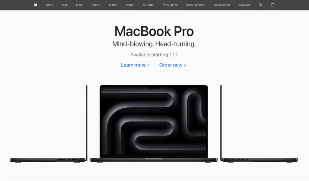
Gone are the days of cluttered pages crowded with text, graphics, Flash animations and other distractions. The hallmarks of modern web design include generous white space, minimal interface elements, and an emphasis on core content.
Some of the characteristics of this clean aesthetic:
- Simple navigation menus and structured page layouts
- High-quality photographs and subtle, tasteful graphics
- Plenty of negative space allowing content to stand out
- Hidden elements that only appear when needed for usability
- Short paragraphs and bullet points rather than dense blocks of text
This minimalism focuses visitor attention on what matters most—your brand message and quality content.
Mobile-Friendly Responsive Design
With over 50% of web traffic coming from mobile devices, responsive web design is necessary for the modern web. Responsive sites automatically adapt layouts and elements to fit different screen sizes.
Common responsive strategies include:
- Flexible image sizes and text that flows appropriately
- Menus that transform into mobile navigation buttons
- Column structures that adjust for smaller screens
- Media queries that apply CSS based on device parameters
Responsive design ensures that no visitors are left behind by providing an optimal viewing experience across smartphones, tablets, laptops, and desktop PCs.
Vibrant, Authentic Photography
The best modern websites use custom photography that captures the emotional essence of brands rather than generic stock photos. Dramatic lifestyle images connect with visitors and make for powerful headers.
Other photography tips:
- Show real people using your products or services
- Convey personality and storytelling through image choices
- Use overlays such as text and graphics for visual interest
- Ensure photography reinforces your brand identity
- Optimise photos for fast loading times
Vibrant images that feel authentic are a perfect match for minimalist site designs.
Bold and Animated Typography
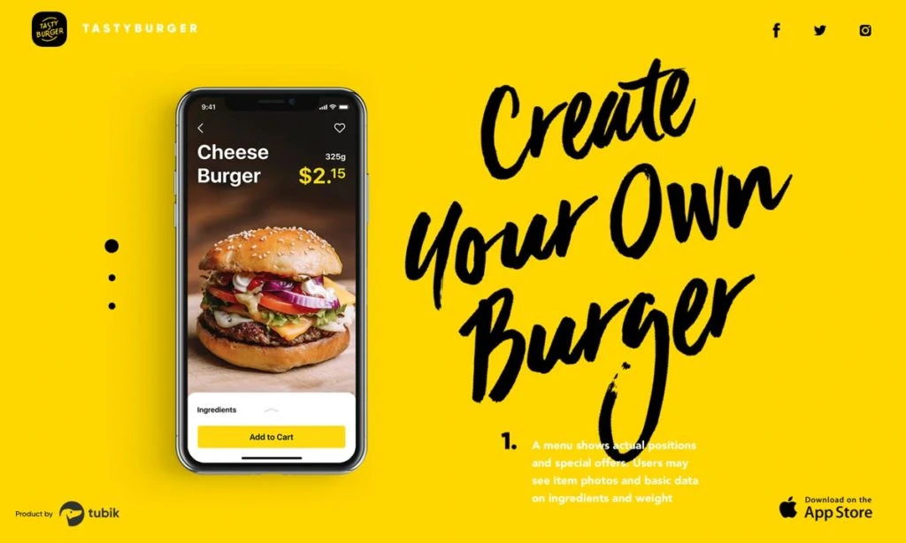
Typography is another area where web designers exercise creativity for modern sites. Custom font choices, weights, scales, and styles create a hierarchy and visually engage visitors.
Trending font techniques:
- Display fonts for headers command attention
- Creative incorporation of font weights and styles
- Handwritten and scripted fonts for personality
- Animated text transitions on interactions for immersion
- Custom illustrations combined with typography
Paired with ample white space, bold typography immediately establishes a unique identity.
Meaningful Microinteractions
Microinteractions may seem small, but they have an outsized impact on user experience. These are the transitions, animations, hover states, and interface feedback moments when users interact with page elements.
Examples of skilful micro-interactions:
- Icon animations on user clicks
- Input field validation messages
- Loading spinners on page transitions
- Hover tooltips revealing hidden info
- Cart quantity transitions
By thoughtfully crafting these micro-moments, web designers eliminate friction and delight users.
Kinetic Parallax Scrolling
Parallax scrolling adds multidimensional depth and motion to modern web layouts. As visitors scroll down the page, different page elements shift and rotate at different speeds to create an immersive effect.
Parallax techniques to try:
- Background images that slowly zoom by
- Sections that slide or fade into view
- Headlines and text transitioning across the field of view
- Graphics and videos warping for added dynamics
When used effectively, parallax engages visitors to scroll further, increasing time on site.
Brutalist Designs
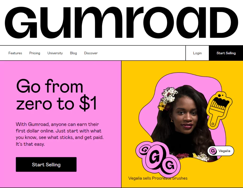
On the opposite end of minimalism, Brutalist web design purposely breaks conventions for dramatic effect. Websites feature bold textures, vivid colours, asymmetric layouts, and maximalist touches.
Hallmarks of the Brutalist approach:
- Raw concrete textures and blocky layouts
- Clashing colour palettes and distressed textures
- Discordant typography and defiant asymmetry
- Images that overflow conventional grid structures
Brutalism's high-impact aesthetic dares visitors to pay attention.
Handcrafted Illustrations
Custom illustrations set modern sites apart with charm and personality. These humanising touches of handcrafted artwork build emotional connections between brands and audiences.
Illustrations work well for:
- Hero sections and eye-catching headers
- Explainer sections educating how a product or service works
- Timelines, process flows, and storytelling visuals
- Testimonials and customer quotes
- Email newsletters and marketing campaigns
Lines, shapes, and hand-drawn elements blend approachability with professionalism.
Kinetic Loaders and Animations
Animation brings energy and dynamism to modern interfaces. Subtle animations guide users, reveal site personality and reduce perceptions of loading times.
Typical uses of animation:
- Loading sequences when fetching data
- Transitions between page sections
- Hovers over clickable elements
- Warning messages requiring attention
- Illustrating complex concepts
- Drawing out important page areas
The motion and momentum animation provides improved usability while engaging audiences.
Vibrant, Emotive Colour Schemes
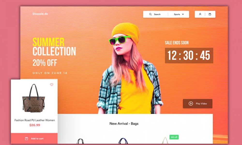
Colour is one of the most immediate ways to influence user perceptions and experience. Modern web design leverages bold, vibrant colour schemes that align with brand identity.
Tips for picking the perfect palette:
- Limit to 2-4 primary colours for cohesion
- Use colour psychology to convey the desired mood
- Make sure hues and tones complement each other
- Test for accessible colour contrast ratios
- Establish primary, secondary, and accent colours
Colours that reflect brand personality make lasting impacts on visitors.
Asymmetric Layouts
Symmetric website layouts can feel stagnant and predictable. The antidote is asymmetric design—purposefully unbalanced compositions that feel dynamic.
Asymmetry adds visual interest through:
- Varying content block sizes and shapes
- Contrasting page margins and negative space
- Overlapping geometric shapes and textures
- Tilted headings and angled photography
- Alternating large and small columns
The right asymmetry balances consistency with excitement.
Art Direction in Web Design
Art direction involves curating page elements like images, graphics, fonts, and colours to match branding objectives. Modern web design art direction focuses on technical excellence and emotional storytelling.
Key art direction strategies:
- Using colour to influence perceptions
- Photographing branded concepts vs generic models
- Matching typography styles to personality
- Animating text and illustrations for immersion
- Composing graphical layouts that reinforce messaging
Meticulous art direction unites page elements into a visually arresting experience.
Immersive Interactions
Incorporating immersive interactions transforms websites from flat content pages into living worlds. These playful touches turn browsing into an experience users actively enjoy.
Examples of immersive interactions:
- Parallax scrolling tying page movement to mouse movement
- Elements that react and transform on mouse hovers
- Audio effects on interactions for added sensory input
- 3D product models users can rotate and zoom
- Particle effects like fireworks on completion events
These moments of immersive delight inspire engagement and sharing.
The Rise of WebGL for 3D Graphics
Many modern interfaces incorporate WebGL for hardware-accelerated 3D graphics rendered right in the browser. The technology allows stunning visuals with responsive frame rates.
WebGL powers experiences like:
- 3D product configurators
- Immersive data visualisations
- Virtual reality e-commerce
- Interactive maps and 360° imagery
- Architectural 3D model visualisation
As WebGL performance improves, expect more brands to embrace interactive 3D experiences.
Web Accessibility Essentials
With over 1 billion people worldwide having disabilities, web accessibility is both a moral and legal necessity. Modern sites place accessibility at the foundation of design.
Basic accessibility practices:
- Add ARIA roles to interface elements
- Use proper semantic HTML5 elements
- Write clear link text for screen readers
- Confirm sufficient colour contrast
- Allow keyboard navigation for all functions
- Provide text captions for audio/video
Accessible design supports the broadest possible audience engagement.
The Rise of Variable Fonts
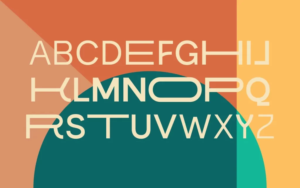
Variable fonts are an emerging web typography technique that lets designers alter font properties like weight, slant, and width along a continuous spectrum.
Benefits of variable fonts:
- Smoother responsive adjustments across screen sizes
- Fine-grained typographic control
- Smaller file sizes from consolidating font files
- Creative opportunities for font exploration
- More expressive headline animations
Expect variable fonts to grow in adoption as designer awareness increases.
Site Designs Driven by UX Research
The most influential modern web designs derive from rigorous user experience (UX) research. Studies uncover user pain points, psychology, behaviours, and needs.
Types of UX research for design direction:
- Generative research like surveys and interviews
- Usability studies observing user struggles firsthand
- A/B testing of design hypotheses
- Analytics revealing how users navigate sites
Research-backed designs aligned to user needs have the highest ROI.
A Focus on Web Performance
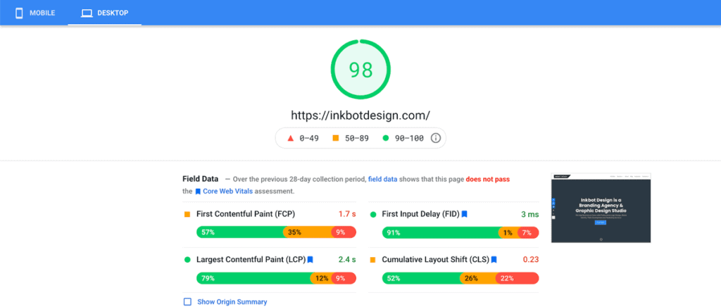
With attention spans dwindling, fast page load times are mandatory for retaining visitors. Modern web design prioritises performance through code optimisations and content strategies.
Tactics for a faster site:
- Minify and compress assets to reduce bandwidth
- Establish performance budgets for page size
- Lazy load of non-critical resources
- Use content delivery networks for more immediate delivery
- Remove render-blocking JavaScript
- Optimise graphics and video files
Speed and engagement go hand in hand—every millisecond matters.
Balancing Innovation and Best Practices
The modern web reconciles innovative design trends with time-tested best practices. Striking this balance is critical for performance, accessibility, conversions, and long-term viability.
Marrying innovation with fundamentals means:
- Following inclusive design principles
- Structuring content for scanning
- Optimising pages for organic search
- Facilitating clear user flows
- Validating ideas through testing
- Ensuring responsiveness across devices
Blending cutting-edge ideas with proven methods maximises results.
Crafting Immersive Digital Experiences

Truly modern web design thinks beyond pages to craft immersive digital experiences. These end-to-end journeys guide users through narratives tailored to their needs.
Experience design strategies include:
- Mapping journeys from introduction to advocacy
- Developing personalised recommendations
- Gamifying interactions for ongoing engagement
- Facilitating social community building
- Providing utility and entertainment, not just sales
Thinking about experiences, not just destinations, strengthens bonds between brands and users.
The web today represents the pinnacle of human-computer interface design. Modern web design engages audiences and empowers businesses by blending aesthetics, content, and technology. The possibilities are limited only by our imagination.
The future promises even richer canvases for creativity as new tools, techniques, and devices expand what's achievable online. There has never been a more exciting time to be a web designer.
Frequently Asked Questions About Modern Web Design
Still, have questions about succeeding with modern web design? Here are answers to 5 common FAQs:
How do I make sure my site design is fully responsive?
The gold standard is to use a mobile-first design approach. First, design for small screens like smartphones. Then, progressively enhance layouts for larger breakpoints. Thoroughly test across all devices to catch bugs.
What's the best way to learn modern web design trends?
Read design blogs like Smashing Magazine daily. Follow thought leaders on Twitter. Explore designs on sites like Awwwards and Dribbble: Analyse competitors and industry leaders. Join online courses and communities.
How do I pick the right web fonts for my brand?
Match font personalities to your brand identity. Sans-serifs feel modern and clean; serifs are traditional, slabs are bold, and scripts are playful. Combine a decorative font for headlines with a simple one for body text.
Should I design mobile apps or responsive websites?
Responsive web design supports all devices, so apps aren't always necessary. Consider native apps for advanced device capabilities or a prominent mobile presence. Start with websites to support the broadest audience.
How much should I budget for a website redesign?
Budget at least $15,000-$30,000+ for a custom design. E-commerce sites fall on the higher end. Ongoing costs include hosting, maintenance, marketing, and occasional redesigns every 3-5 years.
Want even more web design tips and trends? Contact me today!

 Pinterest
 LinkedIn
