The Strategic Principles of Minimalist Logo Design
Minimalism is the most misunderstood concept in branding today.
Entrepreneurs and business owners ask for a “minimalist logo” expecting something clean, modern, and cheap. They see the effortless simplicity of the Nike swoosh or the Apple logo and think, “How hard can that be?”
That’s the first mistake. And it’s a costly one.
Minimalist design isn’t about what you lack. It’s about the ruthless, strategic removal of unimportant things. It’s not an aesthetic you pick from a dropdown menu. It’s the hard-won outcome of a deep, strategic process.
Let’s get honest about what it takes to create a minimalist logo.
- Minimalism is a strategic discipline: ruthlessly remove everything that doesn’t reinforce one core brand idea.
- Simple-looking logos are hard to create; they require deep strategy, exploration, and meticulous refinement.
- Negative space, precise typography, limited colour, and balanced composition are essential minimalist tools.
- Minimalism succeeds when aligned with brand personality; it fails when forced or used as a trend.
- Professional process matters: discovery, extensive sketching, refinement, and real-world testing produce enduring marks.
“Minimalist” Isn’t What You Think It Is
Before we go any further, we need to clear the air. The popular definition of minimalist logo design is wrong. It’s been corrupted by template sites and £5 design contests.
The Great Misconception: Simple vs. Easy
A successful minimalist logo looks simple. It is not simple to create.
Think of it like a punchline to a brilliant joke. The delivery is short, sharp, and seems effortless. But the thought process behind it—the timing, the word choice, the setup—is complex.
Creating a logo that communicates your entire brand ethos in a single glance with just a few lines or a clever use of type is one of the most difficult challenges in graphic design. It’s far easier to hide a weak concept behind layers of ornamentation, gradients, and effects.
Minimalism leaves you nowhere to hide.
Minimalism as a Discipline of Reduction
True minimalism is a discipline. It’s the art of saying the most with the least.
The process doesn’t start with “let’s make it simple.” It begins with “What is the most important idea we must communicate?” Once that idea is identified, the designer’s job is to act like a sculptor, chipping away every piece of visual information that doesn’t reinforce that one core concept.
What you’re left with isn’t “less.” It’s “just enough.”
The Real Enemy: The Sea of Generic, Soulless Logos
The obsession with a watered-down version of minimalism has created a visual pandemic. It’s a sea of sameness filled with sans-serif wordmarks and their meaningless geometric sidekicks: the abstract hexagon, the three ascending bars, the circle with two letters crammed inside.
You’ve seen them a thousand times. They say nothing. They mean nothing.
These logos result from treating minimalism as a style to be copied rather than a principle to be applied. Using the same template, they make your business look generic, forgettable, and indistinguishable from the next dozen startups. A great minimalist logo makes you stand out; a bad one makes you invisible.
The Uncomfortable Question: Does Your Brand Actually Need a Minimalist Logo?
Just because minimalist design is practical doesn’t mean it’s right for you. Chasing this trend without a strategic reason is a fast track to a bland brand identity. You must ask if this aesthetic aligns with your company’s core personality and goals.
When Minimalism Works (And Why)
A minimalist approach is compelling under the right circumstances. It’s often the best choice for:
- Brands Conveying Sophistication and Confidence: Minimalism is the visual language of self-assurance. It says, “We are so confident in our product/service that we don’t need to shout.” Think of luxury fashion, high-end tech, and architectural firms.
- Businesses Requiring Extreme Scalability: A simple mark is a versatile mark. It will look sharp as a tiny app icon on a phone and remain clear when blown up on a billboard. It can be easily embroidered, engraved, or printed on any surface without losing detail.
- Companies with Strong, Memorable Names: A minimalist wordmark can be the perfect solution if your company name is unique and powerful. The design focuses entirely on the typography, turning your name into the visual hero. Think Google, a brand that relies on colour and the clean forms of its name.
When Minimalism Fails (Spectacularly)
Conversely, forcing a minimalist aesthetic onto the wrong brand can be disastrous. It often falls flat for:
- Brands That Thrive on Warmth or Character: If your brand identity is built around being fun, approachable, kid-friendly, or artisanal, a stark minimalist logo can feel cold and alienating. A craft brewery or a children’s toy store often needs more personality and detail.
- Businesses Just Chasing a Trend: Adopting a minimalist logo because “it’s what tech startups do” is a recipe for a generic identity. If your choice isn’t rooted in your brand’s unique story and values, it will lack authenticity and fail to connect with your audience.
- Complex Services Needing to Communicate More: Sometimes, a brand must tell a more intricate story at first glance. If you’re in a crowded market, a slightly more descriptive logo can be a vital tool for immediate differentiation, which a purely minimal mark might struggle to achieve.
The Core Principles They Don’t Teach You on Fiverr
Getting minimalism right isn’t about mastering software; it’s about mastering principles. These foundational ideas separate iconic, lasting logos from forgettable, amateur attempts.
Principle 1: One Concept, Executed Flawlessly
A minimalist logo should be a visual haiku. It must be built on a single, strong, and clear concept. You’ve already failed if you try to communicate two or three ideas.
The entire design must serve that one idea. Amazon’s logo is a perfect example. It’s a wordmark, but the arrow underneath is the concept. It functions as a smile, conveying customer satisfaction. It also points from ‘A’ to ‘Z’, communicating that they sell everything: one arrow, two meanings, one core concept: a customer-centric everything store.
Principle 2: Negative Space is an Active Ingredient, Not an Afterthought
Amateurs see whitespace as the empty part of the canvas. Professionals see negative space as an active, powerful design tool.
The most famous example in history is the FedEx logo. At first glance, it’s a simple, bold wordmark in two colours. But look closer. The negative space between the ‘E’ and the ‘x’ forms a perfect forward-pointing arrow.
This arrow subliminally communicates speed, direction, and precision—the essence of their business. It’s a hidden reward for the observant viewer and a masterclass using negative space to embed a second layer of meaning. It’s clever, not complicated.
Principle 3: Typography Is the Design
In many minimalist logos, especially wordmarks, the typography isn’t just a component; it is the entire design. The choice of font, the spacing between letters (kerning), and the weight of the lines carry the full weight of the brand’s personality.
A sans-serif font like Helvetica can feel modern, clean, and neutral. A serif font might feel more traditional, established, and authoritative. A custom-designed letterform can give a brand an utterly unique voice.
The difference between a professional and an amateur wordmark is often in the details that 99% of people don’t consciously notice, but 100% feel. The tiny adjustments to the space between an ‘A’ and a ‘V’ can be the difference between a logo that feels balanced and one that feels “off.”
Principle 4: A Deliberately Restricted Colour Palette
Minimalism exercises extreme restraint with colour. Complexity is the enemy of impact. A chaotic colour palette will undermine a simple form.
Many of the most powerful minimalist logos are monochrome (black and white). This places all the emphasis on the shape and concept of the mark. When colour is used, it’s done with purpose.
Mastercard’s logo is just two overlapping circles. The magic is in the colour. The intersection of the red and yellow circles creates a distinct orange, symbolising the seamless connection and partnership at the core of their brand: two shapes, three colours, one clear idea.
Principle 5: Obsessive Focus on Balance and Composition
How the few elements in a minimalist logo are arranged is critical. Each part’s visual weight, alignment, and proximity are meticulously considered to create a sense of harmony and stability.
This isn’t about arbitrary placement. Designers often use underlying grids and principles like the golden ratio to guide the composition, ensuring the final mark feels intentional and visually pleasing. A logo where the symbol is just slightly too big for the text, or positioned a few pixels too far to the left, can feel jarring and unprofessional. Balance is everything.
Deconstructing the Greats: What Makes Iconic Minimalist Logos Work
Theory is one thing. Seeing it in practice is another. Let’s break down a few iconic logos to understand the strategic thinking behind their minimalist brilliance.
Case Study: The Apple Logo – From Complexity to Iconic Simplicity
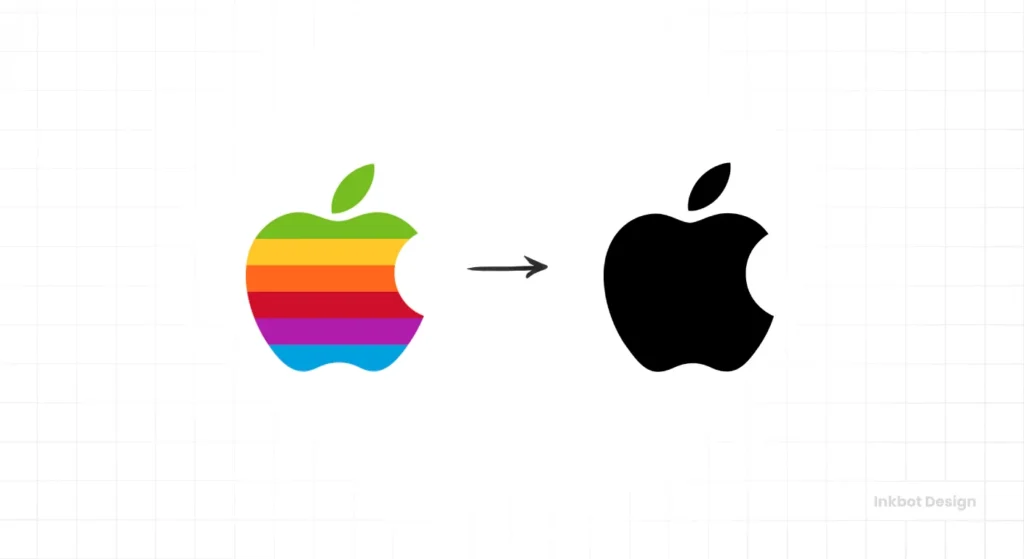
Apple’s first logo from 1976 was a hyper-detailed illustration of Isaac Newton sitting under a tree. It was complex, illustrative, and completely unworkable.
Realising this, Steve Jobs commissioned Rob Janoff to create a new one. The result was the iconic apple with a bite taken out of it.
This simple shape is a work of genius.
The bite serves two purposes: it provides scale so the shape isn’t confused with a cherry, and plays on the word “byte,” linking it to computers. It’s a mark that is sophisticated, accessible, and full of subtle meaning.
Its clean form has allowed it to endure for decades, evolving in colour and texture but never changing its fundamental, perfect shape.
Case Study: The Nike Swoosh – The $35 Symbol of Motion
In 1971, graphic design student Carolyn Davidson was paid just $35 for one of the most recognisable symbols on the planet.
The Nike Swoosh is the ultimate example of a purely abstract minimalist mark. It conveys everything about the brand without a single word. It represents motion, speed, and the wing of the Greek goddess of victory, Nike.
It is fluid, dynamic, and impossibly simple. The mark is so powerful that Nike could drop its name from the logo in most contexts, a level of brand recognition that almost any company would kill for.
Case Study: The Target Logo – Owning a Universal Symbol
How do you take a universal, pre-existing symbol and make it your own? You embrace its most minimal form.
Target’s logo—a simple red bullseye—is brilliant because it literally represents the name and is a metaphor for hitting the mark on price, quality, and shopping experience.
The company resisted adding complexity—no arrows, shopping carts, or frills. By keeping it pure and using it with absolute consistency, they have turned a generic symbol into one of the most powerful retail identities in the world.
Case Study: The Mitsubishi Logo – A Story in Three Diamonds
The Mitsubishi logo, dating back to the 1870s, is a masterclass in distilling a complex heritage into a simple, geometric form.
The logo combines the Tosa Clan’s three-leaf crest with the Iwasaki family’s three-diamond crest, the company’s founders. The name “Mitsubishi” itself translates to “three diamonds.”
The logo represents the three principles of the company: common responsibility to society, integrity and fairness, and international understanding through trade. It’s a powerful story of heritage, family, and corporate ethos, all contained within a spotless and timeless geometric mark.
The Anatomy of a Minimalist Logo: The Only Three Tools in the Box
Minimalist logos, for all their conceptual depth, are typically built from just three basic formats. The challenge lies in choosing the correct format for the brand and executing it perfectly.
The Wordmark: When Your Name is the Hero
A wordmark (or logotype) is a logo with the company’s name in a specific typeface. This is minimalism at its purest.
This approach works best when the company name is distinct and memorable. Think of FedEx, Google, or IBM. There is no accompanying symbol. The brand’s entire personality is communicated through the choice of font, colour, and the arrangement of the letters. The risk is high—a poor font choice can make the brand look cheap or dated. But when done right, it creates a classic, confident identity.
The Logomark (Symbol): The Silent Ambassador
A logomark is a logo that is a purely graphic symbol, with no text. It’s an abstract or pictorial representation of the brand. This is the path taken by Apple, Nike, and Shell.
This is the most ambitious type of logo. The goal is to create a symbol so potent and synonymous with the brand that it can stand entirely alone. It’s a difficult feat that takes years of consistent marketing to achieve. A logomark is almost always paired with the company name for new businesses until brand recognition is sufficiently high.
The Combination Mark: The High-Wire Act
A combination mark marries a wordmark and a logomark into a single logo. Examples include Adidas (with its three stripes or trefoil) and Mastercard (with its two circles).
This is often seen as the safest option, providing a name and a symbol. In minimalist design, the challenge is to ensure the two elements are in perfect harmony. They must feel like they belong together, with neither overpowering the other. A poorly executed combination mark looks cluttered and indecisive, defeating the entire purpose of a minimalist approach.
The Danger Zone: 5 Minimalist Logo Mistakes That Scream ‘Amateur’
The road to a great minimalist logo is paved with bad ones. The line between “brilliantly simple” and “painfully generic” is incredibly thin. Here are the common mistakes that instantly signal an amateur attempt.
Mistake 1: The Meaningless Geometric Shape
This is the number one sin. A designer who doesn’t have a fundamental concept will default to a generic shape—a triangle, a hexagon, a series of lines—and place it next to the company name. This shape has no connection to the business, its values, or its story. It’s a visual placeholder for a real idea. It communicates nothing but a lack of imagination.
Mistake 2: Confusing “Boring” with “Minimal”
A minimalist logo must have a spark. It needs a point of interest, a clever twist, a moment of “aha!” The FedEx arrow is a spark. The Apple logo’s bite is a spark. A boring logo is just a word in a default font without thought about its form or concept. It is simple, yes, but it is also dull, lifeless, and utterly forgettable.
Mistake 3: Criminal Typography and Kerning
Nothing exposes a cheap logo faster than bad typography. Using a free, overused font from a dafont-style website is a red flag. But the more subtle crime is bad kerning—the spacing between individual letters. Automated kerning is rarely perfect. A professional designer will manually adjust the space between every letter pair to ensure the word has a perfect visual rhythm and balance.
Mistake 4: Sacrificing Personality for Simplicity
It’s easy to strip away all the personality in the quest for simplicity. The result is a logo that looks clean but feels cold and sterile, just like every other brand trying to look “modern.” A great minimalist logo should still feel unique to you. It must capture the specific essence of your brand, not just conform to a generic aesthetic.
Mistake 5: Designing for a Single Context
An amateur designs a logo in their software to look good on their own screen. A professional designs a system. They test the logo in every conceivable context: as a tiny favicon, on a dark background, in a single colour, embroidered on a shirt, printed on a business card. A minimalist logo that breaks down or becomes illegible in these contexts is a failed design.
How Professionals Actually Design a Minimalist Logo
A professional logo design is not a 30-minute task in Canva. It’s a rigorous, multi-stage process rooted in strategy, not just aesthetics. Understanding this process reveals why a good minimalist logo is an investment.
Stage 1: The Interrogation (Strategy & Discovery)
This is the most critical phase, and it involves zero drawing. It’s about asking hard questions. Who is the customer? What is the competitive landscape? What is the brand’s core promise? What is its personality? What is the one thing we must communicate? A designer who doesn’t start here is a decorator, not a strategic partner. This discovery phase accounts for the majority of the project’s success.
Stage 2: The Sketchbook (Conceptualisation)
With a clear strategy, the designer begins exploring concepts. This phase is about quantity over quality. It involves sketching dozens, sometimes hundreds, of rough ideas on paper or a tablet. The goal is to explore every possible visual direction for the core concept—from literal interpretations to wild abstractions.
Stage 3: The Scalpel (Refinement & Digitalisation)
The strongest 3-5 concepts from the sketchbook are brought into vector software like Adobe Illustrator. This is where the craft comes in. The designer acts like a sculptor, meticulously refining every line, curve, and point. They experiment with fonts, adjust letter spacing, test colour combinations, and perfect the composition until the concept is executed flawlessly.
Stage 4: The Gauntlet (Testing & Feedback)
A logo isn’t finished until it’s been tested in the real world. The refined concepts are placed into mockups—on websites, business cards, signage, and products. This allows the client to see how the logo functions in context. This stage is about gathering objective feedback and making final tweaks to ensure the chosen logo is beautiful, robust, and versatile.
This kind of methodical approach is precisely what a professional logo design process entails. It’s a collaboration built on strategy, ensuring the final asset is effective and timeless.
Your Action Plan for a Minimalist Logo That Doesn’t Suck
If you’re an entrepreneur or business owner considering a minimalist identity, you must approach it with the right mindset. Here is your plan.
Step 1: Define Your One Core Message
Before you even think about visuals, you must be able to articulate your brand’s core message in a single, simple sentence. What idea do you want to own in your customer’s mind? If you can’t define it, a designer can’t design it.
Step 2: Audit Your Competitors (To Find Your Own Space)
Gather the logos of your top 5-10 competitors. What do you see? Are they all using blue? Are they all using sans-serif fonts? Your goal is not to fit in. Your goal is to find a visual opportunity to stand out. If they all zig, you should zag.
Step 3: Stop Thinking About a “Logo” and Start Thinking About a “Brand Asset”
A cheap logo is an expense. A well-designed logo is a long-term, value-generating asset. It’s the hardest-working employee you’ll ever have, representing your business 24/7 across every touchpoint. Shift your mindset from “what is this going to cost me?” to “what is the potential return on this investment?”
Step 4: Acknowledge the Need for a Professional Guide
The principles and pitfalls outlined here should clarify one thing: this is not a job for your nephew who is “good with computers.” The difference between a generic mark and an iconic one lies in professional strategy, talent, and experience. Investing in a professional designer is the most direct path to a successful result.
If you’re serious about creating a foundational asset for your brand, it’s worth getting a clear picture of what that investment looks like. You can always request a quote to understand the scope and process from a professional agency.
Final Thought: Minimalism Isn’t a Style, It’s an Outcome
Stop thinking of “minimalist” as a style you choose. It isn’t a filter you apply.
True minimalism is the result of a relentless pursuit of clarity. You get rewarded for having the discipline to distil your complex brand into a single, potent, and unforgettable idea. It looks simple because all the hard work is invisible. And that’s precisely why it’s so effective.
Frequently Asked Questions About Minimalist Logo Design
What is the main principle of minimalist logo design?
The main principle is communicating a single, core brand concept with minimum visual elements. It is a discipline of strategic reduction, where every line, shape, and colour serves a distinct purpose.
Why are minimalist logos so popular?
They are popular because they are highly versatile, scalable, and memorable. A simple, clear logo can cut through the noise in a visually cluttered world. They also look modern and confident, which appeals to many new businesses.
Are minimalist logos more effective than complex logos?
Not necessarily. Effectiveness depends entirely on the brand, its audience, and its industry. A minimalist logo is effective when it aligns with the brand’s strategy. For some brands, like a craft beer company, a more detailed, illustrative logo might effectively communicate character.
What fonts are commonly used in minimalist logos?
Can a minimalist logo have colour?
Yes, absolutely. While many minimalist logos are monochrome (black and white), colour can be used very effectively. The key is to use a restricted palette, typically one or two colours, to maintain simplicity and impact, as seen in the Mastercard or Target logos.
How do I make sure my minimalist logo isn’t boring?
A great minimalist logo avoids boredom with a clever “spark” or concept. This could be a witty use of negative space (FedEx), a subtle dual meaning (Amazon), or a perfectly crafted custom letterform. It must be simple, but not simplistic.
Is a minimalist logo cheaper to design?
No. In fact, it can often be more challenging and time-consuming to create an effective minimalist logo. The process requires more strategic thinking and refinement to distil a brand’s essence. The price reflects the strategic value, not the visual complexity.
What is the difference between a wordmark and a logomark?
A wordmark is a logo based entirely on the company’s name (e.g., Google). A logomark is a logo based on a symbol or icon, with no text (e.g., the Apple logo). A combination mark uses both.
Why is negative space important in minimalist design?
Negative space is the unused area around and between the elements of a design. In minimalism, it’s treated as an active element that can create balance, improve legibility, and even form secondary images or ideas, adding depth.
What famous designers are known for minimalist logos?
Pioneers like Paul Rand (IBM, UPS, ABC logos) and Saul Bass (AT&T, United Airlines logos) are legendary figures whose work embodies minimalist design principles: simplicity, concept, and timelessness.
How long should a minimalist logo last?
A well-designed minimalist logo should be timeless. Because it doesn’t rely on current trends, effects, or styles, its simple form can remain relevant for decades with only minor updates, as demonstrated by brands like Nike and IBM.
What file format is best for a minimalist logo?
Like any professional logo, a minimalist logo should always be created and delivered in a vector format (such as .AI, .EPS, or .SVG). Vector files are infinitely scalable without losing quality, ensuring the logo looks crisp and sharp at any size.
Your Brand is More Than a Shape
The difference between a generic logo and a powerful brand mark lies in strategy, not software. A minimalist aesthetic is easy to imitate, but a compelling brand story, distilled into a simple, memorable form, requires a deliberate process.
If you’re ready to move beyond trends and build a truly foundational visual identity for your business, exploring the approach at Inkbot Design is a logical next step. See how a strategic process can transform a simple idea into an unforgettable brand.


