25 Best Fonts for Logo Design (And How to Choose)
Most “best fonts for logo design” lists are a digital beauty pageant, a parade of the same 10 typefaces (looking at you, Lobster) with zero practical advice on what to do with them.
They show you a pretty picture, you download the font, and six months later, you wonder why your “unique” logo looks dated, unreadable, and bizarrely similar to three other businesses in your industry.
As a designer who has personally helped hundreds of small businesses recover from the consequences of a bad font choice, I’ve seen the same mistakes repeated over and over.
A logo font isn’t an accessory. It’s not the “outfit” you put on your brand. It is the brand’s tone of voice, made visible.
Before I share the list, I’d like to share my hard-earned frustrations.
If you’re guilty of any of these, don’t worry. Admitting you have a problem is the first step.
- The “Character” Trap: You choose a font that is so quirky and stylised that it’s impossible to read at a small size. Your logo must work as a 16×16 pixel favicon. If your script font looks like a squashed spider at that size, it’s failed.
- The “Free Font” Fallacy: You found a “100% free” font on a random website. You didn’t read the fine print. It’s free for personal use, but not for commercial use (which includes your business logo). You’re now sitting on a legal time bomb.
- The “One-Trick Pony”: You pick a font that only looks good in one weight (e.g., “Ultra Black”). You have no ‘Light’ or ‘Regular’ weight options to build a brand system for your website, letterhead, or social media. You’ve backed yourself into a design corner.
- Context-Blindness: You’re launching a serene yoga studio and you’ve chosen a heavy, industrial, all-caps font that looks like it belongs on a tub of motor oil. The “vibe” is everything, and yours is giving people anxiety.
- The “Me Too” Font: You use Poppins or Montserrat because you see it everywhere. Now your logo is visually invisible, blending into a sea of sameness. These are great fonts, but they’re not a shortcut to a unique identity.
The goal isn’t to find a cool font. The goal is to find a functional one that will serve your business for a decade.
- Choose clarity over character — legibility at small sizes (favicon) is non-negotiable.
- Check licensing — ensure commercial/logo use is permitted; avoid dubious "free" download sites.
- Pick a versatile family — multiple weights enable a coherent brand system across touchpoints.
- Match personality to context — font must convey the brand's vibe, not clash with its industry.
The 25 Best Fonts for Logo Design
Here they are. No fluff, just analysis. I’ve broken them down by category.
Part 1: The Timeless Sans-Serifs (The Workhorses)
These are the clean, modern, and ultra-functional fonts that form the backbone of 80% of today’s branding.
Inter (Sans-Serif)
- Why it Works: Designed by Rasmus Andersson (a designer at Figma), it was built from the ground up to be insanely legible on screens. It’s neutral, clean, and comes in a massive family of weights.
- Best For: Tech startups, SaaS, digital-first brands, and anyone who needs a font that just works.

Helvetica Now (Sans-Serif)
- Why it Works: This is not the Helvetica you have on your computer. It’s a 2019 redesign of the 1957 original, redrawn for modern use. It’s the definition of “corporate,” “clean,” and “neutral.”
- Best For: Corporate brands, tech, minimalist fashion, and anyone who wants to convey stability and “no-nonsense.”
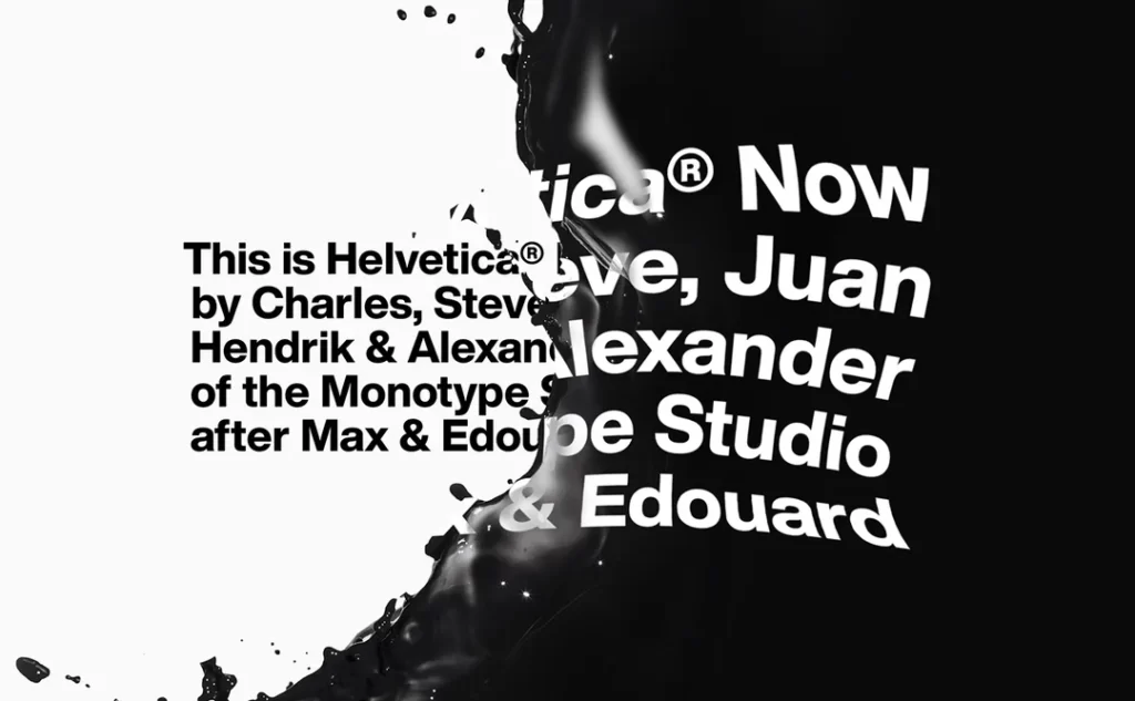
Gilroy (Sans-Serif)
- Why it Works: A modern geometric sans-serif that’s a personal favourite. It has a slightly rounded, friendly feel, but remains professional. It’s like a friendlier version of Futura.
- Best For: Tech, creative agencies, and modern lifestyle brands.

Poppins (Sans-Serif)
- Why it Works: A Google Font mainstay. It’s geometric, clean, and one of the most popular fonts online. Its strength (popularity) is also its weakness (it’s everywhere).
- Best For: Budget-conscious startups, educational services, and friendly B2B brands.
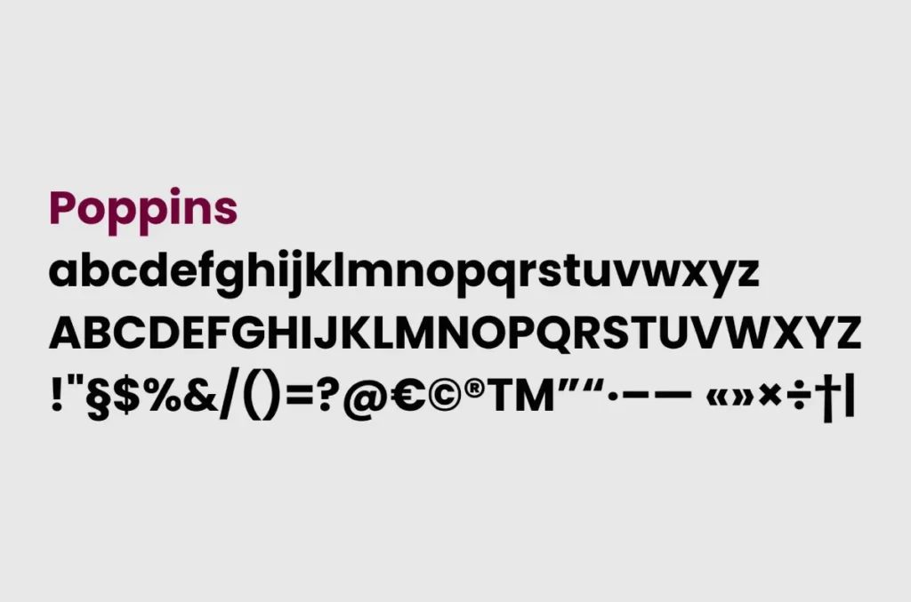
Montserrat (Sans-Serif)
- Why it Works: Inspired by old posters from the Montserrat neighbourhood of Buenos Aires. It has a distinct, strong, and slightly wider feel than other sans serifs.
- Best for: Urban brands, lifestyle, creative agencies, and any brand needing a bold, confident voice.

Avenir Next (Sans-Serif)
- Why it Works: A masterpiece by Adrian Frutiger. It’s a geometric font with a “humanist” touch, meaning it’s not perfectly, coldly geometric. It’s elegant, clean, and timeless.
- Best For: High-end tech, architects, design studios, and luxury real estate.
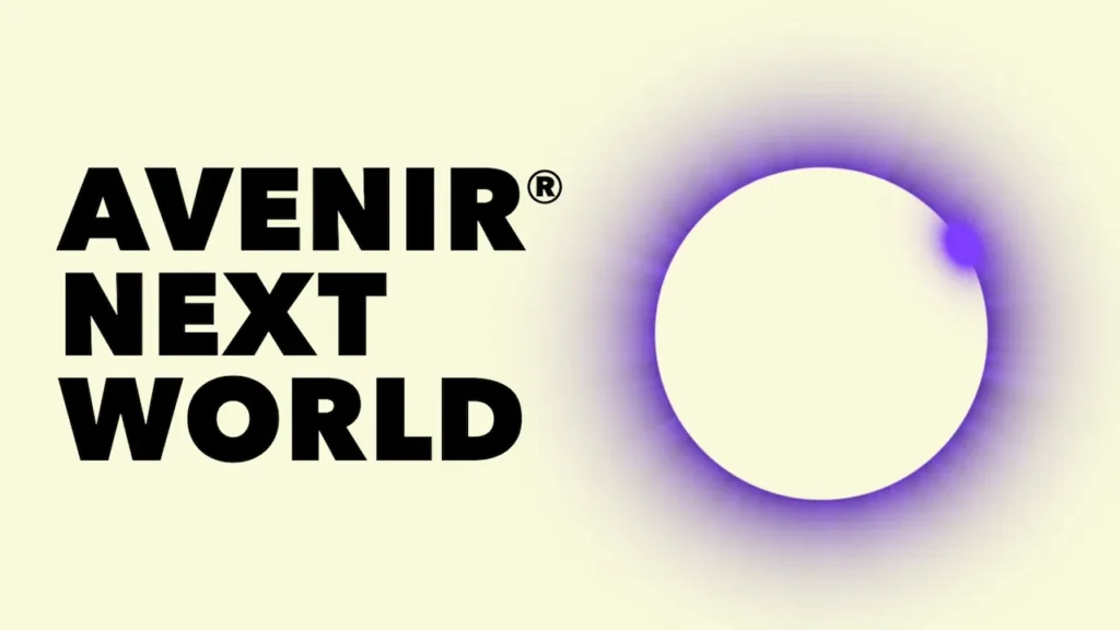
Gotham (Sans-Serif)
- Why it Works: Famously used by the 2008 Obama campaign, this font conveys authority, a distinctly American feel, and trustworthiness. It’s based on 20th-century architectural lettering.
- Best For: Financial services, non-profits, consulting firms, and brands that need to project trust.
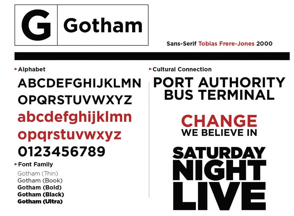
Proxima Nova (Sans-Serif)
- Why it Works: For years, this was the “king of the web.” It’s a hybrid that’s “in between” Futura and Helvetica. It’s modern, clean, and incredibly versatile.
- Best For: A true all-rounder. Tech, publishing, e-commerce, and corporate identity.

Part 2: The Characterful Serifs (The Authorities)
Serifs communicate history, elegance, and trustworthiness. They’re ideal for brands that want to convey and sense of established sophistication.
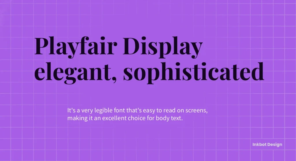
Playfair Display (Serif)
- Why it Works: A high-contrast, elegant serif from Google Fonts. Its sharp, delicate lines feel like they belong in Vogue.
- Best For: Fashion labels, editorial, luxury goods, high-end bakeries, and perfumeries.
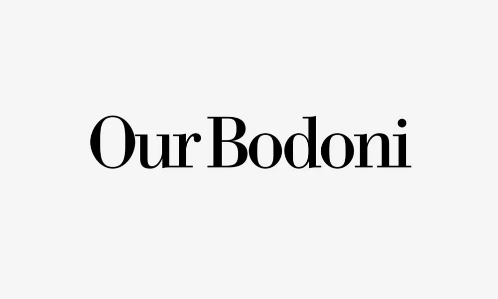
Bodoni (Serif)
- Why it Works: This is the original high-fashion font. Its extreme contrast between thick and thin lines screams “luxury” and “drama.” It’s difficult to use small, but stunning when large.
- Best For: Luxury brands, magazines, and any logo that is just a single, powerful monogram.
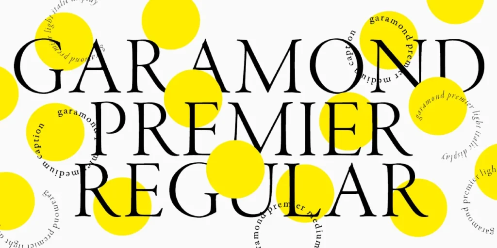
Adobe Garamond Pro (Serif)
- Why it Works: Garamond is a family of fonts, and this is one of the best. It’s the definition of a “classic” book font. It’s readable, elegant, and feels like it’s been around for 500 years (because it has).
- Best For: Law firms, universities, publishing houses, and any brand that wants to be seen as a “legacy.”
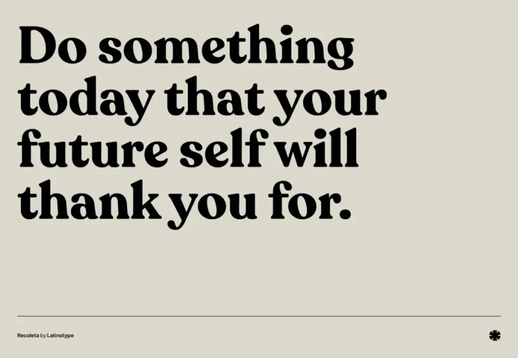
Recoleta (Serif)
- Why it Works: A beautiful, modern “retro” font. It blends soft, ’70s-style curves with a modern, high-contrast feel. It’s friendly, stylish, and full of personality.
- Best For: Lifestyle blogs, creative agencies, coffee shops, and artisanal food brands.
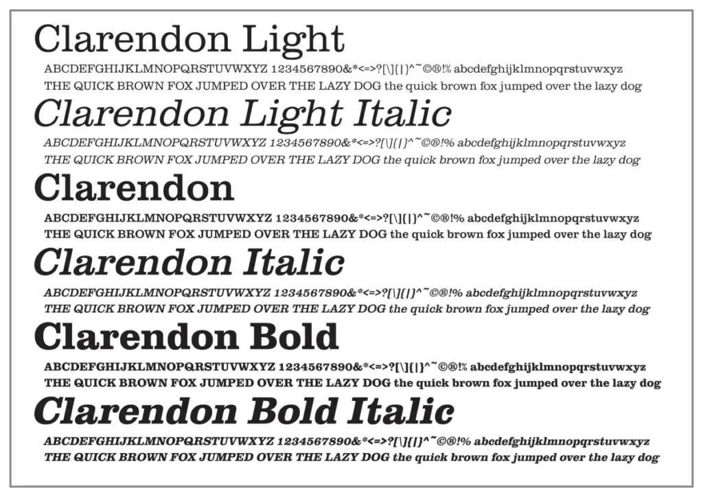
Clarendon (Slab Serif)
- Why it Works: A “slab serif” means the “feet” are thick, blocky rectangles. Clarendon is confident, bold, and slightly rustic in character.
- Best For: Bold, established, or rugged brands. Think Sony (which uses a custom version).
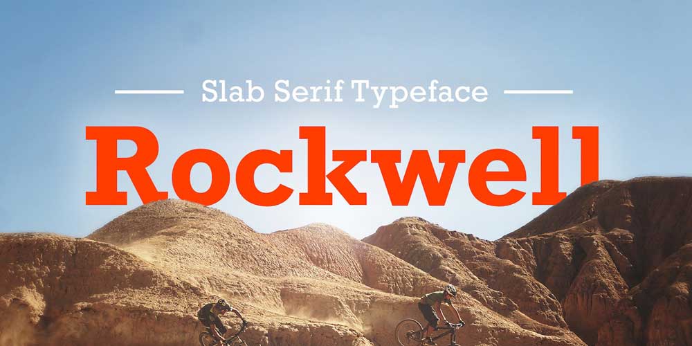
Rockwell (Slab Serif)
- Why it Works: Another classic slab. It’s less ‘Wild West’ than Clarendon and more ‘engineering.’ It’s sturdy, confident, and unapologetically geometric.
- Best For: Construction, engineering, tech, or any brand “built to last.”
Lora (Serif)
- Why it Works: A contemporary, highly legible serif from Google Fonts. It features calligraphic “brushed” curves that lend it a human and artistic feel, while still maintaining a professional appearance.
- Best For: Editorial, storytelling, non-profits, and artisan brands.

Part 3: The Modern & Geometric (The ‘New Guard’)
These fonts sit somewhere between the classic sans-serifs and pure, sharp geometry. They’re clean, design-forward, and very popular with modern brands.
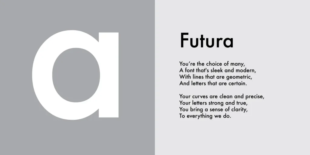
Futura (Sans-Serif)
- Why it Works: The original geometric sans-serif from 1927. It’s built from pure circles and straight lines. It’s timeless, elegant, and (famously) Wes Anderson’s favourite font.
- Best suited for: design-forward brands, tech, aerospace (NASA has utilised it), and high fashion.
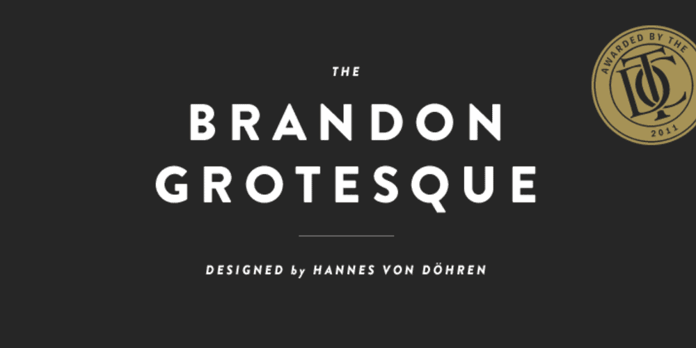
Brandon Grotesque (Sans-Serif)
- Why it Works: A warm, rounded, geometric font. Its slightly low x-height gives it a ‘friendly’ and ‘stylish’ feel. It’s very popular in hospitality.
- Best For: Friendly tech, restaurants, cafes, and retail.
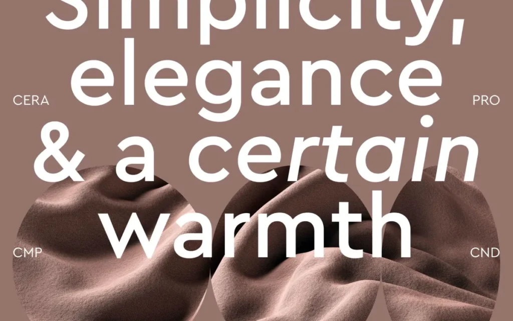
Cera Pro (Sans-Serif)
- Why it Works: A clean, pan-European geometric font family. It’s precise, minimalist, and comes in great ‘Ultra Black’ weights for strong wordmarks.
- Best for: Startups, UI/UX agencies, tech companies, and minimalist brands.
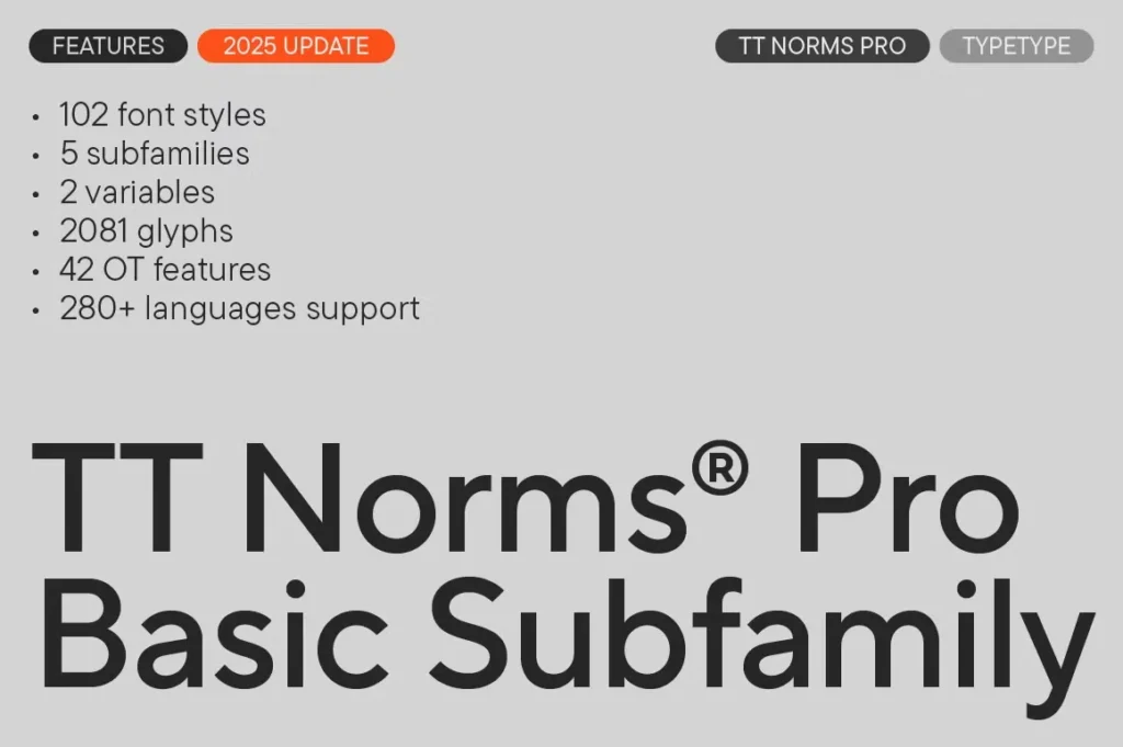
TT Norms Pro (Sans-Serif)
- Why it Works: A fantastic, neutral, and universal grotesk. It’s a great “workhorse” alternative if you feel Helvetica is too boring or Proxima Nova is too common.
- Best For: A superb all-rounder for corporate identity, tech, and digital agencies.
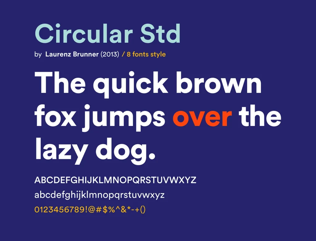
Circular (Sans-Serif)
- Why it Works: You know this as the “Spotify font” (though they’ve since moved to a custom version). It’s geometric but has a quirky, friendly personality (look at the ‘t’).
- Best For: Modern, friendly tech, media, and music-related brands.
Part 4: The ‘Use With Extreme Caution’ Scripts & Displays
Warning: These are not for your primary wordmark. A logo made only of a script font is almost always a mistake. They are for accents, for a single powerful word, or for brands in very specific, stylised niches (e.g., a wedding photographer).
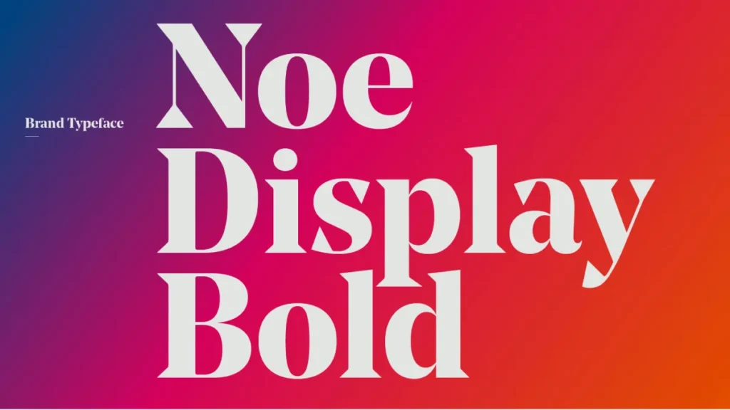
Noe Display (Display Serif)
- Why it Works: A stunning, high-contrast, sharp “display” serif. It’s not for text. It’s for a single, powerful headline or logo.
- Best For: High-fashion, luxury editorial, or a powerful single-letter monogram.
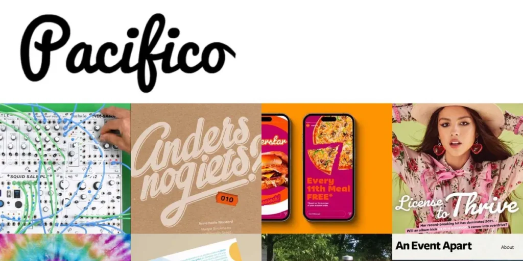
Pacifico (Script)
- Why it Works: A fun, casual, “friendly” brush script from Google Fonts. You’ve seen it. It’s very, very recognisable.
- Best For: Beachside cafes, casual food trucks, or anything that needs a laid-back vibe. (Use with caution).
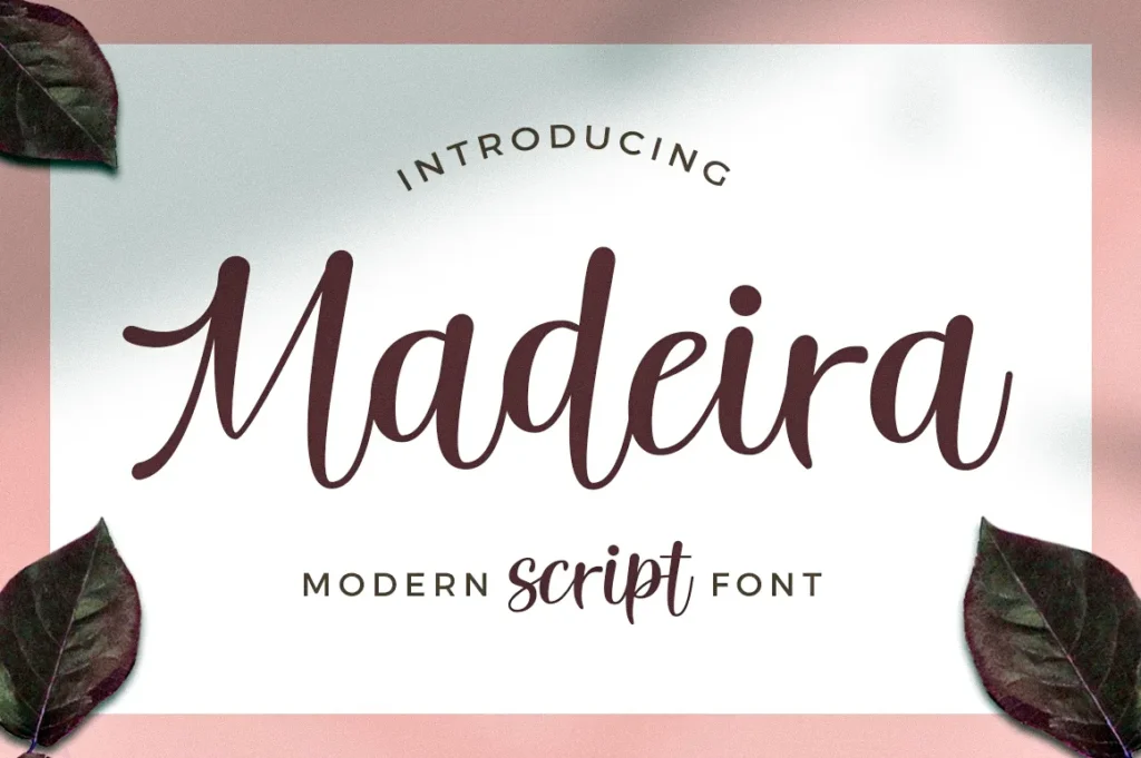
Madeira (Display Sans)
- Why it Works: A strong, sharp, geometric display font. Its precise-cut corners give it an ‘automotive’ or ‘tech’ feel.
- Best suited for: sports, automotive, fitness, or “impact” brands that require a high-performance aesthetic.
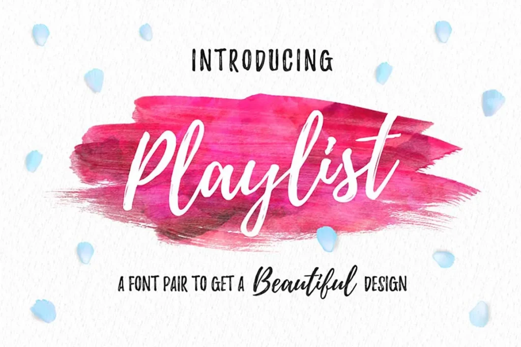
Canva Script (Script)
- Why it Works: Formerly known as Playlist, this is a casual, modern, and very popular script font. It feels personal and hand-drawn.
- Best For: Photographers, personal brands, wedding planners, and artisanal craft businesses.
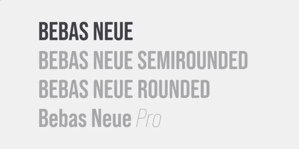
Bebas Neue (Display Sans)
- Why it Works: The “all caps” condensed titan. It’s tall, narrow, and powerful. It’s fantastic for stacking words.
- Best For: Posters, social media, and logos that need a bold, punchy, “movie poster” feel. (It always needs a secondary, readable font.)
The Real Job of a Logo Font
A font has three jobs. That’s it. It must deliver on all three, or it’s the wrong choice.
- Be Legible: Can I read it instantly?
- Be Scalable: Can I read it when it’s tiny and when it’s huge?
- Have Personality: Does it feel like my brand?
This entire process, from legibility to personality, is the core of typography in logo design. Get this right, and 90% of your branding work is done. Get it wrong, and you’ll spend a fortune on graphic design trying to fix a broken foundation.
To make this as simple as possible, here is the litmus test I run every font through.
🧪 The Quick & Dirty Font Test
Before you fall in love with a typeface, check it against this list.
| Criterion | Can you read the brand name instantly, or do you have to squint to make it out? (Show it to someone for 3 seconds). |
| Scalability | Does this work as a tiny favicon and on a giant billboard? (Test it at 16px and 500px). |
| Legibility | Can you read the brand name instantly, or do you have to squint? (Show it to someone for 3 seconds). |
| Personality | Does the “vibe” match your business? (e.g., playful, corporate, elegant, rugged). |
| Font Family | Does it have multiple weights (Light, Regular, Bold) to build a full brand system? |
| Licensing | Is it actually free for commercial use, or am I buying a proper Desktop/Logo license? |
| Uniqueness | Does this look like every other brand in my industry? (If so, find a new one.) |
Understanding the Four Main Font Families
To pick the right font, you need to know what you’re looking at. Here’s the 60-second overview.
| Category | The Look | The Brand Vibe |
| Serif | Has small “feet” (serifs) on the letters. | Traditional, Elegant, Authoritative, Trustworthy. |
| Sans-Serif | “Without serifs.” Clean, modern, simple lines. | Modern, Clean, Approachable, Tech-Forward. |
| Script | Looks like handwriting or calligraphy. | Personal, Elegant, Feminine, Casual. |
| Display | Highly stylised, decorative, unique. | Quirky, Themed, Bold, Specific (Use sparingly!). |
The Elephant in the Room: Font Licensing
I’m giving this its own section because it’s the #1 mistake that can cost you real money.
- “Free” (Google Fonts, etc.): Most fonts on Google Fonts are licensed under the Open Font License (OFL), which generally allows commercial use, including for logos. This is your safest bet for “free.”
- “Subscription” (Adobe Fonts): If you have a Creative Cloud subscription, you have access to thousands of fonts. Read the terms. Most are cleared for logo use; however, if you cancel your subscription, your license may become void.
- “Desktop/Commercial License”: This is the one you buy. When you buy a font from a foundry (MyFonts, Fontspring, etc.), you are buying a license for a specific use. You must ensure your license covers “Logo” or “Commercial” use.
My strong advice: Do not, under any circumstances, download a font from a “free-fontz.com” website and use it for your business. You are risking a lawsuit. Stick to reputable foundries or open-source collections, such as Google Fonts.
You’ve Picked a Font. Now What?

Don’t just type out your name and call it a logo. The real work begins after you choose the font.
This is where a professional designer earns their money. We don’t just “pick a font.” We manually adjust the kerning (the space between individual letters) to make sure the “A” and “V” in your name sit perfectly. We customise the letterforms, perhaps extending the leg of an “R” or cutting the crossbar of an “A” to create a truly unique wordmark.
We build the brand system around it, pairing it with a body font that ensures your website is as readable as your logo is recognisable.
This level of detail is what separates a 5-minute logo from a timeless brand identity. It’s why our logo design process at Inkbot Design starts with strategy, not software. If you’re a business owner who would rather focus on your business than the spacing between letters, it might be time to request a quote.
Your Font is Your Voice. Don’t Mumble.
Choosing a font for your logo design is not just a matter of decoration. It’s a strategic business decision.
A good logo font is invisible—it communicates a feeling so perfectly that you don’t even notice it. A bad one is all you notice. It screams “amateur,” “confusing,” or “generic.”
Use this list as a starting point. Test your choices. And remember the #1 rule: Clarity over character.
💬 Need a Professional Eye?
Choosing a font is just the first step. Building a brand that lasts requires a coherent system, a unique mark, and a strategy that connects with your audience. If you’re ready to move from ‘picking fonts’ to ‘building an identity,’ we’re here.
The team at Inkbot Design has built a reputation on creating timeless, functional brand identities.
Explore Our Logo Design Services
Read More Typography Guides
12 Frequently Asked Questions (FAQs)
What is the most popular font for a logo?
While trends change, “popular” often means “overused.” Classic sans-serifs like Helvetica, Futura, and Proxima Nova are staples, while Google Fonts like Montserrat and Poppins are extremely popular for web-first brands.
What font category is best for a “modern” logo?
“Modern” logos almost always use Sans-Serif fonts, particularly geometric (like Futura, Cera Pro) or grotesk (like Inter, Helvetica Now) styles for their clean, minimal, and functional appearance.
How do I choose between a serif and a sans-serif font?
Choose a serif to convey tradition, authority, and elegance (e.g., a law firm, luxury brand). Choose a sans-serif to convey modernity, approachability, and clarity (e.g., a tech startup, a fitness app).
Are “free fonts” safe to use for a logo?
It depends. Fonts from Google Fonts (under an Open Font License) are generally safe for commercial use. Fonts from “free font” aggregate sites are often labelled as “personal use only,” and using them for a logo carries a legal risk.
What’s the biggest mistake people make with logo fonts?
Choosing “character” over “clarity.” They pick a complex script or display font that is unreadable at a small size, effectively making their logo unusable as a favicon or on a business card.
Why do fonts like Helvetica or Futura cost money?
You are paying for a license to use a professionally designed product. These fonts are the result of thousands of hours of skilled work from a type foundry and come in large, perfect-quality families.
Can I just use a font from Canva for my logo?
What is a “slab serif” font, and when should I use one?
A slab serif (like Rockwell or Clarendon) has thick, blocky “feet.” They feel sturdy, confident, and a bit retro. Use them for brands that want to convey a sense of “established,” “bold,” or “built-to-last.”
How many fonts should be in a logo?
Ideally, one. A strong logo uses a single font family (perhaps a bold weight for the main name and a light weight for a tagline). Using two different fonts (e.g., a script and a sans-serif) can be challenging to execute well and often appears cluttered.
What is “font licensing” and why does it matter for logos?
A font is a piece of software, and you need a license to use it. A “logo” is a core commercial asset. You must have a license that explicitly allows “commercial use” or “logo use,” or the font foundry can (and will) sue you for infringement.
Is [Specific Font] a good choice for my [Industry] business?
It depends. Don’t ask if the font is good for the industry; ask if it’s good for your brand. Does it match your brand’s personality (e.g., playful, serious, elegant)? Is it legible? And is it different from your top three competitors?
What makes a font “timeless”?
A “timeless” font (like Futura or Garamond) has a high degree of craftsmanship, perfect proportions, and a neutral personality that avoids passing trends. It’s so functional and well-balanced that it never feels “dated.”

