The Crafty Art of Educational Website Design
The internet age has been so dynamic for education. The times of boring classrooms and one-size-fits-all lectures are long gone. Recently, people of all ages have been learning from online courses, video tutorials, and interactive activities.
But here is the paradox – simply posting some information on a website does not automatically make it an exciting and practical online learning experience. No, this is where the delicate art of educational website design comes in.
Would you want to watch a TV show with lousy cinematography – one that used confusing scenes? Absolutely not! Like making a movie, creating an outstanding educational website design requires insightfulness, forethought, and knowledge regarding how individuals learn or process materials online.
Now, we delve into the nitty-gritty of developing websites optimised for digital teaching and learning. Get ready to find tips, trends, and real-life examples for creating online courseware and resources that will captivate and educate your target audience. The class is now in session!
- First impressions are crucial; outdated designs can deter potential learners before they engage with content.
- A visually appealing website enhances learning comprehension and retention by utilising multimedia and intuitive navigation.
- Interactive elements are essential for maintaining student engagement and transforming dull topics into engaging experiences.
- Responsive design is imperative, ensuring seamless access across multiple devices for easy and flexible learning.
- Effective design prioritises user experience, accessibility, and aligns with measurable learning outcomes for impactful education.
Why Prioritise Design for E-Learning?

First Impressions Matter
To say that you only get one chance to create a first impression is an understatement for educational websites. Outdated, clunky designs can turn away potential learners before seeing your fantastic content.
By contrast, a clean, modern and visually appealing website sends the right signals about quality. It invites visitors to explore and discover what you have for them.
Humans are Visual Creatures
If you think about it, people process visuals (like pictures, colours, and graphics) much faster than text alone. A well-designed website incorporating multimedia components and intuitive navigation can enrich learning comprehension and retention.
Also, good design keeps everything organised and easy to find, preventing users from getting frustrated and leaving during courses halfway through.
Engagement is Queen 👑
Anyway, most exciting topics may become as dry as deserts after being presented on dull web pages in a static manner. In our digital world, where attention spans are fleeting, strategic website design focused on interactivity and user engagement is crucial for holding students’ attention.
Online teaching with interactive elements such as gamification features will add so much delicious sauce to the meal of eLearning. They create progressive motion that will keep your audience hooked as they strive towards achieving their goals.
Online Competition is Fierce
Whether you’re creating educational resources for a school, business or your online course empire, the competition is stiff in this digital arena. Your site can be made different from others by investing in professional design, which allows effective marketing of your products.
Not just luxuries but essentials; strong visuals and seamless user experience on the web attract the type of learner interested in up-to-date quality digital content. Don't be left behind!
Design Principles to Embrace
So, now that we've covered why design matters so much for e-learning success let's talk about principles. Here are some core concepts to keep in mind:
1. KISS (Keep It Simple, Silly)
Have you ever landed on an educational website design resembling a chaotic circus? Flashing banners, cluttered layouts, pages upon pages of unbroken text – no thanks. Simplicity and whitespace are your friends!
Stick to clean designs with logical navigation menus and content flows. Allow the quality of your information to shine by giving it room to breathe. Don't go overboard, bombarding learners with sensory overload.
2. Structure is Key
How you organise, chunk and sequence content on a website impacts how effortlessly people can understand and follow along. Break down complex material into bite-sized sections with clear headings and visual separators.
Use techniques like incremental learning and scaffolding to build up knowledge step-by-step. Create navigational paths that gently guide learners down an educational journey at their own pace.
Strategically incorporating elements like tables, bullet points, diagrams, and other visual aids boosts comprehension and emphasises critical takeaways.
3. Responsiveness Rules
These days, the “classroom” could be anywhere – a laptop, tablet, smartphone, you name it. Responsive web design that automatically adjusts layouts to fit any device is a must-have, not an optional luxury.
People want to avoid squinting at tiny fonts or pinch-and-zoom their way through an online course on their phone. Make the mobile learning experience just as seamless and user-friendly as a desktop. Your audience will thank you.
4. Consistency Breeds Familiarity
Have you ever used software or websites that had random, inconsistent UI patterns? It's confusing and disrupts the flow, making it harder to focus on the content.
Creating a unified, cohesive look and feel across all pages and components is essential for educational websites. Use the same styles for buttons, menus, icons, typography, etc. That way, learners automatically recognise core functionality and navigation without having to re-learn or re-orient every time.
5. Consider Accessibility From Day 1
Designing for diverse learning needs like disabilities, neurodivergence, or language barriers isn't just good ethics – it's innovative business. The more accessible your online resources are, the bigger your potential audience can reach.
Follow web accessibility guidelines to optimise your site for screen readers, visible colour contrast, keyboard navigation, captions, transcripts, and more. Not only does this open more doors, but it improves usability for all learners.
Design Elements to Focus On
Now that we've covered some big-picture principles let's zoom in on specific components that can make or break the educational website experience:
Colours and Theming
Colours can powerfully influence moods, emotions, and the ability to focus. Choose a primary colour palette of 2-4 hues maximum, sticking to shades that create a sense of stability and calm learnability.
Avoid bright, jarring accent colours that could be over-stimulating, distracting, or headache-inducing. But feel free to incorporate bolder hues to accent key areas like call-to-action buttons.
Also, consider using specific colour schemes and icons to differentiate topics or course sections. Intelligent use of colour theming provides subtle wayfinding cues that orient learners.
Content Formatting
Have you ever tried to read a wall of densely packed text crammed into a skinny column? It's the worst! Optimise content formatting with learner ergonomics in mind:
- Use larger fonts (at least 16px) and broader line spacing for better readability
- Break up long text sections with headings, images, and whitespace
- Left-aligned text with balanced line lengths is most effortless to scan
- Establish a clear content hierarchy with styles for headings, subheads, etc.
- Consider dyslexia-friendly fonts to aid those with reading difficulties.
The art is formatting content layouts in a structured yet visually engaging way that guides attention and enhances comprehension.
Iconography and Visuals
A thoughtful blend of iconography, graphics, illustrations, photos, charts, and other visuals enriches the online learning experience in several ways:
- Appeals to diverse learning styles beyond just text
- Reinforces key points and conveys ideas more concisely
- Provides visual cues and anchors to aid focus and retention
- Adds interest to break up dense, monotonous content
- Creates a cohesive, on-brand, and professional look
Optimise images for fast load times, use icons consistently and don't go overboard cluttering pages. There's an art to striking the right visual content balance.
Interactivity and Multimedia
Do you know those boring, lifeless educational websites that feel like reading a never-ending digital textbook? Let's avoid building soul-crushers like that, shall we?
Instead, create opportunities for interactivity and multimedia at every turn to activate multiple senses and maintain engagement. Think:
- Interactive diagrams, activities, and real-world simulations
- Embedded videos, animations, screen recordings, podcasts
- Annotations, pop-ups, tooltips, and progressive content reveals
- Quizzes, games, and progress-tracking to incentivise learning
- Live session video conferencing capabilities
With modern authoring tools at our fingertips, the possibilities for interactive and immersive online learning experiences are virtually limitless. Don't hold back – your audience will adore you for it.
Smart Navigation
Let's face it – few things are more frustrating than being unable to easily navigate an educational website design to find the content you need or pick up where you left off. Be sure to optimise navigation from day one:
- Use clear, descriptive labels in menus and sections
- Incorporate visual cues like breadcrumbs to show the location
- Allow learners to bookmark progress and quickly resume
- Build in search functionality for more extensive course libraries
- Make menus and navigation responsive for smaller screens
- Link-related content to create guided pathways
Good navigational UX removes barriers and enables self-directed, free-flowing learning experiences tailored to each individual's needs and preferences.
Contemporary, Mobile-First Design
Let's be blunt – websites designed a decade ago look and feel clunky compared to what modern users expect. Keep your educational platforms feeling fresh and cutting-edge by:
- Prioritising mobile-first responsive layouts that are thumb-friendly
- Utilising contemporary design trends like micro-interactions and subtle animations
- Allowing flexible ways to consume content like audio lessons or speed reading
- Exploring bite-sized microlearning formats like social-style content feeds
- Minimising ads and disruptive pop-ups that kill user experience
- Frequently updating looks to stay on-trend as design paradigms evolve
After all, no one wants to feel like they're studying from an outdated relic! Contemporary, innovative design signals quality and keeps learners enthusiastic.
Design for Engagement and Results
Thoughtful educational website design should prioritise engaging your audience and enabling measurable learning results.
An esthetically gorgeous website is one thing, but it must ultimately facilitate knowledge retention, skills development, and achievement of defined learning objectives.
That means folding in elements focused on:
- Facilitating social learning and collaboration
- Providing opportunities for practice, feedback loops, and mastery tracking
- Incentivising progress with rewards, points, badges, certificates etc.
- Enabling customisable, self-directed learning pathways
- Incorporating spaced repetition and reinforcement techniques
- Supporting real-world application through activities and case studies
- Aligning design with measurable learning analytics and data
The definition of an effective educational website design is one that genuinely moves the needle in helping visitors actively learn, grow, and accomplish their goals as students. Everything should ladder up to creating enriching experiences optimised for human learning science.
Case Studies: Who's Doing It Right?
Feeling inspired by all this educational design wisdom? Let's look at a couple of real-world examples of websites knocking it out of the park:
Coursera

As one of the pioneers in massive open online courses (MOOCs), Coursera has nailed e-learning website design through its clean, intuitive interface focused on easy course browsing and seamless learning workflows.
Right away, the eye is drawn to high-quality course imagery and at-a-glance info on the homepage. Menus are simple to navigate by subject area, skill level, and other filters.
Within courses, content is chunked into focused modules with interactive transcripts, notes, supplemental resources, and progress tracking. You can easily toggle between videos, readings, quizzes, and coding exercises.
The mobile experience is top-notch, too. Coursera optimises layouts for watching course videos on small screens seamlessly during commutes or workouts. A modern design gem!
Duolingo
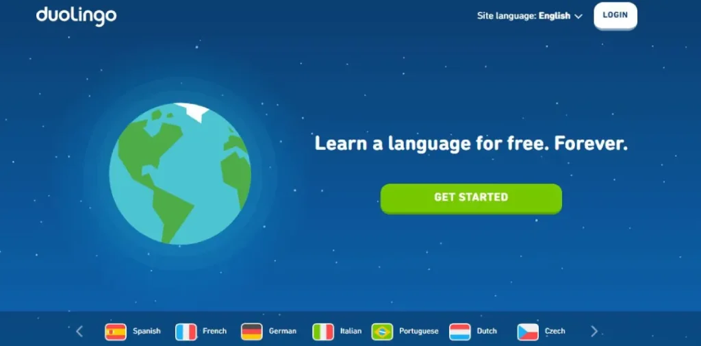
Sure, Duolingo is best known for its addictive language-learning apps. But its main website also deserves an educational design shoutout for nailing gamification and engaging content presentation.
You know those boring language textbooks crammed with stale grammar drills? Duolingo takes the opposite approach through bite-sized, interactive “bite” style lessons that feel more like playing a game than studying.
Quirky characters, points, streaks, levels, and rewards create a genuinely fun, motivating experience loop that has you eagerly returning for more instruction.
The brand's playful illustrations, bold colours, and modern aesthetics make the content pop. Native audio, hover animations, and smooth transitions produce an engaging, intuitive flow.
MIT OpenCourseWare
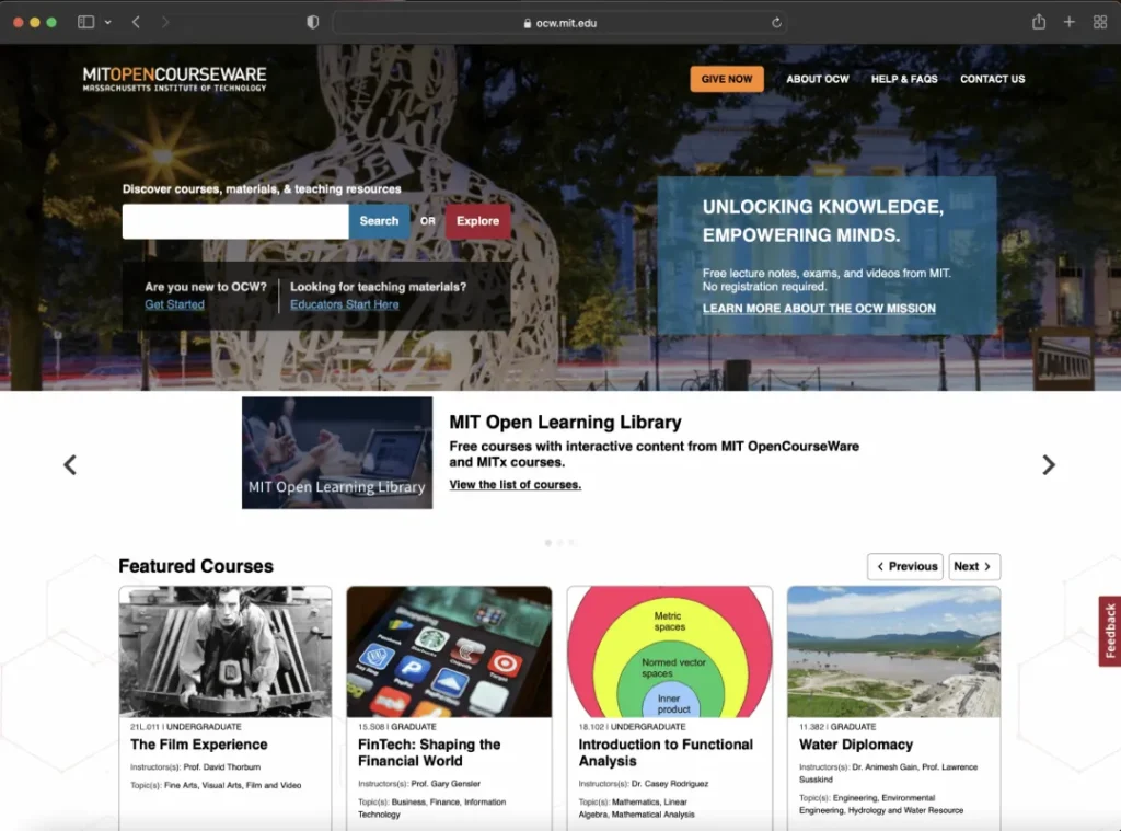
On the other end of the style spectrum from Duolingo is opencourseware.mit.edu – MIT's treasure trove of free MIT course materials for the public. But don't let the no-frills look fool you. This resource exemplifies how to present dense educational content clearly and well-structured.
Each course homepage provides a concise, standardised syllabus overview covering topics, materials, assessments and scheduling. From there, learners can dive into logically organised units with readable content formatting, visual aids, and options to view/download materials in multiple formats.
While not flashy, the website facilitates smooth navigation and content consumption through its clean IA, responsive tables, and descriptive section names. Plus, the no-nonsense academic branding lends credibility.
It's designed for serious, diligent self-learners seeking university-level materials presented orderly and approachable. Sometimes, that's precisely what you need!
FAQs on Educational Website Design
Do you still have some burning questions about crafting killer educational websites? Let's cover some FAQs:
What design tools and resources are best for e-learning projects?
Popular tools include Canva, Adobe Creative Cloud, Articulate 360, iSpring, and Dualingo for prototyping and creating visuals/animations. Collaborating with UX/UI designers and developers is also recommended.
How much should I budget for educational web design?
Costs can vary significantly based on team size, media needs, tech requirements, etc. According to research, corporate e-learning companies spend $18,839 on average for custom design projects. Plan accordingly!
What's more critical – visual aesthetics or functionality?
Both! You need a harmonious balance of beautiful aesthetics AND intuitive functionality. No one wants an ugly mess, but an attractive website that's impossible to use is equally useless. Design comprehensively!
Can I just use a standard website template?
You could, but generic templates aren't built with unique education use cases in mind. Customised designs tailored to how people best learn and consume info online will always provide a better, more engaging experience.
What roles are critical for educational web design projects?
Typical roles include UX/UI Designers, Web Developers, Learning Experience Designers, Visual Designers, Content Developers/Writers, Product Owners, and Project Managers to coordinate efforts.
Any tips for designing accessible educational websites?
Follow WCAG guidelines! Things like adequate colour contrast, keyboard navigation, captions/transcripts, adjustable text sizing, alt text, and avoiding flashing visuals make content more universally accessible.
How can I test the effectiveness of my educational website?
Tactics like usability testing, heuristic analysis, user interviews, learning analytics, and A/B tests provide insights. Continuously iterate and optimise based on qualitative and quantitative feedback. It's an ongoing process!
Should I keep courses open and free or use paywalls?
That's up to your business model and learning objectives! Open courseware increases visibility, but gating premium content can incentivise paid conversions. Strike the right balance for your needs.
The Future of Online Learning Design
And there you have it – a down-and-dirty guide to crafting unforgettable online educational experiences through strategic website design!
Of course, this is just the beginning. As technology and consumer expectations rapidly evolve, designing for digital learning will require constant iteration and innovation.
We're already seeing the rise of AI-driven personalised learning pathways, simulated scenario training through VR/AR, and increased adoption of asynchronous social learning. Who knows what mind-blowing EdTech advancements await around the corner?
One thing's for sure – the most future-proof approach is designing online learning experiences that dynamically blend the art of human motivation with the science of how our brains most effectively acquire and retain information.
Put learners first, embrace fresh creative thinking, and stay curious about emerging trends and best practices. That's how you'll create e-learning websites that aren't just usable at the moment but intensely memorable and impactful for years. Also, you may be interested in trying LearnDash, Lifter LMS, and other LMS-like LearnDash alternatives.
After all, the future of online education is incredibly bright. With thoughtful, human-centric design at the forefront, we can create more accessible, engaging learning opportunities for every type of student worldwide. Let's continue pushing boundaries together!

