The Branding Kit Explained: From Logo Files to Colour Codes
Your brand looks inconsistent, and it’s costing you. One day, your logo is a blurry JPG. Next, your printer uses the wrong ‘blue,’ and your new intern uses a random font on a sales deck.
You’re making costly production errors, and you know you look amateur.
A “branding kit” is the system that stops this chaos. It’s not a vague idea; it’s a technical toolkit of scalable vector logos (SVG, EPS), exact colour codes (HEX, CMYK), and font rules that make your brand look professional, every single time.
- Provide a complete logo suite (vectors, monochrome, submarks) so your mark scales and remains legible across every use.
- Define a precise colour palette with HEX, RGB, CMYK and Pantone codes to ensure consistent digital and print reproduction.
- Specify a typography system with font files, licensing and hierarchy rules, documented in brand guidelines for consistent application.
What a Branding Kit Is

A branding kit is a comprehensive, centralised library of all your brand’s visual and verbal assets.
It’s the “break glass in case of emergency” box for your marketing. It’s the rulebook your team, your freelancers, and your vendors (printers, developers, agencies) use to represent you perfectly every single time.
A branding kit is not…
- A single logo file.
- A “mood board” you made on Pinterest.
- Your marketing strategy.
- A list of your company values.
A branding kit is…
- A complete logo suite in all necessary file formats.
- A defined colour palette with precise digital and print codes.
- A specified typography system with font files and hierarchy.
- A brand guidelines document that explains the rules for using all of the above.
Think of it this way: If your brand were a restaurant, your brand identity is the concept (e.g., “farm-to-table Italian”). Your branding kit is the kitchen: the validated recipes, the specific ingredients (and their quantities), the plating instructions, and the set of sharp knives.
One is the idea. The other is the toolkit that ensures every dish comes out perfectly, no matter which chef is on duty.
The Core Components: The “Must-Haves” for Every Business
At a bare minimum, your branding kit must contain these three pillars. Without them, you don’t have a functional brand toolkit.
1. The Logo Suite: More Than Just One File
Your logo is not a “one-size-fits-all” graphic. It needs to work on a tiny mobile app icon and on the side of a building. This requires a suite of logos.
- Primary Logo: This is the main one. The full-service version, complete with the wordmark and any graphic elements. It’s your default, but it’s often not the one you’ll use most.
- Secondary Logo / Alternates: These are variations for different layouts. If your primary logo is horizontal (long), your secondary logo might be stacked (square). This gives you flexibility for social media profiles or website headers.
- Submark / Icon / Favicon: This is the most simplified version of your logo. It’s the “B” for Beats or the Twitter bird. It’s used for favicons (the little icon in your browser tab), app icons, and social media profile pictures.
- Monochrome & Reversed: This is a critical one most DIYers miss. You need a 100% black version and a 100% white (reversed) version. What happens when you need to print your logo on a dark-coloured t-shirt or overlay it on a busy photograph? The full-colour version won’t work.
2. The Colour Palette: Your Brand’s Emotional Code

As my pet peeve revealed, “blue” is not a colour. You need a system. Your palette is your brand’s emotional shortcut and your most powerful consistency tool.
- Primary Colours: Your 1-2 “hero” colours. These are the dominant colours that people immediately associate with you (think Coca-Cola red or Spotify green).
- Secondary Colours: Your 2-3 accent or complementary colours. These are used for calls-to-action, highlights, and adding visual interest without overpowering the primary colours.
- Neutrals: Your “workhorse” colours. These are your blacks, whites, greys, or beiges. They are used for body text, backgrounds, and giving your primary/secondary colours room to breathe.
For every colour, you must have the specific codes. This is non-negotiable.
| Colour Value | What It Is | Where You Use It |
| HEX | e.g., #FFFFFF | Digital: Websites, apps, social media. |
| RGB | e.g., R(255) G(255) B(255) | Digital: Same as HEX. Used in PowerPoint, Word, etc. |
| CMYK | e.g., C(0) M(0) Y(0) K(0) | Print: Business cards, flyers, banners, packaging. |
| Pantone (PMS) | e.g., PMS 199 C | Professional Print: For 100% colour accuracy on merchandise, high-end print. |
Without these codes, your “brand red” will appear bright orange on one screen, burgundy on another, and as a faded salmon-pink T-shirt when you print it.
3. The Typography System: Your Brand’s Voice
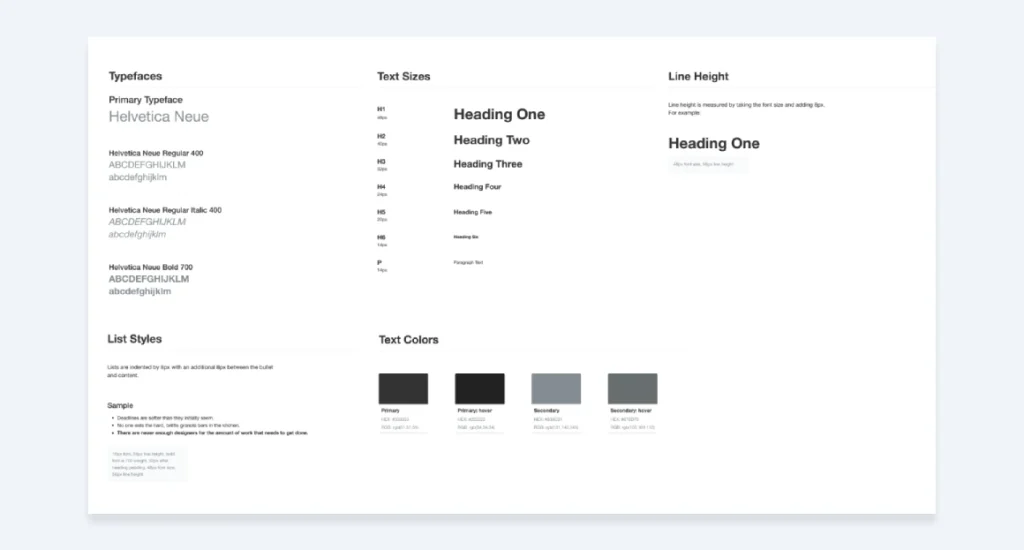
Typography is the visual representation of your brand’s voice. Is it strong and bold (a heavy sans-serif)? Elegant and traditional (a classic serif)? Quirky and modern (a unique display font)?
Your kit must define this system.
- Headline Font (H1, H2, etc.): This is your “show” font. It’s used for big titles and catching attention. It can have more personality.
- Body Copy Font: This is your “workhorse” font. It must be, above all else, legible. This is suitable for long-form text, such as paragraphs, emails, and descriptions.
- Accent Font (Optional): A third font for specific use cases like pull quotes or calls-to-action.
And critically, your kit must include:
- The Font Files: The actual .OTF, .TTF, and/or .WOFF2 (for web) files. How can your team use the font if they don’t have it?
- Licensing Information: Did you buy the font? Is it a free Google Font? You must be aware of the licensing terms for web, print, and app use.
- Hierarchy Rules: Don’t just give them the fonts; teach them how to use them effectively. Example: “H1 is Montserrat Bold, 48pt. Body is Lato Regular, 16pt.”
The “Pro-Level” Kit: Moving from Starter to System
The “Big 3” will get you started. However, a professional branding kit, the kind that scales with your business and enables you to build a truly consistent brand, includes an instruction manual.
This is the Brand Guidelines Document (or “Brand Book,” “Style Guide”).
This document is the Holy Grail. It’s a PDF (or a website) that contains all the core assets, along with the rules for using them. This is what separates amateur design from a professional brand identity.
Here’s what a “Pro-Level” kit includes.
1. The Brand Guidelines Document
This is the master rulebook. It contains everything from the “Must-Haves” section, plus:
- Logo Usage Rules:
- Clear Space: The minimum “breathing room” required around the logo.
- Minimum Size: How small the logo can be before it becomes illegible.
- The “Don’ts”: A visual list of what not to do. (Don’t stretch it. Don’t add a drop shadow. Don’t change the colours. Don’t put it on a busy background.)
- Colour Hierarchy:
- Rules for using the palette.
- Example: “Primary colours should make up 60% of the design. Secondary 30%. Neutrals 10%.”
- Colour-pairing examples (e.g., “This blue call-to-action button always goes on this white background.”).
- Typographic Hierarchy:
- A full breakdown of H1, H2, H3, H4, Body, and Link styles.
- Includes font, size, weight, and line spacing. This is a “styles” list you can hand directly to a web developer.
- Brand Voice & Tone:
- This is the verbal part of your brand. How do you sound?
- Are you: Professional or playful? Witty or direct? Formal or conversational?
- Includes a list of “words we use” (e.g., “clients,” “partners”) and “words we don’t” (e.g., “customers,” “users”).
- Imagery & Photography Style:
- What kind of photos do you use?
- Are they bright and airy? Dark and moody?
- Do they feature people or objects? Are they candid or posed?
- This section includes “good” and “bad” examples of photography to guide your team.
2. Brand Assets & Collateral
This is the library of pre-made, on-brand elements that stop your team from reinventing the wheel (and doing it wrong).
- Brand Patterns & Textures: Custom background patterns or textures used to add visual interest to designs.
- Iconography: A custom set of icons that all share the same style (e.g., line weight, rounded corners). This ensures your “phone” icon matches your “email” icon.
- Social Media Templates: Pre-sized, on-brand templates for Instagram posts, Stories, LinkedIn banners, etc. Your team just drops in the new text and photos.
- Stationery & Print Templates: The digital, print-ready files for your business card, letterhead, and envelopes.
- Presentation Templates: A branded PowerPoint, Google Slides, or Keynote template. This is a massive time-saver and a huge win for consistency.
The Most Misunderstood Part: A Practical Guide to File Types
You’ve got your kit. It’s a folder full of files. Now what?
The final piece of expertise is knowing which file to use. Using the wrong one is how you end up with a pixelated logo on a banner.
Here is a practical glossary. This is what you paid your designer for.
| File Type | What It Is (The “Vibe”) | When to Use It (Real-World Examples) | When NOT to Use It (Danger!) |
| Vector: .AI | The Master File. Adobe Illustrator. | The source file for your logo. You send this to designers or to yourself for review and editing. | You can’t open this without Adobe Illustrator. Don’t send it to your web dev. |
| Vector: .EPS | The Universal Vector. | Your go-to for print. Send this to the t-shirt printer, the banner printer, and the merch company. | Please do not include this on your website. It’s a print file. |
| Vector: .SVG | The Web Vector. Scalable Vector Graphic. | The BEST file for logos on your website. It’s infinitely crisp and has a tiny file size. | Don’t send this to a printer (use EPS). Don’t use it for photos. |
| Raster: .PNG | The Transparent File. | Logos on your website (if you can’t use SVG). Any graphic that needs a transparent background. | Print (it’s low-res). Photos (file size is huge). A graphic on a coloured background (use JPG). |
| Raster: .JPG | The Photo File. | All your website photos. Social media images. Any rectangular image without a transparent background. | Your logo (it will have a white box). Anything needing transparency. |
| Other: .PDF | The Document File. | Your Brand Guidelines Book. A print-ready flyer. An invoice. | Your logo (unless it’s a vector PDF, which is complex). Don’t use it for web images. |
The simple rule:
- Print? Use .EPS.
- Web Logo? Use .SVG first, .PNG second.
- Web Photo? Use .JPG.
- Need transparency? Use .PNG or .SVG.
- Sending to another designer? Send the .AI file.
How to Get a Branding Kit (The Good, The Bad, and The £50 Mistake)
You have three paths to getting a branding kit. Be warned: you get what you pay for.
1. The Bad: The £50 “Logo Contest”
You go on a cheap freelance site. You get one file: a logo.jpg. You have no vector file, no monochrome version, no colour codes, no typography, and no guidelines.
Result: You don’t have a branding kit. You have a “logo-shaped-object” that is functionally useless for building a professional brand. You’ll be back to square one in six months.
2. The “Meh”: The DIY Canva Kit
You use a tool like Canva to pick a template, choose some fonts, and grab some colours.
This is better than the £50 logo, because Canva now forces you to think about a system. You have your colours and fonts saved.
Result: It’s a fantastic starting point for a brand new blog or a pre-launch business. The weakness is that you’re using templates that everyone else is using, and you don’t own your assets in a truly professional, flexible manner (try obtaining a PMS colour code from a free template).
3. The Good: The Professional Investment
You hire a professional designer or a branding agency.
You go through a discovery process. You discuss your goals, target audience, and market. The designer develops a strategy first, then executes the visuals.
Result: You receive an organised folder (or a cloud-based library) containing everything I’ve detailed in this guide. You get the full logo suite. You get the print and digital file types. You get the typography. And most importantly, you receive the Brand Guidelines Document, which outlines how to use all the resources effectively.
This is the difference between a graphic and a full system. Professional brand identity services are an investment in consistency, saved time, and long-term brand equity. It’s the foundation on which you build your entire business.
A Final, Blunt Observation
A branding kit is not a “nice-to-have”. It is a fundamental business asset.
It is the system that empowers you, your team, and your vendors to build your brand, not damage it. It’s the difference between looking scrappy and amateur, and looking professional and trustworthy.
Stop treating your brand like a random assortment of files. Stop having the “can you send me the logo?” conversation every day.
Invest in a system. Build a kit. Use it. Enforce it.
Ready to Build a Real Brand?
If you’ve read this far, you probably realise your current “logo folder” isn’t cutting it. You’re feeling the pain of inconsistency, and you’re tired of looking less professional than you are.
If you’re ready to build a professional system—a comprehensive branding kit that provides you with the tools to grow—we should talk. Inkbot Design creates comprehensive brand identities for businesses that take their image seriously.
Explore our professional branding services to see the full process.
If you’re ready to stop guessing, request a quote today.
Frequently Asked Questions (FAQs)
What is a branding kit?
A branding kit is a comprehensive library of your brand’s core assets. It includes your logo suite, colour palette, typography system, and a brand guidelines document explaining how to use them.
What’s the difference between a branding kit and a style guide?
A branding kit is the entire collection of assets (the logo files, font files, etc.). A style guide (or brand guidelines) is the instruction document inside that kit that explains the rules for using those assets.
What are the three things that must be in a branding kit?
At a bare minimum: 1) A complete logo suite (primary, secondary, submark), 2) A defined colour palette (with HEX, RGB, and CMYK codes), and 3) A typography system (with font files and hierarchy).
What file types should be in a branding kit?
You need both vector and raster files.
Vector (for scalability): .AI (master), .EPS (print), .SVG (web).
Raster (for web/digital): .PNG (for transparent backgrounds), .JPG (for photos).
Why do I need a vector logo?
A vector logo (like an .EPS or .SVG) is built with mathematical paths, not pixels. This means it can be scaled to the size of a pen or the side of a building with zero loss of quality. A raster file (.JPG, .PNG) will become blurry and pixelated.
What’s the difference between CMYK and RGB?
RGB (Red, Green, Blue) is for screens. It’s the colour model for websites, apps, and social media.
CMYK (Cyan, Magenta, Yellow, Black) is for print. It’s the colour model used by professional printers for business cards, flyers, and other materials.
What is a logo submark?
A submark is the most simplified version of your logo, designed to be recognisable in very small spaces. Think of it as your brand’s “initials.” It’s perfect for a social media profile picture or a website favicon.
How much does a branding kit cost?
The cost varies dramatically. It can be “free” (if you DIY it in Canva, paying with your time) or cost thousands of pounds/dollars for a comprehensive kit and guidelines from a professional agency.
Can I make a branding kit in Canva?
Yes, Canva is an excellent tool for creating and organising the assets for a basic branding kit. You can set your brand’s logos, colours, and fonts in their “Brand Kit” feature. Its limitations appear when you need professional print files (like specific EPS or Pantone colours).
What is a brand guidelines document?
It’s the instruction manual for your brand. It’s a PDF or webpage that details the rules for using your logo (clear space, minimum size, “don’ts”), colour palette (hierarchy, pairings), and typography.
What is typography hierarchy?
It’s a system that defines the different text styles for your brand to ensure consistency. It specifies the font, size, and weight for your H1 (Main Headline), H2 (Sub-Headline), Body Copy, and other text elements.
Why is a branding kit so important?
A branding kit ensures consistency. Consistency builds trust. Trust builds brand loyalty. It saves you and your team time, prevents costly mistakes (like a blurry banner), and makes your brand look professional every single time.


