10 Pro Tips for a Captivating Presentation Design
Every single day, brilliant minds get CRUSHED in presentation rooms, not because their ideas suck, but because their slides look like a sleep-deprived middle schooler with a broken clipart collection designed them.
Imagine walking into a boardroom with game-changing insights, only to watch your audience’s eyes glaze over faster than a doughnut at a police station. Your potentially revolutionary concept? Buried under a mountain of bullet points and generic stock images that scream, “I didn’t care enough to try.”
But what if I told you that with just 10 strategic design principles, you could transform your presentations from forgettable to LEGENDARY?
This isn’t about fancy tricks. This is about weaponising visual communication to make your audience lean in, hang on to every word, and REMEMBER what you’re saying. We’re talking about slides that don’t just communicate—they CONVERT.
In the next few minutes, I will summarise top performers’ presentation design strategies to captivate, persuade, and ultimately WIN. Whether pitching to investors, training a team, or trying to change the world, these tips are your secret weapon.
Are you ready to level up? Let’s GO!
- Every presentation should leverage captivating visuals to engage audiences and enhance understanding of complex information.
- Understanding your audience's preferences is crucial for tailoring your presentation effectively, ensuring better engagement and connection.
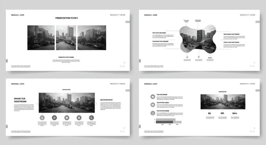
- Consistent design elements across slides create a cohesive experience, reinforcing brand identity and improving the audience's comprehension.
Importance of Captivating Visuals

Just last week, my friend Adam had to present a quarterly report. He used the same old template he’d been given when he started, and, y’know what? His numbers were impressive, but the deck looked dull. Halfway through, I could see people zoning out, some scrolling on their phones.
This is where captivating visuals come into play:
- Visual Appeal: A well-designed slide grabs attention. It’s the shiny car in a parking lot full of old jalopies.
- Support Understanding: When you use visuals like charts, graphs, or images, you translate complex data into something digestible. Think of visuals as the translator for your ideas, bridging the gap between data and understanding.
- Emotional Connection: Good visuals evoke emotions. A well-placed photo can create empathy, humour, or engagement, tapping into the audience’s feelings.
To drive this home, here are a few tips on creating captivating visuals:
- Simplify: Avoid clutter. Each slide should convey one idea or theme.
- Use High-Quality Images: Stock photos can be a lifesaver. Just make sure they’re relevant and not cliché (no cheesy business handshake pics, please!).
- Incorporate Icons and Infographics: These can simplify complex processes or data into an easily digestible format.
Speaking of infographics… did you know that visuals can increase your engagement by up to 80%? That’s a statistic you want on your side!
A well-crafted presentation design isn’t just an aesthetic choice. It’s a strategic move to ensure your audience grasps and retains your message. Think of your design as the foundation of a house: if it’s shaky, the whole thing could come crashing down.
Know Your Audience

Researching Your Audience’s Preferences
Before crafting your slides, one crucial question looms: Who’s sitting in that room (or on the other side of the screen)? Understanding your audience can make or break your presentation. It’s like preparing a dish; you wouldn’t serve a spicy curry to someone allergic to heat.
So, how do you get to know these audience members? Here are some actionable tips:
- Surveys and Questionnaires: Create a short survey to gauge their interests, knowledge level, and preference for visual content. You can send it via email or use platforms like Google Forms.
- Social Media: Check your audience’s profiles or groups to see what they engage with. Are they into minimalistic designs, or do they prefer bold graphics?
- Past Presentations: If applicable, review feedback from previous presentations. Look for patterns. Did they rave about the engaging visuals or point out certain elements that bore them to tears?
Incorporating Audience Insights into Design
Now that you’ve gathered valuable insights, it’s time to put them into practice. Your goal is to design a presentation that resonates with your audience. Here’s how to do it:
- Tailor Your Visuals: If your audience leans towards sleek, modern aesthetics, avoid overly flashy graphics. Stick to clean lines and a cohesive colour palette that matches their tastes.
- Language and Tone: Adapt your language to fit your audience. If you’re presenting to industry veterans, use jargon judiciously. However, avoid it when speaking to newcomers! No one wants to feel left out or confused.
- Engagement Techniques: Incorporate elements that your audience prefers. For instance, if they like storytelling, weave narratives throughout your presentation. If they appreciate data, prioritise charts and statistics.
Remember, one size does not fit all in presentation design. By taking the time to understand your audience’s preferences, you can customise your content effectively. This enhances engagement and demonstrates respect for your audience’s time and attention.
Storytelling Techniques for Engagement
Crafting a Compelling Narrative
Storytelling isn’t just the stuff of novels and movies—it’s a powerful presentation tool. Everyone loves a good story.
Here’s how you can craft a compelling narrative:
- Start with a Hook: Grab attention right from the get-go. Use a surprising fact, a quote, or a thought-provoking question. For example, “Did you know that 70% of presentations fail to engage their audience?”
- Build Your Characters: Introduce key figures in your story. These could be customers, team members, or even obstacles you faced. Make them relatable. After all, people connect with people.
- Create a Conflict: Every good story has a conflict. Share the challenges you’ve faced. For instance, explain how you struggled to make your initial project fly, which sets the stage for your eventual success.
- Provide a Resolution: Here, showcase how you overcame those challenges. Share solutions, results, or valuable lessons learned. Remember to use data to reinforce your success.
Using Visual Storytelling Techniques
While narrative crafting is vital, visual storytelling can amplify your message significantly. Consider how a good book can leap to life when adapted into a movie. Here’s how to use visuals effectively:
- Images: A well-placed image can say more than a thousand words. Use high-quality visuals that complement your narrative. For example, if you’re describing a brainstorming session, include an image of it in action!
- Infographics and Charts: When discussing data, turn numbers into visual representations. Infographics educate while telling a story, allowing your audience to grasp your message quickly. You can present your project’s development timeline in a standout infographic format.
- Videos: Integrate short video clips to bring your point home. I once included a 30-second video testimonial from a happy customer. That clip transformed the energy in the room and shifted my audience’s perception of my services.
Incorporating visual storytelling helps break the monotony of slides filled with text. It engages multiple senses, making your presentation design more memorable.
To tie it all together, the magic of storytelling lies in making your audience feel and connect with your message. It adds human elements that numbers and bullet points lack.
Effective Use of Colours and Fonts

Choosing Colours for Impact
It might not seem like a big deal, but the right colours can create emotional connections and enhance readability.
Here’s how to do it correctly:
- Consider Emotion: Different colours evoke different emotions. For example:
- Blue: Trust and professionalism
- Red: Passion and urgency
- Green: Calmness and growth
- Yellow: Happiness and attention
- Limit Your Palette: Stick to a maximum of three to five colours. This creates a cohesive look and prevents visual clutter. For instance, use one primary colour for headings, a secondary colour for subheadings, and an accent colour for highlights or calls to action.
- Contrast for Clarity: Always ensure enough contrast between text and background. Dark text on a light background is generally easier to read. Use online contrast checkers to verify whether your colour combinations are viewer-friendly, if needed. Aim for WCAG 2.1 AA contrast, at least 4.5:1 for normal text and 3:1 for large text, defined as 18pt regular or 14pt bold. These ratios improve legibility on projectors and in mixed lighting.
Font Selection for Readability and Emphasis
Think of fonts as the voice of your presentation design. A font can make your content sound welcoming, authoritative, or chaotic. It’s vital to choose wisely!
Keep these tips in mind when selecting fonts:
- Prioritise Readability: Choose sans-serif fonts for body text. They’re sleek and easier to read on screens. Traditional options like Arial or Helvetica can work wonders. For headers, consider a bolder font to add emphasis.
- Limit the Number of Fonts: Stick to two or three fonts maximum: one for the header, one for the body text, and maybe a playful accent font. This keeps your slides looking professional and polished.
- Use Emphasis Sparingly: If you want to emphasise a point, use bold or italic text, but don’t go overboard. Too much emphasis can dilute the message you’re trying to convey.
Remember, the right combination of colours and fonts can elevate your presentation, improve comprehension, and help your message stick.
Accessibility basics: contrast, colour-vision, and not using colour alone
Direct answer. Presentation accessibility means designing slides and delivery so people with visual, auditory, cognitive, or motor differences can perceive, process, and act on your message. You reduce friction, widen reach, and avoid errors. It is practical, testable, and supported by clear standards.
- Use dual cues: colour plus text, icons, or patterns.
- Meet contrast: follow AA ratios for text.
- Support audio: enable live captions.
Around 8% of men and 0.5% of women have colour vision deficiency, according to Colour Blind Awareness. If colour is the only signal, many people miss meaning.
- Never rely on colour alone: pair colour with labels or shapes.
- Test in greyscale: low-contrast items will reveal themselves.
- Use patterned or dashed lines to make the chart series distinguishable without colour.
- Direct labelling: add values to bars or lines to reduce legend lookups, as advised by Nielsen Norman Group.
- Live captions: PowerPoint and Google Slides support subtitles during presentations, see Microsoft Support and Google Support.
- Alt text on export: add alt text before sharing as PDF, following W3C WCAG guidance.
The State of Presentation Accessibility in 2026.
- WCAG 2.2 adoption: many organisations now reference WCAG 2.2, which refines focus and input criteria.
- European Accessibility Act: requirements apply from 28 June 2025 to many services across the EU; see the European Commission.
- Live captions norm: PowerPoint and Google Slides ship real-time captions, reducing barriers for mixed audiences.
Slide Layout and Structure
Creating Visually Appealing Slide Layouts
The design is the backbone of your presentation, and a well-designed slide can make your content shine. Think of it as the frame of a painting; without it, the beauty is lost.
Here are some quick tips for creating better slide layouts:
- Use Grids: A grid simplifies alignment and spacing. It helps you position elements harmoniously rather than randomly. Tools in PowerPoint, Google Slides, or Canva have grid options that make this easy!
- Prioritise White Space: Give your content room to breathe. Don’t overcrowd slides with text. Aim for a balance between elements and white space to avoid overwhelming your audience. A good rule of thumb is to keep each slide to just six lines of text.
- Visual Hierarchy: Use size and placement to dictate importance. The title should be noticeable, while key points can be smaller. Applying strategic bolding or colour to essential points can also help.
Importance of Consistent Design Elements
Consistency across your slides lays a solid groundwork for a seamless experience. Imagine walking into a café where the chairs, tables, and wall colours clash like a bad fashion choice—it feels disjointed. This inconsistency can undermine your credibility.
Here’s why maintaining consistent design elements is essential and how to do it:
- Reinforces Branding: If you’re representing a business or yourself, design consistency reflects professionalism. Stick to the same colour palette, font choices, and logo placement throughout your slides.
- Enhances Comprehension: When your audience knows where to look for information (like consistent heading placements), they’ll follow your presentation more easily. For instance, if you’ve used a specific style for statistics in previous slides, keep it that way!
- Creates a Cohesive Experience: It’s like a well-composed song. Each slide flows into the next, creating a better rhythm for your presentation design. Consistent layouts can make transitions smoother, making the whole narrative more connected.
Use Master Slides and layouts for consistency
Stop fixing the same spacing on every slide. Set rules once in the Slide Master, then build fast with fewer mistakes.
- Define styles: set headings, body text, lists, and footers in the master.
- Lock brand: apply your brand colours and logo once to cascade site-wide.
- Build layouts: title, section break, content, quote, and comparison.
- Use placeholders: text and image frames keep alignment repeatable.
- Edit once: changes in the master update all child slides.
In our fieldwork, teams cut rework by moving edits to the master. Less fiddling, more clarity.
Aspect ratio and safe margins
Most modern rooms run 16:9. It is the default in PowerPoint and widely used templates, confirmed by Microsoft Support.
- Start 16:9: switch to 4:3 only if a venue mandates it.
- Keep safe margins: leave space so text is not cropped by projectors.
- Back-row test: view from the last row and check legibility.
So, before you hit the “present” button, ensure your slides are visually appealing and consistent. It can significantly enhance your message and leave a lasting impression.
Visuals and Media Integration

Incorporating Images and Videos
Gone are the days when a simple text-based slide was enough. Nowadays, audiences crave a multi-sensory experience. A memorable image can enhance your message, while a well-placed video clip can build emotional connections.
Here are some best practices for incorporating images and videos:
- Use High-Quality Images: Opt for sharp, relevant, and high-resolution photos. Unhelpful or pixelated visuals can make your presentation look unprofessional. Websites like Unsplash or Pexels offer beautiful, royalty-free images that are perfect for this.
- Limit Video Length: Keep videos short—ideally under 60 seconds. Long videos can cause your audience to lose focus. You want them engaged, not distracted by a lengthy clip.
- Keep it Relevant: Every image or video should serve a purpose. Whether you’re adding a funny meme for a light moment or a graph to showcase data, ensure it directly relates to your message.
Image and video formats and compression
Your media should look sharp and play without drama. Format choice does the heavy lifting.
- JPEG for photos: small size, good for photographic images.
- PNG for graphics: crisp edges for logos, UI, and icons.
- MP4, H.264 video and AAC audio: broad support across platforms, see Microsoft Support and YouTube Help.
- Compress media: trim clips, compress within PowerPoint, and cap bitrates.
- No auto-play audio: it startles people and creates A/V issues.
- Volume check: normalise levels and test on the presentation machine.
Enhancing Presentations with Infographics
Infographics are like the superheroes of presentation visuals—compressing information into a digestible, engaging format. They enable your audience to make sense of complex data without feeling overwhelmed.
Here’s how to integrate infographics effectively:
- One main idea per infographic: Each infographic should revolve around a single theme or concept. That focus helps your audience retain the key message without getting lost in details.
- Use Consistent Branding: Infographics should align with the overall style of your presentation design. Maintain consistent colours, fonts, and logos.
- Data Visualisation Tools: Tools like Canva or Piktochart make it easy to create beautiful infographics. These platforms can be a lifesaver if you’re not a design whiz.
- Interactive Elements: If your platform allows, consider making your infographics interactive! Clickable elements can dramatically boost engagement levels.
Data visualisation essentials
Great charts make decisions easier. Sloppy charts distort perception and trust.
- Start bar axes at zero: avoid exaggerating differences, per ONS guidance.
- Use lines for trends: continuous data is best suited to line charts; see the FT Visual Vocabulary.
- Avoid 3D effects: they distort area and angle judgement, as shown by Nielsen Norman Group.
- Sort bars: descending order or meaningful category order aids scanning.
- Label directly: put values or series names near marks, reduce legend hunts.
- Limit pie slices: use a few categories or switch to a bar chart.
Debunked best practice. “3D charts grab attention” is a myth. Cleveland and McGill’s research on graphical perception shows that humans read position and length more accurately than they do area or volume. 3D degrades those cues and increases error, see summaries via Nielsen Norman Group.
| Wrong Way | Right Way |
|---|---|
| 3D pie with 10 slices | Sorted bar chart with direct labels |
| Truncated bar axis not at zero | Bar axis at zero to show true magnitude |
| Rainbow palette | 1–2 brand colours plus neutral greys |
| Legend-only labelling | Labels placed next to data marks |
Real-world examples.
- NASA Columbia report: the Columbia Accident Investigation Board highlighted information loss in slide decks, a warning against dense bullets and ambiguous charts.
- Hans Rosling: Gapminder’s animated charts with clear narration showed how direct labelling and motion can aid comprehension, see TED.
- London Underground map: consistent colours and labels beat geographic accuracy for wayfinding, documented by TfL.
Balancing visuals and text is a foundation for clarity and retention. Invest time in integrating images, videos, and infographics to give your presentations an extra punch.
As we roll along, the next topic dives into typography tips for design, where we’ll sharpen our focus on guiding attention with clever font choices. Let’s keep this momentum going!
Typography Tips for Design
Best Practices for Typography in Presentations
Believe it or not, your text choices can significantly impact how your message is perceived.
Here are some best practices that can help your typography shine:
- Choose Readable Fonts: Always stick to sans-serif fonts for body text. They’re easier to read on screens. Think Arial, Helvetica, or Open Sans. Each of these can work wonders for your audience’s comprehension.
- Limit Font Types: Keep it simple—one or two font types should suffice, one for headings and another for body text. This creates a clean look and avoids confusion, but using more than two can feel like clutter!
- Font Size Matters: Ensure your font size is appropriate for your audience. A good rule of thumb is:
- Title: 32pt or larger
- Subtitle: 24pt
- Body Text: 18pt
- Be Mindful of Line Spacing: Adequate line spacing can enhance readability. Aim for 1.15-1.5 line spacing to avoid cramped text blocks.
Using Typography to Guide Attention
Now that we’ve covered the basics, let’s take things up a notch. Typography can be a powerful tool for directing your audience’s focus. Think of it like a compass, guiding them through your narrative.
Here’s how you can use typography to guide attention effectively:
- Hierarchy is Key: Use different font sizes and weights to establish a hierarchy of information. If you want your audience to notice a particular point, make it larger or bolder than the surrounding text. For instance, your main takeaway should pop out, enticing them to remember.
- Contrast for Emphasis: Use contrasting colours between text and background to enhance visibility. Make that key statistic stand out in blue on a white background for a powerful effect—visibility is your ally!
- Avoid All-Caps for Body Text: While all-caps can be effective for titles, avoid them in body text. It can feel like you’re shouting at your audience, making reading tougher.
- Use Bulleted Lists Wisely: Bullet points are a great way to break up text and highlight important information. Just aim to keep them concise. Consider shortening or breaking sentences into separate points if you have long sentences.
Good typography is your secret weapon—improving readability and guiding attention within your slides. It enhances your message’s clarity while ensuring essential points resonate with your audience.
Utilising White Space and Contrast
Importance of White Space in Design
You might think, “What’s the point of leaving space on my slides?” But trust me, it’s not just filler. White space is your best friend for creating clarity and enhancing your message.
Here’s how:
- Improves Readability: Including white space allows the eye to rest, making text more digestible. Think of it as a pause in music; it enhances the rhythm of your presentation design.
- Draws Attention: Strategically placed white space can direct your audience’s focus to important content. It helps to highlight key points, making them stand out amidst the chaos of other information.
- Creates Elegance: A clean, minimalist design with adequate white space feels sophisticated and professional. It’s like a beautifully plated dish that makes you appreciate each bite.
- Avoids Clutter: Too much information can lead to cognitive overload. White space helps alleviate that, helping your audience concentrate on your main messages without distraction.
Enhancing Visual Hierarchy with Contrast
When used effectively, contrast can help establish a clear visual hierarchy in your presentation, guiding your audience through your key points.
Here’s how contrast plays a crucial role:
- Differentiate Elements: Use contrast effectively to separate headings from body text. For example, try using a bold font for titles and a lighter font for body text. This contrast makes it easier for your audience to navigate your slides.
- Highlight Key Information: Want to make a statistic pop? Use darker text on a light background, or vice versa. This technique ensures that critical takeaways are immediately noticed.
- Create Depth and Interest: Mixing light and dark elements can create visual intrigue. For instance, pairing a white text box on a dark background can grab attention while maintaining a focused look.
- Consistency: While contrast is essential, it’s also vital to maintain a consistent visual style. If your heading fonts are a specific colour on one slide, keep that colour throughout the presentation.
Using white space is not about leaving things empty. It’s about enhancing understanding and making a powerful statement. Combined with contrast, you can establish a hierarchy that guides your audience and ensures your message gets across.
Animations and Transitions
Using Animations Sparingly for Emphasis
While they can add flair to your presentation, using them judiciously is crucial. Think of animations like seasoning in a recipe; too much can overwhelm the dish, while just the right amount enhances flavour.
So, here’s how to use animations effectively:
- Highlight Key Points: Use animations to draw attention to specific elements instead of animating everything. For instance, having a key statistic fade in can emphasise its significance without becoming distracting.
- Limit Different Effects: Stick to several animation styles throughout your presentation. Too many different effects can make your slides feel choppy. Choose one or two that fit your theme, like ‘fade’ or ‘wipe’, and use them consistently.
- Timing Matters: Ensure animations aren’t excessive. A delayed entrance can build suspense, but your audience might lose interest if it’s too long. Aim for a smooth experience—1-2 seconds is ideal.
- Avoid Overly Complex Effects: While swirling text and zooming images might seem fun, they often detract from your message. Please keep it simple and straightforward to maintain focus on your content.
Transition Techniques for Seamless Flow
Just like in storytelling, transitions help maintain the rhythm.
Here are some tried-and-true techniques for creating smooth transitions:
- Match the Mood: Choose transitions that align with your presentation’s tone. If you deliver a serious financial report, stick with a subtle fade or dissolve effects. Conversely, a more dynamic transition might be appropriate for presenting a creative idea.
- Keep It Consistent: Like with animations, consistency is key here. Whether you use ‘fade’ or ‘push’, try to maintain the same transition throughout the entire presentation. This keeps things professional and visually cohesive.
- Limit Transition Use: Too many different transition styles can disrupt the flow of your presentation. Use them strategically to signify major shifts or sections rather than peppering each slide with a different effect.
- Timing Is Crucial: Aim for seamless transitions rather than lengthy delays. A quick transition should enhance, not interrupt. Around half a second can provide a smooth transition without dragging time.
Design for reduced motion sensitivity
Some people experience nausea or distraction with large or rapid motion. Keep movement calm and purposeful.
- Prefer fades: avoid zooms, spins, and bounces.
- Short and consistent: keep durations tight and predictable.
- No motion-only meaning: content order must still read without effects, matching WCAG 2.2 “Animation from Interactions”.
- Provide a static deck: export a version with animations disabled for sharing.
I once audited a sales deck that used fast fly-ins on every bullet. Removing them improved recall and reduced presenter timing slips.
While animations and transitions can enhance your presentation if done right, moderation is the name of the game. Use them purposefully to highlight important information and maintain the flow of your narrative.
Practice and Feedback

Importance of Rehearsals for Delivery
As we near the end of our design journey, it’s time to discuss perhaps the most crucial element of any successful presentation: practice and feedback. You could craft the most visually stunning slides, but all that effort could be wasted if the delivery falls flat.
So, here are some compelling reasons to make rehearsal a priority:
- Builds Confidence: The more you practice, the more comfortable you become with the content and delivery. When I finally started rehearsing out loud, I noticed how much less nervous I felt when presenting!
- Helps with Timing: Running through your presentation multiple times lets you gauge how long it takes. You don’t want to be the person who rushes through slides or runs over time! Keep an eye out for moments that need trimming or expanding.
- Refines Delivery: Practising allows you to experiment with tone, volume, and pacing. You can identify parts of your presentation that may need more emphasis.
- Catches Technical Issues: rehearsing allows you to test your equipment, from slideshows to mics. This helps prevent any technical glitches on presentation day.
Presenter View and speaker notes
Use Presenter View to keep your delivery tight without reading slides.
- See the road ahead: next slide, timer, and notes in one place, see Microsoft Support and Google Support.
- Write scannable notes: short cues, not scripts.
- Title as signpost: slide titles state the takeaway, and you explain the proof.
Seeking Feedback for Improvement
Once you’ve practised, one vital step is seeking feedback. This should also be part of your process, as outside perspectives can reveal insights you may have overlooked.
Here’s how to effectively seek feedback:
- Choose Your Audience: Share your presentation with friends, family, or colleagues who can provide constructive criticism. It’s best to pick people who will be honest yet supportive.
- Create a Feedback Form: If you’re feeling bold, create a short questionnaire that covers key aspects of your presentation, such as clarity, engagement, and visual appeal.
- Ask Open-Ended Questions: Encourage detailed feedback by asking open-ended questions like, “What part did you find most engaging?” or “Was there anything that confused you?” This approach can reveal specific areas for improvement.
- Be Accepting of Criticism: Remember, feedback isn’t personal. It’s a tool for growth.
- Iterate and Improve: Use the feedback to refine your presentation. It’s all about continuous improvement—even seasoned presenters can benefit.
Technical rehearsal checklist and export options
A smooth deck is planned, not lucky. Run this checklist before showtime.
- Test on venue kit: resolution, aspect ratio, and audio.
- Verify fonts: use widely available fonts or embed them, see Microsoft Support.
- Pack a PDF: carry a PDF export as a fallback for failsafe display.
- Check media: hyperlink targets and video playback on the actual machine.
- Cables and adapters: bring HDMI, USB-C, and a clicker with spare batteries.
- Offline copies: store a local file, not only a cloud link.
In summary, practice is essential for honing your delivery, while feedback paves the way for growth. Embrace both as integral parts of your presentation journey.
As we wrap up, remember that every great presenter was once a beginner. Combining all the design techniques and delivery methods we’ve discussed, you’ll be well-equipped to wow your audience. Now, go out there and own your next presentation design!
If you want extra help, consider working with a professional design team like Inkbot Design to polish your slides. You’ve got this!
