32 Best NHL Logos Ranked: A Creative Director’s Critique
If you want to understand the difference between a fleeting trend and a timeless brand, look at the National Hockey League.
The NHL is a unique ecosystem where century-old commercial identities compete directly against modern, market-tested startups. It is a brutal arena for graphic design.
When a business owner asks me about longevity, I don’t point them to tech companies that rebrand every 18 months. I point them to the ice.
Some of these teams have worn the exact same crest since the Great Depression, while others have undergone identity crises that cost millions in lost merchandise revenue and brand equity.
Your logo is not just a pretty picture; it is the tip of your commercial spear. It needs to function on a 50-foot billboard and a 16-pixel browser tab.
In this audit, we are ranking the best NHL logos, from the absolute bottom to the pinnacle of design excellence.
We are stripping away fan bias and looking at the cold, hard vector data: scalability, distinctiveness, and execution.
- Top logos favour aggressive simplicity, not clutter—two-colour, flat vectors endure across scales and media.
- Consistency builds equity: Montreal, Toronto, Detroit prove longevity beats frequent rebrands.
- Own a colour—distinct palettes (Flyers’ orange, Sharks’ teal) make brands instantly recognisable.
- Negative space and clever monograms (Devils, Kraken) deliver scalability and storytelling without excess detail.
- Avoid trendy effects—gradients, bevels, and over-detailing fail in embroidery and small sizes.
What Makes a Sports Logo “The Best”?
Before we tear into the rankings, we need to define the criteria. A logo in the NHL isn’t just a corporate identifier; it is a tribal badge. However, the design principles remain the same as those we apply when discussing types of logos for corporate clients.
The Three Pillars of NHL Branding:
- Clarity & Reduction: Does it appear as a blurry mess when embroidered on a hat or reduced to a mobile notification icon?
- Identity & Heritage: Does it communicate “Hockey” and the specific city without needing the team name spelt out?
- Colour Ownership: Can you identify the brand solely by its colour palette? (Think Philadelphia Flyers’ Orange or the Red Wings’ Red).
Consultant’s Note: I often see SMBs trying to mimic the complexity of 1990s sports logos—gradients, heavy outlines, fierce mascots. This is usually a mistake. As you will see in this ranking, the teams at the top rely on aggressive simplicity, not clutter.
The Ranking: 32 to 1
We have analysed the vector construction, colour psychology, and adaptability of every active franchise. Here is the definitive list.
The Bottom Tier: Identity Crises & Missed Opportunities
32. Columbus Blue Jackets
This is a design by committee. You have a flag, a star, a bevelled font, and a generic red, white, and blue palette that could belong to any of a dozen American sports teams. The logo attempts to be a tribute to the “Star-Spangled Banner”, but ultimately feels like clip art. It lacks a central focal point. When reduced to a small size, the details in the flag wrap get lost. It’s functional, but entirely forgettable.
31. Washington Capitals
A wordmark is not a crest. The Capitals rely on a slanted lowercase font with a hockey stick replacing the ‘t’ (or ‘l’, depending on the era). It is arguably one of the weakest uses of typography in professional sports. It reads more like a trucking company logo from 1978 than a dynamic sports franchise. While the recent “Weagle” (Eagle/Capitol dome) secondary logo is brilliant, their primary mark remains an outdated typographic failure.
30. Anaheim Ducks
This ranking hurts because their original “Mighty Ducks” logo was a masterclass in character design. The current iteration—a webbed foot forming the letter ‘D’—is clever in concept but boring in execution. The palette of black, gold, and orange feels muddy. They took one of the most marketable brands in history and corporatised it into oblivion. It is a cautionary tale: never sacrifice personality for perceived “professionalism” without a good reason.
29. Los Angeles Kings
The Kings have transitioned from a purple and gold royal image to the Chevy logo era to their current shield. It is… fine. It is a crest-shaped design featuring an “LA” monogram. The problem is the lack of contrast and energy. It feels heavy and static. In an effort to look “regal,” they stripped away the excitement. It’s a safe logo, and in branding, safe is often synonymous with invisible.
28. Carolina Hurricanes
A hurricane is a chaotic, swirling mess of wind. The logo accurately represents this, perhaps too accurately. It is a visual oval of red and black that looks like a toilet flushing when viewed from a distance. The silver/grey outline attempts to contain the energy, but only muddies the contrast. It is distinct—you know who it is—but it is not aesthetically pleasing.
27. Tampa Bay Lightning
This is the “Flash” superhero logo if it were designed for a corporate bank. It is a blue circle with a lightning bolt. While simplicity is usually a virtue, this crosses the line into generic. It lacks the edge and danger of a lightning strike. Compare this to the Gatorade bolt or the Flash insignia; the Tampa bolt feels static. It has zero motion.
26. Florida Panthers
The Panthers recently rebranded from a leaping, aggressive cat to a shield-based, military-style badge. It is cleaner, yes. It embroiders better. However, it resembles a football (soccer) crest more than a hockey logo. By placing the head inside a shield, they caged the animal. They traded dynamic energy for stability, and the brand suffered a loss of aggression as a result.
25. Utah Hockey Club
As the newest entry, Utah is currently using a placeholder identity. It is a simple “Utah” script with a mountain palette. I am ranking it low because it is technically not a finished brand. It is clean and safe, effectively a blank canvas. It avoids being ugly, but it fails to inspire.
The Mid-Tier: Competent but Flawed
24. Winnipeg Jets

The Jets utilise a roundel logo (a circle with text) featuring a fighter jet overlaid on a maple leaf. It is a solid B-grade logo. It references the Royal Canadian Air Force, which gives it heritage points. However, the grey-on-blue tonal range is low contrast. On a television screen, it can read as a dark blob. A punchier accent colour would significantly elevate this.
23. Dallas Stars
The “Big D” star. It uses a bevelled effect to create depth, which is a holdover from early 2000s design trends that need to retire. The “Victory Green” is a fantastic proprietary colour—bright and covering the entire visual spectrum. However, the logo itself is rigid. It’s difficult to use the star without the ‘D’ and vice versa.
22. Nashville Predators
The sabre-toothed tiger is a cool mascot with local historical relevance (a fossil was found in Nashville). The rendering is sharp, aggressive, and uses a unique yellow-heavy palette. It loses points for the excessive detail in the fur and teeth, which creates noise at small sizes. It is a very “minor league” aesthetic that has been polished up for the majors.
21. Colorado Avalanche
This is a relic of the 90s that actually works. The ‘A’ is shaped like a mountain with a puck sweeping around to create an avalanche. It suggests motion, which is crucial for a fast sport. The colour palette (burgundy and blue) is unique. It is slightly dated with its sharp angles, but it has maintained enough equity to stay relevant.
20. Vegas Golden Knights
A masterclass in negative space? Almost. The helmet forms a ‘V’ for Vegas. It is sleek, modern, and the gold/steel grey palette screams “Las Vegas glitz.” My critique is the detail in the helmet shading. It is intricate, which makes embroidery expensive and difficult. However, as a modern expansion brand, it established an identity immediately.
19. Vancouver Canucks
The Orca breaking out of the ice in the shape of a ‘C’. It connects to the Pacific Northwest indigenous art style (Haida), which is a brilliant localised touch. However, the execution is a bit busy. The shattering ice adds necessary context but unnecessary vectors. It’s a logo that tells a story, perhaps a few too many words in that story, but a good one nonetheless.
18. San Jose Sharks
Teal. They own the colour Teal. The shark biting the hockey stick is aggressive and fun. They recently updated it to remove some complex shading, which was a smart move. It is an iconic mark of the 1990s expansion era that has aged better than its peers, thanks to its unmistakable silhouette.
17. Ottawa Senators
The Roman Centurion. Ottawa recently returned to a 2D version of their original logo, ditching a 3D bevelled disaster. This was the right call. The profile view of the Centurion is stoic and strong. The gold laurels add class. It’s a solid, traditional sports emblem that commands respect.
16. Edmonton Oilers
Typography as an image. The oil drop sits inside the name. It is weird, slightly unbalanced, and uses a distinct orange and blue contrast. Technically, it shouldn’t work—the font is strange, the drop cuts legibility—but it has become iconic through the Wayne Gretzky era. Brand equity does a lot of heavy lifting here.
15. Calgary Flames

The flaming ‘C’. It is simple, hot, and effective. The red and yellow palette is energetic. Why is it mid-tier? Because the black outline often feels too heavy. The “retro” version without the black outline (white/yellow/red) is far superior and breathes better.
14. Buffalo Sabres
They went back to the buffalo and crossed swords. Good. The buffalo is distinct, the swords provide the context of the name “Sabres,” and the blue and gold are classic. It is busy, but the circle contains the chaos effectively. It’s a great example of a “Combination Mark” where the symbol and shape work in harmony.
13. New York Islanders
The “NY” with the hockey stick and the map of Long Island. It is geographically specific, which builds local tribe loyalty. The orange and blue are high contrast. It’s a bit clunky—the stick is too long, the map is tricky to render—but it has a charm and history that overrides the technical flaws.
12. Seattle Kraken
The newest brand on the block (aside from Utah) and arguably the best modern launch. The ‘S’ is shaped like a tentacle. The negative space creates a red eye. The tonal blues represent the depths of the ocean. It is minimal, scalable, and frightening. This is how you launch a 21st-century brand.
11. Arizona (Now Utah – Legacy Mention) / Minnesota Wild
Let’s talk about the Minnesota Wild. This is an illustration masquerading as a logo. It is a landscape scene (trees, moon, river) that forms the shape of a wild animal’s head. It is “Gestalt theory” in action. While I normally dislike complex illustrations, this is genius. It rewards the viewer for taking a closer look.
The Top Tier: The Design Masterclass
These are the logos that transcend hockey. They are global fashion brands.
10. New York Rangers
This is a shield. It says “New York Rangers” diagonally. It is not clever. It is not minimal. But it is an authority. The balance of the text, the spacing of the letters, and the classic red, white, and blue shield shape give it a feel reminiscent of a police badge or a government seal. It implies: “We are the establishment.”
9. Chicago Blackhawks
Note: We are critiquing the design execution, not the cultural sensitivity. Visually, this is an incredible piece of art. The colour palette is extensive, yet balanced. The profile rendering is detailed but readable. It is widely considered one of the most beautiful logos in sports due to its human element; it’s not an abstract animal, but a portrait.
8. Philadelphia Flyers

This logo has never changed since 1967. A flying ‘P’ with a puck in the centre to create the wing. It encapsulates speed. It is aggressive. It uses “Safety Orange”, which no other team touched for decades. It is distinct, fast, and technically flawless in its vector construction.
7. Boston Bruins
The Spoked B. It represents Boston as the “Hub of the Universe.” It is bold, simple, and rugged. The black and gold warns of danger (like a wasp or hazard sign). The stencil font is tough. It is the perfect visual representation of the “Big Bad Bruins” brand identity.
6. Pittsburgh Penguins
A penguin playing hockey shouldn’t look intimidating, but the triangle background (representing downtown Pittsburgh’s Golden Triangle) anchors it. The skating penguin has motion and focus. It is a “skating” penguin, not a standing one, which is a crucial distinction for a sports team.
5. St. Louis Blues
The Blue Note with a wing. It connects the city’s musical heritage (The Blues) with the sport (speed/wings). It is incredibly simple. One colour (plus outline). It scales down to 16 pixels perfectly. It is elegant, fluid, and timeless.
4. New Jersey Devils
This is the best “modern” (1980s) logo. It is an ‘N’ and a ‘J’ fused together with horns and a tail. It is a monogram that looks like a devil. It is red and black. It is the perfect marriage of name and visual. You don’t need to see the word “Devils” to know exactly who this is. It is clever without being cute.
3. Toronto Maple Leafs
A maple leaf. It is the national symbol of Canada. By claiming this symbol, the team positions itself as the default representative of the sport’s homeland. The deep blue is clean. The lines within the leaf add texture without noise. It is branding arrogance at its finest, and it works.
2. Montreal Canadiens
The ‘CH’. Club de Hockey. It is the most historic crest in the game. It has remained largely unchanged for over 100 years. It is not particularly clever design-wise—it’s just letters in a C—but the consistency has built massive equity. It stands for winning. It proves that you don’t need a mascot if you have history.
1. Detroit Red Wings
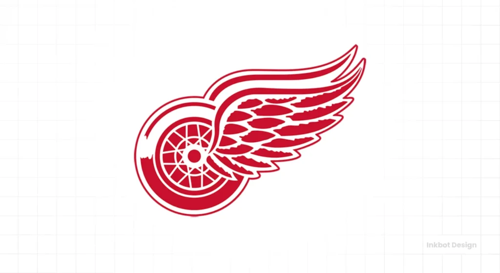
The Winged Wheel. This is the perfect logo. Why?
- Relevance: Detroit is often referred to as the Motor City. The wheel represents the car industry.
- Context: The wing represents speed and the team name.
- Execution: It is a single vector shape. It uses two colours: Red and White. No outlines. No gradients. No shadows.
- Movement: The wing pulls the eye from left to right, the direction of reading and progress.
It is elegant, industrial, and aggressive all at once. It creates a beautiful, intricate shape that is instantly recognisable. It is not just the best logo in the NHL; it is one of the best logos in professional sports history.
Consultant’s Reality Check: What This Means for Your Business
I once audited a client in the logistics sector who wanted a logo featuring a truck, a globe, an eagle, and their company initials. They drew inspiration from the complex crests of European football clubs.
I showed them the Detroit Red Wings logo.
The lesson from the NHL is that brand equity comes from consistency, not complexity. The teams at the bottom of our list (Columbus, Washington) struggle because they try to say too much, or they change their voice every decade. The teams at the top (Detroit, Montreal, Toronto) picked a simple, strong identifier and stuck with it for a century.
Key Takeaways for Entrepreneurs:
- Own a Colour: The Flyers own Orange. The Sharks own Teal. What colour does your competitor ignore? Take it.
- Prioritise Scalability: If your logo relies on gradients or tiny text (like the Florida Panthers’ shield details), it will fail on a smartphone screen.
- Avoid Trends: The ’90s gradient logos are a thing of the past. The bevelled logos of the 2000s are ageing poorly. Flat, two-colour vector designs last forever.
The Verdict
The disparity in NHL branding is massive. You have the Original Six setting the gold standard for corporate identity, and you have expansion teams struggling to find a voice in a crowded room.
If you are looking to refresh your brand identity, consider the top 5 on this list. They don’t rely on angry mascots or special effects. They rely on clear, confident shapes that tell a story instantly. That is the power of professional design.
Is your company logo a “Red Wing” or a “Blue Jacket”? If you are tired of blending in with the competition, it might be time for a professional audit.
Request a Quote for Your Brand Identity
Frequently Asked Questions (FAQ)
What is the oldest logo in the NHL?
The Montreal Canadiens’ ‘CH’ logo has been in use since 1917, making it the oldest continuously used crest in the league. Its longevity contributes significantly to its high ranking and brand value.
Why are Original Six logos considered better?
Original Six logos (Boston, Chicago, Detroit, Montreal, NY Rangers, Toronto) rely on simple, flat vector shapes and 2-3 colours. This simplicity allows them to scale perfectly across modern media, unlike complex modern designs.
What makes the Detroit Red Wings logo the best?
The Winged Wheel is the best because it perfectly combines the city’s industry (automotive) with the team’s name in a single, two-colour graphic. It utilises “Rightward motion” to imply speed and progress.
Why do teams like the Anaheim Ducks rebrand?
Teams often rebrand to distance themselves from previous ownership or to stimulate merchandise sales. However, as seen with the Ducks, abandoning a cult-classic identity (The Mighty Ducks) often damages long-term brand love.
What is the “Golden Ratio” in sports logos?
While not always strict, top logos, such as the Montreal Canadiens, often approximate the Golden Ratio in their proportions. This mathematical balance creates a visual harmony that the human eye finds naturally pleasing.
How important is negative space in logo design?
Crucial. The Hartford Whalers (defunct) and the new Seattle Kraken logos are famous for using negative space (the white space between elements) to hide secondary symbols like an ‘H’ or an eye, adding depth to the brand.
Why are gradient colours bad for logos?
Gradients (fading colours) are difficult to reproduce in embroidery and screen printing. They also look dated quickly. Solid, flat colours, like the Flyers’ orange, are cheaper to print and easier to recognise.
What is a “Wordmark” vs a “Logo”?
A logo (or crest) is a graphic symbol (like the Red Wings’ wheel). A wordmark is just the text (like the Washington Capitals). Generally, symbols are stronger for global branding as they don’t require language fluency to recognise.
Can a logo affect merchandise sales?
Absolutely. Data consistently shows that teams with strong visual identities (like the Chicago Blackhawks or Las Vegas Golden Knights) top merchandise sales charts, regardless of their on-ice performance.
What can small businesses learn from NHL logos?
The main lesson is “reduction.” The best teams use the fewest elements possible to convey their message. SMBs should strip away clutter, gradients, and complex taglines to create a versatile, memorable mark.

